When is good draftsmanship important to an illustration?
That question occurred to me when I saw the current cover of
The New Yorker magazine:
The subject of the cover was challenging to draw: a packed theater audience
captured from an angle that also shows the events taking place on stage. In the past, such an assignment might've demanded the full tool kit of draftsmanship-- perspective, anatomy, foreshortening, etc.
Observe how those skills enhanced the same subject in the past:
 |
| Walter Appleton Clark showed the stage over the shoulders of an audience: a marvelous piece of draftsmanship. And while the treatment may at first seem like antiquated realism, notice how Clark made an abstract design from the backs of heads and the arrangements of the bodies. |
 |
| Gluyas Williams simplified the complexities of our subject with clear lines and geometric shapes, but always on a rock solid foundation |
 |
| An engineering feat: capturing the faces of the audience and the act on stage at the same time. |
 |
| Caldecott award winning illustrator Paul Zelinsky put a magic spin on the subject. Note how he simplified the audience into small circles and ghostly profiles to avoid getting trapped in unimportant detail. He achieved depth with those marvelous silhouettes, and managed to get both the stage and the audience into the picture by bending the time space continuum. These are the judgments of a mature artistic talent |
 |
Mort Drucker was famous for his crowd scenes which he could rotate to any angle with uncanny agility.
|
 |
| Drucker always managed to have great fun with individual
faces in the audience while
still maintaining control over the larger sweep of the picture. |
 |
| Franklin McMahon (above and below) drew stylized pictures on site at political conventions |
For me, it's a pleasure to watch such great skill in action. I think these illustrations were successful in part because the artists had the drawing ability to solve sophisticated problems of structure and organization and emphasis and coherence.
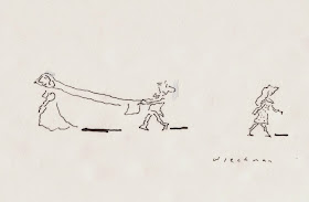
Of course, some pictures don't require technical drawing skills. For
example James Thurber, William Steig and other illustrators
made excellent pictures with flat, naive looking figures drawn simply on
blank backgrounds.
 |
| Steig |
 |
| Thurber |
The trick, then, is to figure out when draftsmanship is important for the picture and when it isn't. Ultimately draftsmanship is only a means to an end. It's a tool for
delivering a concept more persuasively, or elegantly, or effectively, or
economically, or powerfully, as the individual artist sees fit.
In the theater pictures above, good draftsmanship enabled artists to undertake a wider range of solutions. But you'd never find Thurber attempting such a complex composition. He just didn't have the skill, and he knew it.
Illustrator Seymour Chwast said that he avoids attempting pictures “that
require craftsmanship and a drawing ability I do not have.”
Illustrator Elwood Smith said that his inability to draw the scenes he
imagines forces
him to find other alternatives: “if I can’t draw it, I struggle to come
up
with a different idea that’s invariably more original."
Returning to
The New Yorker cover that launched us on this quest, drawing skills were put aside in favor of a naive, unschooled look:
This unschooled style has become increasingly fashionable. It is found on the cover of
The New Yorker but also in graphic novels and mainstream magazines. It is applied more indiscriminately, even to concepts that are not particularly elevated by such an approach. Why?
One reason seems to be a general disillusionment with draftsmanship. Audiences have noticed that some artists with impeccable technical skills never get around to addressing concepts of significance. Also, some artists achieve the appearance of technical proficiency through suspicious mechanical means. This could help explain why so many artists now seek authenticity in spontaneity.
On the other hand, another reason for the popularity of this look-- especially when applied to less suitable concepts-- may be that today's audiences have become more ignorant and less patient, and art directors have become better at catering to those traits.
If the desensitized readers of graphic novels or popular magazines can no longer recognize the difference, it doesn't behoove a publisher to work hard to stay on the right side of that divide. But an artist who hopes his or her work will outlive our current fashions will need to make independent choices about what an artistic concept requires, and when draftsmanship is important, and when it isn't.


