Monday, September 25, 2017

HEINRICH KLEY FEEDS POMEGRANATE SEEDS TO THE MUSE

If a man wishes to be worthy of the best that a woman has to offer, he must have the patience to feed her a pomegranate, one seed at a time.
 -- Ancient Persian Proverb


Before the muse gifted Heinrich Kley with this idea about racing snails...


... he explored snails with lovely little studies such as these:


By working at a snail's pace, Kley learned how to make them race at breakneck speed.


Friday, September 15, 2017

STAYING EASY IN YOUR HARNESS

The poet Robert Frost understood that freedom is not the absence of constraints.  "You have freedom," he said, "when you're easy in your harness."

The illustrator Mort Kunstler used to work for men's adventure magazines such as Stag or For Men Only.

Illustration for the Men magazine article, "Get to Comrade Zoltan with Girls." (1959). The article says that when all other interrogation tactics failed, "There was no choice but to summon the 'passion troops.'"
Cheap and lurid, these magazines were printed on a low budget. They couldn't afford full color reproduction on every page.  In the double page illustration above, Kunstler was told he could use full color on the right side, but only two colors (red and black) on the left side.

Didn't notice Kunstler's sleight of hand, did you?  OK, look again to see how he finessed it:


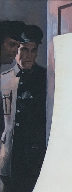
The Russian soldiers were painted in two colors...


...and so was "comrade Zoltan..."


... but Kunstler subtly camouflaged the transition to full color with this red headed temptress:


The real trick was how Kunstler used the artificial light in the room to disguise his color limitation. 


Kunstler was faced with unreasonable constraints, but he knew enough about color and staging so that the restrictions didn't chafe or pinch his painting.  He planned around them. He was easy in his harness.

 And Kunstler wasn't the only one. In earlier days, technical and economic limitations on the printing process created all kinds of obstacles for artists but if they were good enough and imaginative enough, the viewer never knew.

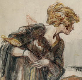
Look at how the illustrator Henry Raleigh dealt with the same problem that Kunstler handled:


Raleigh staged the drawing to take advantage of the blue ink on the right side to convey a dour, obsequious man...


...and used the warm color on the left to create this radiant creature:


Today artists are blessed with unlimited rainbows of color, in cmyk or rgb variations.  The computer monitor permits us to use full color on both the left and the right side at no extra charge.  Nor does the internet constrain the number of copies created.  One might argue that with all these technical advantages artists have finally achieved true freedom.  But that's not genuine freedom, genuine freedom is being easy in your harness.

Saturday, September 09, 2017

ONE LOVELY DRAWING, part 54


You probably don't know the work of illustrator Charles Sarka but you probably should.

Sarka (1879-1960) started out as an apprentice to an engraver and became a staff artist for newspapers (first for the Chicago Record and then for the New York Herald). He did some lovely pen and ink work for Collier's, Cosmopolitan and Harpers in the era of pen and ink greats: Joseph Clement Coll, Charles Dana Gibson, Orson Lowell and James Montgomery Flagg.  In my view, his excellent pen and ink work belongs in that esteemed company.

However, unlike his peers Sarka had wanderlust. Rather than sit by his drawing board he traveled extensively to South Pacific Islands, Africa and other remote locations where he recorded his travels in watercolors. His paintings of the hill tribes of Morocco, of the natives of Tahiti and the markets of Egypt took him far from the normal career path of a typical American illustrator, so his name is not as well known. Still, I think his early ink work is excellent.

Note in this detail how Sarka not only understands hands, but toys with different comic possibilities for presenting them.  He uses a strong, vigorous line to add some excitement to that solid coat and the folds in those pants, but he also appreciates the value of using a variety of effects, such as the spatters on that tire:


In the following detail, his lines shaping those trees are quite muscular, but Sarka knows when to back off, contrasting them with a single lacy line to convey that cigarette smoke; he even adds a few little tweety birds flying through it:


Note how Sarka gives the trees density, weight and movement by giving them heavy shadows and curling them over, (as contrasted with that cigarette smoke which wafts upward on an errant breeze-- one set of lines has to fight gravity and the other one doesn't).  


And speaking of lacy, Sarka applies the same lesson to these two charming ladies. They are clearly earthbound creatures, as we can tell from the volume and density in their dresses and coiffure, but that scarf wafts upward, contrary to gravity, with a different line just like the cigarette smoke.

Two li'l dollinks somewhere between heaven and earth
I like that Sarka put so much personality and energy in his line.  I like that he understood perspective and anatomy but used them only as starting points. I like the sense of humor in his drawing. If he'd stayed home and created a substantial body of work in pen and ink, I feel certain he'd be in the pantheon today.