Wednesday, May 23, 2018

THE FACES OF TIME


Time magazine-- which was for decades the dominant news magazine in the world-- seems to be limping  toward its end.  It was purchased last year for a fraction of its former value and the new owners are  dismantling and selling off the assets.

The cover of Time was the showcase for thousands of remarkable portraits painted by talented artists such as Boris Chaliapin and Ernest Hamlin Baker.    

Time wanted its covers to convey an accurate, lucid magazine; it wasn't advertising creativity or imagination.  So it commissioned careful illustrations that inspired confidence and integrity. 


Week after week, decade after decade, these artists painted cover portraits with great integrity, sometimes on a 48 hour deadline.  (Baker reported "permitting himself only two hours sleep out of the forty eight allowed for the job." Sometimes they worked to the last minute, cutting it so close they had to race in their car to meet a delivery date.) 

The originals were about twice the size of the printed version.  Here you can see how Baker achieved those subtle skin tones: over a light wash base, he applied highly diluted tempera paint, built up gradually with a thousand delicate brush strokes.

Baker went back with white paint to separate eyelashes he thought were too close together


How in the world did Baker learn the face of his subject well enough to employ this approach?  He'd take the reference photos supplied by the magazine-- perhaps a dozen random pictures from different angles-- and study them with a magnifying glass to compile a composite map of the topography of the face.


Baker would then use his topographic map as his guide when painting the lines and crevasses and warts of the face.  That's a lot of work. 


I would not say these covers are works of inspired genius.  I've seen more beautiful designs.  But in my opinion they are consistently works of excellence, and opportunities to be excellent are rare enough in this world that they should not be taken for granted.


If there was a shortcut that could've achieved the same result, I'm sure these artists would've  been happy to take it, and to get back all those hours of their lives.  For example, decades later computers could've saved these guys time.  But regardless, I think artists should take comfort from the fact that time spent in pursuit of excellence is never wasted.

Thursday, May 17, 2018

A TALE OF THREE LANDSCAPES

Which of these two landscapes is more realistic?


George Inness

Sean Lynch

Well, the pink version is actually a photograph, taken with film which reveals near-infrared light.  We don't normally see near-infrared light because our puny eyes are limited to the spectrum of light waves between 400-720 nm long. But near-infrared light is always there, part of the richness of nature bathing every landscape.

So I'll ask again:  Which of these two landscapes is more realistic?

Many painters take great pride in their accuracy, but their work is not "realistic" in a scientific sense.  It is faithful only to a distorted appearance of nature that we see through the limited filter of our eyes.

As long as we're content to accept such a subjective definition of reality,  that should open up the conversation.

Here's another landscape, this one by the great Jean Dubuffet, called "Ecstasy in the Sky."


 Like the landscape by George Inness above, the Dubuffet landscape offers only a limited slice of reality, clearly filtered by the artist's perception.  But is it less real?

Friday, May 11, 2018

PAINTING FOR THE ANGELS

The peculiar grace of a Shaker chair is due to the fact that it was made by someone capable of believing that an angel might come and sit on it.                                                                                                 -- Thomas Merton

This little paint box was used by an Egyptian artist 3,300 years ago:


The artist had seven colors:  blue, white, ochre, hematite (dark red), hematite mixed with calcium carbonate (lighter red), and two grades of charcoal black.  


According to the hieroglyphs on the label, these colors only came in CMYK. (RGB was apparently unavailable with this model.)  I couldn't find the USB port for connecting with the Wacom Cintiq Pro (it must've broken off around 1,000 BCE).  And heaven only knows what obsolete version of animation software this thing ran.

The artist fashioned a little tray to hold water and a brush. The sliding lid is decorated with a genet (a small rodent-like mammal that lived in the papyrus thickets along the ancient Nile).  The artist even painted the lid to look like papyrus. 


What could anyone accomplish with such a primitive tool?  These crummy colors would embarrass any self-respecting kindergarten class today.

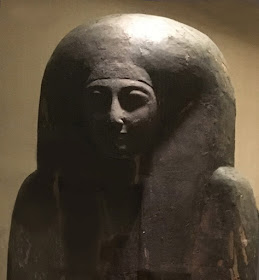
According to the RISD Museum (where I found this paint box) "Painters used these same pigments to decorate statuary and the walls of temples and tombs." So here are a few samples:


These artists lacked what we would consider the most fundamental tools necessary for making a  decent picture-- for example, electric light for painting the walls of a dark, underground tomb-- yet they created works of astonishing beauty that still give us chills thousands of years later:

How many works of art created today will evoke a similar response in 3,000 years?

The first two lessons from the tiny paint box are obvious:  

1.) Art does not "progress" the way other human enterprises do; an ancient drawing in a prehistoric cave may be more beautiful and sensitive than a work of art by today's most "advanced" artist. 
2.) Fancy and expensive tools don't necessarily result in a better work of art; a drawing scratched on a prison wall with a bed spring may be artistically superior to the latest Pixar high tech multi-million dollar extravaganza.

Everybody already understands those first two rules.  This week I'd like to propose a third lesson: 
3.) the power latent in a tiny paint box can be unleashed in part by the beliefs of the painter.  
In an age of faith, when true believers devote their talents to honoring their gods (or their pharaohs, or their one true love) that higher purpose sometimes imbues their art with larger and more important qualities.  Today's artists who are motivated by the press reviews for their next gallery opening or their copyright contract or their royalty fees may produce brilliant, complex material. It may be dazzling in its presentation and clever (although often snarky) in its tone.  But that work often seems thinner and more transitory than the work of artists who, working with the humblest tools, are motivated by fear and dread of their gods...  


...or by the radiance of divine bliss...


...or by the soul flying from our body at the hour of our fate.