Monday, December 31, 2018

THE END OF 2018

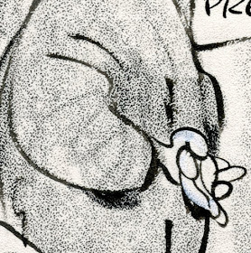
Here's a little year end gift from the great Australian illustrator Ivor Hele who seemed to enjoy drawing his wife while she napped.


Here's wishing you a 2019 full of great drawing!

Sunday, December 30, 2018

ART WORTHY OF 2,527,000 EXTRA YEARS

The year 2018 gave us important discoveries about the origins of art.

Archaeologists have known for some time that our ancestors developed crude weapons (hammerstones and cutting tools) as far back as 2.6 million years ago. After achieving that milestone, it took almost another million years for us to develop more sophisticated weapons, such as stone axes.  Those date back 1.76 million years.  We continued to develop and refine our arsenal, so that 1.3 million years later, in 400,000 BCE, we had invented throwing spears with sharp points.

In September of this year, archaeologists announced that they had discovered the earliest known drawings by homo sapiens:  a 73,000 year old cross hatched pattern found in a cave in Africa.


As reported in the journal Nature, researchers used both microscopic and chemical analysis to establish that the marks were intentionally made by a human hand using a pointed crayon fashioned from red ocher clay.

In other words, as far as we know 2,527,000 years elapsed between the first weapon and the first art.

In spite of all the ingenuity, effort and trial that went into the development of weapons, we were still 2.5 million years away from the urge to make abstract designs on a surface.

Not only that, but November 2018 also brought news of the discovery of the first known figurative drawing by a human, dating back 40,000 years:


The drawing was discovered in a limestone cave in East Kalimantan, Indonesian Borneo.  Its age was confirmed by chemical analyses of natural deposits that had formed on top of the drawing.

So as far as we know it took us 33,000 years to progress from cross hatching to figurative drawing.  That's four times longer than the time from the founding of the ancient Egyptian Empire until today.


Why did it take so much longer for art to arrive on the scene than weapons? Was the urge to make  designs really millions of years harder than the urge to kill?  And did it really require another 40,000 years to go from making abstract designs to making marks that resemble something in the world?

Your guess is as good as mine, but perhaps it took that long before our ancestors felt the need for a more subtle and profound vocabulary, the kind used for communicating more advanced concepts such as love and pain, hope and beauty.  When our emotional range was limited to fear and hunger we may have had no need for the language of art.  But when we finally had a more complex range of feelings and more complicated emotions to communicate,  I'm guessing a hammerstone just wouldn't do. 

It might've taken  2,527,000 additional years for us to experience subtler shades of meaning and then develop a voice capable of shaping and  expressing them.

Whatever the reason, as you start out to make art in 2019, reflect on why it took our ancestors an additional 2.53 million years to invent art, and try to make something worthy of that long incubation.

Happy new year to all!

Monday, November 26, 2018

GEORGE LICHTY


George Lichty is an important data point for those trying to chart the line between loose drawing and drawing like a careless slob.

Not everyone cares about that line. This may be due to the Great Acceleration: internet audiences with unlimited content and shorter attention spans, less patience for pictures that don't move, a coarsening of taste. It may also be due to a lack of interest in the kinds of pleasures that excellent drawing can provide.

Or, it could be the result of increasing shamelessness on the part of certain artists.  Andy Warhol was not much of a draftsman but said that "art has to transcend mere drawing" and replaced it with photomechanical reproduction.  This week Holland Carter of the New York Times pronounced Warhol  "the most important American artist of the second half of the 20th century."

Whatever the reason, many artists, illustrators and cartoonists don't seem to take drawing seriously, and settle for rudimentary linework.

George Lichty's style was famously loose and slapdash, yet maintained genuine quality.


Yet, if you take a close look you can see there's a whole lot of shrewd observation in those hasty lines.  Just look at Lichty's assortment of descriptive hands holding cigars, holding note pads, or clasped in natural poses.


These hands have the ease of random squiggles, but they are not.


Beautiful brushwork, like a zen master.

Lichty knew exactly how to draw a hand clasping a cigar before he reverted to this shorthand version.
Other telltale signs of quality in his drawing: note how the pipes and cigars set to the side in those mouths and the character of the smoke.


Here's a book with character


And a lumpy tree with sparse, scraggly leaves-- just enough for background atmosphere, and no more.


Lichty is a good reminder that drawing can be light and breezy, yet still be a vehicle for imagination and intelligence.

Tuesday, October 23, 2018

JOHN KASCHT KNOWS WHEN TO LEAVE OUT AN EYE

There's plenty to admire about John Kascht's caricature of Keith Richards.


I like the way Kascht seized control of the shape of the head; that receding chin, those marvelous lips.  I like how he captured the dissolute look of an aging rock star-- the deep wrinkles, the scraggly hair, the sallow complexion.  These are all examples of the talent that makes Kascht one of the country's leading caricaturists. 

But then he takes it a step farther and omits one eye-- an inspired way to visualize human disintegration.  It's as if a few of Richards' jigsaw puzzle pieces fell out of the box and got lost over the years.

You don't make unexpected choices like that with talent alone.  You need the muse whispering in your ear.

The ancient Norse myth of Odin tells how Odin wandered the world in search of wisdom. When he finally located the well of wisdom, its owner demanded a terrible price for a drink: Odin had to pluck out one of his own eyes in exchange.  Sometimes we have to go beyond what we see on the surface in order to understand the true nature of things.

Unfortunately, Kascht's client never read that myth.  When they received his caricature they asked him to "finish it" by painting in that second eye.


After the picture was published, he painted the eye out again.  I only know about the original because I was fortunate enough to see the traveling exhibition of Kascht's paintings, currently making its way around the country.


Michael Eisner, printed version (above) and photo from the original (below).


Charles Mingus, printed version (above) and detail from original (below).


Kascht has several paintings in the permanent collection of the National Portrait Gallery in Washington DC.  You've seen his work in all of the top publications, including the New York Times, Entertainment Weekly, Time, Newsweek, Rolling Stone and Esquire.

The Smithsonian institution filmed a documentary about Kascht which explains his working methods. It's well worth seeing.


Going forward, the travel schedule for Kascht's show is: 

MCNICHOLS CIVIC CENTER
Denver
April 21-August 26, 2019

CARTOON ART MUSEUM
San Francisco
September 14, 2019-January 5, 2020
Opening Reception
1-5 PM Sunday, September 22, 2019
6 PM: Pete Docter in conversation with John Kascht

BILLY IRELAND CARTOON MUSEUM & LIBRARY
Columbus
February 15-May 3, 2020

I highly recommend it.

Tuesday, October 16, 2018

MY CANDIDATE FOR THE NEXT X-MAN

If Professor X ever goes looking for a super powered mutant with control over color, I recommend he make a beeline for Nathan Fowkes.

For years I've admired Fowkes' astonishing facility with color.


 This recent painting of a rainy London street knocked my socks off:


That jagged lightning bolt of color may look spontaneous, but it has at least ten kinds of smart in it:  


Contrast the color of the reflected light on the sidewalk with the warm light from the traffic headlights behind it, and then the bright light from the clearing skies behind that.  Note how the soft peaked roof of the purple building in the distance is halfway between an urban silhouette and a cloud; it supports, but doesn't compete with, the focal stripe of the painting.  Notice how the pedestrian in the foreground, while high contrast, is reduced to an abstract design which again supports the total painting.  Fowkes doesn't waste our time painting shoe laces (or even feet). 

Each individual pedestrian in the crowd scene is a separate creative invention-- understated, but still worth an appreciative look:

the shadows, too...

 And the glue that holds all the elements together: a great sense of design.


How does Fowkes go about orchestrating a painting like this?  He was kind enough to share his process photos: 

Step 1

Step 2

Step 3

Step 4

 That's the kind of painting that should get you magna cum laude at Professor X's school.

 Josef Albers (1888-1976) worked at Yale University rather than the Xavier Institute for Higher Learning.  At Yale he reigned as a leading 20th century authority on color.  His treatise, The Interaction of Color (1963) is internationally famous, as are the hundreds of paintings and prints in his color series, Homage to the Square
  
 Image result for albers


These pictures, some of which have sold for millions of dollars, were carefully designed by Albers to explore what he called "chromatic interactions."

In my view, Albers' tedious explorations under laboratory conditions can't begin to compete with the crackling electricity of Fowkes' paintings.  Albers listens in while his color swatches do all the work. Fowkes, on the other hand, employs color with a spirited, nimble brush.  For Fowkes, color is a means to an end, integrated into real life rather than a laboratory test.  

Fowkes also seems to have a superior appreciation for the role of value.  Look at what he has accomplished with value alone in this marvelous sketch of a tree:

A big, wet, sloppy brush wielded with exquisite control
The "homage to a square" spares Albers from some of the the hardest tests of color--  tests of prioritization, tests of contrast, tests of motion.


Rather than paint 27,489 palm fronds, Fowkes selects a few fronds he wants to prioritize, highlighting them against a high contrast background and alters their color accordingly. 

Mighty fine work.


Wednesday, October 10, 2018

THE THINGS THAT NUDITY REVEALS (part 5)

At the beginning of this series on nudes, I suggested that mapping the human body was similar to uranography, the astronomical science of mapping the cosmos.

One reader inquired: "What the hell are you talking about?"

True, our fragile little bodies are not as big as the universe, but our complexity and variety and capacity are just as vast.

Some planets are immense and fertile:

Gaston Lachaise's view of  his wife as an earth mother

The planet Mercury, closest to the sun, is burning hot on one side and freezing cold on the other:

Stephen Early

The universe was governed by the Newtonian laws of physics until Max Planck came along with quantum theory and said, "Oh yeah?"

Matisse views the human form in new ways

Earth is known as the "water planet."  Here David Hockney liquefies the human form (note the shape of those hands and head) and takes liberties with  the color of human flesh.


Remote planets in the pitch black void are revealed to us only by slivers of light along their perimeter.


Adrian Gottlieb

A celestial cloud of nudes:


Renaissance drawing
 Most of what we infer about the universe comes from glimpses of incomplete fragments.  As with art, we complete the picture by using our imaginations: 


Arkady Roytman


This post is mostly an excuse to share a bunch of additional nudes that I think deserve a wider audience.

 But the variety of approaches above should be a reminder that when viewed through the arts, our bodies offer a vast universe to be explored.


Saturday, October 06, 2018

THE THINGS THAT NUDITY REVEALS (part 4)

April Greiman gained fame as a "pioneer of digital graphic design." In 1986 she was commissioned to produce an issue of Design Quarterly magazine. She converted the entire issue into a  nude self-portrait, a large (2' x 6') poster littered with graphic symbols.


The image became legendary, reproduced in textbooks and taught in art classes.  Critics explained its importance this way:

A profoundly influential design piece.... Had it only shown the capabilities of Macintosh design circa 1986, [this poster] would have been memorable. By also exploring the philosophical and personal ramifications of digital design, this piece reached greatness. Since then, Ms. Greiman has remained on the forefront of digital design and its inherent possibilities.

Another critic gushed about the importance of Ms. Grieman's groundbreaking image, concluding: "by 1990 the color-capable Macintosh II computer and improved software had spurred a technological and creative revolution in graphic design as radical as the 15th century shift from hand-lettered manuscript books to Gutenberg's movable type."

I won't dispute the influence of Ms. Greiman or the importance of digital art, but when it comes to the real litmus test-- assessing the quality of a single work of art-- this picture strikes me as little more than a shopping cart. The new digital technology enabled Greiman to scoop up images that struck her fancy and toss them effortlessly into her cart.  It required none of the hard won observations, talent, skill, distortions, consciousness or heartbreak that created the glue for the more interesting nudes we've been viewing.

This is not creation and it hardly even qualifies as curation.

Which brings us to another "thing that nudity reveals."  There's nothing like a nude picture to strip away gimmick and artifice, exposing the naked truth of the image.

Friday, October 05, 2018

THE THINGS THAT NUDITY REVEALS (part 3)

Celebrity artist John Currin proclaimed, "Culture is for old people. When you're young you have your body and that's all you need."  This philosophy might help explain why Currin remains a jejeune confectioner of synthetic nudes:

Currin
Currin is a darling of the Manhattan art market but despite his "fine art" pretensions, his superficial treatments of the human figure aren't much different from the empty work of artists such as Vargas or Olivia, or the fanboys who clutter the internet with drawings of nude Princess Leia or nude Wonder Woman.  These images reveal nothing; they simply reaffirm, in an obvious way, what is already way too obvious about you (yes, you).

For a deeper dive, check out the drawings of Claes Oldenburg, an artist whose nudes reveal a more interesting nervous system:


Claes Oldenberg (1954).

Oldenberg knows how to draw weight on these nude dancers, yet he removes the consequences of their weight so they can fling their ballast around in defiance of gravity, like the dancing hippos from Fantasia.


I love the figures above; they have the primal feeling of the Venus of Lespugue and a humanity and sexuality that makes Currin's candy coated figures look sick.


Tuesday, October 02, 2018

THE THINGS THAT NUDITY REVEALS (part 2)


Artist Gaston Lachaise spent a lifetime drawing and sculpting nude images of his wife and muse, Isabel.  She weighed a mere 110 pounds when they met, yet he always envisioned her as an immense, rotund goddess.

Isabel viewed through the lens of a camera and through the eyes of her husband.
 
 
No matter how short she appeared standing next to her husband in clothing, when her clothing was removed she seemed to tower over him.


Illustrator Robert McGinnis spent a career painting women so tall and thin, the poor creatures look as if they'd been elongated in a tractor pull.


McGinnis claims his inspiration for his females was a beautiful supermodel from his youth, Dorian Leigh.  But Leigh was a mere 5 feet, five inches tall.  She wouldn't have reached the navel of one of McGinnis' stalky giants.

Model Dorian Leigh

And on and on it goes.  Pin up artist George Petty loved women's legs out of all proportion:

George Petty

These are each skillful artists, so the consistently odd proportions of the women they painted can't be attributed to technical incompetence.  These distortions are born of genuine perceptions and expressive needs.  

In the words of Dr. Oliver Sacks: "The world isn't given to us-- we make it with our nervous systems."  

Clothed subjects give our nervous systems a wide variety of things to react to-- folds, patterns, textures, artificially designed lines-- but when working with the bare human form, our reduced choices often seem more revelatory, and closer to the core.