Thursday, August 31, 2006

STANDARDS


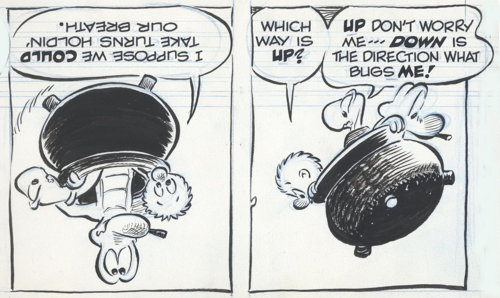
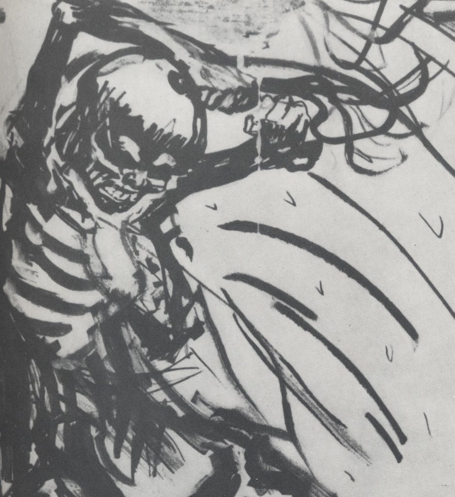
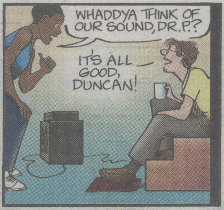
Recently, a column in Editor & Publisher magazine proclaimed that the comic strip For Better or Worse (above) is "the best comic in the 111-year history of the modern newspaper strip." Labeling the creator an "artistic genius," the column argued that For Better or Worse surpasses strips such as Krazy Kat, Little Nemo, Calvin & Hobbes, Peanuts and Terry and the Pirates.


In the LA Times, art dealer Karen de la Carriere asserted that Kinkade, the painter of unmitigated twaddle, "is a modern day Leonardo da Vinci or Monet. There is no one in our generation who can paint like that."


Not to be outdone, the NY Times Magazine pronounced Art Spiegelman the “Michelangelo" of the comic world.

For many years, I thought the only polite response when critics publicly embarrassed themselves was to look the other way, just as you would for someone whose bodily functions got the best of them during a momentary lull at a party.

But when you have a blog like this, you get a lot of traffic from people who insist that everyone is entitled to their own standards, and that taste in art is no different from taste in ice cream. Chocolate, vanilla or strawberry, it's all equally valid. Those people may wish to stop reading now.

There are plenty of reasons for an art critic to be humble. Art means different things to different people. For some it is purely decorative. For others it has religious significance. It can be a form of therapy, a parlour trick, or (in perhaps its highest and best use) a seduction technique. Taste in art changes, so an artist beloved by one generation might fall from grace in the next. Furthermore, wonderful art pops up in unexpected places-- from children, from the mentally ill, from primitive civilizations. In view of all this, who is to say what’s good and bad? If people get genuine pleasure from mediocre art, one has to think twice before telling them they are wrong to do so.


This may explain a recent survey of 230 art critics by Columbia University, which found that passing judgment on art was at the bottom of their list of priorities, while "providing an accurate descriptive account" was at the top. This unwillingness to evaluate quality caused James Elkins, chair of art history at the Art Institute of Chicago, to conclude that art criticism is in a "worldwide crisis" because "contemporary art criticism is entranced by the possibility of avoiding judgment."

In a major essay in the New York Times, Barry Gewen analyzed six art books that survey the state of "fine" art today. Although the books were written from a wide variety of perspectives, they all reached the same grim conclusion: "surveying the trends in modern art leaves one with the sense that we have arrived at the end of something, a state of bewilderment at best, of bankruptcy at worst."

It's a sad ending for a trend that began with such excitement and promise. Nearly 50 years ago, Robert Motherwell wrote:
The emergence of abstract art is a sign that there are still men of feeling in the world .... Nothing as drastic as abstract art could have come into existence save as the consequence of a most profound, relentless, unquenchable need. The need is for felt experience -- intense, immediate direct, subtle, unified, warm, vivid, rhythmic.
But Clement Greenberg, one of the earliest supporters of abstract art, added an important qualification:
The nonrepresentational or abstract, if it is to have aesthetic validity, cannot be arbitrary and accidental, but must stem from obedience to some worthy constraint.
The absence of a worthy constraint-- of standards-- opened the door to artists such as Bob Flanagan, whose art involved nailing his penis to a wooden plank, or Keith Broadwee whose art involved squirting paint from his anus.

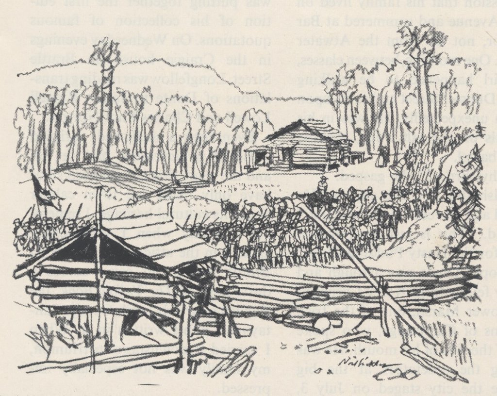
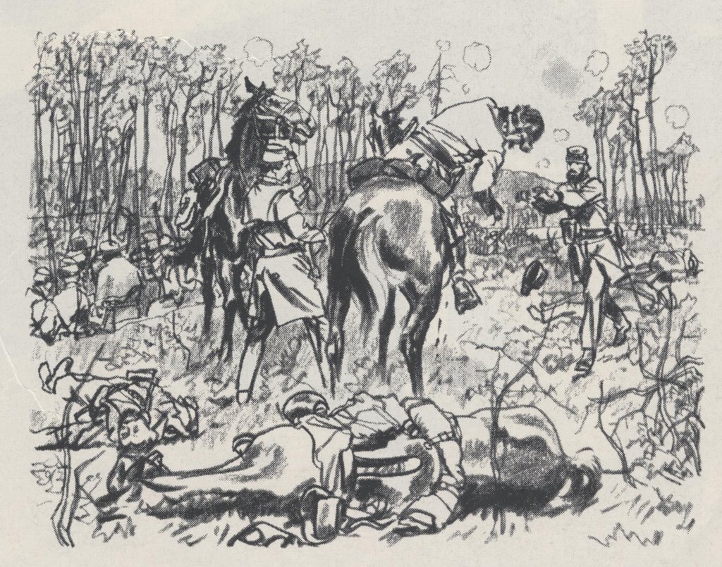
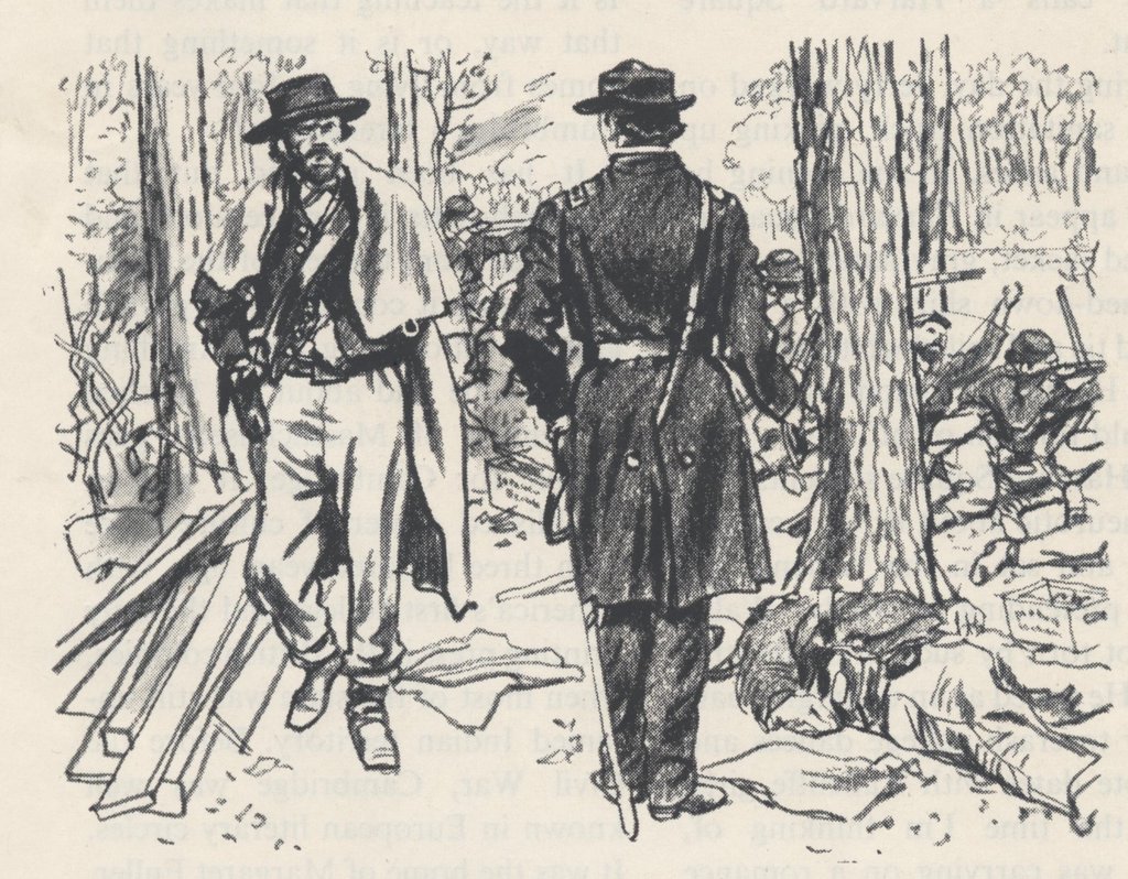
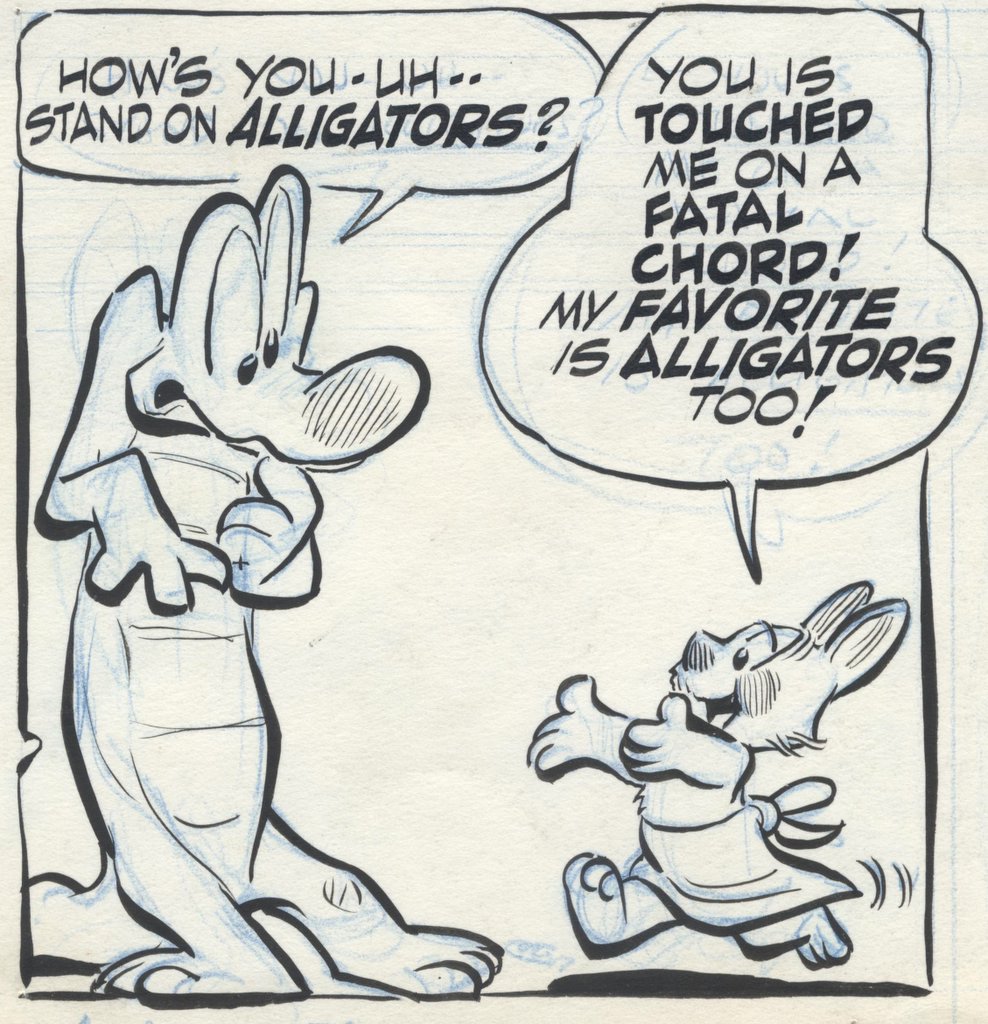
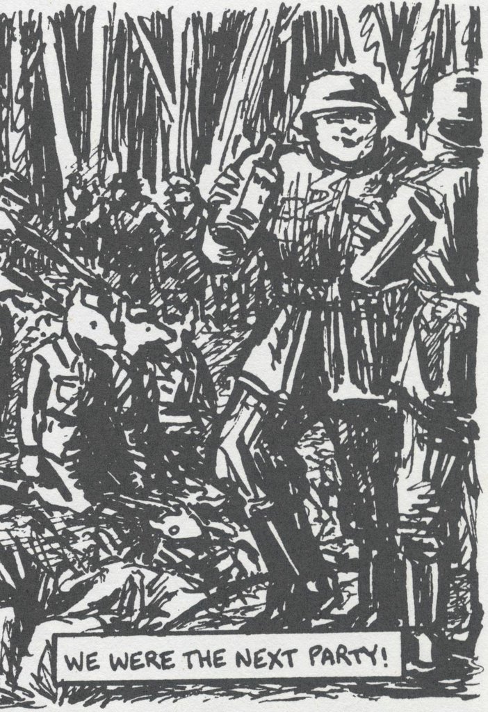
One reason I like illustration and comic art is that it is not as susceptible to narcissism and decadence. As Howard Munce once remarked, "the difference between art and illustration is that there are no amateur illustrators." An honest commercial marketplace may not be the ideal source for purpose and value in art, but it will certainly do until a better one comes along.

In the end, I agree with William Blake:
When I tell any truth, it is not for the sake of convincing those who do not know it, but for the sake of defending those who do.
Many of the artists discussed on this blog are gifted artists who held themselves to exacting standards. They paid a high price to develop their art in ways other than nailing their penises to a plank. It is to honor their accomplishment that I stand firm on this spot in cyberspace and insist, "standards are not an illusion."


.

Thursday, August 24, 2006

AHHHHHHH..... NOEL SICKLES

Alex Toth argued that art should be stripped of all gimmicks and pretension:
Simplicity is a great god. Truth. Throw out all the junk. There's a saying which says: "to add to truth subtracts from it." Make it so simple you can't cheat.
No illustrator of the 20th century drew with more honesty and less pretension than the great Noel Sickles. He was a born draughtsman with an almost supernatural drawing ability. He had no use for pretension.

These stunning Civil War drawings were for an obscure article buried in the middle of a magazine from the 1950s. They were published at approximately the same size as you see them here. They have never been republished nor mentioned as significant examples of Sickles' work. But no matter how humble their size or format, their extraordinary beauty and purity are worth close study today.


This is what I mean when I talk about "drawing."

Friday, August 18, 2006

I LOVES POSSUMS TOO


Why would any artist choose to work in the medium of the comic strip? The pictures are squeezed into tiny boxes where they compete for space with word balloons. The quality of reproduction is usually awful. And for writers, the medium has even less to offer. There is never enough space for words, and the flow of the narrative is chopped into short installments.

For many, these inherent drawbacks prevent comics from ever being a platform for truly excellent art.

But for at least one eccentric group, comics seem to be the best possible medium. Some artists with a strong personality and a talent for both words and images have found that comics allow them the freedom to combine all their strengths and realize their full artistic potential. These include George Herriman (Krazy Kat), Chester Gould (Dick Tracy) and Harold Gray (Little Orphan Annie). These creators could not have achieved the same heights by drawing and writing as two separate disciplines.

Among the greatest to use the special potential of the medium was Walt Kelly in his comic strip, Pogo.


Kelly starts out as an excellent artist. Note in the picture above how effortlessly he employs his knowledge of anatomy and his expressive line to serve the action in this panel: the raised shoulder, lowered head, splayed fingers and recoiling stance of the alligator are all conveyed with the kind of brush work that has not been seen in comic strips for many decades.

Similarly, in the following picture Kelly quietly understands that feet curve in toward each other:


But Kelly was also an excellent writer. Here he combines those drawing skills with his typically clever words:


Kelly could treat words like pictures and pictures like words.


The medium allowed him the freedom to play games and create effects that could never be found in an exclusively literary or visual art form.


Kelly's accomplishment was not just the sum of his drawing and writing. He invested his own distinctive personality and language to create a work that was uniquely his own.


I doubt he could have achieved such greatness in any other medium.

The medium does not suit everyone. Plenty of comic strip artists such as Frank Frazetta or Noel Sickles could not reach their full potential until they were set free from the straightjacket of the comics medium. And there are good writers such as John Updike who gave up drawing comics because they seemed to do better focusing on words alone.

It is easy to get the mixture wrong. Today we seem to have a lot of clever writers such as Art Spiegelman or Chris Ware who cannot draw well, and as a result the quality of the combined work suffers.


Those who were destined to be either an artist or a writer can do good work in comics, but they can never seem to take full advantage of the medium. But for the odd little band of eccentrics such as Kelly, Herriman, Gould and Gray there is no higher art form.

Tuesday, August 15, 2006

WINOLD REISS


Winold Reiss was a German art student who painted in the Viennese style and came to America to meet American Indians but ended up in Harlem where he gained fame designing nightclubs and drawing portraits of black celebrities of the day. Are you following this so far?


Even if you are familiar with Reiss' work, you probably haven't seen his best efforts because they lie in storage at the National Portrait Gallery in Washington DC and rarely see the light of day. You can find some of his Indian portraits (yes, Reiss eventually made it to Montana) on a web site started by Reiss' family. But the books and magazines Reiss illustrated are out of print and it is difficult to find quality reproductions of his work. Here is a close up:


I think Reiss' Harlem work is strikingly beautiful. On the following portrait, you can tell from Reiss' signature way down in the corner that Reiss intended every single square inch of that white space.


The following pictures are examples of how Reiss combined his formal art training, the bold geometric patterns of the decorative arts movements in Germany and Vienna, and African American culture.


Survey Graphic was an important journal at the time of the Harlem Renaissance.


Reiss designed this bold interior for the "Congo Room" at the Hotel Almanac.


Historians tell us that the most important ingredient for a Renaissance is an openness to new ideas and external traditions. For example, the Great Renaissance which began in 14th century Europe resulted from the new cross fertilization of biblical traditions, classical Greek philosophical traditions, and Islamic influences.


In this same spirit, Reiss was receptive to a cross section of strong cultures and he helped create the style of the Harlem Renaissance. It demonstrates the value of keeping your mind and eyes open.

Reiss could not have melded these different cultures together without his powerful sense of design serving as the universal glue.


Wednesday, August 09, 2006

WHERE MEN AND MOUNTAINS MEET

William Blake, the great English mystic, observed:
Great things are done when men and mountains meet; This is not done by jostling in the street.
That is why I have a special fondness in my heart for artists such as Kaethe Kollwitz (1867-1945) who were driven to grapple with the big subjects-- life and death, injustice, war and peace.


  Kollwitz lived through two World Wars in Germany where she worked with her husband in the most impoverished areas of Berlin. Her artwork passionately depicted the plight of the poor and oppressed. As a mother and peace activist, she suffered the twin nightmares of losing her son in World War I and losing her grandson in World War II. Here is her mournful picture of a mother searching for her dead son on a battlefield:


  Kollwitz was persecuted by Nazi goons who considered her pictures "degenerate art." Her career was blocked and her home was bombed but she refused to be intimidated into leaving Germany. She also refused to stop working, saying "Drawing is the only thing that makes my life bearable." She was one of the most powerful graphic artists of the 20th century.


  The place "where men [or in this case, women] and mountains meet" is difficult terrain for an artist. Artists who choose to portray injustice or death (as opposed to flowers or landscapes) tend to get carried away and sacrifice form for content. They often become shrill, or stray from art into the realm of political propaganda.

William Butler Yeats, another cool poet, warned of the dangers of mixing propaganda and art:
We make rhetoric out of arguments with others but we make poetry out of our arguments with ourselves.
The pictures above may seem a little extreme, which is why the fine art establishment sometimes looked down on Kollwitz as a "propagandist." But look at the beautiful drawings below. This is not the work of an artist gone hoarse from yelling. This is the delicate touch of a first class artist with great sensitivity and insight. 


 I admire artists who take the big chances, as long as they retain artistic perspective equal to their passion. For me, that is a far better test than the one offered by Yeats for an artist who takes on big content: is she capable of creating artistic forms strong enough to contain that content? Kollwitz passes that test. 

In my view, she puts to shame much of today's smug art establishment. By casting our eyes back to the place where a woman and mountains once met, we can gain some perspective on just how far we have relaxed our standards to accommodate today's minor artists "jostling in the street." Their tiresome fascination with their own neuroses and bodily functions seems trivial compared to the majestic example of Kaethe Kollwitz. .

Thursday, August 03, 2006

ONE GREAT HORSE'S ASS

Harold von Schmidt was an excellent 20th century illustrator who doesn't seem to get much attention these days. He did superb work, but he tends to be overshadowed by more flashy illustrators. That's why I was delighted when our friend Irene Gallo from The Art Department spread the word that the Illustration House Gallery in New York is having the first major exhibit of von Schmidt's work in decades. The catalog is rich with work by a brilliant artist in his prime.


One of my favorites is this painting of stampeding horses at night. Look at how the entire painting is transformed by the upturned rump of one single horse silhouetted against the flames. The freedom and abandon of that wild flicking tail is absolutely contagious. It is strategically placed and perfectly framed to convey pandemonium throughout the picture.


I have never seen a more effective horse's ass. More fire, more explosions, more horse tails would only have subtracted from the power of this picture.

Later in the show, von Schmidt uses the same high contrast device to create the focal point of another compelling painting. This time, the entire picture is beautifully and expertly calibrated to focus on the threat of a mountain lion.


A lesser talent would have placed a large, snarling mountain lion squarely in the foreground.

These paintings are the work of a master painter in full control of what he is doing. He doesn't hyperventilate. He doesn't over react. Robert Fawcett once wrote that

[an excellent picture is] much more likely to be characterized by the restraint of self-confidence. The artist who has resources does not need to announce this fact from the housetops-- it will be apparent.
I wish I shared Fawcett's confidence that true quality will be apparent to the public. As some readers suggested in the previous post, we often seem to be going through an epidemic of bad taste. However, every once in a while it's a real pleasure to be in the presence of mature talent like von Schmidt's.


Tuesday, August 01, 2006

THE ANVIL OF ART


Young Norman Rockwell dreamed of the day he would paint as well as his idol, the great illustrator J.C. Leyendecker. Rockwell spied on Leyendecker, trying to discover the secret of his genius:
I'd followed him around town just to see how he acted....I'd ask the models what Mr. Leyendecker did when he was painting. Did he stand up or sit down? Did he talk to the models? What kind of brushes did he use? Did he use Winsor & Newton paints?
But Leyendecker's secret had nothing to do with his brand of brushes. A few years later, Rockwell visited Leyendecker in his studio and observed Leyendecker working on the painting above. He recalled:
New Rochelle published a brochure illustrated with reproductions of paintings by all the famous artists who lived in the town. Joe worked on his painting for months and months, starting it over five or six times. I thought he'd never finish it.
The painting was beautiful, with many fine touches.


It was nearly finished, and the client would have been happy to get it. Yet, Leyendecker remained unsatisfied. Rather than completing the painting, he set this version aside and started all over again, searching restlessly for the image he wanted. The final published version looked like this:


Nietzsche once wrote, "you admire the beauty of my spark, but you don't feel the cruelty of the hammer on the anvil that makes it happen."

Leyendecker paid a heavy price for that spark. Whatever it cost, the young Rockwell must have concluded that it was worth it. When Rockwell's turn came, he paid too. Rockwell may not have traded his soul to the devil, but he painted "100%" in gold at the top of his easel to make sure that he never gave anything less. That credo kept Rockwell at his easel seven days a week painting countless studies and refining his craft as his first wife filed for divorce and was hospitalized for depression. She was alleged to have committed suicide. His second wife was hospitalized for alcoholism and depression. Rockwell himself sought professional help for his own depression. And yet, the brilliant pictures kept on coming.


Today, we admire such artists from a safe distance. Few of today's heavily promoted artists are willing to spend the same time on the anvil. I can't say that I blame them, especially when most of their audience is incapable of distinguishing real sparks from glitter.