Wednesday, January 29, 2020

CROQUET, SEX AND CONCEPTUAL ART

In the 19th century, croquet was considered a flirtatious game. One scandalized observer, incensed by the erotic symbolism of the game, ranted:
The brute beast which underlies the thin polish of civilization is unchained by the game. Goaded to fury by each corrosive click of the croquet balls, the hoop which beckons so temptingly is the gaping jaws of Hades.
Today we don't see it.  We look at Winslow Homer's painting, The Croquet Game, and see there's no nudity so how could it be erotic?


Only an imagination borne of constraint could find hidden meaning in driving balls through hoops. Male hearts would flutter when women, bound by corsets and concealed behind hoop skirts, lifted those skirts to expose a foot or even an entire ankle to place it on their opponent's ball.  Homer's painting shows the recently introduced "elevator skirt" which enabled daring women to raise or lower their outermost layer as needed to play the game.  And art historian Randall Griffin explains the man kneeling down:
Hoop skirts look archaic today in part because they, along with corsets, limited their wearer’s mobility. It would’ve been impossible to bend over decorously while wearing a hoop skirt. This explains why men often had to bend down to see if a ball was legally through a hoop, or to set the balls for a croquet shot.
On the croquet field young couples stood safely out of earshot of their prying chaperones, seizing   precious moments to negotiate the tantalizing boundaries of hemlines and relationships.

Whether we're talking about paintings or petticoats, today we seem to have less patience for the process of lifting veils and parting layers.  As a result we miss the undercurrents in Homer's painting of a boring lawn game, so we move on to the next picture in the museum.

Let's say the next picture is Homer's 1865 painting, The Veteran in a New Field


Is this just a boring scene about farming? Mature audiences in 1865 would've looked at Homer's painting and seen something far more poignant.  The year the Civil War ended, the entire country lay devastated.  Hardly a family was left untouched by the slaughter, and maimed veterans limped back to their farms in search of renewal.

Instead of the scythe of death mowing down a wall of troops charging across a field, this veteran's scythe is mowing a wall of wheat in what Homer calls a "new field."  The veteran works alone, despite the fact that harvesting was usually a communal job, because he has been isolated by his traumatic experiences.  The cycle of harvest might possibly be a path to restoring his scorched soul.  What today's viewers might dismiss as a boring scene, Griffin calls "a psychologically acute meditation on the effects of war."

Fifty years ago there was a tectonic shift away from representational, narrative illustration.  As pointed out in the definitive History of Illustration text book, photography and television invaded the traditional narrative role of art and "left illustration to capture abstract meaning and phenomena not easily described by literal representations.... Conceptual illustration [relies on]... visual metaphors and other nonliteral approaches."

For example, conceptual illustrations for an article about the psychology behind a "change of heart" effectively convey the subject this way:


If a magazine such as Psychology Today wanted to visualize such a sophisticated topic, it could scarcely rely on old fashioned narrative realism, could it?

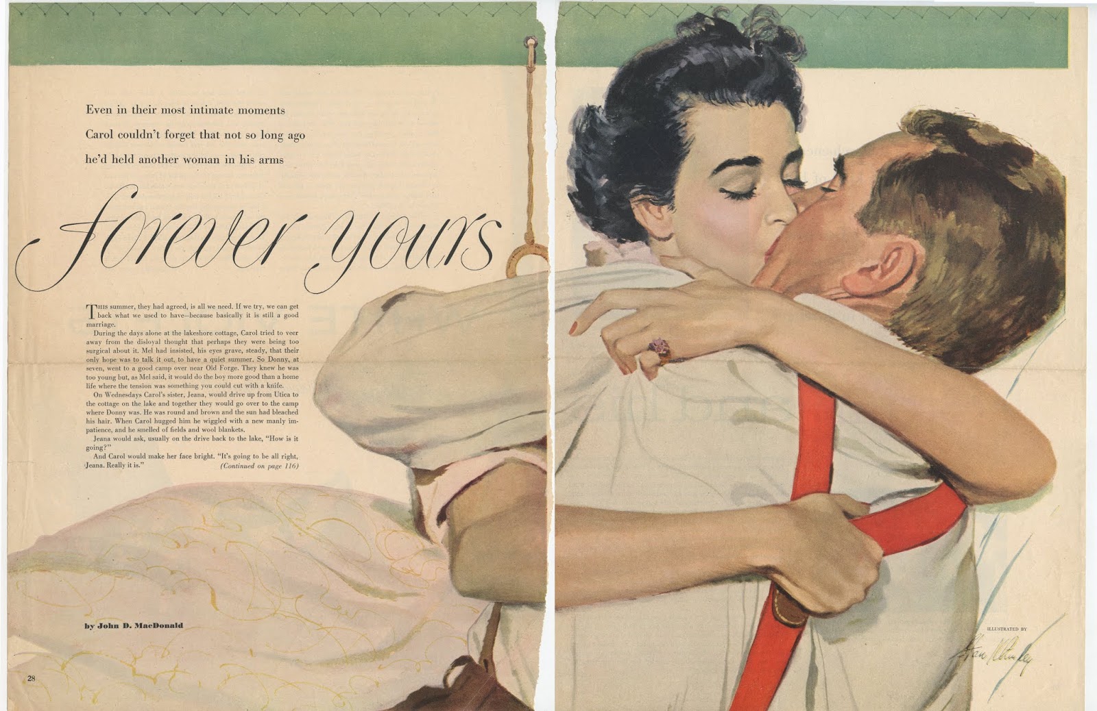
Well, look at how beautifully Saul Tepper handled the very same subject in 1933:  a young woman decides at the last minute not to take that cruise, and turns and bolts down the gangplank.  It's a story, yes, but as we've seen from the Homer paintings above a story can mean so much more to the receptive mind.


Like the  Homer paintings, Tepper's literal narrative is not incompatible with abstract meanings or sophisticated concepts.  It can "symbolize" a change of heart just as effectively as conceptual art.  All that such art requires is a little patience and intellectual engagement.  That requirement (as well as competition from photography) may have played a role in the public's turn to conceptual illustration.

Sunday, January 19, 2020

A FILE OF GOOD DESIGNS

It has been said that form and content are jealous cousins-- they don't always get along well.

Sometimes it seems that today content has scored a TKO over form.  So many pictures in the information age focus on content, while giving very little consideration to the principles of design.

Previous generations of artists would collect entire files of strong designs:


At first I didn't understand what the pictures in this file had in common.  They were of different subjects, by different artists, in different styles, from different eras.  How could this file possibly be useful to a working artist looking for reference?


Then I realized they were all pictures where the form dominates the content, where bold designs and compositions reach out and grab you and only then fold you into the content.

I think these pictures were chosen to embolden-- something a working artist needs as much as they need accurate information about the anatomy of a hand, or the buttons on a military uniform .   

Saturday, January 11, 2020

THE FILE OF GOOD DRAWINGS

Different illustrators clipped different types of reference pictures, depending on their needs.

For example, some kept comprehensive files of children, or different kinds of animals; some fixated on watercolors in order to study painting technique. Some kept boxes of historical reference with pictures of great cities and empires.

But I never saw a collection which didn't keep a file of drawings.  No matter what their professional assignments might be, all artists seemed to appreciate the importance of good drawing.

Here's a selection from the files I inherited:


Thursday, January 09, 2020

AN ERA OF KISSING

In the decade following World War II, illustrators faced an unprecedented challenge: painting more kisses, with more adjectives and adverbs attached to them, than any time in history.

Alex Ross distinguishes between a light, medium or heavy kiss.  ("Heavy, please," she said.)  

Al Parker, one of the preeminent illustrators of the day, described the national sense of relief after the war, when interrupted lovers could reunite and continue where they'd left off.  "The need to escape was already waning and, with it, escapist art." Instead of reading costumed adventure fantasies, young housewives ("the most important reader" of illustrated magazines at that time) wanted to see handsome men and gorgeous women finding each other and settling down for domestic bliss... preferably in the suburbs.  

This meant a whole lot of illustrations of kissing.

For example, here is an illustration of a kiss better than any "kiss in the movies:"

"No kiss in the movies was better."

… a concept which was probably easier to illustrate than a "wherever and whenever" kiss:


"...wherever and whenever he pleased..."

Here's an example of the "surprise" kiss:

This seems in questionable taste today, but judging from women's magazines of the 1950s,
women seemed to like these pictures.

Here, Al Parker himself depicts the unsettling effect of a "wild" kiss...


... which appears very different from the residue of Frederic Varady's "safely married" kiss:


Here is a "missed opportunity" for kisses with Mr. Atomic:


No longer reading historical fantasies, postwar wives were smooching the "knight in shining armor" in their own home.

The "I knew it would be like that" kiss:


Here's the "I'm-desperately-kissing-your-hand-in-the-driveway-because-I'm-going-nuts-and-I-don't-know-if-I-can-wait-for-the-wedding-night" kiss:


And of course, anticipating the "first kiss:"


Sifting through old illustrations is a little like an archaeological dig.  Layers of moldering clippings tell us more about the special look and character of their time than any history book.  That is the great power of demotic art.

In hindsight we can see how different colors, styles and subject matter appealed to the public during different eras.  For example, the colors of the psychedelic 60s still stand out as bright and bold.  Their lines remain distinctively flamboyant.  On the other hand, illustrations from the Depression seem more somber and businesslike. My files from the prohibition era overflow with black and white pictures of society dames and gangsters in fedoras, while the illustration during the war years are all tinged with patriotism and anxiety.  Illustrators were using a lot of olive drab and navy blue to paint uniforms.

And then of course, in the decade following World War II, every other illustration seemed to be about kissing.


Monday, January 06, 2020

FACIAL EXPRESSIONS

Many contemporary illustrators don't devote much effort to capturing facial expressions.  They either rely on a "photo-illustration" to do the heavy lifting, or they draw a simplified face and write in the desired expression.

Here, famed illustrator Seymour Chwast shows us the expression of someone "overcome with emotion" in a 2010 illustration for Dante's Divine Comedy:


And you'd never recognize these facial expressions from Reuben award winner Roz Chast if she didn't label them for us: irony, sarcasm and passive aggression. 


So I find it instructive that every collection of reference clippings I've ever seen from artists working earlier in the 20th century included a substantial file of faces with a wide range of expressions.


These files of facial expressions show us how crucial these artists believed expressions were to their work.  


From the wildest extremes...


...to subtlest smirk:


These artists felt it important to understand how facial expressions worked.

You also discover many pictures of the faces of pretty girls.  Those expressions include 47 varieties of demurely lowered eyelids:


That tells you something about the era too.  

But in this post I'd rather focus on examples of the more fun animated faces I found.