Saturday, April 28, 2007

THE LATEST NEWS FROM THE DISTANT PAST

Holland Carter once wrote, "I go to museums to get the latest news from the distant past."

There's no better place to look for news than in the changing depictions of the human form. Artists have been drawing the human body for over 20,000 years and while the body has remained the same, the drawings keep changing.

Every pose, angle, and facial expression has been drawn a thousand times by talented artists. Look at these figure drawings by the great Annibale Carracci in the 16th century:


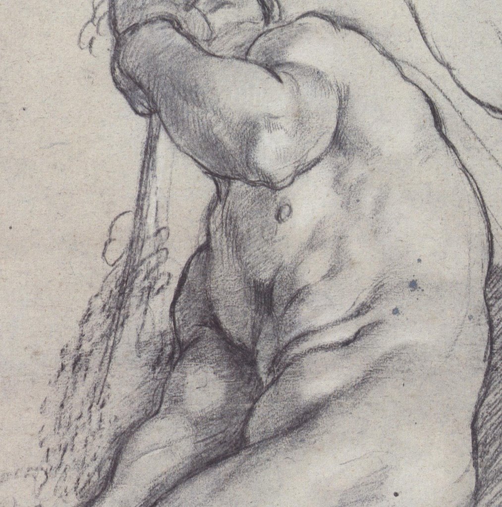
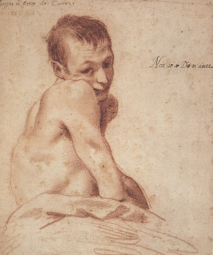
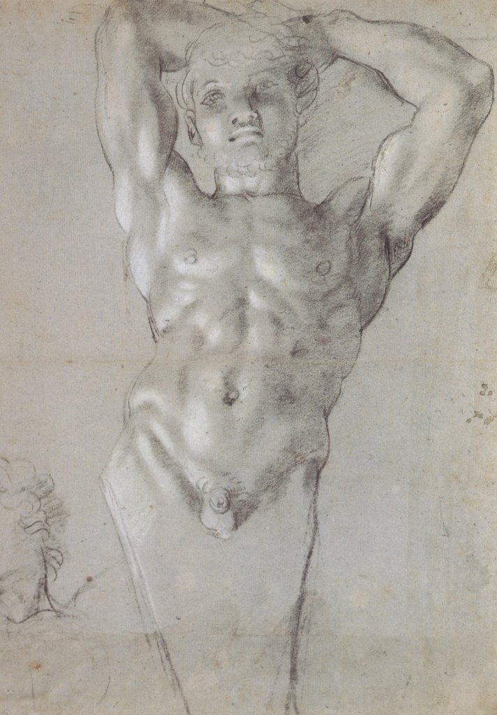
Who would have the nerve to continue drawing the figure after Carracci if there was no new information to convey? What could another drawing possibly contribute?

The fact is, while the human form remains unchanged, each era presents fresh questions for the artist. And even when the question remains the same, the answers continue to change. Look at all the news in this wonderful drawing by Aubrey Beardsley.


Or contrast Carracci's drawings with these recent images by the talented Phil Hale:


The muscles, bones, arms and legs are the same-- and yet what a difference!


If our bodies were merely machines, they would not be a source of infinite fascination for artists. As it is, artists keep returning to the human form for fresh news about our humanity.

Friday, April 20, 2007

BINARY CHOICES

All the magic of the internet-- the movies, music, youtube animation, color pictures-- comes to you through a series of simple binary choices. Your computer has only two digits (0 or 1) to choose between in processing all that information. The electronic signal is either off (represented by a zero), or on (represented by a one).

Similarly, a line drawing is just a series of binary choices: it is either black or white.


Unlike a painting, which presents a rich variety of layered choices and half-choices, a drawing is a commitment: either line or not line. Look at the bold, black-or-white choices in this stunning set of illustrations by the great Harold Von Schmidt in 1929 for Death Comes For The Archbishop:


The following full page illustration demonstrates the same kind of restraint and care that abstract expressionist Barnett Newman used in selecting the perfect location for a zen stripe on a huge blank canvas.


I admit that I prefer drawings to paintings, sculpture, movies or other art forms. Through a series of binary decisions, an artist can evoke the most extraordinary effects.


These are strong, wonderful drawings worth revisiting by any fan of illustration.

Thursday, April 12, 2007

ART THAT IS "SUI GENERIS" (part 1)


Every once in a great while, an artist creates an image that is sui generis-- one of a kind. You look, you tilt your head sideways and squint, you try to fit it into some existing category, but you're still not exactly sure how to react.

For me, Ivan Albright's painting "the door" (official title: "That which I should Have Done I Did Not Do") is such a painting.


Its dark, brooding subject and its melodramatic title are hardly unique. However, Albright worked on this painting for ten years. It towers over eight feet tall, and it has a level of detail that is, to say the least, psychologically troubling. Albright sometimes painted with a brush he made from one lateral spine taken from a single chicken feather. You are looking at a ten year obsession with mortality and the weight of the road not taken. This is one freaky painting.


Normally a viewer might look at a picture and ask, "Does this composition work? Do I like the color? Is it successful compared to similar pictures?" Such questions don't begin to digest such an epic statement.


Albright was not well known, but he was one of
Jean Dubuffet's favorite artists. Curiously, Dubuffet had the opposite style-- he specialized in spontaneous, impulsive scribbles-- but he was stunned by Albright's door, writing "all the notions on which we have until now based our standards of appreciation of all things are erroneous."


If you are ever in Chicago, I urge you to go see this wonderful painting on display at the Art Institute.


.

Saturday, April 07, 2007

THE GLINT OF MADNESS


Some artists work hard to shed their technical skills and draw crude, child-like pictures. There is great artistic power in the pre-verbal, non-rational space where innocent children, raving lunatics and savage animals dwell.

One of my very favorite artists to tap this power is Jean Dubuffet, who illustrated a number of books and record album covers:


Illustration for La Lune Farcie


A selection of covers
Dubuffet was a prolific gallery painter and sculptor. A brilliant, erudite man and unconventional thinker, he was the first advocate for the art of the insane ("art brut"). I adore his work. Among my favorites are his pictures of cows:


...and his huge terrifying monoliths of men with beards...


...and his intense schizoid landscapes...


Dubuffet did thousands of drawings including a memorable series of "pisseurs"-- a droite, a gauche, and en face.


It is not easy to unlearn what you know and achieve this state. Lots of artists mimic sappy children's drawings, but very few can achieve the raw and disturbing effects that Dubuffet did.

Many of today's illustrators cluster around a few popular styles. You see them throughout the annual Spectrum anthology and the Hugo award nominees. Photorealistic artists interested in exploring a little terra incognita should consider artists such as Dubuffet. After all, Norman Rockwell kept a book of Dubuffet's art handy in his studio.


.

Sunday, April 01, 2007

ONE LOVELY DRAWING, part eleven


This drawing by Bob Peak may seem like a cliche today, but in a far off time, O best beloved, this kind of drawing was totally new. Never in 35,000 years of human drawing had anyone made such a picture. How many artists can make a similar claim?

It's hard to imagine this brilliant, brassy kind of art coming from any culture that existed prior to the 1960s. This drawing radiates the energy and enthusiam of its era, but it also has timeless strengths that stand up quite well.

Peak seems to have developed his drawing style by taking the linework of Egon Schiele and blowing it out of a psychedelic cannon.


Egon Schiele drawing circa 1910


Peak ad for Puritan

Peak later went on to a lucrative career making (in my opinion) uninspired and repetitive movie posters following drab specifications from Hollywood studios. But there was a moment in the 1960s when Peak's designs sizzled. His accomplishment deserves our respect and admiration.