Tuesday, September 27, 2011

THE MOST SIGNIFICANT ART

Last weekend I gave a lecture at the Norman Rockwell Museum in Stockbridge Massachusetts.  The following is an excerpt from what future generations shall call my NRM Manifesto (unless the NRM lawyers demand that I remove their name, which is quite possible): 
Anyone with the courage to take a fresh look at the role of art in the 20th century might reasonably conclude illustration has played a more significant role than "fine" art.

Yeah, you heard me-- more significant than Picasso, Matisse, Jackson Pollack and the great Jeff Koons combined.

Absurd?  Perhaps.  But let's explore the issue as soberly and conscientiously as we are able, and see where the facts take us.

We should start by agreeing there are many legitimate methods of measuring the importance of art.  For me, the least satisfying method seems to be the most popular: to blindly accept the conventions of our grandparents who instinctively assigned a lower social status to "commercial" illustration.

What might be a better test? I submit that four of the most relevant standards for measuring the significance of art are:
  • The size of its audience
  • Its economic impact
  • Its effect on society
  • Its impact on our individual lives
The first two tests are fairly easy to apply.  They are objectively quantifiable, and in my view there is little question that illustration has had the greater impact.

Size of the Audience: In a century when many towns did not have an art museum, a gallery, or even a public library, the average citizen has been surrounded by illustrations.  They invaded his field of vision from all sides.  The Saturday Evening Post, chock full of illustrations, was selling three million copies while its rival Colliers was selling nearly as many.  Illustrated magazines arrived in mailboxes all across America, along with illustrated brochures from car manufacturers and other advertisers.  Illustrations in storybooks, billboards, posters and animated movies found their way to every corner of the globe, driven by the mighty engine of commerce.  By comparison, attendance at museums and galleries, and the sale of fine art books and prints, was meager at best. If we judge by raw numbers, Norman Rockwell enjoyed far more viewers Picasso.

Economic Impact of the Art: A small number of fine artists such as Damien Hirst or Jeff Koons are paid huge sums for their work, far more than any illustrator has been paid.  Yet, the average illustrator probably earned more from his or her labors over the last century than the average gallery painter.  More importantly, because of the huge audience for illustration (above) it has had a far greater economic impact on the world than museum or gallery art.  The economics of the video game industry alone likely surpass the economics of the fine art market.  Illustrations have been used to sell cars, design feature films, and advertise countless products.  The economic impact of "fine" art simply cannot compare.

Impact on Society:  This is harder to gauge.  Certainly, contemporary gallery art-- from cubism to surrealism to abstract expressionism-- has had an important impact on the intellectual direction of society.  Yet, illustration has also played a major role in establishing the style, visual paradigms and iconic images of our society.  A quick trip through the annals of illustration demonstrates the impact illustrators have had in shaping the aesthetics of society.  Here is a tiny sample:

The Gibson Girl set a popular standard for beauty
The Arrow Collar Man

John Held established the flapper as an institution

Peter Max's psychedelic style became emblematic of his era

 Impact on Our Individual Lives:  The first three tests are revealing, but in my view this last test is more important than all the others combined.  In previous posts I have applauded scholar Lionello Venturi, author of the definitive treatise on the history of art criticism, who proposed what I believe to be  a very sensible standard for measuring the value of art:
What ultimately matters in art is not the canvas, the hue of oil or tempera, the anatomical structure and all the other measurable items, but its contribution to our life, its suggestions to our sensations, feeling and imagination.
If we consider the "contributions to our life" from both illustration and gallery art, we may discover some interesting facts.  It goes without saying that we have all (myself included) been thrilled by the beauty and power of fine art.  But let's keep exploring and see if we we can identify more specific litmus tests of the way art affects our "sensations, feeling and imagination."


It would be hard to find a more powerful statement of outrage against the atrocities of war than Picasso's famous Guernica:
   

Yet, if you want to inspire people to put their lives on the line, to enlist and fight against those atrocities, illustration has historically proven more persuasive than Guernica or any other fine art:

James Montgomery Flagg

Henry Raleigh

Similarly, if you want to motivate people to give up their money and buy war bonds to help fight the atrocities, Guernica could never achieve the results of Norman Rockwell's famous Four Freedoms:


Putting aside the emotions of hate and fear, and looking instead to emotions of love and lust, romantic illustrations in women's magazines played a huge role in shaping women's concepts of what love was and how it worked.

John Gannam detail: should we have sex before marriage?

Pictures such as these in Redbook, Cosmopolitan, McCall's, Ladies Home Journal and Good Housekeeping had blood racing and nostrils flaring all across the country.  (Meanwhile, husbands were developing their own concept of romance from the pinup illustrations of George Petty and Gil Elvgren.)

Romantic illustrations that shaped expectations and fleshed out our vocabulary weren't limited to fiction magazines.  The language of love was spoken in John Gannam's ads for bedsheets as well:
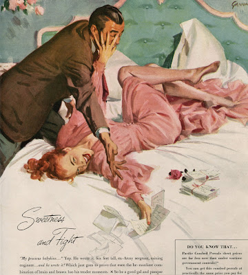
"My precious babykins..."


Now take a look at the kinds of statements famous fine artists have made recently regarding the subject of love:

Damien Hirst, All You Need is Love

Robert Indiana, Love

Tells you something, doesn't it?

There are plenty of other emotions besides love and hate where it might be useful to compare illustration and fine art, but a blog post is not the best place to attempt it.  But applying Venturi's test to the representative examples above, it seems clear to me that illustration has had greater significance.  

The four standards I have suggested are not the only ways to measure significance, and I would welcome any counter suggestions from readers.  In addition, I have not tried to assert which art form has the highest inherent "quality."   I have my personal views on that subject (as does everybody else) but it is far harder to devise standards for measuring quality than for measuring significance.  

In order to play this game, my only restriction is that you have to be willing to abide by Isaac Newton's famous admonition for honest scientific results: 
I frame no hypotheses; for whatever is not deduced from the phenomena is to be called a hypothesis, and hypotheses, whether metaphysical or physical, whether of occult qualities or mechanical, have no place in experimental philosophy.
By looking at the phenomena, I deduce that illustration seems to have been a more significant form of visual art over the past century than "fine" or "gallery" art.  But if you have other phenomena for us to consider, or other standards to apply, I'd be interested.

Sunday, September 18, 2011

LECTURE ON ILLUSTRATION: SEPTEMBER 24

For those who live near the Norman Rockwell Museum in Stockbridge, Massachusetts, the Museum was kind enough to invite me to come present my views on illustration.

The museum is one of the premier resources for promoting "the rich visual legacy of American illustration art," so you can imagine how surprised I was to receive the invitation.

My talk is scheduled for next weekend, on September 24th, from 1:30 to 2:30.  Later in the same day, illustrator David Macaulay (the Museum's 2011 Artist Laureate) will speak about his work.

Wednesday, September 14, 2011

CHRIS PAYNE

Detail                                                                                        
It is easy to become dazzled by Chris Payne's technique but you should resist the temptation.

Payne's tight, crisp images are certainly eye-catching, and his technical skill stands out among contemporary illustrators.


However, if you get too distracted by the skill you'll miss the larger artistry of these pictures (which is the most important part).

There are plenty of illustrators who do highly detailed, photorealistic work.  Artists such as Rowena, Boris and Elaine Duillo are meticulous technicians, but for me their results are usually leaden and uninspiring (unless you count the inspiration that comes from watching honest manual labor).  Adobe Illustrator is helping a younger generation of obsessive illustrators take pointless detail to a whole other level.

But Payne brings something more to his pictures.  His skill is exercised in the service of a larger artistic vision, which is why his pictures positively glow in comparison.

Note for example his dramatic compositions for these excellent portraits:


Or look at the following portrait of Yogi Berra.  Payne must have labored over the details of that car, and the expressions on those faces, and making those figures interact, and creating the jaunty angle with the car hovering mid-bounce, yet all of these complex elements come together like a snap of the fingers.


 The picture has a cohesion and liveliness that makes the hard work look easy. 

To understand what distinguishes Payne's work, it might help to focus on a few details from this picture of a man floating away (a la Renee Magritte) :


At first it appears he is wearing a conventional gray flannel suit, but a closer look reveals that Payne used a purple(!) watercolor wash, with flowing striations deliberately left exposed:


A less confident artist would have painted the suit gray, and painstakingly drawn in the pin stripes.

Those trees and bushes in the background may look realistic but up close we see they are painted very free and abstract.  Rather than make everything in the picture uniformly detailed, Payne understands how to prioritize a picture.  He understands design:


As realistic as Payne's figures may sometimes seem, he frequently elongates and distorts them for the sake of the picture. Heads are stretched and extruded (see below) and ears are pulled out asymmetrically  (see portrait of Vladmir Putin, above):
 

It takes a strong center of gravity to work like this.  It's a far tougher job than merely capturing a likeness, and it's one of the reasons why Payne's work is so admired.


Monday, September 05, 2011

ONE LOVELY DRAWING, part 37

I love this drawing by Harrison Cady of a small house standing in the way of urban progress:

from the Kelly Collection of American Illustration  (24" x  20")

Cady was famous for simple cartoons of funny animals, but this large, complex drawing is a virtuoso feat of draftsmanship.  Note how Cady maintains total control of the value scale, from those faint buildings in the distance to the dark edges of the building in the foreground.


Cady used tens of thousands of tiny hatched lines to create subtle gradations in value from the top to the bottom of that looming skyscraper:


From one point of view, the hatching on the skyscraper is mindless repetitive work.  But it is also a marvelous tightrope walk.

Pen-and-ink is an unforgiving medium; Cady would be screwed if he progressed too quickly from light to dark, or drew the lines in one area too close together-- or too far apart apart; or if he failed to maintain consistent values from left to right.   He had to keep up a steady rhythm, which is especially difficult with a drawing so large that Cady could not see the entire building as he drew.

The drudgery aspect of this kind of work was eliminated long ago by machines.  24 years after Cady's drawing,  Prometheus brought Zipatone to earth.  From that day on, a gradient tone could easily be peeled from a handy plastic backing:

Al Williamson
The stains and cuts from aging zipatone are now viewed as part of the charm of original artwork from that era:

Frank Godwin
Today the world has moved even further away from old fashioned hatch marks.  Zipatone has been replaced by Photoshop.  Cady could've created the shading on that building simply by opening a grayscale screen and customizing it with the gradiant tool.  This is a huge boon for efficiency.  It saves artists from hours of mindless work; it makes them more productive, enables them to meet shorter deadlines (and enables clients to make more changes on shorter notice). These are commercially sensible, perhaps inevitable developments.

But let's not overlook what we lose with all this efficiency.  Artists who spend hours making marks like this often let their minds wander free while their eyes and hand take over.  The rhythm of the linework can put you in a trance-like state while you go to deep places.  Those places may not help meet deadlines but they can be very valuable for an artist.

Fine artist Jasper Johns, who never had to worry about an art director's deadline, made a series of large paintings  delving into the metaphysics of the common hatch mark:  

  Cady                                           Johns

Zipatone and Photoshop are wonderful inventions that help to set artists free.  But as I look back at Harrison Cady's lovely drawing, I am reminded of the words of G.K. Chesterton:  "You may, if you like, free a tiger from his bars; but do not free him from his stripes."