Saturday, December 30, 2006

ONE LOVELY DRAWING, part 9

There's obviously no such thing as the single greatest drawing in the history of the world. It would be foolish to think about rating art that way. However, if there was such a drawing...


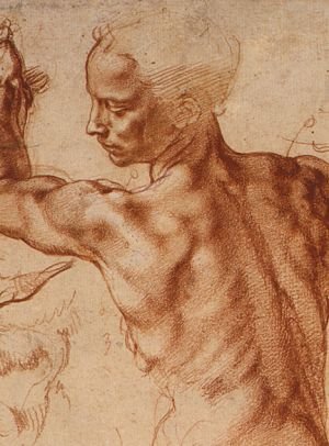
...87.42% of the world would probably agree with me that it's this one by Michelangelo. It's a preparatory drawing for his fresco of the Libyan Sibyl  on the ceiling of the Sistine Chapel.


 I can't think of any object with more grace or beauty with which to end 2006. The Libyan Sibyl foretold "the coming of the day when that which is hidden shall be revealed." She had the power of prophecy because she was half divine and half mortal: "An immortal nymph was my mother, my father an eater of corn." 

 I'm just a lowly corn eater myself but I've enjoyed sharing these lovely images with you in 2006 and I wish all of you the happiest of new years.

Monday, December 25, 2006

THE SOURCE OF ARTISTIC INSPIRATION

One item that made all the press in 2006 was the story of the counterfeit Norman Rockwell.

The Norman Rockwell Museum was embarrassed to discover that a painting they displayed as a masterful Rockwell was forged by a local cartoonist, Don Trachte.


According to the New York Times, Trachte purchased the original painting from Rockwell in 1960 but secretly painted a duplicate when he feared his estranged wife was going to take his beloved Rockwell in a bitter custody battle. Trachte hid the original behind a secret panel in his home and hung the fake in plain sight. Only after Trachte died did his family discover the genuine painting, which they promptly sold for $15.4 million.

There are lots of potential lessons from this episode. Some pundits had great fun taunting the "experts" who could not distinguish betweeen a Trachte and a Rockwell. Some were impressed by the skill of the unknown Trachte. Some focused on the detective work in uncovering the original, while others focused on the economics of the sale.

For me, the interesting part was Trachte's motivation. For 50 years, Trachte drew the dreary comic strip Henry-- a simple minded strip whose success was based on the fact that it took less effort to read than to skip over.


Year in, year out, Trachte was content to churn out these mediocre drawings. He was apparently never inspired by a beautiful sunset to find some higher purpose for his talent. He could not find sufficient motivation in money, pride, artistic integrity, or even sheer boredom to put aside the comic strip he inherited from its creator in 1948. But when it came to thwarting his ex-wife, the man found the inspiration to become another Norman Rockwell.

Many sublime works of art were inspired by petty rivalries, lusts and revenge rather than the glory of mankind. As a general rule, those who need to believe in the grandeur of the creative process would do well not to inquire too deeply into the source of artistic inspiration.

Sunday, December 24, 2006

ADVICE FROM ARTISTS

I generally sympathize with Matisse's view that artists should cut their tongues out so they won't be tempted to explain their work. It may not show, but I do try on this blog to avoid adding to the sum total of BS written about art in the world.

Here are some comments about the artistic process from illustrators or other artists that I think are particularly insightful:

Don't stop to admire a partly completed sketch.
--Robert Fawcett

On always doing your best work: The argument that "it won't be appreciated anyway" may be true, but in the end this attitude does infinitely more harm to the artist than to his client.
--Robert Fawcett

On being accused of making art like a madman: There is only one difference between a madman and me. I'm not mad
--Salvador Dali

What one has most to strive for is to do the work with a great amount of labor and study in such a way that it may appear, however much it was labored, to have been done almost quickly and almost without any labor, and very easily, although it was not.
--Michelangelo

I ain't yet worked out whether I like girls because I like curvy lines or if I like curvy lines because I like girls.
-- some artist on the internet whose name I forgot to write down

On when to put the finishing touches on an illustration: The longer the idea can be considered in the abstract, the better.
--Robert Fawcett

There are moments when art attains almost to the dignity of manual labor.
-- Oscar Wilde

Tuesday, December 19, 2006

TWO TYPES OF FOG


 100 years ago, women were thrilled by Redbook magazine's romantic stories about dark and mysterious men, exotic perils from the orient, women in danger, sublimated passions and heaving bosoms. The stories were illustrated by marvelous pictures like these.


 Often the heroine watched as powerful men struggled over her virtue, or were reduced to helpless tears by their love for her.


The pictures, like the stories, were often shrouded in fog which left room for the reader's imagination to fill in the details. I love these art noir drawings by Gayle Hoskins, Frank Street, E. Ward and Leone Bracker.
 

Today, Redbook has replaced illustrations with bright, clear photographs. The articles are in sharper focus as well. There's no ambiguity in titles like 35 Sexy Places to Touch Your Man, or Get In The Mood in 5 Minutes. Recently, Redbook provided instructions for sex in an airplane bathroom the way GM might describe maintenance on an internal combustion engine ("For maximum maneuverability, stand with one leg on the toilet with your man embracing you from behind.") Despite the new candor, Redbook's modern readers don't seem any closer to meaningful truths than their great grandmothers were 100 years ago. I'm not sure whether it's better to have a sharp picture of a fuzzy concept or a fuzzy picture of a sharp concept. Choose your fog.

Friday, December 15, 2006

EVERYBODY HAS TO START SOMEWHERE


The brilliant illustrator Bernie Fuchs is famous for his sleek, ultra-cool pictures that transformed the face of illustration in the 1950s - 1970s. The following details from an original illustration demonstrate one of his traits that I admire the most-- his ability to combine bold, innovative designs with rock solid traditional drawing skills.


The following detail is of Fuchs' close friend Austin Briggs, reflected in the window of an old car.


Nobody is born with this kind of facility, not even the great Bernie Fuchs. The proof is in Fuchs' childhood drawings which were carefully kept by his high school sweetheart-- now his wife.


Fuchs was seven years old when the movie The Wizard of Oz came out. It obviously made a big impression on him.


I like these childhood drawings, but at some point Fuchs went from drawing like lots of other kids to becoming the superstar illustrator of his generation. As Walt Reed wrote, "his pictures are probably more admired-- and more imitated-- than those of any other current illustrator." Fuchs is very modest about his accomplishments, but he is not afraid to talk about the importance of commitment in a young artist:

I was working in my grandfather's basement at night. I had set up a table there to do my art assignments. It was hard for me. I'll never forget throwing the paint,the brushes, the drawing board and everything across the basement floor and against the wall and crying-- literally. Finally I pulled myself back together, picked up the stuff and started over again.

And thus, a star was born.

Saturday, December 09, 2006

THE ARTIST'S CONSOLATION


This illustration by Maxfield Parrish recently sold for $7.6 million, making somebody very wealthy. Parrish could've used some of that money toward the end of his career, when he fell out of favor with the public.

After Parrish died, two rival art dealers entered into a bitter tug of war over his artwork. The battle raged in angry lawsuits from coast to coast. (cf Cutler v. Gilbert) Each dealer claimed to be protecting the Parrish legacy as charges of fraud, counterfeiting, slander, libel and profiteering flew back and forth. Among the accusations traded in the Boston Globe:

One of the dealers was a "convicted swindler" who pleaded guilty to a felony.

One of the dealers was selling fake Parrishes to unsuspecting buyers

One of the dealers was reproducing Parrish's art without permission

One of the dealers defrauded a store owner by charging $10,000 for the right to call her store the "Parrish Connection" and use the artist's signature as its logo.

One of the dealers was trying to create a monopoly to control Parrish reproductions out of pure greed.

One of the dealers burned down Maxfield Parrish's house

Sometimes being a shrewd art dealer pays better than being a talented artist. One of these fine ladies lives in a mansion modeled partially after the palace at Versailles. The other ran several corporations (sometimes going under the pseudonym "La Contessa De La Gala"). Both were moved by the beauty of Parrish's art to fight over his copyrights like two scorpions in a bottle. Meanwhile Parrish slumbered peacefully beneath the soil.

It's hardly news that illustrators are commercially exploited. Art that never found its way back to the artist from the printer today sells for hundreds of thousands of dollars. A Rockwell just sold for $15.4 million. An N.C. Wyeth sold for $2 million.

Meanwhile, young illustrators face new kinds of adversity, as they struggle with clients who demand work "for spec," or find themselves competing with ready made stockhouse images. It's a difficult career. As Dan Pelavin wrote:

Illustration as a career is most successfully pursued by those to whom no other option is acceptable. It takes that kind of motivation to overcome the inevitable and constant stream of obstacles. Some frankness about the nature of the illustration market and the people an illustrator will have to work for would go a long way in discouraging all but the most foolhardy and desperate from pursuing this glamorous and enviable career.

So what's in it for the artist? What consolation can he or she take from this historically unfair process? I'm not sure, but I suspect the deal is that artists get to look out of their eyes onto a world like this:


Perceiving the world the way an artist does may not help much when it comes to buying a house that looks like Versailles or even feeding your family, but it is not totally without its rewards. As Erica Jong wrote:
In a society in which everything is for sale, in which deals and auctions make the biggest news, doing it for love is the only remaining liberty. Do it for love and you cannot be censored. Do it for love and you cannot be stopped. Do it for love and the rich will envy no one more than you. In a world of tuxedos, the naked man is king. In a world of bookkeepers with spreadsheets, the one who gives it away without counting the cost is God.

Saturday, December 02, 2006

A FEW SMART DRAWINGS

The illustrator Fred Ludekens said "drawing is thinking." Here are some wonderful examples of what makes visual thinking better than verbal thinking:


copyright The New Yorker

Images can convey complex thoughts with more immediacy, universality and ambiguity than words can offer.


For example, William Steig's drawing above of the blissful young lovers in the cottage makes a wicked statement about the darker, proprietary side of bliss by chaining the flower in the front yard:


As another example, the Foote Cone & Belding drawing below shows that creativity and logic are two sides of the same phenomenon by placing them on opposite sides of a moebius strip-- which only has one side.


copyright Foote, Cone & Belding

Next, the symbols chosen by the brilliant Saul Steinberg-- Uncle Sam facing off against a fatted Thanksgiving turkey in the bull ring, presided over by the statue of liberty and Santa Claus-- juxtapose categories rich with meaning in ways that words with definitions just can't.


copyright The Saul Steinberg Foundation/Artists Rights Society (ARS), NY

How many sentences would it take to explain such thoughts in words? Good visual ideas dance where words cannot go. More importantly, how many related ideas would you miss along the way if you were led to a conclusion by linear sentences, rather than by rolling these images around in your mind?

Some sequential artists and graphic novelists seem to think that intelligent drawings are merely drawings accompanied by word balloons containing intelligent words. For me, this view surrenders the real strength and potency of the visual medium.

Sunday, November 26, 2006

ARTISTS IN LOVE, part six


The illustrator Rockwell Kent (1882 - 1971) loved humanity with great passion. Unfortunately, he was an utter jerk when it came to loving individual human beings.

Kent was famous for his illustrations for Moby Dick, Candide, Shakespeare and Chaucer. He was also the author of several acclaimed books, an explorer, an architect, a dairy farmer, a carpenter, a fisherman, a sailor and an outspoken advocate of socialism who was awarded the Lenin Peace Prize by the Soviet Union for his work to achieve peace and brotherhood.


Kent had many wild adventures around the world. He hiked through jungles and over mountains. He explored islands and traveled on freighter ships. Once he attempted to sail around Cape Horn (at the southern tip of South America) in a ramshackle life boat that he bought for a few dollars. Wrote one commentator:


This region, boasting probably the world's worst climate, is buffeted incessantly by winds, swiftly alternating with rain, hail and snow. It is the legendary graveyard of ships and sailors, and Kent [had] the half-formed idea of trying his mettle against the hazardous adventure of sailing "round the Horn."
He was shipwrecked in Greenland and Alaska and lived for extended periods of time north of the Arctic Circle in desolate places like Ubekendt Ejland (Unknown Island). But his first love was painting and he painted almost every day.


Kent's artistic mentor was the painter Abbott Thayer. While living as a guest in Thayer's house, Kent married Thayer's 17 year old niece over the objection of her family. Four months after the wedding, he resumed a love affair with an old flame. Kent went on to have torrid affairs with a variety of girlfriends while his devoted wife stayed at home and bore him five children. (When one of his girlfriends became pregnant, Kent and his wife had to sell everything they owned to pay her off.) When his fifth child was born, Kent decided that his wife's clinging ways were unbearable, so the couple divorced. Kent learned from this experience and made sure all of his future children were illegitimate. Kent's second wife, Frances, may have hoped Kent was willing to settle down because he built a dream house with her out in the country and named it "Asgaard" after the Norse home of the gods. But at the housewarming party that Kent and Frances held for their friends, Kent overheard someone planning a dangerous boat expedition to Greenland and immediately abandoned Frances and Asgaard for this new adventure. Kent did marry a third time, to a woman the age of his youngest daughter.

Kent courted these women using artwork and poetry, and he praised their beauty with great eloquence. He always felt bad (and a little surprised) when they took the news of his infidelity so hard. One former showgirl committed suicide, jumping to her death into the sea. Perhaps it would have been difficult for a wife to accompany Kent on his rugged travels. Kent recounted one particularly horrifying shipwreck in his autobiography, It's Me O Lord:


Against the hurricane that woke us, sweeping down off the lofty plateau of the inland ice... we could do nothing but... hang onto our anchor ropes. And once the anchors failed to hold, the game was up.
Kent's tiny boat capsized. He and his two companions dragged themselves to shore and trekked 36 hours over rugged terrain with no shelter before they stumbled across an Inuit fisherman. None of them spoke Inuit, yet Kent managed to negotiate food, shelter and a young Inuit native girl.


Even though Kent had no space for a wife on his journeys, he always managed to find room for his paints, brushes and canvases. Following the shipwreck mentioned above, Kent returned to salvage his art supplies and spent two months painting that "vast wonderland of sea and mountain."


I have long been fascinated by the selfishness of artists. Some artists place the demands of their art above the welfare of their family and friends. Sometimes the resulting art is so beautiful, the trade off seems worth it to those of us who aren't personally affected. But it is always difficult to draw a bright line between artists who make sacrifices to protect their art and those who are merely self centered. Through the generations, a lot of collateral damage has been caused by artists fighting for their artistic lives.

Kent lived to be 89. Despite all his advetures, he seemed to have had a wistful old age. In one of his books, he described a poem-song he had learned from the Eskimoes about an old man who remembers

old times when I had strength to cut and flay great beasts.


Three great beasts could I cut up while the sun slowly went his way across the sky.

A sick old man could no longer hope to hang onto a woman, so he wishes his

woman away in the house of another,


in the house of a man who may be her refuge, firm and sure as the strong winter ice.


Sad at heart, I wish her away in the house of a stronger protector now that I myself lack strength even to rise from where I lie.


Sunday, November 19, 2006

RONALD SEARLE


Here are the 5 things I love most about the work of the great Ronald Searle (1920 - ).


1.) He is absolutely fearless with ink: the bite and splatter of his drawing remind you how people used to draw before software was invented.


Searle makes a serious commitment with ink, one that requires not only skill but courage. His drawings have the potential to go horribly awry if Searle ends up an inch to the left or right of his goal.

2.) Searle is able to step back from familar shapes and reinvent them: It is very hard to unlearn our basic assumptions about anatomy. Most artists who try end up merely exagggerating. But look at how Searle reinvents the human form. Think it's easy? Try it yourself. Or ask Picasso.


3.) Searle draws with great visual intelligence. You can tell from his artistic solutions that there is a radiant mind at work here.


4.) Even as an old man, Searle's work is playful and humorous (with all the subversiveness that implies).


5.) Finally, I like the path Searle followed. If I drew the way Searle did when he started out as an illustrator, I would have given up and gone in search of honest work.


Yet, Searle persevered and became one of the most influential illustrators of the second half of the 20th century. You can see his strong influence on Mort Drucker, Pat Oliphant and a whole generation of pen and ink artists who followed him. What happened to transform Searle's work? Was he hit by a lightning bolt? Did he have a mystic vision in the night? No one can say for sure, but I suspect part of the answer lies in the following quote:

At the Cambridge art school it was drummed into us that we should not eat, drink or sleep without a sketchbook in the hand. Consequently the habit of looking and drawing became as natural as breathing.
Searle never stopped drawing, and over the years his powerful style gradually emerged, as natural and organic as breathing.

Saturday, November 18, 2006

WORDS AND PICTURES

[No pictures today-- I am writing from Beijing, China, far away from my art collection, my scanner and my sweetheart (hi, Nell!). But I'll be home in a few days, when I can update my blog with fewer words and lots of good pictures.]

My feeble attempts to analyze pictures using words reminds me of Flaubert's lament:
Human language is like a cracked kettle on which we beat out tunes for bears to dance to, when all the time we are longing to move the stars to pity.
Don't get me wrong-- I'm a big fan of words. They have a tough job: to tame a wild, omnidimensional universe of feelings, thoughts and sensory impressions into a straight line with punctuation and spelling. All I'm saying is that pictures manage to take me a few inches closer to Flaubert's stars than words do.

Beethoven said, "music is a higher form of revelation than philosophy," and listening to Beethoven's Piano Concerto No. 5, we surely believe him. Music is able to achieve that exalted height in part by leaving behind the limitations of words, just as the abstract part of art-- the shapes and colors and design-- leaves words behind. It is as close to music as the visual arts can come.

Call me sentimental, but I prefer illustration to abstract art precisely because illustration combines abstract visual design with those limiting, confining words that provide the content. Some people see the words part as an anchor. I see it as ballast.

Thursday, November 09, 2006

AN ARTIST

A few days ago I posted a segment on Stanley Meltzoff's paintings of ancient Greece. I always wanted to meet the artist behind those glorious paintings, but now I never will. As I was posting my blog, Mr. Meltzoff was lying ill in a hospital. Today he passed away.


Diver's farewell to Blue Marlin by Stanley Meltzoff


Meltzoff was a gifted author, teacher and artist who painted images from science for Scientific American, historical illustrations for National Geographic and Life, and science fiction covers for a host of publishers.

Like thousands of others, I was enriched by his beautiful work. But I was most inspired by his astonishing intellectual curiosity and his deep artistic purpose. Meltzoff wrote about surviving in the years when the bottom dropped out of the illustration market:
My wife was ill, my children needed college money and I was almost 60 years old. I stood on the corner of 56th and Lexington Avenue in the rain with a soggy portfolio in my hands and improvised a sad little song about defeat, flat feet and flat broke while I tried to think of something to do.
Meltzoff responded to adversity with great artistic potency. He single handedly created a new market for paintings of seascapes and gamefish, which enabled him to combine his expertise in diving with his passion for art. In his spare time he compiled an art reliquarium and wrote a major scholarly treatise, Botticelli, Signorelli and Savanorola, Theologica Poetica from Boccacio to Poliziano. The book is a marvelous work of history, written with great lucidity, insight and humor-- the kind of epic accomplishment that would have capped an entire career for most historians. I recommend it to you.

Please join me in sending thoughts and prayers to Mr. Meltzoff's family. Irene Gallo of the Art Department blog tells me that we can look forward to a book about Meltzoff from publisher Donald Grant books. I will be first in line.

Most people who gamble on earning a living from their creativity have those moments of standing in the rain with a soggy portfolio. William Hazlitt wrote that, "In the end, all that is worth remembering of life is the poetry of it." Whatever else happened in his life, Mr. Meltzoff's gamble paid off royally. One only has to look at his art to know that his life was rich with poetry.

Saturday, November 04, 2006

MELTZOFF'S PAINTINGS OF ANCIENT GREECE


 In 1963, Life Magazine commissioned artist Stanley Meltzoff to illustrate an article about ancient Greece. The result was a set of glowing masterpieces that brought ancient Greece vividly to life.


 In addition to the beauty of the images, Meltzoff labored long and hard to make his paintings historically accurate. A meticulous craftsman, he even distinguished the uniforms of the Persians from the uniforms of the Scythians and the Medes. His illustrations conveyed everything from the pathos of an a individual dying in the streets from the plague...


detail from the Plague of Athens (below)


 ...to the grand sweep of the world's largest army storming across the Hellespont to invade Greece.


 These are works of enduring value. They appeared for one brief moment in a 25 cent weekly magazine, then disappeared as Life moved on to a different topic the following week. They aren't displayed in a museum or gallery for the public to admire.


 And yet, having appeared once, they are not gone. I can personally attest that these dramatic images were seared permanently into the memories and imaginations of ten year old boys of that time. I am reproducing them here in the hope that there is another generation out there watching.

Wednesday, November 01, 2006

ABSTRACT ART: THE CONCLUSION

Art sits back, licking its chops and waiting for the next fool who believes art can be explained rationally.

I've never been that kind of fool. As far as I'm concerned, the quality of art can't be determined by the accuracy of an image or the chemical composition of the pigment. The poet W. H. Auden identified a far more reliable test:

In times of joy, all of us wish we possessed a tail we could wag.
All of this goes to say that my current diversion into the darkest depths of abstract art is not an attempt to find objective criteria for judging abstract art.

However, my personal view is that abstract art and representational illustration-- despite their obvious differences-- both deal at their core with the creation of form, and can both be judged by what
Peter Behrens called "the fundamental principles of all form creating work." These principles enable us to place all visual art on the same continuum. They give us a standard by which even abstract art can be measured. With representational art, we often achieve aesthetic qualities by starting with subjects from nature that embody these qualities, while with good abstract art the challenge is to distill these principles one additional level, to their essence.

Where do aesthetic principles come from, and how do we apply them?

Aesthetic principles such as beauty, balance, harmony and proportion don't simply spring forth on butterfly wings. They are derived from our daily interaction with the world. Our experience of nature is the fundamental starting point from which we come to understand what colors "go" well together, or how we experience effective compositions or which designs elicit certain reactions.


Not only that, but the vocabulary of value in art is the vocabulary of morality. Terms such as "beauty" and "harmony" are terms by which we order our lives as well as our paintings. These words don't offer mathematical certainty. They are subjective and imprecise, but they are central to the most important aspects of our humanity so we agree to tolerate a little ambiguity.

Some of you will object that illustration is very different from abstract or nonrepresentational art at the philosophical / political / biological / metaphysical / sexual / or religious level. Yes, all of those elements may play a role in art, but they are always embodied in aesthetic form. Only the form is essential to art.

Some of you are very irritated that abstract or nonrepresentational art is overrun with talentless pretenders who rushed to fill the vacuum when objective standards departed. This is certainly true. Only recently the New York Times published a favorable review of conceptual artist Sherrie Lansing who practices "appropriation art." Explains the review:

She re-photographed Walker Evans photographs and presented the copies as her own to question what labels like "original" and "classic"' meant, and why they were always applied to men.
To this I can only respond that an artistic theory can't be held responsible for all the clowns who subscribe to it.

Finally, some of you will object that abstract art "cheats" because there is no external point of reference by which to judge the success of the work. Non-representational artists never have to struggle to get that arm right or to solve that problem with perspective. But this only makes the job easier for bad abstract artists. The lack of an external reference point makes it harder for a good artist (and for the audience) to determine when a picture is right.

I think the abstract art that I offered before is "true" applying the standards above. It confidently applies the same kinds of form creating principles that God applied in designing the world, and it gets the images right. It creates visual images that obviously did not come from nature and yet seem organically at home in the world. It is deceptively hard to apply the aesthetic principles described above. For me, 99 percent of abstract art falls far to the left or right of the mark, but when it works, I find it credible and important and valuable.


Monday, October 23, 2006

WHATCHA GOT UNDER THAT TATTERED COAT?

[This is not my last digression into the difference between illustration and abstract art. It is probably not even my second to last digression. But take heart, because the end is definitely in sight.]
_________________________________________

The inspiration behind abstract art was bold and brilliant. As Holland Cotter wrote about the invention of cubism:
The day of pure optical pleasure was over; art had to be approached with caution and figured out. It wasn't organic, beneficent, transporting. It was a thing of cracks and sutures, odors and stings, like life. It wasn't a balm; it was an eruption. It didn't ease your path; it tripped you up.

The problem is, once artists cast off the shackles of the old standards, there was no consensus on new standards by which to determine quality. By 1918, the Russian painter Malevich, seeking the ultimate essence of painting, produced an all white canvas:


Fifty years later, the American painter Reinhardt improved on Malevich by unveiling an all black painting:


For peasants like you who might question the value of this kind of art, Reinhardt explained: "A fine artist by definition is not a commercial... or applied or useful artist. A fine, free or abstract artist is by definition not a servile or professional or meaningful artist. A fine artist has no use for use, no meaning for meaning, no need for any need." Got it?

Malevich and Reinhardt were conceptually interesting, but modern art had already turned down the path toward its current dead end. Years later, High Performance Magazine, the avant garde journal of post-modern performance art, published the following goofy article on the work of performance artist Teching Hsieh:


Since July when Hsieh announced that for a year he would not do art, look at art, speak about art or think about art , we have been unable to find out any more information.... Friends speculate that the piece grew out of the frustration he experienced trying to organize a one year torch carrying piece that required a minimum of 400 participants. Even after running full page ads in the East Village Eye and other publications, Hsieh was only able to come up with around 200 interested people, whereupon he dropped the idea and announced his "no art" piece. Fallout from the piece has been that he refuses to visit old friends because they have too much art on their walls, and avoids Linda Montano, his friend and collaborator for his last year-long piece in which they were tied together, because Montano is doing a seven year "art/life" piece in which everthing she does is declared art."

Don't believe me? Look it up. Issue no. 32

Obviously, neither Malevich nor Reinhardt nor Teching Hsieh ever read a poem by Stephen Crane (1871-1900):

If I should cast off this tattered coat,
And go free into the mighty sky;
If I should find nothing there
But a vast blue,
Echoless, ignorant--
What then?
Many artists have disrobed in the hope of consummating a relationship with the existential void, only to discover that the existential void ain't interested.

I agree with Clement Greenberg, one of the earliest supporters of abstract art, who wrote:
The nonrepresentational or abstract, if it is to have aesthetic validity, cannot be arbitrary and accidental, but must stem from obedience to some worthy constraint.

Without the constraints of subject matter, objective standards, technical skill, or even the limitations imposed by dealing with a physical object of any kind, the floodgates were opened to charlatans, profiteers and others who dilute the meaning and pedigree of art.


Next: a solution?

Wednesday, October 18, 2006

MORE ABOUT ABSTRACTION

A few of you have wondered just what the heck I was yodeling about in my last posting on abstract art.

Let's start by acknowledging that abstract art is outside the scope of this blog and outside the scope of my competence. However, I do like some abstract art. If you're willing to take a stroll with an uneducated man into a complex field, we may discover some interesting things together.

In my view, much of today's fine art scene is self-indulgent nonsense. The Museum of Modern Art in New York contains some great works of art, but the ratio of money to talent there is downright asphyxiating. Dollar for dollar, the art at the Society of Illustrators a few blocks away has more nutritional content. But there is no clear dividing line between art that illustrates a message or idea on the one hand and abstract art on the other. Here are some splendid illustrations that are not very different from the abstract paintings in my last posting:


Illustration of the descent of the divine power through a the symbolic fish-incarnation (from a 17th century Yogic manuscript).


Illustration of the evolution and dissolution of cosmic form from a 19th century Rajasthan book.


Vase painting from Athens in the 5th century BC


Cave painting circa 17,000 years ago.

Clearly, abstract art is no modern invention. It began when art began-- in the upper paleolithic period (from 35,000 to 12,000 years ago). More artistic and technological progress took place in those 25,000 years than in the previous 2 million years combined. That era saw the first explosion of symbolic (abstract) thinking and the accompanying birth of art. The designs and heavily stylized drawings scratched in the walls of ancient caves share a lot in common with today's abstract art. But unlike modern abstract art, which often seems detached and irrelevant, paleolithic art was close to the core of what it meant to be human. It was life-or-death relevant.

I have always liked Anthony Burgess' characterization:
Art is rare and sacred and hard work and there ought to be a wall of fire around it.

Abstract and conceptual art, when it is good, can satisfy that high standard. And since I've blabbered on too long today, I'll offer some thoughts next time on what "good" means to me in abstract art.