Wednesday, October 25, 2023

ONE LOVELY DRAWING, part 70

 The great Mort Drucker drew this ad for Burger King in 1990:


There are 40 different faces in this riot of a drawing.  


Most cartoonists rely on a basic template of four or five facial expressions, but Drucker is able to conjure up an endless cavalcade of faces.  Note how he never seems to repeat the same mouth twice in this drawing.  Note all the different angles; very few people stand up straight.


Drucker packs his creative choices together densely, which gives the drawing a feeling of generosity.  His lively, bouncy line helps us feel his joy at the infinite variety of humanity.


And that's before we even begin to talk about his trademark hands.


To appreciate the sensitivity of Drucker's line, drill down on the smallest details.  


Note how he varies the thickness of his line to convey 3-dimensionality, or shadows, or conceptual emphasis.  When a feature is less significant (like the shadow on the tip of that nose) Drucker's touch can be as light as a feather.

One lovely drawing indeed!

Saturday, October 21, 2023

A NEWSPAPER AD FROM 1976

In 1976 Northwestern Hospital placed an ad in a Chicago newspaper announcing the opening of two new medical facilities.  Every copy of that advertisement-- except mine-- has now been used to line bird cages, wrap dead fish or fill garbage dumps.  That leaves me as the only person left to praise its evanescent poetry.

Northwestern hired illustrator Franklin McMahon to humanize the mission of the hospital for a general newspaper audience:


Detail

Look at the lovely, graceful way McMahon portrayed the grief of families in the waiting room:


Look at how beautifully he portrayed the architecture:


Detail

McMahon made complex medical equipment less foreboding and more interesting.

Today an advertiser would use photographs or (horrors!) photo-illustration to handle this mission.  

Northwestern Memorial Hospital in photograph (above) and illustration (below)

What a difference illustration makes in charm and in understanding.  But in fairness, there are very few illustrators left today who are capable of McMahon's thoughtful treatment of such a subject. 


Saturday, October 14, 2023

BURT SILVERMAN EXHIBITION


A major new exhibit of the work of Burt Silverman has just opened at the Salmagundi Club in Manhattan.  The exhibit-- a feast for the mind and the eye-- contains 35 significant paintings.

For many years, Silverman has been one of the premier painters in America.  He's from that generation of thoughtful painters who used realism as a vehicle for reflection and discovery.  The result, on display in the exhibition, is rich with nuance and heavy with nutritional content.  

All paintings in this review copyright Burton Silverman


A good example is this 1994 watercolor, The Machine:


Most of this painting is as loose and abstract as any Mark Rothko or Jackson Pollock painting:


Here, design reigns supreme.  These areas aren't governed by objective external references.


But in key places Silverman sharpens his focus and paints solid objects realistically.  He uses folds on clothing, treads on tires and similar hard edged details to create a composition which rescues the abstract elements from a fugue state.   


 These touches keep the picture in an objective, three dimensional reality.


The theme of this picture-- humans wrestling with machines-- is as current as this morning's headlines about coping with the complexities of artificial intelligence.  Other paintings in the exhibition invite the same kind of reflection on other themes.

Silverman's brand of realism is very different from much of the realist revival of the past 20 years, which often exalts technical skill and soulless photo-realism.  The abstract designs inherent in Silverman's painting remind us of the importance of aesthetic values neglected by so many technicians in the "realist revival."  More importantly, Silverman finds in the material world themes worthy of contemplation and extrapolation.  Their messages aren't obvious; Silverman doesn't offer us diagrams or roadmaps.  He's far too oblique for that.  This brand of realism takes time to unfold.  

For those who claim that realism is "dated" in the fast moving art world of AI, conceptual art, NFTs and indigenous futurity, the only anachronism in Silverman's art is its emphasis on humanity and depth-- important attributes that are rarely to be found in much of the contemporary art scene. 

Saturday, October 07, 2023

LEYENDECKER: ANOTHER LOOK

A few weeks ago I criticized a museum exhibition and an art critic for their shabby efforts to reduce the great achievement of J.C. Leyendecker to a "gay fifth column." They claimed to see "hidden messages"(such as an erect penis) in Leyendecker's paintings, which they claimed were designed to undermine "the majority's straight erotics." I responded that Leyendecker's work is still under-appreciated, and that a rare exhibition of his originals should acknowledge his broader legacy, rather than serve as a political tool for tiresome people with a narrow agenda.  

Some readers suggested that if Leyendecker deserves broader attention, I should help give him more attention rather than whining about the people who don't.  Fair enough:

It's important to remember that most people became familiar with Leyendecker in an era when printing technology was relatively primitive and full color reproduction was rare.


So when the public is given a chance to view his original paintings, they are surprised by his acute powers of observation and his astonishing technical skills.

Images courtesy of the Kelly Collection of American Illustration

Every artist today would know enough to paint those white highlights, but how many would also notice that the reflected light on the underside of the black beads is a warm color due to her skin, or notice the proper color for the shadow of the beads on her flesh?  More importantly, how many would even care, if their picture was to be reproduced in two colors? 


In books about Leyendecker, we repeatedly see the same pictures of his stylish Arrow collar man, or Kuppenheimer ads, or sports figures.  But Leyendecker did hundreds of quality covers on a variety of topics for The Saturday Evening Post and Collier's that you rarely-- if ever-- see reproduced. 


There's still a rich lode of Leyendecker's oeuvre which has yet to be mined and appreciated.  It deserves to be taken seriously.


Sunday, October 01, 2023

A NEW BOOK OF ILLUSTRATORS' SKETCHBOOKS


Bill Watterson, creator of the legendary comic strip Calvin & Hobbes, said, "Every line you draw drops your pants."

It's true. A pen nib is a better lie detector than a polygraph needle. Unlike paintings, which can be polished and refined and layered with glazes, drawing is a more direct and immediate medium.  It records initial inspirations and preliminary ambitions, and reveals every tremor or wrong move. It betrays your mistakes and displays your successful gambles. 

Perhaps for this reason, drawing was historically considered a secondary art form, a stepping stone to what Vasari described as the three primary arts: painting, sculpture, and architecture. But in the 20th century, drawing gained new respectability.   As our appreciation for spontaneity, experimentation, vitality and economy grew, classical academy paintings came to be viewed as boring.  Collections of preliminary studies and informal drawings were mined for deluxe art books and museum exhibitions. 

It’s not surprising that the spotlight has continued to move, back to the origins of drawing in the sketchbooks of artists.  Sketchbook pages by Edward Hopper and John Singer Sargent and a hundred other artists have been published.  J.M.W. Turner's watercolor sketchbooks are cherished as the moment of first inspiration for his large oil paintings. 

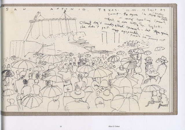
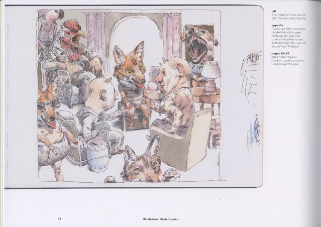
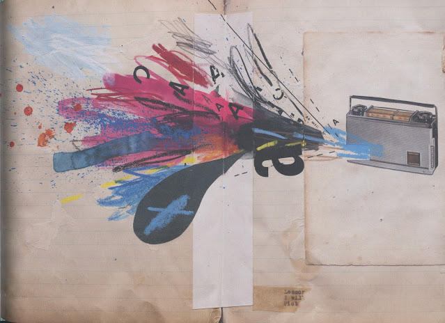
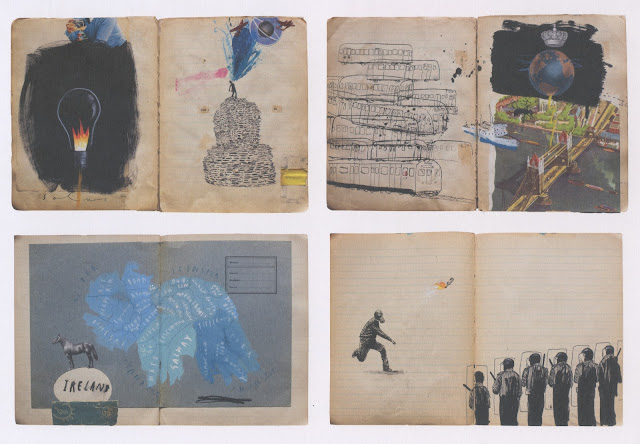
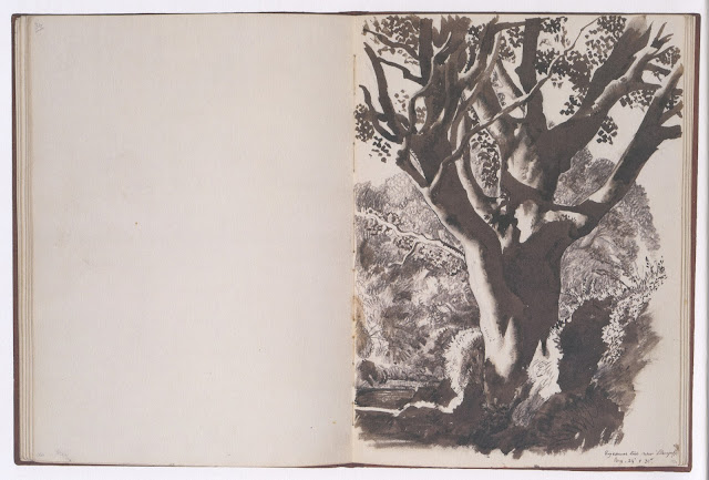
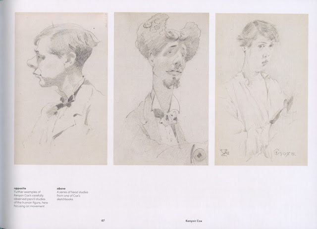
Now Martin Salisbury has come forward with a rich collection entitled Illustrators' Sketchbooks, showcasing the private sketchbooks of 60 well selected illustrators.  For each artist there is a thoughtful description of the illustrator with quotes, along with 5 or more pages from their sketchbooks.

Alan Cober

Remarkable entries in the sketchbook of Ronald Searle
showing how he experimented with the effects he later used in his drawings


Sketches by John Cuneo, one of my favorite contemporary illustrators


Oliver Jeffers


Charles Tunnicliffe

Kenyon Cox

The book contains several of the usual suspects such as Beatrix Potter,  Quentin Blake and Edward Gorey but I most enjoyed some of the names that were new to me, especially the examples from international illustrators.

An interesting selection of images that you won't normally see in books and magazines.