Saturday, December 28, 2019

THE END OF 2019

We've come to the end of another year.  

Specialty drawing by Leonard Starr for the Detroit Press Club in a different era

My sincere thanks to all of you for your interesting comments and suggestions throughout the year, especially for those insults intended to shake me out of my reveries. You've broadened my experience and sharpened my vocabulary, and I appreciate it. 


Here's wishing you a joyful 2020!

Thursday, December 19, 2019

FOUR ARTISTS AND A COMPUTER

This full-page illustration from a recent issue of the New York Times Magazine required the combined talents of four different creators plus a computer


The New York Times separately credits the photographer of the tower, the photographer of the trees and the photographer of the vulture, as well as the "illustrator" who glued them all together on a colored background. 

Let's face it, this picture required only limited artistic choices:  which photo of a vulture to pick from the internet? Whether to paste that cupola a little further to the left or the right? How far to push the color balance slider?  These are the art choices of decoupage. 

I welcome the computer as an artistic tool when it enhances an artist's expressive range.  Even added efficiency is a welcome contribution.  But that's not what's happening here.  A capable illustrator using traditional materials could've completed this job in a day.

Why is so much illustration like this today? It fills its allotted space just fine, but what is there to admire about the talents required for this kind of image?  Are we seeing creative responses to genuine artistic challenges?  Are we witnessing the quirks or eccentricities of the human imagination?  Are there any manifestations of admirable manual skill or dexterity or taste?  

The golden age of illustration-- a glorious century in the history of art--  was only made possible by new technologies, but ultimately the age was ushered out again by newer technologies, more efficient but less hospitable to the artistic imagination.  

The golden age began when high quality reproduction, new kinds of paper, better methods of printing and distribution encouraged unprecedented enthusiasm for images.  These innovations spawned a veritable Cambrian explosion, with hundreds of glossy full color magazines creating an unprecedented platform for illustrations.  On this new platform, artistic quality was still tested by what I consider a higher set of artistic challenges: 

  • Artists had to master the hydrology of liquid media (learning to control liquid, but not too much). 
  • Artists had to take tincture from minerals in the ground and wrestle with their obdurate molecules to transform them into the appearance of totally unlike substances: water, clouds, organic matter, light 
  • Artists had to master the physical gestures of art-- impulses that started with the human nervous system and found expression through the wrist, elbow or even the shoulder (as opposed to the touchpad or keyboard).
  • Because they were wrestling with physical media in the physical world, artists had to risk starting over if a picture didn't work out because the consequences of a failure couldn't be contained in a separate Photoshop layer. This gives different meaning to an artist's willingness to gamble and to the psychology of maintaining high standards.

It's no wonder that these artists-- Norman Rockwell, J.C. Leyendecker, Charles Dana Gibson, Maxfield Parrish, Frederic Remington, James Montgomery Flagg, and many others-- were folk heroes in ways that today's "photo-illustrators" can never be.  For all the gross inefficiencies and manual labor involved in working with physical media in the physical world, creativity seems to come out of constrained circumstances.  If you compare the images from these different periods in the history of illustration, it would appear that the process of wrestling with the angel summoned a grander set of choices and commitments.


Wednesday, December 11, 2019

NEW BOOK FROM NATHAN FOWKES

Steve Martin has a comedy routine about how to make a million dollars without paying taxes. "First," he says, "get a million dollars. Then, don't pay the taxes."

I figured that a "how-to" book on painting from Nathan Fowkes would be similar: First, pick up a brush. Then use your exquisite sense of color, your natural gift for design and your light, nimble touch to make a picture."

As a result, I wasn't expecting that his new book would be much more than a portfolio of his watercolors. Still, that was sufficient reason to order it.  The paintings in this book are quite beautiful and the reproduction is excellent (which is crucial for any collection of Fowkes' art).


But I was especially pleased to find a thoughtful book full of practical, insightful suggestions.


For example, I've always admired Fowkes' ability to simplify complex colors and forms, distilling his subjects to their essence.


On this subject, he recommends "finding a simple statement" by honing in on the quality that made you choose to paint that particular scene in the first place, then editing anything that might distract from that quality.  How exactly are we supposed to do that? He offers tips ranging from squinting your eyes, to forcing prioritization by giving yourself a firm 20 minute deadline to paint a complicated subject, or starting with a basic value statement and adding only a few strategic details.  As another exercise in simplification, he talks about limiting your entire painting to 20 brush strokes.

He also offers personal commentary such as his decision to get rid of his TV: "the TV would call to me from the next room, and when the inevitable frustrations of learning something new would hit, the TV was just too tempting of an escape.  I realized I could never have the level of focus that I needed as long as there was a constant distraction right there in the next room."  The book even talks about  dealing with mosquitoes when trying to paint on site.

An excellent book by an excellent artist.

Friday, November 29, 2019

NEW PATENT SAVES YOU FROM THINKING TOO MUCH ABOUT ART

Not long ago, Publishers Weekly made the following claim about the art of Jaime Hernandez:

 "Jaime's ability to sum up life's joy and pain in a few images has never been surpassed in all of art."


I like the work of Jaime Hernandez as much as the next person but this loony sentence might just be enough to topple the human race from our place on the evolutionary tree.

People have become emboldened to say ignorant things because of our current conceit that art is totally subjective.   Personally, I side with Harlan Ellison who wrote, “You are not entitled to your opinion. You are entitled to your informed opinion. No one is entitled to be ignorant.”

When people express silly opinions about art, it provokes the people around them to strain for some kind of rational, objective standard for evaluating art. The problem is, the people who claim to have found scientific standards usually end up in a place equally goofy.

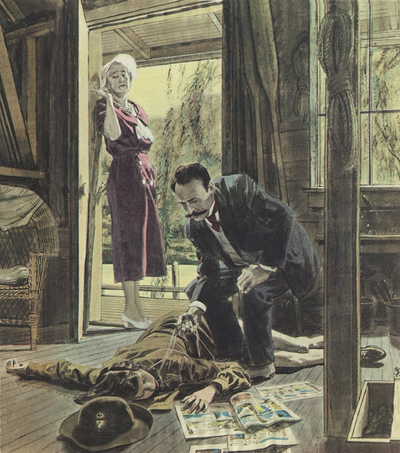
Which brings us to this week's headline: a forensic accountant claims he has developed a computerized technique for identifying Norman Rockwell's artwork.  No longer will you have to judge a Rockwell painting by its artistic merit.

If you research patent #10,460,412 at the Patent and Trademark Office, the inventor claims that in 1940, 
Mr. Rockwell created a blend of Posterization and Steganography, the art of hiding data in a cover medium, to provide an anti-forgery feature to his paintings. He created CMYK paint colors that matched the RGB color model and used the colors he created to hide his initials.
Some of you cynics may be amazed by Norman Rockwell's technical computer skills dating back before the invention of the computer. That shows how little you know. In 1938, the first patent application for "posterization" was filed.  Apparently, when Rockwell reviewed the daily docket for the Patent and Trademark Office he recognized the potential to adapt these nascent technologies into an anti-forgery system for his own paintings:


The patent application claims that using this system, Rockwell was able to conceal his own initials in his paintings to prove their authenticity.  Here are some of the examples of Rockwell's art in the patent application, processed by computer to reveal his hidden steganographic initials:


Note that in one of these examples, Rockwell supposedly wrote his initials "rn" instead of "nr."  No explanation for this is offered.


Based upon this convincing proof, the Patent and Trademark Office granted a patent for this computerized Rockwell detector.

There isn't one character in this process-- including the Patent and Trademark Office-- who wasn't as loony as the claim about Jaime Hernandez.

My point is that we should avoid being coaxed or harassed into either extreme; taste is not totally subjective nor is it objectively provable.  Art continues to demand our highest and best judgment, guided by both reason and passion, on a case by case basis.


Saturday, November 16, 2019

MORT DRUCKER'S LEFT HAND

When artist Mort Drucker was a boy, he was left handed.


He wrote and drew with his left hand but his parents forced him to change to his right hand-- a now discredited practice that conflicts with the natural wiring of the brain, leads to inferior results and can cause developmental problems in a child.


This is the brilliant work Drucker was able to create using his "second best" hand.


Makes you wonder what Drucker might've been capable of doing with his left hand if he'd been left to develop naturally.
.


Tuesday, October 29, 2019

PLUS ÇA CHANGE...

Today marks the 50th anniversary of the first message being sent over the internet.  On this date in 1969 a small team in a UCLA lab sent a message over a network of ARPANET computers. 


Once the concept was proven, ARPANET quickly exploded into today's global internet.

The internet is most famous for conveying the Illustrationart blog to a needy world.

However, some have expressed dismay that so much of the promising new technology is devoted to trading nekkid pictures.  Looking back, this was to be expected: in 1956, during the infancy of the computer age, the first human likeness to appear on a computer screen was a pin up illustration by George Petty:

Cathode ray tube screen of an experimental military computer developed to fight the cold war

1956 Esquire magazine calendar page by George Petty.  Va Va Voom.
As computer journalist Benj Edwards reported, "During a time when computing power was so scarce that it required a government-defense budget to finance it, a young man used a $238 million military computer, the largest such machine ever built, to render an image of a curvy woman...." 

The technological revolution, from Polaroid cameras to betamaxes to camcorders to cell phones to blogs, has never strayed far from this central theme.  People now ask: Have all these tools corrupted our values by spreading such scandalous pictures?

33,000 years ago during the infancy of art, our ancestors used their new tool called "drawing" to decorate their cave with pictures of the human vulva.  In a riveting paper entitled, "Context and dating of Aurignacian vulvar representations from Abri Castanet, France," a team of (male and female) scientists recently detailed how-- even without the benefit of the internet-- prehistoric people drew vulvae all over  the ceiling of their cave.  Another artist, lacking paper, etched a vulva on the molar of a woolly mammoth.

This urge wasn't limited to drawing; prehistoric sculpture followed the same theme-- the first known sculpture of a human was a naked female.

In light of this long tradition, it's surprising that the internet is ever used for anything besides naked pictures.

Okay, but you ask: what about the ominous future?  New artificial intelligence and virtual reality technologies threaten to erode the distinction between truth and lie. These so-called deepfakes can falsify historical events and corrupt our political dialogue.   Spread over the internet they could start wars, topple governments, and undermine science... but apparently not just yet.  A recent survey indicates that 96% of deepfakes are not about any of these things, but rather about sex.  


Monday, October 21, 2019

ONE LOVELY DRAWING, part 61


I love this drawing by Tom Fluharty of George Bernard Shaw holding his dog.


Fluharty's famous drawing workshop came to our town last week.  I attended in the hope of learning how Fluharty achieves some of his marvelous effects, such as this ingenious beard:


But rather than coming away with magic tricks and special effects, I came away with something better: wisdom about the nature and challenges of drawing to help students invent their own special effects.

One of my favorite messages from Fluharty's demonstrations:

"Never coast just because you think you already know how hands look. Never punch the clock. Always continue to look for the story; hands are a story. Ears are another story.  Hair is a story. There's a story to tell everywhere; don't take anything for granted."
 

Sunday, October 06, 2019

ROBERT FAWCETT'S LIMP FIGURES

It has been a while since I've shared another reason why I like the work of illustrator Robert Fawcett.

Even at the height of his career, Fawcett continued to sketch from the model every week.  At the end of each session, he'd open the lid of his model stand and toss in the day's efforts.  When he died, there were several hundred drawings stashed there.


One result of Fawcett's continuing commitment to observation is that when he illustrated a figure, he was not content with the usual simplistic shortcuts: symmetrical people standing perpendicular to the ground.  Instead, he observed that people are often bent or lopsided, reflecting life's tug of war between gravity and organic matter:   


One of the ways Fawcett's life drawing regimen paid off is when he received an assignment to depict a limp figure--  someone whose muscles went slack and who collapsed in a jumble-- Fawcett was able to capture such figures in a very convincing way.  Again, no stereotypes here.


Wednesday, September 25, 2019

ART AND RAGE


Kathe Kollwitz, The Peasants' Revolt

In these divisive political times, words can't seem to keep pace with our anger.  Insults on social media are so prevalent that words have lost their sting.  Hyperbole is so overused that it no longer impresses, so people have resorted to lies instead. (As Nietzsche observed, "no one lies as much as an indignant man.")   Many people have given up searching for words that persuade, and settled for words to offend.

But when words become ineffectual as a means of expression, we can always rely on good ol' drawing to raise the decibel level.

Unlike words, drawing is not a polite game ruled by grammar and punctuation.  Drawing is a more primal mode of communication with a broader range of expressive tools.  In this sketch from Kollwitz's shattering series about the peasants' revolt of 1524, her charcoal strokes on paper are the equivalent of those arms flailing in rage and despair.

Kathe Kollwitz, study for The Peasants' Revolt
Goya's series on the disasters of war vents his feelings of anger and impotence using graphic forms that are more compelling than words.

Goya, a gang rape by soldiers

Amsterdam artist L.J. Jordaan penned this blood curdling image of the Nazi occupation of the Netherlands:


Oceans of words about the Vietnam war were written by armies of talented writers, yet Tomi Ungerer's stark drawings remain vivid in people's minds.


The talented Tom Fluharty could've made a career out of his blistering portrayals of Hillary Clinton:


It is not sufficient that an artist feels anger.  Quite the contrary, anger usually causes art to go astray; it creates a stress test for the connective tissue of art, and artists who aren't up to the task find that anger has left them with an ineffectual mess.  But artists with the ability to hold it together can channel their outrage into truly scalding works of art.

Today's polarized environment has revved up talented, indignant artists, such as Michael Ramirez on the right or Ann Telnaes on the left.  But I can think of none more unsettling and brilliant than John Cuneo.  His pen seems the sharpest, his ink the most acidic, his imagination the most outrageous.

A response to Donald Trump's statement that his opponents should "go back to where you came from."
An artist friend told me about this drawing,  "Cuneo can always make me gasp before I laugh. The cartoon’s idea is just a crude taunt, but his willingness to really GO there and SELL it is, ...well, frankly, a bit scary. "

This next Cuneo drawing-- simultaneously brutal and brilliant-- is an excellent example of what I mean by artistic powers strong enough to contain rage:


It's extremely difficult to balance art and anger, but when properly fused, the two make a powerful alloy.

Tuesday, September 17, 2019

BERNIE FUCHS, TEN YEARS LATER


The artist Bernie Fuchs passed away ten years ago today.  I was fortunate to get to know him; I interviewed him for weeks and listened to his reflections on life and art before he passed away. 

I never met anyone with a greater gift for color and design.  He was a truly humble man, but he understood the nature of his gift-- how could he not?-- and always tried his best to respect and protect it.   A generous spirit, he never resented the legions of artists who imitated-- or copied-- his work.  He simply hunkered down and moved on to something new.  He died with his astonishing strengths undiminished.


Surveying the art scene ten years after his death, Bernie's artistic strengths are no longer as fashionable.  The oversized, glossy magazines which showcased his art died long before he did. "Concept art" and "idea illustration" arose in an effort to make content more relevant and thought-provoking than the corny romantic fiction sometimes illustrated by Bernie's generation.  But as content took center stage, visual skill, and even talent itself, became suspect. Polished images were viewed as a distraction from the message. The stature of visual form shrank as simpler images and deliberately careless drawings served as vehicles for thought.  Meanwhile, "photo illustration" proliferated in response to economic demand, and computer gaming art arose in a symbiotic relationship with viewers with short attention spans.

Audiences eager to avoid being accused of narrow mindedness concluded that the safest path was to abandon all standards. 

No one can be certain where art will be in a hundred years, or how visual quality will be valued in the rectifying mirror of time.  But as I take stock after the first ten years, Bernie's radiant images still stand out for me across a carnival yard cluttered with weak, shoddy and sensational quasi-art.  On the tenth anniversary of his death, his status as a giant in his field remains secure.


Thursday, September 12, 2019

DANIEL SCHWARTZ PAINTS AN ORANGE


When Daniel Schwartz was commissioned to "paint an orange" for an advertisement, he didn't reach for the orange paint.  The labels on the paint tubes were irrelevant; Schwartz wanted a full range of colors to paint orange:


Similarly, Schwartz didn't feel his oranges had to be round.  Instead, he used his vivid imagination to come up with creative, interesting shapes.


When you paint at this level, the normal assumptions about shape and color go out the window.