[This is not my last digression into the difference between illustration and abstract art. It is probably not even my second to last digression. But take heart, because the end is definitely in sight.]
_________________________________________
The inspiration behind abstract art was bold and brilliant. As Holland Cotter wrote about the invention of cubism:
The day of pure optical pleasure was over; art had to be approached with caution and figured out. It wasn't organic, beneficent, transporting. It was a thing of cracks and sutures, odors and stings, like life. It wasn't a balm; it was an eruption. It didn't ease your path; it tripped you up.
The problem is, once artists cast off the shackles of the old standards, there was no consensus on new standards by which to determine quality. By 1918, the Russian painter Malevich, seeking the ultimate essence of painting, produced an all white canvas:
Fifty years later, the American painter Reinhardt improved on Malevich by unveiling an all black painting:
For peasants like you who might question the value of this kind of art, Reinhardt explained: "A fine artist by definition is not a commercial... or applied or useful artist. A fine, free or abstract artist is by definition not a servile or professional or meaningful artist. A fine artist has no use for use, no meaning for meaning, no need for any need." Got it?
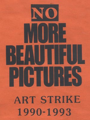
Malevich and Reinhardt were conceptually interesting, but modern art had already turned down the path toward its current dead end. Years later, High Performance Magazine, the avant garde journal of post-modern performance art, published the following goofy article on the work of performance artist Teching Hsieh:
Since July when Hsieh announced that for a year he would not do art, look at art, speak about art or think about art , we have been unable to find out any more information.... Friends speculate that the piece grew out of the frustration he experienced trying to organize a one year torch carrying piece that required a minimum of 400 participants. Even after running full page ads in the East Village Eye and other publications, Hsieh was only able to come up with around 200 interested people, whereupon he dropped the idea and announced his "no art" piece. Fallout from the piece has been that he refuses to visit old friends because they have too much art on their walls, and avoids Linda Montano, his friend and collaborator for his last year-long piece in which they were tied together, because Montano is doing a seven year "art/life" piece in which everthing she does is declared art."
Don't believe me? Look it up. Issue no. 32
Obviously, neither Malevich nor Reinhardt nor Teching Hsieh ever read a poem by Stephen Crane (1871-1900):
If I should cast off this tattered coat,
And go free into the mighty sky;
If I should find nothing there
But a vast blue,
Echoless, ignorant--
What then?
Many artists have disrobed in the hope of consummating a relationship with the existential void, only to discover that the existential void ain't interested.
I agree with Clement Greenberg, one of the earliest supporters of abstract art, who wrote:
The nonrepresentational or abstract, if it is to have aesthetic validity, cannot be arbitrary and accidental, but must stem from obedience to some worthy constraint.
Without the constraints of subject matter, objective standards, technical skill, or even the limitations imposed by dealing with a physical object of any kind, the floodgates were opened to charlatans, profiteers and others who dilute the meaning and pedigree of art.
Next: a solution?
A few of you have wondered just what the heck I was yodeling about in my last posting on abstract art.
Let's start by acknowledging that abstract art is outside the scope of this blog and outside the scope of my competence. However, I do like some abstract art. If you're willing to take a stroll with an uneducated man into a complex field, we may discover some interesting things together.
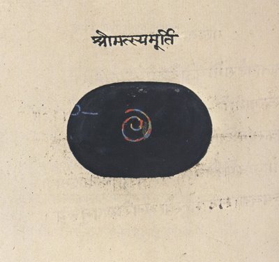
In my view, much of today's fine art scene is self-indulgent nonsense. The Museum of Modern Art in New York contains some great works of art, but the ratio of money to talent there is downright asphyxiating. Dollar for dollar, the art at the Society of Illustrators a few blocks away has more nutritional content. But there is no clear dividing line between art that illustrates a message or idea on the one hand and abstract art on the other. Here are some splendid illustrations that are not very different from the abstract paintings in my last posting: Illustration of the descent of the divine power through a the symbolic fish-incarnation (from a 17th century Yogic manuscript).
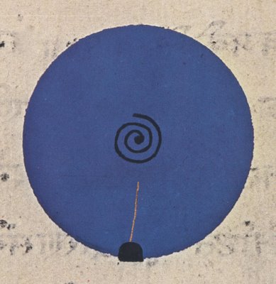
 Illustration of the evolution and dissolution of cosmic form from a 19th century Rajasthan book.
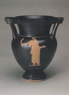
  Vase painting from Athens in the 5th century BC
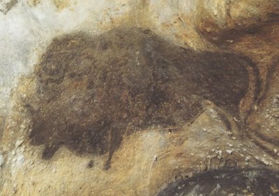
 Cave painting circa 17,000 years ago. Clearly, abstract art is no modern invention. It began when art began-- in the upper paleolithic period (from 35,000 to 12,000 years ago). More artistic and technological progress took place in those 25,000 years than in the previous 2 million years combined. That era saw the first explosion of symbolic (abstract) thinking and the accompanying birth of art. The designs and heavily stylized drawings scratched in the walls of ancient caves share a lot in common with today's abstract art. But unlike modern abstract art, which often seems detached and irrelevant, paleolithic art was close to the core of what it meant to be human. It was life-or-death relevant. I have always liked Anthony Burgess' characterization:
 Art is rare and sacred and hard work and there ought to be a wall of fire around it.
Abstract and conceptual art, when it is good, can satisfy that high standard. And since I've blabbered on too long today, I'll offer some thoughts next time on what "good" means to me in abstract art.
 This lovely little drawing by Robert Fawcett appeared in Look Magazine in the 1960s. It was just a spot illustration, about 2 inches across. It is not likely to be reproduced ever again.
In the 1960s, illustration went wild. Innovators used psychedelic colors and bold new styles to create increasingly abstract work. Representational art was declared obsolete. Fawcett, who was trained in a rigorous traditional style, remained unperturbed. In fact, he was amused by the "misconception that abstract qualities are new to contemporary painting, whereas they have been the comparison of excellence since painting began."
 Today, all those daring 1960s illustrations with the LSD-inspired paisley designs seem quaint and dated. But if you revisit this tiny little drawing by Fawcett, you will see art that is wild in a more lasting, meaningful sense.
 Fawcett often drew conventional subjects using conventional media. He was known for scenes of cultured people in English libraries. But don't be fooled by his subject matter-- he drew them with a powerful, vigorous line. This little drawing is like a DNA sample of the pagan force in Fawcett's drawing. It remains far more wild and frightening today than much of the work that "revolutionaries" such as Peter Max or Bob Peak were producing with the "new freedom" of that era.
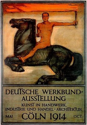
 At the start of the 20th century, artists and designers were excited by the prospect of a new era filled with miraculous inventions such as telephones and cars. Science promised a world where humans could begin to create their own environment. But artists with vision recognized that there was also a danger: a man-made world could easily devolve into an industrial wasteland of purely functional objects unless artists were up to the task of creating new designs and forms suited for the machine age. Only designers could preserve beauty in an era when industrialization and mass production began to replace nature. Perhaps the greatest visionary of this period was Peter Behrens, an illustrator for the magazine Jugend, as well as a designer, architect, typographer, teacher and author. He has been called "the first industrial designer."

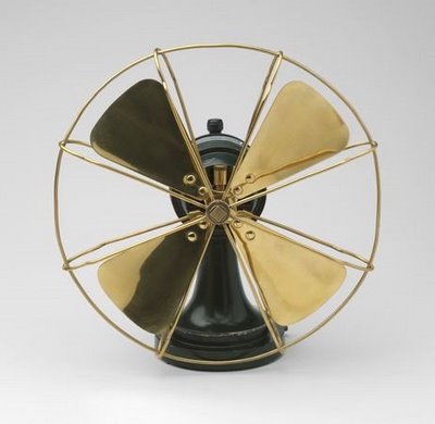
 Behrens designed buildings, stationery, electrical appliances, silverware, typefaces, furniture and environments. He served as the design advisor to one of the world's largest manufacturing concerns, helped to found the German Association of Craftsmen and taught classes that would later become the conceptual underpinning for the Bauhaus. Most of all, he nurtured young apprentices who went on to become the titans of modern design, including Mies van der Rohe, Gropius and Le Corbusier. Behrens said he designed for the modern world by returning to "the fundamental principles of all form creating work."
 Behrens also designed several typefaces that became standards for the 20th century.
 When designing type, he compared the process of the human eye reading text to
watching a bird's flight or the gallop of a horse. Both seem graceful and pleasing. But the viewer does not observe details of their form or movement. Only the rhythm of the lines is seen by the viewer, and the same is true of a typeface.
We all owe a debt to Behrens for helping to preserve a place for design in the human enterprise during the machine age.
But now the 20th century is over. Today's artists and designers face the new challenges of the 21st century. Who will be the new Peter Behrens who develops an aesthetic for the information age?
Information technology has deluged us with more data than we can assimilate-- a capability so dazzling that information has supplanted the role of wisdom or knowledge. As Karrie Jacobs noted, Computers have seduced us into thinking about ideas-- the intangible stuff that comprises our culture, our mental universe, our homegrown organic realities-- as information. Information has become the end product, rather than the means to achieve that end.
Just as Information can overwhelm our ability to convert data into knowledge, it can overwhelm our ability to process sensory input in aesthetic form. Information streams are added one on top of the other, like ornaments on a Christmas tree.
 The typical modern TV screen has a "crawl" with a message along the bottom, a "bug" identifying the station in the lower corner, and pop ups announcing the weather or the next show or the late breaking news. Anyone who has witnessed a message promoting the Gilmore Girls superimposed on the closing poignant moments of The Godfather knows that the domain of aesthetics has been overwhelmed by information. The same could be said of the cacophony of gateways to databases on websites, or even the designs appearing in many magazines. They are not integrated into our lives in an organic or intuitive way. For those artists who feel that the glory days of art and design are behind us, here is a challenge: whoever finds the artistic vision to apply "the fundamental principles of all form creating work" to the new information age will earn our undying gratitude.
