Whenever I travel to New York City, I make a point of visiting the Society of Illustrators'
Museum of American Illustration. The
current show is comprised of classic masterpieces from the Society's permanent collection, most of which are rarely seen. I heartily recommend it to anyone in the NY vicinity.
The star of the show, as far as I'm concerned, is this muscular tour de force by Harold von Schmidt:
Von Schmidt was a genuine cowboy and came by his knowledge of horses honestly. He understood their anatomy, their movement and their spirit and it showed in his paintings.
This large oil painting (over four feet wide) was greatly reduced for publication in a 1933 issue of
Cosmopolitan magazine. It must be seen in person to be appreciated.
The Society's exhibition showcases a cross section of other strong artistic personalities. William A. Smith is represented by one of his gritty noir paintings.
There's a striking Bob Peak employing his trademark psychedelic colors
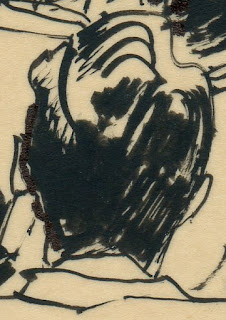
And illustrators such as Orson Lowell and Henry Raleigh show off their draftsmanship.
The illustrators in the show included many bold, opinionated artists who helped shape the popular taste of their generation.
When I left the Society I walked down the street to the Museum of Modern Art where I viewed the work of conceptual artist Luis Camnitzer. His exhibition consisted of 195 pages from the 2009 Montevideo phone book with the names of victims of political repression in Uruguay.
The pages were framed and displayed in rows:
I had to fight my way through the crowd of art lovers in order to admire Camnitzer's photocopies close up.
Today our definition of "art" is broad enough to encompass both Harold von Schmidt's horse race painting and Camnitzer's phone book pages. In fact, our perimeter for art is sufficiently porous to include almost anything.
This creates a real challenge for us to articulate standards-- any type of standards-- sufficient to make such diverse types of "art" cohere as a category. For the word "art" to have meaning, it must stand for something more than random jumbles of unrelated molecules. Even Clement Greenberg, the leading advocate for abstract expressionism, wrote that the aesthetic validity of nonrepresentational art can only come from "obedience to some worthy constraint."
Judging from my mail, we are nowhere close to a consensus on standards for "a worthy constraint." Readers frequently object when I criticize a picture. They say, "You're not allowed to criticize a lack of skill or crummy drawing or poor design, because such cosmetic concerns are irrelevant-- this picture is more about the concept, or about irony or cultural observations. Its visual appearance is secondary." Or they say, "You shouldn't say one picture is better than the other because all standards are inherently subjective. You should accept a picture for what it is. If you don't like it simply pass it by."
I agree that each artwork is entitled to be judged by its success or failure in achieving its own ambitions. (Of course, I also believe the quality of its ambitions are also fair game for criticism, but I'm old fashioned.) But subjectivity doesn't means that two works of art with different ambitions can't be fruitfully contrasted. I believe apples and oranges can be weighed on the same scale, just as I believe the art at the Society of Illustrators and MOMA can be meaningfully compared. An excellent image is still superior to a mediocre concept most days of the week. Many of the anemic intellectual puzzles found at MOMA melt away in the face of some of the bold artistic choices at the Society exhibition.
For better or worse, we seem to be living through a period when it is popular to focus on concept over visual execution. But anyone who believes conceptual art is categorically superior should visit the Society of Illustrators to refresh their memory of what creative design, composition, harmony balance and other traditional aesthetic experiences have to offer.


