Saturday, December 31, 2022

THE END OF 2022

It's the end of another year.

The great Mort Drucker

During the year, we've been visited by the specters of many "ends."   

We've discussed whether AI art will be the end of art as we've known it.  We've taken satisfaction from the end of some of the more foolish dreams about NFTs.  We've witnessed misguided protesters destroying art for religious, political or pathological reasons.  

We've mourned the end of great artists this year, artists such as Neal Adams, Paul Coker and Ralph Eggleston.  We've mourned the end of artistic standards in New Yorker covers and other prestigious art venues.

But it seems clear that there are also many new beginnings and developments that should make 2023 a year of fruitful discussion.

Many thanks for your interesting comments and suggestions throughout the year. You've broadened my experience and sharpened my vocabulary, and I appreciate it.

Monday, December 26, 2022

STEALING THE UR POWER OF COMICS

There's no disputing the visual power of Sunday comics.  Their bold flat shapes, bright colors and high contrast graphics have an ur quality that makes them irresistible.

John Gannam

Mike Ludlow

Harry Anderson


As a result, artists of all stripes, with different objectives and varying levels of authenticity, have tried to piggyback on the visual strength of comics.  They take the aesthetic of comics and plug it into their own paintings like a lithium ion battery, to add power to their own objectives.

Artists such as Roy Lichtenstein, Andy Warhol, Robert Rauschenberg and Jasper Johns incorporated comics in pop art paintings.  These artists may have been striving for non-comic goals: social commentary, parody, irony, kitsch... but the visual strength of these images came from the original comics.  Without this borrowed backbone,  the images would be visually limp. 

Contemporary "fine art" painter Sharon Moody specializes in oil paintings of comics in a trompe l'oeil style:


For me, the Moody paintings are an impressive technical gimmick with none of the visual potency of comics.  She leaves the best part behind. 

By contrast, the far superior artists Gannam and Anderson know how to use the eye-popping colors and strong shapes of comics:


Jasper Johns comes a little closer with this painting from the comic strip Alley Oop:


Note that Johns did not just paint random cartoon-like shapes.  He tracked the original compositions in all twelve panels fairly closely,  abstracting their shapes and colors.:  


Other "fine" artists such as Jim Nutt, John Wesley and Vernon Fisher continued the practice of borrowing the strength of comic art imagery, albeit in the service of different artistic goals. Keith Haring is another example: 


Again and again, it seems to me that the ur of comics is the strongest single ingredient of these pictures.  The social commentary, the irony, the conceptual overlays-- all are interesting elements but without the comics the final result would be artistically negligible.


Thursday, December 15, 2022

ONE LOVELY DRAWING, part 68

On my recent visit to the Norman Rockwell Museum I lucked into their exhibition of Norman Rockwell Drawings.  

There, I was particularly struck by this lovely drawing, Norman Rockwell's interpretation of the classic theme of artist and model:


Rockwell portrays this artist as a circus contortionist-- the opposite of his ramrod straight, expressionless model.  We see the artist struggling to infuse his model with a glamorous flourish where none exists.

Look at what's taking place in this tiny space: the artist holds the magic charcoal with a highly affected grasp,  inventing a sweep of the hair and alluring eyes that aren't on the model.

This is what a hand looks like when it's trying to change reality with sheer force of will

Note how the artist cocks his head way back to give him the perspective necessary to find glamour in his bland and boring model.  The artist's pretentious beret tells us much about his self-image...

But his saggy pants, frayed cuffs and worn shoes tell us more about the reality of the situation:


The artist's unused arm doesn't hang limp at his side; it pulls way back, keeping pencils and all other distractions well out of the line of fire:


With his left knee raised and his right knee lowered, his left arm cocked back and his head pulled aside, the artist looks very much like the pistons in a human combustion engine: 


The important point here is that the portraitist is not simply a master class in body language, he's a master class in human psychology.   

What's going on here?  Is the portraitist merely idealizing his homely client, hoping for a bigger tip?  Are his pretensions just theatrical props, designed to attract and impress paying customers?  Or is there more? 
 
This scene takes place in a cheap, cramped portrait booth, of the type you'd find at a carnival or on a boardwalk.   The artist's affectations suggest he imagines himself to be something he's not.  In short, there seems to be fantasy taking place on both sides of the drawing on that easel.  

Perhaps art is a two-way con. 

Picasso is celebrated for his hundreds of drawings on the theme of the artist and his model.


We are told that his drawings are rich with visual and psychological subtleties, and I believe that to be true but I also believe that pretentious art critics, clinging to their own affectations, tend to overlook the rich field of visual and psychological subtleties in more representational art.  

As I said, perhaps art is a two-way con.  


Tuesday, December 06, 2022

WHEN IS A TREE THE SAME AS A DOG?


The Transversal Law of Pictures says: a log can serve the same function as a dog. 

Andrew Wyeth began this painting featuring a dog....

 
... but changed his mind and started over, substituting a log.  Wyeth explained that the log performed the same function: "the dog disappeared, though the animal is in the ragged, chopped, sharp sliver part of the log."  


Whether a dog or a log, Wyeth introduces a contrasting element which opens a dialogue in both form and content.  

The big change in the final version is not that the dog turned into a log.  The big change is that the dog / log has been moved outside.  That really alters the dialogue.

The sharp, gray, contrasting element now sits outside the window, jagged and ominous, with other asperous symbols: barbed wire, a rusty chain, dead grass.  

Compare the world outside with the civilized tableau indoors.  One critic wrote that the final version of Wyeth's painting is "richly symbolic: outside there is violence and death: inside a sacramental order and the light of an austere divinity."  The window glass is invisible yet it transforms the meaning of an object to be painted inside or out. 

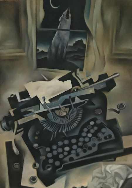
Gary Kelley put his own version of the wildness outside the window...


... but this time the window doesn't appear to offer much protection.  The howl of the feral beast seems to have penetrated the window and undermined the civilization inside.

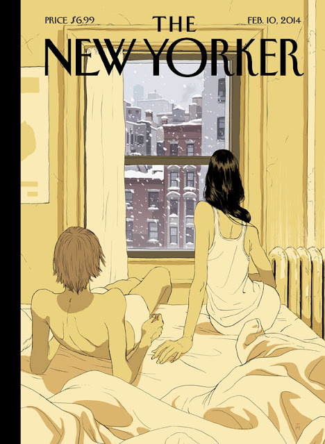
Look at all the ways Tomer Hanuka's window separates winter's wild chill from a steamy interior: cool colors vs. warm, hard geometric building materials vs. tender human flesh, tone vs. line, foreground vs. background:


What role does a window play in these dialogues?  A window offers less protection than a solid wall, but more protection than a blue sky-- a compromise somewhere between nothing and everything.  This range of possibilities makes a window a marvelous artistic device.  For example, an open window leaves a person vulnerable to their "love awakening." 


Sometimes your love awakening arrives wearing a top hat but packing a pistol.  How much wildness can you handle?


Other times a window thrills by merely implying what's outside.  A shadow can be more effective than the dangers we actually see.


Of course, not all the savagery takes place outside the window.  Sometimes it's more savage inside:


Gustave Dore illustrates the age old custom of defenestration
 
As we've all heard, if you leave an open window in your heart, everything you wanted may enter.


However, what you wanted may not be in your best interest. 

Windows can free you from the tyranny of perspective or anatomy:


Windows also thwart our appetite for too much information, forcing us to infer situations.  

Subtle clues

Creativity comes from constrained circumstances.  If you find yourself in a closed space, there are three ways to enlarge your vision. You can look at a picture.  You can look in a mirror.  Or you can look out a window.  The artist's choices about the size of the window, how to crop it, what features from the world to see through it,  determines where the rest of the world ends and the art begins.