

Nobody talks much about Robert Riggs anymore, but he was once one of the nation's most highly regarded illustrators.
As Walt Reed wrote, "Robert Riggs was awarded the Gold Medal for Excellence by the New York Art Directors Club for ten consecutive years and received many additional awards." He was elected to the Society of Illustrators' Hall of Fame. His work is in the permanent collections of the Metropolitan Museum of Art in New York, the Philadelphia Museum of Fine Arts and the U.S. Library of Congress.
What made Riggs so special? If you went through a checklist of factors that normally make an illustrator stand out, Riggs seemed to have none of them. His work was not flashy or innovative or glamorous. He had no special talent for anatomy or facial expressions. His compositions and colors weren't stylish or bold. If anything, he favored basic, symmetrical compositions with conventional color schemes:


 |
| Note how frequently Riggs plants his subject right smack dab in the middle of his canvas. |
Furthermore, his subject matter was hardly topical or crowd-pleasing. No one would describe his work as romantic or witty or trendy-- no pretty girls, no heart-warming family scenes, no attractive couples in passionate clinches. And Riggs didn't try to show off with a lot of details and frills. To the contrary, he simplified and stripped away unnecessary detail.


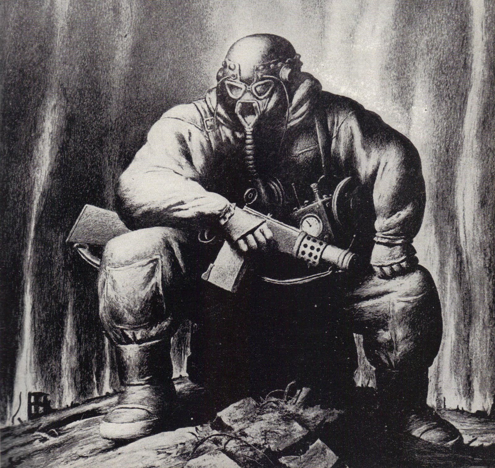
For me, the special appeal of Riggs' work is in its distinctive weight. He imbued every subject with a great feeling of solidity and substance-- what Reed calls "monumental" compositions. Riggs' figures in the following picture are made of the same granite as the mountains behind them.

Riggs didn't follow the recipe for popular illustrations of his day. He viewed the world in a powerful, muscular way and conveyed his vision as honestly as he could. That was enough to capture audiences and the respect of his peers.


74 comments:
Very interesting. I knew the first picture but did not know at all his work. As you said, it's solid and compact. It gives something to think.
Amen.
I love pre-modern monumentalism in art. However, my perceptual association is, justified or not, that most everything monumental produced in the first half of the 20th century (and much that is not monumental) seems to have a socialist propaganda/exaltation-of-the-laborer vibe, and that leaves me turned off. Maybe the Olympians are or are not worthy of such exalted treatment, but I know beyond doubt that unionized knuckleheads turning bolts on assembly lines are not.
That solidity, heaviness or whatever word works best to describe it is what made Riggs' work unappealing to me. On occasion his style would work if it meshed with the subject-matter as is the case with the wagon, the refinery, the workmen and prize fighters. Otherwise it struck me as being "off" in one way or another.
Nevertheless, his work was popular. I saw it a lot when I was a kid.
This is not to say that I regard him as a bad illustrator. I just find it a little hard to "connect" with some of his work.
I grew up with a copy of 40 illustrators and how they worked and always liked Riggs' pieces in it... yet I could never exactly count myself a fan.
Maybe Riggs' heaviness was just right for his era, the fatigue of depression and the fatigue of war. Maybe "heaviness" was in the air, so to speak. There were any number of artists and sculptors, architects (and even musicians) in the 20s and 30s that were using the aesthetic of monumentality to give timeless heft to their work.
Riggs' work reminds me a lot of late N.C. Wyeth and Boardman Robinson's Masses covers, which also partook of a monumental quality... as well as utilizing the same conventions of blank, blocky form to convey thudding mass. I never cared for Robinson, and such work was Wyeth's poorest, in my estimation. And it seems altogether possible that Riggs was influenced by both examples. Riggs work has more integrity, though it also often gives a sense of having been overworked.
Speaking of heaviness in the air, Riggs' work IMHO is best when he lifts the monumental objects he depicts high in the picture plane. They seem awesome at that height, like flying boulders or mountains. When he situates things in an average way, feet on the ground, the heaviness of his figures makes things a tad boring for me.
Umm, on second thought, that illustration showing the boxing scene is a case of being too heavy. The prize fighter has more the build of a wrestler than any boxer I recall.
Li-An-- Thanks. That first picture was reproduced in Walt Reed's "Illustrator in America" and is one of Riggs' best, in my opinion.
Stan Shaw-- Glad you agree.
Etc, etc-- I agree that there was a lot of socialist realism painted in that bulky style, and I completely understand the reasons for it. Reacting to an era where much of the lower class was made up of malnourished street urchins, artists wanted to depict workers as healthy, robust giants marching under a shining proletarian sun. The meek shall inherit the earth, and all that. I agree with you about those "unionized knuckleheads turning bolts on assembly lines' but am wondering why you left out those Wall Street knuckleheads or the government knuckleheads whose negative impact is more harmful to society but who are far better at exalting themselves (using money they have purloined from you).
Donald Pittenger-- One reason I wanted to start a dialogue about Riggs is precisely because of your point-- he does seem a little "off," at least if Norman Rockwell and Al Parker and Albert Dorne were setting your standard for normalcy. Yet, the guy won the gold medal ten years in a row. How do you account for that?
I think that his men of stone projected an aura of strength and permanence and timelessness in an era of the Depression and the dust bowl and World War II, when people wanted a sense of connection with ancient warriors, or with mountains. Riggs often seemed to have a somber, grim view which resonated well in serious times.
He was apparently a strong minded guy.
Kev Ferrara-- I think Wyeth is the perfect reference point, but not just his later work. It seems to me that all the way along his figures had genuine mass and volume. Treasure Island was at the height of Wyeth's powers, and those figures certainly had the effect I am describing.
Wyeth's characters were planted firmly on the floor (or on a horse). Same thing with Harvey Dunn's figures. These were brawny, larger than life men, and their pirates and lumberjacks and construction workers had real meat on their bones. I really like their ballast (as compared with the work of so many artists whose streamlined figures seem to hover off the ground.) Just as you prefer Riggs' work when he lifts the monumental object, I think Wyeth leaves no doubt that his bulky heroes have the strength to project that bulk. He offers us bucking broncos in mid-air and buccaneers lunging forward with a saber.
How do you feel about Michelangelo's sketches of male nudes who were so freakishly musclebound they could barely move in real life?
8/25/2011 8:42 PM
Delete
wondering why you left out those Wall Street knuckleheads or the government knuckleheads whose negative impact is more harmful to society but who are far better at exalting themselves (using money they have purloined from you).
Oh that's easy for me, David...secularization. Nothing some flames tickling the feet wouldn't cure in most cases.
The boxer is exactly appropriate to Riggs' style, a massy brute barrelling out of the ring corner with but one purpose - to destroy his opponent and the will to resist. That is combat at its most elementary and Riggs captures it in full.
P.S.
Riggs' illustration of the boxer is like the lines in Hawk Roosting by Ted Hughes:
I kill where I please because it is all mine.
There is no sophistry in my body:
My manners are tearing off heads -
The allotment of death.
For the one path of my flight is direct
Through the bones of the living.
No arguments assert my right:
etc,etc and David Apatoff --
Regarding Union Socialists versus Wall Street Capitalists:
"The trouble with socialism is socialism. The trouble with capitalism is capitalists.” Willi Schlamm (Ex-Communist turned conservative)
the explosion picture is brilliant.
David, I definitely agree with you that the bulkiness of Wyeth's and Dunn's figures, (particularly when they ignore musculature in favor of heft and deadlines) echoes in Riggs' work.
But Wyeth and Dunn have so many more kinds of ideas going on than the presentation of bulk and physical substance. They have so much poetry and imagination. Pyle taught that figures in art were just as much spiritual things as physical things, or moreso.
Riggs' work in comparison seems as aesthetically hidebound as his characters... a lumbering materialist's dream of eradicating romantic transcendence and shunning metaphysical notions. Riggs' whole goal seems to be to make concrete his inner vision, come hell or highwater. If his aesthetics are anything to judge by, there is only fact and physical substance in his world view. He only seems to dream of substance and matter, muscle and rock, spectacle and stuff.
And yet, maybe because he did not use reference and labored at his work, Riggs's facts are skewed, his scenarios awkward, his substances obstinately peculiarized.
So his work is mannered, in the long tradition of visual dogmatists that trace back to early religious paintings and forward to the mannerism of the Regionalists.
Yes, sometimes Wyeth and Dunn could be equally mannered. But Riggs at his best is a gummy monumentalist... he is mannered to the core.
Wyeth and Dunn at their best are iconic Image Makers, transcendent visual poets, obsessed with the presentation of truths rather than facts.
Which just goes to show that monumentalism is not necessarily iconic, particularly if in the act of going big and heavy, it never attempts to go deep.
Kev,
I agree with much of what you say, although I am not opposed to mannerism at all. In my own terse terms, Riggs to me represents a rather awkward clash of subject matter with style. In fairness to him though, I believe his style could on occasion represent a fairly sophisticated understanding of pre-modern art formalism, and on other occasions a modern understanding as well.
Etc, etc wrote-- "Nothing some flames tickling the feet wouldn't cure in most cases."
Because you espouse "secularization," should I assume that you are not referring to the purifying flames of Dante, but rather the vengeful flames of bolshevism?
ScottLoar-- I agree. Don Pittenger may be correct that the boxer's build is more appropriate for a wrestler, but I think Riggs may have been looking for a force modeled on a cement mixer.
Matthew Harwood-- I can't argue with that.
Etc. Etc,
I have grown to appreciate mannered realism, but it never touches me like a great image can. I seem to have, from the start, preferred art that exhibits a feeling of transparency, where aesthetic windows are left open to allow one's imagination to enter into the scene. The dogmatic quality of mannerism, on the other hand, creates an opacity that blocks me from participating in any learning.
That Riggs you linked to sucks out loud... thanks for sharing! :)
David,
I was identifying rather than espousing, and yes I was going Dante on them.
Kev,
With a little tweaking, I think Psychopathic Ward could easily be converted into the work of some of the quirky Italian Mannerists such as Beccafumi.
Etc., etc,
That's very interesting. I had never heard of Beccafumi before, but I definitely see the connection you're making. Riggs himself talked about Rembrandt and Vermeer being the artists he should have looked to early in his career, rather than Picasso and the modernists. But it seems clear that neither old master nor high modern was his métier at all. Maybe Riggs always longed to be something he was not. And maybe, in the process of trying to be someone else, Riggs simply looked at too much art, rather than appreciating real experience in his formative years.
Kev Ferrara-- I agree with your characterization of Wyeth and Dunn; they do have more poetry and imagination than Riggs (or almost anyone else you could name).
But I also think you're being a little tough on old Riggs ("at his best is a gummy monumentalist"?) He was certainly more successful than most artists in straddling the "fine art" and "illustration" worlds, and not just for a year or two when he was in vogue, but over many years. A serious student of art, both in the US and in Paris, he developed his own approach to combining scratchboard, litho crayon and mixing dry pigment with solvents and other media. He explored abstract painting for years and was a classical lithographer. A man of great intellectual curiosity, he was a world traveler (says Reed: "his studio became a museum of props, costumes and artifacts from trips to the Far east, Africa, India, Siam and the tropics.") I think it is too easy to write off such an artist as "hidebound" or someone who "never attempts to go deep."
You might think the picture of the falling bombs is simplistic or obvious, but remember he came to that picture from a complex path and had to remove a great deal to make the picture that simple. The result, I think, is very effective in a monolithic kind of way. And what do you think about that first picture of Coney island, which is anything but monolithic? Sure, Riggs doesn't employ color the way that Wyeth or Dunn does, but look at the marvelous way he uses those dense blacks in interesting shapes to give the picture a high contrast potency that you rarely find in Wyeth or Dunn.
There was an era when rounded, idealized, volumized forms seemed to resonate with audiences. A little residue of art deco, a little socialist realism-- you saw it in Grant Wood, you saw it in Thomas Hart Benton, you saw it in David Levine and other artists who were once lionized and are still at least respected. I think Riggs got a boost from that trend, but even without it, I still think he remains a strong and interesting character in the illustration firmament.
Thanks for this. Reminded me of an artist with whom I share a certain kinship visually. It's always a nice feeling to discover work that I wished I'd painted. The bombs, binocular guy, tri-canon, boxer could all fit in my portfolio. Also that feeling of tolerated, even awarded, outsider using little reference.
Mannerist who has stuck a chord in me.
When I call Riggs a "Gummy Monumentalist" I mean that in the best sense.
I think Rose O'Neil is another one that has some of that same quality, yet there is a grace and humanity in her work that I find transcends the bulk.
Most of your last post contains defenses of Riggs' work that aren't actually defenses of his work, btw. When did you ever care if some crappy artist you can't stand was "an intellectual" or a "world traveller?" or worked in some original technique that was difficult (like drawing with 2 using your 1, a thought which I've quantized for your protection.)
Would it matter to you if some painter straddled the fine art and illustration field if you didn't enjoy his works? What if Koons collected artifacts from around the world and had a lizardium in his rec room?
I think it is fair to say that Riggs' work is effective in terms of having visual impact. And he is excellent at drama and character. Mad props. But he is not a thinker in the sense of being a romantic.
We have evidence of how he thinks of composition, as shown in the Circus illustration he creates step by step in the Famous Artists course. It showed he had a very "modernist" way of thinking about composition... as masses, and tensions, angles and line weights, and the like. Purely abstractly, intellectually, with no thought of what any of it means. Contrast this with the brandywine philosophy of picture making and everything explains itself.
Well, maybe I am being a bit hard on Riggs.
I am the hardest on artists I like but don't really love... I guess because there's so much to talk about when there's lots of good in the mix and also lots of "if only's" hanging around as well.
In my opinion, Riggs was a very good illustrator. I think he resonated with a time when mountains, soil, force, and dogma were all in ascendency.
bill-- Thanks, I'm glad that you bonded with Riggs.
Kev Ferrara-- You are right, I don't believe that being an intellectual or a world traveler or getting a trophy from the Society of Illustrators is enough to make you a great artist. However, I do think that when we evaluate art we should be willing to take a wide variety of factors into consideration. If the Art Directors Club gives an artist their top award every year for ten years in a row, I am willing to spend an extra few minutes to see why. If someone has the energy and curiosity to travel around the world and investigate new artistic media, I will think a little longer before judging him "hidebound" or "dogmatic" or concluding he "never attempts to go deep." The factors I mentioned don't make someone a great artist, but I view them as clues about where to look. If I am prospecting for gold, that seems like a good place to start.
I like your point that Riggs "resonated with a time when mountains, soil, force, and dogma were all in ascendency." I think that's right, and perhaps I like Riggs because those things resonate with me as well. But not too much... we are probably in agreement: "Riggs was a very good illustrator" but I wouldn't rate him any higher than that.
Now, let's unpack your objections:
Dogmatic: Riggs' work IS dogmatic, visually dogmatic. Not dogmatic in the sense of being ideological. Most mannerists tend to be visually dogmatic, with some semi-exceptions like El Greco or Van Gogh. A dogmatic artist asserts visual information in the same way that an ideologue asserts his ideas... With more crisp edges, solidity, and surety than the actual content being presented allows. Dogma is presented more as a logo than as a proof of sufficient integrity. The finish on the rendering is simply ideal stylizization, designed for easy digestion and marketing, which indicts the realism or quality of the thought.
Dogma is naturally shallow. It just is.
Yet a shallow worldview can also exhibit a great deal of breadth. I've met many a globetrotter who could tick off the facts of their journeys, but who didn't have a thought in their head about them or anything else. I think you mistake breadth for depth.
Riggs' work ranges widely, but what he has to say is always and appropriately presented opaquely. I find this qualifies as hidebound. So sue me!
Best wishes,
Kev
Kev,
It seems to me that are using the label "dogmatic" in a highly subjective way that condemns everything other than photorealism with the exception of whichever artists you choose to elect to salvation (El Greco and Van Gogh...really?). Mannerism is anything but "designed for easy digestion and marketing"; those are terms far more appropriate to realism.
Etc. etc.,
Using the terms "dogmatic" with reference to manneristic design-based rendering is not something I invented. It is something I've come across any number of time in reading about art history and aesthetics.
By realism, I assume you mean strict photo-based Photorealism, rather than romanticism, which can be mannered or not, depending on the practitioner.
Mannerism may or may not be designed for easy digestion or marketing, but Dogma is. Dogmatic rendering has the effect of causing the element to read as a logo for easy dissemination through the eyes, to stick in the mind's eye.
This is the effect of primitivism. It is deliberately unsophisticated (if you understand sophistication to mean the presence of knowledge that refines the concept to its fullest extent.) Dogma is primitive thought. Primitive thought is effective as communication when it is stylized because it becomes fun! And there you have Picasso, DeKooning and Looney Tunes Cartoons.
If you ever wondered why propaganda posters are so darn graphic: Dogma Logos requires hard edges, flat colors, and platonic stylizations in order to broadcast to the cheap seats and fix the distracted minds. This is what relates the great poster movements in modern graphic design to, say, the Van Eycks.
Kev,
Mannerism was widely condemned until authors like Shearman and Smyth (Mahon's Studies in Seicento Art and Theory is very beneficial as well) made an honest attempt to understand it on its own terms in the 1960's. It's very good reading if and only if you approach it with an open mind, as it is not a style that is immediately accessible. But like so many things not easily obtained, it can be far more rewarding than something that has immediacy. Certainly Mannerism has its lapses of judgment, but what art movement hasn't?
I assume you can easily differentiate the way you use the word "dogmatic" from a wholesale condemnation of style itself, but your methodology is not at all apparent to me.
Kev Ferrara-- I find ideological dogmatism far more inexcusable than visual dogmatism. Visual dogmatism, if I understand your distinction, is first cousin to such honorable artistic attributes as exaggeration, simplification, boldness, tenacity, etc.
Personally, I don't have a problem with an artist distilling shapes to their essence in a logo; I don't have a problem with an artist developing a distinctive personal style and jamming everything he sees through that formula, even if the result is 80% the artist's personal surety, and 20% the original subject. In fact, I'm so darn shallow, I don't even mind if the artist's motivation is "designed for easy digestion and marketing," as long as I like the resulting image.
Would you describe Lautrec's posters as dogmatic for these same reasons? ("Dogma Logos requires hard edges, flat colors, and platonic stylizations in order to broadcast to the cheap seats and fix the distracted minds. This is what relates the great poster movements in modern graphic design to, say, the Van Eycks.") You might persuade me that Lautrec's posters are deliberately primitive and unsophisticated, but you'd have a hard time persuading me that his Aristides Bruant posters or his Reine de Joie poster are anything less than brilliant.
Also, I'm not so sure about your reference to broadcasting "to the cheap seats." As I'm sure you know, until the end of the 19th century it was "the cheap seats" that kept Shakespeare, opera, Charles Dickens and Mark Twain alive and in business. Mozart loved the popular reaction to Figaro in the beer halls, and wrote, "As for what is called popular taste... in my opera there is music for every class, except the long eared." In the US we only began segregating art in high temples for the initiated around the end of the 19th century. By far, the longer history is one where art was not divided into high brow and low brow, and artists did not hide from the profanity and vulgarity of the common crowd.
Lastly, even if we accept your point that "dogma is naturally shallow," this does not resolve the issue. There are many important figures in western civilization who are outspoken advocates for shallowness. (Consider Ezra Pound:
O generation of the thoroughly smug
and thoroughly uncomfortable,
I have seen fishermen picnicking in the sun,
I have seen them with untidy families,
I have seen their smiles full of teeth
and heard ungainly laughter.
And I am happier than you are,
And they were happier than I am;
And the fish swim in the lake
and do not even own clothing. )
I could name a dozen intellectuals who claim what you call "shallow" is a more gratifying lifestyle.
Response eaten by blogger... o well
Gist of lost comment: misunderstandings abound. Exaggeration is not necessarily stylized. Dogma is distillation with loss of info, not poetic. Plus heavy rendering of stylized simplifications that stand in place of poetifications.
Lautrec not dogmatic, draws sensitively.
Kev,
Interesting that you have introduced the word "poetic". An important distinction from prose is that poetry has formal structure and stylization; what exactly would you define as "poetic" in visual art?
Poetic=concise distillation of subject without loss of sophistication. Apoetic=blunt simplification where "platonic" or ready made stylizations are substituted for sensitive perception. "Stylization" tends to connote idiosyncratic manner not earned through personal, original observation. It is highly rationalized guesswork which if then insisted upon through heavy handed rendering becomes dogmatic. Dogma becomes bumper sticker-ready by smoothing over equivocating caviats and dismissing the existence of complexity to the matter.
Your definition of poetry = meh. Much prose is stylized. All prose has structure. The issue is that, due to the concision of poetry, structure pronounces more forcefully, and thus has traditionally become more present and conscious and formalized, like the rhythm track and chord changes of songs.. But poetry can be free as well and still be identifiable as poetry. Poetification must be the core of poetry, and blunt simplifications and installed stylizations are pretend versions of poetifications. Otherwise known as buffaloing.
One other point lost, the effectiveness of advertising art is no measure or defense of it's artistic quality.
Kev,
I did not offer a "definition of poetry". I am suggesting that to me the most direct and objective analogy that can be made between poetry and visual art is stylization, i.e. form.
From Wikipedia Poetry Form:
Poetic form is more flexible in modernist and post-modernist poetry, and continues to be less structured than in previous literary eras. Many modern poets eschew recognisable structures or forms, and write in free verse. But poetry remains distinguished from prose by its form; some regard for basic formal structures of poetry will be found in even the best free verse, however much such structures may appear to have been ignored.
As realism is analogous to everyday prose, stylization in visual art, dare I say mannerism, is analagous to poetry. I understand perfectly your stance here because it was once my own; I will simply say that due to some intense, open-minded reflection and study I now hold that former stance of mine to be less informed.
Etc, etc,
Similarly, I understand exactly your position here because it was once one I shared. I will plainly say that, owing to some long term research, consideration, and practice, I now consider that former position, the one you currently hold, to be a poor rationalization of the matter.
(in other words, don't bother with fallacious "argument to authority" tactics, particularly if the authority you cite is you!)
Stylization, as the imputation of irrelevant and/or "platonized" form upon a subject without regard to meaning, is a form of decorative design. This is a recipe for purple crooning, provided it is "pretty." Good poetry contains meaningful design, a.k.a. Composition.
Art is the product or process of deliberately arranging items (often with symbolic significance) in a way that influences and affects one or more of the senses, emotions, and intellect.
Posted by http://www.papersinn.com
Kev,
No, you do not understand my position. If you did, it would be far more obvious.
I am not citing my own authority. I am citing the authority of the old masters and art history.
Etc., etc,
I doubt you understand your own position or mine. And worst of all, I doubt you ever doubt your own expertise, despite the fact that you have never tested any of your ideas in practice. But you've shown many times your affinity and comfort with dogma. I don't expect consumers of dogma to question anything deeply, least of all their own pieties.
I'm enjoying Riggs' compositions today on their own terms and don't wish to discuss them any further in a critical way.
Peace bro
;)
etc etc: "As realism is analogous to everyday prose, stylization in visual art, dare I say mannerism, is analagous to poetry"
the word 'poetry' in regard to the visual arts isn't really useful as description at all. painting isn't word-based. nor does it utilise time / metre. paintings don't have rhythm either though people frequently use the word when discussing abstract paintings. similarly, people often use the word 'colour' when talking about music ('orchestral colour') but there's no colour in music. nor is there any poetry in a game of football. it's just (mis)used to mean 'imaginative', 'sublime' or 'beautiful'. that's the problem… it's far too vague (and subjective) a term to be of any real use.
You are wrong about almost every one of those points, Laurence. There are direct correlations between all the major storytelling arts if you care investigate them. Color, timbre/texture, articulation, rhythm, tempo, mood, suggestion, subtext, tropes, structure, realism, abstraction, melody, theme, and on and on.... all correlated.
And just because poetry as a word is misused in common parlance, does not mean it has become useless as a word, or denuded of meaning for everybody. We are only subject to the rule of the herd if we are cattle ourselves.
Laurence,
There is a great deal of aesthetic writing spanning millennia that deals with comparisons of poetry and painting. While I agree with you that some forms of comparisons are used in an utterly subjective and useless manner, in my opinion more generalized and universal comparisons a la Schelling are entirely worthwhile for cultivating a complete and cohesive aesthetic synthesis, and it was indeed Schelling's lead that I was following in this thread.
you can draw as many parallels between the arts as you like, but painting isn't poetry any more than painting is dance. you might as well say painting is music. it would be about as helpful.
Kev, you'll also have to convince me that poetry is defined as concise distillation. good luck with that . you obviously haven't read Kubla Khan or Howl if you think that poetry is all about concision.
Laurence, by concision, I don't mean Haiku. Kubla and Howl are full of concise and suggestive expression.
Btw, I'm sorry you can't see the poetry of art. I think you can, but you are getting caught up in the word as being solely literary in reference.
Etc, etc... I'm an appreciator of Schiller as well. But it is important to understand that Schiller, as a theoretician, was writing at the very beginning of the 100 year Romantic project to align all the arts and to uncover the Kunstwissenschaft.
Kev,
Schelling not Schiller.
"Kubla and Howl are full of concise and suggestive expression"
yes, they're suggestive … in a highly STYLISED (mannered) language, and according to you mannerism is a form of 'shallow dogma', not poetry.
you can't have it both ways Kev. either poetry is concision or it's isn't. or would you like to invent a new category called 'concise mannerism' ?
Laurence,
There is a DIFFERENCE between style and stylization.
Without understanding that connotative difference, there's no use discussing the matter.
Etc. etc.
Oh. Oops.
Well... I find Schelling much more astute and valuable on the questions we're debating. If you substantially agree with Schelling on form, then we have a shared foundation upon which to build.
I think the confusion here may be due to the fact that Shelling narrowed his focus to one area of the use of form in aesthetics in order to argue a point about its nature, origin, uses, moral purpose, etc. in his philosophy. So he only cursorily discusses the role of form in creating meaning, (which was much developed after him), and, as a transitional figure from the classical he still believes that "the highest beauty is characterless." (Whereas Romanticism develops metaphor and expressionism as equally legit aspects of ideality.)
Thus Schelling's emphasis keeps him more in the classicist camp, imho, despite his reputation as being a seminal figure in Romanticism.
"There is a DIFFERENCE between style and stylization"
you don't think those two poems use a stylized form of language ?
Laurence, that question attempts to elide the essential distinction between plasticity that is beautiful because it is meaningful, and plasticity that is just beautiful.
The ways in which those poems are not like ordinary speech are appropriate to the tonal quality of each poem, which resonates with the meaning of each poem. Their creative formalities add meaning.
"Stylization" in the sense I'm using it, (i.e. Using some architectonic convention to slick over salient distinctions), exists without respect to content. It is flown in, like a photoshop filter.
It is the difference between the decorative language of a Pindar and the suggestive language of a Poe. Pindar's goal is to make the work a supplication, as wallpaper supplicates itself to the decor of a room.
Laurence,
I find the idea of an aesthetic synthesis extremely fascinating and helpful. Perhaps it is instinctual for a person like myself with strong theistic leanings to attempt to arrive at universals from particulars. And, at the risk of plunging the discussion down a whole nother rabbit hole, I think the inclination to seek universals is a more artistic mindset.
D.A., I like the work of Robert Riggs …leave it to you and your crew to do him dirty!
Kev,
i understand the distinction between style which serves content and style which doesn't.
regardless, you haven't offered a definition of 'poetic' which explains what the 'poetic' in a painting might consist of except for 'concision'.
ironically the 'Concise' Oxford dictionary doesn't mention 'concision' as being a hallmark of poetry... it simply says "concerned with feeling or imaginative description" which is probably what the majority would mean if they looked at a painting and said it was poetic. unfortunately it's too broad a term to be of any use. practically any painting could be termed poetic under that loose banner.
etc etc,
you and Kev have yet to sort out what the definition of poetry is between you, so we're a long way off 'arriving at universals'.
Laurence,
We're in luck; I found this:
po·et·ry
noun
\ˈpō-ə-trē, -i-trē also ˈpȯ(-)i-trē\
Definition of POETRY
1 a: metrical writing : verse b: the productions of a poet : poems
2: writing that formulates a concentrated imaginative awareness of experience in language chosen and arranged to create a specific emotional response through meaning, sound, and rhythm
3 a: something likened to poetry especially in beauty of expression b: poetic quality or aspect (the poetry of dance)
And, at the risk of plunging the discussion down a whole nother rabbit hole, I think the inclination to seek universals is a more artistic mindset.
Etc. etc.
So risking plunging down another rabbit infested spitton, so help me... It is, I think, the mathematicians role to be "looking" for universals. The artist should intuit the truthful concepts experience spoonfeeds daily. And theists claim (assert) universal truths that have arrived in intuitive ways.
The 4 lines of the above "poem" share the following meter:
-/-/-/--/-/--/--/-/-
(Looks and sounds a lot like prose to me.)
But then, all language has consistent forms... which are apoetic, because they have become conventions (grammar, lexicon, capitalization, punctuation, indentations, paragraphs... etc.)
Which is why any rigorous analysis of what makes poetry distinct from prose must concentrate on the marriage of original form and original expression that results from aesthetic concision predicated on fresh observation.
Xampuls of wut I wuz sayun' b4 regardun' poe, a tree, & style I say shun:
Poetification (Style earned through unique and perceptive observation distilled poetically into graphics without loss of salient information, imagination activated, hypnotic, airy)
Stylization (Style unearned, conventions installed, little original observation, weak perception, results in shallow decorative design, a feeling of opacity, flatness, stiffness, falsity, critical instincts aroused)
Kev,
When your dictionary gets published, we'll talk; until then:
po·et·ry
noun
\ˈpō-ə-trē, -i-trē also ˈpȯ(-)i-trē\
Definition of POETRY
1 a: metrical writing : verse b: the productions of a poet : poems
2: writing that formulates a concentrated imaginative awareness of experience in language chosen and arranged to create a specific emotional response through meaning, sound, and rhythm
3 a: something likened to poetry especially in beauty of expression b: poetic quality or aspect (the poetry of dance)
"Be it understood, then, that what we have to do, as students of phenomenology, is simply to open our mental eyes and look well at the phenomenon and say what are the characteristics that are never wanting in it..." ~ Charles Sanders Peirce
Poetification (Style earned through unique and perceptive observation distilled poetically....
Kev,
"Poetification" must be "distilled poetically"? That doesn't help much.
Does "unique and perceptive observation" preclude all influence of other artists? Answer yes and you've endorsed naiveté, bland realism, and silly Avant-garde different for the sake of being different art; answer no and you've exposed the subjective value judgments that are inherent in your "definition".
That Leyendecker is quality illustration, but hardly passes muster of your own definition. In some ways it's rather bland.
1. Wasn't attempting to define "poetification" there... as I've already defined it several different ways on this thread. By now, if you can know what I mean, you will. I was just using the word as hypertext link, and then listing some characteristics to note.
2. No, unique perception does not preclude influence. Rather, influence is essential because it is an integral part of deep learning. But there is a difference between influence and pastiche. With steady, unique perception, one's influences become informed and living and integrated, rather than something borrowed and stuck on. Good influence is when an artist learns how another artist thought, which explains why an artist did what he did. Bad influence is copying what another artist did without seeking for the underlying ideas.
3. I deliberately sought out a Leyendecker that had a similarly bland graphic design to the Amsel Sting poster illustration, that way onlookers could ignore subject matter and composition, and just experience the difference in poesis.
The hands alone, in the two illustrations, explain how a master artist concentrates salient information, and how a lesser artist just simplifies without regard to salience, resulting in a vacant bit of drawing. And the rendering of the clothes tell you everything there is to be said about the difference between original observation and pastiche.
No, unique perception does not preclude influence.
Then as I said, you've exposed the subjective value judgments that are inherent in your "definition". I'm perfectly willing to accept that questions of style and subjective value judgments go hand-in-hand, but apparently you are not.
As far as the Leyendecker goes, like much of his work, it seems slightly homoerotic and I don't find anything poetic about buggery.
Whether we like something or not is clearly subjective and should only be debated for fun.
Whether something is true to us or not is a matter of life experience. And whether we share life experiences enough to share truth is a matter of probability, luck, fate or happenstance. (Personally, I think there is a great deal of experience that is universal to the human condition and is thereby truth shared by all.)
Whether we consider a thing well done or not is a matter of sophisticated understanding, leaving behind questions of semantics, connotation, personal preference, and even, if we can bear it, morals.
Clearly, the merits of the Leyendecker solely as a poeticization of form and color are beyond your sophistication. So you fall back on semantics, connotation, personal preference, and morals.
I mean, really, who gives a crap if Leyendecker was gay? Its not like he's trying to give you a lap dance.
Personally, I didn't see any overtones in that illustration of anything except virility. Maybe the problem is that you find male verility de facto homoerotic? That would be a weird turn of events, wouldn't it?
Does this one arouse your suspicions also?
As the bible says, "seek and ye shall find."
Clearly, the merits of the Leyendecker solely as a poeticization of form and color are beyond your sophistication.
Kev,
Do you have anything objective to say about Leyendecker's use of form and color? It hardly seems original and unique. You have this unsophisticated chawbacon dying to take a shot, but I can't hit a fuzzy, moving varmint like "poeticization".
So Leyendecker's way with form -- one of the most instantly recognizable in the history of art -- is not unique?
Again, hard to tell if you're trolling here or if you just lack some perceptive abilities.
Have you considered that maybe you wall yourself off from reality because you instinctively feel your ego to be in zugzwang?
one of the most instantly recognizable in the history of art
So predictable Kev. I knew you were going to dodge or offer more poetizizayshkamen.
Let's back up here.
You want me to re-explain what I've already explained, but in greater detail? You want me to draw diagrams for you and, at your pleasure, send them over the internet, give you free lessons in aesthetics, form, and the techniques of J.C. Leyendecker? Taking hours out of my day to demonstrate something you can't understand, or won't understand, to somebody who's not even an artist, but a stubborn, self-regarding ingrate who wouldn't appreciate the service, certainly wouldn't pay for it, and can't use the information anyhow? To someone who is reflexively antipathetic to the humility it takes to learn new ideas, to stretch beyond the definitions he knows, to move beyond the books he accepts as authoritative? To someone who denies the obvious as it suits his preferences? And smugly so? An angry, anonymous, charmless internet sod with all the answers but without a shred of evidence by which to demonstrate his arrogated authority?
Oh Yes, by all means, sign me up!
(The voice in your head says to take this as a proof of your rightness in the matter.)
p/o
kev
Kev,
You offered the Leyendecker as an example of "poetification", of which you named "unique and perceptive observation" as indicia, and admitted that it had "bland graphic design", that you intended for the composition to be ignored, and then praised the rendering of the hands and clothing. So therefore the "poetification" of the piece lay in the rendering according to you. When I suggested that the rendering (i.e. form and color) "hardly seems original and unique" you then invoked Leyendecker's entire oeuvre including composition and design which were not part of your original argument. Exactly what I meant by a fuzzy, moving varmint.
Clearly you haven't re-read what I actually wrote about poetification. Putting it all together; it is unique and perceptive observation deftly distilled into graphic form without the loss of salient information, all done for the benefit of some expression (which is synthesized with the graphics).
Yes, I was trying to isolate just the poetry of the form drawing in choosing that Leyendecker. I agree it is hardly close to a being a strong example of Leyendecker's work. But don't let that distract.
If there is anybody on this thread besides Ed Cetera who thinks Leyendecker's way with form is not unique and instantly identifiable, please chime in. (That way we can call the Flat Earth Society to order.)
If there is anybody on this thread besides Ed Cetera who thinks Leyendecker's way with form is not unique and instantly identifiable, please chime in.
Kev,
I have an even better idea. It would be great character role play and research for your comic books if you took up that challenge by assuming another blog identity and argued with yourself and others. Oh wait; you already do that. Nevermind.
More difficult than usual to follow the logic of your last post.
Quotes from The Epiphanic Mode in Wordsworth and Modern Literature by Robert Langbaum (1983):
The innovations of Lyrical Ballads (by Wordsworth and Coleridge) as indicated in the Preface is the following: that poetry is not determined by a formal structure, by metre or rhyme, nor by a special kind of subject matter and language. Poetry, in other words is not determined by external signs but by a kind of mental operation that Wordsworth and Coleridge called "imagination". Imagination is democratic because it can turn any subject matter poetic through intensification and transformation. Imagination operates best through a plain style that allows intensification to take place, that does not rely on the artificial elevation of rhetoric. It operates best on realistic material that requires transformation, and helps us believe that the transformation really does take place.
...According to the plan as described by Coleridge in Biographia Literaria, Wordsworth was to choose subjects from ordinary life and excite in us a feeling analogous to the supernatural by lifting the film of familiarity from our eyes.
Love this kev.
interesting art. My work is somewhat different style, but find these images inspiring
Wow! Reading the comments is like going to school!
Mr Rigg's work, in my one-word evaluation (purely from my gut) "Faultless"
Post a Comment