
Comic-Con provides a true kaleidoscope of popular culture. Where else could you find Neal Adams competing with Sergio Aragones-- his artistic opposite-- in a "quick draw" competition? Where else would author Neil Gaiman discuss the merits of Jack Kirby's different inkers? One of my favorites: 20th Century Fox, promoting the new blu-ray edition of The Predator, used 3D copiers to scan the heads of the first 500 customers and create an action figure of the Predator holding up the customer's severed head.
The loud, pounding base line from amplifiers in some of the booths made your lungs compress as if you were in the front row at a Metallica concert (yes, the band Metallica was at Comic-Con too).

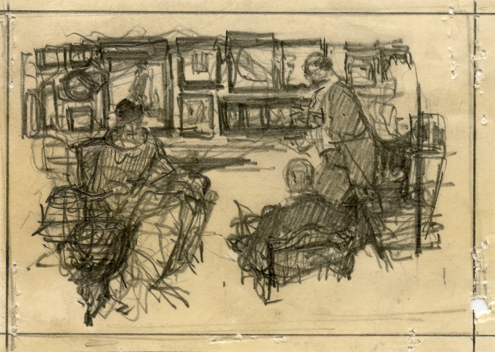
But Comic-Con is governed by the same laws of physics that apply to the rest of the universe, so many of the most interesting things took place quietly at the subatomic level. This year's lesson in quantum mechanics comes from these tiny preliminary sketches by illustrator Saul Tepper, found in a quiet corner of the exhibition hall:
 |
| For scale, those holes are staple holes. |
Each one is about the size of a postage stamp, yet they have all the DNA necessary for a larger, more elaborate image.

Tepper has worked out all the fundamental creative choices. His composition is settled, his priorities are established, his lights and darks are in place, he has decided on the gestures and the movement of each picture.


From tiny acorns such as this grew finished drawings, then big oil paintings on canvas, then pictures that moved and talked, and then 3D digital animation on IMAX screens.

 |
| (Detail) Note how Tepper has decided when to dig in hard with the point of his pencil (as with the hand raised to this woman's face), when to cruise along lightly and when to apply the flat of the pencil for tone. |


In their rush to get to the flashing lights and big screens at the LucasFilm and Sony Pictures displays, I'm not sure many of the participants recognized the seeds from which those mighty oaks grew. But the genetic code starts right here.
(Thanks to Comic-Con exhibitor Taraba Illustration Art for these sketches.)
21 comments:
Fantastic illustration designs collection here looking so great !!
David,
were those sketches for sale ?
is there a lot of old advertising / illustration art for sale at Comic Con ?
David, what wonderful leaps of imagery and scale. From the atom to the galaxy. So it is with thumbnail sketches, whether for movies or illustrations. Big, culture-shifting ideas are born in miniature. That really hit me when I saw Ralph McQuarrie's first exploratory pencil drawings of C3PO exhibited at the CTN convention.
Every year at Comic-Con I head straight to the Taraba booth for a sense of real beauty and craft.
Last year you showed us a picture of the Playboy bunny Avengers. Were they back this year? I am hot for that Playboy bunny Hulk.
I'm in awe of these drawings! Thanks for sharing.
Leave it to Fred to unearth these hidden gems. And leave it to you to realize their value.
Thanks for the jewels!
kev
Laurence John-- Not only were those sketches for sale, their prices ranged from $5 to $10. (They were stashed away in a small box in the back of Fred Taraba's booth, and are all gone now). There were a number of dealers in vintage American illustration art like Fred. (Illustration House, Graphic Collectibles, Grapefruit Moon, etc.)
James Gurney-- I agree 100%. Usually the distance "from the atom to the galaxy" is spread out a little more in the production process, but at Comic-Con they are all pressed up against each other in a way that gives you fresh perspective.
Ray-- Yes, and his art's not bad either.
MORAN-- No Playboy bunny Avengers this year, but they did have a group of Princess-Leia-in-her-harem-girl-outfit-versions of the Hulk, Thor and others. I don't exactly understand the rationale behind this group; they seem to have mixed in some DC universe heroes such as a Batman Princess Leia as well. Perhaps someone out there who follows science fiction and comics more closely than I can explain how I can subscribe to this publication?
Tororo-- I'm glad you like them. When you see them in person, it's extraordinary how much Tepper squeezed into these tiny boxes.
Kev Ferrara-- Yes, I'm a huge fan of Fred's book on 41 Illustrators.
He had a wide range of art. These small sketches were just the subatomic particles.
Inspiring! Thank you, I've never seen anything like these atomic masterpieces before.
what's interesting about these tiny sketches is how the brain 'fills in' the missing information and 'sees' a fuller image than what is abstractly there.
Just wondering (I've been out of town & too busy to research this), but are there any examples of Tepper's finished work from these (and other) thumbnails? Step-by-step examples by important artists fascinate me.
They are tiny, complete masterpieces. The tonal mastery reminds me of Seurat and Daumier.
Deborah Green-- Thanks, I'm glad you enjoy these. I was hoping they would find an appreciative audience out there.
Laurence John-- Exactly. But Tepper understands exactly the kind of shorthand the brain needs in order to extrapolate the rest of the image.
Donald Pittenger-- I have not seen any. Taraba's book on 41 Illustrators has preliminary sketches for a number of the artists he covers, but not for Tepper.
I am agree with your posting.
@ Donald Pittenger - The thumbnails containing two on a page look like they were done as part of the GE Monitor Refrigerator ad campaign. The GE model from the late twenties, early thirties had a distinctive shape with the compressor mounted on top and cabriole style legs left over from when the ice box was made from wood. There are a number of examples on line verifying that Tepper did worked on the campaign.
Larry: Could be; thanks. I'll keep my eyes open. Did a quick Google on "Saul Tepper General Electric" but the images that popped up were too tiny to confirm that they were Tepper's, and the compositions were different. Maybe something will appear later.
Speaking of Fred Taraba's booth at Comic-Con, you can see Fred and the vintage illustration in his booth at this TV interview from San Diego: http://www.youtube.com/watch?v=FlRrBf06WxM&feature=c4-overview&list=UUKENWP3qAu5KFk7a5MMOChw
Larry-- One of the most fun surprises of this whole blogging racket is when readers step forward with expertise you'd never dreamed existed. I am damn impressed with your knowledge of GE Monitor refrigerators. Thanks very much for the images; looks right to me!
Donald Pittenger-- I too spent a little time looking at refrigerator illustrations, and it turns out that in the '20s and '30s when refrigerators were newly exotic and fashionable, a number of excellent illustrators such as Tepper and Pruett Carter were doing full oil paintings about how glamorous refrigerators were. ("Now you can serve ice at your high society parties..." etc, etc.) What a hoot.
Nice to see the work of someone who has thought through things. He has enough control over structure that his imagination is free to play. He improvises on themes without being bogged down by the " how to.". He doesn't seem dependent on mechanical "tools," which really limit the mind's ability to freely create because in accepting a mechanical device you accept it's assumptions without addressing the difficult question of "what are my assumptions."
I like the way he ties his protagonists and antagonists across the centers of the page (whether they are individuals, two groups or a group and a individual.) using the elements of the scene as connectors. Really they are just lines that tie the actors together. A simple but powerful device, that can not be copied it comes from motivation as the artist activates his understanding.
The last drawing made me laugh because where all the energy and weight has been gather in the threatening standing figure on right causing even the picture on the wall to tilt toward him like a giant see saw. I am sure that is why he titled the perspective of the floor in the opposite direction.
Interesting choice of pictures from comic con David.
Thanks for sharing this information and beautiful picture.. They are really stunning... You did a great job.
Clipping Path Service in GroupDMT
Post a Comment