
The illustrator Mort Kunstler used to work for men's adventure magazines such as Stag or For Men Only.
 |
| Illustration for the Men magazine article, "Get to Comrade Zoltan with Girls." (1959). The article says that when all other interrogation tactics failed, "There was no choice but to summon the 'passion troops.'" |
Cheap and lurid, these magazines were printed on a low budget. They couldn't afford full color reproduction on every page. In the double page illustration above, Kunstler was told he could use full color on the right side, but only two colors (red and black) on the left side.
Didn't notice Kunstler's sleight of hand, did you? OK, look again to see how he finessed it:

The Russian soldiers were painted in two colors...
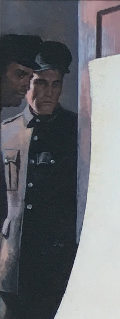
...and so was "comrade Zoltan..."


The real trick was how Kunstler used the artificial light in the room to disguise his color limitation.

Kunstler was faced with unreasonable constraints, but he knew enough about color and staging so that the restrictions didn't chafe or pinch his painting. He planned around them. He was easy in his harness.
And Kunstler wasn't the only one. In earlier days, technical and economic limitations on the printing process created all kinds of obstacles for artists but if they were good enough and imaginative enough, the viewer never knew.
Look at how the illustrator Henry Raleigh dealt with the same problem that Kunstler handled:

Raleigh staged the drawing to take advantage of the blue ink on the right side to convey a dour, obsequious man...


Today artists are blessed with unlimited rainbows of color, in cmyk or rgb variations. The computer monitor permits us to use full color on both the left and the right side at no extra charge. Nor does the internet constrain the number of copies created. One might argue that with all these technical advantages artists have finally achieved true freedom. But that's not genuine freedom, genuine freedom is being easy in your harness.
Didn't notice Kunstler's sleight of hand, did you? OK, look again to see how he finessed it:

The Russian soldiers were painted in two colors...

...and so was "comrade Zoltan..."

... but Kunstler subtly camouflaged the transition to full color with this red headed temptress:

The real trick was how Kunstler used the artificial light in the room to disguise his color limitation.

Kunstler was faced with unreasonable constraints, but he knew enough about color and staging so that the restrictions didn't chafe or pinch his painting. He planned around them. He was easy in his harness.
And Kunstler wasn't the only one. In earlier days, technical and economic limitations on the printing process created all kinds of obstacles for artists but if they were good enough and imaginative enough, the viewer never knew.
Look at how the illustrator Henry Raleigh dealt with the same problem that Kunstler handled:

Raleigh staged the drawing to take advantage of the blue ink on the right side to convey a dour, obsequious man...
...and used the warm color on the left to create this radiant creature:

Today artists are blessed with unlimited rainbows of color, in cmyk or rgb variations. The computer monitor permits us to use full color on both the left and the right side at no extra charge. Nor does the internet constrain the number of copies created. One might argue that with all these technical advantages artists have finally achieved true freedom. But that's not genuine freedom, genuine freedom is being easy in your harness.
17 comments:
What fascinating examples of limitations and how these artists overcame them. It wasn't obvious at all that the constraint was even there until you pointed it out. It's also amazing to see how '40s and '50s illustrators managed skin tones in a black + green color scheme.
That Kunstler picture is pretty awesome. He is talented to mix colors like that. How about talking about some of his awesome nazi covers?
Wow, a unknown Raleigh illustration. Thanks !
I never noticed that about the two colors. Now I'm looking at every old illustration I see to see if the colors are somehow fixed.
JSL
James Gurney-- I agree. It's interesting how much technical skill was necessary in those early days just to get to normalcy-- to achieve a basic likeness. (Think about the illustrators in the 19th century who only had wood engraving-- they had to simulate shading and modeling with with lines gouged into a wooden plank!) But those mid-20th century illustrators made skin tones in black and green look perfectly natural, and they could turn those same skills to being inventive in other ways.
MORAN-- Yes, Kunstler was definitely one of the better cover artists for those corny old men's magazines (called "the sweats" as opposed to "the pulps.") But I don't think we'll be seeing many of those covers here.
Li-An-- Even with the recent book about Raleigh, there is still a wealth of material out there that hasn't been revisited for nearly a century. Quality material worthy of attention.
Anonymous / JSL-- They were pretty good at hiding those things.
I should think he had to specify that the special mix red get overprinted on the CMYK page to ensure the same red or it would have all fallen apart. Brilliant design overall. As for wood engravers, they also signified "color" with their greys, and referred to these B&W engravings as having "good color" when done well. I imagine the print-literate of the period could tell what color was intended by the specific shade of grey too.
Fascinating -- thanks for the history and art lesson :)
This is an excellent example of some of the problems illustrators faced with limited full color pages in some magazines. Here, Kunstler came up with a very unique solution.
However—technically there is something even more interesting happening. The right side would be printed four color process inks while the left side would print in two colors but not process. A two color page—in this case red and black—would be printed using a standard 4A red or something close, about the color of the carpet. To achieve a continuous color of red on the carpet, Kunstler would have to paint the carpet in a color matching 4A red right on the money. This would have to be done so that when the right side was color separated, the process red (magenta) and process yellow could print together and match the 4A red on the left.
For that reason, I think we may be looking at a scan of the original art. Chances are, as skillfully as this was done, the printed illustration would show more of a difference between left and right than we are seeing here. The reds would have less depth and the grays would be much flatter, without the hint of reflected color. For instance, where is the blue gray coming from on the left. We are seeing blue gray in both the lamp and sofa.
At this time, before the wide spread use of less expensive offset printing, the public was used to seeing two color illustration. This could be an interesting post in itself. Many excellent illustrations were done in duotone without the need of full color.
Meera Rao-- Thanks for stopping in!
Paul Sullivan-- You are correct, we are indeed looking at a scan of the original. Those 1959 Men's magazines are hard to come by. But thank you for your expert technical assessment of what would be involved in translating the original into print, and how that would look. I didn't even consider another layer of complication, just to achieve a uniform red from one page to the next.
"Kunstler was faced with unreasonable constraints, but he knew enough about color and staging so that the restrictions didn't chafe or pinch his painting.'
I am not sure I would considered them restraints. Restraints like the rules of the game, make things possible. Which agrees with your conclusion.
The color choices in the Raleigh drawing contribute to the narrative in a big way. By contrasting the youth, vitality, and warm color in the young female character she seems to shine a light, like the sun, into the dark blues of the cold empty space of approaching death. Almost like day and night.
But the difficult of art is rarely in the obvious. As Corot wrote
"Reflections on Painting
The two chief things to study-are
form and the values
These two things are
for me the base
an serious part of art.
Color and execution
will give charm
to the work"
Very interesting! May I share this post? (linking back to this blog, of course)
- Bob S.
Boy! I love this chat!
Jaleen Grove-- Another historian with expertise on printing technology! You are why I have to watch my step with these blog posts.
Tom-- I agree with you that, unlike Kunstler, Raleigh weaves the content of his narrative into the color separation and it works out well. also agree that "restraints like the rules of the game, make things possible" although there are plenty of restraints that are just plain obstacles. If you were on a deserted beach without any kind of marking instrument you'd be limited to making lines in the sand with your fingers. At that point, the constraints are so severe, you might look for something else to do with your time.
Bob Supina-- I would be delighted if you would, thanks for asking. I enjoy it when people take the images I post by neglected or forgotten illustrators and re-post them on places like pinterest. Much of the reason for this blog is to promote great artists who deserve a wider audience than they get today. What I DON'T like is when people take my entire text and pictures, remove my name and re-post it as their own. At last count there are about a dozen bloggers who do that.
WIM GRUNDY-- Glad to hear it! I hope you come back often. The chats amongst knowledgeable people is the best part of this blog.
UPDATE: I obtained a printed copy of the issue of Men Magazine with this story in it. There is indeed a slight (but noticeable) disparity between the red color of the carpet on the left and right pages. I'm guessing that the publisher of Men assumed readers would not be focusing on the carpet. I'm guessing he was right.
The story itself was wonderful, about a man wrongly taken prisoner by the commies and tortured mercilessly for weeks-- beaten with clubs, burned with cigarettes, kicked in the throat and kidneys, bones broken, they left him lying in pools of blood, etc., etc. Finally, when he doesn't crack, four beautiful female guards take him off to their love pit where he has sex with all four of them, one after another. He says, all things considered, "he... was the luckiest man alive." One can see his point.
I think it's also interestingly to note how what's portrayed in each half cleverly aligns with the palette available. The women on the right, wearing silk robes of various colors, stand, or lounge and sit on well-lit, colorful couches. The lamp in their portion of the room is gold. The left page shows two men in much tenser postures: the main character, I presume, crawling on the floor, and a policeman at the door. A large portion of that page is taken up by a stark white lamp. The male figures are in dim light or shadow.
By thematically dividing the illustration to match the color difference, the illustrator creates a logical distinction that perhaps makes the visual difference appear more natural. I also notice that there is no continuous line carrying the red carpet from left to right, which might help disguise the subtle color difference others have mentioned.
I m so glad to visit this blog. This blog is really so amazing
Thanks for sharing, this is a fantastic blog post.Much thanks again.
Post a Comment