
Not everyone cares about that line. This may be due to the Great Acceleration: internet audiences with unlimited content and shorter attention spans, less patience for pictures that don't move, a coarsening of taste. It may also be due to a lack of interest in the kinds of pleasures that excellent drawing can provide.
Or, it could be the result of increasing shamelessness on the part of certain artists. Andy Warhol was not much of a draftsman but said that "art has to transcend mere drawing" and replaced it with photomechanical reproduction. This week Holland Carter of the New York Times pronounced Warhol "the most important American artist of the second half of the 20th century."
Whatever the reason, many artists, illustrators and cartoonists don't seem to take drawing seriously, and settle for rudimentary linework.
George Lichty's style was famously loose and slapdash, yet maintained genuine quality.


Yet, if you take a close look you can see there's a whole lot of shrewd observation in those hasty lines. Just look at Lichty's assortment of descriptive hands holding cigars, holding note pads, or clasped in natural poses.

 |
| These hands have the ease of random squiggles, but they are not. |

 |
| Beautiful brushwork, like a zen master. |
 |
| Lichty knew exactly how to draw a hand clasping a cigar before he reverted to this shorthand version. |
Other telltale signs of quality in his drawing: note how the pipes and cigars set to the side in those mouths and the character of the smoke.


Lichty is a good reminder that drawing can be light and breezy, yet still be a vehicle for imagination and intelligence.


Here's a book with character

And a lumpy tree with sparse, scraggly leaves-- just enough for background atmosphere, and no more.

Lichty is a good reminder that drawing can be light and breezy, yet still be a vehicle for imagination and intelligence.
13 comments:
And then there are those hand-drawn frames and what looks like chisel-point pencil shading. The latter detailing is clear in the enlargements and even the full-size images ... but probably invisible when seen in newspapers.
Very nice. Some of Hank Ketcham's early Dennis the Menace drawings had a similar feel. Loose and yet not.
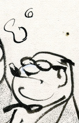
I love the line that represents the chin of the guy in the 6th enlargement. Just perfect.
the Senator’s profile doesn’t compute for me at all.
... well, it does in the 1st drawing, but after that i’m seeing a ping pong ball balanced on top of his nose, and a pince-nez on the ball. i can’t for the life of me turn that ball into a nose, and the thing it’s on - which looks like his nose (and i assume is) in the 1st drawing - into the upper lip of an open mouth, which is what i assume it’s meant to be in the 2nd and 3rd drawings.
that aside, the folds in the clothing are nicely done and show that he knows how they go in real life. i agree the hands are nicely done too. the one holding the cigar has almost gone UPA animation graphic.
Donald Pittenger-- That's true, much was lost when these were reproduced at a fraction of their size, which is one of the reasons for showing these originals in a way that enables viewers today to appreciate Lichty's details. Still, I think that some of his broader exaggerations, such as that rubber capitol dome or those bent desk, survived the shrinkage. I know you're an expert on car illustration; what do you think about that goofy car?
Jacques-- an excellent analogy. I think Ketcham and Lichty may be the two best cartoonists with that hasty, scribbled style. There is a lot of wisdom beneath that light hearted surface. That style was considered very innovative in the 50s and has been much imitated (but rarely equaled) since.
Unknown-- hah, yes that swirl is the essence of Lichty.
Laurence John-- I understand what you mean. The senator is one of the very few recurring characters in Lichty's cartoons. I suspect he started out looking like the college president in the first panel; eventually Lichty drew the senator so quickly and reflexively that I suspect some of the abstractions seem to come disconnected. On the other hand, I am impressed that there is so much range in the other faces in Lichty's cartoons. He is working with very basic ingredients to make simple faces and yet I find a great deal of subtlety and variety in the result.
Okay David, about that car ...
It's clearly a prop and not essential to the joke, so Lichty simply indicated it in his usual style. As for its appearance, it's a generic, postwar compact type -- something a 1968 US senator would be unlikely to have instead of a big, black Buick or Chrysler. But reporting wasn't Lichty's goal, needing only something to fill in the left part of the composition.
Allowing for his casual style, he did roughly follow rules of perspective. The fender line, allowing for some theoretical structural roundedness does meander in the direction of a vanishing point. The roofline is nearly flat, consistent with its position and vanishing point relative to the eye level used by Lichty.
So, like his underlying understanding of the structure of hands, his knowledge of perspective is there, though disguised somewhat stylistically.
I was going to say something a long the same lines as Donald. It is the underlying geometry or perspective that holds everything in its proper place that makes the casualness possible. Once the forms are conceived and properly placed (which is really the hard part of drawing) one can be care free (or tight if they which) with the handling of the tool. Conceiving relations, between things and space, is the hard part and it is probably the reason why abstraction can have such and appeal as you get to feel the joy of mark making without any objective constraints.
He must've had blocknotes over blocknotes of scribled hands alone.
The interesting bit with the car is that he went for shading the hard highlights of the paint. Looking a bit out character perhaps, but probably enjoyed it. Or hated, go figure.
Yes, immediately I think of Ketcham too.
I just love these. Reminds me of bamboo painting and drunken style kung fu, or a good string of curse words and on and on. Tom, I like the way you phrased that last sentence about abstraction.
David, you simplified some of the sweeping themes of this blog with this one, it is for me undeniably masterful, cliche, realistic, abstract. With the great illustrators we get to have our cake and eat it too. The sacred and the profane as a perfect pair.
It's fascinating to see where muscle memory will lead you when drawing cartoon faces.
Like the evolution of a signature, it starts explicitly cursive and then evolves towards an abstract and personal markmaking.
Lichtys speaking characters in profile are like a doctor's signature -- signed so many times that it's no longer legible. Not unpleasant to look at though.
-richard
I've always been fascinated by Lichty's cartoons, the style of which reminds me of the late Canadian-British cartoonist Jim Unger's "Herman" which latter was capable of expressing a tremendous sense of humour and making you laugh just looking at the line drawing.
https://www.theautomaticearth.com/2018/12/fairytales-and-snowflakes/
Beautiful. Thank you for posting all of this. I have been a fan of Lichty's work since I was about 8 years old. I desperately wanted to be a cartoonist back then, but I couldn't see how I'd ever get that good. Then I saw Grin and Bear It and thought, if THIS is considered professional-grade, then surely I can at least do that. I'm happy to see the work close up finally. I am an artist myself and in my cartooning work, try to balance this sort of "controlled slop" style with precise hatching.
Post a Comment