
It has been a while since I've shared another reason why I like the work of illustrator Robert Fawcett.
Even at the height of his career, Fawcett continued to sketch from the model every week. At the end of each session, he'd open the lid of his model stand and toss in the day's efforts. When he died, there were several hundred drawings stashed there.


One result of Fawcett's continuing commitment to observation is that when he illustrated a figure, he was not content with the usual simplistic shortcuts: symmetrical people standing perpendicular to the ground. Instead, he observed that people are often bent or lopsided, reflecting life's tug of war between gravity and organic matter:


One of the ways Fawcett's life drawing regimen paid off is when he received an assignment to depict a limp figure-- someone whose muscles went slack and who collapsed in a jumble-- Fawcett was able to capture such figures in a very convincing way. Again, no stereotypes here.


86 comments:
Fantastic - every time I look through your book on RF , it's as fresh as the first time . His fig. drawing books are something I review often - wish vol. 2 was coming --- of all your books !
I agree that a volume 2 would be lovely, especially on Fawcett. I notice that Manuel Auad's website ad for the Briggs book states, "I do not reprint." True so far, but I wish he would make an exception for the Fawcett book. I've got my copy--but some things deserve to be kept in print.
Look again at Michaelangelo's Pieta. What gives the expression of limpness is not the amazing mimesis, but the draping, near dripping liquidity of flesh suggested by the expression; an idea which clearly guides the rendering from within.
I don't feel the limpness in these figures. I only see academic life drawings of models playing dead on the model stand; schematic accuracy, textural accuracy, surface accuracy. The excellences of Fawcett's efforts and plain to see and appreciate, but what is there to feel beyond that? His compositions are perfectly acceptable and often interesting solutions. But they are ossified by being forced through his obsessive descriptive compulsions, then washed out by his dull values and dull colors. I know he wants me to admire his drawing, and he's succeeded at that. But is that a worthy artistic goal?
I know I should leave out the color commentary per se, because he was deficient from birth in that area. However, his work not only lacks good color, but in over-describing in the lights, outlining dogmatically, and going ahead and stating general dull colors and general dull values, he leaves no room for the viewer to even imagine good color or light effects where they might have been. By not allowing us to fill in his natural blanks with our natural plenty, he is, in effect, forcing us to experience his unpleasant chromatic and artistic limitations. And for every picture he makes, no matter what possibilities the individuality of the picture might have held. Which is just why his work has a pronounced monotony to it. With no light effects to speak of, his work stays flat in more than affect.
No one could accuse Fawcett of lacking integrity in his drawing, certainly. He was a master of a certain kind of academic accuracy. And the blocking of his scenarios is equally serviceable. But his lack of expressive juiciness and fixation on descriptors makes his art dry as a bone. Everything in his work drags on the eye like a cat's tongue on sandstone.
At the time he was working, his parched style was radical and new and influential. But like a lot of radicalism, in the long run one often finds that far more babies were thrown out than the state of the bathwater warranted. Every one of his pictures would have benefited from a brief period in the rain.
al mcluckie and Robert Cosgrove-- Thanks for your kind reactions. A large part of this process is to put the work of deserving, under appreciated artists back in front of the public. it's particularly gratifying when readers recognize and engage on the qualities of this work.
Kev Ferrara-- I agree that Michelangelo's masterpiece (he was said to have spent 9 months picking out the marble alone) is superior to Fawcett's illustration, despite the Pieta's clear flaws. (I suspect that if Fawcett had two characters so far out of proportion you would've burned him for it here.)
As for some of your other points: I generally agree with you about Fawcett's use of color, and I don't cut him any slack for being born color blind. A number of artists (such as Peter de Seve) are color blind, although many of them have a heightened sense of value which helps them compensate, and others are great draftsmen. If the resulting art can't cut it they should find another line of work.
In answer to your question about whether admirable drawing is a worthy artistic goal, my answer is "yes."
As for your assertion that "his work has a pronounced monotony to it," I think the words you were looking for is a "distinctive style." Fawcett is a virtuoso of ink and line, with a broader range of marks on paper than Gibson, Coll, Flagg, Booth or any other pen and ink illustrator you might name. His opinions are so strong and his style is so virile (and sometimes arrogant) that it sometimes overwhelms his subject matter (which is why, for example, he could never compete with lesser artists such as Jon Whitcomb when it came to painting pretty girls in romance stories).
As for your parched vs. juicy dichotomy, I understand you have a genetic predisposition for shiny, wet looking colors; I admire Sorolla too. But there is a separate aesthetic out there, a god so ancient that it was old long before your oldest gods of oil paint were born. Many people (including you, apparently) have come to believe that "radical" means new and avant garde, but in fact radical means pertaining to the root or origin of things. You are unintentionally correct that Fawcett is "radical," in that the carved lines, scratches, gouges, drybrush, and other marks that make up the fossilized ink trail do indeed go back to the root of things. I promise, I like your symphonic embellishments too but those older gods have not lost their sway over me. Maybe it's a lizard brain thing.
I suspect that if Fawcett had two characters so far out of proportion you would've burned him for it here.
I overlook mimetic errors made in imaginative good faith all the time. In fact, if I don't see those errors, that's an immediate tell that the work lacks aesthetic imagination. (And, depending on the year, was probably photo-slaved.)
"In answer to your question about whether admirable drawing is a worthy artistic goal, my answer is "yes."
That wasn't what I was flagging. What I feel is that Fawcett wants me to admire his drawing more than he wants me to enjoy his illustrations.
As for your assertion that "his work has a pronounced monotony to it," I think the words you were looking for is a "distinctive style."
I find each picture monotonous on its own.
Fawcett is a virtuoso of ink and line, with a broader range of marks on paper than Gibson, Coll, Flagg, Booth or any other pen and ink illustrator you might name."
No doubt. However, that the implementation of a broad repertoire of descriptive marks can still result in deadly dull images is the deep point of about half of everything ever said about expression.
As for your parched vs. juicy dichotomy, I understand you have a genetic predisposition for shiny, wet looking colors
No, that wasn't the idea. I mean by "expressive juiciness" anything that will break the monotony of his obsessive discreteness, allowing for the imagination to enter the picture. That Fawcett's values have no resonance or graphic evocative power shows how monomaniacally fixated he was on the one burrow he knew how to dig. It's like he never learned that among the basics, there was more to it than where his talents naturally led.
Like Kev, David, i can't really fault Fawcett on a technical level. Even the washed out colours and muted values don't bother me. The main problem for me is that i can feel the presence of the photo ref too clearly (but that's my criticism of a lot of '50s-'70s illustration too). That, coupled with the fact that the figures are usually too perfectly arranged, and the acting a bit wooden (in a TV melodrama kind of way) lends the whole thing an air of staginess.
There's a whole separate discussion here - which will take too long to go into now - about different types of 'artifice' and how one artist can make the most ridiculously, stylised confection seem utterly believable, while another labours away trying to create 'realism' and it falls flat. In short; the difference between good and bad artifice.
Notice that my problem is with how he dramatises a scene, and brings it to life (or doesn't), rather than anything to do with surface mark making.
Great exchange between David and Kev - thanks guys.
I think Fawcett's 'dullness' (in all its aspects) is largely a consequence of his weakness in realising images as forms fluxed in depth. Awareness of space/depth/proximity (and the poetry to be mined thereof) is, I believe, one of the senses most important to the vivification of an image.
Kev Ferrara-- It seems to me that our difference of opinion about Fawcett echoes previous differences about Dubuffet, prehistoric art, Morris Louis, tribal art, Burri, Rothko and abstract art in general (despite the fact that many of these other artists reside on the opposite side of the solar system from Fawcett).
I suspect the unifying difference is that I'm willing to assign more value to surface elements such as abstract design, while you require an artist to orchestrate a symphony of different elements into some kind of poetic distillation for the purpose of communicating content about something. (And by that you mean content other than "this is the color red.") Woe unto the artist, or the culture, or nation or generation that omits an ingredient from your recipe for high art (although I suspect most of the art from most of the globe for most of human history would not fit in your straight jacket). I treasure Sorolla and Sargent but I would not limit myself to an exclusive diet of their work, nor would I grade the rich multiplicity of art on the strict criteria of a relatively recent western painting tradition. It's possible to experience excellence in classical music and still appreciate excellence in jazz or blues or rock. Applying different criteria to different kinds of art doesn't require us to give up standards altogether, it just requires us to be more open minded and receptive about which standards apply.
The fact that you describe Fawcett as "a master of a certain kind of academic accuracy" and characterize his work as "academic life drawings" suggests to me that you haven't settled upon the criteria to apply to what he does. Academic accuracy is Pierre-Paul Prud’hon, and it never appealed to Fawcett; he was quite outspoken in criticizing peers who took that path. I'd call "academic accuracy" a gross mischaracterization of this kind of drawing.
One thing we do agree about is what you call Fawcett's "obsessive descriptive compulsions." Not on all of his work, but several of his major pieces have a dense, coruscating look and I would say that "obsessive" is not an inappropriate adjective. The only difference is that in these drawings I don't view it as a fault.
(CONT.)
Kev Ferrara-- Our exchange on Fawcett reminds me of the exchange between Andy Warhol and Albert Dorne:
WARHOL: "Art must transcend mere drawing."
DORNE: "Andy, there's nothing all that fucking 'mere' about drawing"
Laurence John-- I think your point about "different types of 'artifice' " is extremely important, and one we haven't considered around here. I think there is a good argument that a painting by Bouguereau, which goes to extremes to create the illusion of 3D reality, contains more artifice than an abstract painting which has no such pretensions and tries to fool no one about what it is. Getting closer to the middle of the spectrum, Fawcett is less interested in illusion than Sargent-- he doesn't carefully replicate skin colors, he doesn't capture light and perspective, he makes intense whorls and black and white designs. Which contains more artifice?
chris bennett-- the same point could be made about "vivification of an image." Would you say that a Franz Kline painting is pretty damn "vivid"?
Kev Ferrara, Laurence John, chris bennett-- Sorry guys, I tried to attach examples of Fawcett's work to illustrate some points in my last answers and failed miserably. Apologies for my technical incompetence; the best I can do is offer you a couple of urls to blog posts where I've reproduced the same images before:
https://illustrationart.blogspot.com/2009/04/one-lovely-drawing-part-24.html
https://illustrationart.blogspot.com/2013/03/warring-with-trolls-part-2.html
https://illustrationart.blogspot.com/search?q=fawcett&updated-max=2012-09-28T05:26:00-04:00&max-results=20&start=6&by-date=false
One of these days I'll learn how to use this here internet machine.
David: "Fawcett is less interested in illusion than Sargent-- he doesn't carefully replicate skin colors, he doesn't capture light and perspective, he makes intense whorls and black and white designs. Which contains more artifice?"
David, you've listed visual properties turned into abstract surface marks, but that's not where my problem with Fawcett's work resides (he excels on the technical / abstract mark making level). Where he falls down is in the staging, composing, acting etc.
If you aim to re-stage reality (with people looking and acting as people look and act, as Fawcett is doing) it can glare when anything is slightly 'off' and feel 'artificial' or 'stagey' ('bad artifice').
Whereas if you build a cartoon world which has its own rules (e.g. Herriman's Krazy Kat), or stylise reality enough that it no longer aims to fool you that what you're looking at is 'realism' (e.g. Cuneo, Jorge Gonzalez, Ralph Barton, John Held etc.) then it can be imaginatively easier to enter the image ('good artifice').
p.s. I got into all of this after hearing about the 'uncanny valley' effect, years ago when i worked in animation. Then i realised it applied to realism in painting too; paintings that attempt a high level of 'realism' but the figures look like waxworks. Then i realised it applied to 'dramatic staging' too; paintings (or films) that attempt to be realistically staged, but fail to convince for various reasons. The uncanny valley turned into a minefield.
David: the same point could be made about "vivification of an image." Would you say that a Franz Kline painting is pretty damn "vivid"?
Yes, indeed. Very much so. I mean 'vivid' as in a strong sense of presence. But it depends on what is being made more vivid or present. A strong design will possess this quality (which is amped up by making it bigger), but because it does not refer to anything outside of itself, this quality becomes one of charisma without content.
With images representing something other than themselves (say, a painting/drawing of violin on a wall), the job of giving them presence is, by definition, contrary to this very condition. As you've no doubt guessed, my example of the violin painting begs the question of how Kev's objections to Fawcett's deadening literalism are any different from criticisms of trompe l'oeil. In other words: in what way is a strong sense of presence in representational art distinct from the literalism of mimetic rendering?
Kev has already supplied the answer to this in stating how suggestion (in all its forms, not just rendering) is the prime mover of aesthetic content. I tend to think of 'suggestion' as the abstracting fulcrum on which poetry and literalism are balanced. But I'm in danger of misinterpreting him and getting in the way of his reply to you, which, I'm sure, will cover these things far better than I.
Thanks Laurence you make a good point. (And one which, I'd say, it is obliquely related to the question of presence.)
Fawcett is less interested in illusion than Sargent-- he doesn't carefully replicate skin colors, he doesn't capture light and perspective, he makes intense whorls and black and white designs. Which contains more artifice?
Sounds like somebody has never noticed that Sargent is far more abstract than Fawcett.
Anyway, Fawcett's inky descriptiveness is attempting to do the same basic thing as Sargent's painterly suggestiveness. Except with less success. The amount of 'artifice' involved is basically the same. Which is to say, if you want to say any semblance of memesis or reference is artifice, they are both nothing but artifice. And the same could be said of books and films and plays. They should have nothing to do with reality, if they are to be "pure" according to the high priest of the authentic Mr. David Apatoff. (see, two can play at this dumb game.)
Regarding Dorne… Albert Dorne actually felt his drawing, which is how he was able to both make it so expressive, and construct it so evocatively. Fawcett isn’t in his league.
I don't have time for a big long reply to everything. But here's something...
1/2
Let’s start with one basic idea, so we have some agreement to build on.
A hole in a carpet is formed by the carpet surrounding that hole. A window’s view is formed by its frame. When we speak of these things, a hole, a window, we are speaking of something which isn’t, not of something that is. And we only understand each by virtue of that which forms the void. This is the nature of suggestion.
Suggestion is a deliberately-formed implication gap. It is a purposeful void in the weave, where sufficient information is absent, but yet, that gap or interval – what is missing and where - is informed nonetheless. And it is informed by that which surrounds and forms it. It is a window frame, where the frame itself, through suggestive information, evokes to the mind the view within it.
In art, the nature of that imaginative/implicative gap (what would be there if what is not there were instead actually, somehow, there) is located in conceptual space, identified as a reference, and formed on the pictorial surface by virtue of the way that that gap has been notated into being; by its immediate local context, as well as by any larger context necessary to its understanding.
The simplest version of this in art can be found in the consideration of lost edges. This Zhaoming Wu charcoal portrait has many poetic lost edges. And it is the found edges that notate into being its lost edges, the “found” extant descriptors that notate into being the nature of the lost nonexistent descriptions. So the head feels solid, even when there is often nothing there in the rendering to describe the head’s contour or its sculptural form or its hardness. This bit of magic is happening by virtue of the notations that form around the lost information, the described head tells us of, implies or evokes to the imagination, the absent head information. Unless there is sufficient extant information, the lost information cannot be recovered by the imagination.
In the above paragraphs, I’ve done my best to describe the basic structure of suggestion. There are many dozens, perhaps hundreds of different kinds of suggestions in art aside from the lost edge. Each of which has a similar basic structure to what I’ve described, but each of which also has unique aspects.
2/2 (edited since original post)
Kev: "The amount of 'artifice' involved is basically the same. Which is to say, if you want to say any semblance of mimesis or reference is artifice, they are both nothing but artifice"
This is my fault for bringing up artifice. I said to David in my comment above that I'm not using the word to mean mimetic rendering. I'm talking about dramatic staging, and varied attempts at 'realism'. And how some fail at that.
Of course, all paintings and drawings are 'artifice' if we simply mean 'illusion'... fooling us into perceiving 3D space where there is none. But that's not the way I'm using it.
Thanks Kev.
I'll just add a little if I may.
I believe the vividness, sense of presence or actuality given off by the Zhaoming Wu drawing comes entirely from its suggestiveness, a large part of which is the lost and found principle you have so well described.
The literalism of trompe l'oeil paintings means they can only really fool the eye when depicting a very shallow space. With an artful image our subconscious reading of its suggestive elements means they are coercing us to imaginatively 'fill in' or supply the missing special sense given to us by binocular vision, changing position (be it subtle or profound) and past experience in relationship to things visually apprehended.
I'm talking about dramatic staging, and varied attempts at 'realism'. And how some fail at that.
I agree with your insight about the uncanny valley principle applying to realistic blocking. I'd never thought about it that way.
However, I would add that one big reason that over-describing is such bad illustrative poetry is because it freezes action. Thus, Fawcett's figures aren't simply stiff because they are melodramatically clunky, they are also stiff (and undramatic) because they have been frozen, permanently knitted into place by relentless description.
I also take Chris' point that his figures don't really express through spatial depth. This was what I meant when I wrote earlier that "With no light effects to speak of, his work stays flat in more than affect." A lack of believable light effect actually causes flatness.
Laurence John-- I agree with Kev that your "uncanny valley" analogy introduces a very helpful concept here. So many artists work hard for realism, and may even get 95% of the way there, only to expire in the dreaded uncanny valley. The horrifying 5% that doesn't work leaves them so far short they might as well not have tried to go at all. So they try to salvage the 95% for which they slaved, through gimmicks like heavy shadows to conceal their inadequate parts, or distracting lighting effects, or poses which hide faces or hands that don't quite work. Those tactics can preserve the benefit of the doubt for a picture or two, but ultimately the artist's weaknesses reveal themselves.
I think the uncanny valley applies far more to realism in faces than to staging, because a near miss in faces looks affirmatively creepy and unnerving to us-- those facial expressions that make you think of a dangerous mental patient or a pod creature from Invasion of the Body Snatchers-- while a near miss in staging often just looks clumsy and amateurish, not threatening.
Fawcett was capable of doing highly representational work but after the first few years of his career rarely attempted to go there. In fact, pictures that looked photo-representational on the surface (such as his Sherlock Holmes series) quickly disintegrated into the craziness of sub-atomic particles when you took a closer look. Fawcett obnoxiously upbraided students and even his peers for polishing and polishing their images in order to achieve a dazzling likeness. He urged them to reconsider their goals. But when it came to staging, he was widely respected as a master of British understatement, employing a tilted head or a raised eyebrow where his American born peers would use an explosion or a splash of scarlet to affect the dynamic of a picture. I would not say that the two illustrations here are the best example of that, but if you read his book on The Art of Drawing or his materials for the Famous Artists School, you will see that he was quite eloquent on the staging qualities being discussed here. I think at some point he decided he had other fish to fry.
chris bennett wrote: "because it does not refer to anything outside of itself, this quality becomes one of charisma without content."
This is a point I've waltzed around with Kev on, and I'm not sure there is a place for a meeting of the minds. Kev has yet to show me a picture that totally "does not refer to anything outside of itself" because I think that the color blue can refer to something outside of itself, just as a vertical stripe can refer to something outside of itself. As long as we are psychologically complex human beings who process data subliminally and think in analogy and metaphor, I don't see how even an abstract painting can be quite without content. Obviously this doesn't satisfy Mr. Ferrara's notion of content. I also believe that while there is much to be gained from spending hours poring over the layered iconography and symbolism of a precious Van Eyck, there is also much to be gained from a huge red Rothko painting over your shoulder adding warmth, solemnity and depth to the tone of a room, (or a wall sized action painting by Kline or Gottlieb painting shaking up your metabolism). I understand that these last examples of content fail some people's legislative definition of "art." I'm saying that's OK.
I agree with you these latter examples do have "charisma" (which as you know comes from the Greek word for "blessing" and refers to a divinely conferred gift or power.) We could discuss whether their charisma is "without content" as discussed in the preceding paragraph, or I could save us all time by asking, "who says that a blessing without a specific narrative content necessarily fails as art?"
David:" ... while a near miss in staging often just looks clumsy and amateurish, not threatening"
To be clear: i wasn't implying that bad staging felt creepy. Just that the 'off' feeling was analogous. Rather than the creepy feeling you get when you see a human but not quite human painting or CG model, the feeling (in the case of staging and acting) is more 'this doesn't feel realistic' or 'this feels wooden'.
David: "But when it came to staging, he was widely respected as a master of British understatement..."
I can see that, but i also see a theatrical stiffness in the overly formal, overly precise blocking, which could equally be the result of a British theatrical vein.
On the Uncanny Valley analogy...
The 'uncanny valley' is a dip in a curve, that represents a sudden decline in comfort as cgi nears mimetic fidelity. There is some research to back up this dip. Though I'm not sure the model of pictorial experience used was all that sophisticated. But there is certainly a truth in there somewhere. It has been said that the dip in comfort relates to the discomfort in recognizing mental disability. Probably physical disability as well; the stiffness of parkinson's, old age, facial paralysis, or the frozen corpse, and so on. Even the strange feeling we get from one of those stiff plastic halloween masks might relate to the effect.
(It is worth thinking of this in a wider way through something Howard Pyle said; "The better your picture, the more a little error calls attention to itself. As a single pebble in an otherwise comfortable shoe will quickly call attention to itself.")
Getting back to Laurence's analogy, I think we can walk it back to something else he pointed out earlier; which is the photo dependency. I think the connection here is that photography is so unnatural in the stiff, inexpressive, non-compositional way it freezes reality that allowing it to unduly influence a work of art will inevitably result in its unnaturality being transferred to canvas. Life is change, life is movement. There is no truth in a frozen instant, only fact. Having said that, I think photography can do well capturing the story of an interesting face. Because a face can contain a full story on its own. But it must be one heck of a face, and the credit for the photo goes to the face, not the finger pressing the shutter down.
With gesture and action, the problem is shown more plainly; the frozen instant captured by a camera is akin to the frozen mask-like face. There is some uncanny about it, literally.
*There is something uncanny about it, literally. (Sometimes that pebble in a shoe is a single syllable.)
Kev has yet to show me a picture that totally "does not refer to anything outside of itself" ... As long as we are psychologically complex human beings who process data subliminally and think in analogy and metaphor, I don't see how even an abstract painting can be quite without content. Obviously this doesn't satisfy Mr. Ferrara's notion of content.
This is a dire paraphrase of my arguments. I have clearly done a poor job explaining my points.
We’ve never had a deep discussion on here about the nature of “content.”
As with everything I am interested in the qualitative hierarchy of visual content, in order to get to the high end and see what makes it tick.
At the low end of the spectrum (literally), yes, you can say a red wall has content. You can say excellent performative crying indistinct from real crying has content. You can say passing gas during a staff meeting may have content (I mean symbolic content; hopefully nothing more than that.)
The issue in the above cases is that the proffered ‘content’ is dead simple. It is so simple in fact, so basic, that in each case, we may not even be dealing with communicative intent at all. The red wall may have been painted by kelp, butchery, or oxidation, the crying may be real or caused by brain damage, the gas a purely accidental emission. And without communicative intent, I don’t think we are talking about ‘content’ in the sense that we mean it.
And if we can’t tell purposeful signification from random sign-like phenomenon, are we even talking about Art? Let alone Art worth talking about? Why are we bothering? Let's be blunt: If somebody says a Geode slice is ‘a work of art’ they’re a hack interior decorator, and don’t really belong in a philosophical conversation. Nor do collectors of corkscrew Akro Agates belong in the same conversation. For it takes no talent whatsoever to choose among a favorite result of a random form-generating process.
Calling collectors of found objects 'artists' is like saying that the couple that picks out floor tiles, wallpaper, and drapes from the stock available at Home Depot are 'artists.'
If a creator purposefully makes their own geode-slice or corkscrew agate looking painting, this is the same as making your own tile, wallpaper or drape pattern. That is what we call design. It doesn't matter if the pattern is hung on the wall or glued to the wall. A frame merely concentrates interest, it doesn't transform the content within it by some magic means.
There is no need to compare applied designs or fabric swatches to a painting by Harry Watson. Calling what Harry Watson does 'design' denigrates his work, and destroys the basic conceptual distinction between applied design and Art.
In communication, complexity and its structure matters. It keeps us from floundering around with uninteresting edge cases, giving credence to the sophists, pretenders and fakers. Saying design and art are the same is the opposite of saying something useful.
Kev wrote
“Because a face can contain a full story on its own. But it must be one heck of a face, and the credit for the photo goes to the face, not the finger pressing the shutter down.”
http://philippehalsman.com/?image=the-frenchman
The qualitative and structural features of Art that make it more advanced than Applied Design are the same qualitative and structural features that make thought more advanced than mood. That’s the simplest way I can put it.
Regarding reference: We've discussed for years on this blog the probability that there is no such thing as wholly non-referential art. I’ve said that Jackson Pollock's work resembles what happens when a car speeds through a mud puddle. We've talked of patchwork art looking like an aerial map. We’ve discussed how any random arrangement of form becomes a projection test, where one can, with a modicum of imagination and suggestibility, ‘see’ similarities to the world. And so on. Nobody’s arguing for art purified of reference (except pretentious graphic designers of the high modernist stripe.)
The distinction of interest with respect to reference is between Art and Writing. What makes Art different than Writing is the dependence of the latter on ready-made references to convey essential meanings.
References require inspection, decoding, and recall. A clever heuristic for determining how meaning is communicated in a painting or drawing, is to note how quickly one segues from experiencing the picture (being in the stunned state of aesthetic arrest) to inspecting the picture in order to understand it.
It is literature’s basic nature as a mode of communication that its code must be inspected in order to be understood. Which is why nobody looks at a page of text from a distance and thinks they understand it. The meaning of the page cannot be intuited aesthetically. It must be decoded. The page is not the canvas literature paints on, nor is the paragraph shape. The words are chosen, not created.
Everything in Art, conversely, is created from scratch. Thus there is a tremendous amount of freedom in how meaning is conveyed. This allows imaginative gaps to be opened up everywhere and between anything, including within the references. And in these gaps within the references (and without them), the essential meanings of the references may be expressed to the imagination directly by the orchestration of sensual forces. Thus, the references themselves don’t actually require recall in order to be understood. This is the sense in which great art creates its own reality.
This is a difficult concept, so I’ll put it another way. It is easy to think of depiction in art as mere illusion. But there is a distinction between the illusion as trick (Trompe L’Oeil, Op Art) and what is going with illusions in greater Art. Depiction in great art is actually only the illusion of depiction-as-reference. What is actually being depicted is the suggestively meaningful forces that sensually define the meaning of the references. Thus we understand the references sufficiently through aesthetic apprehension to understand the image. This is why Harvey Dunn said ‘A picture is its own definition.’
Beyond the period of aesthetic arrest, once the Art spell loses its power over the viewer, the meaning-broadcasting deed has already been done. And one is free to read the references in a word-like way and recall associations at whim.
David: "who says that a blessing without a specific narrative content necessarily fails as art?"
Is a rose a work of art? Is a thoroughbred at full gallop? Or a flawlessly plastered wall? The arrival of spring? Nicole Kidman's body? A Tiger Wood eagle at Augusta? A large rectangle of dark reddish cloth hanging on a metropolitan gallery wall? (or a highly enlarged single comic panel saying "I know how you feel Brad")
All have their own gush of charisma. To say this alone qualifies these things as art is the same as saying all that glisters is gold.
But every one of these examples do have a specific narrative content to them. The question is whether an authored narrative structure qualifies, or fails, as art.
David wrote
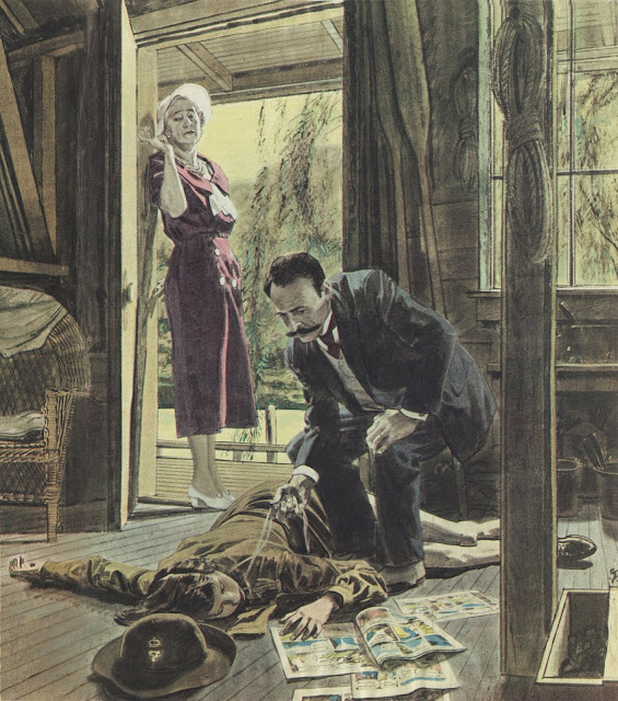
“One result of Fawcett's continuing commitment to observation is that when he illustrated a figure, he was not content with the usual simplistic shortcuts: symmetrical people standing perpendicular to the ground. ‘ Instead, he observed that people are often bent or lopsided, reflecting life's tug of war between gravity and organic matter:”
Maybe your not being critical of symmetry David but it sounds like art school talk where a prowerful organizing principal gets knock down as being old fashion and boring by people who can not do what they are criticizing . Or when modern critics try to make modern art sound innovative and revolutionary by rejecting the values of the past. Bad figure drawing is not symmetry’s fault. In fact understanding symmetry makes good figure drawing possible.The human body’s arrangement to gravity could be a “tug of war,” but more then likely it reflects how nature harmonizes and creates beautiful arrangements when different forces come into relation with each other. The “war,” analogy has little to do with art. One can just as easily say gravity’s our friend because it anchors and supports us and harmonizes by relating all things to one point, the center of the earth
The principle of symmetry is felt throughout Fawcett’s compositions in doorways, aisles ways, the church windows chairs and floors.The man made environment of rooms made up of horizontals masses and verticals masses is the perfect contrast to the rhythm of organic matter and the emotional responses of the human body and this staging focuses the viewer on the human drama at hand which is the point of the illustrations. They may feel artificial and not “realistic, or believable,” but most older entertainment feels the same. I like how readable they are as one element in the pictures leads the eye to another. From the hat in the foreground, to the horizontal body in death contrasted with the two vertical figures. Form which the eye rises with the ‘calm and puzzled,’ detective’s arm and continues up to the woman’s body framed by the doorway and finally too her apprehensive and worried face which directs the eye us back to the beginning of our journey. It’s clearly, “staged,” in an old fashion way but it is also comprehensible, in art things should be clear and understandable, especially when you may only have the viewers attention for a short amount of time. When they are not frustrations arises in the viewer.
David also wrote,
“ (I suspect that if Fawcett had two characters so far out of proportion you would've burned him for it here.)”
I’ve seen that sculpture a lot and I never once thought of it being out of proportion. It bypasses such responses. Michelangelo obviously love the rhythm of form in and of itself and would have considered any failure of clear expression of the individual forms that make up the body a failure on the part of the artist. One only has to read about his response to Titian’s paintings. So much of art has to do with what an artist wants to say about reality, it is the reason he picks up his pencil in the first place and this primal intention gives the work its form. Not understanding that simple intention is what leads to muddled and confused works. One may love mystery while another loves clarity.
I agree with you these latter examples do have "charisma" (which as you know comes from the Greek word for "blessing" and refers to a divinely conferred gift or power.)
I did not know the origin of the word.
However, that Charisma is a 'divinely conferred blessing' is a point about the origin of the word in Greek culture. It is not really an explanation of the actual phenomena of Charisma, in people or Art.
A very interesting technical discussion could be had about what causes the sensation of Charisma in people and Art; what causes that property to emerge? Because, no doubt, all great Art has Charisma.
Etymonline.com is one of my favorite site on the net and it is worth looking up the word there.
Thanks for the link Kev.
And for flagging up David's somewhat cheeky etymological tactics to foil my argument. :)
I am of course using the word charisma in its colloquial sense as described in Etymonline: Meaning "gift of leadership, power of authority" is from c. 1930, from German, used in this sense by Max Weber (1864-1920) in "Wirtschaft u. Gesellschaft" (1922). More mundane sense of "personal charm" recorded by 1959.
“ Beyond the period of aesthetic arrest, once the Art spell loses its power over the viewer, the meaning-broadcasting deed has already been done. And one is free to read the references in a word-like way and recall associations at whim”
While I agree largely with the thrust of your argument, I think you’ve undersold the art of poetry and literature.
Writing, when done well, when done truly poetically, also has stages of “aesthetic arrest” followed by a solidification into literalism.
If writing today fails to provide these phases, that says more to me about how modernist criticism has ruined writing than does it illustrate a categorical difference in the way the forms function.
Writing today has an awful lot in common with anime, and it seems to me that you’ve mistaken this modern codification of ready-made easily-consumed symbolic language for the whole of language’s possibilities as an art form.
Richard,
I don't disagree with you that great writing has its own kinds of wondrous poetic experience/"aesthetic arrest." How that works is a whole other can of worms with interesting parallels and differences to Art. But I think things could get wildly off track here if I started getting into the poetics of writing instead of sticking to Art. (Which is what I would need to do in order to effort to explain all the similarities.)
My point is to get at what it is about Art that makes it unique. As I believe the definition of anything is therein.
Best wishes.
Kev Ferrara wrote: "The qualitative and structural features of Art that make it more advanced than Applied Design are the same qualitative and structural features that make thought more advanced than mood. That’s the simplest way I can put it."
Well, don't you kind of beg the question by labeling a substantial percentage of what the world calls art (for example, Rothko, Olitski Morris Louis, Ellsworth Kelly and others we've discussed here) as Applied Design rather than Art? Aren't you simply defining away any serious consideration of the underlying issue?
Putting that aside, the even more interesting and substantial issue raised by your comment is why you believe thought is necessarily "more advanced than mood." I know that was formerly the central faith of the age of reason. It took a long time for observant, principled people to surrender that faith, and then only reluctantly and gradually, over many decades after they recognized in the 20th century where our magnificent rationalist delusion had delivered us: the inventions of mass transportation that accelerated the delivery of troops to the front in World War I and accelerated the delivery of victims to the death camps in World War II. All the science and technology that was turned into aerial warfare, new kinds of bombs, poison gas, tanks, machine guns, enhanced slaughter of highly literate and cultured Germans and Brits. Some of the most "thoughtful" writers and poets of the 1920s and 30s-- Bertrand Russell, Auden, Spender, Gide, Isherwood, Brecht, etc. rationalized communism as a "ruthless force from which a new and juster order might emerge."
It took the 20th century shock to our system for art to take what you consider a wrong turn when it concluded, "thought has betrayed us and brought us someplace horribly wrong; maybe Dada and surrealism and demoiselles d'avignon and other schools of nonrational disconnective art are an appropriate response to the cracked domain of reason. "
I note that some of the greatest artists recognized this point earlier. Goethe-- the poster boy for thoughtfulness, a legendary scientist, statesman, author, poet and man of letters, a flower of civilization by anyone's standard-- wrote, "The shudder of awe is humanity's highest faculty." Dostoevsky showed us where Raskolnikov's thinking led him, then admonished, "man, man, one cannot live quite without pity."
For me, regardless of whether you label art thought or mood, the ultimate determinant is always quality; a profound mood makes for better art than an unsubstantial thought. (I've previously quoted the art superstar Tracey Emin here, who shared her technique for creativity: "I like to lie in bed in the morning for an hour just thinking, thinking thoughts. And that's one of my favorite things to do." Perhaps you believe her thoughts are more advanced than mood. My answer, as usual, is the unsatisfying "it depends." )
I'm not blind to the risks of celebrating art based on "a shudder of awe," and I do think we always have to be thoughtful and responsible about understanding why we like what we like, but I think there is a countervailing danger in never venturing out from your fortress to examine new and strange art forms.
Regardless of whether you label art thought or mood, the ultimate determinant is always quality
You are confusing the issue. "Quality" is the answer to the question, "what kind of cultural or decorative products do you want in your life, in your house, and in your mind?" And the answer to that is, "Good ones that please me and the people around me and make my life nicer." This translates, I would say, to "I would like nice products of all types in my life, rather than junk or ugliness." So you want a quality kitchen lamp, a quality rug, and quality plumbing fixtures just as much as you want quality designs and quality Art. Yes, everything contributes. You want your home and life to have a pleasant mood that suits you. Fine. But that's a different question.
In other words, since there are many more "blessings" to purchase and consume in life than just Art, it cannot be that Art's definition is "a blessing."
Well, don't you kind of beg the question by labeling a substantial percentage of what the world calls art (for example, Rothko, Olitski Morris Louis, Ellsworth Kelly and others we've discussed here) as Applied Design rather than Art? Aren't you simply defining away any serious consideration of the underlying issue?
That is the underlying issue. The conflation and distortion of meanings to smear and confuse distinctions in order to tear down artists and elevate designers.
The reasons are manifold and predictable; money, marketing, politics, populism. And, of course, it is a hell of a lot easier to make Designs than Art. So it is cheaper to produce. Easier to make them wall size too, because size impresses. And with all that time saved in the studio, there's more than enough time to sell it by the mouth, program hype-men from key periodicals with pretend theory, and create selling networks and scam operations to bilk rich people or create "investment opportunities" for them and advocate for beneficial Tax write-offs. All of which goes to exactly why it goes without saying that "a substantial percentage of the world" is ignorant of even the existence of an issue.
It took a long time for observant, principled people to surrender that faith...
This sentence is not an argument as far as I can tell. Rather, it is bald "perfuming of the well" in which you plan to bathe.
...and then only reluctantly and gradually, over many decades after they recognized in the 20th century where our magnificent rationalist delusion had delivered us: the inventions of mass transportation that accelerated the delivery of troops to the front in World War I and accelerated the delivery of victims to the death camps in World War II.
Absurdly tendentious. This is a purely socio-political hair-on-fire associative way of considering the issue. This has nothing to do with Art or aesthetics. This kind of 'thinking' is exactly why thinking, rather than emotion, is superior. Emotionalism belongs to early motherhood, where first-order thinking suffices. Everywhere else, the unintended consequences of emotionalism become overwhelming.
I'm not blind to the risks of celebrating art based on "a shudder of awe,"
I don't grant your association of the "shudder of awe" to mood over thought. As far as I can tell, technically, there are only sensations in the brain. Sensations are what comprises all of our experience. Mood is, by nature, sensation in harmony without much in the way of drama. While thought contains the same sensations of mood, the same sensations of mind, but orchestrated and organized to (hopefully) create a narrative expression of truth.
2/2
David—Your statements regarding Fawcett's work—especially in reply to Ken Ferrara’s comments—have been magnificent.
I grew up admiring and studying RF’s work. I believe Fawcett’s work is best appreciated when considering his draftsmanship. He was a master at dramatic illustration and composition. However his drawing is what sets him apart. I loved to study is preliminary work.
His book “On the Art of Drawing” reveals much of his unique talent. In that book, is his drawing “Lincoln at Gettysburg”, one of the best illustrations of his career.
David: "As long as we are psychologically complex human beings who process data subliminally and think in analogy and metaphor, I don't see how even an abstract painting can be quite without content"
Surely that would be a failure on the part of many abstract and minimalist painters, since they were explicitly trying to make work devoid of content and representation, that referred only to its own physicality ?
David: "Obviously this doesn't satisfy Mr. Ferrara's notion of content"
But you're seeing content where there shouldn't be any. That can only mean that either the work has failed in being devoid of outside reference, or you're reading it wrong (seeing too much into it).
(i'm talking about 'hard-edged' types, not some of the abstract expressionists, who did permit some gestural vague emotion)
chris bennett asks: "Is a rose a work of art?"
I'm glad you're continuing our tradition of not shrinking from the big questions. Is a rose a work of art? Well, if you're a member of the American Rose Society who cultivates and crafts a rose "to improve its standard of excellence," I'd guess your answer is yes. If you're one of those who believes that a conscious god or mother nature designed the rose, I'd guess your answer is yes. If you're Edward Steichen in the early days of photography, using the new medium to convey the beauty of heavy roses, the answer is "maybe." Different people may have different notions of what it takes for beauty to be "authored." I may have more requirements than most for a heavy handed, conscious "authorship" but not, apparently, as many as you or Kev.
If I find a piece of driftwood that reminds me of an upside down face and I pick it up, turn it upside down and put it on a pedestal at a jaunty angle, its facial expression could well have more "narrative content" than another artist's sculpture made from scratch. ( https://s3.amazonaws.com/files.collageplatform.com.prod/image_cache/1010x580_fit/559650f9cfaf34ff158b4568/7e45d97ed3b9ff79b67cac4b0c885067.jpeg ). If so, why doesn't that count as a "narrative structure" to satisfy your definition? And why don't my conscious actions qualify as authorship?
Tom-- I suppose my point is that symmetry is fine for an initial, rebuttable presumption about the human form, and we might even stop right there if we're drawing idealized people for a Flash Gordon comic strip, but if our goal is to pay attention and depict people as they truly are, that initial presumption is often rebutted by accurate observation. Bodies and even faces are often asymmetrical. My point about gravity was simply a reminder that our depictions of the body tend to be more insightful if we understand what causes bone and muscle to sag with the passing years
I do agree with you completely that "The principle of symmetry is felt throughout Fawcett’s compositions in doorways, aisles ways, the church windows chairs and floors.The man made environment of rooms made up of horizontals masses and verticals masses is the perfect contrast to the rhythm of organic matter and the emotional responses of the human body and this staging focuses the viewer on the human drama at hand which is the point of the illustrations." I think that's a large part of why Fawcett puts those man made perpendicular and parallel masses in, to highlight the asymmetry of the organic forms.
Tom also writes: "I’ve seen that sculpture a lot and I never once thought of it being out of proportion. It bypasses such responses." Yes, but now that it is pointed out to you, you see that Mary is a giantess, don't you? It's quite possible that people don't notice because of Michelangelo's overwhelming artistry but I think it's at least equally possible that people don't notice because star struck audiences have stopped looking.
If I find a piece of driftwood that reminds me of an upside down face and I pick it up, turn it upside down and put it on a pedestal at a jaunty angle, its facial expression could well have more "narrative content" than another artist's sculpture made from scratch. ...If so, why doesn't that count as a "narrative structure" to satisfy your definition?
To make more general the point I made earlier; all things encountered by us humans are automatically, unconsciously and necessarily supplied with a specific narrative content in order to contextualise them. The question is whether an authored narrative structure qualifies, or fails, as art.
And why don't my conscious actions qualify as authorship?
Your first 'conscious action', being a case of pareidolia, is, by definition, unconscious and, being a 'found object', is, by definition, not authored.
Your second conscious action, being to place it on a pedestal to 'best effect', contains narrative in that it is the consequence of wanting to claim the condition of art for something you have found. And you certainly 'authored these actions', but you were not the author of anything outside of that.
An Author that presents a factual narrative without ostensible interpretation is called a Journalist.
To be an Artist/Author does not require the creation of the subject out of whole cloth. But it does require that the work be suffused with the author's narrative creativity. There must be structurally interpretative, creative manipulation and editing of the subject/narrative. Plus deft additions. All manifested through the sensually symbolic terms of the given medium in order to express an ulterior idea that goes beyond the facts or descriptions.
A rose is a product of nature and is not authored in any significant way by a human being, even if cultivated for certain qualities. To change the color of the rose or manipulate some aspect of its shape is design. To improve its health is botanical gardening.
If you find something on the ground, you didn't create it. If you saw a face in it, you didn't create that face. If you put it on a pedestal or a frame, congratulations, you're a postmodern genius.
David,
I think Kev adequately responded to the “errors” in Michelangelo’s Pieta, but since you brought it up again with Tom I’ll try to explain the intention of the design. The exaggerated size is not just some propaganda but represents the magnification of loss, the counter intuitive process by which obliterating loss magnifies the meaningful from the meaningless.
In our daily world, the annoying person magnifies our fallible human nature by demanding an expansion of our current levels of patience through understanding, thus the annoying person serves a sanctifying end by demanding we find the longer rather than the shorter solution.
It’s part of our fallible nature to seek perfection in pleasures, work and all matters and so universal is this drive that it’s a testament to perfection and perhaps this explains the clinging and near worship of architecture, design and digital achievements. What remains allusive is a perfection that reveals itself in the most complex of all human variables, or in everything. That is, a perfection capable of revealing itself to and satiating the core of our fallible beings.
Fawcett was seeking some level of perfection and in a group of images in a small book called “22 Artists and Illustrators and How They Work”, there are a handful of his images in black and white which have ample rhythm between light and dark and active and rest areas. Yet I have often felt it wasn’t easy to enter his illustrations for fear of knocking over some China, or bumping into some detail in the background forcing itself towards the foreground. For all the effort to create space, an overabundance of detail can have the affect of flattening out a picture and in the colored images it’s hard to deny such is happening.
A bunch of good observations above.
Sean
In a (probably vain) attempt to touch back to the original topic of this post, Robert Fawcett, I would just like to point out that Fawcett probably had the most traditional, old-fashioned training of any of the great mid century illustrators. He went through the rigorous instruction process at the Slade school in England where he was tortured through marathon drawing sessions under the watchful eye of humorless instructors.
Despite his traditional training, Fawcett loved "modern" art and was close personal friends with avant-garde British artists such as Henry Moore or the controversial Graham Sutherland. He spoke out often about the legitimacy of modern abstraction and the connection between abstraction and what he was doing in his drawings.
Perhaps as a result of his traditional training, Fawcett's draftsmanship was widely respected by the best illustrators of his generation. It is possible, as someone has suggested, that Dorne was better, but Dorne didn't seem to think so; neither did Parker or Briggs. I personally stood next to Bernie Fuchs as he closely studied an original Sherlock Holmes drawing by Fawcett and concluded, "Man, drawing just doesn't get any better than that." When Fawcett arrived at some of the monthly luncheons for illustrators at a local hotel in Westport Connecticut, a couple of the younger wags would half jokingly bow down before him. (It irritated the hell out of him.)
Popularity or the compliments of peers has never been definitive on this blog, but as long as we know what others were saying about Fawcett at the time, I think that is historically relevant.
Kev Ferrara, chris bennett, Laurence John-- We seem to be having a difference of opinion about just how purposeful and comprehensible the content of a picture must be in order for it to qualify as higher art. I confess I don't feel qualified to legislate how much specific purpose is necessary in order to constitute "art," but then I'm not yet convinced that you're qualified either,
Kev seems to think that "in communication, complexity and its structure matters. It keeps us from floundering around with uninteresting edge cases." I seem to have a higher tolerance for floundering than Kev, or at least a greater willingness to waste my time on art that is potentially "interesting."
Kev further says that in order to get to the "high-end" of the "qualitative hierarchy of visual content," we shouldn't waste our time on "dead simple" content that lacks the requisite communicative intent. We must focus on "purposeful signification." Chris Bennett says that we should give little weight to the fact that "all things encountered by us humans are automatically, unconsciously and necessarily supplied with a specific narrative content," and should focus instead on whether the content was intentionally and consciously "authored" by its creator. Lawrence John worries that I'm reading too much into art that is intended to "refer only to its own physicality," thereby "seeing content where there shouldn't be any."
I agree that it is possible to go too far in the direction I'm describing, but it seems to me your position fails some key tests. Too much great art through history is created when the artist takes his or her hands off the controls and lets their subconscious play a role. Too much art is spoiled by the intentionality of artists who are uncomfortable with ambiguity. Too much important artistic invention comes from viewers meeting the artist halfway and playing a role in the communication process. I think many a muse would disagree with and even resent your prescription of the creative process.
Furthermore, at least a few of you have previously stated that an art object must stand alone, without a position paper or a back story explaining the intent of the artist. All of you seem unwilling to give Dubuffet any credit for finding that piece of driftwood and putting it in a museum at the right angle. OK, but I'd say that if we restrict our focus to the merits of the object itself, and ignore where the object came from, there is more sophisticated and interesting content to be gleaned from the face in Dubuffet's driftwood than in a face purposefully drawn by the third rate Burne Hogarth or 100 other artists we've discussed here. How do you resolve that contradiction?
Too much great art through history is created when the artist takes his or her hands off the controls and lets their subconscious play a role.
This is possibly where the misunderstanding between us is stemming from. You seem to believe that what is meant by the 'authoring of art' is putting a heavy emphasis on the conscious process. As a practicing artist I can say that, in my experience, it most certainly does not.
Art is deeply directed in its realisation by the subconscious because the subconscious, unlike the linear function of conscious thinking, has the ability to synthesise large numbers of elements into a cohesive whole. So it is, in practice, the subconscious that is doing most of the heavy lifting and subtle lifting of the authoring process.
David,
Don't presume we are all making identical argument.
I do not make a distinction between conscious and unconscious creative work. Because I don't believe there is a distinction between the motives of the conscious and unconscious. I understand the consciousness as merely the (often mistranslating) messenger and librarian of the unconscious. There's a separation of duties, but not a split in being. I think we are always doing as a whole being. And any illusion of being a fraction of our total selves (a dissociated consciousness apart from the self) is an egoistic delusion caused by the chatty symbol-obsessed part of our minds trying to run the show.
In my view, only the end product of the art process is to be believed. Whatever is to be understood about the art is in the art itself. Everything else is irrelevant.
Too much art is spoiled by the intentionality of artists who are uncomfortable with ambiguity.
I thought you were here to champion Mr. Fawcett, not bury him?
Regardless, we've already had the argument about ambiguity and vagueness. About how on their own ambiguity and vagueness are just design, though they might also be working as Projection Ttests that people can Rorschach out to at will. But in a narrative context, the possibilities of some vague or ambiguous area are so narrowed, that suggestivity results. Context vivifies mystery; mystery alone is nothing. (Provided what is there doesn't tell against the narrowed possibilities caused by the context.)
Too much important artistic invention comes from viewers meeting the artist halfway and playing a role in the communication process.
Yes, this is called imaginative closure, which is just how one responds to suggestion. The artist provides the frame and the viewer adds the window.
If the viewer is providing the significant content entirely, then he is "meeting the artist" not halfway across the river, but at the other shore entirely. Where the artist is, no doubt, enjoying a nap.
OK, but I'd say that if we restrict our focus to the merits of the object itself, and ignore where the object came from, there is more sophisticated and interesting content to be gleaned from the face in Dubuffet's driftwood than in a face purposefully drawn by the third rate Burne Hogarth or 100 other artists we've discussed here. How do you resolve that contradiction?
I don't think there is any such thing as accidental symbolic content. That's a supernatural claim. And I don't think you are arguing that. Because I think what we mean by "content" is symbolic signfication. Yes?
Regarding Dubuffet's object itself, I've walked the woods my entire life. And I can confidently say, there isn't a single object in the entire forest that doesn't suggest a face somehow. Whether rotted stumps, mushroom configurations, blighted oaks, lichen-spotted rocks, breaks in boulders, tree-branch configurations, pebbles on a dirt mound, any group of leaves, the mountain ahead, patches of sky, and so on. Dubuffet found a good one, no doubt. But there's a billion good ones out there for anybody with half an imagination.
You seem to believe that what is meant by the 'authoring of art' is putting a heavy emphasis on the conscious process. As a practicing artist I can say that, in my experience, it most certainly does not.
Art is deeply directed in its realisation by the subconscious because the subconscious, unlike the linear function of conscious thinking, has the ability to synthesise large numbers of elements into a cohesive whole. So it is, in practice, the subconscious that is doing most of the heavy lifting and subtle lifting of the authoring process.
I obviously agree with this.
David: "Laurence John worries that I'm reading too much into art that is intended to "refer only to its own physicality," thereby "seeing content where there shouldn't be any."
wasn't that one of the main objectives of much early abstraction and later minimalism according to its creators ? don't take my word for it, hear it from the horse's mouth:
https://www.tate.org.uk/art/art-terms/a/abstract-art
quote (referring to Morris Louis): "Post-painterly abstraction (1950s): This form of abstraction focused more than ever before on the basic elements of painting: form, colour, texture, scale, composition and were ruthless in their rejection of mysticism and of any reference to the external world"
https://www.tate.org.uk/art/art-terms/m/minimalism
...
Here's a scenario: A young painter in the 1950s decides to do some large abstract work. Something 'pure', which refers to nothing beyond its literal presence (he has read in a catalogue that this was the concern of important modern painting). One of the paintings in his first show is a large, wide rectangle with two (hard edged) vertical black stripes against a flat orange background, and a perfectly round circle in pale purple. A person attending the private view says "Oh i love this ! It reminds me of a view from my childhood; two telegraph poles and a setting sun". The artist rolls his eyes with contempt. Who is the joke on ? The viewer for being so unsophisticated that they couldn't understand the artistic intentions of the work. Or, the artist for not considering that the human brain will 'see things' in the most minimal composition ?
Laurence,
I believe Victor Pasmore, who became a convert to (almost) 'pure abstraction' after starting out in the Euston Road School's 'objective painting' camp, admitted later in life that what I believe he referred to it as 'the modernist experiment' (I can't find the quote itself) had failed.
Yet it is curious to see a contemporary artist of the first rank, Mark Shields, in the course of his career go from this: http://www.markshieldsartist.com/exhibitions/inhabitants_of_the_dream_courtyard.html
to this:
http://www.markshieldsartist.com/exhibitions/the_inaccessible_land.html
As far as my personal enjoyment of this great artist's work is concerned I believe this to be a self evident loss. I would be very interested to know if David sees it differently.
Chris Bennett wrote: "This is possibly where the misunderstanding between us is stemming from. You seem to believe that what is meant by the 'authoring of art' is putting a heavy emphasis on the conscious process. As a practicing artist I can say that, in my experience, it most certainly does not.
Art is deeply directed in its realisation by the subconscious because the subconscious, unlike the linear function of conscious thinking, has the ability to synthesise large numbers of elements into a cohesive whole. So it is, in practice, the subconscious that is doing most of the heavy lifting and subtle lifting of the authoring process."
Like Kev, I heartily agree with this. But then please explain to me where the misunderstanding comes from? A group of commenters seems to reject the subconscious "Rorschach Test" aspect of what Dubuffet saw in the driftwood on the beach and devalue the subliminal response of a viewer to the violence of a Franz Kline brush stroke. They don't seem to allow credit for the subconscious connotations of erecting the monoliths at Stonehenge or Barnett Newman's bold vertical stripe in an immense blank field. Instead, they want to see conscious "authoring" and "purposeful signification" and "communicative intent." As far as I can tell, this demands a level of control that leaves little room for the subconscious or the happy accident. The inference I drew from this chain of comments is that true art requires a firm hand in control of the brush, executing a deliberate message. Bouguereau, never Kandinsky.
If, as Chris says, 'authoring of art' does not put a heavy emphasis on the conscious process, then I need help understanding the rejection per se of art shaped by dream or intuition, by accident or spontaneity, by drugs or a chance encounter with driftwood on the beach.
Chris, i can't quite fathom what the modern experiment was hoping to achieve by emptying out the image. It seems obvious that it would hit an end point pretty quickly (of maximum emptiness) then swing back to more representational imagery.
And thus... representational imagery was back in vogue as early as the late '50s - early '60s with pop art (to add insult to injury, Clement Greenberg had only just destroyed 'kitsch'). I know pop art is based around found imagery, collage, and mechanical reproduction, but still, it suggests to me that the 'modernist experiment' was far too limited in scope, and straightjacketed by theories and concepts.
Most importantly (as i tried to illustrate in my previous comment) i think it's incredibly naive to think that a visual art-form could be made that bared no relation to the external visual world (usually the first thing we do when we look at something new is to play the game of 'this reminds me of...').
David wrote,‘“I suppose my point is that symmetry is fine for an initial, rebuttable presumption about the human form, and we might even stop right there if we're drawing idealized people for a Flash Gordon comic strip, but if our goal is to pay attention and depict people as they truly are, that initial presumption is often rebutted by accurate observation.”
Sorry David I have to go back to the symmetry observation. Artists comprehend large unifying principals that harmonize the many different things that make up the world.. Where a non artist easily sees the differences and inconsistencies between things, they fail to grasp the organizing principal that allows them to remark on the differences. For example someone comments on the difference between the eye on one side of the face and the eye on the other side, but one almost never comments on how the two eyes are related. Symmetry is not ,”rebutted by accurate observation,” it makes accurate observation possible, it allows one to state differences in a definitive way because it reveals how the parts are organized. One needs simple principles and fixed points to ground one’s observations. Even if one wants to draw something that is catawampus.
And I googled Michaelangelo’s Pieta and sure enough your right about the proportions, but the proportions are a result of the need to support the weight of the marble in Christ’s body. Gravity itself forced Michelangelo to increase the Virgin’s size otherwise she would not have been able to support her son. Once something is started artistic decisions often get force by the internal logic of the work itself.
David-“If, as Chris says, 'authoring of art' does not put a heavy emphasis on the conscious process, then I need help understanding the rejection per se of art shaped by dream or intuition, by accident or spontaneity, by drugs or a chance encounter with driftwood on the beach.”
I think that is a good question, if the “subconscious,” is doing the work who observes its actions? And if an unknown force is operating in the artist who is it that decides to take credit for what it has done? Is there even a individual doer(or author) then?
Instead, they want to see conscious "authoring" and "purposeful signification" and "communicative intent." As far as I can tell, this demands a level of control that leaves little room for the subconscious or the happy accident.
I think the grand point that you are missing is that the Poet-Artist in each of us is not our consciousness, not the word-centric rule-codifying linear-technical mind, but is, in fact, the subconscious. The subconscious being the oceanic realm of metaphor, association, gestalt, synthesis, resonance, memory, truth, dreams, invention, suggestion, insight, and aesthetic forces that roils within us all.
The whole history of Art instruction, it seems to me, consists of attempts at getting the linear mind to understand the vastly more powerful non-linear mind and its far more profound connection to the world. The intellect is a bad artist, but doesn't know it. And so it must be taught to either understand the imagination, or back off and get out of its way.
The belief that thought is the province of the "intellect" is confused. Thought comes from the much deeper place of imagination enacting sensual force-models of the world and running them. Such cannot be pieced together, or constructed. The models must be synthesized. The parts do not create the whole. It is only the interdependency of forces that create the whole. Parts are a static idea, as are their labels.
The structure of thought, the song-like cascades of inquiry and thematic demonstration that form the argument or the narrative play, weren't invented by the scrivener mind. It was just written down by it after long study and consideration of the results of a great many creative geniuses.
Your brandishing of the word 'control' against what we are saying is distorting. The real matter is realization. It is only the imagination/subconscious that can synthesize an imagined world (a functioning force-model). Thus it is only the imagination that can bring an image into being.
False control comes from the linear consciousness; the mini-mind thinking it can describe a force model into being with static symbols.
Overall, all human products embody the thoughts, unconscious or 'conscious', that led to their making. But not all human products express thoughts.
David and Tom:
As Kev so importantly explained:
I do not make a distinction between conscious and unconscious creative work. Because I don't believe there is a distinction between the motives of the conscious and unconscious. I understand the consciousness as merely the (often mistranslating) messenger and librarian of the unconscious. There's a separation of duties, but not a split in being. I think we are always doing as a whole being. And any illusion of being a fraction of our total selves (a dissociated consciousness apart from the self) is an egoistic delusion caused by the chatty symbol-obsessed part of our minds trying to run the show.
When struggling to build and resolve a work of art my conscious mind is alongside my subconscious mind. The paint, as it goes on, constantly presents me with possibilities (little waywardness's of the brush and 'accidents' of the pigment, the surprise of how a colour is behaving on top of or alongside another or how a different application of it to the one I first thought of and seeing it did not work prompted a different application that did etc etc) - all this is the equivalent of your 'chance encounter with driftwood on the beach.
But there are literally tens of thousands of these 'encounters' (delivered by the inevitable unexpectedness's of brush and paint) as I struggle with the painting. And the feeling of this struggle is the process of a string of decisions and edits about what is 'in tune' with my subconscious sense of the image I most passionately want all of this to resolve into.
In other words, a series of 'finds' selected because of their suitability and orchestrated towards a wordless yet nonetheless very definite and intended meaning.
This is utterly different in kind to the business of coming across something and announcing that it looks expressive. Every brushstroke we make 'looks expressive' of something for goodness sake! :)
David: "A group of commenters seems to reject the subconscious "Rorschach Test" aspect of what Dubuffet saw in the driftwood on the beach..."
What's the big deal about seeing a face in a piece of driftwood ? As Kev has already noted, go to the woods (or look at the clouds) and knock yourself out.
David: "...and devalue the subliminal response of a viewer to the violence of a Franz Kline brush stroke"
How many rooms of random brushstrokes could you look at before you got seriously bored, and were just begging for a well constructed picture of something ?
David: "They don't seem to allow credit for the subconscious connotations of Barnett Newman's bold vertical stripe in an immense blank field"
Were 'subconscious connotations' the point of that type of art ? see my previous comments.
David: "As far as I can tell, this demands a level of control that leaves little room for the subconscious or the happy accident"
I think the subconscious aspect has been explained above by Kev.
David: "then I need help understanding the rejection per se of art shaped by dream or intuition"
I love a lot of art that evokes a strange, dream-like atmosphere. But it usually has to be well painted or drawn.
David: "by accident or spontaneity, by drugs..."
Depends hugely on the outcome. If you're talking random, vague, abstract expressionist daubing... same answer as to your 'Franz Kline brush stroke' question.
Many painters deliberately induce a kind of accident while painting. It's like a process of mistake - correction - mistake - correction. Which is really a means of riding the chaos-order borderline while painting to try and keep the outcome fresh and not go too far one way or the other. Alla Prima painting is all about that type of risk taking. But without any organising principal to control the accidents (in the form of a specific image the artist is working toward) ... where's the risk ?
Kev: "... the Poet-Artist in each of us is not our consciousness, not the word-centric rule-codifying linear-technical mind, but is, in fact, the subconscious"
I think the conscious mind shapes the subconscious into an intelligible artistic / narrative form. The two work in tandem. Just look at your own night-time dreams if you want to see what the subconscious looks like without any conscious shaping.
Just look at your own night-time dreams if you want to see what the subconscious looks like without any conscious shaping.
I am very much in agreement with those who see dreams as metaphoric narratives. I can easily list a hundred I've experienced personally or heard of first-hand that are shockingly on-point with respect to what is going on in the dreamer's life. And, of course, the psychological literature and other forms of journalism have many tens of thousands more of these stories of people's dreams and their metaphoric correlation-to-life.
Also, it is now widely considered one of the reasons for sleep, the ordering of the day's experience in mind. Which is one of the reason why, if you prevent people from sleeping for any period of time, they go mad.
All to say, the mind is obviously ordering events reflexively, unconsciously. Which is not to say the conscious can't help out. But, in my view, the way the conscious mind actually works is like the guy who wants some toast. He puts bread in the toaster and presses the button down, but the heated coils beneath actually do the work. The conscious mind is more like the dispatcher who plugs in the mind to the next function down below.
I pay a lot of attention to the similarities between dreams and images, and how both strongly relate to the methods of hypnotic induction. This is why I'm so keen on the aesthetic transmission of meaning. If even the semblance of meaning aesthetically transmitted induces hypnotic induction, the real deal must be (and, in fact, is) quite the dragon.
Tom,
I went and read the same at Wikipedia, but is this a satisfactory answer? Doesn’t it make sense that another angle could have afforded a more petite mother? Couldn’t the rock of Golgotha have been shaped to support much of her son on a different angle aided by some convenient drapery?
The sculpture works according to a pair diagonal lines which can be easily discovered from a head on frontal view but these same diagonals can be found to intersect notable points from multiple angles around the sculpture. This aspect of the design is continuous and complete throughout the entire sculpture.
The concept of the Magnificat is counter intuitive to the instincts of survival; the humble exalted, the powerful humbled, the call to generosity, etc. The Magnificat prayer then is counter intuitive as is the faith. If Mary is not magnified in this moment by the grace of her humility, her oneness with her son, then the sculpture loses a great amount of what it’s saying. It would cease being what it is and become an error or result of error. That just doesn’t seem likely given the artist often spoke in exaggerated forms.
David,
The challenges posed by Kev to Fawcett’s work force us to take a much closer look at it. And Kev’s point of the internal drawing verses say, an observed drawing mapped over an invisible surface grid is a thought provoking observation. The two approaches to drawing can be found in the best drawing and painting, sometimes separately and other times together. One brings forth anatomical and internal gestural rhythms while the grid approach can create a remarkable sense of where something lands in space. That Fawcett was doing modern stuff with his mostly vertical and sometimes horizontal figures, attached seamlessly to the architecture and underlying grid only adds to observations as to some of what interested him.
Sean
The sculpture works according to a pair diagonal lines which can be easily discovered from a head on frontal view but these same diagonals can be found to intersect notable points from multiple angles around the sculpture. This aspect of the design is continuous and complete throughout the entire sculpture.
Michaelangelo's Pieta works because of some imaginary lines that you think you've noticed within it that nobody else can see?
Oh really?
Which of the three Pietas are we talking about BTW? Just checking, I'm assuming it's the one in St. Peter's Basilica.
Yes Chris, David and Tom were discussing the Pieta in St. Peter’s in Rome.
Kev,
I didn’t mean to imply the meaning of the sculpture works because of the lines.
They lend support to the vast amount of stuff going on, unifying a number of intentional accents.
I pointed them out because they reach to the ends of the marble appearing to
be part of the original design.
I’m not doubting that the size of the Madonna also supports the Christ figure as
portrayed, it’s just hard to credit that as the only purpose of her size given the
subject matter, the Magnificat’s first line, “My Soul Doth Magnify the Lord” and Michelangelo’s language of using exaggerated forms.
I’m not sure if you are joking or asking me to point the lines out to you? I will do that.
Give me time to find some images and I’ll describe them.
Sean
Begin with this image:
http://www.italianrenaissance.org/michelangelos-pieta/
Use a 1pt. white or black line on a separate photoshop layer to place different images of the sculpture behind it later.
1) From this frontal view, the back of the lifted heel on the right to the edge of the chest and mouth of the Christ figure forms the diagonal from upper right to lower left.
2) The center vertical line goes straight up the nose of the Madonna and rests at a break in the cloth as it lifts slightly off the base of the rock.
3) The bottom left to upper right diagonal crosses the tip of the middle finger of the right hand of the Christ figure and through his other wrist existing the Madonna where her deltoid attaches to the humerus.
4) A horizontal center line rests at the left elbow of the Christ figure and on a highlight of the external oblique and exits right through the Madonna’s fingers. (Her pointer finger is oddly long and goes below the line. This is one of the broken fingers mentioned at Wikipedia.)
5) The right side is squared with a vertical off the farthest point of the toe of the raised foot of the Christ figure and meets the upper to lower diagonal at the base of the sculpture.
6) The top horizontal rests on the top of the Madonna’s head and squares out meeting the diagonal coming off the chest of the Christ figure.
The now squared set of lines can be moved around the same image revealing parallel diagonals and accents of note in the front view. The lines are established by two points. The same layer or set of lines can also be placed on different angled images of the Pieta with similar results. Highlights and shadow accents count as much as edges and middle divisions of shapes, such as the mentioned external oblique above.
So I messed number 1 up. Sorry about that.
1) forms the lower right to upper left.
Hi Sean, welcome back
“ Doesn’t it make sense that another angle could have afforded a more petite mother?”
I would say yes, off the top of my head, but with marble, one is dealing with a serious amounts of weight! But I agree with you, if your point is he choose his composition for a reason and if he changed the composition to accommodate ideas about correct proportions he would not have produced the sculpture he wished for. Prehaps even the size and the shape of the marble influenced his compositional choices. But in so doing he had to accommodate for physical facts of the material. And as you write he cut stone in a exaggerated manner to express his feelings for form which of course would dictated his outlook on proportion. His forms seem to convey the energy, power and the rhythms of all mankind instead of any individual and so the proportions of his sculptures are in sympathy with his outlook.
So I wasn’t implying an error of any kind nor denying any meanings found in the sculpture. I get your point about Mary’s head being the radius point of the composition or the apex of what is really a cone of space. But I would be hesitant about making any judgements about the composition derived from straight lines seen in photos of the sculpture. Straight lines move through space in 3 dimensions with the most difficult lines to judge being the ones that move away or toward the viewer at a angle. But of course straight lines and the flat plane are the guiding principles in the making of western art.
Just about to post this we I saw your new post which I will check out later. Thanks
Thanks for the confirmation of which Pieta Sean.
However, I feel compelled to say that this business of lines superimposed over masterpieces in an attempt to explain their secrets is utter nonsense. I could lay golden section root five lines over a Barbie doll and spin the same kind of answers. All I can say is that I get a little closer to what makes this sculpture touch us by saying that its play of forms suggests something of a fallen bird's nest. And that is still a long, long way from grasping some sort of idea of the plastic dynamics that are actually making this wonderful piece of frozen music tick.
Thank you Chris,
Michelangelo was also an architect and understood the unifying nature of lines through space. He united all the external walls of Vatican City and St. Peters with a single line. It was one of the things pointed out by Kenneth Clark in his BBC series Civilization.
I’m not trying to say this is what makes the piece tick or reveal some deep secret. Nor am I trying to say such overrides other considerations or that they weren’t felt. I already stated one reason why I thought the size of the Madonna was not in error.
The lines and criss crossing rhythms are evident to the naked eye without any measurements.
I simply had a hunch that the obvious might be equally supported architecturally since it was a major project carved from stone. What I found was the multiple applications of the criss crossing movements applied to every angle of the piece observed from every angle.
Michelangelo destroyed the sketches he did for the Pieta. Perhaps he didn’t want his fellow artists to view his thoughts on the piece and it’s not beyond reason to think he planned the piece with meticulous consideration.
I shared this as evidence of a pattern of thoughtfulness and a kind of exhibit two for ending the idea that the size of the Madonna was an error. There’s also no evidence to support the Wiki suggestion that the size of the Madonna was to support the Christ figure and on this link which might be the wiki source, it’s written as “probably” with no support. So it is pure speculation by a single writer.
Sean
Use a 1pt. white or black line on a separate photoshop layer to place different images of the sculpture behind it later.
Sean, I've analyzed many thousands of compositions. I use Adobe Illustrator.
I've only analyzed a few sculptures and cursorily, because I don't believe a 3d object can be adequately analyzed from photographic images. Sculptures may have preferred viewing angles, but they should work in the round.
Thus, even if I thought the grid you've laid over the front of the sculpture was flagging up some important geometric anchoring (or reference to the platonic) essential to the effect of the piece when viewed from the front, that still would be a trace matter when considering the sculptural experience in the round. When in the room with the sculpture, the overwhelming majority of the viewpoints do not avail the viewer of even the hints of the lines you find "lend support" to the rest of the expression.
So, re: these lines, we've gone from "makes the Pieta work" to "lends support to the Pieta's expressions" to (having laid the lines as directed and done a minute's worth of thought) "isn't even much of thing even at the rare optimal viewing angle you've chosen."
You don't dismiss the criss crossing rhythms weaving through and uniting the two figures which are clear to the naked eye. You just don’t see the linear connections running through them as having much value and so dismiss the architect in the sculptor, at least as I presented it. That’s fair enough.
It may not be an important thing, but these monuments were placed up against a wall and weren’t viewed as modern sculptures are. Still having done the same with a number of viewpoints I found similar anchors do exist in each viewpoint.
I didn’t comment to give David a hard time, but to make a case for the sculpture as I understand it and after five hundred years, there are a lot of different opinions on the piece.
A curious thing about that book I mentioned 22 Famous Artists and Illustrators Tell How They Work, 1964 from the Famous Artists School artists. In it Dorne, Fawcett and Von Schmidt speak well of modern art up to that point. I found that surprising how you admire at least two of them a great deal and yet are dismissive of something they found value in. There might be something to this.
Hi Chris
I don’t think Sean was trying to explain the secrets of a masterpiece. I do think he is pointing to how western artist have found ways to organize the elements that make up an artwork. The dynamics of rhythm can always be kept orderly between two parallel planes that control the peak and troughs of forms. At a simpler level a straight diagonally line controls the rhythm of mouldings in western architecture. The rise and run of rhythm is submitted to a spring line or a datum line just like Bernini controls his design of Sant’ Andrea al Quirinale with a simple circle. A major thrust or axis allows one to determine the proper orientation of details. All good art is simply and firmly based.
Sean and Tom,
Thanks both for your thoughtful replies. I believe you are right about how certain nodal points in the sculpture might well have been designed to configure with key architectural modules of the setting in which it was meant to be displayed. And this certainly has a function in that whatever the spectator feels about the sculpture itself is unconsciously perceived to echo within the building it is housed (and to their mutual aesthetic benefit). Another example of this principle would be the layout and configuration of his four sculptures in the Medici Chapel and, to take a more obvious example, the triangle of the Parthenon frieze.
But this is a different thing from what is being expressed within the play of forms comprising the sculpture itself. And this, if I've understood what you guys are saying, is something I think we are in agreement on.
Tom and Chris,
Your comments are each an education and I will be looking into the mentioned pieces with your thoughts in mind.
Thanks
You don't dismiss the criss crossing rhythms weaving through and uniting the two figures which are clear to the naked eye. You just don’t see the linear connections running through them as having much value and so dismiss the architect in the sculptor, at least as I presented it.
The Pieta is very complex in its orchestration of thematic forces, but its expression is a unity. So if any particular effect is to be isolated out for inspection, it will still be yoked to the main meaning and feeling of the sculpture.
The harmonization of form to the idea is the foundational idea of Art. The harmonization of form to architecture is not; that's a decorative design idea. The idea of the Pieta is clearly not based on the grid you supposed and superimposed. Nor is your superimposed supposition the main source of tension/geometric anchoring in the piece. It isn't a spine. It isn't a linear or spatial generalization. In the way you have described it, it is simply not a key organizing or anchoring idea here.
Noticing hints of structure is often like noticing faces in nature. One needs to be very careful of tendentiousness. Sadly for humanity, the dopamine jolt of joy in finding out things almost always extends to finding out things that are not so. And de-routinizing an erroneous idée fixe is quite the challenge. Especially where ego gets involved.
Having seen your compositional analyses on your website previously, some years ago, and some of your art, I am not inclined to give you the benefit of the doubt.
It may not be an important thing, but these monuments were placed up against a wall and weren’t viewed as modern sculptures are.
It isn't an relevant point. Because the Pieta is not a frieze and was never meant to be viewed as one. The iconic status of the dead-on front view is the product of repetitive and unimaginative photographic documentation.
In it Dorne, Fawcett and Von Schmidt speak well of modern art up to that point. I found that surprising how you admire at least two of them a great deal and yet are dismissive of something they found value in.
The Famous Artists course does a good job of explaining true abstraction (as opposed to non-referentialism) and its necessity as the foundation of pictures. Where abstraction is true abstraction, however, it is narrative. And such would be dismissed by the high modernists. Which is one of the reasons why calling Modern art a design movement is not dismissive.
Von Schmidt as a young student in the WWI period was interested in Modernist developments. But that was at a time when Modernism was still mostly an extension (and good faith over-extension) of what had been "modern" just prior. (For instance, the Art Students League in NYC was considered an upstart modernist counter to the reigning national academies. But now their radicalism would be far too subtle for most to either notice or understand.) Von Schmidt often quoted Cezanne saying the sames things that he surely knew Howard Pyle and his teacher Harvey Dunn taught and believed as well. But, at the time VS was writing for student consumption in the 1950s and 60s, Cezanne had more cache. And I think that explains that.
Dean Cornwell also spoke of Modern developments in his lectures in the 1930s. But he took care to distinguish these from "hyper-modern" developments.
Yes, each element supports the larger story or idea.
The Early to High Renaissance was an era of discovering substructures, anatomy, perspective, architectural supports, etc. and understanding the three dimensional world as a two dimensional translation of was not lost on the artists of the era.
When a sculptor rotates a maquette they observe a two dimensional profile or silhouette as well as three dimensional forces in space.
It is not beyond consideration that Michelangelo used interweaving symmetrical diagonals on each angle in a similar way as a sculptor would adjust the silhouette as a two dimensional read.
As a supportive element the virtual lines don’t have to be a sword driving straight into the heart of a dragon. Elements can be used to support other elements of different categories in ways that are never suspected and still support the main story.
Still, I’m not sure why you would think the perpendicular crossing lines or a cross would be considered unsupportive to the unity and meaning of this piece?
As a supportive element the virtual lines don’t have to be a sword driving straight into the heart of a dragon. Elements can be used to support other elements of different categories in ways that are never suspected and still support the main story.
What is helping what exactly? What is the meaningful relational effect structure that you are flagging up? What does it say or mean? How does it contribute? What part is it playing? And don't keep repeating the phrase "it supports the idea!" How? Tell me how to integrate your scantly traceable frontal-centric lines with the idea of the sculpture.
One of the foundational principles of art since the beginning has been: nothing is placed in a work of art without function and purpose. To be operative, an element must be part of an effect, some aesthetic illusion of poetic meaning that acts on the psyche of the viewer without intellectual mediation. This principle held from Aristotle to Durer to Elvgren and was still being taught to the hypermodernists through the 1960s. If you think you see something significant, it must be doing something. Tell me what.
The above is obviously a series of rhetorical questions, since I don't even recognize your grid of crossing lines as either extant or operative in the piece, (and I could diagram and discuss what I do believe is operative for days)
I see far too many people online placing grids over complex beautiful works of profound Art, apparently getting an ego-high off that public demonstration of what they mistakenly presume is deep and secret "masters-level" knowledge. Meanwhile, only a scant few elements or hints even appear on the work to justify their gridding, the overwhelming majority of elements and edges and such go completely unremarked upon. And, invariably, they have no art to show they even can get in the ballpark of dreaming of the creation of such a work. ("Big hat, no cattle," as they say in Texas.)
To place fanciful, tendentious, or otherwise dubious 2D lines over a 2D artwork is bad enough. But to place such 2D lines over a 3D artwork, that really takes the cake for cluelessness about structural tension and organization.
Still, I’m not sure why you would think the perpendicular crossing lines or a cross would be considered unsupportive to the unity and meaning of this piece?
Because it isn't there. So it's a moot point. You are pursuing an outside idea into the inside of a work which already has its own, much deeper and more clever ideas at play. Experience what is there in the Art, and work from that. Period. Don't hunt for what you want to find, because you will always find it. And how will that learn you anything?
And, I'm not sure if this gets to an implication you are making, but just because the work falls within the culture of Christianity, does not mean a cross is bound to be found within the sculpture. Art is aesthetic symbolism, not code symbolism. A cross is code symbolism, unless it is performing an aesthetic function. The experience of the sculpture is it's meaning. I don't experience the cross.
I wasn’t looking for a benefit of the doubt. I had conceded you had your opinion and was fine with that.
But as you offered an unprovoked unflattering opinion of me I thought some additional information was in order so you know more about who you are trashing.
By my second year in art school I was drawing from life at a professional level, but that’s not a way to make a living and at the time finished illustration was largely dependent on photos which I had no interest in. After floundering for some years, an art director introduced me to storyboards and I then learned to draw from my head. I do understand both approaches to drawing. Stubbornly I avoided photo reference to my detriment but drew competently enough to make a living because I was very good at drawing attractive women in a restrained and understated way which sold TV commercials.
The living afforded me a home and the ability to support a family. We had three children who went to college on full academic scholarships. The two girls went to a top 20 school and the elder has just been accepted to medical school. The younger is a classical musician who opened her studies with chemistry and music theory. Our son graduated one class shy of a double major in physics and physical chemistry at a fine science college and is working towards his doctorate at the top school in the country for laser technology. The three have many awards between them such as HS Hall of Fame, Eagle Scout, Distinguished Athlete Award from the USMC, an NSF and too many more to mention. But what I’m as proud of is that they are well adjusted thoughtful and fun loving young people with no anti-social vices capable as comfortable conversationalists with people of any age.
I also never went in much for the computer and preferred a direct relationship with medium to computer permissions, sliders etc. When everyone was lined up and starving with near identical online computer colored portfolios and the same computer line, I returned to pencils full time and managed another five years in the business as advertising went full google. During this time my draughtsmanship improved greatly. Some agencies I worked with directly closed and my long time NY agent retired about a year ago and I found myself retired as well.
Sean,
I'm very happy you were able to make a living and raise your children. And I hope you're having a happy and fulfilling retirement.
How that, your "life drawing at a professional level," or ad storyboard work relates to the content of this conversation, I have no idea. Unless you're suggesting you were the Bernini of commercial continuity art? (I'd need to see some proof on that.)
Furthermore, how a work of art functions aesthetically to convey and unify to its idea is not just a matter of opinion. Art has a lot in common with stage magic, but it isn't real magic. Thus the explanatory power of any particular theory for how a work of Art interacts with the viewer's imagination to come alive with intuitable meaning is either sufficient, insufficient, or off base. And that's it.
I sense that you have a lot to teach about humanity, life, and culture. Because I feel you are a cultured man who's led a fulfilled humane life. But I don't think you're a teacher of expression and composition. And I find it bizarre that, despite your beatific air, you have so much ego invested in your claims about the subject.
I've recently heard it said that if you contradict someone's opinion and it makes them incensed, you've unwittingly attacked their sacred identity; their treasured sense of self.
Kev,
I find it astounding and have found it astounding throughout our conversations to think that no painting or drawing teacher ever taught you about the architecture of the picture frame, the horizon line, diagonals or other principles of movement inherent in a graphic field as aesthetic forces. It’s like denying gravity or the lightness of the sky.
I put something forth in tangible terms to be considered or not considered and you managed to make it personal as is your habit.
I was fine with your disagreement. I was defending my person. They are different things.
Thank you, I hope I we all enjoy our retirement.
I find it astounding and have found it astounding throughout our conversations to think that no painting or drawing teacher ever taught you about the architecture of the picture frame, the horizon line, diagonals or other principles of movement inherent in a graphic field as aesthetic forces. It’s like denying gravity or the lightness of the sky.
Huh? Wut now? "Principles of movement inherent in a graphic field?" Now whatever might that mean? My, my. This is a mystery.
And what in the devil might all these other magical things be that you speak of? I ain't never heard of none of that there "diagonals" or "horizons!" Blimey! Such words! I figure you for some kind of Wizard or somethin' with all your arcane know-how and terminologies and such. What incantations you must spin when you get going! My oh my.
Me? I just don't understand all that. Shucks, I'm just a simple fella, tryin' to get along without stepping in mud. But you, I bet you could show Ol' Tiepolo a thing or two!
Kev,
I’ve been away a long while and yet certain rumblings here haven’t changed shape.
I mentioned two kinds of drawing a couple times here because one is easier to master than the other.
Fuchs, Briggs and Fawcett represent the better end of one approach verses say Frazetta and Dorne who represent the better end of the other. Whenever David offers up anything from the former you have made a fuss and had trouble grasping their different workings and nature. I agree with you which is the more difficult, thus my little story. Even with the Degas Met sketches David posted as links, you protested seeing them as total trash. The study for the girl with the fan certainly wasn’t trash but again contained movements which were very sophisticated regarding its solution and it didn’t belong to that of the latter group. The two types of drawing did develop different types of solutions and one set of solutions. But you find this amusing and assume everyone simply knows it?
When Dr. Stephen Hicks addressed the thinking of Richard Rorty in his discussion with Jordan Peterson with the question, What justifies a want?, the entire facade of postmodernism collapsed. What collapsed were a handful of contradictory and closed ended positions, beliefs and assumptions in modern thought which must war with one another and reality. Dr. Hind’s question collapsed a presumption with a very simple question. By the way, that was a great post.
Sean,
I have no trouble grasping the "workings and nature" of what the 40s/50s/60s photo-dependent illustrators were doing. Compared to the 1905 era, it was decidedly and obviously linear and compromised. (Fuchs himself admitted his generation didn't compare to the Golden Age illustrators.)
I think it is those who cannot feel the a-poetic/anaesthetic qualities of the photographic scaffolding beneath a trace-based picture who lack comprehension of what is going on. Which is why I take pains to explain how aesthetic/poetic philosophy explains the issues in a reasonable and dispassionate way. The problems of photo-tracing were actually understood long before tracing was a thing.
Of course I know that those who are not truly serious about composition/aesthetics/image-making, or those who cannot feel the truth of what I am writing, or those who are indoctrinated by their moment of youth (and locked into a defense of their permanent nostalgia by understandable psychological needs) will never be convinced by my words.
But I am not writing for them, in actuality. I am writing for those who are reading along, the silent and sensitive people who are interested in real information; and are sick and tired of mass hype, academic buffaloing, amateur guesswork, pretension, and motivated distortions of culture and information.
Sean and Kev
Doesn’t the arrangement of Mary’s legs function like two columns supporting a bean, which is the body of Christ that is only modified by the uneven ground plane and the slightly raise torso of Christ. This simple aesthetic idea of the opposition or the crossing of forces, the vertical legs and the almost horizontal body functions like floors in a building. It supports and carries the rhythm of forms.
You might get a kick out of this, it’s a little long but it does mentioned and diagram diagonals and verticals lines! It takes a page or two but he does get to Michaelangelo. Start at the last paragraph at the bottom of the page if your interested.
https://archive.org/details/in.ernet.dli.2015.88389/page/n67
Doesn’t the arrangement of Mary’s legs function like two columns supporting a bean, which is the body of Christ that is only modified by the uneven ground plane and the slightly raise torso of Christ. This simple aesthetic idea of the opposition or the crossing of forces, the vertical legs and the almost horizontal body functions like floors in a building.
Yes, the legs are supportive to the deceased figure's body, but you are over-persuing your simile "like a building" in the way you are analyzing things. Which is why you push to subtly flatten the limp, melodic body so it is "almost horizontal" to conform to your "like a building... like a floor" internal image. You are letting the argument for your simile take control of your experience of the image.
But what is important about the body expression is not its "almost horizontal" plank-ness. It is exactly the opposite feeling that is essential; the melodic fleshy quality of the figure, the non-architectural biological suppleness of it, that vivifies its sensual idea in the context of the supportive and sturdy legs. The body is more like cables on a suspension bridge draped between towering trestles. In that relatively oppositional idea we get the meaningful effect crucial to the composition... the figure draping between supports because it is limp.
This is what I mean when I encourage staying away from words and other codified reference symbols. Get down to the bottom of things pre-verbally: Tension, flow, gesture, expression, weight, attitude, modulation, etc.
Kev
I find the constructive idea more interesting and expressive then the story the work is telling. So I wasn’t conforming my experience of the work to my glib simile but I was acknowledging the simpler more basic architectural idea that is inherent in all forms no matter how subtle or biological they are. The body of Christ is conceived at the outset as a simple horizontal mass that drops ninety degrees downward at the knees like a simple step conforming to the larger step it rests upon, which is the top and the side plane of the mass that makes ups Mary’s lower body. Michaelangelo then modified that simple conception of Christ’s body by alternating directional changes at the head, the pelvis, the knees and in the feet into four broad large simple planes. The richness of his form development never upsets the over all directional descent of these planes from the decisive thrust of Christ’s chin and neck. The parts of the body are then further modified in relationship to there symmetrical partner, the far thigh is higher then the front thigh which raises the lower limb of the far leg higher above the ground plane then the lower leg in the foreground, he turns the foot of the back leg outward laterally exposing the foot’s down plane, contrasting it with the top plane of the front foot. And on and on it goes as the rhythm unfolds. All these relations are controlled, anchored and maintained by the initial simple architectural idea of a few simple masses and their planes. This architectural stability, or underlying geometric conception, is the thing that gives the work its monumental quality.
The arrangement of Mary is like a great chair, like the Egyptian sculptures of the seated pharaohs, which again is just another form of a step submitted to a new purpose, made up of the vertical mass of her lower legs followed by the horizontal mass of her thighs and returning back to the vertical plane in the mass of her torso. The two masses and their three planes can be contained in simple incline plane, or more simply still, to a single diagonal line of thrust as in the rise and run of a staircase. The long axis of Christ’s body is perpendicular to the long axis of Mary’s thighs (the constant insistence on the harmony of oppositions) but as far as mass is concerned Christ’s body follows the same stair stepping as Mary’s body, exposing the side plane of his body to the frontal viewer while the front plane of his body faces skyward with the top plane of Mary’s upper legs. These simply arranged masses or blocks and their grand planes that constitute their surfaces is where the true power of the work resides and it is what the layman never senses let alone comprehends.
I find the (simpler, more basic) constructive idea more interesting and expressive then the story the work is telling.
Mother Mary holding the dead body of her son, Christ, in her lap is not the story of the work. That is the subject of the sculpture. The story is in the vivid expressive ideas that transform and transfigure the subject; how the story is told in the pre-verbal, uncoded language of forces; thematic organizations of form and void... (and possibly archetype, presuming archetype isn't further divisible into aesthetic forces; it may very well be.)
As was often said prior to modernism, the motion is the emotion. Without movement, there is no Art-Story, no effect, no expression, no moving the audience through the idea. Rodin spoke of sculptures as composed of something like time zones; volumetric moments that segue into each other to form a mobile sequence that the eye reads. This is a foundational principle of art and experience. (All is physical and mental change. There is no such thing as a frozen moment.)
The body of Christ is conceived at the outset as a simple horizontal mass
Since the body of Christ is not a simple horizontal mass, I don't see how we can intuit that Michaelangelo "conceived" it as such. The relaxed, draping and elevated upper portion of Christ's body is just as important as the lower stepped, angular, 90° angle portion. They, together, along with the void they help form (in conjunction with Mary's structure) produce a unit of sensual meaning; one that is central to the sculpture's effect.
This complex mobile relationship is at the level I understand artistic conception to be: Michaelangelo's is not a simple static design statement; every muscle, tendon, and bone matters; each a sub-unit of aesthetic force contributing to larger sub-units, which altogether comprise a full story.
In fact, Michaelangelo's crayon drawings in general demonstrate his brilliant internal modeling system for conceiving figures in their full narrative complexity. He clearly was able to believe what he imagined, and seems to have proceeded from belief. ("I saw the angel in the marble and carved until I set him free.") He wasn't a constructor who needed to build his ideas convention by convention, like a symbolic carpenter. So he didn't need to resort to simple and static design conceptions as a starting point. This is the hallmark of artists who can draw 'realistically' out of their imaginations.
A "chair" is just such a static conception, thus is not an artistic conception, it's a design idea. It has affordance without the illusion of time and movement. Analyzing according to static conceptions may make us feel more at home than complex narrative force conceptions, but I would suggest that such is the wrong analytical tool to understand Art.
This is not to say that the Pieta is not 'monumental' or massive in execution. Nor is it to say that at some point Michaelangelo never said, "hey, this kind of looks like a great chair!" Who knows. But a mother's lap is a deeper, more primal, more moving idea than a chair, so why bother with the latter?
Post a Comment