In the 1950s abstract expressionism was in full flower.
American magazine illustrations, on the other hand, remained fairly tight and realistic. Yet, these representational illustrations often contained abstract flurries of brush strokes and color, frequently in the tousled hair of stylish women.
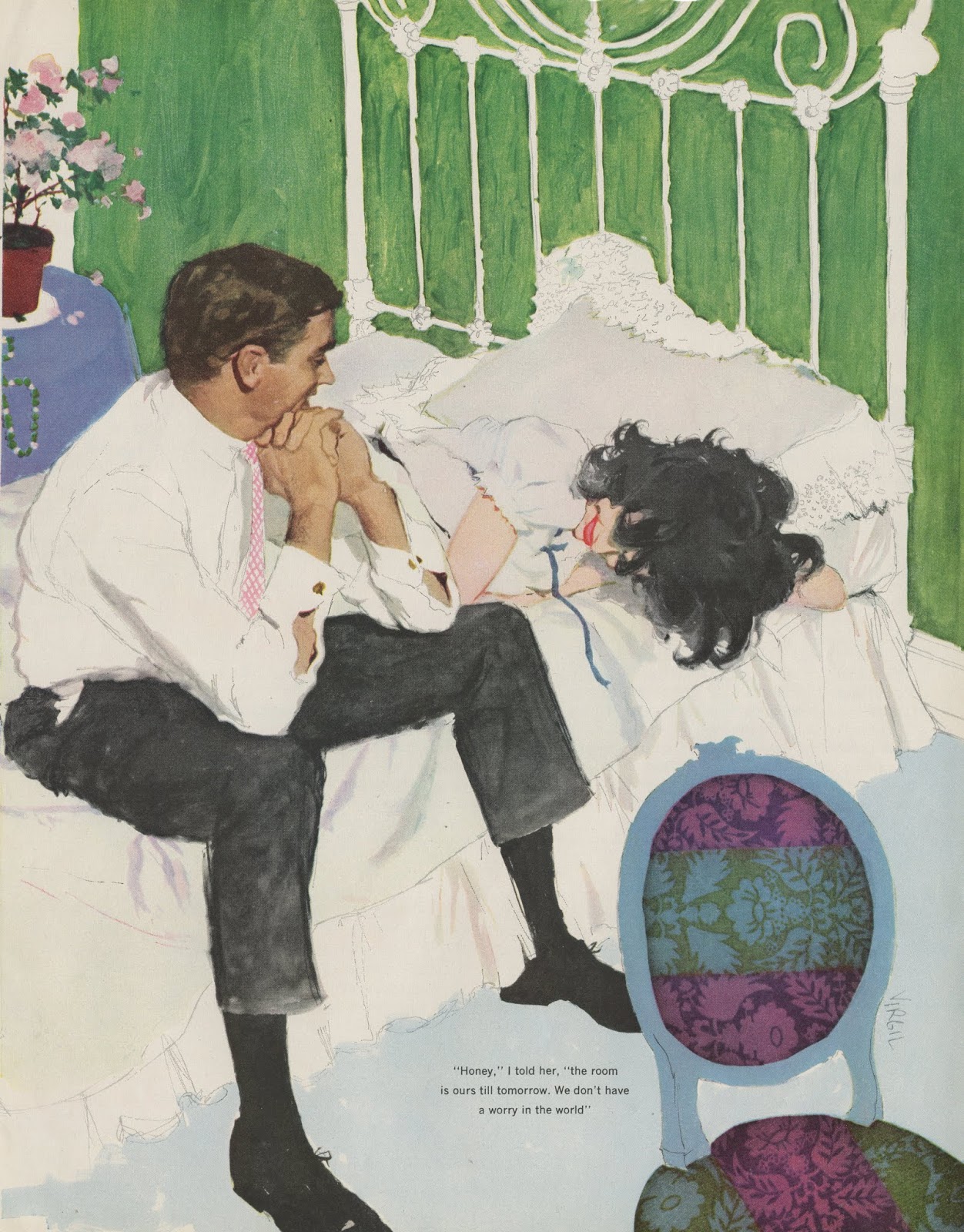
 |
| Andy Virgil |
Compare Coby Whitmore's treatment of hair...
 |
| Coby Whitmore |
...with Willem de Kooning's abstraction:
 |
| de Kooning |
In fact, flipping through the typical illustrations in women's magazines in the 1950s and 60s is like visiting a museum of abstract art:
 |
| Joe de Mers |
 |
| Virgil |
 |
| Whitmore |
 |
| Joe Bowler |
The prevailing style, across a variety of illustrators, was that skin and facial features remained sharply realistic but illustrators enjoyed an almost unlimited license for the treatment of hair.
These artists were perfectly comfortable with the same abstract values that were the pride and joy of the abstract expressionists. Illustrator Robert Fawcett wrote that he was amused by the "misconception that abstract qualities are new to contemporary painting, whereas they have been the comparison of excellence since painting began."
 |
| Whitmore |
 |
| Walter Skor |
 |
| Whitmore |
 |
| de Mers |
 |
| de Mers |
 |
| Stan Klimley |
 |
| Al Parker |
 |
| de Mers |
 |
| Whitmore |


84 comments:
I'm not seeing the "abstract values" you're pointing to in this hair.
Hair is a chaotic, complex, dynamical system, like water or clouds, but that doesn't mean that it's "abstract" by any definition of abstract that I am aware of.
These treatments of hair are perfectly representational, illusionistic. This was a reduction in style, that man learned through studying photographs of chaotic systems.
If anything, these treatments are less abstract than the 19th century and prior, which sought to treat hair as an orderly predictable system. Treating a chaotic system as orderly is more of an abstraction, than trying to get at its actual naturalistic character to build the illusion.
A hyperreal drawing of a cloud is not an abstraction. Quite the opposite.
Oh, and these are lovely drawings by the way. Thanks for doing what you do.
Glad you cleared that one up Richard .
This is a great selection. Aside from the solid designs and pretty ladies, the wild hair action (which often added a good old splash of attractive color to the page) of this era of illos is a lot of fun to look at.
I'm sure you know that llustration has a long history of using hierarchies of abstraction with the hair rendering high on the pole. I think John LaGatta's sophisticated and lovely abstractions of hair in the 20s and 30s was very influential. Looking further back there was any number of guys from the 1900 period: Toulouse Lautrec, Howard Chandler Christy, Albert Wenzell. Mucha's stylized nouveau hair was its own kind of abstract composition.
Marvellously delicious post David, and as Kev said, a delight to look at quite apart from the premise informing it.
Just a technical point though, which I do not want to distract from the joyful thrust of your post; a macro close-up of any element on the women's heads would produce Rothkos, Motherwells, Hoylands, Gorkys etc. Which means it's all abstract anyway.
I like the way you pick a theme and compare different illustrators on a micro level so that we can see the varieties of their textural surfaces. You have framed the debate in terms of "realism" and "abstraction," which usually ends up as an exercise in semantics. Hair is an apt topic for such analysis, because of the way it flows in locks and curls, and the way it can be represented by individual strands and massy locks. Every painter has to figure out a way to convey the effect of hair by manipulating pigmented goop with animal-hair brushes. Among those mid-20th-century illustrators, there's defintely a freedom and exuberance in the brushwork they used to communicate hair (as opposed to the great care in painting eyelashes and lips). But you'd probably find the same exuberance in Tiepolo's or Hals's treatment of hair, long before there was a consciousness of abstraction as a fundamental mode of aesthetic expression.
Richard--you make some interesting points about the nature of abstraction and I agree with many of them. My point here is that these treatments don't look at all like photographs of hair, or like the traditionally realistic treatment that Ingres or Andrew Wyeth or Boris Chaliapin might paint.
As for imposing abstract order on a chaotic system (isn't "chaotic system" an oxymoron?) Disney animators filmed the movement of long-haired women and then employing seven high-speed computers to analyze the behavior of hair in order to draw Rapunzel's hair for the movie, Tangled. I think these artists from the 50s and 60s have taken greater liberties, painting much more boldly with forms and colors in an effort to add sizzle to their illustrations. I also believe that in doing so, they were guided by the same kind of abstract qualities of form creation that guided de Kooning and other abstract expressionists.
Kev Ferrara-- I agree with you about The hierarchies of abstraction; certainly they date back to Rembrandt and earlier. I think that underscores Robert Fawcett's point.
If you sift through a stack of 100 tear sheets from this period, it's remarkable how many talented and skillful illustrators were cranking out these crisp, stylish, well-designed paintings of beautiful women against flat backgrounds. There were easily half a dozen excellent illustrators producing such paintings for oversized, full color women's magazines in those days. It was almost painful for me to crop out the eyes, hands, outfits and other features in order to focus in on the hair. The other features were all equally worthy of attention but they would've distracted from my point.
however free the mark-making in these images, they still convincingly suggest hair within the context of the image, and with a fair degree of ‘realism’ too. they are still an illusionistic portrayal of form. therefore i disagree that “they were guided by the same kind of abstract qualities of form creation that guided de Kooning and other abstract expressionists”.
p.s.
David, i don’t know if you’ve looked at much Chaim Soutine, but i’d argue he’s a much better example of someone who “was guided by the same kind of abstract qualities of form creation that guided de Kooning and other abstract expressionists”.
i saw some paintings in London last year, and had the feeling i was looking at reality through a distorting lens, made of paint rather than glass. his brush appears to hit the canvas to describe an ear (for example) and then decides to veer left randomly, creating a large smear. a bent arm becomes a distorted wavy shape. there are lots of paint for paint’s sake passages: random stabs of colour, impasto, aggressive swipes. it’s as if the likeness of the subject is overtaken by the look of the gestural marks on the flat surface. his paintings seem to foreshadow Francis Bacon and the abstract expressionists.
Chris Bennett wrote: "a macro close-up of any element on the women's heads would produce Rothkos, Motherwells, Hoylands, Gorkys etc. Which means it's all abstract anyway."
I agree that if we go down to the microdot level, any portion of a painting will look abstract. However, I do distinguish between good abstractions and bad ones. I view an abstract Rothko or de Kooning as something totally different from an abstract scribble by a child. A random close up of someone's hair could as a fluke be either a terrible or an excellent abstract image. I think the samples of abstraction I've provided here are all visually strong, and complete enough so that they aren't a fluke; they express the intentions and judgment of the artist.
James Gurney-- Thanks, James. It is indeed interesting that hair in eyelashes merits such tight control, while hair on heads seems to set these artists free. There seems to be a consistent, accepted code in all of these illustrations about where you could paint loose and where you would have to remain tight.
As I noted in my answer to Chris Bennett, I agree that many artists (such as Tiepolo or Hals) have enough activity in their brush strokes so that any close up could easily appear abstract. Nevertheless, I think that working in the age of Jackson Pollock liberated these illustrators in ways that Tiepolo or Hals might find audacious. Many illustrators were very mindful of what was going on in the fine art world. Austin Briggs became a member of the Museum of Modern Art the year it first opened, and visited it frequently for inspiration.
> I think these artists from the 50s and 60s have taken greater liberties, painting much more boldly with forms and colors in an effort to add sizzle to their illustrations. I also believe that in doing so, they were guided by the same kind of abstract qualities of form creation that guided de Kooning
Ah, I get what you're saying now, but isn't that 'design', not 'abstraction'?
Oh, and yes, chaotic systems definitely sounds like an oxymoron. The Wikipedia page for Chaos Theory gives the great example of a double-rod pendulum.
David - I wonder what it would look like if one of them reversed the formula and did the hair conscientiously , and went loose on the facial features .
As an idea for a future post , on Frazetta { Frank} , you have done posts on his use of bookended cliffs , on his abstract backgrounds vs Boris backgrounds - how about his skill in depicting dents and weathered texture on helmets , shields and armaments ? Those are some elements that made his work sell the feeling of his works , and something many illustrators fall on .
Al McLuckie
James Gurney,
I like your point about letting one's creative hair down when painting it. Formally speaking it offers the same kind of opportunity as drapery but without the need to keep one's shirt tucked inside one's trousers. (That's two in a row - what on earth is in this coffee?)
Laurence wrote: however free the mark-making in these images, they still convincingly suggest hair within the context of the image, and with a fair degree of ‘realism’ too. they are still an illusionistic portrayal of form. therefore I disagree that “they were guided by the same kind of abstract qualities of form creation that guided de Kooning and other abstract expressionists”.
In principle I agree with this, but the greater apparentness of the 'handwriting' in these images is, I think, due to the deepening of the modernist zietguest during the mid century.
Is it relevant to point out that these hairstyles to begin with are more "chaotic" or "abstract" than the carefully coiffed styles seen in, say, 16th century paintings? Would such handling work for meticulous braiding or tightly pulled hair? I see Richard's point about the realistic handling of the hair in these illos. The rendering here is near the optical/modern sp (not Modern) pole of realism spectrum rather than the sculptural/classical of the Renaissance, Baroque, Neo Classic, etc periods.
David, I think you nailed it. These illustrators were absolutely speaking the same language as the abstract expressionists and both to wonderful effect. So glad I don't have to choose or give a shit about semantics. Although the time I have spent with Wyeth's work especially with originals I see filled with abstract expressionism as well, though not so much in his usual treatment of hair!
https://joellevinson.info/wp-content/uploads/2017/08/Wyeth-excerpt-15-600x501.jpg
there’s a difference between marks which are ‘abstracted from reality’ (to create the painterly illusion of something from it), and ‘abstract’ (correct term: non-representational) marks which don’t describe a 3D form and only refer to their own gestural appearance / formal organisation on a flat surface.
to add to the confusion, if you look at close ups of the former and just see abstract passages of paint which no longer resemble anything, you might conclude that they’re formed by the same thinking that made the latter.
Artist set the stage so their marks can take on intended descriptions and meanings.
Looking at these close ups with the eyebrows and eyes and thumbs across a face is not at all like walking through a gallery of Abstract expressionist paintings. And what values do these illustrators share with the abstract expressionist? Except maybe a believe in the "flatness," of the picture plane. As all the women look cut out with scissors and pasted on a background. It seems you need to state what the values of the Abstract expressionist are. The best impression I get from your post is abstract expressionist like to slop paint around. Which is not much of an achievement and almost void of any philosophical insight.
As for Tiepolo and even the Abstract Expressionist the size of their painting would simply dwarf these illustrations. The brush handing of Tiepolo contains a full a sense of form and thought that simple makes such comparison silly.
At best I feel like all you telling us from this post is that these illustrators are on par with the abstract expressionist. Which causes the reader to ask, "and....?" Why not take the illustrations on there own merits. One needs to look at the real work as little reproductions make everything equal and we lose so much of what makes art interesting and demanding, proportion, scale, rhythm, gravity and space.
I think Richard was on to something its much harder to make complex patterns coherent. A real good artist brings clarity to complexity he doesn't avoid the complexity by simply focusing on the edges of a thing. He finds the motivating force behind the pattern.
Tom,
I don't think scale has anything to do with the principle being discussed here. The abstract expressionist movement is just the voice of the graphic language but saying very little, thus in order to garner attention comes the need to shout, to make 'em BIG.
I think David has expressed his take on Abstract Expressionism already: He likes it, he thinks it's good art; any philosophy that says it isn't good art he's not interested in and cannot agree with.
It must be acknowledged that this is an impenetrable position.
A lot of other people think the same thing too, culture wide, including people who confer a lot of status and/or monetary valuation on such work.
So we come to the idea of this post. In order to elevate other work/artists that he likes (or feels sorry for) who have been disparaged in status or valuation, David takes an hour out of his life to demonstrate that they compare at a basic visual level with that which has been established as high status work.
What more of an argument could be made, really? After all, aesthetic philosophy has already been boxed out from the whole matter from the start. All that remains is basic visual comparisons.
However, the Collectors, Institutions, and Taste-Conferring Mandarins who gate-keep the Abstract Expressionist narrative couldn't care less about either philosophical arguments or basic visual comparisons. Why would they pay attention to, let alone consider elevating, what has already been successfully branded as low-grade bourgeois kitsch? This has nothing to do with art.
> [A good artist] finds the motivating force behind the pattern.
I'm not a good artist, but I think that finding the motivating force is definitely part of what's so fascinating for me about learning to draw chaotic systems.
On the one hand, as you draw them, you can sense that there is an orderliness to them, but if you drew them as fundamentally ordered you'd end up with an adolescent drawing (of a tree, or rock, or smoke).
So, take drawing trees. Graph Theory has a great math term for the orderliness in a tree graph -- Arborescence -- which is a directed graph in which all of the graph's edges point away from the root node.
But an actual tree is a bit more complex than an aborescent graph: an actual tree is in three dimensions, without symmetry of branches, but with a general balance of branch weight radiating in all directions away from the central vertex.
When you're drawing a tree, particularly from your imagination, you have to balance all of these rules in your head, while avoiding falling into orderliness which will kill the drawing. Fascinating stuff.
Hair follows its own chaotic rule systems from what I can tell, although I don't understand the math. Here's an intro to the mathematics of hair if anyone wants to try to untangle it:
https://brewminate.com/leonardo-rapunzel-and-the-mathematics-of-hair/
Laurence John wrote: "however free the mark-making in these images, they still convincingly suggest hair within the context of the image, and with a fair degree of ‘realism’ too. they are still an illusionistic portrayal of form. therefore i disagree that 'they were guided by the same kind of abstract qualities of form creation that guided de Kooning and other abstract expressionists'."
I suspect one reason these depictions "convincingly suggest hair" to you is that they are sitting on top of highly accurate, skillful representations of human heads. If you cut a coiffure-shaped piece from that de Kooning and placed it on the head of one of Whitmore's beauties you'd probably say, "this convincingly suggests hair within the context of the image."
The tension between sharp realism and (what I regard as) abstract wildness is one of my favorite things about these illustrations. In an era when the abstract expressionists were hurtling toward the outer boundaries of art, the mastery of traditional skills and the obligation to communicate with a popular audience kept these illustrators honest, and tethered to reality. They were the brakes on what turned out to be the road to entropy.
In the past on this blog, I've tried to explore what prevents art from devolving into an existential puddle. It seems to me that artists can be as spontaneous and free as they want in many fundamental ways, as long as they can still identify a valid principle to which they are faithful long term. I've previously quoted Tagore to the effect that "The freedom of the storm and the bondage of the roots join hands in the dance of swaying branches." Unless you have both the storm and the roots, there just ain't no dancing.
Ina similar vein, Bono once said, "When the desire to communicate is met with an equal and opposite urge not to compromise in order to communicate — when those two things are in perfect balance — is when everything happens with rock & roll." I think that fine art lost much of its potency when those two factors became seriously out of sync. Artists who delighted in being incomprehensible ended up adrift in narcissistic bullshit. I'm not sure anyone could've predicted it at the time, but the ability to splash paint around freely within the confines of the integrity of a painting turned out to be an important way to anchor visual art.
If Bono is not your style, I'd refer you to Paradise Lost, where Milton describes the garden of Eden as a place of free and absolute pleasure, but it needed some kind of limitation: "do anything you want but don't touch this one tree."
Richard wrote, "Ah, I get what you're saying now, but isn't that 'design', not 'abstraction'?"
Well, I guess I'd say that design may be the primary difference between good abstraction and bad abstraction.
Al McLuckie wrote: " I wonder what it would look like if one of them reversed the formula and did the hair conscientiously, and went loose on the facial features."
An interesting question. There seems to be a well established convention that artists can take liberties with hair or clothing but not so much with faces. However, flipping that convention could make for very interesting experiments.
Chris James-- I agree with you about 16th century paintings, although I think we see glimmers of this phenomenon in the 15th century visionary, Rembrandt. Can you help me understand what you mean by "optical/modern sp (not Modern) pole of realism spectrum"?
Joss-- I didn't mean to sell Andrew Wyeth short. I have great admiration for his work. Sometimes he treated hair abstractly but for many of his best known works he used an intensely realistic approach:
https://www.cityartsmagazine.com/andrew-wyeth-retrospect-sam/
https://curiator.com/art/andrew-wyeth/siri
Tom wrote: "And what values do these illustrators share with the abstract expressionist? Except maybe a believe in the "flatness," of the picture plane. As all the women look cut out with scissors and pasted on a background. It seems you need to state what the values of the Abstract expressionist are. The best impression I get from your post is abstract expressionist like to slop paint around. Which is not much of an achievement and almost void of any philosophical insight."
I'd argue there is more than one area of overlap, at least between "good" abstract expressionism and good illustration. As a foundational premise, I agree with Fawcett that "abstract qualities are [not] new to contemporary painting... they have been the comparison of excellence since painting began." Like Chris Bennett, I don't think that "scale" is a significant barrier between illustration and abstract expressionism. Mark Rothko started out doing his abstractions in watercolors smaller than these illustrations. I do think the graphic flatness and plain backgrounds helped separate these illustrations from traditional realism, but that was partly a happy accident of the times. As Al Parker recalled, "the dynamic simplicity that produced these fresh illustrations also affected reproductions, since the paper shortage [of World War II] had foisted inferior stock on the magazines. It was advantageous to employ clean, flat colors from a high-keyed palette, leaving plenty of white areas for vignetting the composition. Large close ups of the hero's and heroine's heads eliminated unwanted clutter from the background." This is one more way in which constraints nurtured creativity.
I would not disagree that "abstract expressionists like to slop paint around" but then, who doesn't? I think a far larger percentage of art is controlled accident than many people suspect.
Finally, as for your point that my post is "almost void of any philosophical insight," well, I can't argue with you there.
Kev Ferrara wrote: "I think David has expressed his take on Abstract Expressionism already: He likes it, he thinks it's good art; any philosophy that says it isn't good art he's not interested in and cannot agree with. It must be acknowledged that this is an impenetrable position."
Kev, I'd put it a little differently. I think that 98% of abstract expressionism is raw sewage. Where I think we differ is that I claim to be able to tell the difference between the 98% and the 2%. I'm not sure you agree that such a difference exists.
If you cut a coiffure-shaped piece from that de Kooning and placed it on the head of one of Whitmore's beauties you'd probably say, "this convincingly suggests hair within the context of the image."
Absolutely not David. All it would suggest was some brushwork pasted onto another painting, at best suggesting some anarchic cardboard hat.
The only reason the DeKooning brushwork suggests hair in the DeKooning painting itself is because it is positioned just above the basic symbols for eyes, nose and mouth.
The same thing would not be true if you cut out the hair of a late Degas pastel and stuck it on a Gainsborough, or cut out the Gainsborough hair and positioned it on a late Degas ballerina. It would still read as hair but would be, among other things I haven't time to go into, 'out of drawing' or, comparing it to the languages of music and literature, 'out of key' or a 'false beat'.
Sorry, I was a little quick-on-the-draw with my example of Degas hair being grafted onto a Gainsborough.
It would of course depend on the specific pictures involved. There are cases where the Degas hair would resemble a bird's nest on top of a Gainsborough head, so my saying that the same thing wouldn't be true is not necessarily always the case.
David: "If you cut a coiffure-shaped piece from that de Kooning and placed it on the head of one of Whitmore's beauties you'd probably say, "this convincingly suggests hair within the context of the image.”
like Chris, i disagree, for the same reason as he stated. they don’t just look like hair because they’re on top of a realistic head. they look like hair because they’re describing the form of those hairstyles with a fairly high degree of realism (with the exception of the Whitmores 3 & 7 from top).
don’t forget that you can abstract drastically from reality and still see what the abstraction is meant to be if the intention is there (think of a cartoon hairstyle done with a few swipes of black ink). so… loose handling of paint is not the same thing across all paintings even if there’s a superficial resemblance between isolated passages.
this is the important point, which you ignored above:
there’s a difference between marks which are ‘abstracted from reality’ (to create the painterly illusion of something from it), and ‘abstract’ (correct term: non-representational) marks which don’t describe a 3D form and only refer to their own gestural appearance / formal organisation on a flat surface (e.g. de Kooning).
i might open a bottle of champagne if you would just acknowledge the difference.
Laurence John-- What incentive do I have to induce you to open a bottle of champagne if I'm not there to partake of it with you?
Laurence John and Chris Bennett : let's test your conviction just a little further. I am guessing that if I excised a rectangular detail from a photograph of hair, you could tell right away what it was, whether I positioned it upside down, right side up or sideways. The same goes for the two Andrew Wyeth paintings I offered to Joss, or the hair in a Steven Dohanos painting or any other hyper realistic painting. Now, if I took a rectangular detail out of Virgil painting 1 or de Mers painting 5 (as well as the two Whitmore paintings mentioned by Laurence John) do you really thing they describe hair "with a fairly high degree of certainty"? I confess that, severed from context that way, "hair" is far from the first association that would come to my mind, and when it did it would be largely because I've become acculturated by these illustrators to think that way.
I do agree that there’s a difference between marks which are ‘abstracted from reality’ and marks which are ‘abstract.’ I see the difference largely as one of degree, depending on how much reference remains to the physical world. I don't think it is possible to totally purge all reference to the physical world. Hegel said that the only imaginable point of departure for art is experience, and I'll be darned if I can think of another. Thus, even a purely abstract canvas that is sunny yellow will remind us of... sunshine. But as we travel along the continuum from the more extreme forms of abstraction such as geometric abstraction or lyrical abstraction to forms of abstraction that contain more discernible references to our physical reality ( in the case of de Kooning, for example, going from what you describe as "marks which don’t describe a 3D form and only refer to their own gestural appearance / formal organisation on a flat surface" to one of his paintings of abstracted women) we get into fauvism and cubism and other forms of liberty in disconnecting from our experience of the world around us.
> I am guessing that if I excised a rectangular detail from a photograph of hair, you could tell right away what it was, whether I positioned it upside down, right side up or sideways.[...] do you really think they describe hair "with a fairly high degree of certainty"?
It sounds like your definition of abstract is now inextricably tied to how close one can look at a painting or drawing before the details are no-longer identifiable. Is that really "abstraction"?
Is a landscape inherently more abstract than a portrait, because the pictorial elements of the landscape are more difficult to identify in isolation? Even if the landscape is extremely illusionistic?
Or, if these same drawings were physically much smaller, so that it was more difficult to look at the hair in isolation, would that make these drawings less abstract?
Lawrence, sure there's a difference and I enjoy your elucidation of it, but it hurts my brain to sort it out technically and while I do seem to enjoy that hurt up to a point, seeing the similarities is somehow more enjoyable and easy. Isn't the post essentially about appreciating the similarities? Do you reject the similarities?
The only artist coming to mind who "abstracted" the face compared to the rest is :
Mark English
More like "missing face" tho.
I'd like to see more apt examples if anyone can.
Beautifully observed - I'd never noticed that before but it's spot on! Many thanks.
David, i agree it’s a continuum. that’s why i offered Soutine as an example of a middle ground.
Joss: "Isn't the post essentially about appreciating the similarities?”
yes, but i’m suggesting the similarities aren’t as similar as they -at first- appear.
there are lots of recent painters in the Alex Kanevsky mode who do a bit of figurative ‘realism’ and then some flat mark-making (on the same canvas) -drips, scrubbed-out bits, random blots of colour, flat areas of white etc- which doesn’t inhabit the same illusory space as the figurative area, but floats on the surface, and is an obvious nod to abstract expressionism.
i’m not a huge fan of that kind of thing personally, but it serves to highlight the difference between marks which describe 3D space / form and marks which have no intention of doing so.
> Alex Kanevsky mode who do a bit of figurative ‘realism’ and then some flat mark-making (on the same canvas) -drips, scrubbed-out bits, random blots of colour, flat areas of white etc- which doesn’t inhabit the same illusory space as the figurative area, but floats on the surface, and is an obvious nod to abstract expressionism.
Even with Kanevsky, I'm not so sure that what he's doing is purely abstract.
Kanevsky seems to be trying to replicate the aesthetic of "Glitch Art" (https://en.wikipedia.org/wiki/Glitch_art), circuit-bending, Vaporwave, etc. but in paint, rather than Abstract Expressionism.
From Kanevsky's Wikipedia page -- "Alternatively, photography enables the artist to explore fleeting situations, unintended artifacts, and imperfections."
If you're replicating real-world phenomena (digital artifacts, out of focus camera lenses), are you really inhabiting the same domain as an artist who is making marks that are strictly non-representational, like De Kooning?
Kanevsky and Kent Williams , when they teach , stress not to try to "have or develop " a style , but to be honestly immersed in the subject matter - photo or live model - and move towards something . Yes they absorb glitches from photo/video , but that is secondary to the process of immersion as well as destroying what was rendered and then "rescuing" the image . Wyeth did that .
I like what Williams said, "style emerges from sweat equity " not from a self conscious attempt to look unique . That they have imitators is not something they control - some use their ideas as a departure point like Jones did with Frazetta , some drip scuff etc to look like their heroes .
I don't think K or KW for example try to "nod" toward any school or label that someone came up with .
Al McLuckie
Al, i don’t intend to bash Kanevsky’s work. he was just an example of ‘a bit of figurative and a bit of abstract’ which is a bit of trend at the moment. i’m afraid i find all the random abstract surface effects a bit decorative and pointless with that kind of thing, however well done the paint handling might be. if artist’s statements about their process mean you enjoy the work more, that’s fine. i personally judge the work by what i see, and take what artists say with a very large grain of salt. and yes, i see ‘abstract expressionism’ in the mix.
the larger point - to try and tease apart the difference between marks which describe 3D form, and marks which don’t - seems to still be causing confusion. for instance, the fact that Kanevsky may have been influenced by digital glitches is irrelevant. any random pattern or design out in the real world might influence an ‘abstract’ painting. much early abstraction was supposedly influenced by the grids of cities or the ‘machine age’ … so what ?
p.s. David, the Fawcett quote "...misconception that abstract qualities are new to contemporary painting, whereas they have been the comparison of excellence since painting began.”
i take to mean this:
given that painters are ‘abstracting from reality’, we judge the quality of their work on how eloquent (or poetic) those abstractions from reality are. this does not mean that we view a detail in isolation and marvel at how pretty it is as a piece of abstract design, devoid of context (which is what you’re doing). the eloquence of the ‘abstraction from reality' (passage of paint) is only visible when seen in the context of the whole image. i.e. when you can see what it is describing, and how eloquently - in terms of abstraction - it is describing it.
@David
"Can you help me understand what you mean by "optical/modern sp (not Modern) pole of realism spectrum"?"
It's a way of drawing/painting that seeks to place masses of light and dark as the eye sees them on the subject. Students are taught to organize light and dark in a map-like way. Drawings/paintings are often started with a very linear approach focused on value shapes and their edges, or "blocking in," lines running along the border between light and shade. This is what is taught in most modern realism ateliers I can think of, and seems to be the way of realistic painting in the U.S. for quite a while.
As opposed to sculptural/classical drawing, in which things are rendered according to what the form is doing, often in spite of the masses of light and dark as the eye sees them. Realism is arrived at through producing a strong sensation of 3D volume, illusion of projection from the picture plane. In drawing, light and shade are drawn across the form, e.g. chalk strokes that curve slightly to describe the form of arm or neck. Shading is usually built up stroke by stroke across the form, as opposed to an outlined shadow shape being filled in. In one of his books, Robert Beverly Hale pointed out how Leonardo in one of his drawings omitted the shadow that would usually be there under the nose according to the direction of the light source, because it would have destroyed the delicate form of the philtrum area.
I don't think it is possible to totally purge all reference to the physical world.
In real life, space cannot contradict itself. No idea and its contradiction can be true simultaneously. Two objects cannot exist in the same space at once. A single location cannot be located in two different locations at the same time. You cannot rotate a wheel in two directions at once. Something that cannot exist, does not exist.
So-called "abstract art" contradicts itself all the time at the abstract and archetypal level, destroying physical reference.
At the emotional level, we humans may experience tumult and confusion. We can hold two opposing thoughts in mind, not knowing which is true. The projection tests we call "abstract art" can be interpreted as representing such sloppy states of consciousness. But then again, so can the stained alley wall behind an old restaurant.
So a mere confusion of vague sensations is not necessarily Art.
I agree that it is probably Design that separates "good" non-referential works from "bad" non-referential works. Intentionality and taste do seem operative now and again in such pieces. But what content is being 'designed' in this formulation?
My answer is, again, a "mere confusion of vague sensations." Another way to put it is; random demonstrations of plasticity.
So what effect is Design having on these random arrangements of confused plastic gibberish?
Well, design puts things in order without reference to meaning. I've pointed out before that the principles of design are reductions of compositional/aesthetic ideas, which are predicated on meaning. Design is dumbed-down Artistry; grammar without lexicon, form without meaning. Good Art is always well designed because it is so full of unified meaning. The reverse cannot be said; mere design can say nothing.
So what the principles of design are doing when organizing the plastic gibberish is making the gibberish take the form of meaning.
In other words, design takes nonsense and makes it look like it is meaningful. It creates a knowledge illusion.
But as we travel along the continuum from the more extreme forms of abstraction such as geometric abstraction or lyrical abstraction to forms of abstraction that contain more discernible references to our physical reality ( in the case of de Kooning, for example, going from what you describe as "marks which don’t describe a 3D form and only refer to their own gestural appearance / formal organisation on a flat surface" to one of his paintings of abstracted women) we get into fauvism and cubism and other forms of liberty in disconnecting from our experience of the world around us.
The "abstraction continuum" you generally speak of between Bougereau and Pollock is not actually a continuum of abstraction, but a continuum of referential specificity at one end and referential vagueness at the other. It is a critical mistake to confuse vagueness with abstraction, although vagueness may contain something that will function as an abstraction, especially in a context that can clearly locate its identity (as in the example of the face located the identity of the loosely painted hair).
> At the emotional level, we humans may experience tumult and confusion. We can hold two opposing thoughts in mind, not knowing which is true. The projection tests we call "abstract art" can be interpreted as representing such sloppy states of consciousness.
Even if tumult is “sloppy”, that doesn't exactly argue that it isn't great. Rachmaninoff is tumultuous, noisy, almost to exclusion sometimes, but some people seem to count his music among the best.
> My answer is, again, a "mere confusion of vague sensations." Another way to put it is; random demonstrations of plasticity.
Music seems to inhabit a similar area of nonreferential sensation, yet it's considered a great artform. Why shouldn't the visual be able to play in that same purely abstracted realm?
>But then again, so can the stained alley wall behind an old restaurant.
That stained alley wall behind an old restaurant may make great music. At the very least it will give us Bruce Springsteen. I'm not yet sure why it shouldn't make any Art at all.
Rachmaninoff is the exact opposite of sloppy or confused. Every note is part of a highly refined expressive organization designed to create a specific aesthetic effect with sound. Bad example.
Partially, it is the very scaling of the continuum of sound into 12 steps per octave that prevents music from falling prey to the slovenliness of random plasticity. Every interval possible has luminosity. Hard to find a better way to prevent mud.
Why shouldn't the visual be able to play in that same purely abstracted realm?
If you can find a place where I said it couldn't, that would be a miracle.
I've said before around here and often, I do think it is possible for visual art to do many of the same kinds of things that music does. It already has in fact. You can look at Kotarbinksy (his Roman Orgy, in color) or Brangwyn... the entire Brandywine tradition was taught how art functions as visual music. But the very people who hyped themselves with claims of creating utterly non-referential music were pathetic visual musicians. And so that mountain has, in my opinion, yet to be scaled. It can't be scaled by random demonstrations of plasticity; its in blind ignorance of why "abstract" audio music works and how it functions.
That stained alley wall behind an old restaurant may make great music. At the very least it will give us Bruce Springsteen. I'm not yet sure why it shouldn't make any Art at all.
I find this passage confusing. What are you claiming or asking here, exactly?
Well Kev summed it nicely with the reply to my post, I’ll just quote a section ”What more of an argument could be made, really? After all, aesthetic philosophy has already been boxed out from the whole matter from the start. All that remains is basic visual comparisons.”
I can’t help it but I find the vagueness of such a comparison completely mind numbing, the statements are of such general nature that they are practical meaningless. Michelangleo used line so does Leroy Nieman which reveals their shared artistic values. It’s like banging your head against a wall:) Robert Fawcett declares “abstraction,” has always existed in art, which begs the question what kind of abstraction has always existed in art?
The Al Parker quote reflects more on his mind and outlook then it does on art, it's just those qualities of the printing press that eliminated the qualities of art. As anyone who has attended a great exhibitions and then sees the reproductions of the works “reproduced’” in the exhibitions catalogue.
Of course scale matters because it is part of the aesthetic effect of the work.
Would you say that it is possible to create a non-referential (music-like) system for communicating pure sensations visually, but that no one has done it successfully, or instead, that it's not actually possible because painting is missing important elements (i.e. time)?
It seems to me that you can still play with "intervals" in non-referential painting, like the interplay between differing hues and levels of saturation, but that without duration the "chords" you build out of those visual intervals have to be separated by other means (generally, placement on the panel, or each panel becomes a separate "chord" and set of paintings becomes the "piece" so to speak).
Do you see the relationship between the build up of notes into chords, and the build up of visual "intervals" into visual chords?
Tom,
I believe that Three Blind Mice or The Lark Ascending each retain the intrinsic consistency of their respective aesthetic effects whether played ppp or fff.
Richard,
Oskar Fischinger’s abstract animations are probably the nearest thing i can think of to non-referential ‘visual music’ because they change over time like music. of course, they had a music soundtrack, which ruins the whole analogy, but watch this with the sound off and let us know how successful it is:
https://www.youtube.com/watch?v=3ILonUB6YHw
or this by Walter Ruttman:
https://www.youtube.com/watch?v=Ewbb9pvtM6A
Tom, wow, mind-numbing? the content of this post seems such a simple pleasure to me. The comments on the other hand seem to veer to the "incomprehensible ending up adrift in narcissistic bullshit"(misappropriatley quoted from David's 3rd response above). And yet if I give them enough attention with an open mind all these comments reveal a dizzying kaleidoscope of intelligence and insight. I would suggest a similar shift happens when we are more open to the plights of artists we consider "bad". Even if that artist is a blogger who spent an "hour" making vague comparisons. For me David is like a great deejay with his cropping and splicing and provocations. I hope it took him more than an hour(Kev's idea) considering the amount of time we are spending winding and unwinding all our responses!
Here's an image I love that comes to mind as more clearly straddling the abstract expressionist/representational "divide", no cropping needed.
Werner Knaupp
> Watch this with the sound off and let us know how successful it is
Well, yes, it's absolutely mind-numbing. But I've seen abstract visual effects which hold much more "music" to them than flat circles floating on a black background.
Fischinger's visual impression of music seems more like a fire alarm, an air raid siren, a spoon banging on a pan, interspersed with the whirring of a house fan.
There's as much difference in quality between any given shot from Fishinger, and the works of popular working abstract expressionists, as there is between those abstract expressionists and Beethoven.
Complicating matters -- if it were indeed possible to create a non-representational visual language, as I suspect, it's fully conceivable that you couldn't do it from thin air. It may not be possible to invent, but would have to grow organically from rudimentary visual grunts.
It's also conceivable that even were that visual-music language to exist, people may be naturally illiterate to it, in the same way that truly feral children neither perceive music or speech.
Would you say that it is possible to create a non-referential (music-like) system for communicating pure sensations visually, but that no one has done it successfully, or instead, that it's not actually possible because painting is missing important elements (i.e. time)?
Sensations-for-their-own-sake can be caused in the viewer at will, yes. And these can be orchestrated in a musical way.
Frantisek Kupka is often who I think of when I talk about an artist who tried to do this but failed because they didn't know enough about music and how complex it is in organization. His stuff is essentially just painted stained glass designs. I'd rather look at Frank Lloyd Wright's actual stained glass.
I consider Kandinsky the worst musician of all the famous artists who tried to make visual music. Paul Klee's simple attempts at music come out child-like, which is why Alexander Girard easily converts them into designs for children's items.
The control of the reading of a painting -- direction, speed, pacing, pauses, etc -- is one of the foundations of narrative compositional technique, although it is practically impossible to find real information about it, for various reasons.
I've found very little in music that doesn't have a parallel in art, including intervals, pitch, timbre, tone color, chords, melodies, rhythm, theme, counterpoint, tempo, instrumentation, orchestration, and so on. The musical structures of art are much more difficult to suss out and how they work, than in music however. Probably because art has not been systematized like music was, so academic intellectuals don't have access to good information about it and can't understand it by experience because they don't have the talent.
Also because art has more kinds of grammars and more complicated poetics than music and they tangle up in a way that music doesn't. (I think because art must concentrate its expression in a limited area, while music unspools linearly.)
It's also conceivable that even were that visual-music language to exist, people may be naturally illiterate to it, in the same way that truly feral children neither perceive music or speech.
The visual language does exist. And most people cannot speak it well at all, even with practice. Those that are native speakers are the born artists. Such talented people, with a little information, a few hints from someone who knows, suddenly explode with creativity in the use of it.
A visual-representational-narrative-aesthetic language exists. (I think there is fairly universal agreement about that, and I'm much more optimistic about the number of native speakers.)
Either way -- is that the same language as a visual-nonrepresentational-musical language?
I'm not so sure. These two visual languages will surely overlap on several expressive techniques, but I'm not convinced that their evolution is towards union.
I would be inclined to guess that they'd end up as far from one another as Poetry is from Yodeling.
And, for whatever little it's worth, it seems to me that much of the debate around taste in the visual arts seems to boil down to a preference or instinct towards Art as Poetry (which is a relatively mature form) or Art as Music (which is a millenia younger, and therefore worse).
Either way -- is that the same language as a visual-nonrepresentational-musical language?
A language has grammar and lexicon. What is a grammar without structural rules? What is a non-referential lexicon?
To build a non-representational language requires the development of grammar and lexicon. The principles of design might suffice as grammar. Let's say inchoate sensations and emotions expressed through random demonstrations of plasticity may function as a lexicon.
Both are subsets of (or are derivative of) the far more extensive musical-poetic-representational language anyhow. (Dan Adel demonstrates this connection wonderfully in many of his wilder works. Not coincidentally, he says that his work "participates in the undoing of the undoing" in the arts.)
The great developers of the larger language not only found brilliant grammars, and lexicons extracted from experience and nature, but developed brilliant principles for structures of much larger complexity and scale. Such that, they allow for the composing of compelling narratives and the orchestration of any number of different modes of thought.
As far as I can tell, this language has been in decline and devolving for 90 years.
And, for whatever little it's worth, it seems to me that much of the debate around taste in the visual arts seems to boil down to a preference or instinct towards Art as Poetry (which is a relatively mature form) or Art as Music (which is a millenia younger, and therefore worse).
The debates about taste cannot be boiled down so easily or as you state them.
And visual music and visual poetry cannot be distinguished. Possibly you are associating visual poetry with overt symbolisms, which is a mistake. Such are codes rather than aesthetic.
> Both are subsets of (or are derivative of) the far more extensive musical-poetic-representational language anyhow.
Purer artforms can be understood as subsets or derivitive of "larger" artforms.
One could argue that both Thanatopsis and Eine Kleine Nachtmusik are members of the superset "Songs", that artform which combines both Music and Poetry.
One could say that Representational Art and Literature are members of the superset "Comic Books", and that "Comic Books" and "Songs" when combined with the set "Photography" add up the superset "Movies". But clearly I think that something is lost when we don't keep an eye on delineating the pure subsets, and the characteristics that are specific to them.
> And visual music and visual poetry cannot be distinguished. Possibly you are associating visual poetry with overt symbolisms, which is a mistake.
I don't mean symbolism. I mean the poetry in the way an artist handles the specific illusion of something representational to get at its character. What David is calling "abstraction" in the hair in this post, I would put under the territory of "poetry". Poetry is non-literally about the thing it represents, or the things it non-literally represents add up to a larger thing that they are non-literally about.
Purely speaking, “Music” would not be about things represented. It would evolve towards a language which is abstracted away from representation towards pure emotion.
Brilliant thoughts all . It is ironic that the vast majority of really good and great artists , illustrators , would not give a damn or even want to read these essays /comments , they are too busy creating fine work for people to comment on .
Purer artforms can be understood as subsets or derivitive of "larger" artforms.
If you want to pursue the modernist pretense to purity in a sincere way, you should know it's knocked off from Platonism. And the real Platonic answer is that the only truly pure thing about any art is that which is suggested by it, but is not actually present. Everything else is instantiated and thus compromised.
Not understanding this leads to purification attempts like minimalism. Which Rauschenberg easily dispensed with in 1951 with “White Painting.”
One could say that Representational Art and Literature are members of the superset "Comic Books"
"Superset" is a technical term and if you want to get technical about the constituent elements of both representation art and literature, respectively, you will find aspects in both that fall outside "comic books." They are subtle aspects, for sure, but you shouldn't make pretenses at technicality unless you plan on being consistently technical.
Poetry is non-literally about the thing it represents, or the things it non-literally represents add up to a larger thing that they are non-literally about.
All aesthetic suggestions are poetry.
Purely speaking, “Music” would not be about things represented. It would evolve towards a language which is abstracted away from representation towards pure emotion.
All music is narrative, and all narrative is representational in some way, even if metaphorical or expressionistic.
"Pure emotion" might be something that a person feels, but a work of art has no such thing in it. Art is suggestive signification.
> if you want to get technical about the constituent elements of both representation art and literature, respectively, you will find aspects in both that fall outside "comic books."
That's exactly right. My argument is that such supersets are absurd. I suggest that lumping representational visual poetics and non-representational visual musicality falls into the same category of association fallacy.
> All music is narrative, and all narrative is representational in some way, even if metaphorical or expressionistic.
That's right. Neither music or poetry are platonic solids, I'm not arguing for metaphysical purity of that kind. I'm only making the observation that there's practicably definite art forms, of the earthly kind. Music is not poetry, even if to define the edges of one or the other would give us headaches.
Representational visual poetics and non-representational visual musicality are similarly not platonic ideals, yet they're trending towards languages that are rather different from eachother.
Put into practice, the experience of poetry in a poetic representational artwork is wholly unlike that of the musical in a musical non-representational one.
I prefer the former, I think it's the higher art form. I also happen to think that poetry is a higher art form than pure music. But I'll happily put on some Scarlatti, as I hope my great great great great grandchildren will enjoy some non-representational visual Scarlatti some day.
That's not to raise de Kooning up to Rembrandt, but to suggest that de Kooning et al are sounding out the Hot Cross Buns of an art form which will someday have a Mozart, and that deserves some respect, for the same reason that we owe cave men respect for having put their hand print on a wall.
That's exactly right. My argument is that such supersets are absurd.
Your superset was not absurd. It was subtly wrong.
Regardless, it was a poor analogy for the reduction I was talking about. See Dan Adel's realistic paintings of abstract expressionist and modernist patterns/designs for proof of concept.
I suggest that lumping representational visual poetics and non-representational visual musicality falls into the same category of association fallacy.
I deeply, deeply doubt you've done even a modicum of research to support this claim.
That's right.
Amazing the things you know after I write them.
Music is not poetry, even if to define the edges of one or the other would give us headaches.
All aesthetic suggestion is poetry. Visual Music is full of aesthetic suggestions. Poetry without musicality doesn't exist. In art you cannot disentangle the aesthetic tropes from the visual music without breaking the art. They synthesize. I've done the work to know this is true.
Representational visual poetics and non-representational visual musicality are similarly not platonic ideals, yet they're trending towards languages that are rather different from eachother.
Dog ate your homework.
Richard is Nathan Thurm.
...the real Platonic answer is that the only truly pure thing about any art is that which is suggested by it, but is not actually present.
A beautiful and profound insight so succinctly put Kev. My sincerest thanks.
I believe it to be the reason that when we are 'in the zone' the painting seemingly paints itself, the brush capable of divining the intention of some unseen force.
Evidence of this on the prosaic level would be the reason the cracks in the oil paint cutting across the forms of a Waterhouse do not matter one jot in terms of how it moves us.
It is reported that Michelangelo said that if a great sculpture were rolled down a mountainside it would not diminish it.
Nice painting Joss,
But for me it feels way to claustrophobic it intrudes instead of invites I immediately want to step back, in the same manner as a car alarm announces to an intruder'"step away from the car." I prefer a work of art that invites me in. Plus the paint feels like it's going to slide off the canvas to the floor. Not very agreeable feelings.
"For me David is like a great deejay with his cropping and splicing and provocations." Exactly, and I'm just responding to his "provocation,":). But cutting and pasting is kinda of a superficial activity. Or like Sesame Street's "one things not like the other."
But why not take his provocation to the next level and dive deeper. Why not zoom in on the images until there is nothing there expect empty space?
Very good Kevin. You made it through four complete volleys.
Tom: "Why not zoom in on the images until there is nothing there expect empty space?"
great idea !
oh wait, modernism (in it's infinite depth) did that already.... black canvas, white canvas.
talk about a dead end.
Now Lawrence how can space be a dead end? It contains everything.;)
> "Why not zoom in on the images until there is nothing there expect empty space?"
Very good point. At a certain zoom level it becomes abundantly clear that the driving principle behind every painter is the same as that of Mark Rothko.
"often wrong, never in doubt"
Carve that in stone and put my face on it, anon
Maybe anon what you don't realize is that Rothko was just re-examining the trans-esclusionary nature of the Ying Yang, to find new gender harmonies, and all art is about finding harmony toot specifically between two opposing forces, good and evil, female and male.
“The prevailing style, across a variety of illustrators, was that skin and facial features remained sharply realistic but illustrators enjoyed an almost unlimited license for the treatment of hair.”
It may be the case, if the theory of some psychologists is correct that it is not so much that we see with our eyes as rather that we “screen out” bombarding impressions which, if we did not, would overwhelm us, it could be that how we normally view the hair of a person in real life is more “abstract” than realistic (i.e., in the sense of being low-definition), and that illustrators reflect this in their art. In other words, we should differentiate how we would look at the “realistic”-appearing hair in a high-definition photograph, noting the almost innumerable threads and how they interweave with each other vs. the way our almost casual glancing eyes perceive someone’s hair in person we meet every day, limiting or screening out its full detail as being unnecessary. So some illustrators arguably render the hair more “realistically” in making how it looks appear “abstract” on close examination. I hope the foregoing adequately expresses the point I’m trying to make, as wrong as it may be.
Comicstripplan:
I think you've made a very interesting point there and I don't think you're wrong in saying it plays a part in why such subjects as hair in a picture are often treated so. By how much is an interesting thing to ponder. Thank you very much indeed for this.
i wonder which abstract expressionist Sargent had been influenced by when he did this in 1882 ?
https://hyperallergic.com/wp-content/uploads/2015/09/Charles-Stuart-Forbes-300.jpg
or this by William Merritt Chase in 1886 ?
https://artsandculture.google.com/asset/mrs-chase-in-prospect-park/CQGPEdxvclDCQA
... my guess is they'd both been looking at the king of abstract expressionism, the 'pot of paint flinger' himself, James Whistler, circa 1874:
https://en.wikipedia.org/wiki/James_Abbott_McNeill_Whistler#/media/File:Whistler-Nocturne_in_black_and_gold.jpg
We ignore and defocus that which we think we already understand. We focus on tasks and then refocus on anomaly when and where it appears, because such might be important.
What happens to elements out of our focal area in visual experience is they become blurry and mis-register stereographically in the horizontal direction; the more out of focal depth, the more the misregistration. Objects also become less colorful as they reach our vision's periphery.
If artists only had in mind a kind of realistic depiction (mimesis) of experience the above mentioned methods of defocusing would be the kinds of rendering effects you would find in the zones outside the face.
Blur rightly is frowned upon in art (as a general matter) because it is mostly slovenly in expression, rather than poetic, which makes it an aesthetic and artistic drag. Although now and again, when used in just the right place, it can be amazing. With clever brushwork, artists have come up with many kinds of blur that have some artistry to them. But such never replicates the kind of natural blur of vision.
Nobody I've seen tries to obtain depth effects in paintings and drawings (in the manner of our stereoscopic vision) by horizontally misregistering two nearly identical images, misregistering them more in one direction to increase forwardness, and more in the other direction to increase distance from the focal depth. Although some pretentious book on Cezanne says he tried it. Reason is, because if the picture had any depth to it, most of the objects would look like a confused mess and the misregistration wouldn't work anyhow to produce depth (unless you are working with 3D glasses of some kind, either color lenses or polarized, and you render each of the two images so that it can only be seen through one lens). There's a reason Art is only built of only monoscopic ilusions.
And while weakening the intensity of colors at the periphery of a canvas is common practice, the reverse is also a common practice. I can show a thousand landscapes where the two strongest colors are sky blue and grass green, with the bluest blue and greenest green touching the canvas edge at top and bottom respectively.
So there are other factors causing these particular kinds of "abstract" treatments. Namely, here, decorative expressionism that causes graphic interest and reader attraction.
... as well as aesthetic forms of abstraction, musical and suggestive in character.
> Objects also become less colorful as they reach our vision's periphery.
Is this true? I've heard it said, but I can't perceive that effect.
I've even heard that a number of opticians suggest that human vision is dichromatic at the edge of our field of vision.
Yet, as I sit here dumbly holding brightly colored objects at the edge of my periphery, I seem to perceive a normal range of hues -- a tennis ball is still bright highlighter green-yellow, a red folder is still bright red, a blue matchbook is still blue.
Seeing that the vast majority of the color cones are centrally located, it's easy to think of the peripheral reduction in color like photoshop desaturation. Like; as elements move into peripheral vision they become gray. But it seems not to work like pigment being grayed down. There are still enough cones at 60° and further out to see any color just as it looks. The lesser feeling of color seems to be due to a reduction in the number of receptors, each of which sees fine on its own. So its an issue of signal strength, not a change in the signal. Similar to how a Db is a Db whether played softly or loudly, whether heard in one ear or two. Which seems to explain why, in the experiments, simply enlarging the color stimulus in the periphery results in the same ease of identification as the same color normal size in central vision.
Blur rightly is frowned upon in art (as a general matter) because it is mostly slovenly in expression, rather than poetic, which makes it an aesthetic and artistic drag. Although now and again, when used in just the right place, it can be amazing.
Are you making a distinction between straightforward 'blur' (as in, say, the blur tool in Photoshop) and effects like sfumato, blending and scumbling one finds in, for example; Leonardo, Igres and Inness?
I ask this because although sfumato, blending and scumbling are used to simulate effects that occur in the natural world (for example; the side of a cheek or the value transitions in an evening sky) they are also used to wilfully summarize forms as well. This is employed to a large degree in the work of Dewing and to a varying extent in Degas. I consider both artists are successfully using it to serve very definite aesthetic aims.
With regard to this I think the increasing adoption of a style of painting that art critics have coined the terms 'discombobulation', 'Kanevskyfication' or 'interrupted realism' is also serving the need to summarize areas of a painting. But like the 'out of focus' effects of sfumato, blending and scumbling it is also prone to the same sloppy misuse.
Yes, I think these are two different things.
Blur, I would say, is a kind of indiscriminate smearing applied with little, if any, thought. The result is vagueness. And aside from that vagueness, there is no other meaning to it. Often it is used to elide difficulties, to fudge. Sometimes it is used to try to bring photographic qualities to imaginative painted works as a fun kind of trick.
A somewhat smooth transition on a face by Ingres is never fudging, nor applied randomly. The structural form in his work, while very subtle, is very strong and clear. The blending makes sense in the structural context, it is clear what he is trying to do and it works. Ingres, Degas, Dewing, Inness, DaVinci... are all using various methods of creating transitions areas to create feelings, which is why if you look at the transitions of each, all are different and identifiable.
The discombobulation thing is very current. For the most part it is not smeary. I guess my take on it is something like; Anything that looks good but does not convey meaning is design.
Thanks for the clarification Kev, very much appreciated.
Post a Comment