
 |
| Alex Ross distinguishes between a light, medium or heavy kiss. ("Heavy, please," she said.) |
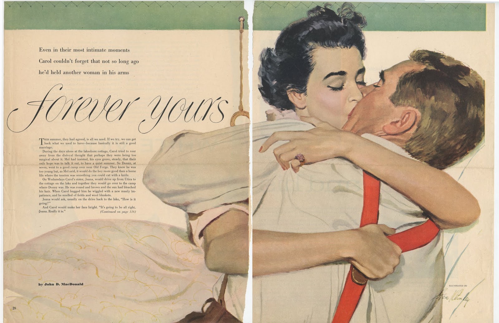
Al Parker, one of the preeminent illustrators of the day, described the national sense of relief after the war, when interrupted lovers could reunite and continue where they'd left off. "The need to escape was already waning and, with it, escapist art." Instead of reading costumed adventure fantasies, young housewives ("the most important reader" of illustrated magazines at that time) wanted to see handsome men and gorgeous women finding each other and settling down for domestic bliss... preferably in the suburbs.
This meant a whole lot of illustrations of kissing.
For example, here is an illustration of a kiss better than any "kiss in the movies:"
 |
| "No kiss in the movies was better." |
… a concept which was probably easier to illustrate than a "wherever and whenever" kiss:
 |
| "...wherever and whenever he pleased..." |
Here's an example of the "surprise" kiss:
 |
| This seems in questionable taste today, but judging from women's magazines of the 1950s, women seemed to like these pictures. |
Here, Al Parker himself depicts the unsettling effect of a "wild" kiss...

... which appears very different from the residue of Frederic Varady's "safely married" kiss:


Here is a "missed opportunity" for kisses with Mr. Atomic:


 |
| No longer reading historical fantasies, postwar wives were smooching the "knight in shining armor" in their own home. |
 |


Here's the "I'm-desperately-kissing-your-hand-in-the-driveway-because-I'm-going-nuts-and-I-don't-know-if-I-can-wait-for-the-wedding-night" kiss:


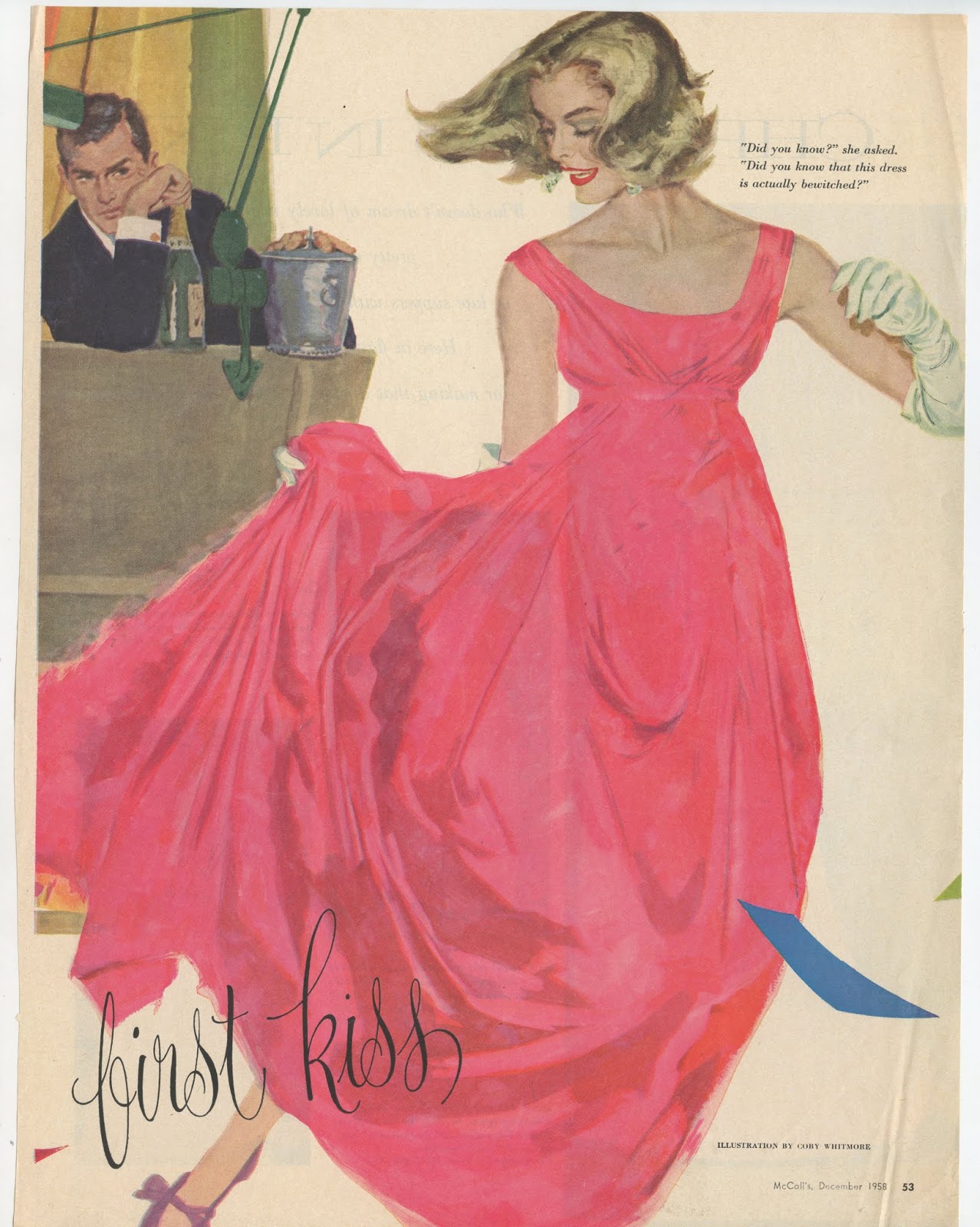
And of course, anticipating the "first kiss:"
Sifting through old illustrations is a little like an archaeological dig. Layers of moldering clippings tell us more about the special look and character of their time than any history book. That is the great power of demotic art.
In hindsight we can see how different colors, styles and subject matter appealed to the public during different eras. For example, the colors of the psychedelic 60s still stand out as bright and bold. Their lines remain distinctively flamboyant. On the other hand, illustrations from the Depression seem more somber and businesslike. My files from the prohibition era overflow with black and white pictures of society dames and gangsters in fedoras, while the illustration during the war years are all tinged with patriotism and anxiety. Illustrators were using a lot of olive drab and navy blue to paint uniforms.
And then of course, in the decade following World War II, every other illustration seemed to be about kissing.
5 comments:
Great stuff.
An under-appreciated amount of ingenuity went into illustrating these love stories at the top of the industry; all these artists, struggling against the hackneyed, probably came up with ten thousand different plausible clinch and kiss variations to give freshness to their age old subject. That's no mean feat. Their subtle creativity is commendable even when their styles feel interchangeable.
Looking at these, it came to mind that one of the areas where periodical illustration still held a candle to the sensationalism of movies was in the area of kissing limits. Whereas the Motion Picture Production Code, throughout the middle of the century, had a strict 3 second limit for onscreen smooches, the picture painter could offer a kiss that lasted; that stayed still for endless rapt contemplation. Romantically hopeful women were free to dream into these images all they wanted and for all they were worth.
A different degree of mastery on display here with Al Parker. Many great pictures, but the best illustrators understood that while lips touching is sensually potent, the narrative power of the kiss peaks in the moments that lead up to it and in the fallout.
To play on Kev's insight -- Parker holds the heart-wrenching tender shy moment just before a first kiss forever. Like the Tristan chord, we sit on edge! But, in this case, the only way for us to find resolution is to go get a kiss of our own!
I couldn't see who did the fifth one up from the bottom, even though to me it looks more like CPR than a kiss- but what a great design!
Kev Ferrara--That's an interesting point about the "freeze frame" advantage of the still picture over movies. The men in these pictures couldn't speak like Cary Grant, but on the other hand readers were able to focus on the good part-- climactic kiss, the agony of uncertainty relieved, as captured by these talented artists and invest whatever day dreams they wanted.
Some of the artists who specialized in these paintings were steamier than others. I think of Coby Whitmore, Joe bowler and Joe de Mers as the best of the bunch when it came to expressing passion in these illustrations for women's magazines. Parker was a great artist, but from an older generation and therefore not quite as comfortable about PDA. I don't think he was ready to feed raw meat to the 1950s generation of housewives who felt they had sublimated far too long already. Whitcomb, Harris, Kane, Ross, Ludlow, Virgil, Klimley-- even the back bench was pretty talented.
Richard-- Agreed. That Parker illustration lacks the hard edge realism of some of the other pictures here, but he perfectly captures exactly what the picture needs: her hand holding him at bay, while his hands pull her closer. That expression of doubt on her face ("will you still love me tomorrow?") With her face held back just far enough so her eyes can focus on his face and read what she could in his eyes. Great psychological staging by Parker. Also, thanks for the link to the Tristan chord--I really enjoyed that.
Kevin Mizner-- yes, one of the things I like best about this generation of illustration is the importance it attached to design. The best of these illustrators (including many of those mentioned in my response to Kev above) used the strong compositions aided by white or high contrast backgrounds to emphasize the design element in these pictures.
Is that Joe Bowler's signature on "I knew it would be like that"?
Post a Comment