

One of the joys of writing the biography of illustrator Austin Briggs was getting to know and interview his son, Austin Briggs Jr., a retired professor of literature and a nationally renowned expert on James Joyce. Austin Jr. generously shared his father's personal collection of tear sheets and memorabilia containing thousands of images that wouldn't fit in the book.
Now the time has come for me to relinquish that collection. Once I pass it along to the museum selected by the Briggs family, this amazing stash of images will be well protected but I'm not sure the larger public will ever get a chance to view them. Many of them are unsigned. So before I let them go, I'm going to post a large batch of Briggs' forgotten works here for posterity.
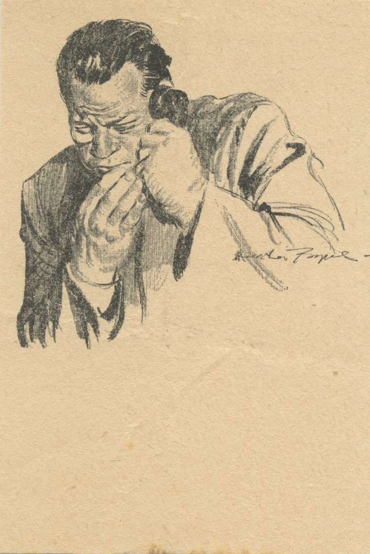
The following images, dating back to the 1920s and 1930s, are not all masterpieces, but they do show the development of a major talent responding to changing times and changing media.


In my many years of association with him I remember few jobs that came easy for him... if they did, his intuition told him something must be wrong, or that he was getting in a rut, and he would do something hard-- not always a success either in the product or the acceptance by client-- but he was slugging most of the time.
26 comments:
Jesus - that Soda illo was inching into J C Coll territory - looking forward to this .
Al McLuckie
I don’t understand why museums don’t digitize their collections. Is there a market incentive to keep these things hidden? Seems like they’d increase the value of the work by sharing it, as this blog has no doubt improved the value of several artists
I like that first illo a lot. The Raymond stuff is fun. He had good taste in influences.
Jesus - that Soda illo was inching into J C Coll territory
Some of those figures (and hands) from 'Soda-Fountain Saga' and 'Cat and the Bolster' are more than 'inching' toward Coll, they're actually pinching from Coll. Most egregiously, the 8th image posted (red), the figure facing us is a direct swipe.
The Walt Reed tearsheet collection - an archive held by Washington University - has been digitized. It's a whale of a collection. But there's at least five other major tearsheet collections out there that have no digital presence at all.
Kev , speaking of pinching - have you seen Alfred Boucher's "To Earth " sculpture , used by Frazetta for his "spider man' oil ? The front view of it . For you , is there a line that falls short of being egregious in spotting a "swipe " , where the artist was inspired by something and riffed off of it , or lazily just used a shortcut ?
Best , Al
al mcluckie-- Briggs was just starting out in these years, Al, and we can tell that he was sometimes trying to find his footing. However, I think we can also tell that his growth trajectory was pretty impressive.
Richard-- I agree. Sometimes museums lack the budget to digitize and sometimes they just enjoy being the gatekeeper to their collections. I know that with some collections of illustration art (as opposed to fine art), possessors worry about copyright issues.
For example, the USAA insurance company owns all of the Mead Schaeffer oil paintings done for his World War II series. We spent more than a year trying to get permission from USAA to take photographs of those originals for my recent biography of Mead Schaeffer. USAA couldn't point to a reason-- legal or other-- to deny our request, but still they kept fretting that they might somehow get in "copyright trouble" if we reproduced their paintings. We had USAA conference calls with their bureaucrats and their executives and their lawyers and offered to indemnify them from any risk. Occasionally they'd say "OK" but then they'd think about it some more and corporate cowardice would take over. If anyone wants to see those original Schaeffers, you'll have to visit USAA headquarters in Texas. Give them my regards.
Kev Ferrara-- You have a sharp eye, as always. It doesn't surprise me that Briggs, at age 20 or 21, hadn't learned to conceal his swipes. Can you tell me where I might see the Coll original?
Thanks for the alert about the Walt Reed collection being on line, that's wonderful. My first visit found it frustratingly slow and difficult to navigate but I assume it will come to me in time.
@Apatoff: well as there are more than 150 000 references in Reed collection, you cannot hope to be fast.
Hi Al,
Having read your post, I looked up Boucher’s “To Earth” (unknown to me). I like the statue, but I see no deep similarity to Frazetta’s Spider-Man figure or his idea for that image. From the front, there’s some surface similarities in the musculature and vasculature of the forward arm and the bent-ness of the implement under stress. But, if influence it was, I consider what he did with it perfectly reasonable and valid. Because the essential gestural quality and force of the Spider-Man figure is clearly the product of Frazetta’s soul, and more importantly, so is the overall sensibility and poetic effect of the image.
After all, an image’s idea isn’t located in a vein, deltoid or a shovel; it’s a whole effect complex that functions as an emotion engine to deliver narrative meaning. And imo that’s the real test. If the main figure or idea has somebody else’s soul (as with swiping) or if it lacks a soul entirely (as with photo copying) then it is at best dumb or misguided, at worst rank thievery. I agree with David that young artists should be forgiven those kinds of transgressions. However, equally, they shouldn’t be praised for them.
Even experienced artists, though, can fall into half-baked beliefs about the validity of “quoting” or “paying homage” to master artists. I remember Mark Schultz “re-imagining” a male Frazetta figure from Untamed Love as the main female in one of his comic panels. He did an amazing job referencing, drawing, and rendering the figure in ink. And yet, it instantly stood out from the rest of his work and, looking at it, I knew instantly it was a Frazetta figure. So the figure became an ‘in-joke’ for fans, breaking the narrative flow in the process.
Artists should be the opposite of cribby, slavish, or sneaky; rather they should be fountains gushing up from their own personal wellsprings. The simplistic principle might be that the “quote” cannot be the mainstay of the art. Just as a text quote should not be the essential/dominant part of a poem, short story, or essay.
A great challenge to this view would be Norman Rockwell’s Rosie The Riveter. But I see that as THE masterclass in transforming source material at the molecular level. It is satire that is also better than (and appreciative of) the original. It is social comment of its moment yet timeless for both narrative and technical reasons. It is patriotic while being unique. And it takes great care to subtly adjust everything about the figure and its setting so its attitude and meaning is original, yet also without losing its clear tether to the Michaelangelo original. He simply reconjured the damn thing from the inside out.
Note: The 1929 (The Girl Who Was The Moon) illo David just put up also has a Coll figure (the lower male.) Not sure about the girl figure.
David-Thanks SO much for posting this, and for all your efforts to share so much wonderful work over the years! -Josh Sheppard
...Norman Rockwell’s Rosie The Riveter. But I see that as THE masterclass in transforming source material at the molecular level. It is satire that is also better than (and appreciative of) the original. It is social comment of its moment yet timeless for both narrative and technical reasons. It is patriotic while being unique. And it takes great care to subtly adjust everything about the figure and its setting so its attitude and meaning is original, yet also without losing its clear tether to the Michaelangelo original.
I agree with all of that except; "is also better than (and appreciative of) the original."
The poetic content of the Michelangelo is fundamentally different from Rockwell's re-imagining of the formal template from the original. They are serving different aesthetic fantasies and therefore cannot be compared qualitatively in the way you have.
I understand that Briggs wasn't thrilled by his work on Flash Gordon. It shows. His Sunday pages following Alex Raymond's departure were perfunctory at best, and his drawings for the daily strip were worse. It wasn't just because he was young and couldn't do better. Briggs' Secret Agent X-9 dailies, done before Gordon, are full of vigor and excitement missing from his Flash work.
The poetic content of the Michelangelo is fundamentally different from Rockwell's re-imagining of the formal template from the original. They are serving different aesthetic fantasies and therefore cannot be compared qualitatively in the way you have.
I'm sure you've read me saying here recently that all poems are valid, provided they are actually poetic.
Yet, certainly there are qualitative differences even between poems of utterly different subject matter. Most poems have disappeared for good reason. Great poems, truly great poems, tend to get known and appreciated. I think it goes without saying that a great poem by Poe is better than the dullest poem by Tennyson, and vice versa.
A poem builds a world. The extent to which it does so, and in a consistent manner, is a quality poems have. To build a great poetic world requires a great deal of interacting suggestion to establish setting and character and mood, etc. all of which are also qualitative factors to be appreciated or not.
Among other qualitative factors in assessing poetry; one may ask whether the work is self-consistent. For instance, a figure should not be rendered in an unnatural combination of two or more lighting scenarios. Nor should form be rendered flat here, then volumetric there, without reason. If reflected light is used, it should be used consistently and should have something to do with observed phenomenon; i.e. naturalism shouldn't noticeably appear and disappear unless the work has a strong graphic design presence.
Then there is the matter of appropriate color harmony, need for sufficient contrast, avoiding redundancy, and so on. A meaningless piece of cloth should not be added to a silhouette such that it gives the sense of a random gross figural distortion (the cloth at the shoulder of Isaiah, which makes neck look off-center), etc.
All of the above are qualitative factors. And qualities add up. Not precisely, but generally. Such that a hierarchical assessment can be made.
Li-An-- I used to sift through Walt Reed's collection of tearsheets and books in the back room of the Ilustration House gallery in New York. Perhaps I just miss the way I could flip through them and change files in whichever way my wandering eyes took me.
Kev Ferrara-- there is of course a long tradition of artists working from the images of other artists. Van Gogh re-drew Rembrandt's Lazarus Rising from the Dead and Dali did his own version of Vermeer's The Lacemaker. Rockwell not only did his own take on Michelangelo's prophet Isaiah but also Manet's Fallen Matador and Vermeer's The Little Street in Delft. I agree with you there's no shame in "reconjuring" such works. I think when when Briggs was a teenage professional illustrator struggling to learn he may have used Coll's work as a life preserver, but in short order he became the real deal.
Movieboards / Josh-- Thanks, I'm glad there are people out there to see and value these works.
Smurfswacker-- Yes, Briggs disliked drawing Flash Gordon, but it took a great act of will to tear himself away from such a lucrative gig to aim for something higher, following his years as a starving artist. I give Briggs great credit for that; Raymond never pulled it off.
There are some great stories about the relationship between the two in my book; they met at a party when Briggs was doing illustrations for Bluebook and Raymond had just won the lottery with three comic strips (X-9, Jungle Jim and Flash Gordon). Raymond hired Briggs to help out on the new strips and Briggs introduced Raymond to Bluebook to get him illustration work. When Briggs formally took over Flash Gordon, he and his wife posed in the back yard in their underwear for the figures, with nothing but an old picnic table and an old pistol as props.
I do differ with you about Briggs' work for X-9; I generally thought it was pretty immature work. Is there a period you particularly like?
chris bennett-- I always wondered about possible linkage between Rockwell's Rosie and Michelangelo's Isaiah. I thought that there might be some overlap in poetic content, as if Rockwell was implying that Rosie was a modern day Isaiah. When I looked into it, I was disappointed to find none. In fact, just the opposite-- Isaiah prophesied the evil invaders (the Assyrians in his case) would conquer Jerusalem. So it seems that Rockwell only liked the pose and invested nothing in the poetry behind Michelangelo's image.
Kev Ferrara-- when you talk about making a "hierarchical assessment" of the quality of the two paintings, I assume you aren't referring to your view that Rockwell's Rosie is "better than (and appreciative of) the original." I love Rosie, but if you're suggesting that it's better than Michelangelo's original, that's where I get off the trolley.
I love Rosie, but if you're suggesting that it's better than Michelangelo's original, that's where I get off the trolley.
It's clearly better, in all the ways I mentioned above. That is if one's eyes may still see things as they are, rather than succumbing to the circumscribing hallucinations of hallowed precedent.
I thought that there might be some overlap in poetic content, as if Rockwell was implying that Rosie was a modern day Isaiah. When I looked into it, I was disappointed to find none.
Oh really?
Firstly Rockwell's patriotic and progressive image is called Rosie The Riveter. It is not called Lady Isaiah. It is full of differences in attitude and content. So one should not assume a perfect mapping of every meaning to Michaelangelo's original.
Given this, there are enough clear parallels to understand Rockwell's adaptation.
Rosie the Riveter was first a song, the patriotic character was not invented by Rockwell. She next appeared on a poster flexing her bicep muscles with the slogan "We Can Do It!" as a stand-in icon for all women who might work in industry to help the war effort. Then a year later she starred in the Rockwell painting.
The first Biblical resemblance to point out is that Isaiah was "a true patriot who loved his country and his people," just as Rosie was.
The more pertinent Biblical parallel comes from the following: When God said, "who shall I send" (into the 'battle' against evil, shall we put it) Isaiah said "Send Me!" And he said "Send Me!" knowing full well, having been seen formerly as a low figure, he'd meet up with a bunch of naysayers and mockers. Yet he made himself available because 'the war' had to be won.
I find a clear parallel to the situation with women working in the factories during WWII. Rosie's "We Can Do It!" slogan is analogous to "Send Me!" And obviously, given the mores of the time, women volunteering to do "men's work" were considered somewhat ridiculous and were mocked. But the war against evil had to be won, damn the tomatoes. And there was pride in taking an important role in the effort. That's why Rockwell's Rosie has her head lifted up, somewhat defiantly or petulantly, even though some of the unbelievers might think her ridiculous; she's a hero regardless of past attitudes toward her.
Kev Ferrara-- sometimes a precedent is hallowed because it really deserves it. If we flatten out Michelangelo's Isaiah, bleach it with bright lights and reproduce it next to Rosie in a book, your observations might seem fair. But if you compare the ambitions and the profundity and physical accomplishment of the two painters, including the fact that Rockwell was sitting in his heated studio mixing oil glazes for a small picture while Michelangelo was lying on his back high in the air painting frescoes hundreds of times larger, your criticism of Isaiah's neck seems a mite stingy. For me, this photograph of the restorers working on the Libyan sibyl gives us a much better sense of Michelangelo's accomplishment: https://www.imageupload.net/image/Im22O
As for parallels between Rosie and Isaiah, I don't know whether Rockwell was much of a biblical scholar but Isaiah was martyred by being sawed in half, and he predicted that his country would be invaded and destroyed for its sacrilegious ways and its desertion of God. Can you imagine Rosie saying that Americans will not repel the invaders and regain their country until after they've been punished and purified? I wonder if the publishers of the Saturday Evening Post knew about this?
All of the above are qualitative factors. And qualities add up. Not precisely, but generally. Such that a hierarchical assessment can be made.
They do. But only if the assessments are true. The one you chose as an example, and I assume you found it the most noteworthy; "A meaningless piece of cloth should not be added to a silhouette such that it gives the sense of a random gross figural distortion" is not. The billowing cloth could belong or have something to do with the arrival of the child at Isaiah's shoulder, who must be supernatural to fly around like that and gain the attention of a grown man, and endorsing that notion is this crazy swirling cloth. Plus the formal function of the cloth and child's attitude (turning Isaiah's head) is precisely the one made use of by Rockwell with the stars of the American flag at Rosie's shoulder. And finally I see no distortion induced by all this in Isaiah's neck; any 'awkwardness' is intended and I see the same quality in Rosie's turn of the head as well.
But you insist:
It's clearly better, in all the ways I mentioned above. That is if one's eyes may still see things as they are, rather than succumbing to the circumscribing hallucinations of hallowed precedent.
Physician heal thyself.
For me, this photograph of the restorers working on the Libyan sibyl gives us a much better sense of Michelangelo's accomplishment:
I would not have put Rockwell's Rosie ahead of the Michelangelo's sublime Libyan Sibyl panel. But, okay, I accept your argument that I'd need to see a really good photo of Michelangelo's Isaiah fully restored in order to make a informed judgment. Agreed.
I don't agree with your counterthrust that Rockwell's form is flat in Rosie. Rather, I think it is very beautifully and subtly turned, using several methods at once, all, I presume, unknown/unused hundreds of years prior.
Also your arguments about how the chapel was made, in my opinion, have no bearing on how one should experience the artistic result. As the common art school refrain went: A thing is only as a good as it looks. Let's not scumble together different kinds of 'achievements.' Otherwise we get the kind of person who thinks the heavier the sculpture the better. Or that a yard sign is a masterpiece because the right candidate's name is on it.
I don't know whether Rockwell was much of a biblical scholar but Isaiah was martyred by being sawed in half, and he predicted that his country would be invaded and destroyed for its sacrilegious
Yes, I've already conceded that there are aspects to the analogy that don't map. I only mentioned the ones that do; specifically to refute your untrue assertion that there were no parallels at all.
The billowing cloth could belong or have something to do with the arrival of the child at Isaiah's shoulder, who must be supernatural to fly around like that and gain the attention of a grown man, and endorsing that notion is this crazy swirling cloth.
A thing is only as good as it looks. "Could be" is no defense against a thing looking wrong. And the shoulders do look awkwardly lengthy on the near side to me, a feeling shared by many artists I know. It's a bad chunk of cloth that messes up a silhouette. Would be interesting to hear if others on this thread feel the same way. (However, again, I take David's point that an excellent photo may alter my opinion.)
Physician heal thyself.
There is no precedent for believing that Rockwell's Rosie The Riveter is qualitatively better than Michelangelo's Isaiah. Rather, I'm supposed to believe the exact opposite without question.
"Could be" is a defence of the cloth being what you described as "meaningless". Further, it is the nature of supernatural events to be somewhat unfathomable as to their cause and purpose. That's precisely why I read the content of that area as a property of the supernatural.
On the matter of the awkwardness of the shoulder, I do not feel it this way, but like you I would be interested in what others on this thread think about this.
There is no precedent for believing that Rockwell's Rosie The Riveter is qualitatively better than Michelangelo's Isaiah. Rather, I'm supposed to believe the exact opposite without question.
That is certainly true, and I, and I'm sure David too, was fully aware of this before you felt the need to point it out to us. My point was perhaps too subtle; that you possibly suffer from your own inverted version of this as a product of your own "circumscribed hallucinations for the hallowed" American illustrators of the golden age.
perhaps suffer from your own inverted version of this as a product of your own "circumscribed hallucinations for the hallowed" American illustrators of the golden age.
Perhaps not my friend, given how brutal I am towards the vast majority of Golden Age Illustration. This line of argument is weak judo.
Further, it is the nature of supernatural events to be somewhat unfathomable as to their cause and purpose. That's precisely why I read the content of that area as a property of the supernatural.
Maybe there is some confusion here. I am not speaking of the seraphim's billowing fabric, nor the green cloak. I am speaking of the hunk of yellowish cloth at Isaiah's near shoulder that bunches up then drapes down around his latissimus dorsi. I'm saying that yellow cloth causes a mis-shapen over-large silhouette at the shoulder that causes a misread of the anatomy. Given this too-big misread, the exposed portion of Isaiah's neck-nape then seems too far in the opposite direction toward the far shoulder, making the neck feel misaligned on the body.
I think what happened was he put the Isaiah figure into a contrapposto pose that narrowed the shoulder width so much that it no longer looked heroic in stature. So he padded the shoulders.
I've done a quick diagram of the figure to understand the situation better. (Diagram.) And in doing so, I also notice that I can't reasonably place the belly button on the figure anywhere that doesn't reveal that the arms are also strangely oversized; the elbows hanging down to the tops of the ilia (plural of ilium) or lower.
Perhaps not my friend, given how brutal I am towards the vast majority of Golden Age Illustration. This line of argument is weak judo.
Well, given I am pretty damning when it comes to early Italian art, Renaissance Mannerism, a great deal of 17th century Dutch genre scenes and much Victorian painting, not to mention most of the 'Modern Masters', my move required no more force than was necessary... ;)
Maybe there is some confusion here. I am not speaking of the seraphim's billowing fabric, nor the green cloak. I am speaking of the hunk of yellowish cloth at Isaiah's near shoulder that bunches up then drapes down around his latissimus dorsi.
Ah, I see. And thank you for taking the trouble with preparing the diagram by way of clarification of what you mean. I can see your point, but I don't feel these underlying distortions as subtracting from the aesthetic purpose at all. They are, to me, in the service of Isaiah's gesture in personal response to the arrival of the supernatural child. This is in contrast to Rosie's turn of the head which is not caused by an external disruption to her state but is a prideful posturing in return for our admiration.
these underlying distortions (are) in the service of Isaiah's gesture in personal response to the arrival of the supernatural child.
A hunchback's shoulder and giant arms?
Rosie's turn of the head which is not caused by an external disruption to her state but is a prideful posturing in return for our admiration.
It's not posturing, and it isn't pride alone. It is also thoughtfulness.
A hunchback's shoulder and giant arms?
I just do not see it that way. It's a shame no other commentators on this thread have given their opinion on the issue in answer to our request.
My use of the word 'posturing' was not meant to denigrate Rockwell's masterpiece. And I do consider it a masterpiece.
Post a Comment