Tuesday, November 24, 2020

A HANDFUL OF THUMBNAILS

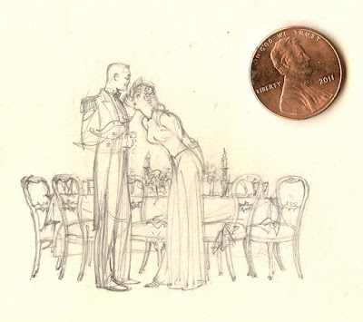
The thumbnail preliminary sketch is where artists first attempt to capture a spark of inspiration.

Before the layers of refinement have been added,  before the details and finishing  touches, before the mistakes have been corrected, a concept takes its initial raw form in a thumbnail.  Sometimes it's fun and educational to look at pictures in their embryonic state.  

Different artists use thumbnails for different purposes.  Some seek out the basic poetry of a picture:

Saul Tepper thumbnail


John Singer Sargent's thumbnail for his portrait of the Wyndham sisters

These sketches wouldn't serve as a roadmap to anyone but the artist.  Other artists manage to squeeze in an amazing amount of detail, working out a miniature blueprint for the picture to come.

 
Harry Beckhoff


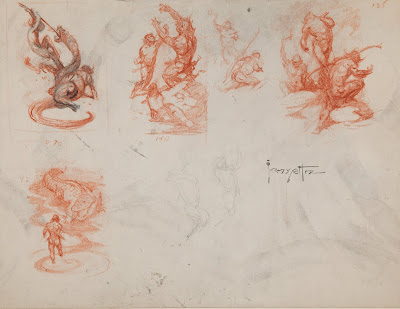
Frank Frazetta's tiny sketches for his Canaveral series contained all the DNA  for his finished pictures.  

Thumbnails can be dense with questions, bad instincts, alternative choices. The artist can afford to be fast and loose because thumbnails require less commitment than any other kinds of picture. They are the most promiscuous form of art, with all the attendant advantages and disadvantages. 

Illustrator Robert Fawcett drew six tiny thumbnails on a single card:


... before settling on the composition for this 1953 illustration:


Even in rapid, miniscule sketches, Fawcett was able to record numerous decisions such as the tilt of a head, the angle of a hat, the weight of shoulders leaning on elbows, and the role clouds might play.


Note how quickly he indicated the compositional role that might be filled by tree branches:


As he tested different possibilities, he used his wealth of knowledge about shadows, clothing, anatomy, rocks, etc.


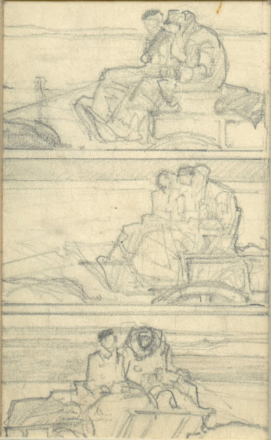
Next we see illustrator Dan Content experiment with alternatives for an illustration of a couple in a carriage... 


Apparently settling on that third version, he reduced it to ink... again, in miniature.


In the next set of thumbnails we can see how Content strengthened a composition he liked.


Content sharpens the geometric shapes of the objects in the foreground and the designs on the robes and carpet.


Thumbnails by the classic illustrators often demonstrate a strong sense of priorities and a sharp eye for key details such as the shape of the vase on the table.  But the key strength of thumbnails is that they always imply so much more than they show.  In many completed pictures the original concept is diminished.

More from Saul Tepper:


Thumbnails are tiny but inch for inch they can be more revealing than the finished picture.  Good things can come in small packages. 


Monday, November 09, 2020

18 GOOD FROGS

I like John Cuneo's witty, wicked drawing of Shostakovich's String Quartet No. 12.


Was that alligator ever really sincere about the music, or was he merely using it for nefarious purposes? And what in the world motivated the other three members of the quartet to create art with a predator? For that matter, is the creation of beauty ever compatible with ugly motives?

These are all important questions, but today the question that preoccupies me is: what's the deal with those 18 frogs littering the floor of the recording studio?

Picasso said, "Art is the elimination of the unnecessary.” If that's true,  Cuneo must've felt each of those frogs was necessary.   They are tiny (only 1/4 inch) and yet each one is distinctive and beautifully drawn.  Each required powers of observation. 


We see differences in personality...


...and differences in color:


The frog next to Cuneo's signature even contributes a little music:


These frogs required serious effort.  I have enlarged them here for you, so that you can give them the attention they deserve.

Now about those birds...