The thumbnail preliminary sketch is where artists first attempt to capture a spark of inspiration.
Before the layers of refinement have been added, before the details and finishing touches, before the mistakes have been corrected, a concept takes its initial raw form in a thumbnail. Sometimes it's fun and educational to look at pictures in their embryonic state.
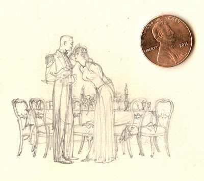
Different artists use thumbnails for different purposes. Some seek out the basic poetry of a picture:
 |
| Saul Tepper thumbnail |
 |
| John Singer Sargent's thumbnail for his portrait of the Wyndham sisters |
 |
| Harry Beckhoff |
 |
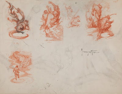
| Frank Frazetta's tiny sketches for his Canaveral series contained all the DNA for his finished pictures. |
Thumbnails can be dense with questions, bad instincts, alternative choices. The artist can afford to be fast and loose because thumbnails require less commitment than any other kinds of picture. They are the most promiscuous form of art, with all the attendant advantages and disadvantages.
Illustrator Robert Fawcett drew six tiny thumbnails on a single card:
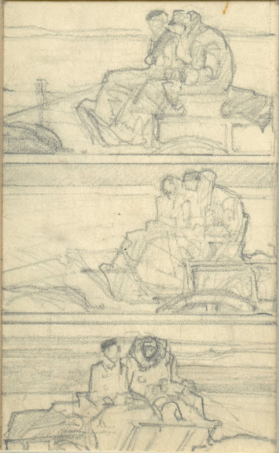
Next we see illustrator Dan Content experiment with alternatives for an illustration of a couple in a carriage...
Thumbnails by the classic illustrators often demonstrate a strong sense of priorities and a sharp eye for key details such as the shape of the vase on the table. But the key strength of thumbnails is that they always imply so much more than they show. In many completed pictures the original concept is diminished.
More from Saul Tepper:
Thumbnails are tiny but inch for inch they can be more revealing than the finished picture. Good things can come in small packages.


17 comments:
Nice pictures David. The rulers next to the pictures makes one realize how much older artist knew and understood how a given scale controls proportions of the whole picture and makes drawing easier.
Fawcett is awesome at any size.
...said his model, late into the party.
Thanks David, I enjoyed looking at these very much. I was particularly impressed by Saul Tepper. It was interesting to compare them with the one by Sargent which, I believe, did not serve the same function.
The Wyndham Sisters is one of my favourite portrait paintings, so I've spent a lot of time looking at it, and something tells me the thumbnail is a casual diagram of the painting (either finished or in progress) drawn perhaps in a letter of correspondence or some such. Of course I could be wrong about this, but in my experience the calligraphy and expression does not have the look of how artists think 'aloud' while groping around the germ of an idea. In other words: it has all the plastic hallmarks of being drawn after, rather than before, a fact. And this, to me at last, raises many interesting questions.
What amazes me as much as anything else is that those thumbnails and (probably) others still exist. There seems to be virtue in being a packrat.
Chris,
That Sargent thumbnail is in a Sargent book I've got. There's another to the right of it in which the figure-area is slightly lower (closer to the finished painting). The book caption says "Preliminary Studies of The Wyndham Sisters (from a sketchbook.... 9"x11").
My guess is that he was quickly judging how high to place the figures before beginning. In both books I've got on Sargent this is the only thumbnail sketch that has been printed with the finished portrait. Of course, that doesn't prove there weren't others, but from what I've read on how he worked, he would have little use for a thumbnail composition sketch before beginning a portrait or life study (or landscape study). Different situation when it came to mural-work obviously.
Thanks Laurence, that is very illuminating. I guess what you say about that thumbnail makes me sort of 'half right' in that it was being used as a diagram for judging the placement of an established idea rather than being part of its initial genesis.
Thanks a lot. Always a pleasure to discover how the image were conceived. I should thumbnail wore often.
Love this post. Wish I knew the Tepper and Content images these presaged.
Happy Thanksgiving everybody.
This is such an amazing blog, and I am so glad to see it still going in 2020.
I used to reference it often when I was more dedicated to making stuff a number of years ago.
I hope to spend more time here soon.
Tom-- Yes, I agree. Most of these are from the era when illustrators were working on large canvases, two or three feet tall, sometimes larger. I've been impressed when I see how effectively these tiny postage stamp size sketches translate into the finished product.
MORAN-- As long time readers know, I'm a sucker for Fawcett's ink work.
chris bennett and Laurence John-- Well, it's clear Sargent wasn't using the preliminary sketch to record details he'd need later, or work out vexing problems. But I think it does fulfill a different key role of these preliminaries. When Sargent is "judging the placement" of the Wyndham sisters, he's not just trying to map out how much tulle he can squeeze into a picture. He's looking for a design just as any abstract painter might. Even for a painter with Sargent's technical facility composition remains key.
Li-An-- Obviously most of the work on these thumbnails is conceptual. The slightest little line is code for a lot of visual thinking, and only the artist can unpack it. I think it's interesting that artists still need a physical drawing to work out and retain all their mental conjuring.
Kev Ferrara-- I agree, I wish I could track the final versions but they didn't turn up in my clippings and there is no book on Tepper as of yet. (I understand that Illustrated Press is working on one. The tribute is long overdue IMO).
I hope you and all others had a great Thanksgiving despite covid 19.
1914-- Welcome back! Yes, we're still here, although fashionable friends assure me that blogs are obsolete, superseded by instagram, pinterest, etc. But none of these other vehicles facilitates the kind of dialogue that makes this place interesting.
I found the published image for the first Tepper thumbnail in your post.
Here’s the intermediate sketch between the initial sketch posted and the finished version I linked to above.
Thanks Kev for taking the trouble to seek these out and post them up.
It's interesting how the intermediate sketch expresses all the plastic pushes and tugs of the final painting even though they are sometimes embodied by different elements than what was suggested in the sketch. For example, the guy on the far right with the outstretched arm. Interesting too how the spiralling form on the far left of the sketch is turned into the oval picture frame.
Chris,
I think the spiraling form was simply the result of Tepper feeling around for where to place the circular framed mirror, which was a stock prop in brandywine work set in contemporary interiors. It wouldn't have need clarifying in the sketch.
Yes, that makes sense.
It's interesting to see what elements he was dealing with in the initial stages were particularized in his mind as actual objects and what was unnameable plastic flux. The dream comes to the artist like a box containing a broken puzzle in which only they can sense the promised picture, and their job is to figure out how those pieces should be assembled to realise that picture.
Don't know where you found those sketches of Fawcett but they are fantastic and so informative. Great post.
Post a Comment