I'm glad to see that the art of illustrators is increasingly showing up in serious museums and galleries. At the Yale University Art Gallery, whose collection includes Rothko, Koons and Jasper Johns, you can also see paintings by N.C. Wyeth, Maxfield Parrish and Edwin Austin Abbey. The Metropolitan Museum of Art now displays the work of Norman Rockwell.
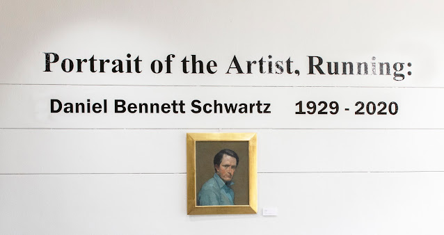
The latest example of this trend is the retrospective exhibition of the work of illustrator Daniel Schwartz at Bowling Green State University.
I'm a fan of Schwartz and the University was kind enough to invite me to contribute an essay for the catalog, alongside an essay by Charles Kanwischer, Director of their School of Art.
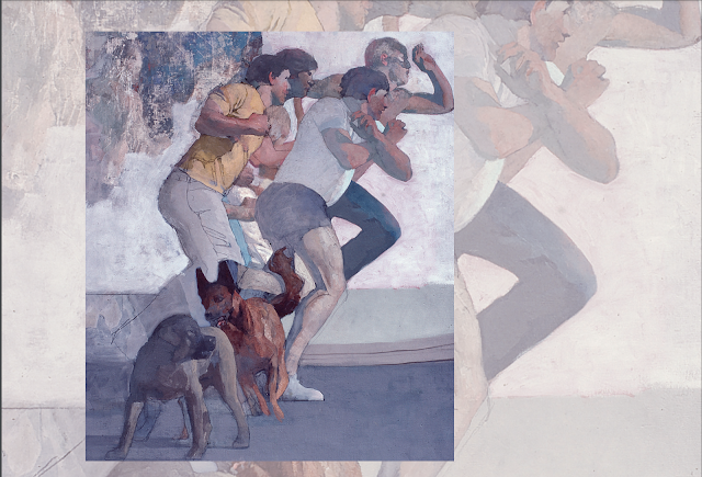
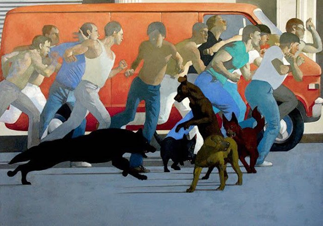
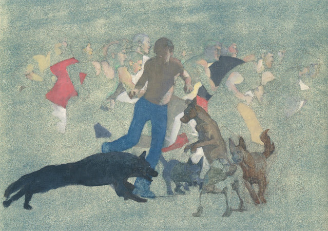
The exhibition is centered around Schwartz's magnum opus, Portrait of the Artist, Running. While meeting tight deadlines for clients such as Life, Esquire, CBS, Fortune and Playboy, Schwartz spent 15 years working on his epic masterpiece, making dozens of handsome studies and sketches:
I always wondered if his painting meant that Schwartz felt trapped in his career as a commercial artist.
The exhibition space is large enough to accommodate other paintings by Schwartz as well.
If you are in the vicinity of Bowling Green I recommend that you stop by.



33 comments:
If anyone missed the previous discussion about the 'Magnum Opus' painting it's here:
https://illustrationart.blogspot.com/2014/10/daniel-schwartzs-magnum-opus.html
"Dead end" is dead right.
He had great sensitivity, no doubt. Degas, Eugene Carriere, and Dewing were positive influences on him, and the more he went that way, unlabored and ephemeral, the better his poetic sensibility came through. But the more he thought about it and planned the more he entrapped himself in systematized graphic clarifications; a steel sieve.
I agree with Kev on his quick assessment of Schwartz's artistic internal/technical conflict - the various stages of the running men picture (sequenced in the excellent book on that subject) do indeed evidence the left brain's intellectual candle snuffer lowering down on what promised to be a wonderful work of art.
I have lived with "Portrait of the Artist, Running" for several years, involved since Mr. Schwartz's widow donated the work to
Bowling Green. In this process have had many feelings and impressid ons of the work. Most of us do not have this unique experience. I am not a professional, but have always admired Schwatz's work, and was priviledged to know him. Dan loved to work and he enjoyed other passions like jazz music and a lovely dinner with friends. This is a haunting painting. I never leave the image that I don't feel the release of power. When an artist grabs you by your shirt collar, how can it be anythig but compelling. I believe that Dan will now have students who are not casual about his work. Artist, illustrator, thinker,social scientist--just a very involved and intelligent human being "talking" about his time with a voice that cries out for listeners. How very fortunate these young people will be that in a university in the heart of the clountry to have Daniel Bennett Schwartz in their midst. And hopefully they will go beyond "Portrait" to a body of work that is his self portrait--even the illustrations he did with such honesty saying magazine pages were his canvas.
Laurence John-- Thanks for the link. I think it's very unusual for an illustrator with a steady flow of projects, working on tight deadlines, to work for many years on a major project like the Running Man. Harvey Dinnerstein, who was one of Schwartz's circle, did it but very few others. Some of the great illustrators, such as Wyeth, Parrish, Brangwyn and Cornwell spent a lot of time working on large murals but they weren't personal projects like the Running Man.
Ambitious projects like this help define an artist's aspirations.
Donald Pittenger-- The post modern trajectory of art really does remind me of the future that astrophysicists predict for the expanding universe: matter density eventually reaches zero, nothing is able to cohere anymore, matter ionizes and dissipates.
Kev Ferrara-- in Schwartz's book on the Running Man, he talks about the evolution of this painting. He was a very thoughtful painter, but I agree with you that the more he intellectualized his subject over 15 years, the more his instinctive, natural designs suffered. In my view, several of his preliminary studies, which were loose and intuitive, were absolutely gorgeous, superb works of art. When he chose to put that red van behind the runners and flattened everything it may have aided the symbolism of his message but I think the aesthetics of the finished painting suffered. It was still better, in my view, than the work of most illustrators of his day but given a choice I would take one of a dozen preliminaries over the final version.
There is a lesson here for all artists who struggle with content the way Jacob wrestled with the angel: If you ruminate too long about the meaning, and keep adjusting the form to reflect the content, you may find that content has won by a TKO in the 11th round. That's more acceptable for a writer, but it's usually not good for a visual artist.
Chris Bennett-- How interesting that you, Kev and I all had the same reaction to the preliminary versions of this painting. This is one of the big risks when you "go big" and work on a subject that consumes you for 15 years. It's also a reason why so few artists take such big risks anymore. Artists run a similar risk of going astray when they "go personal," which Schwartz clearly did here as well.
I admire big risks. Schwartz was writing Moby Dick, not limericks for Hallmark cards where it would be easy to look cute and smart and balance a limited set of ingredients. I construe this painting to mean that he was torn about his role as an artist / illustrator, and whether he would ever be able to break free from the competitive pack of artists jockeying for position. He could not have made some of the statements he wanted to make with this artwork-- such as painting his own face a featureless void in the shadows-- if he had stayed with the original looseness of hie preliminaries. He had to show every other face in the race more literally, with determined expressions and jaws set, in order to make that point. That seems to be part of a personal story he really wanted to tell, and he made some aesthetic compromises in order to be able to tell that story.
I suspect that Dan would have liked nothing more than to meet those who saw things differently then he did. Is it not Running Man that gets us to the table? This painting stands alone in so many ways? An entire nation took to the streets in the 1970's in more ways then one. We were running for our health in new shoes designed to give us lift. Did we achieve our goals? Did Schwartz?
How very special we have have been brought into the challenge.
.
Nancy Lindemeyer-- I envy the time you spent with Schwartz-- he was an important voice for profound and enduring values in art during a period when those values ceased to be fashionable. He, David Levine, Burt Silverman and Harvey Dinnerstein were not cowed by popular and lucrative trends. Some of those trends look quite silly in retrospect. Meanwhile, the qualities in pictures by Schawartz and his circle of traditionalists remain as relevant today as they were back then. As Ralph Waldo Emerson said, "Excellence is the new forever."
Thank you for your role as a catalyst in this exhibition at Bowling Green. I hope the audience there appreciates the experience.
Schwartz is the man in the middle, caught up in a pack of aggressive, determined racers, struggling to break free while dogs obstruct his path and nip at his heels.
Hardest thing in the world to believe a picture yet to be created.
Simple, by contrast, to construct it from parts; to block it like a diorama, and then go from trick to trick trying to bake it into a unit.
I never believed that this was an actual event. So it never occurred to me to actually pay attention to what was happening as if it was happening. Because, with the combination of photoreference and graphic silhouetting, nothing feels like nature and nothing has the illusion of movement. Thus the sensations of the painting, in total and part, have nothing to do with meaning-forces superficially being referenced by the depiction.
It seems to me a great shame that Schwartz's generation never had the opportunity to study with the great Imagists who had left the Art Students League a decade prior to their arrival. The older generation could have explained how to actually make the figures feel like they are running, that central figure look like it is turning away from the pack, and the dogs actually jumping around and nipping. And why to do that in a picture.
A principle of Imagism is that the qualities of the The Metaphors (actual metaphors, not similes being called metaphors a la Lakoff) are sublime to the picture. Thus when we feel the meaning through the depiction in Images, we cannot distinguish the physical meaning from the conceptual meaning. Because we believe the moment. And we believe because first the artist believed.
It is this synthesis of meaning and movement where the true visual poetry exists. Movement illusions and visual forces in general are the foundation of the language.
Frozen meaning-cyphers, on the other hand, are visual words; symbols requiring the code book. And code is anaesthetic; a form of literature. Which flags the great problem with Allegory anyway; that it exists to make the figurative literal; which is the province of writing.
That Schwartz wrote out a treatise - laying out his internal verbal sparring regarding the painting - only confirms the issue. The painting is about the treatise, not vice versa.
The figures in the front of the pack work work better, and to a lesser extent the figures in the back too, but the center falterssome. Probably for reasons that Kev gives that are a bit too cryptic for my uneducated POV. The dogs are just plain clunky, if that is a valid critical point, and aren't scary though they are intended to be scary. Can it be that the painting falters (not fails) because the center is via the "treatise" noted by Kev?
Its a lovely painting in terms of an idea, but lacks a focus, even as a focus is intended. He seemed to have made all figures "univocal" - having the same value, when its clear that he wanted the central figure to have the greater value. Maybe he couldn't get the dogs scary enough without making them cartoony. If you isolate the frontal group its a pretty amazing depiction, and does give a pell-mell feeling of movement.
I think the main problem with the painting is that it can't make up its mind what it wants to be. Is it allegorical ? Maybe, but an allegory for what ? If I hadn't already read David's synopsis and other comments, I would have no idea the guy in the middle represented Schwartz. Could the painting not just as easily be based on snapshots taken at a demonstration that turned into a riot ? It feels like an uneasy mix of journalistic realism, allegory and narrative.
Formally I think the painting would have been much improved if he hadn't gone with the red van idea. The colour, value and additional shapes / patterning all compete too much with the deliberately weak-value figures. The 'weak values bounded by dark' school (David Levine et al) works best when the background is dark and non-competing with the figures it's enclosing:
https://i.pinimg.com/originals/5a/64/24/5a642464bbe204876674fc3b253770be.jpg
https://i.ebayimg.com/images/g/DcQAAOSwBhdiQlEr/s-l1600.jpg
I would have gone with similar; a mid-dark warm grey background to completely enclose the figures (similar to what is already there in the dark edge of curb, and the bit of dark windows visible behind the van), dispensed with the light pavement altogether, leaving the figures in a minimal stylised setting. I know it's easy to make suggestions in hindsight, but that f**king red van is the main cause of the visual-stylistic problems in my opinion.
p.s.
Wes, everything in the painting is hard-edged, semi-flattened and graphic, therefore I wouldn't single the dogs out as being a 'clunky' problem. If an artist veers from 'realism' and into mannerist or graphic territory they have to 'own it' (as the kids say) and do it with conviction, but are still required to solve tonal and colour relationships in a satisfying way, and avoid confusing or unpleasant background - foreground clashes.
Kev Ferrara wrote: "It is this synthesis of meaning and movement where the true visual poetry exists. Movement illusions and visual forces in general are the foundation of the language."
We've discussed (and disagreed about) this issue before, and I'm pleased to continue the discussion. I understand why you believe that Imagism and "the great Imagists who had left the Art Students League a decade prior to [the arrival of Schwartz's generation]" was the high water mark of painting. After all, the "synthesis of meaning and movement" are wonderful attributes in painting. Movement is what the genius sculptors in the golden age of Greece brought to western civilization.
I too love what the imagists did, but by the 1960s Dean Cornwell couldn't find work, Rockwell was ridiculed as out of step, and Leyendecker had long since been relegated to the ash heap of history. In the 1960s when Schwartz began working the imagists would have starved to death.
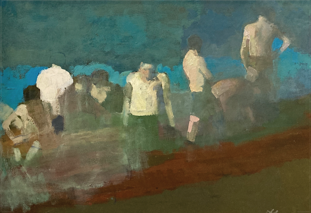
It seems clear to me that on his smaller, faster works Schwartz was quite capable of painting with movement when he wanted (as with his painting of people fleeing a burning building in this post. ) Similarly, although Schwartz painted "Running Man" in mostly flat, primary colors, his normal palette was far richer and warmer and organic than most of the artists of his generation, closer to the Brandywine palette. Schwartz clearly knew how to do it when he wanted to. He retained so much of the imagists (and Rembrandt, etc.) that he was frequently criticized for being old fashioned.
But getting back to the central point, where you and I disagree is that I seem to think art offers a more diverse menu of greatness than you do. Paintings by Giotto and Fra Angelico, for example, look stiff and awkward by comparison to the imagists and yet you'd have a hard time persuading knowledgeable viewers that they weren't at least as great-- if not greater. The Catalan master Bernardo Martorell's figures were similarly static and he was clueless about perspective, yet I think his brilliant paintings compare very well to the work of the imagists.
It should be no surprise that my examples above are mostly great medieval painters (although I could find equally apt examples of brilliance in ancient Egyptian art, Chinese art, Korean art and prehistoric cave paintings). Medieval art frequently used the same flat palette of primary colors as "running man" and-- most importantly-- was similarly rich in allegory and iconography. There is a literal kind of symbolism to "running man" that is found more in the world of the pre-Raphaelites than the imagists. It would be much harder to achieve the literalism that Schwartz wanted if he tried to paint this statement the way Harvey Dunn or Leyendecker painted.
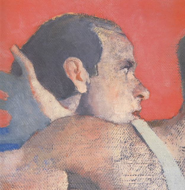
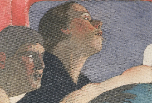
From my perspective, when we look at the close ups of the faces I have included here, it is apparent that Schwartz is not running in the same race as a Saul Tepper or Mead Schaeffer. There's a modernism to his colors, his images and his geometric designs that bespeaks different values in a different world. When Bernie Fuchs move to Westport and started to set the illustration world on fire, Al Dorne arranged a luncheon between Fuchs and Norman Rockwell because he thought the two should get to know each other. Fuchs recalled that while they both admired each other's work, they painted in completely different ways for completely different masters and saw little relevance in what the other was doing. Schwartz came along ten years after that.
Laurence John-- I would not have picked the red van myself, and it doesn't show up anywhere in Schwartz's preliminaries, but Schwartz explained, in a speech to the Century Club, why he made that choice:
"In the final version I obliterated the background with a red truck, which was the... stroke that I needed. Now the figures worked in a kind of crazy quilt way. Unlike the first version, which was very hazy and washy and mysterious, the painting became very precise, with a lot of edges, a lot of abstract negative shapes. A whole transformation in which I got an education in how to paint a large picture."
When you say, "I think the main problem with the painting is that it can't make up its mind what it wants to be," I think "what he wanted it to be" evolved over 15 years. It's obviously a highly personal, revelatory statement, perhaps a form of therapy. In some ways I think the painting would have been visually stronger if Schwartz didn't think so much; over the years he pondered the fate of a sensitive person trapped amidst packs of dogs and packs of runners (is there a distinction?). Clearly it was something he brooded about, but sometimes an artist has to take his or her hands off the controls and let the force take over. The works by Schwartz that I admire most are the ones where the intuitive right brain plays a larger role, but as noted above it's hard to think of another illustrator who attempted a masterwork of this scale and took these risks. Some paid off and others didn't, but that's what makes it interesting to me.
I would not have understood the themes underlying this painting either if I hadn't read his explanatory book, "Portrait of the Artist, Running" (an apparent reference to James Joyce's "Portrait of the Artist As a Young Man," except in the 1970s and 80s Schwartz clearly felt that an artist had to stay on the move, couldn't stop running).
Wes-- Schwartz wrote about his grouping of the figures in a way that I found illluminating. The figures didn't start out as "univocal" but became that way as the painting evolved. Schwartz said: "One day in 1969, watching a crowd of joggers across the street, I thought I might attempt a large painting based on this resolute, determined group of men. Over many years, the mysterious runners evolved into a self portrait.... a painful progression of discoveries both about what I wanted to communicate and also about what abilities I had to carry out my ambition."
Schwartz described a number of elements in the painting of the figures that escaped my attention at first, such as the side lighting from the right or the clenched fists: "Looking at the painting one sees a crowd of men running, not away from something or in all directions – as with a mob – – but resolutely towards something ambiguous, represented by the strong side light on their faces. These faces reveal nothing but an intense seriousness, except for one, which represents anxiety.... Their attitudes are aggressive, strained, their fists clenched. They are closely packed into a distinct group… They are all muscular, their masculinity paramount, except for the central figure who is more fragile, hesitant. He is trying to break away from the herd of onrushing men. His face is in a shadow,… I have placed myself in an alienated context, set apart from my fellow men who are engaged in a fierce race for a goal I will not share, a race to oblivion." Perhaps these elements are too subtle for anyone who doesn't have access to "the treatise." Or perhaps these elements are more for Schwartz personally than they are intended to be understood by a disinterested viewer.
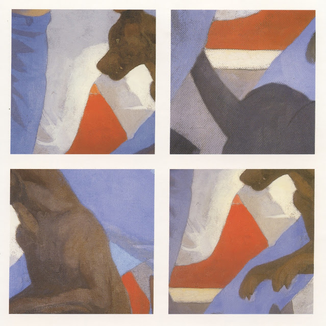
As for the dogs, Schwartz writes: "Wild dogs harass us as wild dogs would harass a herd of harmless animals until finally cutting out the weakest member for killing and devouring." He assigns them a role which helps explain why the dogs are flat, a little cartoonish, unlike the way one of Kev's "imagists" would paint a dog: "One of the dogs stands like a man to suggest its victory over us."
Re DOGS. November 12, 1972, article in THE NEW YORK TIMES about wild dogs in Brooklyn--perhaps 100,000--that were deemed dangerous to pets and people. As I recall the article, black and white of course, the dogs reminded me of the one's Dan painted in
"Portriat." I am sure one can google the article if you have a subscription to the TIMES.
I am so enjoying the commentary and so pleased thet the posting has created such a discussion. Would not any artist, writer, etc. want to have such a back and forth?
Perhaps these elements are too subtle for anyone who doesn't have access to "the treatise."
Or perhaps they are all too clear.
At the risk of being invidious, The Running Man is not rich in allegory. You only think it is because you read the book. Now the stated impetus, internal debates, the conceptual evolution, the final reasoning – all the apologetics – are filling your head with art phantoms that aren’t prompted by the work itself.
And we are back to the problem of disunity where words outside a work seek to bolster it; to explain it and give it a conceptual life that it doesn't possess intrinsically.
“A thing is only as good as it looks” has long been a staple of art teaching, and with good reason. Because a work of art only means how it looks, aesthetically speaking.
Reject this principle and (theory predicts and evidence shows) you get selling by the mouth in the Visual Arts, and eventually nothing but selling by the mouth. Which, not to beat the dead nag, is exactly where we are now; at the bottom of the multipolar trap, where dens of connected pomo hucksters front as the elite art world, barring or slandering all rivals.
By the 1960s Dean Cornwell couldn't find work, Rockwell was ridiculed as out of step, and Leyendecker had long since been relegated to the ash heap of history.
It may not matter to you, but it matters to me just who ridiculed Rockwell and who relegated Leyendecker to the ash heap of history.
Because those hotshots are the ones who’re now vanishing into the big dustbin in the sky. While Rockwell's and Leyendecker’s stocks have been steadily on the rise for decades; top gavel prices standing at $15 and $4 million respectively if that matters to you. (Even with garbage modernist and postmodern ideologues dead-set on keeping them marginalized.)
Dean Cornwell, on the other hand, indeed failed to compete for work in the 1960s illustration market. Mainly because he was a full-time muralist. But also because he was dead.
In the 1960s when Schwartz began working the imagists would have starved to death.
Von Schmidt and Meltzoff are two prime examples of greats who, as the 60s wore on, couldn't get work in the slicks due to the style change (and youth politics).
For a brief period in the late 1950s and much of the 1960s Imagism was indeed squaresville; out. Pop and slop, scrub and bubble, day-glo and pomo came in.
Then Frazetta sold a million copies of reprinted fantasy stories from the 1930s with a single image. And that fairly-well proved that it was not 'out' at all. Except among certain hotshots at the Society of Illustrators bar.
It would be much harder to achieve the literalism that Schwartz wanted if he tried to paint this statement the way Harvey Dunn or Leyendecker painted.
Firstly, Schwartz clearly didn’t know what he wanted; he fingerpainted the work for 15 years. And convinced himself it was done when he found a graphic “solution” to what was fundamentally an imaginative problem. He’d cornered and exhausted himself with intellection and then, I’d suggest, he took the first ready escape to end his self-torture.
Second, it isn’t “literal” in the Robert Fawcett sense. As Laurence put it, “It feels like an uneasy mix of journalistic realism, allegory and narrative.” I agree. Though I’d say it is mostly dogmatic.
Third, the understandings that developed into Imagism aren’t style-related; there are thousands of different styles, from Franklin Booth to Andrew Wyeth. (And I’m sorry to break the news to you, but I love those works by Martorell. Perspective and lighting only matter when they matter narratively.) Anyway, I’m not talking about replacing what Schwartz was good at, or altering his style, but adding arrows in his quiver. (Water under the bridge however.)
The problem with the mid-century guys is that they longed to go back and learn, they had sympathies with the old guard, but they were cut off, essentially. The Modernist coups had done their work. So they had to start from zero again, a pathetic circumstance for such great talents.
Then they had to bow to the day’s fashions and use “modernist colors” which I don’t know what they are. But I assume they must be synonymous with ‘bilious’.
Kev Ferrara-- Dean Cornwell died in December 1960 so technically he was alive in the '60s. But more interesting and relevant, here is what Roger Reed wrote me about the demand for Dean Cornwell's paintings in the 1960s:
"Cornwell [asked] some assistants to clear out an old studio downtown he was no longer using, but had kept paying rent on. Not so crazy a scenario, considering that even a very successful illustrator couldn’t get a museum exhibit nor gallery show for old illustrations, and this is why DC turned turned to murals, after all.... the assistants were to throw everything down a chute into the trash, but the paintings wouldn’t fit, so had to be broken in half. Then at least one of the assistants was heartbroken over the destruction, and took the shards home.... The fact remains that there are numerous early Cornwell illustration paintings on illustration boards that were broken in half, and semi-professionally restored.... Several of the Cornwells that were in our show in 1990 had previously been repaired in this manner, and some of them were canvases that had been torn or cut and then glued down onto masonite, using Epoxy glue!! I’ve never been able to determine who did such work, but it might have been the artist Allan Stone, who was Cornwell’s assistant on his last mural project, and he wound up with a lot of DC’s artwork in the 1960s....."
As for who would have the temerity to denounce the great imagists as being "out of step" at the end of their careers, Norman Rockwell wrote about Leyendecker, "Joe had been the most famous illustrator in America. Then the Post had dropped him; the advertising agencies had dropped him; the public had forgotten him. He died in obscurity." Of Leyendecker's work he said, "It was perhaps true that there had always been more technique than feeling in it....Whenever he was tired or discouraged about a picture he'd just put more technique into it. And technique alone is a pretty hollow thing." Which may be why Leyendecker fell out of favor as (again in Rockwell's words) "his work became even emptier than before."
I wondered if we were going to make it through this post without dealing with the divine Frazetta. You may like to think that Frazetta sold a million books because the public appreciated his "imagist" painting technique. It is equally plausible that a million Walter Mittys swooned at the fantasy of being a muscular barbarian with a beautiful half nude girl clinging to their inner thigh. I don't know how to test one explanation for his success over the other. He was certainly more of a crowd pleaser than a sensitive, literate, self-aware artist who searched his soul, fretting about alienation. Here's something that makes a difference to me, but may not make a difference to you: while Frazetta was a talented painter, intellectually he was something of a dolt. Politically he was a moron of the Rush Limbaugh / Donald Trump variety, macho and confident to a fault, petty enough to compete with his own kids. If Schwartz was overly cerebral about his work, there was no risk of Frazetta falling into that trap. That made Frazetta's work more appealing to some audiences, less appealing to others.
David, thanks for the quote. My own interest in works that employ deliberate artifice, stylisation and mannerism, has increased hugely in the eight years since I commented on that first post about the Schwartz 'magnum opus' painting and I still don't think the painting is a success. As i mentioned to Wes above, if an artist is going to take the viewer into a re-configured world that breaks the rules of 'realism' they need to do it with a large degree of conviction, in order to not have the viewer constantly asking themselves "why does that not look quite right ?" (that question is almost the worst thing a painter can hear from a viewer). Although Bernie Fuchs didn't do any gallery paintings anywhere near the scale of the Schwartz (as far as i know), he did go even further (i would say) into experiments in similar stylistic areas: weak value / tone, unusual colour choice, busy compositions, patterning, flattening etc in his regular illustration work. Yet I can't find any examples where they look problematic or unresolved.
To go back to Bernado (Bernat) Martorell for a moment, I don't feel any of the unresolved feeling i do when looking at the Schwartz, when i look at a painting such as this:
https://upload.wikimedia.org/wikipedia/commons/c/c2/Bernat_Martorell_-_Martyrdom_of_Saint_Eulalia_-_Google_Art_Project.jpg
... even though it's way more mannered, non-naturalistic, and even contains similar high chroma reds that i feel are clashing with the figures in the Schwartz. Why? Because we've come so far from 'realism' that we're in a pictorial world that has its own self contained rules, and the rules are consistent, and the problems within it are resolved.
For my money, Schwartz should have either gone further into mannerism, out there colours, and stagey drama, or the other way into loosely handled, painterly realism, but as it is, the painting is caught somewhere in between.
___
Kev, I'm surprised you like the Martorell painting that David linked to, as it's full of 'left brain' stiffness / mannerism. Why does it get a pass when other mannerist works don't ?
better repro of it here:
https://upload.wikimedia.org/wikipedia/commons/9/99/Bernat_Martorell_-_Saint_George_Killing_the_Dragon_-_Google_Art_Project.jpg
p.s.
Kev: "And we are back to the problem of disunity where words outside a work seek to bolster it; to explain it and give it a conceptual life that it doesn't possess intrinsically."
I agree. We should never let the backstory of the creation of a work of art influence our judgement of the final piece. If the story is full of hardship and struggle by the artist, it induces an 'appeal to pity' effect where we cut the artist a ton of slack for their valour through the difficult times and deters us from being critical in an unbiased way.
Of course, lots of stories from the lives of artists and the creation of certain works are interesting, but ideally we would view the work and make up our own minds about it before we knew a single thing about its backstory.
Laurence John-- I strongly agree with you that a work of art must stand on its own and should not be propped up by wordy explanations. At the same time, I'll confess that my appreciation for medieval art has been enhanced by reading about its iconography. Without words, how would I understand the meaning of a white lily, or why Mary's cloak is always blue? The same goes for understanding the symbolists, or the pre-Raphaelites, or Egyptian tomb paintings. I guess my prejudice is that a picture must first succeed as a visual object before it merits further verbal explanation. Bosch's Garden of Earthly Delights must first stand alone as a beautiful, scary, mysterious painting, but then deciphering its allegories can also be edifying.
My friend Kev is convinced there is no allegory in the running man because it never occurs to him that men racing "into the light"-- an off stage, unexplained destination-- could have symbolic meaning. Kev knows that when Frazetta paints a space lizard or a bearskin loincloth, it's a space lizard or a bearskin loincloth gol durn it. Artists who deal with more profound or personal or religious topics often depict the divine as a ray of light, or a fire, or a strong wind. Words (going back to the Bible and earlier) are what alert us to these possibilities, broaden our frame of reference, and make us receptive to the layered meanings of allegory. Artists who lack this broader vocabulary are relegated to painting god as an old man in a white bathrobe (or, in the case of Frazetta, a silly looking human Jesus).
When it comes to the words written about Schwartz's running man, the words came out 20 years after the painting, and they came in the form of a published collection of the numerous preliminary drawings and paintings that led up to the final painting. I'd say the book is more about the journey and the radical mid-course alterations than an explanation of the symbolism of the painting (which is good for me because I would not be as interested in the final painting if I didn't have such admiration for the versions that led up to it.)
Like you, I have also developed a greater appreciation for artifice and stylization as my tastes have (hopefully) matured. The stiff primitivism of Gauguin used to leave me cold, but now I love his work.
My friend Kev is convinced there is no allegory in the running man because it never occurs to him that men racing "into the light"-- an off stage, unexplained destination-- could have symbolic meaning.
Where did I say this?
I just said the piece wasn't 'rich' with symbolical import. It isn't. Verbal predicates for pictures are flat reductive and result in aesthetic poverty. You can name Schwartz's open-ended symbols a la carte and in short order...
The group running represents _____ and their symbolic destination is ______.
The man turning out of the pack represents _____.
The excited dogs in his way represent _________.
The street represents ________ and the red van represents _______.
Its like a fill-in-the-blank editorial cartoon, but writ in paint.
(The runners represent investors, their goal is cryptocurrencies riches, one investor has second thoughts but has to get through barking FCC regulators to sell his crypto shares. The red van represents "animal spirits" in the market.)
I also said I didn't believe the picture, so I didn't believe what was depicted was actually happening. So the whole thing isn't functioning aesthetically to vivify a complex metaphoric meaning. It's all simple.
The National Endowment For The Arts should bestow Orders of Merit for Sensitive Intellectualism at a wastewater treatment plant.
Kev, I'm surprised you like the Martorell painting that David linked to, as it's full of 'left brain' stiffness / mannerism. Why does it get a pass when other mannerist works don't ?
I don't think it is stiff. I think the left brain-isms are in balance with right brain creativity and exploration. The picture creates its own world.
Your point about the consistency of style is definitely part of it. If a picture looks realistic but one key element is distorted in a mannered way, it will flag itself up as alien/disunited. But if everything is similarly distorted, there is unity.
Most Mannerist pictures are inconsistent and clunky. The dogma comes from putting a high finish on weak conceptions, weak justifications, badly faked details, and poor interrelations between elements (again, disunity).
This one is full of aesthetic consciousness from edge to edge. Mental energy is fairly crackling through it, and the composing is dynamite. Not only is the value and color balance excellent, but there is even pattern and texture balance; a very high and rare level of artistry indeed.
Dean Cornwell died in December 1960 so technically he was alive in the '60s.
'Technically' he was legally blind by the late 1950s.
Dan was criticized during his life for rejecting modern art. He fought for his heroes Rembrandt and Eakins. It's funny to hear him criticized now for not painting in a traditional style.
JSL
Kev, I had assumed, based on previous discussions, that all mannerist painting was, in your eyes, guilty of the sins of "putting a high finish on weak conceptions, weak justifications, badly faked details, and poor interrelations between elements". Not to mention 'dogmatic clunkiness'.
Can you give an example of a mannerist work that you think exemplifies everything that is bad about mannerist painting ? I don't mean just a terrible, amateurish painting, but something that hangs in a museum, by someone considered a noteworthy artist.
I had assumed, based on previous discussions, that all mannerist painting was, in your eyes, guilty of the sins of "putting a high finish on weak conceptions, weak justifications, badly faked details, and poor interrelations between elements". Not to mention 'dogmatic clunkiness'.
I think there is a difference between Mannered and Stylized. Mannered, as I understand it, is always stiff. And 'stiff' comes from putting a finish on something lacking in integrity and which has been conceptualized in isolation (as opposed to with respect to the compositional/gestalt whole) which results in a kind of clunky visual dogma.
'Stylized' just means it is distorted to expressive effect.
The Martorell may be classified as Mannerist by scholars for their purposes. But to my eye it looks 'stylized to expressive effect'.
As far as 'stiff' Mannerism, a quick search yields the following...
One
Two
Three
Kev, there's weak drawing in all of those examples, which breaks the spell. I can go with almost any amount of stagey artifice, stylisation or expressive distortion as long as the finished picture is well realised and consistent within its own rules.
This for instance, has the static diorama feel, but it's so well done that I can't help but get drawn in (sorry, the hyperlink code doesn't work for me for some reason) :
https://artsandculture.google.com/asset/justice-of-emperor-otto-iii-beheading-of-the-innocent-count-and-ordeal-by-fire-dirk-bouts/5AGtQbEd3j5HnA
ditto this:
https://artsandculture.google.com/asset/main-view-composite-detail/ZgHyl9glFN55Jg?childAssetId=VAH5mmnlns3rfA
I can go with almost any amount of stagey artifice, stylisation or expressive distortion as long as the finished picture is well realised and consistent within its own rules.
I can almost agree with that, but I would add that there should be enough 'art' per what's being represented. The thought and effort must be there to make the thing radiate with aesthetic life at least a little.
For example, your second link of "The Deposition" is a strong vignette with an overall expressive effect complex. And has great faces, each unique in character. Each color - deep blue, red, white, dark brown, and gold - has its own balance. Additionally it has that exquisite pattern on the dress at right which is balanced by the texture of the frizzy hair, beard and epaulets/medals over the head of Jesus.
So even though it is flat and mannered, it is working on other kinds of poetics, other kinds of ideas to create beauty on its own terms.
Now, I still don't love it, and I'll probably never look at it again, but it definitely earns my respect (whatever that is worth) for having consciousness and unity.
Reminds me of a Harvey Dunn aphorism related to his having students of wildly different abilities in his classes. "Be a master of such as you can do," he would say. Which enabled and encouraged some of his less naturalistic students to develop their own unique styles...
Mario Cooper
Harry Beckhoff
Vernon Grant
Post a Comment