Tuesday, December 26, 2023

THE END OF 2023


Milton Avery (1893-1965) was famous for simplifying forms.  He refined and refined them in search of their poetic core.

I love his painting of a spring orchard:


Here are two of his paintings of the sea shore at night:


Avery tugs and plays with the shapes of nature to discover lyrical forms that no one else sees.  For example, this is his view of an industrial gas tank on the island of San Tropez:


Since Avery takes the liberty to reinvent nature's forms, he must decide exactly where to draw the line.  Watch him explore:


Three different attempts to figure out just how far to go.


His drawing is a neat little reminder for artists in the new year:  until you've gone too far, you'll never really know if you've gone far enough.

Wishing you all a happy, healthy 2024!


Tuesday, December 19, 2023

A TRIP TO THE SOCIETY OF ILLUSTRATORS

 Every time I visit Manhattan I make a beeline for the Society of Illustrators which, pound for pound, remains one of the most interesting galleries to visit in the city.  Many pictures there are not to my taste, but I never fail to learn from and be inspired by their varied assortment of art on display.

Here are some particularly excellent images I want to point out to the world:

This huge, juicy watercolor by the talented Bill Joyce reminded me that I don't revisit his work nearly enough.  Up close the painting just glows in ways that printed books-- or your computer monitor-- can't capture.  


Joyce's distinctive imagination shines through in every garment, every hairstyle, every pose, every architectural detail, every lighting effect.  This is a beautifully constructed painting.


The Society is also displaying Victor Juhasz's preliminary sketches leading up to his illustration for the short story, The Mailman, about a mousy little man provoked to violence. 


Milton Glaser warned students, "A designer who cannot achieve the specific image or idea he or she wants by drawing is in trouble."  For proof, look no further than what Victor Juhasz is able to accomplish with his excellent preliminaries for different ideas:


Juhasz can master extreme foreshortening to fit all the necessary ingredients into the picture, each with the right emphasis.  He knows exactly how to balance the weight of the figure in the pose he needs.

You want those figures drawn from above?  Yeah, Juhasz can do that too.

How would that shadow work from a different angle?  Under control.

Another extreme perspective: a knife's eye view of the situation.

It's a joy to watch a talented draftsman like Juhasz play with alteratives. Would you find comparable draftsmanship at the Museum of Modern Art?  Would MOMA even care that you can't?  

Here is the final approved illustration:


In a different vein, an exhibit of children's book illustrations displays, among others, the joyful work of Christian Robinson.  His inventive designs are always refreshing to the eye.  He is, in my view, this generation's successor to the greatest designer/illustrators, such as the Provensens.


And for one more example in a different category, kudos to whoever at the Society figured out that this mask by illustrator Wladislaw Benda needed to be lit from below, with a red background.


Benda is another excellent illustrator who seems to have slipped through the cracks, but in the 1920s and 30s he was as famous for his masks and costume designs as he was for his illustrations.

There you have it-- a selection of personal high points from the Society of Illustrators this week.  Always worth the trip.


Saturday, December 02, 2023

ARTISTS IN LOVE, part 23

 After last week's arguments over politics and war, we are overdue for another report on the curious doings at the intersection of art and love:

Norman Lindsay and Rose Soady

Artist Norman Lindsay said that he usually began his complex pictures by drawing a single female form, then built the rest of his composition around that central image.  Starting in 1902, the central figure in Lindsay's life was his favorite model (and later wife) Rose Soady.   


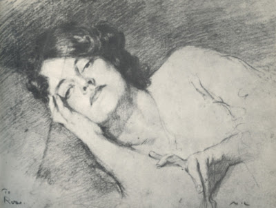
Sketch of Rose, 1905
 
In a dusty used bookstore I recently stumbled across Rose's memoir of her unconventional life with Norman.


Lindsay was married with children when Rose began modeling for him, but after two years Rose reports the two consummated their relationship "spontaneously and without premeditation," then stayed together for the rest of their lives.  She was apparently the rare woman who was scrappy and open minded enough to keep up with him.


Rose described the extraordinary measures the couple took to hide their scandalous relationship.  She lied to her mother about posing nude and Lindsay lied to his wife that he was sleeping in his studio. The couple lied to their landlady that they were brother and sister (but were sternly evicted when the landlady caught on). Later when the couple rented adjoining rooms, they cut a secret trap door in the wall so they could get together. 
The partition was only thin wood, which made entry from room to room easy-- just by cutting a trap door.  A saw and two hinges were all that was necessary for the job.  It was cut out just above floor level and the drawing table placed against the trapdoor; a chair, a mat, and a scatter of papers and books made it look just right to callers. 
But here's the interesting part:  despite their elaborate efforts to keep up pretenses, Norman's pictures of Rose seemed to be public advertisements for their affair.  Why even bother lying to their landlady if Norman was drawing pictures like this?


Lindsay became famous for his hundreds of pictures of wild nymphs and satyrs trysting.  


Artists who draw the most intimate or controversial subjects somehow feel shielded by their art.  It's like the child who thinks that if they put a napkin over their head, no one can see them.  

The artist's audience might suspect, but can't prove, where fact ends and fantasy begins.  This fig leaf often emboldens artists to put all kinds of revelatory and personal subject matter out there.  Once a picture has been launched, it becomes something separate from the artist, who-- if pressed-- can disavow any reality in the content.  

Where did the fact end and the fantasy begin?  Above, Norman's reference photo of Rose (reproduced in her memoir). Below, a fanciful drawing by Norman.


Of course, some friends and family were unwilling to abide by the polite fiction and stopped associating with Norman or Rose.  Shrill letter writers accused her of being a "tart."  Publications such as The Sydney Morning Herald and Art in Australia sponsored campaigns against Lindsay's work.  Art galleries and museums refused to exhibit Norman's work.  Angry clergy clucked at and scolded the couple.  

The feisty Rose tried to defend Norman's work, visiting hostile publishers and confronting critics who publicly attacked Norman while privately applauding his work.  Norman wrote:
A country that fails to understand that the moral value of Art has nothing to do with the ethics of suburban back parlours is not worthy of being given an art....[N]ot one specimen of the Moral Lion who is at present  roaring at my work has the faintest perception of its moral intention, or could, in a single instance, explain the meaning of one of the works he is making such a fuss about.
By 1913, when Norman drew Rose in the role of "Venus Crucified" by society's moral guardians, the jig was pretty well up:


Looking back, Rose seemed to relish her youthful adventures.  In her memoir she proudly reprinted some of Norman's [NSFW]  early photos of her.  "Those were the days," she recalled. 
 

Norman developed their personal photos himself using chemicals in their small kitchen.  Rose recalled that the chemicals smelled terrible, but apparently the results were worth it.


Norman passed away in 1969, and Rose followed him in 1978.

Thursday, November 16, 2023

EDENTULOUS


This editorial cartoon by the great Michael Ramirez was published by the Washington Post on November 7 and withdrawn the next day after complaints that the cartoon was "racist."

Ramirez combines strong opinions with strong drawing abilities-- the ideal
combination for an editorial cartoonist. 

Several forces now threaten the once-great institution of editorial cartoons.  Among them are the dwindling circulation of newspapers and the sensationalism of the 24/7 cable news cycle.   But there's an even larger issue: whether modern newspapers and their audiences still have the stomach for caricature.  

Cartoons have an important history of offending targets in ways that words cannot.  The corrupt politician "Boss" Tweed famously said he was unafraid of what newspapers wrote, but "those damned pictures" by cartoonist Thomas Nast had to stop.  Tweed was right to be concerned; cartoons toppled his regime, and as a fugitive from justice he was identified from Nast's drawings.  

When cartoonist David Low savagely depicted the Nazis on the eve of World war II, the German government formally protested to the British government.  Low explained his strategy: "To draw a hostile war lord as a horrible monster is to play his game. What he doesn't like is being shown as a silly ass."   

Hitler was reported to have personally put a price on the head of cartoonist Arthur Szyk for his cartoons lampooning the "master race."

Victims of caricature have always pressured newspapers to stop, and newspapers have had to find the courage to stand up to the pressure.  

Today, villains who are indignant about being ridiculed have found more effective ways to get editorial cartoons removed.  Experience shows that nothing can cause the Washington Post to retreat faster than an allegation of "racism," whether the allegation had any basis or not. 

Racism? Caricature by Ramirez (left) of Hamas official (right)

The same tactic was used when cartoonist Ann Telnaes drew a cartoon criticizing Senator Ted Cruz for filming his small daughters reading an attack ad against his competitor.  Telnaes drew them as performing monkeys.  


Cruz's allies shrewdly recognized that the best way to get the cartoon removed was to allege that the cartoon was "racist"-- a ridiculous charge, but The Post immediately caved and withdrew the cartoon.  

The removal of Ramirez's cartoon last week shows that the trick still works.

So what kind of editorial cartoons can safely pass muster at the Washington Post today?  Three days after withdrawing the Ramirez cartoon, the Post editorial page ran the following edentulous cartoon:  


Bland lifestyle cartoons are no threat to anyone.  But compare the draftsmanship and the content of this cartoon to the brilliant and biting humor of Ramirez.

 Newspapers shouldn't withdraw editorial cartoons just because the target feels offended.  Those newspapers that do, no longer understand the nature of caricature and might want to consider getting out of the editorial cartoon business.   

Sunday, November 05, 2023

THE ARTIFICIAL INTELLIGENCE THREAT TO TRADITIONAL ART

Artists have historically performed many important functions, such as drawing pictures for young women to show what their future husband will look like naked.  


Note that the above drawing will be "hand made."  No computers involved.  The artists will "read your future by aura and tap into the source" in order to provide you with: 


The huge demand for such information has been a major source of revenue for traditional artists: 


You'd think such an important role for art would be safe from incursion by cold Artificial Intelligence.  After all, what kind of person would trust a machine to tell them whether their future husband will be overweight or have a tattoo on his butt?  Only a true artist could know such things.

Despite this fact, today there are numerous AI image generators offering a variety of "clothes removal functions" which you can use to learn intimate details about your potential life partner.


With the click of a button, Nudify.online will strip the clothing in a photograph in less than a minute.   And Soulgen reminds you that after you've used their software to create a NSFW image from a photo of your beloved, if you have some really detailed questions "you can reuse the image and write a text to create exactly what you want with that character."  

I can understand how people interested in a meaningful lifelong commitment would want to seize upon this information to help them make their choices.  But how can they be so easily duped into believing that AI will give them reliable information?  Better to stick with authentic art, made by a genuine artist.

Wednesday, October 25, 2023

ONE LOVELY DRAWING, part 70

 The great Mort Drucker drew this ad for Burger King in 1990:


There are 40 different faces in this riot of a drawing.  


Most cartoonists rely on a basic template of four or five facial expressions, but Drucker is able to conjure up an endless cavalcade of faces.  Note how he never seems to repeat the same mouth twice in this drawing.  Note all the different angles; very few people stand up straight.


Drucker packs his creative choices together densely, which gives the drawing a feeling of generosity.  His lively, bouncy line helps us feel his joy at the infinite variety of humanity.


And that's before we even begin to talk about his trademark hands.


To appreciate the sensitivity of Drucker's line, drill down on the smallest details.  


Note how he varies the thickness of his line to convey 3-dimensionality, or shadows, or conceptual emphasis.  When a feature is less significant (like the shadow on the tip of that nose) Drucker's touch can be as light as a feather.

One lovely drawing indeed!