

Milton Avery (1893-1965) was famous for simplifying forms. He refined and refined them in search of their poetic core.
I love his painting of a spring orchard:

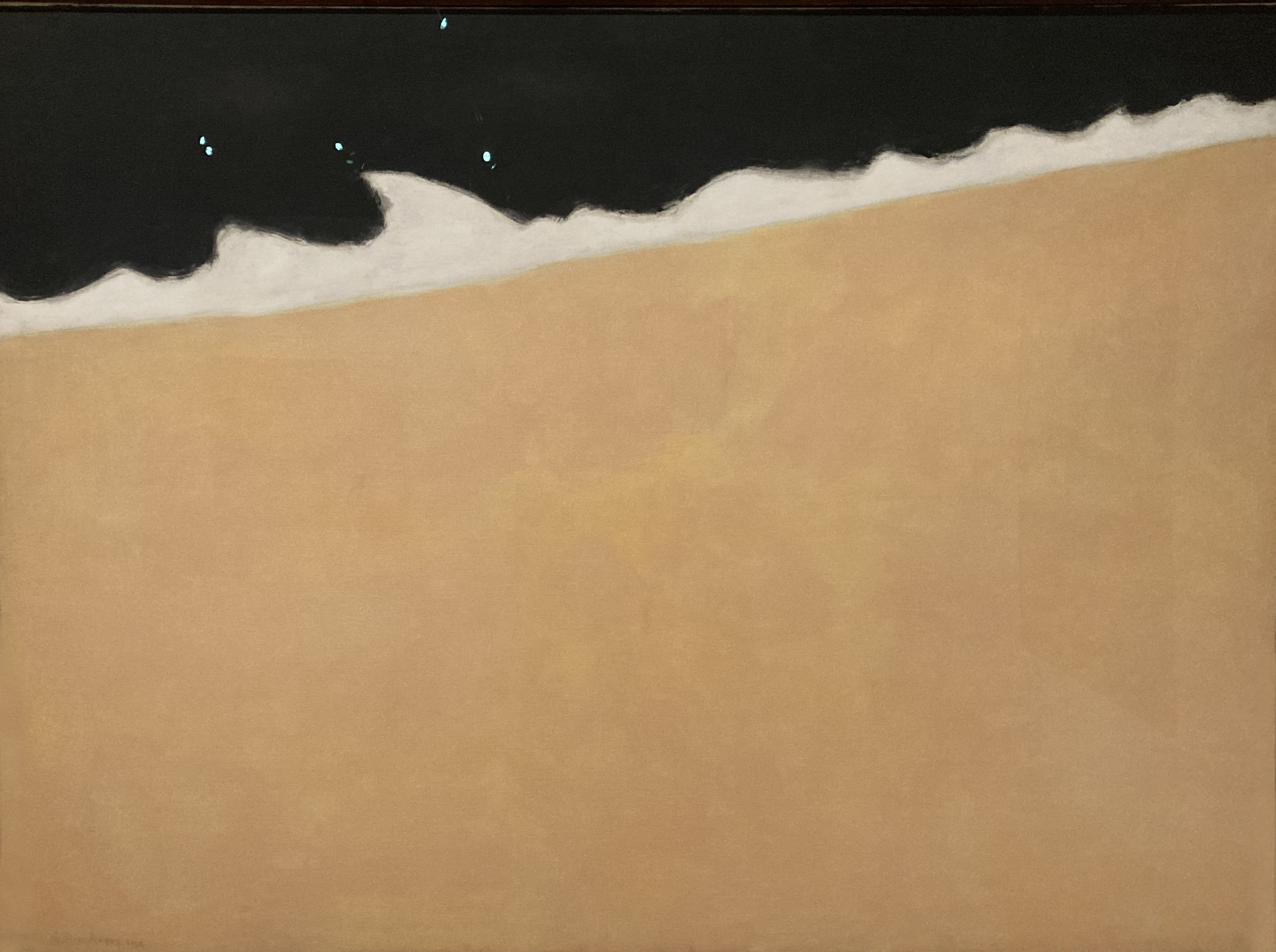
Here are two of his paintings of the sea shore at night:

 |
Avery tugs and plays with the shapes of nature to discover lyrical forms that no one else sees. For example, this is his view of an industrial gas tank on the island of San Tropez:


Since Avery takes the liberty to reinvent nature's forms, he must decide exactly where to draw the line. Watch him explore:
 |
| Three different attempts to figure out just how far to go. |
Wishing you all a happy, healthy 2024!
27 comments:
Ever year I love your year "end" pictures.
That giant ass drawing is the only one that passes the sniff test.
The other kinds of representations are more parsimony than poetry; reductions to absurdity. All the suggestive complexities of art in relation to life have been expelled, all the aesthetic difficulties avoided. The result is stylized cartoony graphics, one shade away from computer icons.
Which is a great style for entertaining kids – Adam Sandler-level simple-mindedness is self-justifying as comedy for certain age groups - but hardly a nourishing cultural meal for adults. Like a kid can eat Twinkies, BonBons, and HoHos and pass for normal, but an adult that regularly eats those artificial confections is probably in need of therapy.
Happy New Year!
“The End of 2023”? Is that a wisecrack?
Thanks, David . . .
... for your wonderful blog; as always -- interesting and informative.
Happy New year, all!
Cheers!
Wes
Farter-ta-ta, farter-ta-ta 2023...
Closing part of the comedy sketch 'The Art Gallery' by Peter Cook and Dudley Moore:
https://www.google.com/search?sca_esv=594082483&tbm=vid&q=pete+and+dud+art+gallery&sa=X&ved=2ahUKEwjWmujH0LCDAxWHXEEAHUckBbQQ8ccDegQIDxAH&biw=1396&bih=679&dpr=1.38#fpstate=ive&vld=cid:adf68e54,vid:0Wyr2g6xjp0,st:0
Thanks David for such a great blog and good wishes for the New Year to you and all the gang in the comments section.
MORAN-- Many thanks. Every year there are so many candidates to choose from.
kev ferrara-- Only 3 days left for you to make 2023 the year when you finally open your mind to a broader concept of art. But don't worry, if you can't quite make it I'll stick with you in 2024.
Movieac-- Of course not. But by some coincidence every end-of-year post for the last several years has the same theme.
Wes-- Thanks, and happy new year to you too!
chris bennett-- Thanks, I hadn't seen that one. Cook and Moore were so great in those early years, before the high budget Hollywood extravaganzas.
Yes, happy new year indeed to "the gang in the comments section."
"Only 3 days left for you to make 2023 the year when you finally open your mind to a broader concept of art."
I wish you many, many glorious and wonderful days of health and happiness, just one minute of which set aside for you to perceive "Spring Orchard" with your open eyes instead of your "open mind" and to realize that the only thing "Spring Orchard" about it is the name. And the name isn't the art.
This is a nice follow up: 'Mannequin in a Spring Orchard'
"Do not be so open-minded that your brains fall out." ~ G. K. Chesterton
"Too late! I come from the 1960s!" ~ David Apatoff
Best wishes always,
The Unconnable Kev
'One of the Gang'
Kev Ferrara-- Did you mean to say "unconnable" or "unconscionable"? I thought you might have had the Autocorrect function turned on.
As for that great G.K. Chesterton quote, I used it in a post a few months ago ( https://illustrationart.blogspot.com/2023/05/evading-snare-of-modern-art.html )but when I read it, it was attributed to the Maharani of Jaipur. Perhaps it's one of those quotes that is better attributed to Abraham Lincoln.
Avery's early work was traditional realism. He started out painting landscapes, and it would've been easier for him to continue to do that forever. But he wanted to continue to grow and explore; after a lot of initial resistance, he persuaded his peers of the value in what he was doing.
“Milton Avery (1893-1965) was famous for simplifying forms. He refined and refined them in search of their poetic core (...) he wanted to continue to grow and explore”
He certainly can be credited for exploring. But “Poetic Core” is empty rhetoric. There is no such thing. Poetry is always complex, despite the puffed up claims of 120 years of simple-minded herd intellectuals.
The inherent simple-mindedness of herd intellectuals is why they always end up with reductive bald designs to illustrate their impoverished academic theories: Red squares on white canvases, or just white canvases. Or just black canvases. Or just a graphic stripe on a canvas. One drip. Ten splatters. Circles for heads. Black rectangles for rocks. Green blobs for trees. And every 'ism' theory under the sun.
Such absurd reductions are not ‘refined’ nor the result of 'growth'. But rather are (often) manifestations of the left brain dominant need for quick simple linear answers to impossibly nonlinear questions. Or, more charitably I suppose, a longing for childhood simplicity. Where a car is just a box with a steering wheel sticking out of the top and two black circles for tires at the bottom.
Meanwhile, one of the greatest arts of Art is to have the broad power of graphics without giving up subtlety, humanity, inner movement, truthful gesture or naturalistic honesty.
For example, a real poem of a Spring Orchard may look like this…
A real poem of rough surf breaking against dark rocks in front of a dim Ocean backdrop may look like this…
FunConscionable Kev
I stopped reading the comments here because I am always curious to look at the work of the commenters and… Well, as we say somewhere in the world "You don’t need to be a chicken to enjoy an omelette".
Happy New Year dear Mr Apatoff, your blog is always titillating.
Herd intellectuals just don’t understand that memetic fidelity is at once a deciding factor in whether a painting gets the Priest’s approval AND the prime reason for His dismissal of photography. Representative art is God’s plan; only don’t get TOO looks-a-likey, or the Devil’ll getcha!
Thanks for this space, David, where all these interesting discussions have taken place over the years. Happy New Year everyone!
"Herd intellectuals just don’t understand that memetic fidelity is at once a deciding factor in whether a painting gets the Priest’s approval AND the prime reason for His dismissal of photography. Representative art is God’s plan; only don’t get TOO looks-a-likey, or the Devil’ll getcha!"
Hiding Doctor Heckle, here's a simple summary just for little old you:
A recording is not a work of poetry. No more than a photo of a sculpture is the sculpture, or a recording of a concert is its performance, or a fingerprint is a finger tip. Mechanical recordings, though full of distortions and elisions that are often difficult to notice, are inherently journalistic. What you or I say has no bearing on that reality.
Lossy stylizations are graphic, glyphic, or typographic designs. The resulting symbols - which usually use conventions that go back to the stone age, because humans from the start have been reflexive simplifiers and conventionalizers - do not afford instant intuitive re-assembly of the missing/elided information, but rather require some interpretive and intellectual constructing of the absent content.
This is the way words work. Words are puzzle-like and game-like. You solve them. You solve sentences to get their meanings. Just as one must solve Avery’s graphic paintings to figure out what they depict. This is why such graphic-symbolic simplifications are “lossy”.
Meanwhile aesthetic suggestions are subliminal poetic communications. You can’t consciously intellect about them because they aren’t caught by the net of conscious attention; which is literalist by nature. They pass into the mind unnoticed in their particulars. Then you either intuitively grasp the aesthetic effect structures (achieving closure reflexively) or you don’t. If you do, you get a strange visual sensation; a meaningful illusion effect. If you don’t react to the effect structure, you sense nothing except your own lack of interest or antipathy.
Poetry is built of these meaningful illusion effects, which lurk beneath between and behind what is evident and literal (the references). The more a picture (or poem) relies exclusively on poetic effects, the more it is poetic, and the less dependent on references and conventions. (The more it pings the imagination directly, rather than the intellect.)
And because each subliminal illusion effect is a particular kind of strange visual distortion, the more poetically suggestive a work of art is the more strange it will feel. Which is to say, the more the work will reveal itself to be art via that magical feeling that we associate with Art. Which is the accumulation of individual effects acting on the viewer en masse from all scales of the work.
Hope that helps!
Happy New Year!
Kicking myself for that misspelling - I meant «mimetic», not «memetic».
…but perhaps that error carries its own relevancy to this theme, as you carry on on insisting on the existence of communicative «effects» that somehow manage to exist, communicatively, beyond language, while at the same time categorically categorizing only visual art that, by any pragmatic threshold of sanity, is representational as able to emit these mystical rays of non-representational communication.
Happy New Year!
Kev Ferrara-- Unconcordable, perhaps?
I know you don't believe that the thousands of years of artists struggling with the simplification process is "a longing for childhood simplicity." We've discussed the supreme challenges of simplification here in too many contexts, from too many talented artists.
Alex Toth wrote: "Simplicity is a great god. Truth. Throw out all the junk. There's a saying which says: 'to add to truth subtracts from it.' Make it so simple you can't cheat." We've seen similar sentiments from Robert Cunningham, Charles Schulz, Alexander Calder and others going all the way back to ancient Zen sages and Chaldean priests.
Li-An-- Many thanks, I appreciate your input.
Aleš -- Thank you. Here's wishing you a happy and fruitful 2024.
Anonymous-- we don't deduct points for typos around here, only for absence of nutritional content. I enjoyed what you wrote, and you're doing just fine. Happy new year to you too@
"..as you carry on on insisting on the existence of communicative «effects» that somehow manage to exist, communicatively, beyond language, while at the same time categorically categorizing only visual art that, by any pragmatic threshold of sanity, is representational as able to emit these mystical rays of non-representational communication."
I don't think Art is communicating non representationally. I think it is communicating in a way that is fundamentally different from text based language. The way we receive meaning through reading text is different than the way we receive meaning by viewing a work of Art.
Abstract pieces of art (like most of the fun Avery's in David's post) substitute the part for the whole. They are decontextualized designs that are put on display. Not a bad thing to do or enjoy, but these exercises are fundamentally different on an experiential level from Art. Art says something about reality by way of (Kev's language) orchestrating abstract designs. The designs are given a context and related to each other, thus becoming the building blocks of the pictorial language. I am following Herbert Reads* definition which I learned about from this blog. "The real function of art is to express feeling and transmit understanding."
These opinions are my own, though obviously inspired and indebted to Kev's writing on this blog.
Happy new year all, and thanks for keeping up such a great blog, David!
*Though perhaps I am misreading him, since he seems to have been a champion of high modernism.
«effects» that somehow manage to exist, communicatively, beyond language, while at the same time categorically categorizing only visual art that, by any pragmatic threshold of sanity, is representational as able to emit these mystical rays of non-representational communication.
The audience brings meaning to the table, which the artist can leverage in a representational piece.
Whether it's a beautiful woman on a veranda, a foggy field of battle, a helpless child with outstretched hands for food, or a majestic pagan old tree, each of these images is packed with meaning. The artist can play with these meanings, adding to, subtracting from, multiplying, and dividing them in their treatment.
Moreover, within any one of those things, there are additional layers of meaning. For instance, the girl on the veranda is beautiful – but beautiful in what way, like Keira Knightley or Scarlett Johansson? These types of beauty convey different meanings. Casting in a picture is like casting in a film – the character's identity changes the entire meaning of the picture.
And what sort of veranda? Is it Romanesque/Italianate or Southern Gothic? The setting also alters the meaning.
And what about the weather? Obviously, a sunset on a beautiful day differs from a rainy day.
And if it's raining, does the lighting make the rain feel comforting or stark and cold?
How are the girl's hands? Are they dirty or clean? Is she clutching something?
And so on. A representational picture has an infinitude of these little details, all carrying meaning, that the artist can manipulate.
And that's before considering the treatment. Suppose the artist has selected all these elements for the girl on the veranda, creating a whole narrative. But is it in the style of Charles Schulz, Monet, Cassat, or Da Vinci? The meaning of the picture changes wholly based on those treatments, yet very little can be expressed about them in language that would capture what is fundamentally different in the feeling of a Monet versus a Cassat treatment of the girl on the veranda.
In this sense, the painter is similar to a poet. There's the meaning of the words, the choice of words to convey that meaning, and how the words themselves sound, all combining to create something more.
A non-representational picture is very like a poem with only nonsense words. The artist cannot provide content in what is said, only in how it is said and what those phonemes remind us of.
So, on the very representational side of abstract poetry, we have Jabberwocky, which lets the nonsense words remind us of real words we know: "Twas brillig, and the slithy toves / Did gyre and gimble in the wabe: / All mimsy were the borogoves, / And the mome raths outgrabe."
And on the perfectly non-representational side, we have Hugo Ball's "Karawane":
"jolifanto bambla o falli bambla
großiga m'pfa habla horem
egiga goramen
higo bloiko russula huju
hollaka hollala
anlogo bung
blago bung blago bung
bosso fataka
ü üü ü
schampa wulla wussa olobo
hej tatta gorem
eschige zunbada
wulubu ssubudu uluwu ssubudu
–umf
kusa gauma
ba–umf"
Alex Toth wrote: "Simplicity is a great god. Truth. Throw out all the junk. There's a saying which says: 'to add to truth subtracts from it.' Make it so simple you can't cheat."
I agree that Avery has indeed simplified the values and colors to a point where he couldn't "cheat." But merely avoiding cheating does not automatically translate to a passing grade.
His approach to simplification has, rather, highlighted his significant artistic shortcomings. Most glaringly, his simplification has made it abundantly evident that his shapes stink. Where his terrible shapes could pass in his early impressionist phase, once he moved into this more minimal style, that weakness became obvious.
This deficiency in his shapes is due to Avery's basic lack of drawing skill.
What Avery managed to accomplish despite never learning to draw is indeed noteworthy. More astonishing, perhaps, is how often artists spend their entire careers without acquiring skill in drawing. Common logic would suggest that a lifetime immersed in, thinking about, talking about, and producing art would naturally lead to learning to draw, but incredibly, this is very often not the case.
Alex Toth wrote: "Simplicity is a great god. Truth. Throw out all the junk. There's a saying which says: 'to add to truth subtracts from it.' Make it so simple you can't cheat."
I've read and researched this Toth quote many times. We first need to understand that the word "simplicity" is used in different ways.
To simplify without poetic consideration results in the loss of salient information. That's graphic reduction; which doesn't care about the content that has been dispensed with. Posterizers (Designers and Cartoonists) generally don't care about knuckle anatomy because they don't need it for what they are doing. A poster is the headline only, a form of announcement. The longer the announcement babbles on, the less it is understood and the less people pay attention to it. Thus announcements and headlines have no subtlety; the word graphic means blatant.
Toth explained his definition of simplification better elsewhere. "Reduce it down to the bear minimum and then draw the hell out of what's left," he said. Which is a fine prescription for creating poetry. Toth is thus implying that you must come to a decision about the minimum sufficient information needed to make your expression, and then wonderfully justify it by good drawing. That is what will evoke what has been thoughtfully elided. To say the most with the least plastic material.
What Avery did with his visual playthings is to say less with less. To, in fact, say so much less that it ends up saying entirely too little. Parsimony is the result; too stingy with the suggestions and evocations. Which is why they turned out to be visual puzzles instead of poems.
So Toth's use of the term 'simplicity' is meant as poetic concision. You compress the given information down into a radioactively evocative diamond.
Harvey Dunn talked about how if you were drawing a picture of a Spanish interior of the 17th century, how just a bannister alone, if you really worked on it, could evoke the entire culture and era by itself. (I call this the "Spanish Bannister Principle".)
Not incidentally, Toth's quote, "To add to truth subtracts from it" is actually a Harvey Dunn quote from An Evening In the Classroom. Toth quotes from both Von Schmidt (whose lectures - it turns out - Toth attended at the ASL in the early 1950s) and Dunn in interviews. So he's very much in the selfsame Brandywine tradition that informs my (apparently) wilting discordancy on the topics of "modern" and "postmodern" aesthetics and academicism.
"you carry on on insisting on the existence of communicative «effects» that somehow manage to exist, communicatively, beyond language, while at the same time categorically categorizing only visual art that, by any pragmatic threshold of sanity, is representational as able to emit these mystical rays of non-representational communication."
Wow, a real live left-brain-dominant Literalist denying the existence of subliminal poetic effect! What is this, typecasting?
Yes, reality is not built of brushstrokes. Nor is reality organized into thematic patterns (except on the most extraordinary life-changing occasions, as Robert McKee pointed out in Story and Dewey in Art as Experience).
Nor do the visual relations of 'reality as it is' express anything beyond their natural import. Reality doesn't exist to communicate via phenomena. It just is.
Art does communicate via phenomena. And it is artistic effects which cause them.
In the real world, a shaft of sunlight casting into a dim room is caused by the sun. In a painting it is not. In a painting the ray of light in the dim room is an engineered effect; a kind of magic trick. And magic tricks aren't supernatural; they are artfully crafted.
Which is why I have never claimed that Artistic Effects are 'mystical rays.' They are suggestive plastic relations that have sensual meanings that build upon one another, concatenating, superposing, reactively comparing, nesting... both linearly (additively, sequentially) and nonlinearly ... into larger and larger felt meanings. Sensual meaning complexes, built of sensual meaning simplexes.
Art is exhaustively structured sensations. This is a kind of language. But as Dean Cornwell said, it is "a language wholly separate and distinct from English. If it can be said in words, it is a not fit subject for a painting." The language of art is uncodified; unmoored from the ready-made. It is, by miles, the most difficult language I've ever come across. Mainly because the entire language is experienced via visual implications. And that which is implied is not present.
"The meaning of the picture changes wholly based on those treatments, yet very little can be expressed about them in language that would capture what is fundamentally different in the feeling of a Monet versus a Cassat treatment of the girl on the veranda.
In this sense, the painter is similar to a poet. There's the meaning of the words, the choice of words to convey that meaning, and how the words themselves sound, all combining to create something more."
This is all true, Richard. And well written, but still doesn't get down to the organization of plastic material to produce effects, and the composing/orchestration of those effects at all scales and through depth. The issue is effective patterning.
The "helpless child with outstretched arms for food" is an object; a noun. The aesthetic question is how do we recreate that noun wholly out of verbs? And further how do we situate that child in a telling setting also wholly out of verbs? That kind of poesis is what makes the child's plight effective beyond the literal depiction. In the process of recreating the noun 'desperate child' wholly out of verbs (effects), the child as a piece of literature disappears.
Which is to say, artistic effects go beyond the thing. The thing is only evoked in passing while suggesting larger ideas. Like an eddy in a river that stays more or less consistent while fresh water keeps passing through it.
"Reduce it down to the bear minimum and then draw the hell out of what's left..." Toth is thus implying that you must come to a decision about the minimum sufficient information needed to make your expression, and then wonderfully justify it by good drawing.
Just to add a thought that might be helpful:
One can see this process happening in a 'robust sort of way' with a typical painting by Lyendecker or, to take a specific, example, the head of Michelangelo's David where the abstractions are weightily stated in their discreet relation to one another yet nevertheless compellingly effect a sense of the natural.
On a more technical note, the further that abstractions are simplified the greater the need for transfiguration in order for them to maintain truthful correspondence to the the reality they are being abstracted from. Avery's graphic simplifications are, as Kev has already stated, 'posterizations' rather than meaningful abstractions and are consequently bereft of poetry. This is why Picasso and Matisse and any cartoonist worth their salt are compelled, as a matter of course, to alter figurative outlines in order to maintain the relational, natural truth between their forms.
doesn't get down to the organization of plastic material to produce effects, and the composing/orchestration of those effects at all scales and through depth [...] The "helpless child with outstretched arms for food" is an object; a noun. The aesthetic question is how do we recreate that noun wholly out of verbs?
I'm not sure I see this as a distinctive feature between representational and non-representational art.
At the core of both representational and non-representational art is a suspension of disbelief that what we're looking at is an effect or noun, and not merely paint on canvas.
On the representational side, the viewer suspends disbelief that they're seeing a helpless child or a beautiful girl.
At its best, on the non-representational side, the viewer also suspends disbelief that they're seeing slithy toves and mome raths.
In either case, the artist must compose those effects and nouns to support the viewer in their suspension of disbelief, to allow them to see "verbs as nouns".
The primary distinguishing feature seems to me to be the interplay of poiesis and literature in one, and in the other, the lack of literature only poesis.
The picture of the hungry boy is ultimately about the hungry boy. The poetry exists on behalf of the literature, has meaning because of the literature, and ultimately the audience is still consuming the literature as the primary content.
The picture's poetry is cinematography to the picture's plot, setting, casting, acting, etc. The poetry exists to sell the literature, by mood to make the literature work, and the literature exists to give the poetry something to talk about. Even a beautifully painted apple functions as literature -- "We live in a special universe, that even the apple can be so charming."
Absent the literature, poiesis is just pretty sounds, and we'd be just as well reading poetry Ball's "higo bloiko russula huju, hollaka hollala" or looking at abstract expressionism. Poesis absent literature is how we got to this blind alley of "pure art" nonsense in the first place.
“I'm not sure I see this as a distinctive feature between representational and non-representational art.”
Then I’ve failed to explain myself well. I'll fire some more arrows into the air and we'll see if any find their mark:
• ‘Narrative’ is one of the most deceptive aspects of Art. What you think is compelling you to pay attention in a narrative is rarely what is actually transfixing you. What causes you to ‘suspend disbelief’ is also no easy matter to pinpoint. "Drama" and "Audience Transference" are much more abstract subjects than one might expect at first consideration.
• I do not think Modern Art Aficianados “believe” those works in the sense that children looking at cartoons believe. I think MAAs simply experience the baldly presented effect-illusions. Which cannot be denied. (Which is different than being believed in the narrative sense.)
• Effects alone are not poetry. They can be randomly generated by throwing fruit at a wall or by oil spilling into a puddle of water. Without the meaningful superpositioning of visual content related to visual experience, there are no visual tropes. Equally there is no such thing as poetry without true abstractions - which derive not from principles of design (nor unprincipled design) but from experience of the world. Thus I would not agree that high modern art visual gibberish is the result of poiesis. When the designed effects work to produce narratively-unmoored visual illusions, that is probably ‘aesthesis’. But lots of modernism doesn’t even function at that level.
• A great work of art is unified to a singular pictorial idea of sufficient effective beauty, meaning and complexity to warrant its orchestration and performance across a canvas. Thus a character is not a pictorial idea. Nor is costuming, blocking, staging, lighting, framing, camera angle, aspect ratio, action, drama, special effects, color gamut, lens, or lens filter.
• What makes a character come alive is not his emotions. He doesn’t have emotions because he isn’t real. What makes a character come alive is your emotions. That means the picture isn’t about the character, the picture is actually about what the picture does to the audience while the audience pays attention to “the character”. The existence of the character is incidental to the total pictorial effect.
An analogy: the ‘still eddy in the rushing stream’ example I mentioned earlier… One might think of the eddy as an object. But it is not, it is a dynamic that seems like an object, a kind of illusion. But it is not even that, because the eddy dynamic is actually indistinguishable from the much larger dynamic complex of nature; the consistently flowing stream fed from some distant unseen source; a continuity which, in passing through the eddy-as-an-object illusion, wholly affords its existence.
Which is to say, you are still getting hung up thinking that what is actually an illusion of an illusion of a character is only an illusion of a character. (The latter is what I meant by ‘literature’ in this context.)
A complex thought, admittedly. And hard to notice in situ, for good reason. In life, effects naturally hide their causes because the former replaces the latter sequentially. In art, causes stay right there on the page and must go unseen while the resulting effects are experienced. This requires masterful stage magic techniques, which are meant to misdirect attention. (Mucha kept saying in lectures to students, “Hide your artistry!”)
The foundation of all successful pictorial ART is a solid foundation of structural design, and Milton Avery expresses that, he shows us patterns colors lines and shapes that make a successful picture. He has a different perspective on the use of colors that is interesting and informative.
Nice post!
Post a Comment