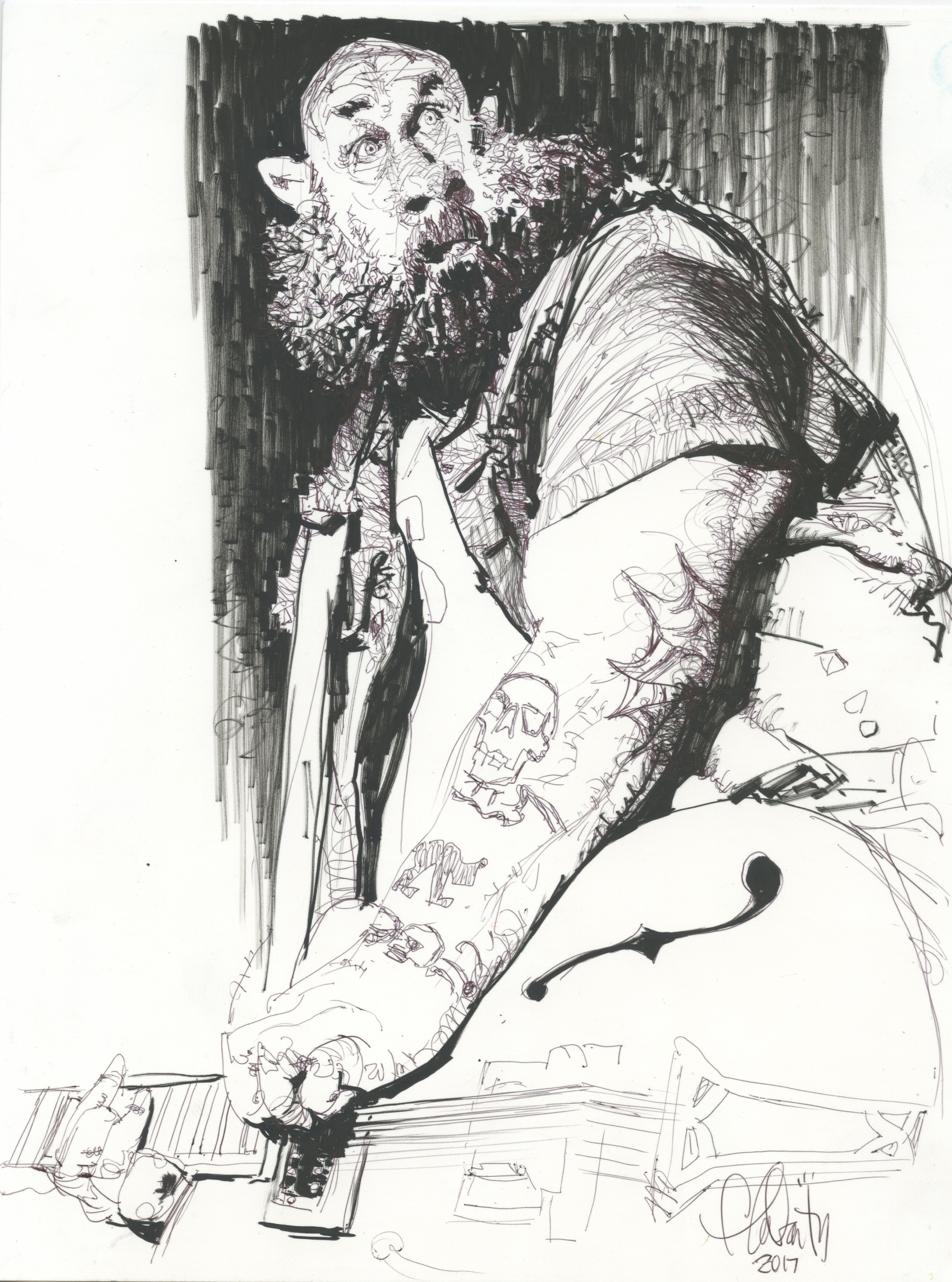
Here are the top 5 reasons why I love this drawing by Tom Fluharty:
1.) I love these hands:
Fluharty is an artist who not only knows anatomy, but has formulated opinions about it. Photo reference gave him the basic facts he needed about the position of the fingers, but after that the artist took over. He plays with line the way a great guitarist might play guitar strings.
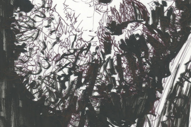
2.) I love this beard:
Look how brilliantly Fluharty combines lights and darks in this beard. That thin line doesn't flow in a direction, the way most artists would draw hair. Instead, it forms crazy static all over the place, before Fluharty comes in with a heavy line and chisels lightning bolts into the beard to give it some sense of order.
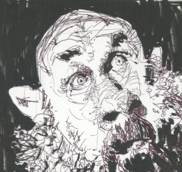
3.) I love this face:
Another great example of how understanding anatomy pays off. Those dynamic lines whipping all over the place don't trace specific facial wrinkles but they create values which demonstrate knowledge of the skull, the eye sockets, the facial features, etc. far better than a painstakingly realistic approach might. When it comes time to enhance the design by distorting those ears, Fluharty knows exactly how far he can take it.
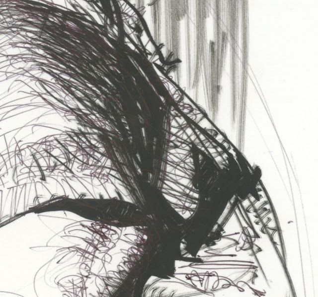
4.) I love the muscularity of those bold lines:
Fluharty claims to be no fan of abstract art but these bold lines are straight out of Franz Kline. Superimposed on a network of fine, curling lines which go in all directions, these powerful dark accents contribute vigor and confidence.
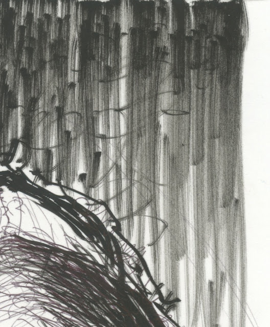
5.) I love the way this drawing uses felt tip markers:
Most illustrators today use markers because they're frightened of india ink. They fear they can't control a dip pen or a brush. But Fluharty appreciates the visual qualities of a marker-- even one that is beginning to dry out-- and fearlessly takes advantage of those qualities. Ink-- not even a drybrush--could accomplish this effect, which contributes so much to the energetic feel of the drawing.
In an era of photo-drawing, semi-drawing, AI-drawing and excuses for not drawing, I think this is the kind of work that vindicates true drawing and puts all those excuses and substitutes to shame.


27 comments:
I love the composition and how the lighting/detailing changes, from the dense and expresive face to the almost schematic guitar with made up perspective on the lower right corner.
As the famous art teacher said, "You can get all the energy you want in a brush-stroke - but can you control it? Can you say something with it?"
Kline plays tennis with the net down and no lines delineating the court. He smashes the ball wherever he wants.
Fluharty plays with the net up, and pulled taut, the court lines clear. And he dances as he whacks aces.
It's like the difference between incoherent ranting and articulate poetry. In fact, it is incoherent ranting vs articulate poetry.
Thanks for introducing me to Fluharty on your blog last year. He's a genius.
Big admirer of him . I was hoping to attend a workshop a few years back but I think it was cancelled from Covid . Do you know if he draws from life to keep sharp like Fawcett did ?
Al McLuckie
Nice post David, thanks.
However, I was gonna pick you up on your "Fluharty claims to be no fan of abstract art but these bold lines are straight out of Franz Kline" line, but Kev has got there before me!
Kev Ferrara and Chris Bennett-- As the physicist Philip Anderson wrote, "More is different." If we isolated one of Fluharty's rough, rapid lines and put it in the center of a canvas 8 feet tall, it would be a very different kind of statement. As Kev says, Kline took down the net and removed the lines that applied to the previous game, for which he'd say, "You're welcome." Kline was playing a new game with different lines, an ontological game detached from your distracting illusions, a game which places a single brush stroke under the microscope in order to give you a framework for considering what Fluharty does on a more elemental level.
For what it's worth, I had the pleasure of accompanying Mr. Fluharty on a walk through a modern art museum. While it is not my place to divulge his reactions, I think you'd have been very, very entertained.
xopxe-- Agreed.
MORAN-- Glad to hear it, he deserves the widest possible audience.
Al McLuckie-- I attended one of those workshops and found it to be excellent. Even looking at the eyebrows on this figure reminded me of Fluharty's unusual advice during his workshop about how to think about eyebrows. I don't know if he draws from life; during his workshop he worked only from photographs, but never tracing. He kept photo reference at a respectful distance and mined it for selective information.
If we isolated one of Fluharty's rough, rapid lines and put it in the center of a canvas 8 feet tall, it would be a very different kind of statement.
Would you take a syllable or two spoken by Orson Welles and turn it into a movie where it is the sole aesthetic event? Of course not. You are being absurd.
As Kev says, Kline took down the net and removed the lines that applied to the previous game, for which he'd say, "You're welcome."
The punk at the chess table began moving his pieces without rhyme or reason. The grandmaster sitting across from him said, "But what game are you playing, what are you doing? Where is the truth, the beauty, the logic, the argument, the thematics?" And the punk said, "Man, am I cool or what! Stand back old man! Look at how I'm moving the pieces! This is the new chess!"
Kline was playing a new game with different lines, an ontological game detached from your distracting illusions,
Oh, are Fluharty's illusions now 'distracting' to you? How so? You prefer the mindless illusion of a non-descript entity slapped or spattered into being rather than an articulate illusion with a human meaning behind it?
a game which places a single brush stroke under the microscope in order to give you a framework for considering what Fluharty does on a more elemental level.
The right brain thinks that when it breaks human dynamics down into atoms it gets answers. It doesn't. It merely gets ego frissons from the accumulation of pretend secret knowledge; 'knowledge' that is actually frozen shards of a more comprehensive, once-dynamic, more mysterious phenomenon.
Kline was a lazy intellectual graphic designer who knew his market and his audience.
Kev Ferrara-- Oh, I think creating illusions of 3 dimensional natural forms using 2 dimensional marks on paper can involve all kinds of distractions from the quality of art. How much badly drawn pin up art is nevertheless wildly popular because the interest in large breasts overrides poor artistry? The worst artists in the world can still find work illustrating pin up calendars or Tijuana bibles.
The risk of distraction is even more significant when your artistic goal is content-free visual forms (think Ellsworth Kelly or Helen Frankenthaler or yes, Franz Kline). You may question whether content-free art is worth the candle, just as you may question whether surrealism or dada or cubism were worthwhile experiments, but if one is going to perform those kinds of artistic investigations, one needs to keep them pure and untainted to get legitimate results. (For example, if you painted a cubist painting that subliminally looked like a girl in a bikini, how could you reliably explain the appeal of cubism?)
Sometimes the illusion of reality can be enobling and enriching, but sometimes the most distracting illusions of content are a cheap game that might better be played by a camera or computer (such as violence porn, some trompe d'oeil, religious propaganda, etc.)
I'm not passing judgment on whether any school of art is per se superior, I'm just saying that if you think Franz Kline's expressionism is a legitimate avenue for experimentation (and I think it is) you'd better keep it clear of unwanted content.
Gosh, a man who can draw having fun in an area he’s at home in.
The scale alone is wonderful. Love the way the guitar suggests a giant thigh.
The hands done from life are as comfortable as where he’s improvising and that’s the sign of an artist who draws so well that drawing from reference is like taking candy from a baby.
If nothing else bringing abstract artists into it expresses the freedom to
try things and to trust what one learns. Fluharty’s hand is a playful one and he didn’t find his hand being uptight. Even the way he lets an edge go as we see where the beard meets the face is something that feels like a cross breeding of drawing and painting.
When I was living up in Minnesota I got a call for a big storyboards job over a weekend that was so large that nobody could it do it without producing work that was pretty wonky, well below one’s standards even in a business where speed was a standard requirement. I forget how many drawings were involved but it might have been near forty, all in color. I was tired from previous work and experience taught me that the instructions alone can take the evening, (sometimes they only had part of the job worked but just want to secure an artist).
It was in an era where the art directors trusted the artist and they didn’t always insist on seeing sketches. Still, I decided to pass, though I knew had disappointed the art buyer. I wanted to take the job, but knew the physicality of it too well and had previously gotten gravely sick from pushing my body too far.
On Monday I got a call to make some revisions to the job and saw it was Tom Fluharty
who had taken it. He must have been flat out spent alright. It was in nutty situations
like that where one saw who had what. That he got through the job was a mighty
accomplishment itself, but there were passages in some of the frames that were
beautifully drawn and could only have come from a hand with many thousands of drawings
behind them, talented, skilled and fluid. In wild assignments like that one is forced to trust what they know and let their hand go. I guess what I’m trying to say with the story is that his fluidity didn’t come from nowhere. There’s intensity behind those bouncy and very personal lines.
In the posted rocker, the dark/light/dark/light and final darker accent going up that shoulder is really nice. There appears a bit of struggle in the meat of those many thin lines which belies the dancing nature of the line work. Yet that struggle is maybe the most satisfying area for me. Also like that solid black F-hole against the busy by lightly sketched tattoos. Lot’s of space. The surprised look.
Lot’s of stuff to like in this drawing! Very nice.
Fluharty is first class. I only knew his blue drawings but this is special.
JSL
I find it astounding at this late date there are still those who take umbrage that abstract art can be considered valid, much less be deemed appealing or interesting or even beautiful. Why can't one appreciate both representational art and abstract art. Why must it be either/or? In the end, whether representational or abstract, it is the artist's use of formal means--line, shape, color, value, and their arrangement on a page or canvas--that makes his art pleasing or not, (plus whatever mysterious "personal" quality or feel the artist imbues into his work). There are plenty of forgettable (but technically competent) representational drawings and paintings, just as is so with abstractions.
The veneration of representational art qua representational art is a mistake one can see non-artists making--they are so astounded that someone can create a facsimile of "reality" with line or paint they think any representational work is a miracle just by its existence. However, representational drawing and painting is just a skill that can be taught, practiced, and learned. Yet, technical competence does not guarantee a good artist or a memorable painting or drawing. There are many competent representational artists whose work is rote and dull, many illustrators who are hacks. The majority of skilled representational drawings/paintings that have been made are ordinary or less,largely destined for historical oblivion.
I can find equal pleasure in the drawings of da Vinci (or many of the illustrators discussed here) and the paintings of de Kooning, Pollack, and Kline, or (some) "naive" artists, just as I can enjoy a piece of music by Bach or a "crude" blurt of sound by Bo Diddly, or the a-melodic squall of "free music," and so on.
Robert,
My issue is not with abstraction per se because, as I have said, a work of art is an abstraction. The issue is to do with the role of content: what is misleadingly referred to as 'abstract art' (an oxymoron by virtue of the statement I have just made) is really design without content, such as the paintings of Rothko, Pollock, Klein, Kandinsky, Scully, et al. Art, be it painting, literature or music, is designing with content (composing). As far as I see this is not an assertion of either/or but a statement of fact.
The question becomes more interesting if one considers the work of an artist like Ben Nicholson whose work I consider generally distinct from those I've just mentioned, essentially because even at its most abstracted Ben's paintings and reliefs generally imply an authored metaphor, a bridge to and from some tangible, specific, worldly progenitor.
The joy of a drawing like the Fluharty is in how the loose and lively line-work creates the illusion of 3D form, while still being very noticeable as abstract mark making. The mechanics of the illusion are made visible, and the illusion is all the better for it.
Without an illusion of 3D form to conjure, the marks in a non-representational painting (e.g. Kline) become totally arbitrary. My reaction when i see paintings of that type is 'so what ?'
The lines and marks serve no purpose, and therefore nothing is at stake. I'm literally bored by such work.
The joy of a drawing like the Fluharty is in how the loose and lively line-work creates the illusion of 3D form, while still being very noticeable as abstract mark making. The mechanics of the illusion are made visible, and the illusion is all the better for it.
It's also a direct expression of his soul. It is funny in its bones; full of 87 different "fluharty-isms". You can see it came out of him like an oil gusher; he's so fluent in drawing he doesn't need to draw. What he's doing isn't even drawing. He's just capturing aesthetic thoughts.
ERRATA: I wrote earlier that "The right brain thinks that when it breaks human dynamics down into atoms it gets answers." It should read "The left brain..." Again, a McGilchrist reference. h/t Chris Bennett.
Chris,
Thank you for reminding me of Ben Nicholson. I'd forgot about him and I have been taken with the works of his that I've seen.
How much badly drawn pin up art is nevertheless wildly popular because the interest in large breasts overrides poor artistry? The worst artists in the world can still find work illustrating pin up calendars or Tijuana bibles.
Of course I agree here. This gets us back to the "disinterestedness" criteria of Kant. And also to the problem of 'cheating' in art via limbic hijacking for the sake of eyeballs; which is another multipolar market trap that leads everybody competitive to the sewer, the back alley, and the bedroom.*
But the antidote to this problem is not to disparage all whiffs of content as distractions equivalent to boobs, butts, and bloodshed. As has been pointed out many times, aesthetic effectiveness - sublated suggestions based on deft abstractions, mystery and evocation, breadth and unity - turn the mundane and murderous alike into worthy poetry.
* I'm reminded of David Mamet's reasoning about why sex in movies is bad art. Because people either look at and say "Nah, they aren't really having sex." or "Hey, they're really having sex!" Which has nothing to do with belief in the narrative overall, let alone the saying of anything through the work.
Do you know the great Jordi Bernet?
"* I'm reminded of David Mamet's reasoning about why sex in movies is bad art. Because people either look at and say "Nah, they aren't really having sex." or "Hey, they're really having sex!" Which has nothing to do with belief in the narrative overall, let alone the saying of anything through the work."
Yes!
Plus, viewers cannot help be think, "So that's what (actor/actress of choice) looks like naked!!" Nudity and sex in movies, I suppose, can be (but rarely are) handled effectively or well. More than anything, it tends to destroy the cinematic dream--as we scrutinize naked celebrities--public figures we think we "know"--performing fake copulation.
Well, leaving aside the act itself, so much of 'cinema' is exploiting how alluring the actresses are, or how dashing the male lead, or how violent the car crashes, how dazzling the special effects, and so on. I remember hearing people talking about how the characters on Friends the television show seemed like their real friends. (The photographic representation and photographic footage warps minds.)
In the 1960s, when cinema was struggling to survive due to TV's market incursion, suddenly blood spattering, nudity, copulation, horror, and gore were good-to-go at the local Drive-In. One assumes Hollywood paid off a lot of influential people to get that sudden sea change to happen.
> Plus, viewers cannot help be think
Exactly. That’sa viewer problem, not a poetry problem. That’s like the Taliban saying showing women’s hair in movies is bad art because viewers can’t help but feel rapey when they see it.
Comparing women's hair being visible onscreen to the act of copulation onscreen is funny stuff. Like comparing a lit match to a Dresden fireball.
Since art only functions with respect to an audience, an inescapable aspect of human nature that causes a 'viewer problem' is an inescapable art/poetry problem. (Assuming one subscribes to Unity or The Unities as foundational values in the arts.)
Artists that are self-indulgent narcissists are always crying that viewers should service them, rather than the reverse. They'll transgress any boundary of taste, principle, aesthetics, or form as they flail against reality and tradition, and a limited audience of aesthetic Walter Mitty types will trail after them hoping for a frisson of novelty or naughtiness. It's a kind of dysfunctional relationship.
But nudity in cinema was about exploiting the limbic system of viewers to make money, plain and simple. There is no artistic liberation to the implementation of anything goes cheap shortcuts to hold attention in the arts.
This was a large problem Kubrick had to overcome when conceiving 'A Clockwork Orange' in general and the orgy scene in 'Eyes Wide Shut' in particular. I believe he achieved it with authorial distancing or disassociation and therefore the sense of 'coolness' one finds in dreams, often blackly comic in the earlier film and manifestly oneiric in the latter.
This is in fact a deep principle employed whatever the content matter involved. To stay with Kubrick, one only has to think of 'Dr Strangelove' or 'Lolita' to see it at work with different forms.
Cinema is more that Hollywood and the star-system. Just as illustration is more than Americana pin-up.
My last post was eaten by the techno-censors.
Post a Comment