
Not every artist can afford to hire professional models to pose on a model stand in a spacious studio.
Living in a small apartment, sharing space with relatives (particularly during years of war rationing) artists may still feel the same burning need to record life, and still respond to that need with insightful, excellent drawings.
I admire the work of English illustrator Raymond Sheppard (1913-1958) who justly earned fame for his illustrations of animals. He did much of his professional work at the zoo, but when the zoo was closed Sheppard drew his family at home, reading, knitting, napping or even posing.
.tif)
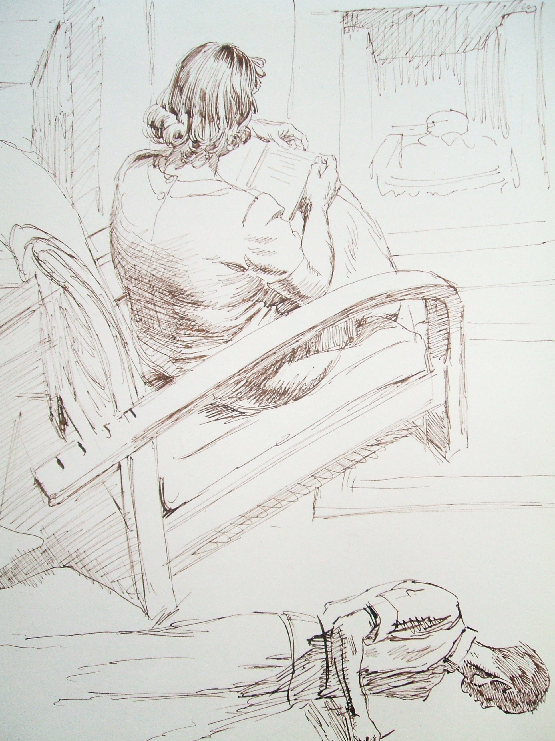
Sheppard used these life drawings to create genuine challenges for himself. Note how he draws these family members from difficult angles, testing his powers of observation.

.tif)

Unlike professional models, children don't always sit still, so Sheppard had to be prepared to capture his subject quickly:
.tif)
.tif)
.tif)

Sheppard paid a high price for these drawings; he was diagnosed with cancer at age 33 and spent much of his remaining years in pain. Yet, rather than languish he found it meaningful to devote the rest of his life to making careful, patient drawings such as these life drawings.
.tif) |
| Sheppard's self portrait |
21 comments:
Such a relief to see some Sheppard after Fawcett and Schwartz. And not just because the subject is so much more fulfilling sentimentally, but also because his drawing is so much more confident and lively. The former trace artists clearly struggled with capturing a line as assertively when it wasn't already compressed into two dimensions for them, and instead spent the time scrubbing in romantic fuzzy value statements to make up for it.
Seeing the sheer quantity of drawings of his daughter Christine, I think she and/or he must have the patience of saints. AND in different media too!
There are some absolutely wonderful, enchanted drawings here David, and a real joy to behold. When I have a longer moment I'd like to comment on a couple individually. But for now, these renditions of fellow cold fish warm the cockles of my heart... ;)
I am thrilled to see you appreciating and inviting comment on my father's drawings. I have vivid memories of being asked as a child to pose- often to hold my arm or head in a particular angle to match an illustration he had been asked to do for a magazine or a book. My brother Michael and I were paid pocket money for "sittings" and although we were bored by sitting still, I think we were pleased to be "helping Daddy" with his work.
Christine Sheppard
Haptics. He senses internally (within himself) both the structural form and the character he is setting down. Haptics plus love.
These are really beautiful.
Another artist who we were exposed to years ago without realising it (in terms of a 'person behind the pictures') when we were kids through his book illustrations, but who hit a deep chord that stayed with you. I could recognise them from long-ago libraries decades later.
There was a comment here a while ago which led to the Raymond Sheppard blog/site which I've been enjoying immensely. The lines are as alive as the animals. Thanks !
Bill
And 'thank you' to Miss Sheppard, above, for enlivening these still further with the memory !
Bill
That's my blog Bill, so I'll take the compliment with thanks. Christine Sheppard has been a great supporter and help to me over the years. I've still got lots in my collection to share on http://raymondsheppard.blogspot.com/
Thanks Norman !
I'm not sure why, but those look like actual honest drawings from nature. Somehow they transmit that the artist was interested, he actually wanted to capture something simple but meaningful to him.
It is incredible how much light is unleashed when the lines and washes as halftones are so compatible with the stark white paper. In the pencil drawing with the sepia wash, the light is almost luminous. That is, the white of the paper takes on a luminous quality with the drawing.
Sheppard’s sensitive hatched lines render the darker areas towards compatibility with the light of the paper. By contrast, a solid black, or chunky black line are discordant marks to the white paper and require a different organization to fall back into their respective places, usually following a general rule as shadows.
What Richard commented on about how the traced lines reduced the drawing into two dimensions is absolutely true, but the interests of the artists in the 1950s owed more to Degas than the photograph. Degas introduced dark lines into his pastels which found unity with the shadows of dense and intense pastels. In that setting he used lines of equal width and density to describe both the top and bottom of say and arm, and it served as a kind of tunnel of movement. When he used equal dark lines as accents on an ankle for instance, the movement was similar to sand flowing through and hour glass. At other junctures, Degas would use dense black lines to merge and separate between two figures.
In other words Degas had introduced the use of lines the way the Japanese used them as a graphic element apart from rendering. The Greeks and later decorative artists used lines similarly at times but the lines were thinner. Just as dark areas had to be organized in comics, the use of thick black lines to describe multiple purposes other than shadows, required a different kind of organization to mitigate their discordant nature. To do such without rendering techniques such as cross hatching or modeling was a part of the interest of artists who were using dark lines. Many who copied the artist's trying to do such had no idea what they were doing because it’s very confusing to see this dark means shadow, but that dark means accent, the next dark is sturdy, this one flows, that one comes forward, and so on.
The preoccupation with formalities hurt their drawing, so it was not only because artists traced photos. Many who used photos and traced them such as Norman Rockwell were such good painters of light and flesh that their work was alive with spirit, as well as in their characters and stories.
I see the subjects as a little more complicated than photos or rendering, though one sucks the life out while the latter brings life when done well. The terms “mark making” or “contrast events” were born in fine art, even representational fine art and these too are a kind of casualty of formal preoccupations, but they did arise as people came to understand more commonly that discordant notes can be made harmonious with surroundings. In the 1960s, musicians in popular music had come to use discordant notes in hit music. One was a song called “On the Road Again” where Alan Wilson’s harmonica solo included a note not in the key he was playing. People speculated how he did it as it wasn't on the harmonica he was playing and also how, though being wrong, it sounded so right. I’m using such analogously to the discordant black lines and marks that were being were being incorporated into representational space aside from decoration or the light-shadow formula.
Yes I agree with everyone, the Sheppard drawings are wonderful.
Drawings 4, 6 and 9 while being tenderly observed aspects of an individual young girl are also monumental in their celebration of youthfulness, realising the universal within the particular, the particular within the universal. Grace within the awkwardness.
Drawing 4: Coupled feet bounded by sandals begin a journey of forms where interlocked hands branch into arms flowing each side of the knees to finials of ruched frock clustering into collar and hair coming together with a parting crowning a turning head. Energy containing itself.
Drawing 6: A compact maze square-spiralling towards the centre where the girl's attention unravels it back into the spaces of the room.
Drawing 9: To me, is about light, the light that unfurls a flower, a flower unfurling its light. The wash of shade on her chest radiating luminosity by its relation to the dark fingers rooting into the page.
Chris,
The white of the paper usually is the light in a pencil or ink drawing. Yes, the shadow in the hand in 9 acts as an anchor, heightening the sense of light.
The black shadow in the hand wouldn’t be considered a discordant note though because it’s in its expected place, a shadow in a dimensional world of light and shadow. The shadows throughout the drawings are behaving as one would expect them to behave.
The analogy to music helps because for example in the 1968 piece I mentioned, besides the discordant note in the harmonica solo, a handful of guitars recorded together create a raga drone which would be completely unexpected in a country blues. It’s one of a handful of unexpected things in the tune that at the time gave the piece a fresh and unique blues sound.
Degas was doing something similar with Japanese graphic elements but he didn’t entirely depart from rendering. Had Fawcett, Briggs and others not so radically departed from rendering, they may have unified the two worlds together in a more soulful way.
> Haptics.
You think so? This struck me as a more visually driven approach than a physically felt approach.
Take the young girl in the chair with the stuffed animal for example. I think that kind of cartoon-adjacent gestural line simplification only happens from a very visually driven approach to drawing, if it was very physical id expect more internal contour, eg
> Drawing 9: To me, is about light, the light that unfurls a flower, a flower unfurling its light.
I feel like he made the drawing, fell in love with the lines and didn’t want to lose them by shading, so he threw some washes down to try to finish it in a way that his lines wouldn’t be lost. A kind of afterthought. To me he’s all about extremely strong iconic shapes and lines. I believe that’s what drew him to animals. He doesn’t treat them as mood interests generally, but rather as a dense graphical shape.
Richard,
But even if that were so, one could ask why he fell in love with the lines and why they prompted the particular manner of washes that they did. A belief in the primacy of light does not preclude strong shapes because shapes realise the action of light. So, for instance, to my sensibility there is a point reached in Turner's late paintings where the forms become so vaporous and indistinct that the pictures start losing the potency of embodied light that is being sought.
Richard, To the first of your three comments above. There are different kinds of physicality and observed drawing often lacks a sense of an internal contour as you described it.
In considering David’s three posts of drawn figures, the Sheppard drawings brought a life you acknowledged in your first post.
Considering the limited use of the holding line in animation and comics of their time, Fawcett and his contemporaries did extend the capacities of linear drawing to create space, form and a type of unity without the use of rendering. Perhaps such was too cerebral, limited, or esoteric to capture the liveliness and soul of Sheppard’s well observed and thoughtful family drawings. So the notion of unity itself has different levels or dimensions. Not every drawing captures everything, but one of Augustine’s ideas may actually here apply to one of its dimensions, Unity witnesses to love.
Or perhaps, the deepest unity does witness to love.
"I think that kind of cartoon-adjacent gestural line simplification only happens from a very visually driven approach to drawing, if it was very physical id expect more internal contour"
Sheppard isn't forgetting anything, even though he just dashed that one off. I would say, if you feel both the weight and reality of the thing at the same time, that shows deep feeling into the subject; a kind of mental inhabitation. Contour isn't the only way to do it, and is the least poetic because it gets into rendering. The idea is to do more with less. Which brings in edges...
"Edges can tell form and texture, distance from the beholder, light quality and ever so many things. Edges are one of the most important considerations in a picture. (...) The edge will carry the mass. (...) The character, position and weight of an object is in the edge." ~ Harvey Dunn
Kev, I'm not sure what you mean by contour 'gets into rendering.' Do you mean using outline/contour to clearly state forms, vs. suggesting form (and everything else Dunn mentions) with edges?
Kev, I'm not sure what you mean by contour 'gets into rendering.' Do you mean using outline/contour to clearly state forms, vs. suggesting form (and everything else Dunn mentions) with edges?
Sorry, I meant 'internal contour' as I understood Richard to mean it; the use of parallel lines - feathered or not, turning or not - within the silhouette boundary to create a sensation of wrapping the volume of a form or sculpting it plane by plane.
Point being that if you feel the sensual volumetric quality of the object to be represented in your mind ("When you paint the old man's nose, feel it as your nose." ~ Harvey Dunn) any marking method you use to set that information down will be encoded with the haptics you felt at the time. (Assuming talent, will, and competence in the medium.) That includes the use of outlines... which I believe is most famously discussed in Kimon Nicolaїdes' The Natural Way to Draw.
Of course outlines can be dead too, bereft of haptic encoding. So outlining per se guarantees nothing.
nice blog
Post a Comment