Thursday, August 08, 2013

ROBERT FAWCETT, IN LINE AND TONE

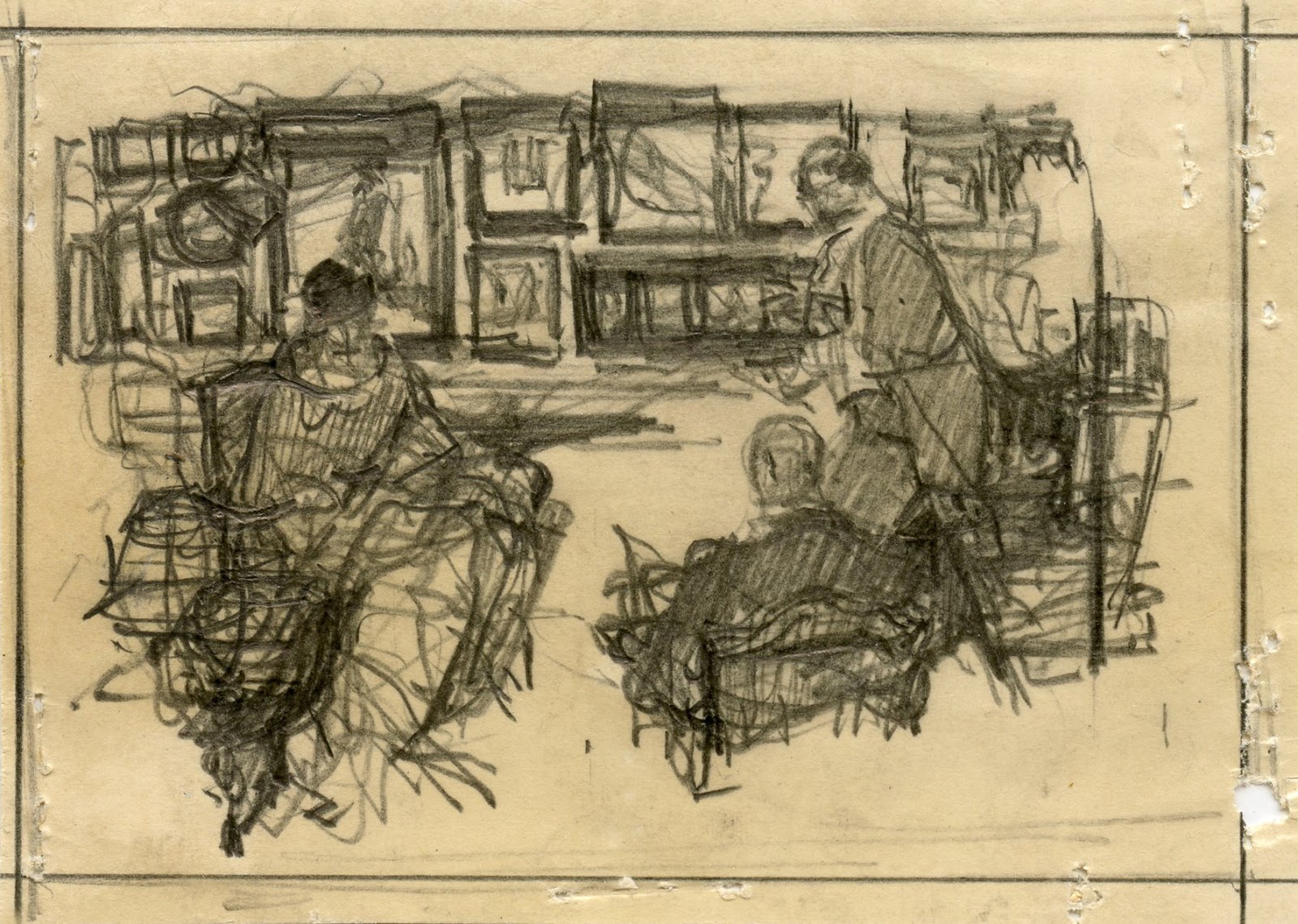
Here is another spot illustration by illustrator Robert Fawcett, this time a small ink drawing of his friend Austin Briggs who was giving a slide show presentation:


Despite the sedentary subject matter, close ups of the original reveal a vigorous knife fight:  


Pausing over details, we begin to appreciate the extraordinary variety of Fawcett's marks on paper :


Over the last few days we have focused on Fawcett's ink work, but before we move on to different topics, here is one of Fawcett's pencil drawings for a different perspective:


This life drawing was included in Fawcett's book, The Art of Drawing but by looking at the original we can see that Fawcett (who was color blind) supplemented his drawing with shading from a red pencil.  Fawcett's eyes can't help but impose lines on a form:


 but he understood tone and value as well:


Sunday, August 04, 2013

ROBERT FAWCETT'S PATTERN OF LIGHTS AND DARKS

In the 1950s, Robert Fawcett visited the instructors working at the Famous Artists School in Connecticut and talked with them about his method of constructing pictures.  He sketched three examples of how one might depict "a knock at the door":

Original size: 4" x 6"


He told the instructors that when designing a picture, it is important to focus on the pattern created by lights and darks.   He suggested that students use a tissue paper overlay to block out the geometric shapes which form the abstract pattern: 


He told the instructors that students should not try to redraw the underlying drawing on their overlays, but rather "outline mechanically" to separate the form from the content. 

He made handwritten notes for the instructors to use:
 
 Among his advice: to keep the pattern lively, use a "quick, nervous, spotty method" when outlining the key shapes:
 
He also urged, "wherever possible, use angular forms and emphasize differences of direction":
 
The materials from this long ago lesson were taped together on an illustration board (along with his separate lesson on creating "interior atmosphere"-- apparently they couldn't spare a separate board.) 


Worthwhile advice from a smart artist.

Saturday, August 03, 2013

ONE L0VELY DRAWING, part 44

I feel this blog performs a public service on days when I can share close ups from an original Robert Fawcett drawing.

 This drawing had everything going against it:


  1. It's a tiny, low budget spot illustration for an industrial brochure...
  2. drawn from a photo...
  3. of a deadly dull topic: a middle aged, anonymous instructor at a correspondence school, working at his drawing board.
Yet, for Fawcett even a boring subject could be like working in a firecracker factory.  

He starts out working fairly tightly on the head, even using a little white paint to sharpen his focus...


... but from there, he quickly gets wilder:


With energy and integrity, it's possible to overcome even the most uninspiring subject matter.  

In the next few days, I will be  posting more unpublished original work and some of Fawcett's handwritten notes about his approach to drawing.


Wednesday, July 24, 2013

COMIC-CON 2013

This year's Comic-Con in San Diego was like the ancient bazaar of Constantinople teleported to the third moon of Zarbtron. There were charlatans and geniuses in abundance, hawking their wares from platforms that ranged from a cardboard box on the sidewalk to a glittering Hollywood extravaganza on the stage of the huge convention hall.  (Of course the platform was no predictor of quality, so you had to check out everything.)

Comic-Con provides a true kaleidoscope of popular culture.  Where else could you find Neal Adams competing with Sergio Aragones-- his artistic opposite-- in a "quick draw" competition?  Where else would author Neil Gaiman discuss the merits of Jack Kirby's different inkers? One of my favorites: 20th Century Fox, promoting the new blu-ray edition of The Predator, used 3D copiers to scan the heads of the first 500 customers and create an action figure of the Predator holding up the customer's severed head.

The loud, pounding base line from amplifiers in some of the booths made your lungs compress as if you were in the front row at a Metallica concert (yes, the band Metallica was at Comic-Con too).


But Comic-Con is governed by the same laws of physics that apply to the rest of the universe, so many of the most interesting things took place quietly at the subatomic level.  This year's lesson in quantum mechanics comes from these tiny preliminary sketches by illustrator Saul Tepper, found in a quiet corner of the exhibition hall:


For scale, those holes are staple holes.

Each one is about the size of a postage stamp, yet they have all the DNA necessary for a larger, more elaborate image.


Tepper has worked out all the fundamental creative choices.  His composition is settled, his priorities are established, his lights and darks are in place, he has decided on the gestures and the movement of each picture. 


From tiny acorns such as this grew finished drawings, then big oil paintings on canvas, then pictures that moved and talked, and then 3D digital animation on IMAX screens.


(Detail) Note how Tepper has decided when to dig in hard with the point of his pencil (as with the hand raised to this woman's face), when to cruise along lightly and when to apply the flat of the pencil for tone.


In their rush to get to the flashing lights and big screens at the LucasFilm and Sony Pictures displays, I'm not sure many of the participants recognized the seeds from which those mighty oaks grew. But the genetic code starts right here.

(Thanks to Comic-Con exhibitor Taraba Illustration Art for these sketches.)

Monday, July 15, 2013

A PICTURE'S PHYSICAL DELIGHT

 "Wildness can be the picture's better part, its physical delight."  -- Gordon Parks
 In the 1960s, American illustration entered a wild, expressive phase.  Many illustrators employed vigorous, slashing strokes to convey the new mood (and speed) of the country.

 
Bob Peak

These pictures had an energy and virility that still stands out, fifty years later.  Bob Peak was one prominent example of that style, but there were dozens of less well known illustrators who helped to visualize the mood of the '60s.

For example, the talented Harvey Schmidt worked in a similarly robust, vigorous style:


Another talented illustrator, Jim Jonson, made expressive, high velocity illustrations of figures stretched to the max:


Here, Neil Boyle applies this same energetic line to inanimate objects:


The Society of Illustrators annuals from the '60s contain a great deal of art in this dynamic spirit; lots of slashing lines and lightning bolt scribbles back and forth.  In later decades illustration might adopt a more conceptual approach.  Later audiences might grow to prefer a more controlled look.  Yet, these pictures from the '60s retain a potency that is undeniable.

One reason these pictures feel good to look at is because they felt good to make.  They exemplify what Parks called the "physical delight" of picture making-- something that seems less evident in the era of Wacom tablets.

Robert Weaver
Al Parker

Joe Cleary
Like Parks, I believe that the wildness in a picture can be the picture's "better part," and that in the right circumstances it can hold up against anything else a picture has to offer.   

Sunday, June 30, 2013

MAKING PEACE WITH THE MACHINE

The great illustrator Frank Frazetta proudly wrote his personal credo: "I work purely from my imagination, no swipes or photographs."

But this Frazetta drawing...


...was taken directly from a Life Magazine article on a day at the beach:


The great illustrator Robert Fawcett warned his fellow artists against becoming dependent on photography: "photography has been abused, to the point where many illustrators are afraid to put pencil to paper without first photographing their subject exhaustively."  Yet when he needed to draw a south sea island native...


...he relied on this photo from Life Magazine:


Norman Rockwell was one of the most successful illustrators in America when he secretly began using photographs.  When his peers asked if he used photographs, he lied:
At a dinner at the Society of Illustrators, William Oberhardt, a fellow illustrator, grabbed my arm and said bitterly, "I hear you've gone over to the enemy." "Hunh?" I said, faking ignorance because I realized right way what he was referring to and was ashamed of it. "You're using photographs," he said accusingly. "Oh...well... you know...not actually," I mumbled. "You are ," he said. "Yes" I admitted, feeling trapped, "I am." "Judas!" he said, "Damned photographer!" and he walked away
I am interested in why some of the most confident, successful illustrators felt ashamed to use photos.  And why, despite their shame, they thought the benefits were worth it.

Since those early days, attitudes about using photos have changed but the role of photos has changed even faster. 

What started as using photos for reference evolved into projecting photos directly on the page, which then developed into light boxing, which changed to scanning photos, later altered with increasingly subtle filters that transform scanned images into a pastel drawing or a watercolor painting or a mezzotint.  To make a caricature today, we have only to apply the Photoshop "liquefy" tool to a photo of a face.  To improve a composition, we have only to employ the "divine proportion" tool.  Technology has played an increasingly vital role in picture making, encroaching more and more on what was once the human core.  It remains to be seen whether artists are following in the footsteps of John Henry.

Far from being resolved, the question "how much dependence on a machine is acceptable?" becomes a new question with each passing decade.

In this context, I think it becomes incumbent on each of us to make our own peace with the point along the spectrum where the role of the machine becomes too great.

I think the talented Matt Mahurin is a prime example of an artist working interchangeably in traditional media, photography, and film:


I find his work, which blurs the line between photos and hand crafted images, imaginative, powerful and personal.  Mahurin writes:
When a client decides to call me, it's not because they are in love with my color palette or feel they can't live without my sense of composition.  I am hired for the way I think-- my ability to express clear thoughts and powerful emotions visually.  Often the technique or style I use to complete an image is merely an afterthought, no more important than the physical act of typing up what already flourishes in the writer's heart and mind.
But perhaps the real challenge to the boundary between art and machine-created images is posed by photographs that today seem to inspire more reverence and awe than more traditional hand made arts do. 

NASA's "pillars of creation"

Pictures adorning Renaissance altars and palace ceilings were valued as high art in part because they elevated viewers by giving them a sense for the sublime. It has been a long time since traditional, hand made arts have aspired to that role.