Friday, December 13, 2024

JAZZ AGE ILLUSTRATION AT THE DELAWARE ART MUSEUM


Nicholas Remisoff, cover for Vanity Fair, 1923

One of the most exciting and edifying exhibitions of illustration art this year is currently on display at the Delaware Art Museum. The show, Jazz Age Illustration, surveys illustration from a period of American history that was crackling with energy-- an era of music and dance, of flappers and prohibition, of the new freedom and permissiveness that came with the automobile, of the Harlem Renaissance and the literary and visual stylings of Vanity Fair.  

From the "Club Hot-Cha" to the "Radium Club," cartoonist E. Simms Campbell's guide to the jazz hot spots of Harlem gives us a great snapshot of the vitality of the Harlem Renaissance 

McClelland Barclay
The show is an eye opener because it features not just the "usual suspects" of illustration-- the Leyendecker / Rockwell / Wyeth / Parrish crew that has already been accepted by the fine art world-- instead, it casts the net more widely, revealing a bounty of lesser known artists who were doing vibrant, creative, socially relevant work from 1919 through 1942 and who deserve our attention today.

James Harley Minter

Jay Jackson
I was especially pleased to see work by under-appreciated artists such as the evocative Douglas Duer... 


...or the talented Winold Reiss, whose work is usually hidden away in the archives of the National Portrait Gallery in Washington:


I loved the art deco silhouettes of John Bennett, a new name to me:


For me, some of the most powerful work was not from the glossy pages of popular magazines such as Vogue or The Saturday Evening Post; it was unheralded art that the Museum discovered on pamphlets and other "low" printed matter that revealed the throbbing pulse of the jazz age:


Aaron Douglas, detail from book cover

The Delaware show is a robust reminder of the potency of illustration.  So many recent fine art trends have ended up as withered limbs on the evolutionary tree of art-- self-indulgent, self-conscious, with little relevance to everyday life.  

Beginning with Warhol and Lichtenstein and continuing through the larcenous Richard Prince, we see fine artists repeatedly borrowing from illustration, comics and other popular arts in an effort to rejuvenate the desiccated  landscape of fine art.  Art critics have been forced to invent an entire new vocabulary to justify this new"appropriation art."  They label it "re-contextualizing" or "sampling" or "augmentation."  Lawyers, too, were forced to come up with a new vocabulary to apply the copyright laws based on whether an imitative work has been sufficiently "transformative" of an original.  But this jargon can't conceal the underlying envy for the vitality of the popular arts.

That's one reason why the Jazz Age Illustration exhibition is so refreshing.  It reminds us of a primal, creative period when musicians were inventing jazz and highly original artists dominated the world of illustration.  Jazz was the soundtrack to art with more authenticity, energy and relevance than you're likely to find in the Museum of Modern Art today.  


Monday, December 09, 2024

MORT DRUCKER'S PRELIMINARY SKETCHES


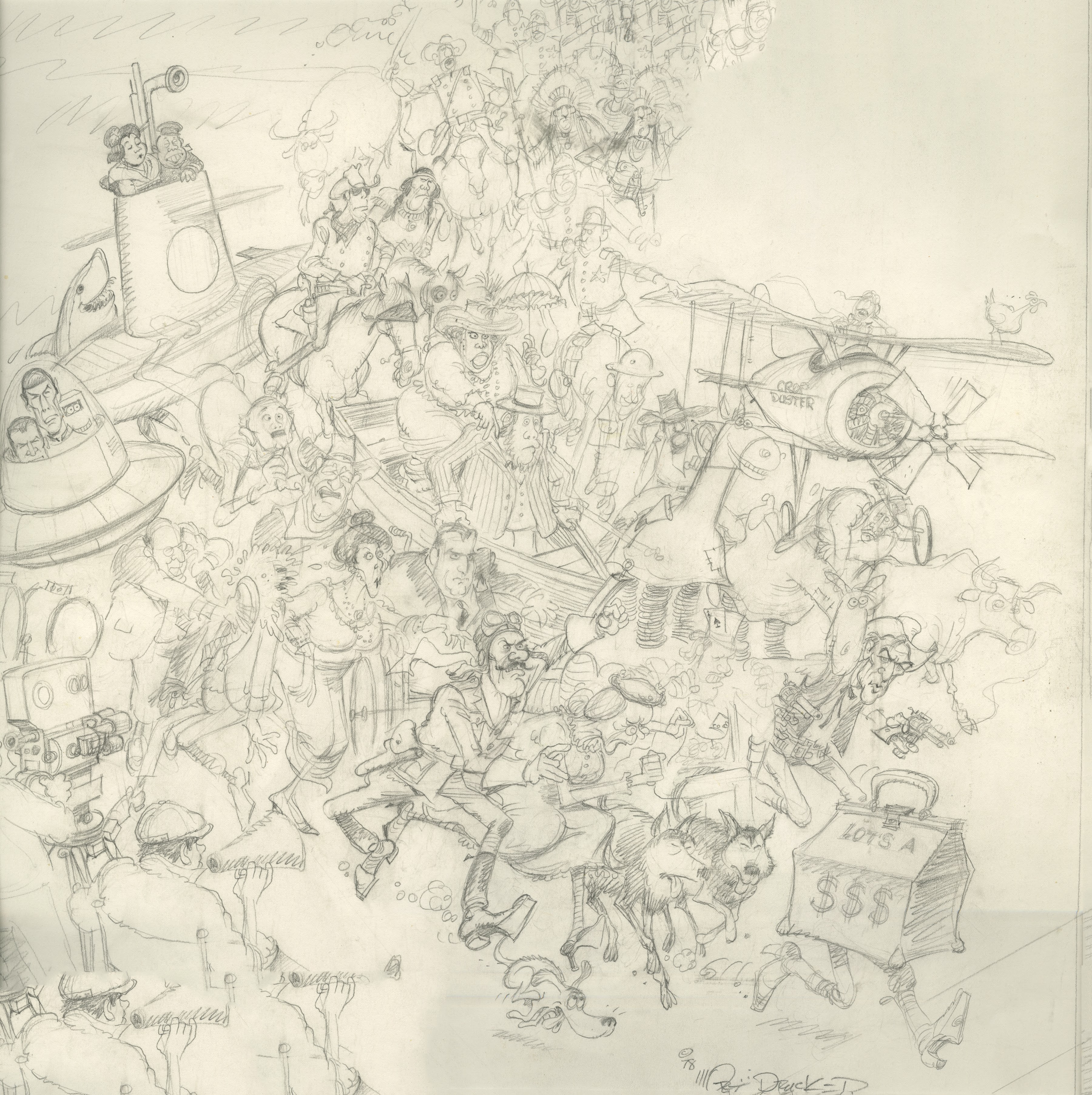
Early in his career, cartoonist Mort Drucker attracted attention with his drawings of large crowds of personalities: 


Detail


Drucker was able to summon up an endless supply of faces, characters and visual puns.  He dispensed them freely, leaving a feeling of great abundance. 


Detail


Detail


How was he able to fit all those puzzle pieces together so densely without losing the bounce in his line?  We get some clues from Drucker's preliminary drawings. 


It's clear from his sketches that Drucker was a nimble, talented draftsman.  But it's also clear that he worked like a dog.  For every sketch of a crowd, he produced dozens of sketches exploring individual faces and expressions that he banked in his private arsenal.


Drucker's atttude about work was, "if you enjoy what you're doing, it's not work."

Friday, November 29, 2024

BACKING AWAY FROM THE FASTIDIOUS

Illustrator Chris Payne sometimes roughs up his drawing surface with a brayer.  He combines ultra matte medium and thinned acrylics, rolling out a textured foundation for his pencil drawings.  


This rough surface not only leads to ragged, uneven edges around the drawing, but adds unpredictable fault lines, sometimes at the most sensitive parts of the image:


Payne is admired for his tight, realistic drawings but if he was after mere accuracy there would be no point in using a brayer to create an uneven grain on his sketchbook pages.  He clearly seems to be after  a more organic, rugged feel to the surface.  The brayer level helps to prevent Payne's meticulous drawing from becoming too precious. 


Today's state-of-the-art drawing tools offer even the most jejune art students a quick and easy path to realism.  Today's state-of-the-art audiences are increasingly insensitive to the difference, so it can be difficult for aspiring artists to resist temptation.

But stronger artists, the ones who still remember the difference between a drawing and a photograph, and aren't satisfied by the ability to simulate photographs, those are the artists worthy of our attention.  They are the ones who set out to make trouble for themselves.  


Tuesday, November 12, 2024

LOLITA'S LITMUS TEST

It's hard to think of a more challenging test for realistic illustration than Vladimir Nabokov's book, Lolita.  Nabokov emphasized to his publisher that any illustrator who attempted a representational image of the character would be missing the point.  He wrote: "There is one subject which I am emphatically opposed to: any kind of representation of a little girl."

The difficulty of illustrating Lolita has been widely recognized.  The (excellent) book, Lolita; The Story of a Cover Girl contains essays and dozens of images on "Vladimir Nabokov's novel in art and design." Lit Hub compiled a (useless) survey, The 60 Best and Worst International Covers of Lolita  and here are 210 covers over the years.  In 2016 The Folio Society produced what they called the First-Ever Illustrated Version of Vladimir Nabokov’s Lolita.

Many artists and art editors have tried coming up with realistic illustrations for Nabokov's psychologically complex novel but the results have been pretty worthless:


Illustration for the recent Folio edition

You may not think much of the talents of these particular illustrators, but replace them in your imagination with your favorite representational illustrator.  Is there a facial expression or a pose or a color scheme that you think would be more successful?

Now contrast the representational images above with the conceptual illustrations below, often using photography or graphics.  


In my view, these conceptual illustrations are far more impressive;  they get closer to the meaning of the book; they engage the viewer and inspire deeper thought.  The sheet of notebook paper shockingly reminding us of what a 12 year old girl is. The broken lollipop or the crumpled clean white page conveying besmirched innocence.   The repetitive writing of Lolita's name giving us insight into Humbert Humbert's obsessive brain.

The following photographic illustration (one of my favorites in this series)  could be the view of the deranged  Humbert lying in bed staring at the ceiling, and it could also be the panties of a 12 year old girl. A very powerful use of imagery by Jamie Keenan.  


Could this image have been as effective if it was painted by a talented artist?  I doubt it.  Crimped by the intent of the artist, a painting would look too much like either panties or a ceiling.  The objectivity of the camera gives this image its double entendre, and it gives us the shock when we realize what our mind is seeing. 

If anyone can suggest more effective representational paintings or drawings of this book, I would welcome them.  Absent that,  I think these images are strong evidence for the argument that the end justifies the means in illustration, and that excellence can extend beyond hand drawn or painted images, to encompass some kinds of photography, graphics and digital imagery. 


Wednesday, November 06, 2024

DID SOMEBODY STEP ON A BUTTERFLY 62 MILLION YEARS AGO?

I'm taking a 24 hour break from our series on digital art to observe election day in the United States. 

Here are a few panels from a classic Al Williamson story for EC, written by the prophet Ray Bradbury. 


For any youngsters out there who may need a little more of the background:


All right, who stepped off the path?

Saturday, November 02, 2024

MAKING THE BEST USE OF "THE ONLY TIME WE'VE GOT"

Following up on last week's discussion of artists who are challenged to make the best use of the new technologies in our era of illustration:


Horrible New Yorker cover drawn on an iPad by famous artist David Hockney


French painter Paul Delaroche saw the handwriting on the wall back in 1839.  When he spotted his first photograph, he proclaimed, “From today, painting is dead!” Delaroche may have been a little premature, but he was right to be alarmed.  

In the following years, technology continued its inexorable incursions into art.  Photography improved and became more accessible, then morphed into moving images, then moving images with sound.  When photography went digital, it became possible for even the most untalented to manipulate images, simulate the act of drawing, and cut and paste moving images to create visual collages. In recent years generative AI has made that process interactive.

These technological changes put new creative freedom in the hands of the lumpenproletariat and introduced undeniable economy and efficiency into the production of images.  What are we to make of all this?  It does no good to avert our eyes.  These are the forces that pushed illustration out of most magazines and then pushed most magazines out of business.  Today they have breached the barricades of the most distinguished art museums.
 
For a while, we could take comfort from the fact that most digital art, even digital art by accomplished artists such as David Hockney (above) was so laughable that it didn't warrant serious consideration.  But today talented artists are creating first class images digitally, and first class images are always self-legitimizing.  If the image is excellent, I reject objections to its pedigree. 

Exhibit A for discussion is the work of the brilliant Nathan Fowkes Born and bred on traditional art media, he nurtured his talents honestly, spending years doing lovely, honest plein air paintings.  In recent years he has also become a virtuoso with digital media:


I think these paintings are admirable.  When I first saw them I couldn't distinguish them from traditional media, so it would be dishonest to think less of them just because they were produced digitally. 

Instead, I salute the open mind with which Fowkes embraced the new tools and the honesty with which he explores their potential.  I'm happy to say that both are hallmarks of Fowkes' work.