Showing posts sorted by relevance for query fuchs. Sort by date Show all posts

Friday, January 06, 2006

FINE ART vs. ART THAT'S MIGHTY FINE

In the 1950s and '60s, fine artists Robert Motherwell, Robert Rauschenberg and Franz Kline dazzled art critics and museums around the world with their brilliant avant garde paintings. At the same time, another painter-- Bernie Fuchs-- dealt with the exact same aesthetic problems in a different forum. 

Like Motherwell, Rauschenberg and Kline, Fuchs rejected the realistic painting of his predecessors (such as Norman Rockwell) and focused on broader qualities of abstract design and composition. If we compare Fuchs' art with the work of the other three painters, applying the same standards, it is difficult to tell which painter is superior. Fuchs' compositions were equally bold and lovely. The colors and shapes were comparable. 

In fact, the consistent difference between Fuchs and the three "fine" artists was the purpose for which the art was created.  Motherwell, Rauschenberg and Kline created "art for art's sake."  Fuchs' art had a commercial function. He created art for a client's sake, for he is an illustrator. 

Fuchs and Franz Kline:


These two paintings by Fuchs (above) and Kline (below)share vigorous, caligraphic brush strokes, strong compositions against a painterly white background, and stark use of negative space.


 Both were highly innovative for their day. Can you tell which one belongs in a museum? 

Fuchs and Robert Motherwell: 

 Measured as abstract art, the following Fuchs painting...


 ... accomplishes everything the Motherwell painting below it does.


 The big difference: the Fuchs painting also serves a function. 

Fuchs and Robert Rauschenberg:

Beginning in the early 1960s, Fuchs began assembling "montage" pictures with multiple images, sometimes including photographs or "found" objects. In doing so, he rejected the orthodox notion that an illustration had to be a single image.


 At exactly the same time, Rauschenberg wowed the art critics with his groundbreaking approach
 using montage images such as the one below. 


 The Fuchs painting appeared on the cover of TV Guide. The Rauschenberg piece appeared in a museum. While Rauschenberg lacked some fundamental drawing skills, I think he was nevertheless able to make a very nice montage out of photographic images. 

Society For The Prevention of Cruelty To Dead Horses: 

At the risk of belaboring the obvious, if the "fine art" market had a higher ratio of intellectual integrity to bloviation and avarice, museums would display fewer pictures on the basis of pedigree and more pictures on the basis of the object itself.

Saturday, March 30, 2013

WARRING WITH TROLLS, part 3

"To live is to war with trolls." --Ibsen 

While researching my upcoming book on illustrator Bernie Fuchs, I was amused by the imitators who encircled his ankles wherever he went.

For example, Fuchs' groundbreaking illustration for Cointreau...
 

... was imitated by some of the top illustrators of the day:

Even Bob Peak tried a version of Bernie's approach

The Cointreau drawing was blatantly copied by illustrators as far away as Korea:


I love how this imitator re-purposed Fuchs' line for the woman's hair into a dotted coupon line.
The thefts became so ridiculous that Advertising Age magazine even sponsored a competition challenging readers to send in ads that copied the Cointreau drawing.  Fuchs never tried to do anything about it, just moved on to a different approach.

He got a lot of attention with this bold new illustration for McCalls in 1964: 


Among the artists "influenced" by Fuchs' picture was Aldo Luongo, who painted the following version and sold it as a limited edition print,  advertised heavily in fine art magazines:


When Fuchs changed directions, painting with a series of thin acrylic washes...

Fuchs

...illustrations by others in the same style began popping up a few months later:

Andy Virgil

I suspect the imitators who hurt the most were the capable illustrators who did not copy a specific image but just adopted the Fuchs "look."  They were the hardest to distinguish.  More than anyone else, these images diluted the the Fuchs "brand."  But he just kept changing the brand.

When Fuchs began painting bright yellow floors... 
...bright yellow became the flavor of the month for imitators such as this anonymous artist. 

Fuchs' agent used to become indignant when people called to compliment him on a new Fuchs illustration that turned out to be by an imitator.

But when I interviewed Fuchs before he died, he never mentioned it.  One good way to fight trolls is not to notice them. 


Monday, October 21, 2013

PHOTO REFERENCE FOR ITALIAN SUNLIGHT

Vacationing in Italy, illustrator Bernie Fuchs was struck by these shadows on the wall of a building.  He took this photograph...


...which he later used as reference for this painting:


Fuchs squeezed colors into the painting that were nowhere in the original photograph:


The photo preserved important information, yet the special quality that Fuchs saw in the Italian light, and the hidden forms it revealed, did not come from a camera.  They only emerged after Fuchs digested the photographic information and began his painting. 

Fuchs was trained in traditional drawing and painting skills, without photographs. However, when he worked in a Detroit commercial art studio in the 1950s, he was visited by an illustrator from the famed Cooper Studios in New York who urged him to make more use of photography.  The illustrator explained that all the top illustrators in New York were now relying on photo reference to satisfy modern client demands.  He told Fuchs: "It makes no sense to paint the way you are doing it.  You'll never be able to keep up with the competition."  From that point on, Fuchs used his camera as a reference tool, especially in situations where he had no time to sketch or paint details:

Fuchs photographing President Kennedy in the oval office

Fuchs photographing the action at a sports events for Sports Illustrated
My work on the upcoming book on Fuchs has heightened my appreciation for how Fuchs used photo reference.  The parts of his paintings that mattered came from the artist, not the camera.

Note how Fuchs subsequently pushed those Italian shadows even further.  He uses them as a vehicle for meditations on color, value and design. 


In this final painting, the last residue of the photograph has been stretched and distorted.  The shadows on the building have been completely stylized. 


The old man hobbling off into the distance is Fuchs' invention.

Sunday, March 29, 2009

BERNIE FUCHS

In 1958, a staff artist worked patiently in a back room at the famed Cooper Studio in New York, retouching the Pepsi Cola logo on a stack of illustrations. He came to an illustration by a new, unknown artist and stopped dead in his tracks.

Illustrator Murray Tinkelman, who also worked at Coopers, remembers receiving the call: "Hey Murray, come take a look at this." Tinkelman went over to see the new picture. "It was gorgeous" he recalls. The two decided to call in the superstars of Cooper Studios, Joe Bowler and Coby Whitmore. Bowler and Whitmore arrived together to inspect the new painting. Whitmore was "speechless." Bowler said, "I don't know who the hell did this, but the business is never going to be the same."

Bowler was right.


Young Bernie Fuchs arrived in New York and quickly set the field on fire. By the time he was 30, the Artists Guild of New York had voted him "Artist of the Year"-- an unprecedented achievement. His dynamic illustrations for magazines such as McCalls made him famous and attracted dozens of imitators.


So Fuchs was feeling pretty cocky by the time Sports Illustrated called him in the early 1960s to ask him to illustrate an article. Fuchs met with the legendary art director of Sports Illustrated, Richard Gangel. A tough minded visionary, Gangel gave Fuchs an assignment, but as Fuchs was leaving, added-- "Oh-- and I don't want that shit you do for McCalls."

Fuchs could have walked off in a huff. It would have been easy for him to continue working for other clients in the successful style he had already developed. Instead, he rose to Gangel's challenge and became even bolder and more innovative:


Image courtesy of Illustration House gallery


For a later issue of Sports Illustrated, Fuchs turned a portrait of the rather dumpy looking Branch Rickey into poetry.


Fuchs left behind all the imitators who continued to exploit the formula for Fuchs' earlier approach, and instead moved forward to grapple with new challenges. As illustration styles came and went, Fuchs' work was selected each and every year for more than 40 years by different juries from the Society of Illustrators as among the very best work produced that year. No other illustrator can claim such a record.

I am convinced that in order to accomplish what Fuchs has, you need both of the qualities demonstrated in the two stories above. You have to begin with great talent, sure, but perhaps even more important, you have to be prepared to take your initial success and re-invest it in new challenges. There is no guarantee that such a gamble will pay off, but if you are really, really good, that's what artistic success is for.


Monday, February 07, 2011

THE LAST COURT PAINTERS

Illustrator Bernie Fuchs standing behind President Kennedy at the White House

Once upon a time, kings and pharaohs sought the most talented artists in the land to serve as court painters. In an era before photography (and often before literacy) royal patrons of the arts knew they would be remembered by the images of their accomplishments.


Akhenaten's distinctive face was immortalized by his royal artists

Goya, Van Eyck, Rubens, Titian, Velazquez, Holbein and others found steady employment as court painters; they received a regular salary, ate well, and got to live in nicer surroundings than their peers in the art guild. Sometimes they went beyond capturing the face of the king to putting an aesthetic face on the entire kingdom.

But gradually emperors stopped sponsoring artists. The Medici Popes and Dukes who had once taken such pride in being represented by brilliant artists-- Michelangelo, Leonardo, Botticelli, Fra Angelico-- ended their patronage. Corporations emerged as the new centers of economic power and became the primary sponsors of art. The types of artists who once painted military victories for nobles found work painting for shampoo companies and car manufacturers.

Even though the era of court painters is over, we still see occasional flashes where an artist's strong voice helps articulate the identity of a leader or the style of the kingdom.

Dwight Eisenhower's presidency (1952-1960) was a conservative, traditional period so it was natural that his most iconic portrait was captured by Norman Rockwell-- an artist whose work embodied the traditional American values of the first half of the 20th century.

There is no better known painting of Eisenhower than this image from the cover of the Saturday Evening Post.

But as John Kennedy became president in 1961, a warm spring thaw was spreading across the country. The culture began an exciting period of innovation and experimentation.

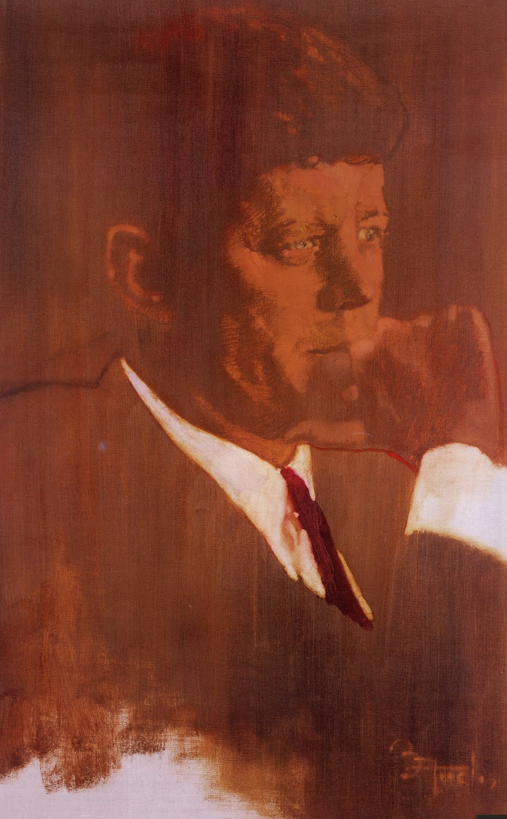
Note the dramatic contrast between Rockwell's portrait of Eisenhower and Bernie Fuchs' iconic portraits of Kennedy just a few years later:


Fuchs' dynamic images of Kennedy were warmly embraced by the Kennedy clan. The painting of Kennedy on his boat (above) hangs today in the home of Kennedy's sister, Ambassador Jean Kennedy Smith. Kennedy's counselor and speechwriter, Ted Sorensen, kept another painting by Fuchs on the wall of his office until the day he died, a few months ago. And when Sotheby's auctioned off the personal possessions of Kennedy's widow, Jacqueline Onassis, there were two Fuchs images among them. Accurately or not, Fuchs' artistic perspective was the way many in Camelot chose to perceive their era.

Kennedy posing for Fuchs in the oval office, 1962

Fuchs in the White House rose garden behind JFK and RFK

A few years later when Fuchs returned to the White House to paint President Lyndon Johnson's portrait, he found the personality of the government had changed sharply. The artistic style which was so appropriate for Kennedy was not of interest to Johnson.

Fuchs delivering his portrait of Lyndon Johnson in the oval office


Today it is difficult to imagine a leader anywhere who would turn to the arts to help establish their image . The triumph of video and the changed receptivity of the public are obviously important reasons for this transformation (although the lowered taste of rulers and the reduced ambitions of artists probably have something to do with it).

For a sense of just how far presidential portraits have sunk in our era, consider this famous portrait of Barack Obama being applauded by trained seals:


The artist Shepard Fairey lifted his image from a copyrighted news photograph. When confronted with his theft, Fairey admitted that he had lied to the court and tried to destroy the evidence. Nevertheless, the fawning art critic and "postmodern poet" Peter Schjeldahl wrote an embarrassing review for the New Yorker in which he called Fairey's poster "the most efficacious American political illustration since 'Uncle Sam Wants You.'"

In an era where Photoshop substitutes for technical skill and expropriation substitutes for imagination, perhaps it is fitting that the era of court painters is behind us.