Thursday, May 28, 2020

BULL

In 1967 Bernie Fuchs drew this bull for an ad for the Henry Schroeder Banking Corporation. 


Eight years later, artist Susan Rothenberg rocked the fine art world with this picture of a horse:


When Ms. Rothenberg passed away last week, The Washington Post extolled her as "one of the most acclaimed and influential artists of the past half century."

Why?  The New Yorker explained the "asteroidal impact" of Ms. Rothenberg's horse pictures:
[T]he effect of the horse paintings that Rothenberg sprang on the world in 1975... was like an asteroid impact....her huge paintings in acrylics made some of us laugh with sheer wonderment....The works conveyed anger, exaltation, and self-abandoning intrepidity. 
The Fuchs picture is a far superior design; it's a more sensitive and observant portrayal of the animal, with a more powerful use of dense blacks, artfully contrasted with light, lacy drawings of broken china.  It is a more mature, sophisticated piece.  It even has a discernible, layered meaning. Yet, we must all concede that the Rothenberg picture is stronger in the "self-abandoning intrepidity" department.

Fuchs' failure to master self-abandoning intrepidity will always remain a serious drawback to his art. But he did seem able to tell the difference between a horse and bull.

Wednesday, May 20, 2020

THE GREAT NOEL SICKLES, part 5

Unlike many artists who hedge their bets with numerous fine lines, Sickles often used bold lines and dry brush.  


In the following close ups, look how his highly selective use of broad dabs of ink and watercolor create the impression of a tightly rendered figure, but without the same manual labor.


An artist who employs a thousand lines to make a picture can make a lot of lazy or even wrong choices with impunity.  Sickles' approach requires a more sure artist.


In the next detail, see how Sickles uses a swipe of dry brush where lesser artists might be drawing wood grain and knot holes with a hundred strokes of a crow quill pen:


In this next picture of a cannon fusillade, we see a similar approach


Sickles does his best to eliminate unnecessary details, but he just can't help his obsession with how the engineering of his subject works:


Tuesday, May 19, 2020

THE GREAT NOEL SICKLES, part 4

Here are some hopefully edifying close-ups of a Sickles drawing:

Sickles was assigned to illustrate technicians at work on a nuclear reactor... not exactly an artist's dream assignment.   But the resulting drawing shows how Sickles rotated and cropped the image to turn a complex subject into an interesting design.


Sickles' philosophy was, "For reportorial drawing one needs a draftsman, an artist who goes beyond a literal rendering and who interprets and selects.  He can often make the slightest sketch significant and can bring life, meaning and vitality to a drawing as well as the imprint of a personal style."

Sickles was famous for his location drawings, which pioneered the trend in American illustration away from "finished" drawings, and toward the acceptance of more spontaneous sketches.  This trend was later developed further by artists such as Robert Weaver, Franklin McMahon, Alan Cober, Paul Hogarth and Tom Allen, before it became the dominant style in illustration. 

In his excellent book On-The-Spot Drawing, Nick Meglin quotes Sickles on this transformation in taste:
My drawings were mostly observations, details, compositions, ideas and just plain visual notes to myself...a wagon wheel looks like this...an oak tree looks like that.  You'd go to an editor with your drawings and he'd say-- "Yes, fine.  This is what we wanted.  Now go home and do me a finished one." Today he says-- "Yes, fine.  This is what we wanted." Then he reaches over and rips it out of your sketchbook and prints it, charcoal smudges and all."
The craftsmanship and technique may not be the same, but as public awareness increases, the demand for the true picture, the natural picture, has become the important thing.
I don't know whether this drawing of the nuclear reactor was done with the aid of photo reference; I do know that if you follow Sickle's pencil line close up, you can see that he did not slavishly follow the line of any photograph when it came to the human figures here.


Even when he draws the machinery, we can see from the detail below that Sickles made a few sparse guidelines with some mechanical tool to make sure the basic structure was squared off, then drew the reactor freehand with a natural spirit using uneven, overlapping and transparent forms.


Sickles  knew exactly how tight he wanted to make this drawing, and no tighter.


Saturday, May 16, 2020

THE GREAT NOEL SICKLES, part 3

Noel Sickles was a capable painter...


...but he was first and foremost a draftsman.  He used the most basic black and white tools to achieve the most extraordinary results.  For example, working on a small scale with humble materials he was able to create the illusion of epic events:


The following is Sickles' drawing of one of the worst disasters in Naval history-- the night collision of the aircraft carrier USS Wasp with the USS Hobson.  You'd think that such an immense topic would require a big canvas and a full range of colors.  But look at what Sickles was able to accomplish with graphite on a small piece of illustration board:


Sickles gives us a sense of the scale by his extreme foreshortening of the Hobson and his depiction of the looming Wasp, lit from below by the sparks from the collision.  The tilt of the lumbering Hobson gives us a sense for the immense weight of these ships.

A less skilled hand would dramatize the impact using bright fireballs and plumes of smoke.  With a highly limited value scale, Sickles does a more potent job.  (I've often quoted Thucydides: "Of all manifestations of power, restraint impresses men most.")


As always,  Sickles' linework-- even in a night scene-- reassures us that he is firmly in control of the structure of his subject:


Delicate details such as this were important to show on the Hobson, so viewers would understand its vulnerability in the path of the  huge, implacable Wasp.

Thursday, May 14, 2020

THE GREAT NOEL SICKLES, part 2


This is Noel Sickles' preliminary sketch...


for this finished illustration of runaway horses on main street:


Unlike many artists, Sickles rarely made detailed preliminaries.  For him it was most important to analyze how his subject worked.  Once he'd mapped out the structure of the street, the sweep of its curve, the strategic location of key landmarks such as that parasol in the road he could proceed directly to the final drawing of the horses, carts, etc.

Henry Pitz noted that Sickles was such a remarkable draftsman, once he walked around a stagecoach and understood how it worked, he could rotate it in his mind and draw it from any angle.  His brain was equipped with CAD/CAM software. 

This may look like a painting, but as you can tell from this close up of the original, this remains primarily a drawing:


Here is another preliminary sketch...


for this finished illustration of the siege of Leningrad:


Again and again, Sickles' sketches demonstrate the approach of a structural engineer:


If he can figure out how the thing works, he is confident his drawing will be authentic.

Wednesday, May 13, 2020

THE GREAT NOEL SICKLES, part 1

In an era plagued with viruses, squabbling politicians and fake news, the honest drawings of Noel Sickles make a great disinfectant.

Here you'll find no cheating, no gimmicks, no subterfuge.  Even in this tiny spot illustration, notice how Sickles captured the sagging of the stagecoach and the foreshortening of the road.


Even a small truth is not to be discounted in this day and age.

Sickles didn't draw the surface of things; he understood their underlying structure and that gave his line speed and courage.  His drawings don't hide or obscure-- to the contrary, they share Sickles' x-ray vision with us.


Sickles might be better known today if he'd had a more flamboyant style.  But so many artists use "style" to conceal weaknesses in draftsmanship.  Sickles' only style seemed to come from his sincere love of drawing.  For example, on the following cover there are no sharp cinematic techniques, no wide angle shots or close ups of faces.  Sickles doesn't experiment with inventive media or stylistic exaggerations.  This is just a straight-on drawing of the backs of 25 people from a distance:


Yet, Sickles shows us that if you're good enough, a long distance drawing of 25 backs can make a strong picture.


Sickles can't even bring himself to paint that great big backdrop of a sky with a wash, he draws it with the same churning strokes than he applied to the overcoats in the crowd, only amplified to the scale of the sky:


I don't manufacture Purell sanitizer so perhaps the best substitute I can offer is a few days of Noel Sickles' honest drawings, which I'll start tomorrow.

Tuesday, April 28, 2020

A GRATUITOUS JULIAN SCHNABEL PAINTING

I had no interest in posting a picture by celebrity artist Julian Schnabel.  Then I read the following in the New Art Examiner:
Wishing to reproduce a work of art by Julian Schnabel....[w]e phoned the Pace Gallery in New York, Mr. Schnabel's dealer, and requested a photograph of any of his recent work.  Their response? "All requests for a photograph of Julian Schnabel's work must be made in writing along with the complete textual passage that discusses him; these requests are forwarded to the artist for his approval."
Such an extreme provocation compels any public spirited citizen to set aside their legitimate labors and post a gratuitous photograph of Schnabel's work without his permission.  Here's mine:


And here's my "textual passage that discusses him:"  In my opinion this is a noisy, clattering, third rate painting by a noisy, clattering, third rate painter.  Adoring fans tell us that "Schnabel's use of broken crockery as a painting surface signaled an overtly defiant departure from the almost sacred 'flat surface' rule of Minimalist painting," but Schnabel's picture is minimal in more important ways.  Devoid of taste and substance, it is to be appreciated primarily as a highly successful marketing gimmick by a true master of publicity.

Section 107 of the U.S. copyright law states: "the fair use of a copyrighted work... for purposes such as criticism, comment...scholarship, or research, is not an infringement of copyright" and if Julian Schnabel doesn't like that he can kiss my butt. 


Thursday, April 16, 2020

PLAGUE ART, part 4

John Cuneo has a mind and sense of humor that are, in my opinion, unique in illustration today.  As far as I know, they're unique in the rest of the world too.

Detail of a sketch on the back of a menu from the Bear Cafe
The internet is flooded with artistic responses to the coronavirus.  Some are more interesting or illuminating than others.  As you'd expect, there's a huge amount of repetition and overlap.  But Cuneo overlaps with nobody.  Every time you go to his instagram page you know you'll see something you haven't seen anywhere else.

The following are some examples of Cuneo's perspective.  Beware!  Because it is Cuneo they are VERY NSFW.  But Cuneo uses sex the way Hitchcock used suspense-- a seemingly "lowbrow" vehicle that a master can employ to deliver powerful, trenchant statements of a high order.

Look how smart this joke is:


Cuneo bypasses the predictable joke that men are such pigs that-- even in the face of a deadly worldwide pandemic-- they think only about one thing.

He also bypasses the predictable joke that the man is so selfish that he wears a mask but cuts a hole in his partner's mask because some things are worth the risk to your partner, y'know.

He even bypasses the joke that his partner understands what a loathsome fellow he is;  she doesn't even bother to yell any more, or look up from her cell phone, she just gives him a sidelong glance with a world weary expression on her face.

Any one of those ideas would be a punchline for one of the better cartoonists today, but they are just way stations for Cuneo on the path to the woman's calm, understated request for the scissors.  What a marvelous statement about human nature, both male and female, in the face of the virus.

Here's another drawing about human interaction during the plague-- a different kind of "safe sex."


But Cuneo is particularly good at depicting lives of quiet desperation that people are experiencing after weeks of isolation at home:


Cuneo is one of those rare artists today who doesn't use a loose, scratchy style to evade scrutiny.  Study the faces on that last drawing above to see how carefully he captures the pathos of the unfeeling husband and the despondent wife.


The hunched shoulders, averted eyes and body angle fend off any attempt at human interaction


One might argue that Cuneo's distinctive voice is in the tradition of R. Crumb, but I think Cuneo is smarter, funnier, and better at drawing.


Thursday, April 09, 2020

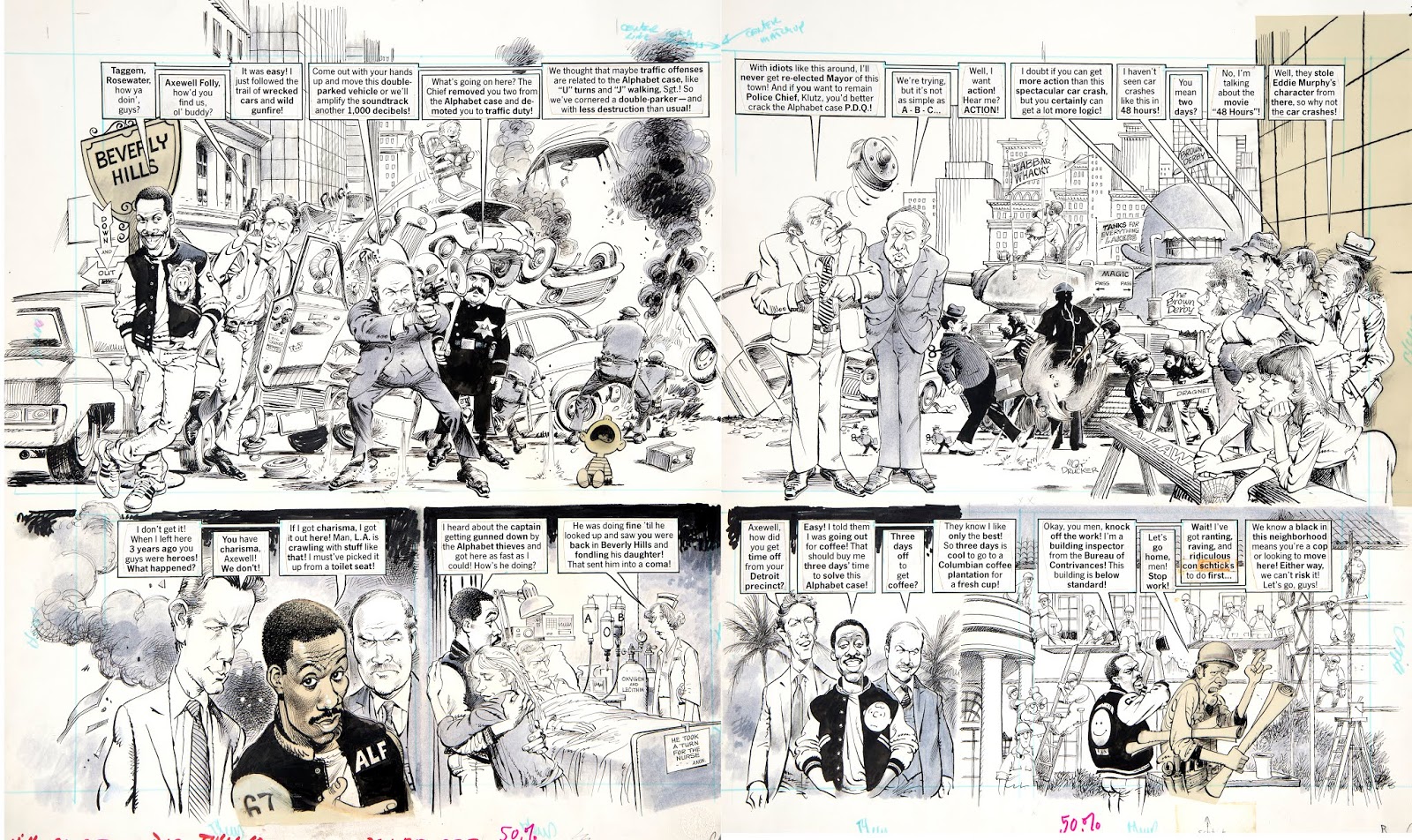
MORT DRUCKER 1929-2020


Last night the great Mort Drucker-- one of the few true geniuses of 20th century comic art--  passed away peacefully.  He left behind a legacy of brilliant art that influenced, and will continue to influence, generations of young artists.


Drucker was such a humble, gentle soul, I could never quite figure out where he found the drive and ambition to stay at his drawing board creating hundreds of beautiful stories, decade after decade.  He was the opposite of competitive, as generous and open minded an artist as I've ever known.  Yet he held himself to excruciatingly high standards as he crafted his marvelous drawings, working out likenesses for his caricatures and populating his pictures with details and humor that reflected his abundance of spirit.


His work inspired a vast and diverse array of artists.  Oil painter Phil Hale said that his ambition in life was once to go work for Mort Drucker at MAD.  And it was widely reported of painter Jeffery Catherine Jones, "if Jones wanted to emulate any artist in his youth, it was probably Drucker and he wrote him fan letters asking questions about the types of pens he used and how he approached illustration assignments."

This wonderful anecdote from Mort's obituary in The Washington Post reveals his influence:
A 1980 spoof of “The Empire Strikes Back” — portrayed by Mr. Drucker as “The Empire Throws Up” — prompted a nasty letter from lawyers representing director George Lucas. They demanded all profits from that issue of the magazine and asked that the original art be turned over or destroyed.  Publisher William Gaines sent them a copy of a letter received days before from Lucas, in which he gushed about the Mad parody and praised Mr. Drucker as the “Leonardo da Vinci of comic satire.”
The art world won't see Mort's like again.


Drucker and his family at his induction into the Society of Illustrators Hall of Fame 


Saturday, April 04, 2020

PLAGUE ART, part 3


Man Throwing Up  by David Lynch
Before David Lynch became a master at making unsettling, creepy films he was a master at making unsettling, creepy drawings and paintings.  He did an entire series of ill, vomiting figures:


This next one is called Six Figures Getting Sick:


From the same series:


I like Lynch's pictures, starting with his early, unconventional comic strip, The Angriest Dog in the World:


Detail

I think he brings a horror to his subject that more skillful artists have missed in the previous pictures I've offered.  This is not because Lynch explicitly paints vomit.  To the contrary,  I think his real strength is taking the most normal, innocuous elements and assembling them in a way that becomes far more ominous and unnerving than any pictures of dead bodies or skeletons.

For example, this next picture is called, She Was Walking to Her Home and Then There Was Someone.


Yikes!

Another example: There is Nothing Here.


Or the unnerving, Who Is In My House? which summons feelings of mental patient level paranoia.


Even words as bland as This Is My Truck become transformed by Lynch's images.


Who would've guessed that such harmless elements could be combined to create such a tone? And if such meanings can lurk beneath such safe concepts, what else is at risk?

The point is, an artist doesn't need to show circling vultures or blood and guts or skeletons...  a nondescript blob on a flat red ground can be more effective.