Monday, December 23, 2013

WARRING WITH TROLLS, part 6

 "To live is to war with trolls."  -- Henrik Ibsen


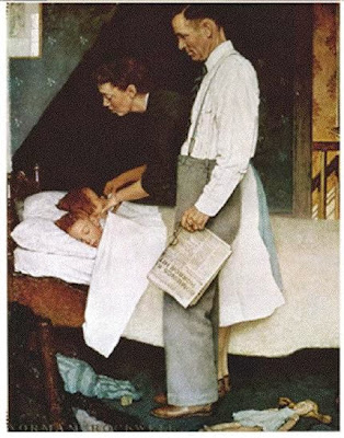
 One of the most interesting stories from Deborah Solomon's new biography of Norman Rockwell involves his famous series of paintings, the Four Freedoms.  During World War II, Rockwell wanted to aid the war effort but was too old to enlist and not physically suited to be a fighter.  He set out instead to illustrate Franklin Roosevelt's "Four Freedoms" in a way that would inspire patriotism and encourage the purchase of war bonds.

After sketching his four paintings, Rockwell went to Washington to donate his art to the government but the government wasn't interested.  Rockwell showed his drafts to the Office of War Information but the official in charge responded:
The last war, you illustrators did the posters.  This war we're going to use fine arts men, real artists.  If you want to make a contribution to the war effort you can do some of these pen and ink drawings for the Marine Corps calisthenics manual.

Solomon deduces that the official who rejected Rockwell's art was the "pompous" Archibald MacLeish, poet and Pulitzer prize winning playwright.  MacLeish was the Assistant Director of the agency.  He said he preferred to inspire the country with pictures from "real" artists such as Marc Chagall, Salvador Dali and Japanese artist Yasuo Kuniyoshi (6 months after Pearl Harbor!)

Rarely has a misguided act of cultural arrogance been so promptly, thoroughly and satisfyingly refuted.

Stung, Rockwell took the rejected paintings to the Saturday Evening Post which used them as internal illustrations.  Editor Ben Hibbs later wrote:
The results astonished us all....Requests to reprint flooded in from other publications.  Various government agencies and private organizations made millions of reprints  and distributed them not only in this country but all over the world.  Those four pictures quickly became the best known and most appreciated paintings of that era.  They appeared right at a time when when the war was going against us on the battle fronts, and the American people needed the inspirational message which they conveyed so forcefully and so beautifully.

Subsequently the Treasury Department took the original paintings on a tour of the nation as the centerpiece of a Post art show to sell war bonds.  They were viewed by 1,222,000 people in 16 leading cities and were instrumental in selling $132,992,539 worth of bonds.
The Post received 60,000 letters about the paintings:


In the meantime, the imperious Archibald MacLeish lasted a mere eight months in his job at the Office of War Information.  After he left, the OWI sent a film crew to Rockwell's studio and filmed a five minute newsreel about his Four Freedoms.  The government's newsreel played in movie theaters around the country.

MacLeish was a brilliant intellectual but he let his reflexive cultural arrogance substitute for thinking about what type of art would be effective.  In doing so, he became just one more of those obstructive trolls described by Ibsen. 

Monday, December 16, 2013

THE CLIFFS OF FRAZETTA


It's a known fact that 47% of all cliffs in American illustration were painted by Frank Frazetta.

He'd paint them on the right side of the picture:


...and then for variety he'd paint them on the left side of the picture:


And on days when he was feeling ambitious he'd paint cliffs on both sides of the picture:


When it came time for something completely different, he might draw cliffs instead of painting them:


Frazetta lived in a land of cliffs that no geologist would ever recognize.  Apparently he felt that cliffs added drama to his pictures.  They conveyed brinksmanship, a place where the hero's back was to the wall with no retreat.

Some of Frazetta's cliffs were less successful than others. For example, this one seems hopelessly overworked to me:


The technique may be dazzling, but Frazetta seems to have become so caught up in making pretty lines that he lost control of the drawing.

The more he labored over individual cracks and pebbles in his cliffs, the less substantial and persuasive the cliffs appear.  For example, the unnecessary details in the drawing above result in a flat, awkward cliff with no real weight or mass. Similarly, the cliffs in the gorilla painting, where each layer of rock is carefully delineated, look like a cheap theatrical backdrop. 

Yet, when Frazetta lightened up, and made his cliffs delicate compositional devices, they began to take on genuine artistic weight.


Another cliff or a column of smoke?  They both weigh the same, aesthetically.

Monday, December 09, 2013

WARRING WITH TROLLS, part 5


"To live is to war with trolls." --Ibsen

The qualities of Norman Rockwell's painting Saying Grace have long been obvious to everyone except a handful of fine art critics.  Now that the painting has been sold by Sotheby's for $46 million, fine art critics are able to see its merits it as well.


The sale offers us a propadeutic moment, shining a spotlight on the scoundrels who encircled  Rockwell.  Such lessons should not be wasted.

As explained in Deborah Solomon's new biography, Rockwell paid a heavy personal price to create this painting:
He did only three Post covers that year and Saying Grace ate up months.  The illustrator George Hughes remembered a night when Rockwell threw the canvas into the snow in a fit of disgust, only to retrieve it the next morning.
Rockwell agonized over his painting; he probably lost money on it, but he was the only one who did.

Saying Grace was one of seven Rockwell paintings in the auction from the "personal collection" of Ken Stuart, who was Art Director of the Saturday Evening Post until 1962.  Illustrators who worked for Stuart complained that he leaned on them to "donate" their original art to his personal collection, in order to stay on his good side when he handed out new assignments.  Illustrations that Stuart didn't want to keep, he sometimes donated to museums to get the tax deduction.

In today's world, abusing his position of responsibility for personal gain would be considered highly unethical and a conflict of interest.  But in the 1950s, because of the lower stature of illustration, artists were largely helpless when art directors, printers and clients embezzled originals. The Post later sued Stuart for walking off with illustrations, but a court ruled that it waited too long to assert its rights.

Stuart left his Rockwell paintings to his three sons, thinking they would benefit from his windfall.  Instead, they took to fighting like scorpions in a bottle.  Accusations of theft and misconduct flew back and forth as the brothers squabbled and sued each other over the best way to monetize the art.

The owners of the Saturday Evening Post watched the Sotheby's auction with dismay, accusing the Stuarts of being  "in it for the money.”  However, it turns out that today's Post is no saint either.  The magazine responsible for those great Rockwell covers and other imaginative illustrations and stories died in 1969.  Its assets were purchased in 1971 by an industrialist who spotted a shrewd way to squeeze additional profits from the corpse of the old magazine.  Today's incarnation of the Post is far more aggressive than the original Post at marketing Norman Rockwell key chains, calendars, gift cards, coasters and other knicknacks.  It became known for aggressively tracking down and claiming royalties for the use of obscure images from the original Post.  In this light, the new Post's indignation about people being "in it for the money" seems comical.

Unfortunately, the war with trolls does not end there.  To add insult to injury, during his lifetime Rockwell had to chafe under misguided political and artistic editorial controls.  For example, Solomon's biography reveals that in another cover,
[Rockwell] was angry at Stuart for overstepping his bounds and altering a painting without telling him.  When Rockwell received an advance copy... of the Post, he was in disbelief.  Stuart had taken it upon himself to paint a horse out of the picture.
The kind of misconduct described in this blog post only comes to light on rare occasions such as the Sotheby's sale, when it becomes economically worthwhile for someone to expose it.

To his credit, Rockwell focused more on his artistic choices in Saying Grace than on fending off the parasites and scavengers around him.  That's part of what enabled him to create such superb, lasting work.  

Thursday, December 05, 2013

EMPOWERING THE PENCIL


In the mid-20th century, American illustration witnessed an explosion in lush, impressionistic pencil drawing.

Assignments that would previously have been completed in paint or ink were now handled in pencil or charcoal by a remarkable group of illustrators who worked with a sensitive, expressive line.

These included the great Carl Erickson (known as "Eric"):


 Austin Briggs:

Note the broad variety of lines in this simple drawing
 
Briggs employs a slender outline for the figure,contrasted with a thick, vigorous crayon for the folds.

 Rene Bouche:


Bernie Fuchs: 


Supreme Court Justice William O. Douglas
and Bob Peak:

Peak also did the portrait of James Cagney, above
In previous generations, the printing process could not pick up such subtleties, so  talented illustrators who worked in pencil (such as F.R. Gruger or Arthur William Brown) were unable to take drawing to such extremes.   In the 1930s we begin to see experimental illustrators such as Al Parker basing illustrations on delicate pencil work:


 ...and within a few decades become quite comfortable with pencil's more aggressive applications:


Graphite and wash


Detail
Famed art director Otto Storch became concerned that some of Bernie Fuchs' delicate lines were too light to reproduce, so he called Fuchs and asked him to darken them.   Fuchs was adamant about the effect he wanted, and refused.  Storch thought for a moment and asked, "Well, would you at least be willing to wear a heavier watch?"


We like to believe that changes in the arts result from developments in the human mind or spirit.  But sometimes changes are prompted by something as simple as a mechanical invention.
 
For example, the invention of the piano helped inspire the Romantic Era in music.  Before the piano, composers wrote for the harpsichord which made clipped, succinct sounds.  The piano suddenly gave composers new expressive power; they could create long, sustaining notes, deeper resonance, greater control over subtle nuances and a broader range of sounds.  Enthralled by their new capability, composers such as Beethoven and Chopin began writing music that was more lush and emotional.

The improvement in printing gave 20th century illustrators the gift of more expressive power, and in the drawings above we witness their delight over their new gift.  For the first time, illustrators could capture delicate gestures and a wider variety of lines.  It did not take them long to bring out the full symphony of effects from a pencil.

Tuesday, November 26, 2013

YOU CAN'T DO THAT WITH WORDS, part 1

Here at the good ol' Illustration Art blog, we have great respect for words.  However, every once in a while it's good to remind ourselves that pictures do thing that words cannot.

Lines can be fashioned into letters of the alphabet, or they can be set free to play in the wilder meadows of drawing.  If lines are hardened into letters, their function becomes clear and unavoidable: to form words and sentences, marching in straight rows, obeying the commands of their master, punctuation.  But when a line is still free and retains its original primordial wildness, it can do countless things in countless ways.

For example, you might use words to convey a message such as "television corrupts youth."  But look at how the line of the great Lou Myers plays with the same theme:


You can't do that with words.

Lines that have been civilized into letters and words can never return to their pagan state.  Language is rule defined, so it becomes unintelligible as it approaches chaos.  But the lovely, wild line of art remains at home in chaos.


Friday, November 15, 2013

ART IN PENULTIMATE TIMES

Yesterday, the 5th Annual Doomsday Clock Symposium was conducted by the Bulletin of the Atomic Scientists at the American Association for the Advancement of Science.  During the Symposium, one of the lecturers shared Harold Edgerton's photographs of the world's first atomic explosion.

Edgerton, an MIT professor, received a top secret contract from the US government to film the first bomb test in the New Mexico desert in 1945, as well as several subsequent tests.  He invented the rapatronic (Rapid Action Electronic) camera, with a shutter speed of just two milliseconds, to capture the very instant the nuclear blasts ignited.  These ghostly images were taken from seven miles away in the desert to protect the camera from being incinerated: 

The beast Extinction, unchained for the first time

Edgerton's photos remind me of Phil Hale's skull paintings:


As nuclear weapons proliferate, it becomes more difficult to run the calculations on the Great Actuarial Table and come up with a happy ending.  After all, we can never un-learn the science of how to inflict catastrophic harm.  That knowledge can only become more widely disseminated, easier to use and harder to prevent.

The math suggests we're living in penultimate times.  What role can art play under such circumstances?  Can it raise our consciousness?  Humanize our attitude toward nuclear technology?  Provide us with solace for what appears to be an inevitable fate?

Art and death have been best friends since the very beginning.  Our mortality is one of the greatest inspirations for art.   Yet, despite all the effort that generations of artists have spent contemplating individual death, they have never quite figured out how to react to death's ugly big brother, total extinction.

Oh sure, there have been pretenders along the way.  The Black Death in Europe had the potential to end the world, and it inspired artists such as  Bruegel, Bosch,  Chaucer and Defoe.

The Triumph of Death by Bruegel
However, the Black Death ultimately helped to usher in the Renaissance by breaking  the grip of a repressive feudal system and an autocratic church, thereby awakening the modern western mind.

As another example, the genocide of World War II was pretty damn impressive.  At the end of the war, Picasso (who had painted the slaughter at Guernica a few years earlier) visited the extermination camp at Birkenau where 20th century technology had been employed to massacre over a million people.  He walked the camp in stony silence and left oppressed by the inadequacy of art.

The front gate at Birkenau, circa 1945
That night he turned to his friends and muttered, "We had to come here to understand.  To think that painters once thought they could paint 'The Massacre of the Innocents.'"

Until now, even the worst slaughters have been redeemed by the possibility that a surviving audience could bear witness to (and perhaps give meaning to) the tragedy. That slender consolation may no longer be available.

Artist Ralston Crawford was commissioned by Fortune Magazine to witness and illustrate one of the first atomic bomb tests in the south Pacific in 1946.  Perhaps his senses were damaged by the blast, for he came up with this laughable reaction:


Another artist, Enrico Baj, sensed that the jig was up and urged in his manifesto that traditional painting be demolished and that art be re-invented to respond to the new reality.  However, despite the sincerity of his intentions, his art was not up to the challenge.


Today an occasional museum exhibition will work up the nerve to take on this biggest theme of all. Artists such as Isao Hashimoto make their point effectively with hard data, while artists such as Carol Gallagher take a very personal and emotional approach and Jonathan Fetter-Vorm has prepared a graphic novel about the first Trinity explosion.  Some of these efforts are more successful than others, but they are all well-intentioned.

The ancient Greeks tragedians understood that even a doomed person retains enough control to elevate his or her fate from mere misery to the dignity of tragedy. That's not much, but if it's the only way to extract salvation from despair, it's important.


Friday, November 08, 2013

THE CHANGING ETIQUETTE OF THEFT


Recently a west coast illustrator was outraged to discover that her art had been used without her  permission by a corporation, Cody Foster Inc., for its line of Christmas ornaments.   The illustrator complained that the stolen art was "100% mine" and launched a publicity campaign attacking the plagiarism of her work:


However, during her publicity campaign it was discovered that the illustrator herself had "borrowed" someone else's copyrighted work to make her illustrations.


Her double standard is consistent with the highest traditions set by today's master artists.  Jeff Koons repeatedly "borrowed" other people's images to create his masterpieces, but when he discovered someone borrowing from him, he became indignant and sued for copyright infringement.  Similarly, Andy Warhol shamelessly borrowed images belonging to others, but the Andy Warhol Foundation aggressively pursues anyone who attempts to copy Warhol's copies.

Apparently, the part of the human brain responsible for recognizing irony has atrophied as a result of exposure to contemporary art over the past 50 years.

 In the 1960s, Pop artists such as Lichtenstein and Warhol regularly used images by other artists but slept soundly at night believing that, although their images looked nearly identical, the underlying "concept" was different.

Lichtenstein explained why his version (on the right) is not a copy: "What I do is form, whereas the comic strip is not formed in the sense I'm using the word...."

Since the 1960s, the language of borrowing has become more glib, even as borrowing has become more blatant.  The Museum of Modern Art sniffs,
The recontextualization of familiar images from television, film and advertising suggests that the meaning of those images might not be intrinsic and unchanging but rather culturally constructed and context specific. 
In addition to "recontextualization," borrowing has been justified as repurposing, transformative use, sampling,  augmentation, or sometimes just plain old appropriation art

In such a complex world, no wonder the etiquette of borrowing has become confusing.

There used to be a natural defense against appropriation; art required technical skill, and  if you couldn't paint like Caravaggio, you couldn't appropriate his work. But in recent decades the role of technical skill has diminished while the ease of mechanical copying has increased.  The barricades against appropriation quickly fell, along with the old moral prejudices against it.

Today information technology indiscriminately captures vast oceans of images; it delivers them to us instantly from anywhere in the world, and empowers the least talented among us to duplicate them, alter them and even animate them in ways that the original artist would never permit.   Our attitude toward these pictures has changed because Google Images, Tumblr and Instagram have led many to believe that untethered images buzz around randomly in nature, like subatomic particles.  Today we seem to spend more time managing and tweaking pre-existing images than we spend creating important new ones.

In fact, a growing number of artists manage streams of information the way previous generations of artists managed pigment on a palette.  Data is becoming the raw stuff of art, and the low challenge for  the artist is to manage that data with just a little more taste and style than a search engine or data mining software might manage it.

The etiquette of borrowing will continue its radical transformation and it will be interesting to see where it ends up.  But no matter what happens, one universal principle is likely to remain unchanged: it will always be less of a crime for fine artists to steal from "commercial" or "low" artists (such as illustrators, product label designers and comic strip artists).  The Museum of Modern Art celebrates this phenomenon as "appropriated images from popular media and culture." Some things just don't change.