Sunday, March 23, 2014

EXHIBITION OF WATTERSON AND THOMPSON ART


 Art critic Robert Hughes distinguished between two different aspects of a picture: the part "which can survive reproduction-- the story, the moral, the iconographic detail" and on the other hand "the authentic, expressive, incarnated touch of the artist."

If you want to appreciate the difference, go to the Billy Ireland Museum at Ohio State University to see their new exhibition of art from Bill Watterson's Calvin & Hobbes and Richard Thompson's  Cul de Sac.


I greatly admired these two strips when I first saw them reproduced in newspapers and compilations  but the original pictures on display in Ohio add a whole different dimension-- highs and lows of color and line well beyond the reproductive capability of the modern printing press;  preliminary pencil lines and mid-course changes which demonstrate the honest thinking of craftsmen at work; and most of all, the intimacy of what Hughes called "the incarnated touch of the artist."
  
Rather than reveal the secret tricks used to create the illusion of magic, these originals confirm that, indeed, the magic was true.
People have rightly bemoaned that history and economics have been unkind to the syndicated comic strip.  Newspaper circulation has dwindled, strips have shrunk to postage stamp size, and other more explosive forms of story telling have stolen away key audiences.  No wonder we are told that the medium can no longer attract Alex Raymonds and Walt Kellys.  But if you look at the diminutive originals on display at the Billy Ireland Museum, you'll see that artists who are good enough can prevail over such limitations.  Watterson and Thompson both simplified their images to the bare essentials.  They were also generous with their labor, not seeming to fret too much that nuances in color might not fully reproduce, or that a few delicate lines might drop out of the printed version.  

These two comic strips are my favorite strips of the past thirty years because of their marvelous drawing and imaginative themes.  But as I walked through the two adjacent galleries I was most overwhelmed by the incredible heart in this work.  I don't know how I missed it before... perhaps I had to see the originals to appreciate it fully.  But in my view, that's the single most important bond between the work of these two terrific artists.

 Big hearts are such a rare commodity these days, it's worth a trip to Ohio to witness the phenomenon for yourself.       

Thursday, March 13, 2014

CLARIFICATIONS


Last week's series on the importance of good drawing prompted the following observations from other web sites:
"Apatoff is always infuriating...."

"He seems to have a real bug up his behind.... "

"[F]or fuck’s sake."

"You don’t understand comics."
 

"cartooning isn’t drawing,"

"[Y]ou invariably write nonsense."
 

"Chris Ware’s comics... do not employ drawing.... "
Others might rest on their laurels at this point, but I have three additional clarifications to offer on the subject of good drawing:

1.  I do not equate good drawing with 1950s photo-realism.   Compare this excellent drawing by Picasso


with this terrible drawing from the Smithsonian Book of Comic Book Stories


Both drawings show distorted figures locked in an embrace.  Both employ bold, loose, rapid lines.  But in the first example, the distortions are compelled by expressive necessity while in the second, they result from technical ignorance.  Too many artists today think their technical ignorance is concealed simply because drawings are no longer expected to be realistic.  But viewers can still tell the difference.


2.  Technical skill can empower, not diminish,  imagination.  Look at John Cuneo's splendid drawing of an alligator excited by the arrival of his goldfish martini:


The subject matter is anything but realistic, yet it is obvious from special touches such as the alligator's excited little hands or his smiling eyes that Cuneo is a brilliant draftsman. 
 

 Last week I wrote about how Leonard Starr's ability to draw hands provided a separate stream of information, parallel to the text, which enhanced the expressive quality of the picture.  Cuneo's alligator hands won't be found in any anatomy book, yet note the great precision with which they were rendered.  A few fingers in different directions or a few of those seemingly casual lines moved to the left or the right would make the hands less perfect.

I think Cuneo is just about the most psychologically complex illustrator working today.  Look at the following detail from a different picture of an alligator, this one lolling with snakes and empty wine bottles on a living room floor. 


For those who argued last week that drawing is less important than the "emotional resonance" of the subject matter, consider how Cuneo's dark  imaginative content would be diminished if it were not accompanied by his great drawing skill.


3.  A drawing should not be excused from excellence merely because it is one panel in the service of a larger narrative.  Disney animator Preston Blair drew a hippo dancing in a ballet tutu for the movie Fantasia.  His sketches are not "realistic"--  you'll never find photo reference to show how the rolls of fat would hang from a hippo  prancing on her toes-- yet they are persuasive to us because Blair's drawing ability and his understanding of forms enabled him to project how a dancing hippo might operate in real life.  


These sketches are another wonderful example of how imagination is empowered by technical skill.

A number of commenters explained to me last week that the drawings inside those little panels in graphic novels should not be evaluated as "drawings" because they are merely in the service of some story.  It is the "larger narrative" I should be concerned about, not the qualities of some component.  But take another look at Blair's loving drawings of that hippo, which make up a far smaller part of Fantasia's narrative than a panel in a graphic novel.  Rather than impede the flow of the narrative, they insure that every ingredient contributes its own holistic excellence. If Blair had told his boss Walt Disney, "these individual drawings don't need to look good because they are in the service of a larger narrative," Disney would have fired his ass, and he would have been right to do so.   


Monday, March 03, 2014

THE LOST VOCABULARY OF VISUAL STORYTELLING, day 4

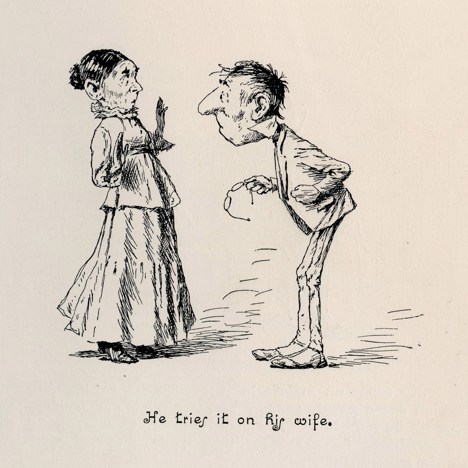
A few years ago I wrote about how the great A.B. Frost made use of the gaps between his sequential drawings.

In the following drawing, a man decides to try hypnotism on his wife. 


The second picture skips over her reaction and goes directly to the end result:


Frost implies the action, then leaves it to our imagination to fill in the blanks.  By involving us in the picture, he can make a humble little pen and ink drawing potentially boundless. 

This pacing of the images is another aspect of what I'd call the vocabulary of visual storytelling.

Like Frost, Leonard Starr sometimes chose not to depict the fateful blow, as in the following strip, where a character circles back to get two agents who have been pursuing the heroine.   Starr makes dramatic use of the empty space between his images.

"I convinced them that we were quite another thing..."
 Another well spaced strip, employing the same device :

"It seems to be clear now...."  If anyone knows the whereabouts of this original, I'd be interested in hearing from you.
There are many other ways in which the timing of sequential drawings can be handled effectively or ineffectually.


 But recently, popular notions about the pacing of sequential drawings have changed.  We see sequential drawing that is intended, as one commenter has said, to be "underplayed, understated, deadpan."  Rather than razor sharp timing and theatrical punchlines, we see time sequences stretched out to convey what has been called "bleak humor." This reflects a different set of artistic goals, but in my view those goals lack some of the elegance and power of the previous pacing.


Sunday, March 02, 2014

THE LOST VOCABULARY OF VISUAL STORYTELLING, day 3


In days 1 and 2 of this series, I tried to show examples of the visual language of drawing, which I think is absent from many of the comics currently embraced as "legitimate" art.  I've discussed the ability to notice revealing details such as hand gestures and facial expressions, the technical skill to capture them, and the ability to manage multiple elements interacting in complex ways. 

Before I go any further, I should emphasize that I am not talking about the mere ability to draw detailed, photographic pictures.  Details are just as likely to be a liability as an asset in a picture.  So it's time to talk about the importance of restraint in drawing.

In the following strip, Starr draws a conversation in the dark, between two silhouettes. 


You won't find any unnecessary details such as fingernails, buttons or folds, just flat geometric shapes until we arrive at the single expression that Starr needs: that eyebrow raised in doubt.   So the moon catches the character's face at that moment before returning to the shadows.


Artists with technical skills often find it hard to resist details, but there is no virtue in detail for its own sake.  Today we see many popular comics with highly detailed drawings that amount to little more than a calamitous blizzard of lines.  Unless an artist makes the choices necessary for prioritization, a drawing cannot cohere.


One reason I like Starr's drawings is his selective use of detail, his restraint of his great technical skill in the service of the picture.

Saturday, March 01, 2014

THE LOST VOCABULARY OF VISUAL STORYTELLING, day 2


Yesterday I suggested that contemporary comic art, for all of its new found legitimacy, often works with a more simplified set of visual tools.  So I'm spending a few days talking about what has been gained and what has been lost in this evolution, using some of Leonard Starr's drawings from the 1960s as examples. 

Today I'd like to offer a few examples of how Starr staged complex drawings.  Here is a scene involving the dynamics between three main characters who are rehearsing for a play:


Oh yeah, and here is a fourth guy, who has no name and is just a low level functionary:


Why in the world would Starr squeeze an unnecessary fourth character into the backgrounds of those cramped panels,  along with all that dialogue? 

It turns out that this anonymous character performs a very important function: he informs the reader, better than words might accomplish in this limited space, of what is going on.  The handsome star of the show is an abusive bully, and the role of this fourth character is just to stand around and cringe  and furrow his brow,  so readers understand who is behaving unreasonably:


In this way he performs the same function as a Greek chorus:  he has no individual identity in the play, but he provides a running commentary for the audience.

Most comic artists today would balk at trying to insert four speaking characters into such a small space.  Without the right storytelling skills It would be too dense and unmanageable.  But Starr manages to do it employing a tool kit of visual techniques that are largely unemployed today.

____________________________________

As long as we're looking at these pictures  I would like to add one postscript:

These drawings were published in a newspaper at a size approximately two inches tall.


The printing technology at the time was  nowhere close to what it is today, so much of the charm of the original drawings and the subtlety of the facial expressions was lost in translation.   Yet, the anonymous fourth character is drawn with more precision and care than the main character in almost any "realistic" newspaper strip today.  I consider that a mark of bygone craftsmanship.