Wednesday, February 28, 2018

THE COLLECTOR'S EYE: PETER DE SÈVE

When Rembrandt declared bankruptcy in 1656, an official from the Amsterdam Insolvency Office showed up at his house at No. 4 Breestraat to inventory Rembrandt's possessions.

The possessions would have to be auctioned off to pay Rembrandt's debts.  Moving from room to room, it didn't take long to figure out why Rembrandt had gone bankrupt.  As Anthony Bailey wrote in his book, Rembrandt's House:
The house was crammed with pictures, stacked against and hanging from the walls.... [T]he collecting trait appears to have become an ungovernable compulsion. 
Bailey reports that these pictures included "bits and pieces," scraps and sketches that Rembrandt fancied by his contemporaries,  drawings from Italy, paintings from different periods in a variety of styles.
In part he collected... pieces that he could use in his works, not just for themselves but as pointers and touchstones.  [B]ut his collection of pictures was huge and diverse.  Rembrandt's collection was almost a museum.
I thought about poor bankrupt Rembrandt recently when I viewed the current exhibition at the Society of Illustrators of the art collection of the illustrator Peter de Sève. The exhibition includes work from greats such as Rackham, Searle, Kley, Frazetta, Frost, Sullivant, Disney artists, Winsor McCay and many others.

Unlike a typical museum exhibition organized by a curator or art historian, de Sève has assembled work that appeals to his artist's eye.

He includes working drawings that reveal the thought processes of the artist:

Jules Feiffer

Preliminary sketches that reveal the original spark of inspiration before the concept has been refined and diminished.

Frazetta

Another Frazetta.  Note how, even in this preliminary rough, each of the seven "green women" has a distinctive pose and role.  Frazetta doesn't lump them all together in the background.  This prelim contains all the DNA for the finished painting.


Frazetta
As one of the leading character designers for animated movies, de Sève seems to have a special interest in the evolution of sequential drawing, starting with the A.B. Frost's series of pen and ink illustrations in the 19th century...


A dog racing down the road...

...leaves disaster in its wake.

and moving on to Winsor McCay's Gertie the Dinosaur at the dawn of animation...


...before turning to great Disney art such as Preston Blair's famous hippopotamus ballerina from Fantasia and art from Lilo and Stitch.


There's strong pen and ink work by artists such as Heinrich Kley:


... and work by Arthur Rackham that reveals the artist's underlying sensitive pencil lines:
De Sève writes, "It's thrilling for me to see the half-erased pencil lines that reveal clues to the artist's thinking process and detours he or she traveled to get to the final artwork."

The exhibition also contains final work with interesting solutions by fellow illustrators:

Nick Galifianakis shows all we need to know about the child prodigy Mozart: the top of a wig and those tiny dangling feet.  Note how the artist draws our attention to those little beribboned shoes by making them red against a stark white background. 
And of course there are a number of examples by the master, Ronald Searle:


As fearless with watercolor as he is with ink. 
As an example of de Sève's irreverent eye, he displays the work of his young daughters side by side with the work of the world's top professionals, and for perfectly legitimate reasons.   He explains how he gains inspiration from both: "I know it’s a cliché to want to draw like a child, but honestly, look at the sheer inventiveness and variety in every heart on that page!"


Valentine from de Sève's daughter Paulina when she was five years old.

Paulina's picture exemplifies what makes an artist's exhibition so interesting.  De Sève isn't misled by the pretensions and superficial considerations that preoccupy so many curators and art historians.  Instead, he hones right in on the nutritional content; all marks on paper are judged on a level playing field.

At the entrance to the exhibit, De Sève writes: "The artist I've become is a result of the things I've learned, and continued to learn, from others."

When the Amsterdam Insolvency Office finally shows up at de Sève's door, you'll want to be there for the auction.

Thursday, February 22, 2018

OVER-THINKING THE SITUATION

I like this cartoon by Charles Barsotti of a committee of dogs deliberating a rubber ball:

From the inventory of Taraba Illustration Art LLC 

Barsotti is famous for his light hearted, spontaneous style.  He draws only the bare essentials, perfect for his special brand of humor.

There's no "over-thinking" in this drawing... is there?

When you look at the original, you see that Barsotti decided that some of those dog noses would be funnier if they were a fraction of an inch shorter:


And that round rubber ball... maybe it needed to be a fraction of an inch larger to balance perfectly against the dogs:


And as for those dogs... gosh, would the joke go over better if they had eyebrows for facial expressions?

Nope, I guess not.  Better white them out.


This airy little drawing about not over-thinking the nature of play contains ontological ironies:  It requires effort to be perfectly effortless.

Monday, February 12, 2018

THAT CLEAN, SHARP LOOK (day 5)

This is my final example of an artist who drew in what might be called a slick, polished manner: Leonard Starr.

Like other artists we've observed this week, Starr could draw in a tight style:


And yet,  take a close and look you'll see that, like the previous artists I've featured,  he doesn't pursue realism slavishly. This zig-zag line in the man's hair, for example, adds a nice effect but could never be derived solely from tracing photographs:


Neither could Starr's restraint on the girl's face, or his tapered lines showing the volume of her hair.

Starr's drawing ability enabled him to stage his pictures in the most thoughtful or dramatic way. Unlike so many comic artists who are fashionable today, he was not hindered by a lack of skill.


Detail

Starr's figures were idealized, in accordance with the fashion of the times.


I suspect that many of today's audiences prefer a scruffy, unschooled style because it seems more sincere than idealized pictures by skilled artists.  Sophisticated audiences would rather be shown the dark underlying truths than the glossy surfaces.

But is such closed minded skepticism toward idealistic images warranted?  The ancient Greeks lived a harsher, more imperiled existence than we; feuding city states, corrupt politics and daily strife gave them plenty of reasons to be disillusioned about human nature.    Yet they still devoted major room in their culture for the "illusion" of idealized beauty.  (Clean lines, beautiful proportions, harmonious forms-- as Socrates said,  "In portraying ideal types of beauty we bring together from many models the most beautiful features of each.")   The parthenon, for example,  was intended to be perfect, the embodiment of clean reason and perfection despite everything the Greeks knew from the savagery they had experienced.

Their minds were supple enough to appreciate that art could be both realistic and transcendent,  both true and beautiful.


Thursday, February 08, 2018

THAT CLEAN, SHARP LOOK (day 4)

Continuing our daily series of artists who draw in a slick, polished style: Stan Drake.

Like Alex Raymond, Stan Drake drew pretty pictures in a tight, realistic manner. 


Portraits of the rock group Supertramp from Drake's 1979 strip, "Pop Idols and the Disco Scene" 

Note how Drake's fine tipped marker has discolored with time, while the ink remains black

Drake understood perspective...


...and (unlike the poor, dissed Mr. Mowat) Drake understood how to draw hands.


He had the technical skill to place figures in a room. 


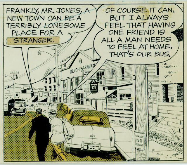
Like other artists featured this week, Drake was nimble with a pen and fearless with ink.

For years Drake shared a studio with his close friend Leonard Starr, who described Drake this way:
His models were the previous golden age pen and ink illustrators like Gibson, Flagg, Lowell, Coll, et. al, mainly because he couldn't afford paints.  Oh the forces that shape our lives.... His brush strokes were used for solid black areas and as accents, very often arbitrarily placed, a heavy stroke ignoring the light source, as often, the top of Evie's hair.  Arbitrary but Oh, how it worked.


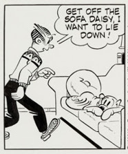
In the 1980s, Drake realized that there was no longer sufficient demand for his sharp drawing skills, so he changed his style and became the artist for the more simplistic comic strip, Blondie.


Wednesday, February 07, 2018

THAT CLEAN, SHARP LOOK (day 3)


Continuing our daily series of artists who draw in a slick, polished style...

One current comic artist who draws sharp as a razor is Sean Murphy, creator of series such as Tokyo Ghost and Punk Rock Jesus.


Note how Murphy's range encompasses the sleek speed lines and mechanical drawing for that boat as well as the imagination and courage necessary for that heavy brush treatment of the explosion:


Murphy clearly loves to draw; he often inserts splash pages with ambitious architectural drawings and grand themes requiring great craftsmanship and rare technical drawing skills.


He's also not afraid of crowd scenes and angle shots.  Here a group of adoring fans hound a character...


...causing her and her bodyguard to take refuge in a public restroom.


There has been some discussion in the last few posts about the importance of "organic unity" in art and not just resting on skilled draftsmanship alone.  Murphy gives his stylish drawings a consistent dynamic look with his slashing brush strokes and aerodynamic forms.  This is high energy drawing by an artist with the resources to operate safely at high speeds.


Monday, February 05, 2018

THAT CLEAN, SHARP LOOK (day 2)

Continuing our daily series of artists who draw in a slick, polished style...

Allan Kass drew these1960s illustrations for clients such as Esso Oil Company and Vauxhall automobiles.


Some will object that this was drawn from photo-reference, but there's a reason Esso didn't use a photograph for its ad.  It cost Esso more time and money to commission a drawing, but a photograph would've lacked that snazzy brushwork on the fender and headlights...


...and in a photograph, that asphalt would be solid black, rather than the visible brush strokes which add life to a flat shape. 


Here is his ad for a British Vauxhall car:


Note the nice way Kass has handled those hills with line and tone:


Some more examples of his linework:


This is another example of drawing that is often dismissed today as glib (or perhaps I should say, merely eloquent) at a time when content-- particularly personal, confessional content-- is king.  Some of the crummiest drawing is applauded today if its content passes muster.

Is this an accurate statement of the trade-off?  And if so, is it a worthwhile trade-off? 

More examples to follow.