Tuesday, August 30, 2016

COMIC-CON 2016: SIMPLE vs. SIMPLISTIC

At Comic-Con this year, I was struck by the number of prominent cartoonists who lectured on the virtues of simplicity.

Jim Davis, who presides over the Garfield empire, said that he tries to limit his strips to 25 words or less, and to get to the punchline in fewer than ten seconds.   Davis said that if readers spend longer than ten seconds, they might guess the punchline ahead of him.


Note that there are no backgrounds or details to distract the reader.  Davis also said that by using three nearly identical drawings, he spares readers the effort of thinking about transitions or shifting perspectives. 


Garfield was custom made for a low effort, short-attention-span audience, which means it is wildly successful.  In his talk, Davis impressed me as extremely bright and sophisticated.  His marketing strategy seemed similar to the strategy of cigarette companies that genetically modify tobacco plants to make nicotine more addictive.

Kate Beaton, creator of the popular webcomic Hark, A Vagrant! was another advocate for simplicity.
 

Like Davis, Beaton tries to minimize the number of words (which is good because she has little enthusiasm for punctuation, lettering, and sometimes spelling).  When it comes to drawing,  Beaton said, "I used to be self-conscious about my art.  The more I worked and tried to make it look finished, the worse it looked." Then she heard a story that made her realize she didn't need to work so hard.  According to the legend, illustrator Quentin Blake once had to rush an assignment and turned in quick, unfinished sketches which his art director liked even better than Blake's finished work.    This helped Beaton accept that her simple, casual sketches could be enough.


Beaton writes that her drawing process is "simplistic."  I agree with her, but I suspect she meant to say "simple."  ("Simplistic" means superficial, facile or oversimple. )  I think Beaton's real strengths are verbal-- her distinctive voice about historical characters and her thoughtful (and occasionally heartbreaking) stories about her home town. One might wonder why she chose an essentially visual medium to convey her ideas.

I love loose, naive drawing.  Some of the greatest drawings are the ones that have attained child-like simplicity.  Simplification is a wonderful discipline because it forces an artist to prioritize-- to continually sacrifice the lesser in favor of the greater until only the greatest is left.  But I fear that today's comics are flooded with mediocre drawing because the fashion is to view visual quality as expendable, a "lesser priority" which can be painlessly sacrificed in favor of the text or concept. 

In truth, this sacrifice hasn't hindered the success of Davis, Beaton or other mega successful cartoonists.  The New Yorker, with its literary emphasis, has become a cheerleader for these priorities.  Much of today's audience is incapable of distinguishing loose drawing from sloppy, careless drawing.  Like Beaton, they haven't mastered the difference between "simple" and "simplistic."
    

This trend isn't a tragedy on the level of climate change. However, it does suggest  that most art in today's strips falls short of the distinctive drawing that once made comics a great visual art form. Perhaps comics are evolving into a primarily literary medium with drawings serving a subordinate role as a mere lubricant for the words.

Saturday, August 20, 2016

COMIC-CON 2016: THE LARGE AND SMALL OF IT

A sketch of a pebble may be a greater artistic achievement than a full color painting of the Grand Canyon.  An allegorical picture with grand ambitions about social justice may be inferior to a picture with no ambition beyond capturing a clump of grass.

You can just never tell.

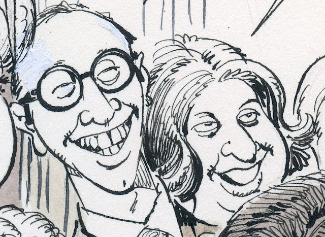
I'm reminded of this every year at San Diego's Comic-Con, where the smallest, most informal art is nestled in the crevices between elaborately staged multi-million dollar corporate art.  This year in a quiet corner of Comic-Con I came across this small (5" x 8") sketch by Wilbur "Pete" Hawley on a ratty, torn piece of tissue paper:


This is a preliminary rough for an illustration for the American Greetings card company.  I admire  his selective use of dark accents and the variety in the width of his line  (contrast the sensitive line describing this cheek with the brisk, full lines shaping the hair on the back of the head):


Even without the wrinkles and bone structure that most artists rely on to convey facial expressions, Hawley managed to create marvelous expressions in an integrated unit.

Note Hawley's use of smudges and a heavier line to create volume

Remember, these were Hawley's notes to himself-- this was a preliminary sketch to work out how Hawley might paint the final version.


Leif Peng wrote, "If God bestowed The Magic Cute Pencil upon any one illustrator of the twentieth century it must surely have been Pete Hawley.  Cute wasn't a formula Hawley had worked out and applied to his drawing style... it was as natural to him as breathing."

Pictures of cute babies were scarce at Comic-Con.  Far more of the artwork focused on inter-galactic battles between armies of muscle bound super heroes.  Popular artists hawked limited edition archival giclee prints of photo-realistic paintings from fancy 3D displays.


But for me, Hawley's battered little sketch on crummy paper was stronger than much of the juiced up, overwrought art  on display in the exhibition hall.

That's part of the miracle of drawing.


Saturday, August 13, 2016

ONE LOVELY DRAWING, part 50

I recently had the pleasure of speaking with Mort Drucker and asked him about this drawing for the MAD Magazine spoof of the movie, The Heartbreak Kid.


There are 35 faces in this crowd.  I always assumed Drucker kept the world's largest reference file of face photos:


But Drucker explained that these were "spontaneous faces" he made up as he went.  I asked where the great variety came from and he answered,  "I like to notice people's faces.  Sometimes when I was on the subway or sitting outside the dressing room at Loehmann's waiting for my wife Barbara to try on a dress, I'd see an interesting face and say, "Hmmm, I can use that."

How do you make use of your time on the subway?   


I don't know of another cartoonist today who pays such attention to the variety of the human face.  To the contrary, as I've complained in the past, the trend seems to be toward generic, simplified faces with little content or individuality.  This seems especially true of cartoonists and illustrators who pride themselves in their editorial content.


Talking with Drucker, I was struck by the pleasure he takes in the humanity of individual faces.  That may be a difference between an artist who focuses on the human and artists who focuses on abstractions about humankind.