Wednesday, May 26, 2021

HOW LEONARD STARR DID BUSINESS, part two


 This is another in a series of posts about the working materials of cartoonist Leonard Starr.  These materials were donated to the Billy Ireland Cartoon Library and Museum in Columbus Ohio where they will be available for viewing by the public.


Leonard Starr drew and inked over 30,000 pictures for his comic strip, On Stage.  How did he create distinctive faces for hundreds of different characters, and then keep those faces consistent and recognizable from different angles with different facial expressions over many years?

That was one of the unique challenges of a syndicated comic strip-- no other art form in history imposed such a requirement.  

Starr would begin by identifying a person with a particular "look."  He'd then take about half a dozen photographs of their face from different angles and use those photographs as reference for future drawings.

Young actors on the NY theatre scene were usually desperate for a little modeling money.  Here is Starr's photo of acting student Larry Hagman who later became famous starring in the sitcom I Dream of Jeannie and as J.R. Ewing in the TV series Dallas.


Hagman became Starr's character Jed Potter:


The following are Starr's photos of actor George Lindsey, who became famous as the character Goober Pyle on the Andy Griffith show.  Starr took eight photographs with different angles and expressions, which he used as the starting point for his character, Claude Harper:

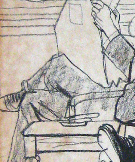
If Starr knew that the plot would eventually involve a difficult scene
such as a fight, he'd take a photo with mussed up hair 


Once he had the basic features-- for example, a profile, or a distinctive nose or unusual chin, he could improvise how they'd look in different positions.  For example, he could take this profile... 


...and mentally rotate it in the opposite direction:


He could also predict how shadows would fall on such a face.


But in order to keep his characters recognizable, he maintained files of his key drawings and revisited his past solutions for continuity:


For example, having mastered the shadows on the character, his clipping file would keep that lesson at hand should the character ever re-appear:
 

Over several years, Starr developed quite an extensive working file of his drawings, organized from every possible angle.  You can tell from the numerous pushpin holes that he got a lot of practical use from them.  

Mary Perkins right profile


Mary Perkins left profile


Mary Perkins right profile from behind

If he was happy with a particular drawing, he'd also file that away for future reference.  He kept files of his past clinches, semi-clinches, people using the phone, etc. 


If your job requires you to draw 30,000+ drawings, it makes sense to keep track of your best examples to save you from needlessly re-inventing past work while at the same time protecting yourself from slipping into formulaic approaches. 

Classic comic book artists such as Jack Kirby, Wally Wood or Wayne Boring often employed a standard template for basic male or female faces.  They'd vary only a hair style or add props such as glasses. But Starr, along with Stan Drake and similar "soap opera" comic strip artists of the 1950s and 60s embraced some of the broader artistic challenges of a continuity strip.   The materials that you see here demonstrate how Starr handled the "business" side of his strip behind the scenes.


Friday, May 21, 2021

NEW BOOK FROM JOHN CUNEO

 NSFW (of course)

It's always welcome news to hear about a new book from the brilliant John Cuneo.

Complex and hilarious, fearless and shocking, there's no one like Cuneo in the field of illustration today.  Perhaps there never was.  

I laughed out loud several times reviewing this book.  It's hard to understand how drawings can simultaneously be so wildly imaginative and so excruciatingly true. 

Cuneo's drawing becomes more sophisticated with each new book.

I love this drawing of a clown circle:


Note details below like the little hop by the clown in the background; the banana peels spread around the ground; those great checkered shorts and boots on the clown in the foreground-- special touches typical of Cuneo.  


Cuneo obviously pays a heavy personal price to create pictures like this, which makes the price of the book a comparative bargain. 
   

96 color pages, 6.5 x 10.5, available from Fantagraphics or The Golden Notebook independent bookstore.

Thursday, May 13, 2021

HOW LEONARD STARR DID BUSINESS

The great cartoonist Leonard Starr wrote and drew, on average, 27 complex panels every week for decades.    


Starr usually employed an assistant to finish the backgrounds he laid out, and a letterer for the word balloons.  But the literate plots, the sparkling dialogue, the drawing and inking of the figures were completely Starr's creation. 

Starr said that "producing a great many pictures in a short period of time," meant that he needed to use an opaque projector "by means of which ... you can project a photograph of a locomotive, or an ocean liner, or the NY skyline onto your drawing paper in the size you want."  Starr would rough out the projected figure with a hard (4H) pencil on 3 ply Strathmore,  then complete the drawing with ink using a #3 brush.

How did this process work in real life?  Well, take this figure for example:


The following comparison shows that Starr used a projector to import only the basic proportions and key folds.  This enabled him to add the magic part of the drawing with ink, quickly and reliably:


If Starr had attempted to trace the completed drawing from a projected image, it wouldn't have ended up with the vitality that Starr was able to add in the inking stage.  


This working method might disillusion some who'd prefer that a strip was produced with no mechanical aids, but Starr-- winner of the Ruben award for outstanding cartoonist of the year as well as repeat winner of the NCS award for the best strip of the year-- would've scoffed.  "This is a business," he said.  "Anything [the artist] can use to help him is all to the good."

It was up to Starr to prioritize where his talents were most needed.  He might've had more time in his week to ink his own backgrounds if someone else wrote the scripts.  He might've been able to pencil everything from scratch without a projector if someone else had inked the figures.  But Starr allocated his great talents where they would do the most good, and used mechanical aids and human assistants to fill in the rest for a high quality product. 


Saturday, May 01, 2021

REAL LINES, part 2

Every beginning art student is taught to draw volume using rounded lines that follow the form:


Yet when Robert Fawcett drew cylindrical columns...


Whoa!  What the heck is this???


Did Fawcett miss that art class?  I don't think so.  He seemed quite proficient in other respects: 


But somehow, as Fawcett developed as an artist, he decided there were better ways to draw volume than lots of repetitive fine lines.  He used loops and swirls and drybrush that even went against the form, yet it always ended up looking all right in the end.  

Some of the other great illustrators seem to have reached the same conclusion, outgrowing those uniform lines in favor of lines with more character and variety.  Were they right?  Well, let's take a look.  

We should start by recognizing that many talented illustrators used the "thousands of fine lines" technique to express form. 

Norman Lindsay:


Frank Frazetta:


Lee Conrey:


There's a lot to admire in this technique, but ask yourself, "What exactly am I admiring?" The level of physical effort? the technical skill in controlling so many fine lines?  The energy suggested by all that activity?  Then ask yourself whether there are more admirable things to admire about drawing.

Take for example the case of Austin Briggs.  Like many other artists,  Briggs started out drawing thousands of fine lines wrapping around his subject matter.  By the age of 20 Briggs was already successful drawing in this style for top magazines such as Colliers


But after a few years Briggs became disenchanted with what he perceived as the limitations of this type of drawing, which he said exhibited "only energy" but not true quality.  


He quit working as an artist altogether and resolved to start over, taking the time to learn "honest" drawing. 
I set about learning to draw, which I never could do before, despite the fact that some of my illustrations had been more or less acceptable. I really didn't know the craft of my profession.  I think I had imagination then but I really didn't know how to use it. 
At the end of his re-education, Briggs threw out 98% of his lines, but devoted the same level of attention to the few lines that remained.  Nothing was done on automatic pilot.  Each line became more thoughtful and expressive.   Lo and behold, those lines turned out to be every bit as successful at conveying rounded forms.


Compare the following two illustrations by Briggs of the same subject, before and after his conversion:  


Briggs abandoned the duplicative lines whose only role was to reinforce the line to their right or left.  He became more selective about the lines he chose to emphasize and he found ways other than repetition to emphasize them.  And just like the mature Robert Fawcett, whose drybrush swirls we witnessed at the beginning, Briggs became less concerned about staying within the lines:


Alex Raymond is another example of an artist who started out using those fine lines wrapped around the form:


But after thousands of drawings, Raymond came to view the potential of a line more broadly:


Now those are what I call "real lines."

Neither technique has a monopoly on quality.  There are good and bad examples on both sides.  But it's a mistake to assume that artists who draw with a thousand fine lines work harder.   Instead, they often remind me of Abraham Lincoln's story of the preacher who said, "I could write shorter sermons but when I get started I'm too lazy to stop.”