Thursday, March 31, 2016

THE GREAT JACK UNRUH


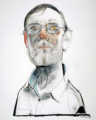
Jack Unruh has had a long career of sustained excellence.

Born in Pretty Prairie, Kansas, Unruh graduated from the famed illustration program at Washington University in St. Louis (the starting place of Al Parker, Bernie Fuchs, Douglas Crockwell, John Hendrix and others).  From 1960 until today, Unruh's artistic dedication has taken him to the most unlikely places:
As an illustrator I've crawled through caves to research paleolithic man, flown on helicopters, slept in cars to view the Valdez oil spill, visited research labs, refineries, deserts, coldrooms, tops of mountains, floated remote rivers in Alaska and Chile, and viewed every major brewery in Mexico.
Unruh has done a splendid job with all sorts of subjects...


...but his greatest strength is as a nature artist.  I've previously quoted Unruh's friend and admirer John Cuneo who said, "Here is a man for whom 'back to the drawing board' usually involves pissing on a campfire."    Unruh looks nature in the eye, up close and personal, finds rich patterns and textures, and reveals them to the rest of us through graceful lines and colors.  I love the ink on this Griffon Vulture:


Jack's intimate appreciation for nature shines in these pictures.  His love is infectious.

One of my personal favorites is his drawing of a spoonbill:


No other artist-- not Audubon, nor anyone else-- has ever captured a bird in a way that I find as intensely moving.

Jack is a terrific illustrator and an even more terrific human being.  He is ailing these days.  I would urge others who have been similarly moved by his work to tell him so, via facebook.  And don't take too long to do it.

Monday, March 28, 2016

RETURN OF THE CROSS HATCHERS

In the 20th century, illustrated magazines went from being smaller, primarily black and white publications with line art...

 
... to larger color magazines with lavishly painted illustrations.  By the 1960s,  magazines such as McCalls and Ladies' Home Journal featured huge, double page spreads in bold, bright colors.


The new printing technologies had opened up all kind of expressive capabilities for artists, making traditional pen and ink work appear stale and old fashioned. Cross hatching, stippling and other relics from the era of wood engraving all but disappeared.

It seemed that magazine pages couldn't possibly get any bigger or more colorful.  But just like a supernova shines most brightly as it collapses on itself and explodes,  magazines such as Collier's, Look, The Saturday Evening PostLife, and American Magazine all went out of business during this period, victims of television.   McCalls, Redbook and Ladies' Home Journal all began turning from illustration to photography.

As magazines became smaller and more specialized, markets for lavish illustration shriveled.  Budgets for color printing declined.  The demand for double page spread illustrations disappeared as magazines turned to spot illustrations.

Then there arose in the land a new generation of cross hatchers who went back to small pen and ink drawings.  "In the days of the frost seek a minor sun." The new generation didn't employ the vigorous, flamboyant lines of a Robert Fawcett, a Charles Dana Gibson, or a James Montgomery Flagg.  Instead they created dense micro-drawings, using cross hatching to create coruscating fields of value.

These artists included the great Alan Cober : 


The talented Brad Holland:


And the superb Jack Unruh:


Other cross hatchers that emerged in this era included Marshall Arisman...


...and Murray Tinkelman.


 Although the cross hatched illustrations were more compact and monochromatic than the illustrations of the early 60s, some of the new cross hatchers-- particularly Unruh, Cober and Holland-- achieved just as much potency through their powerful editorial content and the intensity of their cross hatching and other patterns.  They revived a medium that had been largely abandoned and adapted it to prosper for decades more in a changed marketplace. 


Tuesday, March 22, 2016

ONE LOVELY DRAWING, part 49

I really like this drawing from the 1960s by illustrator Andy Virgil


Just when it seems that every possible subject has been drawn every possible way, and that there's nothing new under the sun, somebody comes along and says, "Hey, how about if I put this car on the ceiling rather than the floor, and crop off the driver's head, and then fill in a couple of these shapes with brand new Dayglo fluorescent colors,  and then run the car right off the edges of the page?

That's what was happening in the 60s, a decade of rampant experimentation.  And in the next era of innovation some enterprising artist will surely come along and draw something in a totally new style.

The pencil line in this drawing adds energy to flat, lifeless colors such as the color of car tires:


 And the lines describing the contours of the car are sensitive but restrained.  They are, for the most part, outlines.


This drawing is more about composition than it is about line.  But it is, in my opinion, one slam bang drawing.


Saturday, March 12, 2016

WEIRD DRAWING


Everyone enjoys weird pictures that disrupt our conventional ways of thinking (as long as those disruptions don't require us to get up out of our armchair or sacrifice our allowance). 

Walter Schnackenberg  (1880 - 1961) did some mighty peculiar drawings.  He was the Kafka of illustrators.


Schnackenberg trained in Munich and worked for for the magazines Jugend and Simplizissimus


Yet, Schnackenberg was not a slave to his weirdness.  He also did standard commercial work-- magazine covers, posters and  theater illustrations.  His conventional work demonstrated great control-- it was beautifully designed and colored, with strong draftsmanship.  


Artists who try to fake their weirdness are usually not nearly as satisfying.  For example, much of R. Crumb's power to disturb us comes from the fact that we can tell he is a genuinely demented personality.  His funny, unsettling pictures give us a ringside seat to a life that, fortunately, we don't have to live ourselves.  After we're done savoring his strangeness, we can close the comic book and return to normalcy.

But being weird is not enough.  Crumb, like Schnackenberg, really knew how to draw.   We see plenty of popular artists today trying to simulate strangeness in superficial ways.  Some try to be strange by discarding artistic convention and making drawings that are a big, undisciplined mess. Others try to be strange by packaging bizarre or explicit content in child like or mechanical drawing (so the strangeness comes more from the contrast between form and content than from the image itself). 

I think that often the best weirdness, the most unsettling drawings, comes from artists who do not relinquish control, but rather use it well.

George Martin, the producer for the Beatles, died this week.  Before he passed away he discussed how the Sergeant Pepper album succeeded in shattering convention with psychedelic drug images and surrealistic references: "There's no doubt that that if I too had been on dope, Pepper would never have been the album it was.  Perhaps it was the combination of dope and no dope that worked."