Sunday, January 30, 2022

COMIC STRIPS OF THE 1960s, part 5: FRIDAY FOSTER

 Another in the pantheon of well drawn comic strips from this era was Friday Foster, a sharp, stylishly drawn story about the adventures of an African American woman.

Spanish illustrator Jorge Longarón was selected to draw the strip in 1969.  Like many other cartoonists of the 60s, he started with the foundation of a photorealistic approach but he also introduced bold patterns at every opportunity-- a combination of African fabrics, fashion illustration and op art.


Like all of the other artists I've described in this series, Longarón could really draw.  He knew how to tilt the angle of a scene to keep it interesting... 


... and he paid attention to facial expressions... 


... and he understood anatomy and foreshortening...


... because there were expectations for draftsmanship in those days.  Every morning the comics page of the newspaper was spilling over with drawing skill.


The 60s were certainly a decade of dramatic change.  They were the beginning of the end of these beautifully drawn story strips.  They were also a time of change in race relations.  In 1961, Leonard Starr introduced a black character into his strip, On Stage, and immediately several newspapers in the south cancelled his strip.   Eight years later, Friday Foster became the first major syndicated strip with a black main character.  

Longarón went to Harlem to shoot photographs for reference and got a hostile reception from residents  suspicious of the man walking around with a camera.  The strip ran in a number of papers in the northeast but could never get traction in the south, so perhaps things didn't change all that much after all.


Thursday, January 27, 2022

COMIC STRIPS OF THE 1960s, part 4: TALES OF THE GREEN BERET


Comic pages of the 1960s contained  a rich variety of drawing styles by some of the top pen and ink artists of their day.  Among those artists, none was a more fearless inker than Joe Kubert.  He was a daredevil of hydrology, and his Tales of the Green Beret was a showcase for his bold, rapid brushwork. 


Many strips in the 60s were drawn with "pretty" lines in the tradition of Alex Raymond or Stan Drake.  Cartoonists favored styles that would be easy to digest in the morning newspaper along with breakfast.  Not Kubert.  The dense, inky style of Green Beret was rougher than most strips, yet it was every bit as sophisticated. 


Note how selectively-- but effectively-- Kubert uses fine lines:

These strips appeared when the war in Vietnam was still a hot war.  When you turn over these yellowed clippings, you find the ghosts of a tragic and painful period.


No comic strip today would dare to deal with such a hot, controversial topic.


Many comic book artists dreamed of getting a syndicated comic strip.  Veteran comic book artists such as Al Williamson and Leonard Starr drew important strips in the 60s.  Kubert had been drawing comic books since 1942, but he clearly brought his best game to Tales of the Green Beret in 1965.


Tuesday, January 25, 2022

COMIC STRIPS OF THE 1960s, part 3: BIG BEN BOLT

 A cartoonist who really cares about drawing can turn a throwaway background scene of a random apartment window into a handsome, observant picture.

Note that even the word balloon has been trimmed to preserve the integrity of the drawing.

A cartoonist who really cares about drawing can turn even a background image of a plane trip into a strong, well designed picture:

A cartoonist who really cares about drawing is not afraid of the extra work to take a background shot of a building seriously:


 A cartoonist who cares about drawing will often exert the extra effort to come up with fresh ways to portray common scenes.

Artist John Cullen Murphy put this standard of care into his strip, Big Ben Bolt (1950-1978).  Nothing was wasted; there were no cheap placeholders, despite the strong temptations created by daily deadlines. Day after day for years, Murphy crafted complex, well composed pictures in his distinctive style:


Detail


The aesthetic of the "soap opera" strip hasn't been seen on newspaper comic pages for decades.  Its disappearance had nothing to do with quality and everything to do with the economics of the newspaper business.  Big Ben Bolt began at the start of the television era.  Television would gradually siphon enough of the advertising revenues from newspapers to have a material impact on newspaper strips.  During those years of slow descent, many excellent cartoonists worked valiantly to maintain their standards against the inevitable.

Putting aside economics, the qualities displayed here-- design, composition, line work, chiaroscuro, dramatic presentation-- are timeless building blocks of art, and will remain undiminished for revisiting after 50-- or 100-- years.


Sunday, January 23, 2022

COMIC STRIPS OF THE 1960s, part 2: RICK O'SHAY

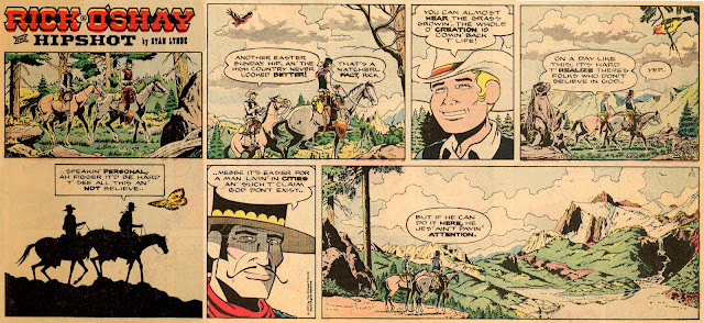
In the 1950s newspapers began reducing the size of comic strips.  By the 1960s and 70s, artists found themselves tossing out backgrounds and details, simplifying images and shortening their messages to fit within the new compact formats.  One good way to look at the  impact on the quality of the strips is to consider the western comic strip Rick O'Shay (1958-1977).  

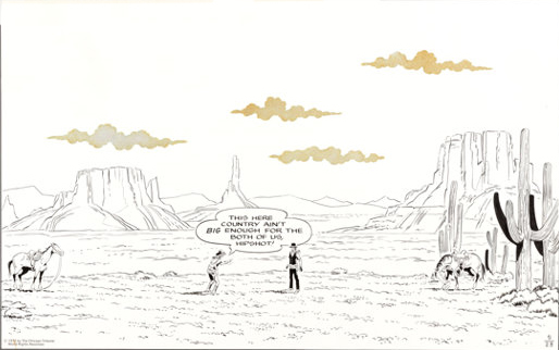
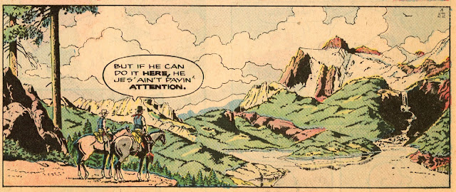
Montana artist Stan Lynde was often at his best rhapsodizing about the wide open spaces he loved.


Detail

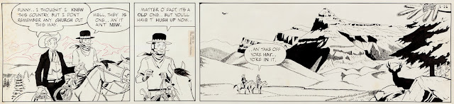
Strips today no longer have the space to portray epic landscapes, but then again they rarely address epic content.   

The diminished size of today's strips doesn't just restrict geography.  It also affects the pacing and staging of an entire strip.  

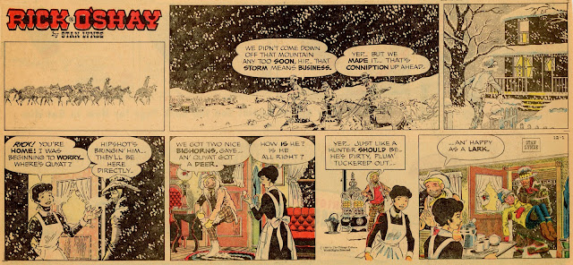
For example, in the following Rick O' Shay episode, a young boy was all excited about going on his first deer hunt in the mountains with two hunters he idolized. Lynde had enough panels to set the stage with stark, black and white drawings which stood out on a color Sunday page.  We only begin to see color for the first time in the third panel, as the weary hunters returns home.


There's a lot of humanity in this strip... the concern of the mother,  the tenderness of the adult hunters, all well laid out by Lynde.  But this kind of big-hearted content takes room, and today's strips don't have the panels or the emotional space for such stories.

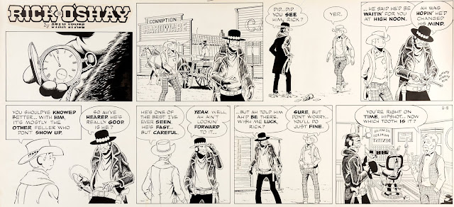
In this next strip, see how Lynde uses his 8 panels to show the passage of time.  He sets up this strip like the movie, High Noon, to build suspense with a surprise at the end.   


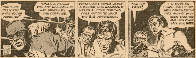
You won't see strips staged like this today.  Jim Davis, who heads the Garfield corporate empire, understands how to succeed in today's diminished format.  Davis says that he tries to limit his strips to fewer than 25 words, and to get to the punchline in fewer than ten seconds.   He says that if readers linger over his strip longer than ten seconds, they might predict the punchline ahead of him.

There are still more ways in which comic strips have been pinched by today's restrictions.  For many years, Lynde featured Native American characters in his strip.  His Native American friends in Montana enjoyed the characters and never complained.


However, toward the end of the strip a lawyer in Los Angeles complained about the use of Native American characters, causing Lynde to greatly reduce their role.

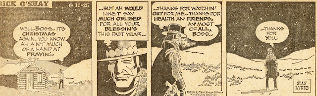
Every once in a while, Lynde was known to bring religion into his strip-- something that would be  unfashionable now.


Strips have shrunk not just in physical dimensions but in other ways that go to the heart of their artistic contribution.   

Saturday, January 22, 2022

COMIC STRIPS OF THE 1960s, part 1


When a giant star runs out of hydrogen to burn, it fades and dies but not before it flares up in one final burst of heat and energy, called a supernova.

The supernova era for traditional illustration was the mid 20th century.  The magazines and newspapers that had been the platform for illustrations and comic strips were fading away.  Magazines that fueled the golden age of illustration either died (The Saturday Evening Post, Collier's, Liberty, Scribner's, The Century) or changed their business model, turning primarily to photography (Life, Vanity Fair, Redbook, Cosmopolitan, Sports Illustrated, Esquire).  Similarly, The newspapers that carried comic strips were passing away at an alarming rate as they lost readership to television and then to computers and mobile phones. 

In an effort to win back readers, art directors became more adventuresome, seeking attention-getting images and graphic styles that TV and computers could not offer.  This created a burst of new freedom for artists.  Excellent cartoonists rose to the challenge and produced strong work, but in the end talent was not enough to overcome the laws of economics. 

I've previously offered a series of posts about magazine illustrations from this period.  Now I'd like to do the same for the art of newspaper comic strips.  The classic strips from the golden age (Flash Gordon, Prince Valiant, Terry and the Pirates) had already faded away.  Circulation was dwindling and size was shrinking.  But before the comics page evolved into today's simplified format, dozens of strips such as Apartment 3G, Big Ben Bolt, Friday Foster, Mac Divot, Rick O'Shay and Tales of the Green Beret came and went.  These strips were less famous than their legendary predecessors but still showcased skillful, well composed drawings by artists who cared about their work.

I usually try to display images here from the original art, but for the next several days I'll be showing images on yellowed newsprint, with occasional smudges and shadows as they were originally viewed. 


 I think that's a more fitting way to remember this moment in the history of art.  


Friday, January 14, 2022

POLITICAL CARTOONS part 8: RICHARD THOMPSON

In my opinion, there are only two reasons why Richard Thompson isn't celebrated as one of the greatest political cartoonists.  

The first is that he devoted most of his time and energy to other artistic pursuits--  his popular comic strip, paintings, illustration art, a weekly gag panel, etc.

The second is that Parkinson's disease cruelly robbed him of his drawing ability while he was still young, and he tragically passed away at age 58.  

Nevertheless, looking back at Thompson's political cartoons, it's clear he was an artist of enormous gifts.  

Here we see President Clinton entertaining the crowds with the game, "Soak the Rich." Meanwhile the "Global Peril" game is crawling out of its container unnoticed.   


Thompson's breezy, child-like scrawl is built upon an architectural
engineer's solid understanding of the forms he was drawing.


Thompson's caricatures of presidents and presidential candidates are sheer poetry:

Ross Perot


Richard Nixon


Hillary Clinton


Saddam Hussein


Rudi Giuliani in an earlier era

For his weekly panel, Richard's Poor Almanac, Thompson wrote the text accompanying his drawings: 


Even his apolitical cartoons often contained clever social commentary:  


Thompson's political cartoons amounted to only a tiny percentage of his total work, but based on the brilliance of that work, Thompson remains firmly among my favorite political cartoonists.