Showing posts sorted by date for query briggs. Sort by relevance Show all posts

Saturday, October 26, 2024

THE ONLY TIME YOU'VE GOT


" I don't know whether this is the best of times or the worst of times, but I assure you it's the only time you've got."    
                                                --  Art Buchwald

I recently attended a talk at the Society of Illustrators where the speaker declared that the 1960s were "the golden age of illustration." 

But in the 1960s, illustrators believed the golden age was already over.  The Society's Annual asked, "Is illustration over the hill?...  I don't think illustration will ever regain the popularity it once had."  Illustration historian Walt Reed explained why the 60s were actually wretched for illustration: "Television had stolen the fiction magazines audience and illustration's former position as a pace setter for popular culture was usurped....Illustration's role became more incidental and decorative."

It seems that every generation of illustrators is convinced they missed out on the good times.

Back in 1927 a prominent art critic insisted that the golden age of illustration occurred in the late 19th century, and that the field went downhill at the start of the 20th century.  In his essay on the decline of illustration, he asserted: 

 [Illustration] soon departed from the decent standards of the old school, and so debased drawing into the cheapest form of mechanical ingenuity —slippery, sentimental stuff.... As connecting links between the old and the new orders, I may mention Charles Dana Gibson and Howard Pyle. 

Gibson, he complained, "was limited and mediocre, and despite the most valiant efforts was unable to learn the first principles of draftsmanship."  Pyle, he claimed, was a "prolific hack."   He mourned that by 1915 the field of illustration was disintegrating because "the leading American magazines have discarded illustration."  

In the following generation, another great historian-- Henry Pitz-- had a different view of the golden age.  He claimed that the era of Gibson and Pyle had been the true golden age.  He insisted that it was the next generation of illustrators in the 30s and 40s who had gone astray; they became obsessed with mere design.  For these callow youngsters, "momentary impact was to be of more importance than leisurely scrutiny of content.  Character delineation slips away from us-- no one over 21 has much right to appear on a double spread."  

Yet, later generations would look back on the 30s and 40s as "the glamour years."  By the 1950s, according to the Society of Illustrators Annual, "the glamour years of illustration had passed.  The reading public was diminishing....The role of the illustrator as a means of enticing readership was dwindling." Gone were the big budgets and generous deadlines for illustrations painted in oil on big canvases.  Gone were the deluxe illustrated books and the magazines filled with costumed adventure stories.  Illustrators were painting in smaller scale on illustration board using fast drying paints. 

Later generations saw things differently.  They would look back jealously on the bountiful 1950s, the era of The Famous Artists School, with talented artists such as Rockwell, Briggs, Dorne, Fawcett, Ludekens, Parker,  von Schmidt, Helck, Gannam, Sickles and others.   Al Dorne drove a custom Mercedes with a burled walnut dashboard and a pull-out bar. His steering wheel had Dorne's initials engraved on a silver plate below a star sapphire.  That sounded pretty good to later generations.

And so it went, on and on.  The good years were always yesterday.  The current market had always become terrible.  

Scholar Walt Reed described the dire condition of illustration in the 1990s:

Recycling already-published images inexpensively through huge image banks is changing the financial foundation of the field.... [Illustrators] are increasingly replaced by a novice with Photoshop....the bread-and-butter work is vanishing.

Artists tried to keep up with the changing times.  Pioneers of technology thought the future belonged to "internet art" but artists have already been warned that post-Internet art is the "new aesthetic era."

So what lies ahead?  This cycle of destruction and renewal over the past 125 years of illustration should make us cautious about predicting the end of illustration.  But can this history teach us anything about survival as illustration enters the brave new world of generative Artificial Intelligence?

John Cuneo

In the next few days I'd like to offer you some examples and pose some questions regarding whether this is really the end of the road for illustration as we know it.  But even before we start, the one thing we can be certain of is that Art Buchwald was right:

 "I assure you it's the only time you've got."


Tuesday, January 31, 2023

LEARNING TO LOVE ORPHEUS

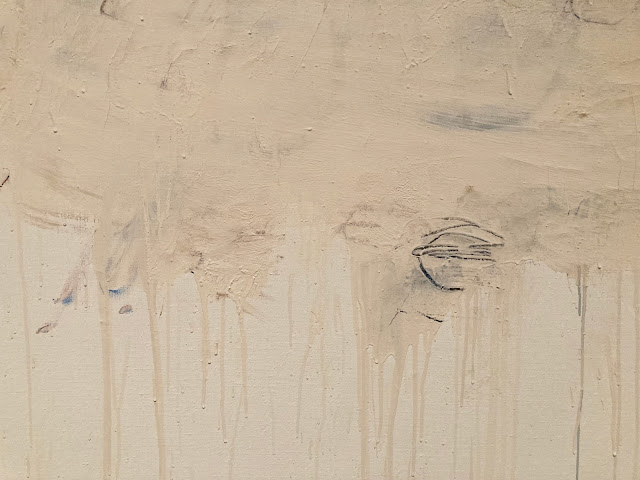
 I love Cy Twombly's drawing, Orpheus.  


Let's see if you can too.

____________________________________________

In times of uncertainty for painting, artists often revert to their primal roots in drawing to help find their way.  As curator Katharine Stout noted, drawing has long been the mechanism for strengthening the gene pool of fine art, contaminating it with strong graphic properties, bold notions from advertising and comics, structural strength from geometric and mathematical systems, and other impertinent strains.

As we've previously discussed, the 1950s witnessed a renaissance in expressive drawing using basic tools, such as vine charcoal or a lithography crayon. Artists who had long painted polished, realistic images using oil paint or gouache began returning to the simplest, most primal ways to make marks.

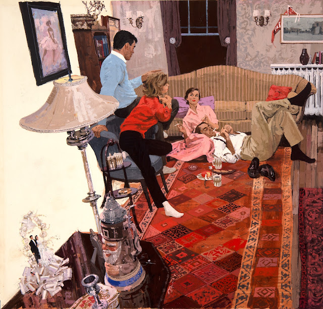
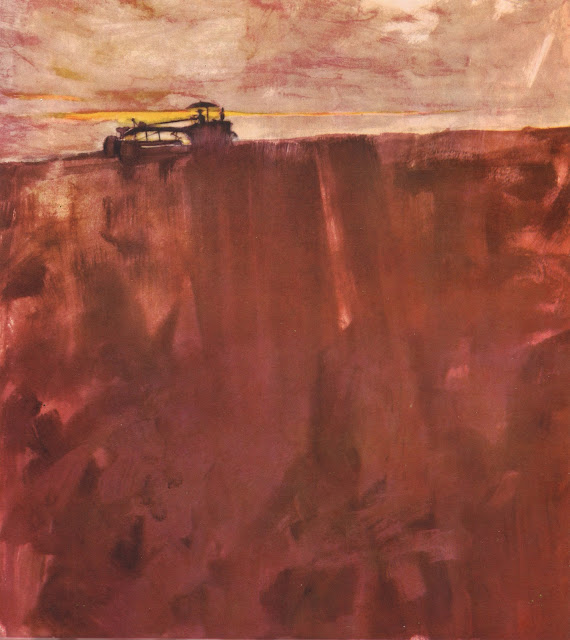
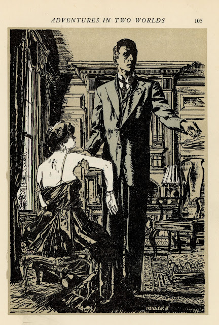
For example, Austin Briggs painted sophisticated oil paintings like this as they slowly went out of fashion...


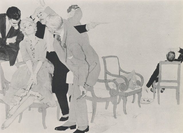
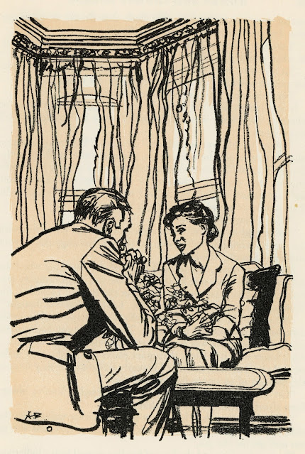
... before finding new vitality in drawings such as this:


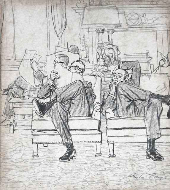
Artists such as Briggs, Eric, Sickles, Fuchs and Bouche led the revival of rough drawing tools. They persuaded the leading high end magazines to devote entire pages of prime space to charcoal drawings.

This 1964 illustration by Bernie Fuchs is a snapshot of what was gained from the reintroduction of line.  We can see the old world and the new world co-existing briefly side by side:


Fuchs painted the face of this athlete sensitively enough to achieve an excellent likeness...


Yet in the same picture, the rough black line has taken the stage. Look at what a contribution it makes to the painting! It is crude and brutish but transforms the image with explosive energy not found in academy painting. 


Notice how uneven the line is.  It might have been scratched into the painting with a lupine claw.


Fuchs' cover is an excellent example of that turning point in the evolution of illustration, with drawing and painting juxtaposed against each other in the same image, like a piano and a symphony orchestra juxtaposed against each other with the invention of the piano concerto.  People sat up and took notice of the new style.  Everyone wanted more.

The most important point to make about these accomplished artists is that, while they were trying to unlearn layers of technical facility and shed hard-earned muscle memory, their artistic taste and sensitivity remained undiminished and were in many cases heightened.

Look at a detail from this drawing by Briggs:


Briggs combines the directness, simplicity and immediacy of the crayon with an underlying sensitivity that persuades us he could perform brain surgery wearing mittens.

Fuchs was a master at marrying sensitive descriptive line with lines that appeared to result from a spasmodic twitch


Why? Because this is part of the physical delight of the drawing, just as impasto is part of the physical delight of painting.

______________________________________

This has been a long prologue to the reasons I love Cy Twombly's Orpheus but if any of you have accompanied me this far, I hope you'll be willing to come with me a little further.

Orpheus  195.7 x 334.5 cm. (1979)

Like the great illustrators, fine artists such as Picasso, de Kooning and Twombly spent a lot of time mid-century trying to unlearn stubborn conventions.  De Kooning experimented drawing with his eyes closed, trying to understand better the intuitive sources of art.  Twombly practiced drawing in the dark, recognizing that such drawings would lose many obvious qualities but interested in what he might gain. 

I approach the raw scrapings in Orpheus the way I approach the  rough crayon drawings of Briggs and Fuchs.  Walking away from realism (or perhaps chased away by photography) they have located lush qualities and brute design in the atomistic levels of  mark making.  They have focused our attention on the sensuousness of line through extreme simplification-- something academy painting could never do.


But "Ah," I hear you ask, "Do these childish scribbles really contribute anything?  I know the story of Orpheus, who descends into hell to rescue his wife, the beautiful Eurydice, but in what way does scrawling his name illustrate that story?  Where is the picture of Orpheus heroically fighting the demons of hell?"

I think this painting can stand alone as a lovely abstract design but if you're prepared to go beyond form and look for content, it's there in spades.  You won't be able to read it like a story in The Saturday Evening Post; it must be approached more like a fragment of an ancient, time-worn text.

The hero partially obscured by the sifting sands of time


It helps-- but is not essential-- to know that Twombly was obsessed with the ancient poets Virgil and Ovid and loved Greek and Roman culture.  He lived in Italy, in an apartment filled with ancient artifacts.  So he well understood the story of Orpheus and its implications for hope, tragedy and mortality.  
Even without that background, we don't need a separate written explanation to understand meaning inherent in the visual forms.  I couldn't do better than to quote the description by art critic Sebastian Smee:
...a giant O takes up the left part of the canvas. The remaining letters, smudged, and mostly erased, spread to the right and downward, like descending notes on a musical stave. There is a sense of resignation or fade-out in the script's formation, as if the word were not worth completing, the gods having long since departed. But the letters' placement also conjures Orpheus himself descending to the underworld to retrieve his beloved Eurydice.
This is a level of symbolism and beauty that is different from traditional illustrations of stories, but is a fitting experiment for a new generation.


Twombly, a lover of antiquity, was adamant that he wasn't trying to cast off tradition with his innovations.  He said, “what I am trying to establish is that modern art isn’t dislocated, but something with roots, tradition, and continuity.”


Tuesday, January 03, 2023

TOUGH GUYS

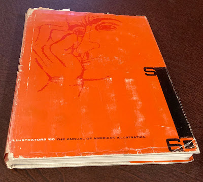
 The 1960 Annual published by the Society of Illustrators was crackling with talent and energy. 


The Annual collected illustrations by "fine" artists such as Ben Shahn, Henry Moore, Leonard Baskin and Andy Warhol, all of whom were employed as illustrators that year.  Other distinguished illustrators that year included Norman Rockwell,  Milton Glaser, Saul Steinberg, Coby Whitmore,  Al Parker,  Austin Briggs, Bob Peak, Albert Dorne, Bernie Fuchs, Noel Sickles, Robert Weaver, Joe Bowler, Robert Fawcett  and Stanley Meltzoff.  Legendary cartoonists Ronald Searle,  Andre Francois and Tomi Ungerer also appeared in this collection.

With such a rich field of talent, the judges who chose the pictures for the Annual must've crowed about the art, right?

Wrong.

Here is what the judges wrote in the 1960 annual: 

"The general level of merit was low.  More work should have been rejected."

"I was disappointed in the overall quality, too much that was not bad but ordinary."  

"The work submitted fell, more or less, into three categories: a.) technically skillful execution of banal ideas; b.) banal execution of banal ideas; c.) some quite lively and fresh work in juveniles and paperbacks."

"The jury generally was disappointed in the overall quality of the work submitted... New trends, while interesting, do not necessarily mean good trends and their derivative 'inspirational' sources are usually rather thinly disguised."

Can you imagine reading such a withering assessment today?   These judges were tough guys (yes, the judges were all guys back then) and they pulled no punches.  Despite their harsh indictment, they remained pretty open minded about different forms of excellence.  Here are examples of the variety of work they selected for that 1960 Annual:

Bernie Fuchs


Milton Glaser


Alfred Ingegno


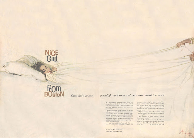
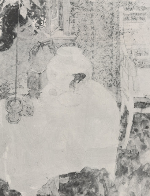
Austin Briggs


Harvey Schmidt


In 1960 young Andy Virgil was developing in the style of Coby Whitmore, Joe Bowler and Joe de Mers...


...but Whitmore and the others were already moving on to other creative touches


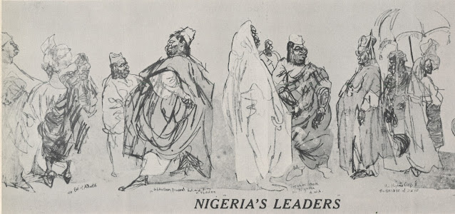
Felix Topolski


Robert Weaver


The Provensens


Jack Potter

Daniel Schwartz 

The Annual was published before the era of false praise, so the Society was not afraid to ask each judge, "What lack or fault do you feel contemporary illustration suffers from the most?" and the judges were not afraid to answer.

Albert Dorne answered: "Imitation-- and lack of drawing-- 'creative' gimmicks for the gimmick's sake.

Robert Weaver's criticism was even more fundamental: "Lack of serious artists in the medium."

Hugh White complained: "too many follow-the-leader illustrators and too many still trying to do what photography can do better."

Walter Murch criticized: "the cliche."

Note that the judges didn't hesitate to sign their names to their opinions.  They would've viewed it as an act of cowardice to do otherwise.  

They didn't view their role as validating the feelings of artists or puffing up their work.  Instead, they seemed to believe that the best way to inspire young talent and reflect honor upon their profession was to articulate the highest standards they knew, and apply those standards ruthlessly.  That attitude may account, at least in part, for the quality of the artists of that era.   


Friday, May 20, 2022

THE WARMTH OF A MINOR SUN

"In the days of the frost seek a minor sun."  -- Loren Eisley

The 1950s and 60s were great decades for American illustration.  Magazine pages were getting larger, the quality of full color reproduction was getting better, editorial restraints were loosening, and creative experiments were encouraged.  

Yet, already the chill winds of photography and television were being felt, and markets for illustration were beginning to dwindle.   One by one, the large general interest magazines that previously purchased art by the bushel were dying.  

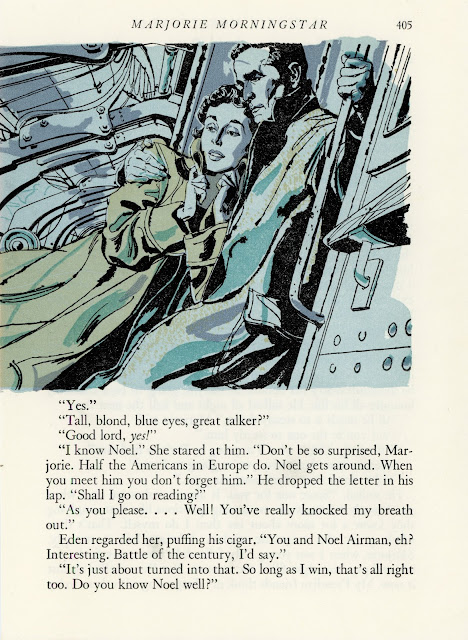
As glamorous jobs became fewer and farther between, illustrators were forced to accept lesser work.  One of the more reliable sources of employment between major projects was The Readers Digest.  It had smaller pages, low quality paper, and was limited to line illustrations, often with just two colors.  On the other hand, it paid illustrators on time. As a result, some of the greatest illustrators of the era, such as Robert Fawcett, Austin Briggs and Noel Sickles, eventually worked for The Reader's Digest.  

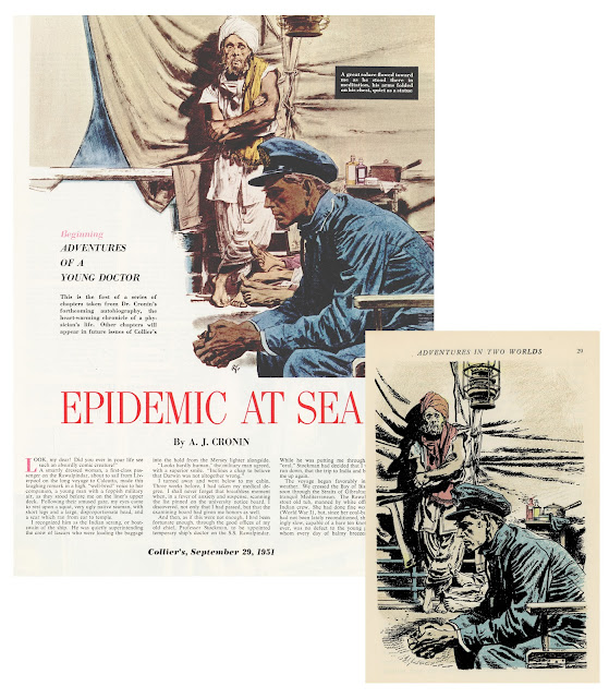
Robert Fawcett illustrated the same story twice, first for Collier's (left) and years later
for The Reader's Digest (right).  Note the difference in size and production quality.

Big shot illustrators who had become accustomed to basking in the public glow and driving fancy cars sometimes had to seek warmth from minor suns.  How did they respond to this reduced status? 

The great Noel Sickles, who had recently done such fine work for Life magazine, realized he would have to adapt his pictures for the simpler, humbler platform at Readers Digest. 

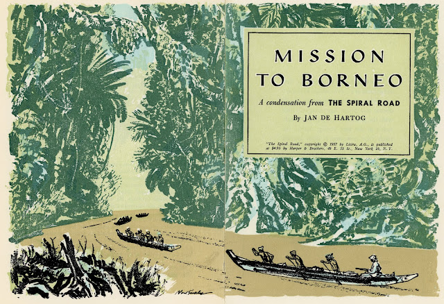
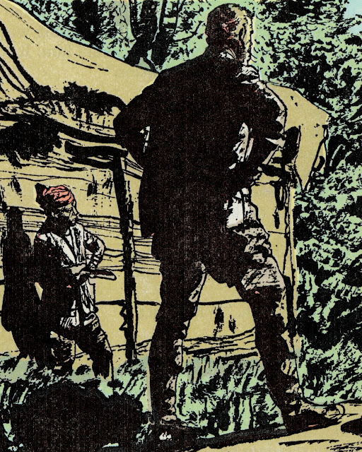
In the drawing below, the coarse pulp paper wouldn't hold a fine line well, even if The Readers Digest had the size or the budget for a detailed drawing of an immense jungle.  So Sickles solved the problem  with large, jungle-like shapes abstracted and screened. 

Rather than be timid with a paper stock where the ink bleeds, Sickles took full advantage of it:


Is the page too small for conveying a panoramic vista? Is the printing process hostile to smooth lines?  Not a problem.

Unlike some of his more slick and polished peers, Sickles was never afraid to go rough.

Sickles became a great illustrator by being tough and resilient and solution-oriented. He wasn't daunted by poor working conditions and he didn't reserve his favors for glamorous projects that afforded him a wide audience. He didn't view a smaller paycheck as a license to turn in second rate work.  That work ethic, those standards, were a large part of what put him above so many other illustrators regardless of where his pictures appeared.

The same thing could be said for Robert Fawcett:


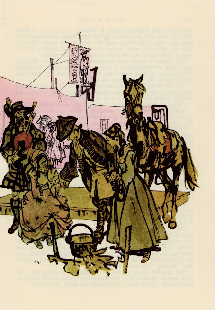
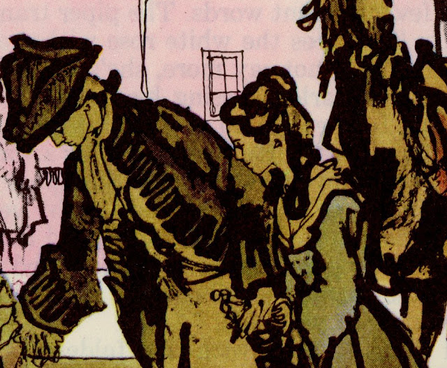
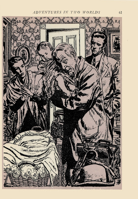
And for Austin Briggs:


Briggs' distinctive linework was hugely influential at the time when young
cartoonists such as Neal Adams and Stan Drake were learning to draw


Horrible Readers Digest color

Preliminary sketch


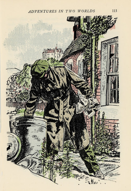
And for Ken Riley:


To survive during the ice age of illustration, these resourceful artists had to gain warmth from such minor suns as they could find.  They didn't disrespect the sun gods by doing lesser work.  You never know how long that frost is going to last.

 Besides, as Fawcett said, 

The argument that "it won't be appreciated anyway" may be true, but in the end this attitude does infinitely more harm to the artist than to his client. 

Sunday, June 06, 2021

GOOD ART, BAD CLIENTS

Not every good idea finds a client, despite the fact that plenty of bad ones do.

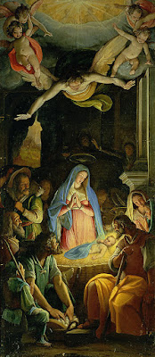
His royal highness, King Philip II of Spain (1527-1598) was a wealthy patron of the arts.  He prided himself on commissioning work from the finest painters.  He learned of a promising artist in Rome, Federico Zuccaro, and summoned him to Spain for an audition: to paint an altar painting of The Adoration of the Shepherds.  


As Zuccaro unveiled his finished masterpiece in front of the King, he promised, "Your majesty, this is the highest that art can get."  But Phillip noticed a shepherd holding a basket of eggs, and felt there were too many eggs in the basket.   So he fired Zuccaro and sent him packing, ending the artist's golden opportunity.
The king is the boss, so his taste governs.  

However, it turns out that every boss has a boss.  Philip also commissioned six paintings by Titian prominently featuring nude women.  Philip's wife Elizabeth didn't like that one bit, and forced him to cover Titian's paintings with drapes whenever she was home.


The path of art is altered by bad clients.  Like a rogue ball bearing, they affect the careers of artists and the direction of art in unexpected ways.  

I've previously written about how artist Frank Brangwyn was fired from his commission to paint the epic Empire panels because certain members of the House of Lords felt his art was too "colorful."  Lord Crawford in particular complained that there were ''tits and bananas'' in the paintings, so the lovely work was never completed.


Brangwyn learned his lesson and the next time a client complained about a mural, Brangwyn changed the painting and got paid.

I've also written about how artists such as Norman Rockwell and Austin Briggs chafed under the racial censorship policies of their client, The Saturday Evening Post and eventually left that client. The artistic innovations of Bernie Fuchs were spurned by bureaucratic art directors who insisted on following a corporate formula so eventually Fuchs became a freelancer painting Italian landscapes.

Rather than submit to changes demanded by his client, Diego Rivera said he preferred that his mural be destroyed.  And it was. 

And of course, over the centuries morons on the left and morons on the right have substituted their politics for aesthetics.  

On the other hand, sometimes clients have a legitimate gripe.  British shipping magnate Frederick Leyland refused to pay artist James Whistler for a mural because Whistler was probably having an affair with Leyland's wife.  ("If I find you in her society again," he snarled, "I will publicly horsewhip you.")
Claes Oldenberg was commissioned to draw a poster for the Passloff Dance Company.  He came up with this:


I kind of like it, but the client rejected it because they seemed to think their name was "illegible."

My point is that, while most art historians don't pay attention to the issue, the gravitational pull of clients can have a significant impact on the resulting work.

That's why many of the artists I respect the most are the ones who recognize that there will not always be a client for every good idea.  If an artist has the guts to pursue good ideas to the best of their ability, they'll sometimes have to do it on their own.  

Nathan Fowkes said, "Sometimes at work I just want to stare blankly out the window, but I had my whole palette of paints right in front of me so why not turn it into a sketch? So all of these images are a careful chronicle of me doing something other than what I was being paid for."


The lesson he learned from this?  "The variety was quite surprising; changes in weather and atmosphere made the exact same scene have quite a different mood from day to day."

Another good example is John Cuneo, who is widely known for his New Yorker covers but whose highest art is his personal work, which could never make it through a corporate de-flavorizing machine.   

Multinational clients have poured hundreds of  millions of dollars into digital art, yet the path of digital painting has been transformed by the personal work of artists fooling around in their spare time.  Craig Mullins, the father of digital painting, has reshaped the field with his innovations.


Mullins speaks insightfully about the value of experimentation and play, free from the deadlines or specifications of a client: 

People are always asking me, “what’s your process?“ I think it’s unfortunate when artists can answer that, and come up with a linear process. I'm always trying to fit things together in strange ways.  That’s what I’m doing when I play around.  Of course, it has a very low chance of success so I can’t do that when I'm on deadline.   I have to set aside time in order to break things and experiment.... If I experiment and get something to work, then I can move it over to the A-list. 

 Mullins has worked for many of the biggest clients on some of the most important and influential digital projects, but he has to hold those clients at bay and take time off from juicy assignments to develop as an artist.