For years I've admired Fowkes' astonishing facility with color.


This recent painting of a rainy London street knocked my socks off:

That jagged lightning bolt of color may look spontaneous, but it has at least ten kinds of smart in it:

Contrast the color of the reflected light on the sidewalk with the warm light from the traffic headlights behind it, and then the bright light from the clearing skies behind that. Note how the soft peaked roof of the purple building in the distance is halfway between an urban silhouette and a cloud; it supports, but doesn't compete with, the focal stripe of the painting. Notice how the pedestrian in the foreground, while high contrast, is reduced to an abstract design which again supports the total painting. Fowkes doesn't waste our time painting shoe laces (or even feet).
Each individual pedestrian in the crowd scene is a separate creative invention-- understated, but still worth an appreciative look:
 |
| the shadows, too... |
And the glue that holds all the elements together: a great sense of design.

How does Fowkes go about orchestrating a painting like this? He was kind enough to share his process photos:
 |
| Step 1 |
 |
| Step 2 |
 |
| Step 3 |
 |
| Step 4 |
That's the kind of painting that should get you magna cum laude at Professor X's school.
Josef Albers (1888-1976) worked at Yale University rather than the Xavier Institute for Higher Learning. At Yale he reigned as a leading 20th century authority on color. His treatise, The Interaction of Color (1963) is internationally famous, as are the hundreds of paintings and prints in his color series, Homage to the Square.
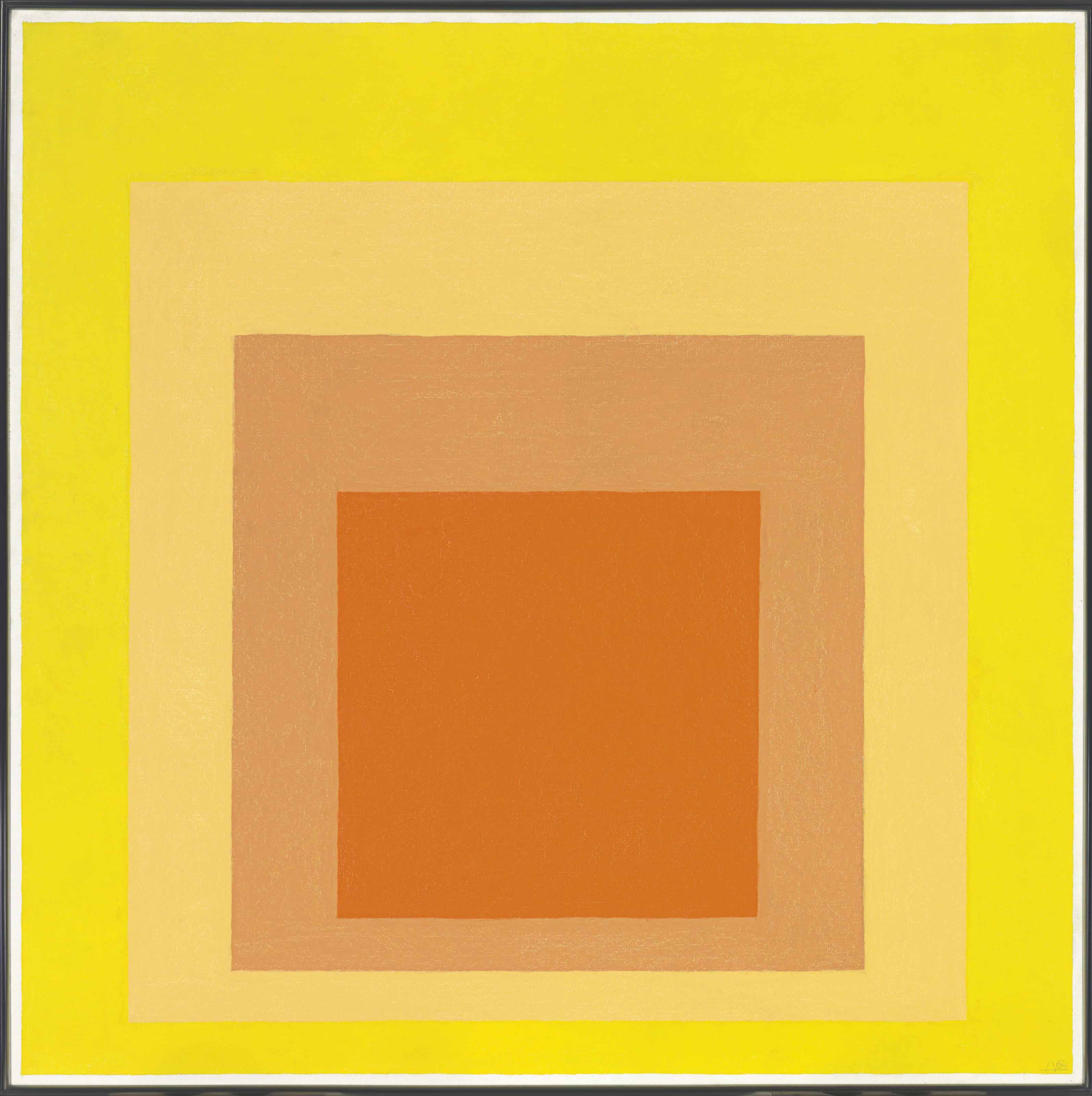
These pictures, some of which have sold for millions of dollars, were carefully designed by Albers to explore what he called "chromatic interactions."
In my view, Albers' tedious explorations under laboratory conditions can't begin to compete with the crackling electricity of Fowkes' paintings. Albers listens in while his color swatches do all the work. Fowkes, on the other hand, employs color with a spirited, nimble brush. For Fowkes, color is a means to an end, integrated into real life rather than a laboratory test.
Fowkes also seems to have a superior appreciation for the role of value. Look at what he has accomplished with value alone in this marvelous sketch of a tree:
 |
| A big, wet, sloppy brush wielded with exquisite control |
The "homage to a square" spares Albers from some of the the hardest tests of color-- tests of prioritization, tests of contrast, tests of motion.
 |
| Rather than paint 27,489 palm fronds, Fowkes selects a few fronds he wants to prioritize, highlighting them against a high contrast background and alters their color accordingly. |
Mighty fine work.