Saturday, May 01, 2021

REAL LINES, part 2

Every beginning art student is taught to draw volume using rounded lines that follow the form:


Yet when Robert Fawcett drew cylindrical columns...


Whoa!  What the heck is this???


Did Fawcett miss that art class?  I don't think so.  He seemed quite proficient in other respects: 


But somehow, as Fawcett developed as an artist, he decided there were better ways to draw volume than lots of repetitive fine lines.  He used loops and swirls and drybrush that even went against the form, yet it always ended up looking all right in the end.  

Some of the other great illustrators seem to have reached the same conclusion, outgrowing those uniform lines in favor of lines with more character and variety.  Were they right?  Well, let's take a look.  

We should start by recognizing that many talented illustrators used the "thousands of fine lines" technique to express form. 

Norman Lindsay:


Frank Frazetta:


Lee Conrey:


There's a lot to admire in this technique, but ask yourself, "What exactly am I admiring?" The level of physical effort? the technical skill in controlling so many fine lines?  The energy suggested by all that activity?  Then ask yourself whether there are more admirable things to admire about drawing.

Take for example the case of Austin Briggs.  Like many other artists,  Briggs started out drawing thousands of fine lines wrapping around his subject matter.  By the age of 20 Briggs was already successful drawing in this style for top magazines such as Colliers. 


But after a few years Briggs became disenchanted with what he perceived as the limitations of this type of drawing, which he said exhibited "only energy" but not true quality.  


He quit working as an artist altogether and resolved to start over, taking the time to learn "honest" drawing. 
I set about learning to draw, which I never could do before, despite the fact that some of my illustrations had been more or less acceptable. I really didn't know the craft of my profession.  I think I had imagination then but I really didn't know how to use it. 
At the end of his re-education, Briggs threw out 98% of his lines, but devoted the same level of attention to the few lines that remained.  Nothing was done on automatic pilot.  Each line became more thoughtful and expressive.   Lo and behold, those lines turned out to be every bit as successful at conveying rounded forms.


Compare the following two illustrations by Briggs of the same subject, before and after his conversion:  


Briggs abandoned the duplicative lines whose only role was to reinforce the line to their right or left.  He became more selective about the lines he chose to emphasize and he found ways other than repetition to emphasize them.  And just like the mature Robert Fawcett, whose drybrush swirls we witnessed at the beginning, Briggs became less concerned about staying within the lines:
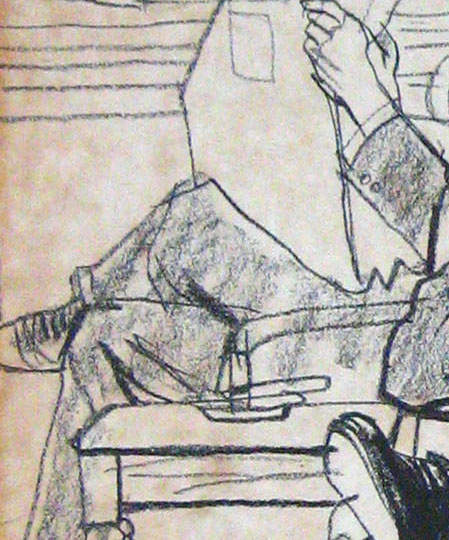


Alex Raymond is another example of an artist who started out using those fine lines wrapped around the form:


But after thousands of drawings, Raymond came to view the potential of a line more broadly:


Now those are what I call "real lines."

Neither technique has a monopoly on quality.  There are good and bad examples on both sides.  But it's a mistake to assume that artists who draw with a thousand fine lines work harder.   Instead, they often remind me of Abraham Lincoln's story of the preacher who said, "I could write shorter sermons but when I get started I'm too lazy to stop.”


Sunday, April 25, 2021

REAL LINES, part 1

"A drawing of a person is not a real person but a drawing of a line is a real line."   

                                                                                -- Sol LeWitt


Compare these two drawings of a Dutch sky:

Rembrandt


Franklin Booth

In nature the sky has no black lines (or any lines at all, apart from the outlines of clouds) so both artists are taking liberties when conveying sky with a tool that only makes black lines.  How have they used that liberty?

Booth uses a series of uniform, closely drawn parallel lines of constant width, to create a gray tone:


Rembrandt, on the other hand, uses line in a much more free form way because, well, he's Rembrandt:


The manual labor behind Booth's drawing is impressive, but the ratio of work to creative choices is less impressive.  Some of his work would later become the work of zipatone.  

Rembrandt's lines, on the other hand,  shape and radiate and sculpt; note that when Rembrandt does use straight lines (in the upper left corner) they are neither as parallel nor as uniform as Booth's lines.  Rather than add mere tone Rembrandt's lines add power; whether beams of light or driving rain, they shape the image and give it vertebrae. 

We are witnessing two different types of control.  The constancy of Booth's lines, before the era of micron pens, displays one type of control.  Note how Booth even attempts to join the unavoidable breaks in his lines:


Here's another example of Booth's sutures in the sky: 

These breaks aren't created intentionally to describe some phenomenon in the sky, or for abstract expressive purposes.  They are a necessary limitation of his technique due to the the limits of human wrist movement.   Note that Booth's sutures pervade his drawing; they are in the grass, and on his human figures as well, but they matter less if the purpose of all those lines is just for tonal effect: 

Booth

Rembrandt's brand of control was very different.  I don't know if Rembrandt was drawing from his wrist, his elbow or his toes but you see no such sutures in his drawing.  His lines drag and loop around with great freedom.   

With each new line, Booth only had to ask himself:  "Is this line the exact same width and distance as the ten lines that preceded it?"  With each new line, Rembrandt had to ask himself: "Is this line the right shape, length, design and location to depict a sky that has no black lines in it?  Where I'm cross hatching am I creating pockets of density and light, control and freedom in the 'right' places?"  These are harder choices than Booth's.  The answers require more artistic courage.  The payoff is greater.

Lots of other artists use thousands of lines to create tone with varying results.  When using that technique, each individual line carries less weight and becomes less important.  The economists call this "diminishing marginal utility."   Drew Friedman and Virgil Finlay use stippling.  Cober, Tinkelman and many others use cross-hatching.  Wrightson, Norman Lindsay, Frazetta, Foster and others often used repetitive fine lines to show shading or volume.  Sometimes these techniques can be employed to stunning effect.  Sometimes not.

To return to where we started, it is in the nature of drawing that every single drawing must take liberties in order to translate reality into line.  As Sol LeWitt noted, a drawing of a person is not a real person. The question is, how does an artist make best use of those liberties?  My personal taste is to give most credit to artists who are always conscious that "a drawing of a line is a real line," and I'll be posting some examples of that. 

Saturday, April 17, 2021

ROBERT FAWCETT'S MUSEUM OF MODERN ART

Even a boring spot illustration of a postal clerk can become an exciting trip through an abstract art exhibition when the illustrator is Robert Fawcett. 


Take a closer look.  Back before micron pens and Photoshop became the illustrators' tools of choice, Fawcett was wrestling pictures out of bold, lusty marks such as these.


There are 2,437,152 artists drawing hair at this very moment, but how many have the guts to open the subject to this kind of experimentation?


Even a row of rubber stamps becomes a small act of anarchy.


All of this took place when illustration was still primarily a visual, rather than a conceptual enterprise.  Today we've traded many of Fawcett's artistic strengths for a different set of virtues, but it would be a big mistake  to forget what such potent vigorous drawing brings to even the most commonplace subjects.


Sunday, April 04, 2021

WALT KELLY'S EASTER MESSAGE


No one drew bunny rabbits better than the great Walt Kelly.  

This Easter  episode of his comic strip Pogo reminds us of the kind of brilliance that was once found in the comic section of daily newspapers.  


Not just the drawing, but the staging, the words, the timing, the charming message-- this combination of talents show what once made comic pages such a significant cultural force.  

Note for example the range of facial expressions of the bunny as they advance the story. 


Kelly's acting ability with an ink brush deserved an academy award. 
   

Saturday, March 13, 2021

DR. SEUSS


In July 1573 the artist Paolo Veronese was summoned to testify before the Inquisition. This was never welcome news.  The Inquisition had a nasty habit of torturing citizens whose thoughts strayed from the true faith.

It turned out that Veronese's crime was his painting of The Last Supper which the Inquisitors deemed unseemly.


The painting showed cats, dogs and even drunken revelers at the last supper.  The Inquisitor demanded: 
Does it... appear fit to you that at our Lord's Supper you should paint buffoons, drunkards, Germans, dwarfs, and the like fooleries ?.... Do you hold that it is right or even decent to have painted your picture in such a manner?
The terrified Paolo escaped the wrath of his Inquisitors by quickly changing the name of his painting from The Last Supper to Feast in the House of Levi.  The painting remained physically identical, but now the Inquisitors no longer cared.  A simple name change transformed it from a life threatening heresy to a non-event. 

In Hamlet Shakespeare wrote, "There is nothing either good or bad, but thinking makes it so."  Our minds can perceive a palace to be a prison, or a prison to be a palace.  The same painting can be good or bad depending on the title we project upon it.

Last week, the estate of Dr. Seuss (Theodore Geisel) announced that it would stop selling six books by Dr. Seuss which are now perceived to contain "hurtful and wrong" stereotypes.  It's good to be sensitive to malevolent intent and unnecessary hurts, but many of the criticisms now being leveled against Dr. Seuss strike me as fundamentally ignorant about the nature of drawing. 

Professor Philip Nel, author of Was The Cat In The Hat Black? The Hidden Racism of Children's Literature, explained that "The most egregious ones come in If I Ran the Zoo, from 1950, which includes a page featuring the mountains of Zomba-ma-Tant, with helpers who all wear their eyes at a slant."  


But for centuries, Asian artists have been drawing Asians with similar or even more extreme exaggerations. These images remain honored today.  They can be found in traditional, highly respected museums and books.


Exhilarated by the prospect of finding racism, the New York Times jumped to label this next drawing a "crude racial stereotype." 


However, the "slanted" eyes of the Chinese man are virtually indistinguishable from the eyes of half the band playing behind him.


The expressive distortions of the Asian character are no more extreme or derogatory than the expressive distortions of the caucasians or any other character on the same page. 


If the Asian character had been drawn more realistically, he would stand out as the only character in the book drawn that way.  I have yet to see a critic of Dr. Seuss' drawings offer what they consider a "non-racist" way to draw an Asian person in this style.  The same whimsical drawing style is applied uniformly across all characters in the book, none more insulting than the other.  The same quick jots and lines for eyes, the same brightly colored clothes.  Perhaps the drawing of the Chinese man is deemed more insulting because "thinking makes it so"? 

This brings me back to the esteemed Professor Nel, the leading academic responsible for rooting out racist undertones in the work of Dr. Seuss.  I was curious about his methodology so I listened to his lecture, Was The Cat in the Hat Black?  There, he claimed that "The Cat In the Hat is racially complicated, inspired by blackface caricature and by actual people of color." 


How so?  Well, the professor researched different stories behind Seuss' creation of the Cat, and "one story" suggests that Seuss may have gotten the idea for the Cat's white gloves from seeing the gloves on an African-American elevator operator (rather than, for example, seeing the white gloves on Mickey Mouse or Bugs Bunny.)  

If that's not racist enough, the professor continues, "A source for the Cat's red bow tie is Krazy Kat, the ambiguously gendered creation of bi-racial cartoonist George Herriman."  

 
For the coup de grace, Professor Nel reveals that 35 years before he wrote The Cat In the Hat, Seuss wore blackface in a high school minstrel show.

This is the type of mental gerrymandering for which the lunatics at QAnon award scholarships. 

In an era of high stakes and serious issues, important liberal causes are undermined when silly people make themselves such an easy target.  "Thinking" can make a picture seem good or bad, but apparently "not thinking" plays a big role too.
 

Thursday, March 04, 2021

THE VIEW FROM BEHIND

     "Oh the things you can find if you don't stay behind!"  

                          -- Dr. Seuss

When Raymond Sheppard drew animals at the zoo, they'd often turn their faces away.  Most artists would then move for a better view of the face but Sheppard stayed behind.  He found the forms and details from the back to be a worthwhile challenge.  

It's an impossible angle to draw-- no eyes, nose or mouth. No facial expressions, no standard guidelines, formulas or conventions for capturing faces from behind.  What art school teaches how to draw the south end of a northbound horse?


You can't draw pictures like this on automatic pilot; they require pure and honest observation from the very start:


The rear view of a rhinoceros head turns out to be an astonishing landscape of bumps, ridges and knobs.   By "staying behind" Sheppard found a reality more phantasmagorical than anything produced by Dr. Seuss's 's imagination:


The back of a tiny dormouse head was far subtler.  Without conspicuous landmarks and features, its extreme simplicity required the most sensitive line.  


Birds were of course among the most uncooperative subjects, but Sheppard still found details worth recording:


Sheppard's honesty when drawing heads from behind is all the more impressive because, when deprived of facial features, many artists have a great temptation to cheat.  

For example, in the following drawing artist Neal Adams cheated by sliding features over from the front of the face to make them visible.  Frustrated by the lack of details and lines from behind, artists invent marks that don't exist:


Even worse, some art critics, when confronted with the back of a head, cheat by fantasizing about the meaning of the face.  New Yorker art critic Peter Schjeldahl imagines qualities to Gerhard Richter's painting Betty and startlingly concludes that it is "the single most beautiful painting made by anyone in the last half century."
  

This is not art criticism, this is a Kuleshov experiment run amok.  

At least Schjeldahl has the excuse of being in his job too long.  Having used up all his adjectives describing things that are, he now resorts to describing things that are not.  This excuse is not available to the younger Washington Post art critic Sebastian Smee , who chimed in that “Betty is arguably the most famous painting by the most influential artist alive."  Like Schjeldahl, Smee gives the artist a helping hand by fantasizing all kinds of significance to Betty's missing face:
“Betty,” twisting away, evokes for me an impossible yearning: a desire to turn away from the din, the debacle, of political life and to dissolve instead — to bleed, to blur — into an intimate, apolitical present.
This brand of criticism is not about the painting, it's about the critic.

This kind of mendacity makes me value Sheppard's brand of honesty even more.  In the following quick sketch of a leopard, Sheppard draws just enough of the spots to show how foreshortening individual spots can reveal the structure of the animal.  They help make sense of the rear view.


What wonderful economy (a necessity when your subject might get up and move at any moment).

With all due respect to Dr. Seuss, there are wonderful things to be found behind the ear of a rhinoceros or in back of the jaw line of a sow.  These sketches are not flat recitations of fact, they are tests of our vision, our imagination, and our appreciation for the world in which we live.