
In the words of Roberta Smith, "drawings are a direct extension of an artist's signature and very nervous system." The humble act of making a line with sensitivity and grace is one of the defining acts of humanity; it's the first thing our ancestors did when they evolved from Neanderthals to modern Cromagnons. So what are we to conclude from the state of drawing today? Artists such as Art Spiegelman and Chris Ware seem to be the current darlings of the illustration community, but largely because of the content of their message. Let's face it-- their drawing is just plain lame.
 |
| Chris Ware |
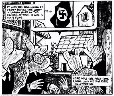 |
| Art Spiegelman |
In fact, a great many of the artists who helped shape the course of illustration over the past several decades-- Seymour Chwast, Edward Sorel, Garry Trudeau and others-- seem to lack fundamental drawing skills. To their credit, they don't try to conceal it. Chwast is among the first to say that he avoids techniques and media "that require craftsmanship and a drawing ability that I do not have." Sorel admits, “I have never had the confidence that I could draw.... To me, a person with drawing skill is a guy who can sit down to a piece of paper and draw upon his familiarity with the body and with gesture, and do whatever he wants to do.”
The message of their art may be brilliant, but most of them could not have found jobs as an apprentice sharpening pencils in the era of Noel Sickles, Robert Fawcett or Austin Briggs. There are thousands of marvelous drawings out there by now-forgotten artists whose work is far superior to the work that currently causes the critics to swoon. To illustrate the point, let's look at some random examples of quality drawing. Compare the contemporary "masterpieces" above with the vigor and complexity of the linework in this sketch by J.C. Coll :

Some illustrators argue that, as the illustrator's message becomes more important, the need for a "slick," polished image diminishes. Yet, the brilliant Ronald Searle repeatedly proved over the past 50 years that an illustrator does not need to sacrifice artistic quality in order to convey biting content:

For another example of visual form worthy of its content, look at this fabulous, robust drawing by Jean Dubuffet, appropriately entitled "pisseur a droite." The drawing is just as powerful as the subject matter, and it makes the contemporary drawings above seem anemic by comparison.

Here is yet another approach: Alex Raymond could always be counted on to wield a pen and brush for a sparkling effect. Each of these four artists artists draws with a strength and a humanity that is often absent in an era where so much art has been processed through the photoshop deflavorizing machine.

How can we explain our hypogeusia? For one thing, our primary interest in art seems to have shifted from aesthetic quality to intellectual content. Arthur Danto, the art critic for The Nation, observed:
The way things have evolved, art can look like anything, so you can't tell by looking.... [A]rt these days has very little to do with aesthethic responses; it has more to do with intellectual responses.This is what happens when we draw with our brains. From my perspective, "intellectual responses" are dandy but they can't begin to compensate for the decline in aesthetic quality. I am, however, eager to be instructed by those who understand "concept" illustration better than I do. There are plenty of you out there because I see your worshipful blogs to Ware, Spiegelman etc. all over the place. You're the reason I wrote today's entry. Please comment and explain where I am missing the boat!
18 comments:
Great post. I'm with you, I don't quite "get" the modern intellectual approach to art. I've read Maus and I agree it's an incredible story, so well told that somehow the bad art doesn't bother me. Maybe I should say "simple" art. I think there's a difference. Something can be simple, even crude, yet still have an aesthetic appeal. Wish I could put my finger on why. Anyway, great post.
I know exactly what you mean, Cedric. Drawing doesn't need to be sophisticated or polished. I am a big fan of art that is simple, primitive, even crude. That's one reason I included that Dubuffet drawing-- one of my favorites. And I love James Thurber's wispy, feeble drawings, or simple folk art. But a drawing should display some character and imagination and perhaps a sense of design... or else why not write a book instead?
This is one of my favourite hobby horses, David, and kudos to you for broaching this ( often volatile ) topic.
With comics I think you're dealing with a special case: the desire to create in sequential art form shouldn't be limited by the artist's ability, IMO. I find both Spiegelman's and Ware's styles to be incredibly sophisticated and accomplished - and entirely appropriate to the subject matter they are portraying.
I also subscribe to Scott McCloud's theory in "Understanding Comics" that the more simplified and iconic the image, the more the viewer is able to identify with it. His example of the man on the men's room sign as the ultimate example of this concept rings true with me: that symbolic man could be black, white, asian, young, old - you name it - when you see it, you know it means *you*.
In the area of illustration, however, I am less accepting of *bad* art - and by that I don't mean "hack" art ( I have a great fondness for "hacks" ) but rather bad in the sense of meaningless, thoughtless, unaccomplished, derivative art. For that there is no excuse, and I place the blame squarely on the shoulders of the art directors who commission that work. Shame!
Hah! I share your fondness for hacks, Leif, which is one reason I bristle when I see less talented artists get fawning attention because they travel in more pretentious circles. I like David Levine's caricatures in the New York Review of Books, but IMHO, he is not as good as Mort Drucker in Mad magazine.
I don't fault anyone who is still able to make a buck in this crazy business, but I start deducting points as the ratio of hubris to quality starts to climb.
As for the need for simplicity in sequential art, I guess I am a little less forgiving than you. Many cartoonists use a "simple" line to profound effect: Steinberg, Schulz, Thurber, Mel Lazarus, Percy Crosby, John Held, etc. I just don't think some of the artists we've mentioned do as well.
David,
I totally agree with you.
and leif.....I do respect what was said about McClouds 'Understanding Comics', but things can be taken too far. No matter what the point the artist is trying to get across - I would rather it be Alex Raymond, than the guy how did the men's room door to get my money and valuable time.
Also I think sometimes this problem can be traced back to education too. At least formal art education, too many programs at the lower levels are concerned with the idea over the craftsmanship, and not in conjuction with the craftsmanship. I have seen too many art teachers who don't have the basic skills teaching, or trying to teach. And I have also seen programs at universities where the same occured, thus the teacher can't help a student that wants to be a craftsman like an alex raymond.
Hoo boy, I did say this is one of my favourite hobby horses, right? Stop me before I write an essay. ;-) Let me preface by saying I not only respect your opinions but that I don't necessarily disagree with you. In the interest of healthy debate and analysis, please let me elaborate from my perspective...
You may recall a piece I posted a couple of weeks ago by Thomas Vroman and the letter to the editor that followed its original publication.
http://todaysinspiration.blogspot.com/2006/01/great-art-or-disgusting-garbage.html
That letter writer was so insensed by the *awfulness* of the illustration she vowed to never read the magazine again. Art is a funny thing - our reaction to it is pretty nearly entirely subjective. You can be the most learned, cultured, respected authority with a million legitimate reasons why a certain artist or piece of art is "good" and have the consensus of thousands of others backing you up, but when it comes to defining "easthetic quality" I say "to each his own".
A favourite topic of derision among the public here in Canada is the $1.8 million purchase by the National Gallery of "Voice of Fire"
http://images.google.ca/imgres?imgurl=http://www.ottawasun.com/News/ottawa150/2005/07/25/voiceoffire.jpg&imgrefurl=http://www.ottawasun.com/News/ottawa150/2005/07/25/1147087.html&h=337&w=200&sz=5&tbnid=g2DrKuylNkCxrM:&tbnh=115&tbnw=68&hl=en&start=10&prev=/images%3Fq%3DVoice%2Bof%2BFire%26svnum%3D10%26hl%3Den%26lr%3D%26sa%3DG
but to my mom, a person with a deep love of abstract art, it makes her swoon.
David, I bet you feel Schultz should have the Pulitzer they gave to Spiegelman and Tom, you prefer Raymond's approach to the expression of an idea over the iconic simplicity of symbolic representation ( the men's room door visual is an extreme example but let's place Chris Ware's approach withing that realm ) - and I respect your choices.
Personally, I found Spiegelman's gritty and awkward style extremely successful in portraying the personal nature of the story in Maus. I felt like I was reading someone's diary, written in their own hand, unencumbered by the artifice school-taught craft and the homogeneity of acceptable main-stream style.
Similarly, when I see Chris Ware's work, I feel like I'm looking at the soul of an artist trapped in the body of a draughstman who works in the engineering department of an elevator parts manufacturer. He has tremendous technical skills and the desire to express deep-felt sadness, but the inability to break free from a lifetime of rulers, t-squares and technical pencils.
What's so compelling about the work is that with the use of spare, simple-shaped iconography, he manages to convey powerful, complex and emotionally-charged ideas. To me.
Now, all of that being said, I have a whole long theory about how the accepted merit of modern fine art (vs commercial art) has been warped beyond all comprehension in these times - and the role played by bad teachers (who churn out bad students) in that process, but - jeez - I'm monopolizing your blog, David!
NOW we're cooking!
Great response, Leif. In my blog entry, I asked for someone to explain what I am missing about the Ware / Spiegelman style. You have done about as eloquent a job as possible, particularly with respect to Ware. It always helps to have a fresh perspective. (Looking at the abstract painting in your link reminds me of a time when I was looking skeptically at a similar painting-- a single, radiant red stripe painted down the middle of a large raw, unprimed canvas. I didn't get it, but the person I was with said "wow-- his balls must've weighed 20 pounds apiece when he painted that stripe." And suddenly, I understood the painting. That one sentence gave me a totally fresh perspective).
Having said that, I still think the Ware / Spiegelman crowd is vastly overrated as artists. A wise man once said, "the only way to speak the truth is to speak lovingly," and one of the things I like best about your comment and about your approach to illustration is that you are so open minded and receptive to a variety of styles. Please understand that to the extent I am claiming the emperor has no clothes, it's not to embarrass the emperor so much as to defend the nameless artists who actually did pay the dues, worked their asses off, mastered their art and died in anonymity.
I can tell that this is going to require another post!
To say Chris Ware does not know how to draw well betrays a lack of exposure to and connection with his work. After reading Jimmy Corrigan, I saw mundane and ugly architecture in a completely new way, and the world in my eyes was changed.
It's easy to paint our contemporaries with a broad brush, but you would be surprised if you spent a little more time with the living. Like John Lennon said "nostalgia is death."
But as nostalgia responded: "John Lennon is long dead and I'm still here."
Actually, I am no great fan of nostalgia, unless you think artistic integrity is nostalgic. I didn't see this as a clash between the old and the new. I viewed it as an interesting dialogue about whether the intellectual aspects of artistic content are eclipsing the importance of artistic talent and technical skill (and if so, whether that is a good thing) I'm glad that Chris Ware's work opened your eyes-- that's as good a test of art as any. But I will try to explain my position on Chris Ware in another post today. I hope you will respond to that as well. And be blunt. I am genuinely hoping to be educated by this process.
That's a fascinating parallel. I am no expert on music, but even I couldn't help but notice the trend you mention. The vocabulary of contemporary lyrics seems to have boiled down to a handful of simple, monosyllabic words articulated without consonants. It is painful to watch today's rappers, so very proud of themselves for coming up with primitive almost-rhymes. Their ignorance is palpable, but the strength of the music (sometimes) redeems it.
I don't think the diagnosis is as tidy as saying that music and the visual arts are on reverse trajectories. Even though "concept art" focuses on the cerebral rather than the aesthetic, the cerebral part is none too impressive as far as I'm concerned. Compare the words and ideas from Ware or Spiegelman with the books from more literate eras and you'll see how far our standards have fallen.
A fascinating point of view here and one I can understand. leif made all the great points I might have made and I have nothing to add except to post a link to Chris Ware's sketchbook. if you click on 'surprise me' you may find a talented illustrator.
Chris Ware's Sketchbook
I can't find a good drawing teacher in San Francisco. No one knows how to draw any more. We need to bring back the 19th Century ateliers and the Salon. Modern art has become a joke because it is meaningless. If anything can be art, then nothing is art.
I apologize for not having the patience to read the entire discussion, but what I read didn't look to be going the direction I am so I'll not bother hold myself.
Firstly, I agree with what Leif said, not in the principle but rather the functionality of if. Simple, symbolic images are accessible to the public, and make the read easier and, as Cedric noted, appealing. A perfect example of this principle is The Rocky and Bullwinkle Show, which was written like a radioplay (a very good one at that) and just had animation for accessibility, which worked In fact, the animation was even intentionally bad to emphasize the writing, with continuity errors even added.
As David noted, the modern literary standards, especially based on graphic novels, are quite below classic literature. Although modern graphic novels contain some layer of meaning, their purpose is quite unchanged: To entertain. It's still a consumer medium, produced to be bought. Truly great literature is not what people buy these days, which is why William Faulkner did so poorly for the greater part of his life. It took a fair bit of reducing and condensing his thoughtful writing into the simple social relations he conveyed to bring him into popularity, which is the only way he could afford to write.
I'm afraid to keep writing, as I'll be prone to saying that graphic novels will never be as good as a painting or a novel because of some posh artistic reasoning. Infact, I'll just cut this short. I'd rather urinate.
Black Backgrounds suxs David, I couldn't even read the comments!
Ze
I can't tell if you're a Venezuelan advertisement or if you're a illustrator/fan of illustration/whatever, but I have to disagree with you either way. Black reduces eye strain. That's why old computers always output in black and green.
Bravo, Apyr-- urination plays an important role in the history of art. Not just the Andy Warhol urination paintings or the famous Andres Serrano work, "Piss Christ," but as far back as the prehistoric cave paintings, artists urinated on their works on cave walls to serve as a fixative. So you are continuing in a proud tradition!
It is probably too late to wade in on this one, and wading in isn't always my favorite thing to do, I often find myself in the dep end...
The line work in Chris Ware's work is actually quite nice, and subtle. It suits the suburban, mundane, boring and ultimately depressing world that Chris' stories inhabit. The line work is Charlie brown grown up and starting to realise he is going to have to live the rest of his life on meds.
Art Spiegelman's craft is slightly lacking in his line work, but is quite strong in his use of the comics medium. So is Ware's...
But still, nothing beats Shulz.
Thank you for that post. It is important to discuss these type of issues. The discussion here has been exciting to read! I guess the "holy grail" would be to combine both an aesthetic and intellectual approach.
Different aesthetics can act as a powerful re-enforcer to the message. I guess in a ideal world a style would be carefully chosen firstly for it's relevance the message. Secondly it's artistic merits and never because of the artists ability.
It is sad that the beauty and craftsmanship of well executed artwork can get overlooked and almost seen as merely decoration to the words! They should work together as a whole. Sure if one element is particularly strong it can hold up the rest, but this is not ideal.
I find Leif's dismissing "aesthetic quality" as "each to his own" is too easy, and deeply unsatisfying. We need to have courage to say certain aesthetics are either inappropriate or just plane bad. It can't be just a case of taste. There has to be some underlying standard (even if it seems amorphous) - otherwise we bring devalue everything. That isn't to say that taste does not exist, or that people don't connect with different work more than others.
I'm glad you show some gritty work in your post, as a rougher look should not be mistaken for a less talented or lazy. Crude, or naive aesthetic may actually help re-enforce certain messages more powerfully. And I think Leif is right when he says:
"Spiegelman's gritty and awkward style extremely successful in portraying the personal nature of the story in Maus. I felt like I was reading someone's diary, written in their own hand, unencumbered by the artifice school-taught craft."
The fantastic book "understanding comics" makes some great points about simplicity. I really saw this working we in the recent film Persepolis (I've not read the graphic novel). I subscribe to what McCloud says but its only one element of the picture.
Post a Comment