
For most of the 20th century, the primary gripe against illustration was its simple-minded content. No matter how talented or skillful the artist, illustrations for silly romantic fiction in women's magazines or childish advertising slogans just could not be taken seriously.
How odd, then, that in recent years this situation has completely reversed: we have changed from sophisticated illustrations of cartoonish subjects to cartoonish illustrations of sophisticated subjects. Illustrators now deal with the most adult and graphic content, but do so using simple, child-like forms.
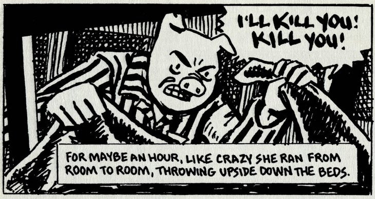
Art Spiegelman's crudely drawn comics of talking mice confronting torture and genocide in Nazi death camps won Spiegelman a pulitzer prize.

Child-like pictures by Debbie Drechsler convey blood curdling stories of incest and molestation.
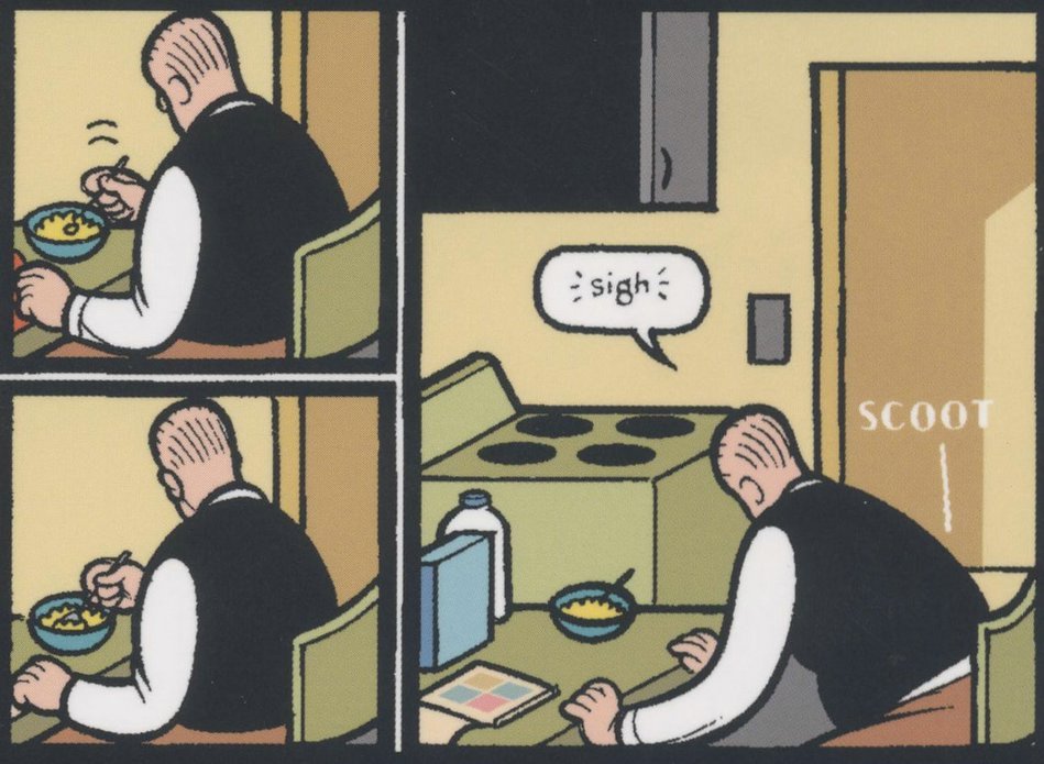
Chris Ware portrays bleakness and alienation using simplistic diagrams reminiscent of industrial instruction manuals.
This trend is evident from the changing mix of artwork in the annuals of the Society of Illustrators. It can also be seen in the work of the "new illustrators" group, the "concept art" crowd and the innovators behind "Raw." What is happening here? Why have form and content switched places in modern illustration? And what does that say about the evolution of our society?
I suspect that there are multiple forces at work. Clearly, illustration lost much of its ambition for technical skill as it fled from the path of the camera. There was not much point in investing years of rigor and discipline to develop skills if illustrators (and the publications that sustained them) were destined to lose the battle to television and photography anyway.
It also seems pretty clear that many of today's innovators didn't want to compete on the home turf of the great illustrators who preceded them. Seymour Chwast confessed that he stays away from techniques and media “that require craftsmanship and a drawing ability I do not have.” Elwood Smith, another highly regarded "cartoon-style" illustrator, recounts that when he tried to draw like the twentieth century “old master” artists with pen and ink, he simply couldn’t do it. But, he says, his inability to render the picture in his mind leads to greater innovation: “if I can’t draw it, I struggle to come up with a different idea that’s invariably more original.” The same could be said of a number of other contemporary illustrators who have shifted the direction of modern illustration.
But there are other, more legitimate reasons for the transformation to child-like styles. Recently, it seems that audiences and creators have become so saturated with mature content that they have become virtually shock proof. It is hard to envision a single vice that has not received ample, repeated and graphic airing. Perhaps for that reason, artists reach for simple, child-like images to reach audiences at a more susceptible and vulnerable level.
The great Mark Twain found that he could create a fresh perspective on adult corruption, greed and slavery by describing them through the eyes of an innocent young boy, Huckleberry Finn. Ever since then, artists have made creative use of the contrast between adult and child-like in various combinations. In the 1950s, Charles Schulz revolutionized the comic strip by putting adult wisdom in the mouths of simply drawn little children. Mel Lazarus used a similar approach with the beautifully drawn Miss Peach.
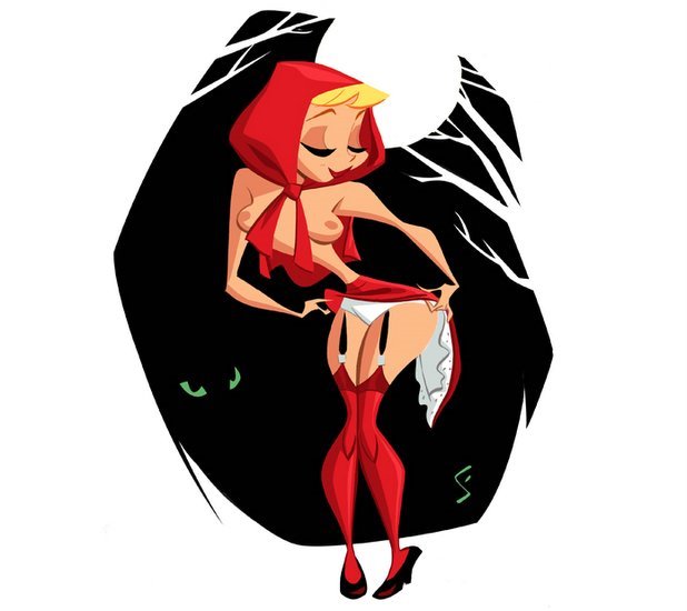
One interesting example of this trend is the use of a simple and innocent 1950s visual style from Disney animated movies and Golden Books to convey a more wicked subject matter. This juxtaposition of form and content can evoke surprising reactions. One of the very best at this is Shane Glines, a creative and prolific young artist with an excellent design sense.


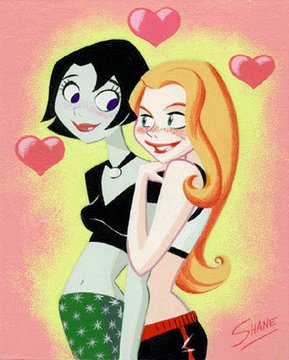
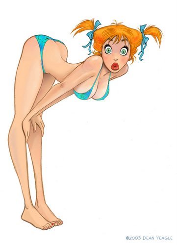
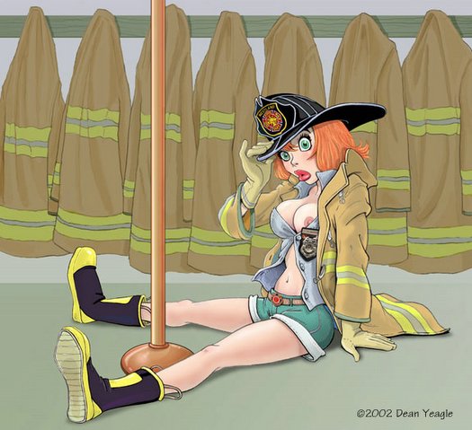
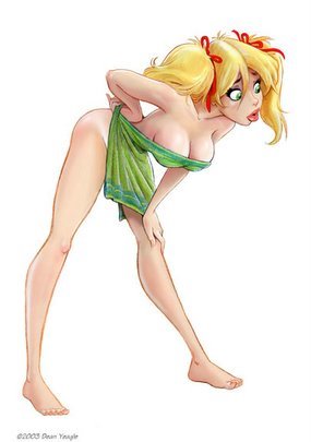
Another such artist is Dean Yeagle. These two, along with other illustrators, seem to be mixing spicy content with innocent images in creative ways. I enjoy their work.
There is of course a larger issue that I have not addressed yet: why do illustrations with mature content but mediocre drawing merit museum shows, laudatory reviews in the New Yorker and pulitzer prizes, while illustrations with simplistic content and superb drawing are chronically snubbed? For example, comic strips like Flash Gordon by Alex Raymond (which had brilliant drawings of goofy stories) will never be accorded the respect that comic strips like Maus or Jimmy Corrigan (which have unimpressive drawings of serious stories) receive. As you might imagine, I have some thoughts on this too, but I have blathered on far too long for one day.
6 comments:
Miss Peach was beautifully drawn? News to me.
In comics, as in all art I guess, there is great solace to be found in having your own little secrets. Who cares what the critical community at large thinks of artist A while they completely ignore the superior work of artist B. Let the babies have their bottles and feel secure in the knowledge that you have an ace in the hole. How's THAT for a mixed metaphor?!?
In the meantime, keep up the excellent work of sharing your little secrets with the rest of us. Which brings us back to Miss Peach. What do you see in the work of Mel Lazarus that is laudatory?
Anonymous, I understand why you raise an eyebrow about Mel Lazarus. I didn't pay much attention to him myself until I stumbled across some of his originals.
For me, there are two parts to enjoying the drawing in Miss Peach. First, Lazarus is a little like Hank Ketcham or Charles Schulz in that he draws with a deceptively simple line. Like Ketcham and Schulz, it may even appear careless at first, but his direct style contains a great deal of clarity and truth. When you only have a few basic lines to work with, it is not easy to make one child appear dim, another child appear conniving, or a teacher appear sweetly clueless about the intrigue within her class. Lazarus did all this with great restraint, modifying the shape of an eyelid or the tilt of a head. His job might have been easier if he allowed himself a few more lines, perhaps some cross hatching or an occasional shadow, but Lazarus understood the mantra of Alex Toth: "adding to truth only subtracts from it."
I admit that Lazarus did not draw with the same nuance that Schulz did, but that's where the second ingredient in Miss Peach comes in. Lazarus drew his kids with huge bloated heads that looked like they'd been run over by a steam roller. Their bodies were odd little wisps. His characters were auto-plastic in the same way that authentic children's drawings or art brut is auto-plastic. They remind me very much of Jean Dubuffet's drawings from the '50s and early '60s: child-like and scary at the same time, innocent and bizarre. If you took them seriously, they were really quite startling, like Peanuts on steroids, and I liked that. What Lazarus lacked in sensitivity of line, he made up for in boldness and weirdness.
I fear that nothing I say could make as much of an impression as looking at his early originals close up. (Perhaps it's time for a Mel Lazarus posting?) But I did enjoy your point about personal taste and little secrets. That's very close to the heart of why I do this little blog. Got any secrets you'd care to share?
David, thanks for another great post!
On the subject of childish drawings vs non-childish subject:
- Manga
- Dilbert
Scott Adams isn't the best illustrator in the world, of course, but he does apply himself on the jokes :-)
-- Hernan
Manga is another great example, Hernan. I also like Dilbert. The humor is so eccentric, it humanizes and anmimates drawings that would otherwise seem pretty mechanical.
Charles Schulz and R. Crumb are Gods to most contemporary cartoonists. Ware, in particular, is obsessed with Frank King's Gasoline Alley, Krazy Kat and McCay, along with Schulz and Crumb, all of whom used simple cartoon protagonists.
If you read _Understanding Comics_ by Scott McCloud, I think you'll get a lot of insight into where most comic book creators are coming from. In it, McCloud postulates that simply drawn protagonists are easy for readers to project into. He contrasts the simplicity of Tintin and Asterix, and the ease of reader idntification to Kerby and Toth's finished work, which is, according to McCloud, distant and other, and more like watching a movie instead of being 'in the action.'
David, do you actually think manga artwork is bad? It seems you only have seen the pokemon variety.
Post a Comment