

Perhaps the best political cartoonist to emerge from the smoking cauldron of World War II was David Low.

The power of his simple, clear drawings took him halfway around the world and protected him from many forms of censorship.

Low was born in a small town in New Zealand in 1891. He learned to draw from studying the pictures in old magazines in the back of a second hand bookshop. The popular style when Low was growing up was fancy, elaborate linework the way Charles Dana Gibson, Charles Keene and Norman Lindsay drew. Low wanted a simpler, cleaner look. His goal was to combine "quality with apparent facility."

Low's direct, powerful style stood out from other editorial art of the day and brought him to the attention of local New Zealand publications, which then brought him offers of employment from Australia, and later from England where the richest and most powerful newspapers bid fiercely for his services. From this forum, Low waged a brilliant graphic assault on the Nazis.
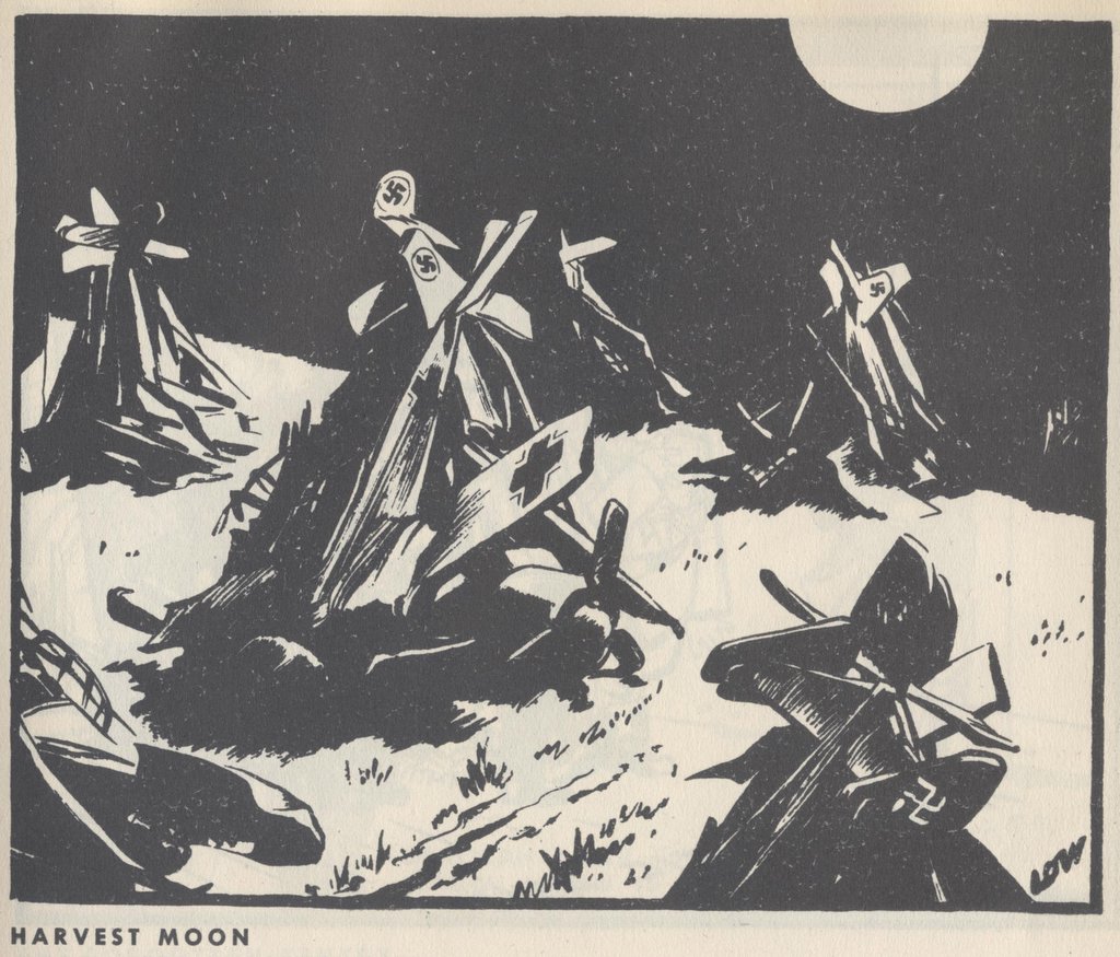
Low's art was not as simple as it looked. He later wrote, "making a cartoon occupied usually about three days: two spent in labour and one in removing the appearance of labour." You can see Low's hard work below the surface in the beautiful body language and facial expreessions of Stalin and Mussolini singing above, or in the salutations of Hitler and Stalin below. Note the tilt of the heads and the angles of the bodies. These are wonderfully choreographed drawings with simple, powerful darks and whites.

By studying the originals up close (see next image) you can see just how blunt and uncluttered Low's brushwork was. He worked large-- a typical cartoon would be 14 x 17.

I love Low's no-frills drawing. Its honesty and toughness stood up to many a powerful enemy. Low was an ardent socialist but he was so good that the staunchly conservative Lord Beaverbrook begged Low to come work for Beaverbrook's newspaper, The Evening Standard. Beaverbrook promised to double Low's salary and give him complete artistic freedom. Beaverbook later grumbled that Low was trying to comandeer the whole paper's editorial policy, but he never dared to censor Low's voice.

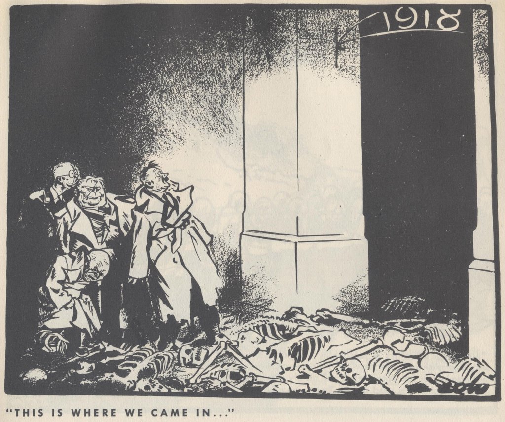
Hitler was enraged by Low's scathing drawings, and the Nazi government formally requested that the British government "bring influence to bear" to stop Low. However, nothing was done. After World War II, objections came from the opposite side of the fence: Winston Churchill claimed that a cartoon about the situation in Greece should be blocked "in the interests of western democracy."

Once upon a time, the ability to draw with strong, clear lines and a sharp eye could take you from a small town in New Zealand to the center of the world stage in London where powerful publishers and world leaders would rail against you, to no avail. Low was ultimately protected by the beauty and directness of his work.
6 comments:
Hi, I've just discovered your site. It's so great to see and learn about the great illustrators of the past and present. I really enjoyed your critique of Chris Ware. I've wondered myself whether or not he deserves as much of the praise given him but my own lack of knowledge left the question unanswered. Have you considered doing a piece on Alex Ross? I wonder how well he compares to the great American illustrators and if, like Ware, he deserves the accolades. Thanks for the great reads, Craig
Great illustrations! Another notable caricaturist from the WWII period was Lino Palacio "Flax", also a master of the deceptively simple line.
-- Hernan
Thanks, Craig-- I do know the work of Alex Ross, and people differ on his accomplishments. I have no immediate plans to do a piece on him, in part because I don't know that much about him. However, Leif Peng has a whole section on Ross in his Flickr gallery at http://www.flickr.com/photos/leifpeng/sets/1490737/ and I would recommend that to anyone who is interested. Leif has done a great service to fans of illustration by capturing tearsheets of many of the great but inaccessible illustrators and putting them on display for all to see and enjoy.
Hernan, thaks for flagging another artist out there. I was generally aware of "Flax" but now I have gone back to take a closer look!
Hi David;
Thanks as always for your kind words of support. If i may clarify on behalf of your first commentor, he is asking your opinion on the modern Alex Ross, a former ad artist from Chicago who exploded onto the comic scene some years back with his mini-series, "Marvels", and has since then painted his way through both the marvel and Dc universes.
I too would love to hear your opinion of the currently working Alex Ross!
Whoops-- thanks for the correction, Leif! I used to follow the work of the "modern Alex Ross" and I think his technical facility can be truly dazzling. However, from the work I have seen, his paintings lack soul. I have no problem with photo based art as long as the artist uses the photo as a tool rather than a crutch. There are lots of great illustrators, such as Norman Rockwell, Bernie Fuchs or C.F. Payne who start with a photograph and add to it. They are able to paint perfectly realistically but they then transform the image with their personal taste and style. The part they add becomes the guts of the painting, and is far more important than the technical precision. When I stopped following the modern Alex Ross more than five years ago, he hadn't outgrown that infatuation with technical facility. You can see it most of all by the way that his pages don't hang together as an integrated whole. Each panel is a distracting bauble, and it's pretty neat that he can paint that way, but there is little structural integrity to the page. Maybe he has overcome this problem by now. Does anyone out there have any strong contrary views on this?
Post a Comment