
 |
| Roswell Keller |
However, that style was gradually replaced by a simpler look that emphasized concept over technical skill. For example, this 1950s treatment of a couple going to bed...
 |
 |
| Seymour Chwast |
Not as pretty to look at, no obvious skill required, the latter picture could easily have been executed by any mildly competent artist. It would never have passed muster at the great illustrated magazines that dominated the first half of the 20th century, such as the Saturday Evening Post, Colliers, Life or Redbook. Yet, thanks to illustrators such as Seymour Chwast and Milton Glaser at Push Pin Studios, it became a dominant style.
What led to such a drastic change in taste?
There is more than one reason for the transformation, but such a change could not have occurred if the new look didn't bring something new and valuable to the table. Here are two excellent examples of that "something," Chwast's clever perspectives continuing our theme of "a couple going to bed:"
 |
| "Impotence" by Chwast |
 |
| "The Wedding Night of Art and Literature," by Chwast |
The old realism of Norman Rockwell or J.C. Leyendecker would not have been suitable for such artistic solutions. Chwast earned his exemption from the old standards because he gave us something meaningful in exchange.
 |
| The old realism would not permit Chwast to give smoke a gender |
Despite his lack of traditional drawing skills, Chwast shows a genuine appreciation for the importance of visual elements. A survey of his art demonstrates a lively, creative mind at work.
 |
| Illustrations for a poetry collection |


Even when Chwast draws flat, stilted figures, he can turn that to his advantage with his content. This bland livingroom scene is a perfect foil to show how we live every day with the existence of the bomb.

I enjoy Chwast's sculptures, which show he is not confined to simple diagrams on a printed page.


I have said some unkind things on this blog about contemporary illustrators who (in my opinion) don't draw well. (For example, last week we had a brisk conversation about artists who mechanically draw circles for the human head). By contrast, I think Chwast is an example of what illustrators were able to accomplish by ridding themselves of the constraints of the first half of the 20th century. Chwast understood that if you are going to take liberties, you have to give something in exchange. Chwast used his liberties to achieve worthwhile results that could not have been achieved within the confines of traditional skills.
My gripe is that the second and third generation of artists following Chwast lose their appreciation for the trade off. Some have become accustomed to the loss of discipline and technical skill as a way of life.
 |
| Illustration by a current illustrator from Businessweek November 2014: even simpler and flatter |
They unthinkingly accept lowered standards with little recollection of why the standards were lowered to begin with. Few of them offer any offsetting or redeeming profundity or creativity, in part because many of their viewers have become satisfied with banalities.
Chwast threw out the bath water, but he knew to keep the baby.
20 comments:
Agreed that post-Chwast has been generally downhill -- just flip through almost any of those recent books about illustration, post-1970.
My thought re Chwast is that he got away with what he did because he was illustrating concepts, not stories or the other things Rockwell, Lovell, even Whitcomb were depicting.
All the literary ideas that are displayed in the examples could have been delivered by the realistic means of the first example. So the ‘gain’ with recent illustration trends (and art in general, witness the POMO generation) is to deny the image of deeper resonance. The question then becomes: “why does our society prefer surface over depth, statement over evocation, concept over experience? Why has the packaging of the cultural food become more important than what is inside?”
Some would argue that the new trends are in fact delivering the content without the surface veneer of technique which is just a faux quality dressing hiding the real meat of the matter. Such a view, in my opinion, betrays the belief that all communication is delivered by surface alone. Which is what we have now: a society largely insensitive to the resonant implications behind appearances, the pan cultural general belief that weather has nothing to do with rainbows.
the graphic-metaphor approach is probably the dominant one in illustration today, and the reason is probably to do with the current dominance of literary thinking over visual (as discussed in the last post).
i disagree however that it's been downhill since Chwast and Glaser in this area.
Chris what is the realistic means of showing impotence?
Moran: Aside from the fact that a cartoon of a plug pulled from its wall socket does not intrinsically communicate impotence, I'd say, off the cuff, that a bedroom scene showing a sexy woman laughing at her distressed lover's limp tackle would do the trick.
It certainly wouldn't put me in mind of an unplugged electrical fitting. :)
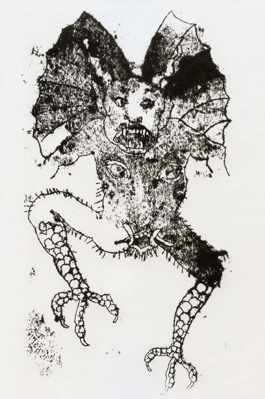
I'm with Donald. Mainly, I see Chwast's "value added" falling in realm of cleverness -- producing easily readable and easily forgettable twists on familiar concepts. Except for that one demon, there is not much shocking, eye-catching, memorable.
Perhaps in that way, it's not all that different from the Roswell Keller piece: it, too, is slick and simple, coated for easy digestion.
Chris that just shows she's a bitch. You can't show his limp tackle so maybe she's laughing at his size or shape or maybe he's normal but she laughs cuz he thinks he's getting some. What if she is understanding and doesn't laugh. What if she is sad and cries. That plug isn't pulled from the wall, it never got inserted.
Moran: How do we know the plug never got inserted into the socket? How do we know it was never pulled out? How do we know it has anything to do with impotence? Unless the caption does the job for us and we reinterpret the image.
"Sexy woman laughing at her distressed lover's limp tackle" is only words. But I can imagine a great illustrator sowing in all the clues in their picture to tell us the couple are lovers and that woman is trying to disguise her own distress at failing to arouse the man by laughing at his impotence.
And there are hundreds of other ways a good illustrator could convey the experience of impotence. I've just exampled the first thing that occurred to me. The fact that a great image can convey so much more than the mere concept of 'impotence' is part of my larger point about our society generally preferring to eat the packaging rather than the food inside.
Donald Pittenger-- I agree that Chwast was illustrating concepts more often than the fiction illustrated by previous generations of artists. I think that's just the way the market demand went, for reasons ranging from technology (fiction magazines were replaced by TV and the internet) to a lower literacy rate.
Chris Bennett-- I agree with you about the "surface over depth" point but I'd be interested in hearing how you would depict "The Wedding Night of Art and Literature" by the realistic means of the first example.
Laurence John-- I agree that there are many excellent illustrators today and i did not mean to suggest that it has all "been downhill since Chwast and Glaser." I do think the standards have been lowered because a lack of talent and technical skill has now been legitimized. Artists who previously would not get past the receptionist are doing work for a wide variety of publications because the ticket for admission is much cheaper. That does not mean the illustrators have to do a crappy job once they're in the door (although many do).
Peter Sattler-- There's a fine line between "clever" and "smart." In this instance, I would tend to give Chwast more credit for his artistic solutions for Impotence or the Wedding Night of Art and Literature than you do, but that's what makes horse races. I shared a selection of Chwast's other, less metaphorical work because, although he can't draw well, I think they show he does take images very seriously. What do you think about those bold, creepy poetry illustrations? They were wildly adventuresome in their day. Or those sculptured heads on the lamp stands? I don't know about you, but I see real humor and creativity there.
MORAN and Chris Bennett-- I note that you are talking about two different ways of implying impotence: Chris says we can infer impotence from emotions-- facial expressions and body language (a woman "laughing," a man "distressed")-- while MORAN says we can infer the physical phenomenon of impotence from an electrical problem (the strangled cord that holds the plug back from being inserted into the outlet). Both are surely right, but MORAN's approach depicts the physical dysfunction without presuming to address how humans will react to it. Chwast is not trying to say whether the woman is sarcastic or devastated. If his text was not about that, then an emotional perspective would not seem to be warranted.
My first reaction to this split was that these euphemisms and metaphors are all made necessary because the artist could not / did not want to do a literal treatment of what Chris calls a man's "limp tackle." Hard to blame him for that. But even a Norman Rockwell treatment of such a subject would have some unavoidable, ambiguity because the man could be limp for a variety of reasons. In a static image, there will always be inherent ambiguity, which is good.
the invention of the photograph? many artists felt the goal of good drawing or realism was a 'dead end'. No matter how well you painted/drew you would never be able to paint/draw a scene as fast as a camera could capture it {nor offer as many variations}? Stock photography only magnified the problem with easy access to compelling realistic imagery. Some Illustrators felt they had to go where photography could not go which meant more liberties with 'realism' and more stylized and/or conceptual illustration?
David— ‘The wedding night of art and literature’ is a highly abstract, literary idea. There can be no such thing as that happening in the physical world. Thus any attempt to portray it as an image is going to need allegorical means to do it. The pen and the palette in the bed together is no exception.
But to answer your question directly:
A room. One half is an artist’s garret, the other half is a study stuffed with books. Exactly in the middle is a double bed. At the foot of the bed, on the floor, is a wedding dress made of the pages of a book. The wedding dress is entwined with a paint-spattered artist’s smock. At the far end of the bed, peeping out of the covers, are the heads and shoulders of a happy couple smuggled up together. The man wears woman’s glasses and the woman wears a paint-splattered beret.
I doubt if that would even need a caption to make sure of the allegory being illustrated. :)
However, I take your point about the cartooning methods maintaining the purer, less fettered nature of the literary idea they decorate. ‘Decorate’ is possibly a little harsh. There is, to be sure, a little ‘kick’ to be enjoyed by reading the caption/title and then seeing the image resonate it in another form.
David, that's a nice selection of work by Seymour Chwast. He did bring more to it than the circle head group and the two on lust are very well done.
Chris Bennett is expressing the nature of this genre of illustration and art, "statement over evocation, concept over experience" and "our society generally preferring to eat the packaging rather than the food inside".
In the 1970s it seemed every concept became an interchangeable brand with TM, EST, Scientology, Our Bodies Ourselves, Psychology Today people wearing orange for a particular guru and the endless stream of self help books.
Chwast and Push PIn were very good at this type of identity communication or branding and it was the alternative to work shown at the Society of Illustrators, which ignored it until around 1979, I think, when they had a show called The New Illustration.
But scanning the images from top to bottom I couldn't help notice the loss of warmth as I left the Keller and moved progressively downward. Yes, there is a kind of sympathetic cynical, funny humor in the sculptures but it's from a different place than the warmth felt in the Keller.
I think the comparison of the Keller and the Chwasts, (also the circle heads) does show the difference between something expressed using existing reality, alongside that which is an expression of reality as a concept.
If I'm not mistaken, this other level of experience, (in the Keller I see it as warmth from the figures and the dignity of their treatment) to be part of what Chris is trying to get at.
Sean, your observation about the loss of warmth is very interesting, and I think astute. I hadn't considered that before because of the association of bright cartoons with children's programming. But I think, aesthetically speaking, there is a brittleness here; partially to do with the obnoxious color schemes, stiff figures, deadpan staging and arranging, and crude, immature drawing... but also it is to do with the nature of intellectual abstraction itself (including graphic design)... which is, by its very nature, divorced from humanity and human emotions.
Having said that, the Keller illustration is done in a style that is indistinguishable from that of about 300 other illustrators from that era who were all using the same process to get that commercial slick look. "Sharp and stylish" it may be, but it is still derivative and vacuous.
Both styles serve to show just how far away from fine art the illustration field fell as it became increasingly desperate for ad dollars and eyeballs. But the Chwast stuff shows evidence of the later editorial need for cheap and quick space-fillers. Which is just depressing and hardly worth celebrating.
Kev,
Everything you said is true, especially the nature of intellectual abstraction...divorced from humanity and human emotions.
The conceptualizing or branding of ideas in the 1970s appeared as basic mercantilism, but it turned out being an economic process which replaced a previously existing culture. There was a similar crudeness of behavior resulting from the abstraction or conceptual absence of warmth in what was a very contentious, mixed up and unhappy decade.
The intellectual abstraction continues to divorce itself from humanity.
Thanks
PS: On a happier note, I think people are beginning to tire of it and that might be a sign of a turn to something better.
Keller's "warmth" is melting a lot of cheese.....
Post a Comment