"In the days of the frost seek a minor sun." -- Loren Eisley
The 1950s and 60s were great decades for American illustration. Magazine pages were getting larger, the quality of full color reproduction was getting better, editorial restraints were loosening, and creative experiments were encouraged.
Yet, already the chill winds of photography and television were being felt, and markets for illustration were beginning to dwindle. One by one, the large general interest magazines that previously purchased art by the bushel were dying.
As glamorous jobs became fewer and farther between, illustrators were forced to accept lesser work. One of the more reliable sources of employment between major projects was The Readers Digest. It had smaller pages, low quality paper, and was limited to line illustrations, often with just two colors. On the other hand, it paid illustrators on time. As a result, some of the greatest illustrators of the era, such as Robert Fawcett, Austin Briggs and Noel Sickles, eventually worked for The Reader's Digest.
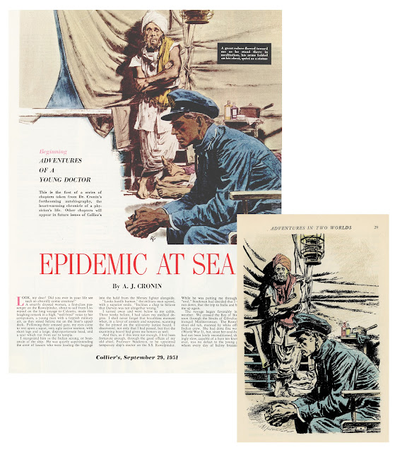 |
| Robert Fawcett illustrated the same story twice, first for Collier's (left) and years later for The Reader's Digest (right). Note the difference in size and production quality. |
Big shot illustrators who had become accustomed to basking in the public glow and driving fancy cars sometimes had to seek warmth from minor suns. How did they respond to this reduced status?
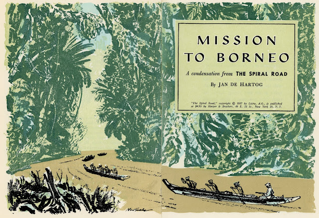
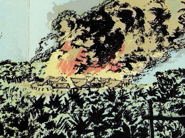
In the drawing below, the coarse pulp paper wouldn't hold a fine line well, even if The Readers Digest had the size or the budget for a detailed drawing of an immense jungle. So Sickles solved the problem with large, jungle-like shapes abstracted and screened.
Rather than be timid with a paper stock where the ink bleeds, Sickles took full advantage of it:
Is the page too small for conveying a panoramic vista? Is the printing process hostile to smooth lines? Not a problem.
Unlike some of his more slick and polished peers, Sickles was never afraid to go rough.
Sickles became a great illustrator by being tough and resilient and solution-oriented. He wasn't daunted by poor working conditions and he didn't reserve his favors for glamorous projects that afforded him a wide audience. He didn't view a smaller paycheck as a license to turn in second rate work. That work ethic, those standards, were a large part of what put him above so many other illustrators regardless of where his pictures appeared.
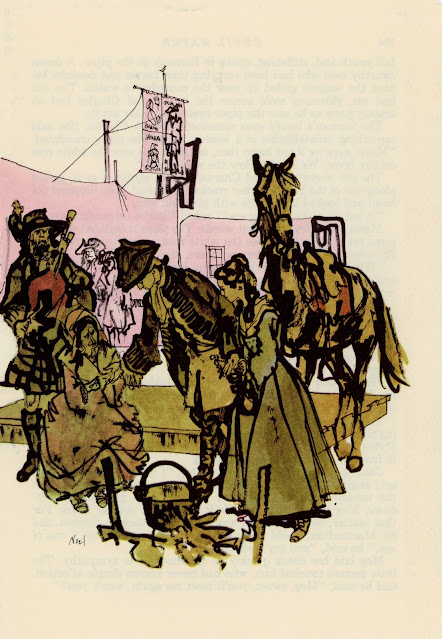
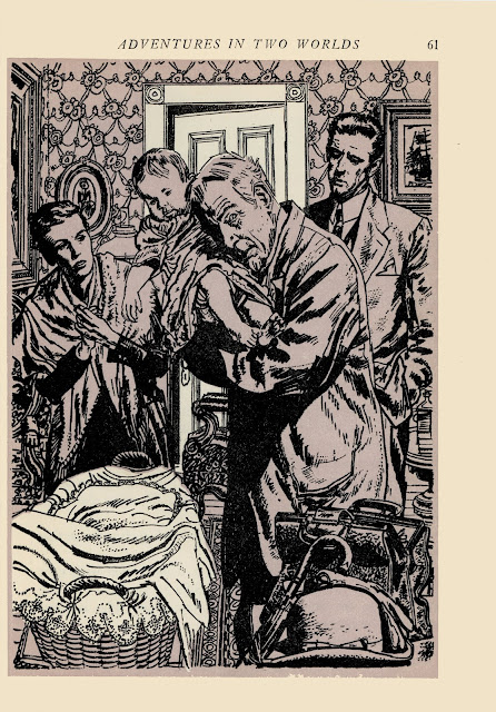
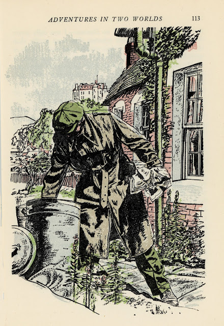
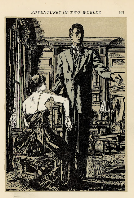
The same thing could be said for Robert Fawcett:
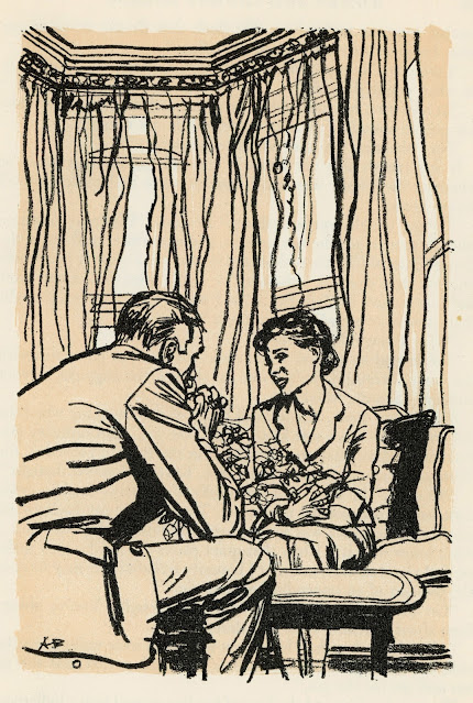 |
| Briggs' distinctive linework was hugely influential at the time when young cartoonists such as Neal Adams and Stan Drake were learning to draw |
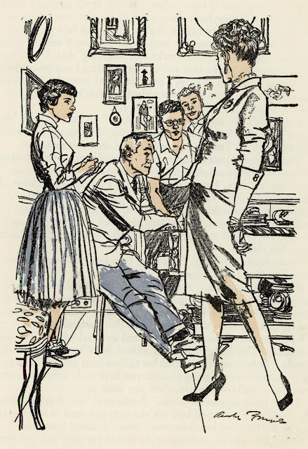 |
| Horrible Readers Digest color |
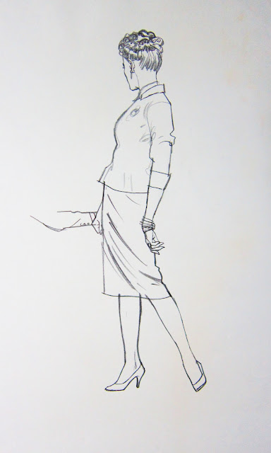 |
| Preliminary sketch |
To survive during the ice age of illustration, these resourceful artists had to gain warmth from such minor suns as they could find. They didn't disrespect the sun gods by doing lesser work. You never know how long that frost is going to last.
Besides, as Fawcett said,
The argument that "it won't be appreciated anyway" may be true, but in the end this attitude does infinitely more harm to the artist than to his client.





11 comments:
woff that last phrase is the reason I respect my small commisioner clientele with the same respect as any big client.
you should try investiganting the golden age of argentinian comic book. you had a bunch of people with inks similar to these. we had the biggest comic artist at some point.
cheers!
Caterina Gerbasi-- The only reason I haven't written more about the great Argentinian artists is that I feel I don't have any special knowledge to contribute. I try not to be one of the million sites that simply copies and recirculates somebody's images. I've written about Jorge Gonzalez (born in Argentina, living in Spain) because I corresponded with him and had access to some of his originals, so I felt I had interesting images and a few words of wisdom to share.
I very much admire the work of Ignacio Noé, Jorge Zaffino and Carlos Nine and would like to learn more about them, but who wants to hear an ignorant person like me prattle on about them? I am always looking to expand my knowledge about these and other Argentinian artists, and would be very interested in any suggestions that you or other readers can contribute.
the lost art of creative integrity.
That Ken Riley of the guy on the telephone is very good indeed.
Interesting crop of samples David, thank you.
Regarding Sickles, we need to keep in mind that he drew the Scorchy Smith comic strip (printed on newsprint) for a number of years. He also once in a rare while subbed for his buddy Milton Caniff on the Steve Canyon strip -- if I recall correctly.
So he had some experience illustrating for non-slick publications.
...and Briggs drew Flash Gordon for a while.
Great post. The group of illustrators you featured are on my list of heavy hitters. They knew to draw and some of their best work is in line rather than four color.—Paul
David! there is a lot to see if you know spanish (sadly not much interview and documentary material is translated)
let me leave you a video of Alberto Breccia (the greatest comic artist to ever live in my opinion) making a comic with collage and talking in front of an ugly wall
https://www.youtube.com/watch?v=KVble2NlgKQ
cheers!
chris bennett-- Ken Riley is often overlooked, perhaps because he never developed a distinctive personal style the way that some others did. But he was certainly a talented draftsman. I should really promote some of his work from the 40s here.
Donald Pittenger-- Yes he sure did. One interesting thing about Briggs is that he started out working for pulp magazines like Bluebook. He developed all kinds of techniques for working with crappy black and white reproduction on crappy paper (for example, he learned he could simulate half tones by working on textured window shades rather than normal drawing paper). Then he was doing full color paintings for the cover of the Saturday Evening Post. Then he was doing black and white illustration on crummy paper for The Reader's Digest.
Paul Sullivan-- Sounds like you have the right list of heavy hitters!
Personally, I’d like to see a follow up to this excellent post. With the proliferation of full color reproduction, the market for line illustration has all but disappeared, if it exists at all. When we think of the passing of the golden age of illustration, most of us remember stunning works in full color. However, it is good for us to recall the dazzling black line illustration that graced publications through those years. Much of that work was done by recognized master illustrators. However, some of the work was done by artists who were appreciated at the time but today are all but unknown.
Hello David. I've found your blog recently. It's an incredible source of information for Golden Age illustration admirers like myself. When it comes to Argentinian artists I'd humbly suggest looking at the work of Alberto Breccia (actually born in Uruguay but lived and died in Argentina) and his son Enrique Breccia who is an amazing artist in his own right.
On a side note, I'd like to know if you can help me identify an artist from the Famous Artists Course. In lesson 4, page 27 (“Seven artists draw the same figure”) he’s featured 2nd from the left right next to Harold Von Schmidt. His first name seems to be Alex but I can’t make the last name. Thanks!
Post a Comment