
There's a long tradition of wars with-- and about-- ink:

(The Ink Battle by Utagawa Kuniyoshi 1843)
Ink has left a trail of rivalry, braggadocio, hostility and sometimes just general commotion.

Ink as a weapon can be flung, spattered and scrubbed; it can be a tool for slapstick and a tool for marking rivals with an indelible stain.
 |
| (Toshikage, 7 Gods Fighting with Ink, 1888) |
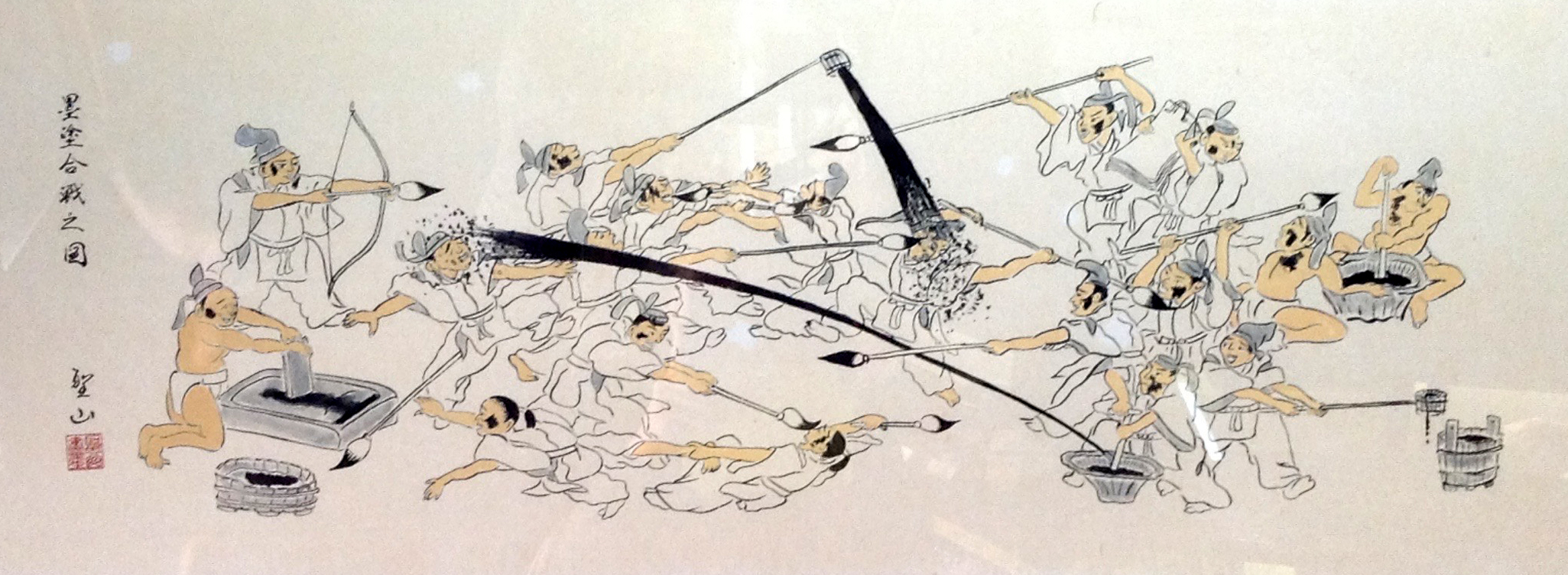 |
| (The Ink War) |
 |
| (Ralph Steadman, the Malevolence of War) |
But when it comes to the heart of ink, Alice Mollon may have a wiser understanding.
 |
| Alice Mollon's illustration of ink slipping nude into the world |
It's not that Kuniyoshi is wrong; it's just that there are more important truths in Mollon's delicious picture of ink taking form from the brush.

But the few subtle details are so well chosen, anything more would've been less. The toes turned inward, the brush that doubles as hair so effectively, the raised arms that help create a feeling of liquid flowing from the concealment of the brush, to take shape on the dry surface below. This picture reminds me of Botticelli's Birth of Venus.
Nicely done.
71 comments:
Kobayashi was a master draftsman from a civilization that had long mastered the ink brush, whereas Steadman can scarcely draw in any medium, and Mollon, a digital designer, appears to have never actually used ink and knows nothing either of its character or flow.
It seems to me we have three very different treatments of ink here. Steadman represents one extreme-- he is an action painter with ink, someone who spent a fair amount of time doing technical drawings for an industrial employer and later found value in relinquishing control, exploring what he and mother nature might accomplish as a team. It's a very different way of depicting violence than the Kuniyoshi, one that admittedly requires less skill but I'm not prepared to say that it is less effective. It requires curatorial taste from Steadman to determine when a splash is garbage as opposed to when it can be made compelling.
As for Mollon, I didn't miss the irony that I'm using an ink-free image to make a point about ink. Yes, she's a digital artist and a conceptual artist as well; I know that combination horrifies some of the commenters here. But I stick to my point that hers is a smart artistic insight into the nature of ink at the moment of creation. The Kuniyoshi and the Steadman images are typically testosterone-laden, aggressive uses of ink. Lots of detail. Lots of violence. Lots of 3 Stooges level humor. Mollon's image is more restrained and slender but wiser. The details are fewer, but carefully chosen and beautiful.
One of the best things about this site is how it presents new experiences in illustrations for me to discover and explore. Another is that I have now started reading your posts on The Saturday Evening Post, great stuff. Thanks.
Reminds me of that anecdote Roger Ebert would tell of his days watching European cineaste films in grad and postgrad-attended art house theaters in the late 1960s. When an obvious bit of ham-fisted meaning would pop up on the screen the audience would yell out "Symbol!" in unison and throw popcorn.
With "conceptual" graphics, of course, blatancy is the whole M.O. The bald presentation of the visual-wit concept is the whole point; in order to get an insignificant moment's credit for that whimsical trifle. There's nothing else being expressed, so there's no artistry required to hide anything. Like a small moth pinned alone inside a large glassed-fronted box frame. You see it and then, "now what?"
It's that cute joke at the dinner table in the middle of a completely different conversation. The guests take 2 seconds to appreciate the moment of humor, almost reluctantly, and then get back to the actual discussion, utterly ignoring, going forward, that the joke ever happened.
Imagine if, later, some party to the discussion were to try to re-center the whole conversation around that single aside.
As far as inking tropes go, Paul Coker Jr. did a similar girl in the brush bit in one of his Mad paperbacks. She was drawing on the paper, as I recall, with her pointed toe. And I remember seeing elsewhere one of a crowquil pen where a fellow's head was caught in the little ink reservoir hole; trapped by what he had written or trapped in the difficult writer's life I suppose the idea was. And I've seen one where the black point of the ink brush was a tongue licking the paper. There's one, I believe by Artzybasheff from the late 40s, of figures that have been drawn getting off the paper onto which they've been rendered and trying to jump back into the inking brush. (Or was that by Escher?) And then there's figures jumping out of the ink bottle onto paper. Etc. etc.
These kinds of graphics-based mash-ups are glyph-play. They're a form of writing with clichéd visual conventions. A point easily proven by the fact that this image using the ink brush convention/trope was obviously done via computer.
My second thought upon seeing the Mollon illustration was: The legs and feet seem to taper to a pen nib’s point, which confuses the concept in a manner suggesting the artist might possibly not be familiar with working with actual ink on paper.
- - -
Postmodern Anonymouse
Movieac-- You're kind to say so. Those columns for the Post are a different species than this blog, but the Post irresistibly offered me full access to their 150 year archive of illustrations, and who's going to turn down an offer like that?
kev ferrara-- you ol' die-hard art miscegenist you-- It will do you no good to continue to rail against commingling of the breeds. Whether it's pictograms or word art or hieroglyphs, whether an image is infected by symbolism or metaphor or parable or analogy, you're a lonely sentry on that remote outpost trying to save the world from mongrel art.
I respect the rhetorical skills you employ to protect the purity of the one particular form of art that you prize the most. And I share your reverence for many of her qualities, really I do. But you're so choked with rage at easy targets among the devilish postmodernists and prosperous pseudo-artists such as Kruger, Holzer, Prince, Indiana, etc. that you seem unwilling to do the hard and uncertain work necessary to seek out the value in conceptual artists such as Steinberg or Twombly. Roger Ebert was no enemy of cartoonish symbolism-- he did the work to draw distinctions between those "European cineaste films" and the chess game in the 7th Seal (which he revered) or Hitchcock's famous train entering the tunnel.
Your list of "similar" images of ink simply reinforce my point and also demonstrate that yes, it is quite possible to "re-center the whole dinner conversation around that single aside." Let's start by acknowledging that what Mark Twain said about land is doubly true about art: "No tribe, howsoever insignificant, and no nation, howsoever mighty, occupies a foot of land that was not stolen." So I'm not daunted by the fact that all these artists, along with Mollon, anthropomorphized ink. But consider how different they are from Mollon's, and in what important ways. The sharp, rigid and pointed control of a crowquill pen is the opposite of Mollon's liquid nude flowing from a brush, and the hungry tongue licking the paper is a needy supplicant compared to Mollon's ink venus descending onto the paper.
Back when this blog was relatively new, I posted a little discussion about the handling of ink. That wouldn't be suitable for a dinner conversation either, but only because it was potentially too erotic: https://illustrationart.blogspot.com/2009/10/ink-and-commitment.html
Postmodern Anonymouse-- (by the way, thanks for the moniker, it is helpful).
I read those delicate little feet turned inward very differently. Most of any liquid is dispersed among the hairs of the brush, as revealed by those full, womanly hips. While dispersed in the brush, ink has no form; it only takes shape (that is, converts into a dry, solid form) at the tip of the brush where the ink narrows and flows out onto the paper. Mollon shows it flowing down in the shape of a woman, the catalyst for this creative birth we're witnessing. I like the way Mollon's ink alights delicately; it doesn't stomp down with two flat feet. It doesn't drop from Steadman's stick and splatter. It descends gracefully like a queen.
you ol' die-hard art miscegenist you-- It will do you no good to continue to rail against commingling of the breeds.
I think you mean anti-miscegenist? (Sometimes you old libelists need a little help with your slanders.)
Anyway, where was I doing that? For one thing, I quite like good comic books - for instance - which is a commingling of literature, film, illustration, and blinking.
And this particular editorial/conceptual illustration seemed rather pure in its nature. It's stripped down to nothing but hackneyed symbolism hacked together. So I'm as confused as you are as to what you are counter-arguing.
you're a lonely sentry on that remote outpost trying to save the world from mongrel art.
Mongrel art? I'm a mutt myself! What is this, a primer on the accuracy of Godwin's Law? (And not all sentries are lonely, especially when they're off-duty. Anyway, I'm more of a sharpshooter.)
The graphic knickknack you're slobbering over is an artistic Cheetoh. There's nothing to it but the wrapper and some empty calories. You want to rhapsodize on lab-synthesized point-of-purchase pseudo-foods, you go ahead. Grab an armful and go sit on the couch and munch away.
Overt symbolism works for editorial. It is functional. Blank space would work just as well to give the eye rest, but people would ask for a discount because of horror vacui.
But you're so choked with rage at easy targets among the devilish postmodernists and prosperous pseudo-artists such as Kruger, Holzer, Prince, Indiana, etc. that you seem unwilling to do the hard and uncertain work necessary to seek out the value in conceptual artists such as Steinberg or Twombly.
What now?? ... "Choked with rage??"
Oh yes. I'm soooooo angry, so "choked with rage" .... and so lazy that I don't like stupid Twombly's work. You got me there! Whereas our even-keeled and dutiful investigator hero (that's you!) just love, love, loves that big ol'bag of Cheetohs!
(I can't help but worry about that "raging" inner voice you keep hearing in your head when you read what I write. It sure ain't me.)
Since I love Steinberg's work (and, as mentioned previously, good comics) I don't know where that leaves your whole wacky counter-tack.
Roger Ebert was no enemy of cartoonish symbolism-- he did the work to draw distinctions between those "European cineaste films" and the chess game in the 7th Seal (which he revered) or Hitchcock's famous train entering the tunnel.
I don't know if you've read on Screenwriting or fantastical fiction in general - but it is now widely understood that the writer is granted one crazy coincidental premise to incite the story. And once that is granted, everything else must run like clockwork. Seventh Seal is the perfect example of that. I love that film.
Hitchcock's brief clip of a train entering the tunnel was an overt joke. For the sake of understanding my position in this discussion, imagine if that clip was the entire movie.
Kev Ferrara-- the laws dealing with miscegenation are commonly called "miscegenation laws," at least in legal circles. I envisioned you in the role of a southern sheriff who apprehends typography trying to unify with poesis in the back of the Piggly Wiggly parking lot on sweltering summer nights.
I don't know who wrote the law that "a writer is granted one crazy coincidental premise to incite the story. And once that is granted, everything else must run like clockwork." But apparently they're an art sheriff, just as you're an art sheriff who enforces the rules for the one type of art that you most prefer.
I was re-reading Walt Reed's magnum opus the other day, and he wrote that as early as the 1940s, "the era of Harvey Dunn's school of painting sumptuous oil on canvas was passing." He described how the market changed, how clients changed, how styles changed. By the 1940s, he wrote, "most illustrators were now working in gouache at a smaller scale, but with more emphasis on detail." That was 80 years ago, and the circumstances surrounding the creation of art have continued to change at an ever increasing clip. So digital art doesn't look like Bouguereau and Bartok doesn't sound like Beethoven, and 95% of the art created in any era is not worth revisiting. It takes courage and work and vision to pass judgment on art for which there is not yet a consensus; we should neither swoon over it out of ignorance nor condemn it due to lack of familiarity.
I look at this "cheeto" picture, as you call it, and I see that the key ingredients are simplified to a very few in number, and marginal differences become key. The few stray hairs on the brush could've been done a hundred different ways, or left off altogether, but I think Mollon got them exactly right for the dual effect she wanted. The figure's arms could've been down by her side, or outstretched, but they are positioned perfectly to convey that she is flowing downward but feeling the ride as she goes; Mollon wisely refrained from including facial features or other details. There are lots of tiny, sophisticated choices here-- the hips didn't need to be as full as they are, the woman could've been higher or lower on the brush, but Mollon made the right choices. Put all those judgment calls together and we have something which is, as I said, "nicely done."
One thing I enjoy about your comments is that even in the process of disavowing rage, you can't help employing terms like "stupid," "slobber," and "nothing but hackneyed symbolism."
I don't know who wrote the law that "a writer is granted one crazy coincidental premise to incite the story. And once that is granted, everything else must run like clockwork." But apparently they're an art sheriff, just as you're an art sheriff who enforces the rules for the one type of art that you most prefer.
I certainly grant that stark editorial graphics have their place. They do, and so do headlines and font choices. I'm not one to dwell on the nuances of in-house production art, however.
On the larger cultural question, this much we know: Know-nothingism doesn't work. The gaps in principle and rigor get filled up with cheap short-cuts (diminishing time-savers) or trash (refuse) in the marketplace.
What works works. That's the "art sheriff" - reality. Slowly, over time, from what works, principles are derived. If they are true principles, they stay true. If not, they get overturned because they are limiting quality instead of fostering it.
In all narrative arts, the nature of each specific aesthetic/fictive world is discovered by the audience early in the attention period. It is a naturally consequence of the orienting reflex; audiences want to know the lay of the land and the rules of the world (and the plan of the protagonist). Or else they/we can't actually understand anything else that happens subsequently.
If Dracula can't go out in the daytime at the beginning of the film for fear of melting, he shouldn't be taking an inconsequential afternoon stroll at the halfway mark. In baseball, if the umps get rid of strikeouts midway through a game, people would leave the ballpark, annoyed. At the start of an essay, speech, or trial you reveal what is to be elaborated, then you stick to that plan or risk losing your audience or case.
The start of any narrative sets up the rules/consistencies of any narrative game. This is a true principle.
The cheat of solving artistic problems late in the narrative game by a random interjection of fate has been called Deus Ex Machina for two thousand years. This technique is still used in comedies, because anything for a laugh is the rule of comedy. But in every other form, it breaks the logical unity of the piece.
All sorts of postmodern experiments in narrative happened in the 1960s and early 1970s. Nobody reads or watches those experiments anymore except ironically, for research, or out of nostalgia. To rebel against reality is the height of futility.
One thing I enjoy about your comments is that even in the process of disavowing rage, you can't help employing terms like "stupid," "slobber," and "nothing but hackneyed symbolism."
You forgot "graphic knickknack", "whimsical trifle", and "glyph-play." (They can't all be gems!)
Apatoff -
It certainly is a cute idea and a pretty picture. A fine illustration. It does, however, lack that trace of an aura that is promised in especially the Steadman piece. It fails as an object, as a material manifestation of its statement, which I still maintain is meaningfully confused by the nib-like legs. The smooth yet simulated perfection of the inky pixie seems unearned and untethered from physical reality. There is no tension in the piece, no tactile reality. Nothing flows. Nothing bleeds. There simply is
no ink.
- - -
Postmodern Anonymouse
She looks like an insect that has been trapped inside the brush. Is she trying to escape. What is the story behind the idea? Is it an illustration for a fantasy story?
Taye Grant
<<<even in the process of disavowing rage, you can't help employing terms like "stupid," "slobber," and "nothing but hackneyed symbolism."
You called kev a miscegenist before all that, that's comparing him to a southern racist or Hitler, etc, for his views on artwork. That's wild where I come from. So I think you win the rage trophy this time out. lol.
Ink wars are crazy. Not a fan of this picture, but thanks for showing. Looks like cut out paper. Always cool to see what's going on in the field. Girl doesn't look like she's inking anything, just standing around. It would have been smarter if there was something on the paper to look at that had been inked. Big fat brush like that and the little puddles it made, makes no sense. Brush would have wicked up a lot more ink too. It feels all wrong, like the person never inked before.
~ FV
FV-- actually, that's not correct. I would never suggest that Kev has a racist bone in his body. My reference to miscegenation is an analogy, based on his longstanding arguments about the sole path to achieving the highest form of art and the iniquity of cross-breeding that art with abstraction, post-modernism and other lower art forms.
Postmodern anonymouse-- I agree there is no tension in this piece, but personally I wouldn't want there to be. As for "nothing flows," I guess if it flowed more, the anthropomorphized ink would lose its shape. For me, the inky pixie flows about as much as she can while still possessing bones. It's a trade off between liquidity and form.
Kev Ferrara-- I agree that "Know-nothingism doesn't work." The problem is that certitude has its problems too; we don't always know what we think we know. Confidence is a wonderful thing until it's not warranted, but confidence blocks us from recognizing when it's not warranted.
Besides, "the gaps in principle and rigor" are often where creativity, innovation, improvisation and progress make their way into a picture. Frazetta used to say that his great "Neanderthal" painting turned out the way it did because he was caught the night before a deadline with no canvas board, so he pulled up a masonite tile being used for home construction and didn't have time for one of his more typical [overworked] backgrounds.
I don't think you can say that the art sheriff is "reality" unless you're prepared to allow everyone their own sheriff. Pilate was not the first to ask, “Quid est veritas?” and no one (except perhaps you) has answered it yet.
I will grant you this: I think truth is an asymptote. The more you search in good faith, the closer you get to zero point on the curve (although the curve and the line still only intersect at a point in infinity.)
I don't think you can say that the art sheriff is "reality" unless you're prepared to allow everyone their own sheriff.
This does not make any sense; it is like saying you cannot submit to the law of nature unless you are prepared to allow everyone laws of their own.
We are a part of nature, so it follows that we are formed as a fractal of the patterns of nature. Thus, as pattern, we comprehend nature in its pattern.
I think truth is an asymptote. The more you search in good faith, the closer you get to zero point on the curve (although the curve and the line still only intersect at a point in infinity.)
It seems to me that it is more like we act within or 'in phase' or in agreement with truth rather than approaching ever closer to it. This proximal attainment idea of truth is a delusion of assuming that the material success of scientific and technological progress is the same thing.
To know Truth (with a capital 'T') is, I've come to understand, a participatory act rather than an understanding of propositions that approximate ever closer to, without ultimately arriving at, some comprehensive definition. Much like how we can only know a person by being with them.
So, I think of the 'Art Sherriff' as the patterning of nature pinning the badge of truth on whatever pattern we make that is in tune with its laws.
Yours, darn it, Kev's deputy...
> The problem is that certitude has its problems too; we don't always know what we think we know. Confidence is a wonderful thing until it's not warranted, but confidence blocks us from recognizing when it's not warranted.
What has worked has worked, so an artist feels certitude. Someone else comes along and proves that something else works better or differently well? Then we have more truth. We have something that works, and something that works even better.
Reality is the sheriff that decides if a boat floats. It’s also the sheriff that decides if a plane flies. The invention of human flight did not alter the truth that boats float.
<<<I would never suggest that Kev has a racist bone in his body. My reference to miscegenation is an analogy, based on his longstanding arguments.
For a guy that quotes classical poetry, I don't think claiming ignorance of connotation is going to play. References have associations. People taint their targets all the time with the sneaky analogies they use. Under the radar of most people.
~ FV
deputy chris bennett-- Hey, this didn't start with me. Pontius Pilate famously asked, “Quid est veritas?” and the question wasn't new with him.
Your point that everyone can't have their own law of nature harkens back to our discussion about whether the "laws of nature," as discovered and applied by scientists, could be applied to aesthetics in order to give objectivity, permanence and certainty to art. I still maintain that if scientific truth applied to art, we would have progress in art the way we have progress in science. If you compare the art of ancient Greece to the art of today, I don't need to make an argument; res ipsa loquitur.
In physics if you try to be your own sheriff, your boat sinks. In art if you try to be your own sheriff, Kev insults your boat.
I would not disagree with your characterization about acting "within or 'in phase' or in agreement with truth." It's not the Platonic form of truth, but it's close enough that we can often tell when we are congruent to it, assuming we do it with some humility and as long as we recognize that what counts as artistic truth for the 20th century may differ in some respects from what counts as artistic truth for the 19th century.
Richard wrote, "What has worked has worked." We all know when a boat doesn't work. How do we know when art doesn't work? I could swear that Koons and Hirst and Prince and Kinkade don't work but they show no signs of sinking any time soon. Is our measuring stick fame? Money? Reviews? Publications by art history grad students? Self-satisfaction? If you are willing to make me the art sheriff I'm in full agreement. To the extent you deviate from that, you start to lose me.
FV-- We have to be able to distinguish between process and content. If someone believes so firmly in a particular style of art, or a philosophy of life, or a school of literature that they feel its purity must be maintained, and they are unwilling to entertain any other ingredients that might adulterate it purity, that doesn't make them racist in any way. Some might say it makes them narrow minded.
"Some might say it makes them narrow-minded." "In art if you try to be your own sheriff, Kev insults your boat."
The matter is really quite simple, David, if you can manage to close your mind long enough for it to be opened...
This looks silly while this looks solemn.
This looks cold in temperature while this looks warm.
This has violence while this has calm.
This has mystery and mood while this is full of specific journalistic detail.
This feels cozy and familial while this feels weird.
These respective aesthetic feelings (and a million more) – which I posit every human of reasonable aesthetic sensitivity would share in – have causes. Which can be understood. Thus can be learned and taught.
The question of Thomas Kinkaid is a very interesting one. It goes to a central debate from the 1905 era. Which involves the difference between effects for their own sake and something that has truth to it; which has honest relationships to the world and among its constituent elements.
Kinkaid's work is effective, but it isn't true. And, I would posit, the reason many people like it is because they like the effect of it without caring about the absurd falsity of it.
That not everybody has the same falsity detector - or the same sensibility that would be bothered by cloying fictions - does not make Kinkaid's work any less kitschy.*
*I defined 'Kitsch" a while back as a marketing strategy that fails badly pretending to be Art.
> Kinkaid's work is effective, but it isn't true. [...] I would posit, the reason many people like it is because they like the effect of it without caring about the absurd falsity of it.
I would posit, alternatively, that Kinkade's work is authentic, and that most of us are too cold-hearted to appreciate it. The sweet old grandmas and the poor inner-city ER nurses can appreciate Kinkade because they are morally superior to us.
By the same token, many people today with sick souls cannot believe in Norman Rockwell or the more heroic pictures by Cornwell. When we say an ideal is kitsch, we're merely measuring the limitations of our own souls. My soul, for what it's worth, is also too dark, modern, and urban to appreciate Kinkade, but I'm just old enough to know that the idealizations of Norman Rockwell and Cornwell are 'true'. Before long, as our decline continues, very few will be able to see the truth in Rockwell's idealizations.
Conversely, even today's grandmas who love Kinkade can't appreciate Botticelli's Venus or Bouguereau's Virgin with Angels without a healthy dose of suspension of disbelief.
I still maintain that if scientific truth applied to art, we would have progress in art the way we have progress in science. If you compare the art of ancient Greece to the art of today, I don't need to make an argument; res ipsa loquitur.
I've possibly not made myself clear and you have misunderstood me. I would say that 'scientific truth' can only be applied to art's syntax be that a visual, musical or linguistic one because the validity of any 'scientific truth' rests on the degree of success of its predictive performance (which is what Kev is getting at with his examples above).
But Truth (with a capital 'T') is, as I said, that that can only be known when we feel somehow 'in tune' with a deep patterning structured within the world. And as I understand it the quality engendered by any experience finding itself 'in tune' with nature's pattern is that the experience resonates with profound meaning. This is distinct from what I would call 'arbitrary meaning' which is a belief or goal or task chosen for its ability to engross or occupy or distract and so forth. So, for an artwork to be 'true' it must give the sensation its pattern is in tune with the pattern of reality from which it has been abstracted.
** I am now considering whether Bierstadt ranks above or below Rockwell on the spectrum of this relationship between moral strength and suspension of disbelief.
By the same token, many people today with sick souls cannot believe in Norman Rockwell or the more heroic pictures by Cornwell. When we say an ideal is kitsch, we're merely measuring the limitations of our own souls.
I can certainly sympathize with the urge to defend good people from accusations by effete snobs of having bad taste. Or being "suckers" for cheap industrially-produced schmaltz. (Especially since so many effete snobs just say that they like the thing they're supposed to like for status reasons.)
But this idea that the authentic homespun sensibility or moral goodness of Kinkade's fans makes his art good or authentic is magical thinking. The art is what the art is. It is a marketing strategy made material. Before Kinkade became a hell of a marketer - which may have been what made his own soul so sick - he was a heavenly landscape painter. Thus we have ample evidence of the artist he could have been. Before he found his golden gimmick.
Further, just because there might be some overlap between the good fans of Rockwell and those of Kinkade, does not mean that Rockwell and Kinkade are artistic equals.
As I've mentioned previously, Rockwell said that his "world" was based on his childhood summers on farms in upstate NY. My family ran such a farm and my grandmother's generation - of which there were 7 siblings - worked on that farm. I knew and loved them all. And they all had that Rockwell/Saturday Evening Post sensibility. He was their artist, and they were his people.
But even if I had not known them, I would have sensed the truth in Rockwell. And the falsity in Kinkade. Rockwell's work is imagined wholistically. Kinkade's is built up from distractions and trickery, tchotchkes and pin lights.
But this idea that the authentic homespun sensibility or moral goodness of Kinkade's fans makes his art good or authentic is magical thinking.
But you have reversed my argument. It's not that Kinkade's good fans make him good. Kinkade is good, and we, being bad people, can't see it because it's morally challenging. Kinkade's beauty is, like Jesus to the sinner, too good, and so we reject him out of self-preservation.
(Similarly, I did not argue that Rockwell is good because good people like him, but that Rockwell is good, and bad people can't see it because they're bad people.)
Before Kinkade became a hell of a marketer - which may have been what made his own soul so sick - he was a heavenly landscape painter. Thus we have ample evidence of the artist he could have been. Before he found his golden gimmick.
I don't think you give Kinkade nearly enough credit. What you see as "finding a gimmick," I see as bravely pivoting from the predominant lineage of the naturalists and impressionists to the more obscure Dutch Romantic school (a continuation of an older fight going back to the Carracci and the Caravaggisti).
Kinkade rejected the high-brow gospel that "less is more" and committed the most heinous heretical act in aligning with the medieval idealist "more is more" school, in line with Koekkoek, Schelfhout, Nuijen, van Hove, and Leickert before him.
He also rejected the anachronism of the limited palette, wherein Zorn et al. tell us that we ought to paint the same way modern sculptors sculpt — creating blank marbles instead of using the full color space available to us with modern pigments.
And finally, again most egregiously heretical, he sought to replicate the beauty of real life in all its glory through fictionalization. He recognized, correctly, that no amount of "naturalism" could replicate the orgiastic light effects the human eye sees in the natural world. Instead, he realized that to convey the truth about what one experiences as the dew kaleidoscopes on a river-side rose in the gloaming, one had to fictionalize the effects to approach the truth.
None of this is marketing. This is honest exploration of (heretical) truths.
But you have reversed my argument. It's not that Kinkade's good fans make him good. Kinkade is good, and we, being bad people, can't see it because it's morally challenging. Kinkade's beauty is, like Jesus to the sinner, too good, and so we reject him out of self-preservation.
Is this the same reason we reject Snickers™ and Oreos™? Because the sweetness is too strong to our bland, fallen palettes, the otherworldly power of Saccharine Ideality too forceful; the Grand Realm of Platonic Sweetness simply too mind-blowing in its Godlike Purity for us Mere Mortals, and so we must reject these Divine Candies out of fleshly self-preservation?
Or is it simply because Snickers and Oreos are - as my Jewish grandfather used to say - Sugar Shit? Which is to say, because these items are disgusting confections specifically designed to hijack our pleasure centers, to con us out of money in exchange for cocaine-level sensations based on nutritively-empty lab-made substances with absurdly long shelf-lives, resulting in diminished mental and physical health.
The problem with your argument is that, sadly, good people are fooled all the time. In their right minds, most sensible people believe in 'naturalism' when it comes to what they consume. Food, experience, art, love, friendship, building materials, habitat, etc. But, it seems, every damn business sees the opportunity to hijack and hack our pleasure and fear centers to fix us and addict us to their hyperstimulating and hyper-real crap products. All of it junk food.
Kinkade's work is utterly unnatural in the hyperstimulating manner of junk food. Which is stronger in some sense than natural products and quotidian reality - but that is not the same thing as 'Ideal'. Truth isn't found in excess, pleasure gorging, nor a laundry list of stuck-on symbolisms or ostentatious moralizing.
Rather truth is found in refined and justified abstractions from immersive and contemplative experience. In noting subtle but real and profound connections across space and time. It is found in a purification of what is, not a proliferation of what ain't.
(Similarly, I did not argue that Rockwell is good because good people like him, but that Rockwell is good, and bad people can't see it because they're bad people.)
Since I love Rockwell and find Kinkade weak, I must be both morally good and morally bad? Right? (This bit of illogic is why I didn't think you were saying what you were actually saying.)
Aligning with the medieval idealist "more is more" school, in line with Koekkoek, Schelfhout, Nuijen, van Hove, and Leickert before him.
These aren't my favorite artists, but at least they looked at the world. They didn't detail for detail's sake. They didn't have a literal Kinkadian list of symbols (e.g. paths that lead nowhere, window lights) they would put in every picture to give it that extra something. (Wish I could find the article with Kinkade's full list of his 'hidden symbols'. I think there were 20 items that he literally 'stuck on' all his pictures. This is called MARKETING.)
He also rejected the anachronism of the limited palette, wherein Zorn et al. tell us that we ought to paint the same way modern sculptors sculpt — creating blank marbles instead of using the full color space available to us with modern pigments.
He rejected color harmony and the principles of color gamuts as they occur in nature. Which have certain beautiful and hidden abstract structures which artists have appreciated for centuries. Which is to say - to restate in other terms - Kinkade rejected 'God in all his Glory' in favor of Glare in all its Gaudy. He rejected Creation in the process.
Again, sadly, good people are fooled all the time, hijacked by hyperstimulating products and wondrous advertisements. Anybody hooked into media/marketing is hooked on junk, and in the act of becoming a junkie.
P.S. If you are just trolling me, you are doing an excellent job!
Kev Ferrara-- I don't disagree with any of your examples (mark this day on your calendar!). Yes, cool colors convey a cold feeling and warm colors convey warmth. Vigorous brush strokes describing active movement suggest violence, while calm brush strokes of a placid scene convey calm. Those are building blocks of a picture and are as close as we come to objective biological facts in art. The color red is instinctively recognized by most mammals as a "fight or flight" color. The color of fire. The color of blood. So far so good.
I think our differences start to arise when it's time to advance to the next stage. You can have violent pictures that are successful and ones that are unsuccessful. You can have cold pictures that are excellent and cold pictures that are terrible. Those are tests where objective standards would be most useful, but that's exactly where your process seems to fail us. Your example of a picture full of journalistic detail is warm, and it is calm, and a lot of other things but it is also (IMO) a real dog of a painting. Many readers would disagree with me, arguing "look how skillful and realistic it is. Look at how perfectly he paints each piece of straw." That's the fight we want to settle with your objective standard.
chris bennett-- I agree with your point about the experience of art "resonating with profound meaning." My problem is that there is great variety in human impressions of profound meaning, leading to great variety in tastes in art. Those differences cannot be normalized or resolved by mere "fractal patterns in nature."
I would go so far as to say that our sense of design is largely (but not exclusively) a product of fractal patterns in nature, but since you seem to be among those who believe that purely abstract paintings, based solely on principles of design, are an inferior branch of art, it seems that the fractal patterns we comprehend in nature will be of little use in resolving the key questions about the merit of a picture.
Now if you are willing to talk about using your patterns to evaluate DeKooning or Rothko or Franz Kline or Ellsworth Kelly or Helen Frankenthaler, that's a conversation we can have!
Wonderful discussion I agree with Kev on his dissection of Kincaid work. Junk food indeed.
Here’s my youthful understanding of the dilemma.
Kev, you said earlier that “these aesthetic feelings – which I posit every human of reasonable aesthetic sensitivity would share in – have causes.” I think you take this a little too far. Just because many people would agree with you doesn’t render the feeling universal, or the aesthetics objective.
I note you’ve chosen very broad associations for nearly all of your examples, which make them harder to find issues with—but this is a paper-thin excuse against the many, many counterexamples I could provide to such inductive reasoning. (Would the Rockwell read so well to a rural Chinese farmer with little conception of thanksgiving and an idea of white as a mourning color?) Can’t we be comfortable with taste?
I think we’d best stick to the facts: Artists are just apes trying to communicate with other apes. I don’t think there’s anything universal about it. We don’t fault Defoe for Crusoe’s archaisms, or its “god and country will guide the way” arias, because *some things do change.* Great art may well contain a kernel of Truth fitting to the patterns of nature; but only as far as nature on this earth, in the era it was created, through the eyes of the man who made it. Lucky for us, then, that eras are slow-going and men seem to have more in common than they do different, even across great spans of time.
Another, different thing. I came to this most recent post after binging a few old threads (including a very excited discussion about Frazetta and line), and I’m enamored with the fruitfulness of the rhetoric displayed here, and the depth of the philosophy. I really want some… I don’t know, an index, or even a monograph, for each of the recurring commenters here to describe their beliefs and prescriptions for illustration. It’d be extremely enlightening. As it stands, all I can do is trawl through the many thousands of pages of comments and digest what I can stomach…
I note you’ve chosen very broad associations for nearly all of your examples, which make them harder to find issues with—but this is a paper-thin excuse against the many, many counterexamples I could provide to such inductive reasoning. (Would the Rockwell read so well to a rural Chinese farmer with little conception of thanksgiving and an idea of white as a mourning color?) Can’t we be comfortable with taste?
The compositional feelings caused by the Rockwell picture are abstract in origin. The point I'm making hasn't anything to do with the holiday 'Thanksgiving' per se, which is culturally specific. It is the feelings caused by experiencing the abstractions.
One of the great problems in discussing art is the constant conflation of basic human sensations with cultural matters by academics, artists, and lay people alike. What I've been doing is disambiguating exactly those things.
Sensations are more fundamental than culture, which is why they are the basis of what is 'universal' in art. Can you imagine anybody of any culture not being fooled by a Ricky Jay magic trick? Aesthetic illusions work on very basic human perceptual features.
For a long time (I think since Heidegger really), in opposition to the old beliefs in the arts, it was claimed that all art responses were culturally-specific. That there was no 'universal human response." I never believed that, and most great artists never believed such a claim. But you know how most academia is; they don't participate in the real world and don't challenge their beliefs. Something gets popular for irrelevant reasons - it sounds right for my politics - or nobody dared called bullshit on it and simple inertia took over.
Anyway, recent scientific studies in both music and visual art have showed that indeed there are all sorts of responses that are cross-cultural. Just as the great artists of yore said. There are indeed universal sensation-illusions. Which, as far as I can tell, can only be screwed up with heavy heavy cultural conditioning (aka brainwashing.) Or by inherent brain problems or perceptual/cortexical issues.
Vigorous brush strokes describing active movement suggest violence, while calm brush strokes of a placid scene convey calm.
Vigorous brush strokes are superficial sensations. I keep trying to get this through to you. It is the composition itself that predominantly gives the picture its sense of violence. Or calm.
Those are tests where objective standards would be most useful, but that's exactly where your process seems to fail us. Your example of a picture full of journalistic detail is warm, and it is calm, and a lot of other things but it is also (IMO) a real dog of a painting.
No argument there.
Many readers would disagree with me, arguing "look how skillful and realistic it is. Look at how perfectly he paints each piece of straw." That's the fight we want to settle with your objective standard.
That's part of a different argument which I've also long discussed here. Which is the difference between something that functions aesthetically as a communication (is artful in its suggestions, and built primarily of suggestions) and something that 'works' to interest people technically or intellectually, which then courts the myopia of art inspectors "appreciating details" instead of the gestalt suggestive-effect complex.
Again, this is about disambiguation; to get away from peculiar perceptual proclivities so we can actually understand art better as a unique aesthetic-poetic thing.
Let me clarify for myself. Would you, Kev, make the claim that there are universally objective standards by which to judge art's aesthetic function/merit, OR that there are standards that most humans would agree to? These are very different claims.
I admit, I may be reading you poorly or in bad faith (after all, I sympathize very much with Dunn's "Brotherhood of Mankind" shpeel). I'm just wary of generalizations, I suppose, and the below seems a bit too close to a no-true-Scotsman for my comfort (less about disability and more about your standards of "reasonable aesthetic sensitivity" or "brainwashing").
> Which, as far as I can tell, can only be screwed up with heavy heavy cultural conditioning (aka brainwashing.) Or by inherent brain problems or perceptual/cortexical issues.
I don’t know many people who "reject" Snickers and Oreos outright. The few I do know are full-blown OCD narcissists.
My aunt won’t eat Snickers or Oreos. Once, we took her 6-year-old daughter to McDonald's, and my aunt wouldn’t speak to us for a year afterward. The wide-eyed giggles and joy that little girl felt the first time she felt Coca-Cola bubbles tickle her nose were well worth the excommunication.
If your argument is that people shouldn’t only look at Kinkade or look at Kinkade too often, that’d be one thing. But if you’re trying to tell me that we should swear off Oreos and Kinkade because we’ll become addicts, then yes, that sounds like a moral failing. Teetotalers project their own weaknesses onto those around them.
As far as I’m concerned, art would do well to introduce some Oreo-esque little joys. Right now, the world at large has moved on from art entirely. They’ve moved on because most of it is devastatingly boring, anesthetic, irrelevant, etc. It’s amazing how boring it is since it has every advantage, being able to depict anything the artist can conceive of and has the technique to execute.
The one exception to this is among the cartoonists, who, from time to time, at least make something worth looking at, however childish. But by and large, we have pedantic technicians who seem to think their technical prowess warrants eyeballs even when their pictures offer precious little but a pictorial account of how skilled they are.
(A similar situation is going on in music, where the Pop/Rock/Electronic musicians are the only ones making anything worth hearing, while the Jazz and Symphonic musicians seem content to musically lecture us to death.)
Kinkade, unlike almost everyone else with the technical chops to paint at that level, seems to realize that pictures ought to be a joy to look at. We would all do well to study him and seek to resolve the areas of weakness in his work. Junk food or not, for all his weaknesses, he’s one of the only artists this century making paintings the public has any interest in looking at.
The fact that people the world over love his pictures, hang them in their kitchens, and take great joy from them, tells me all I need to know. Regular people should want to look at art, and arguments that they’re just not sensitive enough for the all natural, totally organic, low fat Good Stuff is a nonstarter. I’ll be filing those between arguments that the public shouldn’t like Jackson 5 but should like Mingus.
Regular people should want to look at art, and arguments that they’re just not sensitive enough for the all natural, totally organic, low fat Good Stuff is a nonstarter.
The lowfat craze was by and large bs. And is equivalent to the poorly intellectualized, joyless and institutionalized art that you cite and decry. We live under a cultural regime of larping elites, politicized out of their minds. Who have anti-talent. And so destroy every artform they get their controlling little hands on.
I don't judge people for eating a Snickers bar or Oreo cookie or two. Or for hanging a Kinkade in their kitchen. But if you don't prefer a good ribeye, I don't know what to tell you.
Would you, Kev, make the claim that there are universally objective standards by which to judge art's aesthetic function/merit, OR that there are standards that most humans would agree to?
I'm interested in the nature of things. Only in the nature of things; in inherent structural dynamics – understood through abstractions, and justified with facts - is there truth.
Structural dynamics produce qualities. Qualities are what we experience as sensations. And sensational experiences are what we share ‘universally’. Because humans are similarly sensual beings. Sensations are a natural human language, and art formalizes that language to specific ends.
"Standards" and “Judgments” are the kind of words that derail understanding. How people react psychologically or what people think - or have been taught, or what they believe they want out of art - usually compromises what they have actually felt and understood sensually. Almost nobody is phenomenally conscious (intellect connected to intuition) in the modern world.
What comes to mind after an aesthetic experience cannot be controlled. Thus artists – insofar as they are acting purely as artists rather than politicians, or moralists, or educators – cannot be artistically concerned with what happens after an audience member breaks out of the initial aesthetic spell of their work. There is no controllable universality possible there.
Kev Ferrara wrote: "Vigorous brush strokes are superficial sensations. I keep trying to get this through to you. It is the composition itself that predominantly gives the picture its sense of violence. Or calm."
How do you explain the sense of violence in Franz Kline's paintings, which are almost nothing except vigorous brush strokes?
> There is no controllable universality possible there.
... which implies there is controllable universality possible in the aesthetic experience.
This really helps me to understand your perspective, Kev, so thanks for the clear response!
But if you don't prefer a good ribeye, I don't know what to tell you.
I ate steak every day for a year during a body building stint and would happily never touch the stuff again so long as I live, and that’s roughly what I’m saying about art. The public is tired of steak and potatoes. If that’s still all the “serious” artists are willing to offer up, I think I might skip dinner and have some Oreos.
Richard,
While there are bright spots in all of these fields, fantasy illustration is dominated by bright colors, digital rendering, and magic spells. High budget animation is usually the formless and copypasted 'CalArts' style, with lots of ultra-realistic materials and as much detail as they can render. Or, 'Across the Spiderverse,' the closest thing to an anxiety attack I've ever seen on screen. TV animation has sunk even below CalArts, mostly basic shapes and color with no design at all. Editorial and marketing art are still stuck in the ghastly, ultra-childish, corporate art style with the small heads and large limbs, where all trace of potentially offensive characterization has been sand-blasted off. Children's books would make children blush. Outside of the big budget arms race, lots of gaming opts for the cartoon look, again with lots of colorful bells and whistles and VFX to keep the dopamine hits coming, every time you press a button. Fashion by nature is always going for novelty. And all of this was before the deluge of AI junk, which is making it 100x harder to find the good stuff that is there.
Realistic art does have its niche of depressing, gray figure paintings of bored models, but this is a tiny world that not many normies even know exists. All of which is to say, you surely cannot think that our problem is too much steak and potatoes? That the people have been starved of quick sugar hits?
Kev Ferrara wrote: "I'm interested in the nature of things. Only in the nature of things; in inherent structural dynamics – understood through abstractions, and justified with facts - is there truth."
Ah yes, the "nature" of things. The Spanish philosopher Ortega wrote that there's no such thing as human nature, because for every example you give of human nature, he can provide an opposite example. You claim that it is human nature to be good? He can give you plenty of examples of bad humans. You claim it is human nature to be selfish, or curious, or to strive, or to care about their children? Again, he can give you long lists of contrary examples. All humans want to live? Here is a long list of suicides. Ortega says that if you're serious about understanding human nature, you should approach it the way scientists do: human "nature" is nothing more than human history. ("Man has no nature; what he has is his history.")
When scientists identify a law of nature, and then nature "breaks" that law by behaving differently (e.g., quantum theory) then scientists have no recourse but to change their "laws," until the next contradiction comes along and the laws of nature change again. Nature is as nature does-- that's how science gains its legitimacy. That's why people are prepared to call scientific facts "true."
You say you're able to find artistic "truth" in "the nature of things; in inherent structural dynamics." If you expect that truth to be universal, rather than your personal preferences, are you prepared to hew to the same rigorous, heartbreaking process that science does?
How do you explain the sense of violence in Franz Kline's paintings, which are almost nothing except vigorous brush strokes?
It has nothing to do with brush strokes per se. It's the high-contrast and opposed stripes that were created by them.
Random contradictory stripes in a high-contrast design suggest a chaotic dangerous event; a possible melee of slashes and counterstrikes, gunfire, lightning, or other intense agitations - which foster an empathetic sense of violence in the visual field. (And thus danger in an audience.)
These kinds of basic mood designs were discussed in Loomis. By many illustration teachers back to Pyle. And were probably understood since the mid 19th century at least. Beginning art/design students usually draw a few notan examples of these in their first year courses.
The Spanish philosopher Ortega wrote that there's no such thing as human nature, because for every example you give of human nature, he can provide an opposite example.
The "Big 5" personality trait model incorporates such opposites.
You say you're able to find artistic "truth" in "the nature of things; in inherent structural dynamics." If you expect that truth to be universal, rather than your personal preferences, are you prepared to hew to the same rigorous, heartbreaking process that science does?
Sure. Just for starters, all you need to do to destroy my project (which is really a 2000 year project going back to Aristotle at least) is to prove that the warm temperature effect I linked earlier doesn't produce an aesthetic sensation of warmness wherever it is used, or an action effect doesn't produce an aesthetic sensation of action wherever it is used. Or the high-contrast oppositional stripe design (discussed above) doesn't cause a sense of danger and violence. Should be a simple matter to disprove all this narrow-minded claptrap I spout, right?
This looks silly while this looks solemn.
This looks cold in temperature while this looks warm.
This has violence while this has calm.
This has mystery and mood while this is full of specific journalistic detail.
This feels cozy and familial while this feels weird.
None of these examples are always-already true. To most of that slight slice of human history where sufficient training and skill in mimesis had accumulated in the human animal, the Booth piece might, at best, be read as signifying a phallus. I'm not claiming dick pics can't be solemn, by the way, but I'm pretty sure I'm not the only one to connotate religiosity with silliness either. The point being that none of these representations mean anything beyond that which they can at any given time be made to mean.
There's a parlour trick on display here, which begins with Aristotelean abstractions and ends with a reversal of of inferred knowledge back into Platonic truth.
As to Kinkade, "authenticity" is just as problematic a term to invoke in a discussion on aesthetics as "truth". They might mean the same thing and they might not. Without clarification, innumerable points of reference along an entire genealogy of thought are invoked, adding only confusing. Aristotle? Heidegger? Trump?
- - -
Postmodern Anonymouse
To most of that slight slice of human history where sufficient training and skill in mimesis had accumulated in the human animal, the Booth piece might, at best, be read as signifying a phallus.
The amount of visual information you would have needed to drop and hallucinate in order to come up with that absurd 'read' shows that you don't belong in this conversation. You're just a troll. You aren't a student in any sense of how the intuition actually works, or of aesthetics or poetics. I doubt you even care about art.
I'm pretty sure I'm not the only one to connotate religiosity with silliness either.
Ideological or literary connotations and judgments are not the point. (Nor is anything I'm saying related in any way to Platonism, in reference to another of your 'intellectual' disputatious sentences)
The point being that none of these representations mean anything beyond that which they can at any given time be made to mean.
If you have trouble retaining an understanding in your head of what I'm arguing over less than a paragraph, don't respond to me. I am not interested in your pretend-intellectual blather. And you aren't interested in either learning anything or educating anybody. I don't even think you care about art.
You do sound just like a jargon-spewing AI. And I think you are an AI. Or some depressed and smarmy troll using AI to waste his own, and our, time.
Prove to us that you're a real human being please. Tell us what art you truly love. Link us to it. Link us to your real identity.
Kev, you have a strong appeal, but you negotiate it too far and spew insults at anyone whosoever questions its absolute authority. Within a modern context—within the context we live in—I think it's fair to argue that MOST, if not all, of your common-sense associations stick. David agreed with all your descriptions of the examples; I do too. But PMA basically states the obvious: Not everyone would agree. It's easy enough to imagine examples where one wouldn't.
Like I said earlier, if art is another language (albeit a much more powerful lingua franca than any written one), it makes perfect sense that different people would interpret the same picture differently. But this mundane fact about language doesn't disprove the existence of great writers, who pull on themes using great craft that holds deep human meaning which transcends its context. Likewise for artists. Just because the associations you cite aren't universal doesn't mean they can't be valuable.
I'd be in complete agreement with you if not for this stubborn claim that you are arguing on the side of the "nature of things." The nature of our perceptions; certainly. The nature of the human condition; maybe. The nature of capital-t Things? Nature qua nature? What are you talking about? Keep in mind we're just apes slinging paint. We're damn good at it, but still...
> Yes, we all commit unintentional trespasses against each other. When you called Dunn's philosophy a "shpeel", I felt a pang of annoyance at the diminishing word choice. When you asked for a treatise summarizing each of our positions because you felt there was too many pages of back catalog to go through, I felt a pang of annoyance that you somehow think we here write for you at your discretion.
Okay, fair enough. And thanks for giving me the benefit of the doubt (about intentionality). I meant neither thing disrespectfully, especially the index comment---the reason I proposed the idea being that I think these threads contain fascinating, valuable, and most of all rare perspectives on illustration, and such an index would render them more accessible to students of the arts or interested laypeople wanting to learn more. Of course, such an endeavor is not the contributor's responsibility or in any way "deserved" by non-participatory agents.
> It isn't about interpretation. It is beneath that. Sensations are the foundation of experience. They are, unto themselves, meaningful.
But can't sensations, like interpretations, differ? Disability is only the most obvious version of this, with the colorblind or hard of hearing. And I'm not totally sure about intuition being "beneath" interpretation---I'd wager the two often go hand-in-hand, with intuition (the layer between sensation and interpretation? or its own sensation?) leading interpretation and interpretation, given time, informing intuition. A studied artist of nature, compared to a learned botanist, compared to a tea farmer, could have very different sensations about one sprig of camellia sinensis held in their hands. Or would you disagree?
ERRATA: "But can't sensations, like interpretations, differ" between different people.
"But can't sensations, like interpretations, differ between different people. Disability is only the most obvious version of this, with the colorblind or hard of hearing."
Yes, to some degree. I've discussed this many times before. Which is why I'll usually caviat what I'm saying with "in the normal distribution of aesthetic sensitivity" and with allowances for variation in intensity of experience (mentioned earlier).
Just how red a red a person can see matters little to me insofar as they can still sense differences in intensities of red or which way the red hue leans. (We can appreciate many reproductions of art that are somewhat faded or off in color. And if we've never seen the original, can enjoy them well enough.)
For the colorblind, though, we cannot stop using red and green to make them feel comfortable. Because this would make art itself disabled.
By the same token, we cannot stop using aesthetic force and poetic sublation in art just to make the people who lack capabilities in those areas comfortable. Nor can we define art nature by the lights of those same folk who actually can't experience it in its full effect (or at all.)
David A. made the humane point about such deficient people a while back, asking "why can't they have art too?" In other words, why can't there be art made especially for those who cannot process the aesthetic or poetic?
Since I can't imagine art without it involving, fundamentally, the aesthetic and poetic, I still haven't figured out an answer to that question.
You'd lose the wager about sensations happening in parallel with the kinds of interpretations you are discussing. The initial period of art experience has been called "Aesthetic Arrest" for more than a hundred years. I've discussed that on here. But don't have time now to go back into it.
I'll be gone for the rest of the day.
I did not consider it being Easter just as I would not have considered it being Ramadan were a vertical illustration similarly featuring a minaret to have be made to examplify solemnity. The point would remain the same, i.e. that these images are not imbued with inherent meaning. Whether the Booth is solemn or silly depends on whatever meaning is produced upon interaction with the piece. And this applies to all examples given. The mise en scène of the allegedly calm painting of the lone (horse thief? murderer?) implies proximity to the blood meridian, the relatively brightly lit ocean shore appears wet but warm to arctic eyes, the deathly whites of the Rockwell add horror to the manic death's head grins of the beheaded so ceremoniously placed around the alter before the hierophant, etc etc.
What these all have in common isn't archetypal content, it is simply mimesis. They all represent, they all depict. Non-figurative art simply has no place here, but not because it would lack that mysterious quality, that outside-text beyond language, no, it isn't art primarily because it fails to attempt to look like something else, something already known.
Personally, my taste is pretty much in alignment with the locals, and I know why I like what I like. But I also know that my personal preferences are culturally contingent and not instantiations of divine truth.
- - -
Postmodern Anonymouse
Also, Happy Easter, Happy Passover, Have a Generous Ramadan and may you all enjoy a great and fertile Spring!
- - -
Postmodern Anonymouse
Those differences cannot be normalized or resolved by mere "fractal patterns in nature."
I would go so far as to say that our sense of design is largely (but not exclusively) a product of fractal patterns in nature, but since you seem to be among those who believe that purely abstract paintings, based solely on principles of design, are an inferior branch of art, it seems that the fractal patterns we comprehend in nature will be of little use in resolving the key questions about the merit of a picture.
Now if you are willing to talk about using your patterns to evaluate DeKooning or Rothko or Franz Kline or Ellsworth Kelly or Helen Frankenthaler, that's a conversation we can have!
David,
You have taken my point about the patterning in nature way, way, waaay to literally! I think of the patterns found in nature as not just something confined to helixes and spirals and what not but to all phenomena which includes behaviour (be it organic or inorganic) and its relationship and interaction between other phenomena and how they mutually shape each other and bring each other into being. My saying that this is all fractal in nature was to do with how these patterns of phenomena will necessarily scale both up and down.
So for example; the phenomenon of breathing can be understood to scale up to the waking and sleeping cycle, and this scales up to procreation, which scales up to the birth-death-birth-death cycle of succeeding generations. And all this scales down into the metabolism cycle, and this pattern scales down into the cellular cycle and down yet further into the ordering and disordering of molecules to build the cells, and then down from that into the atomic level etc etc. Its the same pattern occurring at higher or lower levels. This is why I say that phenomena in nature is fractal; to say the behaviour of its identity manifests in the same a way as the Mandelbrot set.
PmA, I think (if I'm not mistaken) that Kev means to say that the representation---the depiction---in itself becomes meaning. This is what he means when he says that sensation is beneath interpretation; before the mind has an opportunity to pull through emotional connections and learned associations, we experience, ah, "aesthetic arrest."
What my stance on that is (however much it matters), I'll have to do some further research. I, like you, am extremely skeptical of any such "always-already true", universal sensations (let alone meanings!). But it's clear that Kev has a deeply considered philosophy of perception, and that this informs his "call it how you see it" interpretations of art.
<<<< The point would remain the same, i.e. that these images are not imbued with inherent meaning. Whether the Booth is solemn or silly depends on whatever meaning is produced upon interaction with the piece. And this applies to all examples given. The mise en scène of the allegedly calm painting of the lone (horse thief? murderer?) implies proximity to the blood meridian, the relatively brightly lit ocean shore appears wet but warm to arctic eyes, the deathly whites of the Rockwell add horror to the manic death's head grins of the beheaded so ceremoniously placed around the alter before the hierophant, etc etc.
Ha ha. This guy can't get away from interpretation if his life depended on it.
Let me ask you, Mouse, do you have asperger's or autism? Or OCD?
~ FV
Wormod -
The position is an asymptotic line of thought - the argument that meaning beyond language can be meaningfully be spoken of, remains non-sensical. The elegant verbiage can only serve to accelerate the flight along that the tragic trajectory towards infinity. No matter how carefully considered, how deeply maintained, how adamantly defended, the position can only always approach yet never break through that barrier of language it entirely exists within. The web of meaning is vast, but it does not extend beyond itself.
...but the position is also religious. Superior knowledge of these esoteric movements of meaning beyond language is claimed and maintained, and heresy is, shall we say, harshly considered (and then deleted).
Of these two aspects, the philosophical considerations, the Sisyphean task willingly undertaken to always proceed no matter how futile, the struggle to communally create and explore meaning and meaningfullness, is certainly a beautiful thing.
The religious zeal is not.
And just as I'll personally take singularly honed craft over institutional Fine Art any day, I prefer Gavin Bryars' "Jesus' Blood Never Failed Me Yet" over any priest's sermon and song.
- - -
Postmodern Anonymouse
> the position can only always approach yet never break through that barrier of language it entirely exists within. The web of meaning is vast, but it does not extend beyond itself.
PmA, it's a bold claim that meaning exists within (and not without) language. Setting aside picture--what about music? Or touch, or taste? And what if I said, as I did, that pictures were, in themselves, language?
"I would go so far as to say that our sense of design is largely (but not exclusively) a product of fractal patterns in nature, but since you seem to be among those who believe that purely abstract paintings, based solely on principles of design, are an inferior branch of art, it seems that the fractal patterns we comprehend in nature will be of little use in resolving the key questions about the merit of a picture."
So you think the patterns you see in "modern art" are more advanced or true to nature than those in great naturalistically-justified art?
We have a real problem on this board of people not being able to see how complex the abstraction complexes are behind seemingly realistic works of art. Visual poetry will be invisible in that case.
Kev, happy to report I think I'm finally beginning to grok your perspective (and, because of it, better understand An Evening too!). A question remains: How would Art's abstractions transcend individual perspective?
When I say individual perspective, I'm not talking about disability or "brain-washing" as you put it, but the mundane differences in memory and experience which render us all unique. Associations drawn from concrete experience---childhood memories---the associations stored in our eyes, tongues and hands just as much as our minds. Couldn't those differences affect the way a person processes (senses) complexes of abstractions (in effect, individuating the period of aesthetic arrest)?
Abstraction (expressed through suggestion as it can only be) is the deeper “language” of good art, but it is not formalized as to lexicon like code languages.
It's a little confusing to refer to it as language. The term language implies symbols and decoding, communication and interpretation.
I think art shares information, not as communication, but as demonstration. Just as a fisherman demonstrates how to tie a fly, an artist demonstrates imagination.
The information doesn't exist outside of the object, with painting being a method to encode an object with that information to later transmit it, but rather, the painting is itself a recorded demonstration of its own information.
This is possible because, unlike other forms of art, the visual artist operates by illusion — the relationship between the art image and imagination is not even onomatopoeic (Cock-a-Doodle-Doo), which is cultural, but more akin to mimicry (like that of an octopus), which is biological. The mother octopus constricts the chromatophores, iridophores and leucophores to demonstrate for her offspring a memory of a predator that they don't have. She is as artist.
Wormod -
Well, my position remains that sensation and meaning aren't the same thing. Sensation occurs, meaning is produced. In a previous iteration of this eternal return in this forum, I used fire to examplify the difference. Unless one appeals to ancient philosophy or contemporary theology, fire does not burn with meaning - it does not meaningfully burn. It just burns. But upon sensation of fire, meaning can be produced in the mind and language of the sentient. A punch to the liver doesn't convey any meaning either. But it does certainly arrest both body and mind.
- - -
Postmodern Anonymouse
"But upon sensation of fire, meaning can be produced in the mind and language of the sentient."
Yes, sensation produces meaning. And we have five senses. Thus fire, in its full extent, is more than burning to us. It also looks like fire. Smells like fire. Tastes like fire. And sounds like fire.
If you only think fire is burning (touch-sense), then why shouldn't someone else only think that fire is how it looks to us (vision-sense)?
When we speak of fire, we are talking about any or all of those five different types of sensations we derive from the experience of fire. Each of which is valid.
Thus any evocative presentation of the sensation or sensations of fire in art can afford meaning to an audience.
However, communication through aesthetic effects allows for poetic effects which are actually commentaries.
Could you unpack a bit here what it means that a poetic effect is commentary? Do you mean that they are commentary on the subject?
And apologies for making you repeat yourself.
Post a Comment