
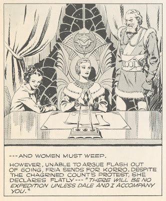
The stories in comics, pulp magazines, science fiction and fantasy were never subtle about the proper roles for men and women. Here is Flash Gordon by the great Alex Raymond:


 |
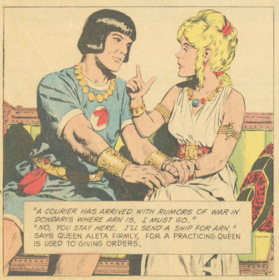
We see a similar perspective in Prince Valiant (1972), drawn here by John Cullen Murphy:


 |

 |
| Prince Valiant by Hal Foster |
The politics of these stories have been the subject of robust debate. I leave that debate to others.
What interests me is that the words are only one small part of narrative art, and the non-verbal portion-- the lines, colors and shapes-- can express a gender orientation of their own.
In the 1950s, illustrator Albert Dorne was commissioned to illustrate a story for Cosmopolitan magazine. The story involved a barn that burned down at night, a cow, and a young couple confronted by crooks. Dorne turned in this powerful illustration:

"Albert, your drawing is swell but we are afraid our readers will not like it. The violent fiery red is a bit frightening, the interpretation too literal. We have found from our readership polls, etc. etc. Would you mind doing it over?"Dorne was irritated. He recalled, "The audience in mind being primarily women, I knew I couldn't actually show fire, so I... created the illusion of fire by lighting the picture with a deep fiery glow from off stage." But that wasn't sufficient. The picture's strong, high contrast treatment, with pointed fingers, sharp angles, extreme positions and facial expressions was still viewed as too yang for a female audience.

Cosmopolitan presented Dorne with "a layout designed in a much lighter vein and quite gay in its concept." The art director explained, "This is the sort of thing our readers like."
Dorne (a powerful, cigar smoking man and former prizefighter) bitterly started over and this time turned in a much softer, pinker, friendlier picture:
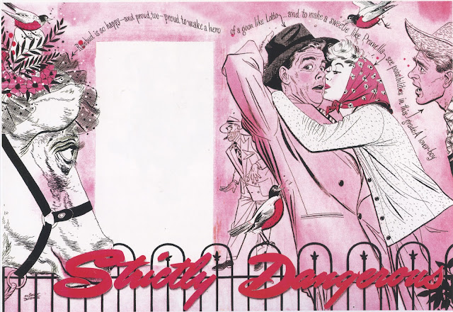
To his amazement, Dorne received a flood of compliments for the revised illustration, not just from the readers of Cosmopolitan but from art directors of other women's magazines who thought that Dorne's light and charming style would be well suited for their audiences.
This was not a conspiracy between a male artist and a male art director. The patriarchy had nothing to do with these aesthetic choices. These were the colors, lines and shapes proven to induce more women to buy and read the magazine.
47 comments:
The revised Dorne looks like a Dave Sim take on the first version. Wouldn’t look out of place as a spread in Glamourpuss, following the month’s instalment of The Strange Death of Alex Raymond.
- - -
Postmodern Anonymouse
QED I guess, just take a glance at the comics read by girls and those read by boys.
Raymond was great. Nobody like him anymore. There was a lot of truth in those messages about men and women.
That kind of stuff will not happen nowadays, stick figure characters have no gender and forget about today’s illustrators drawing a cow.
"See, they like what we show them". Self-fulfilling prophecy much?
I mean, it's pretty obvious that had the media pushed a different self-image and fed different styles, the expectations and tastes of the female readers would've been different. Even without mentioning that there's not a monolithic "female reader" but a multitude of groups that can be spliced in a zillion ways.
Maybe if Gen Z grew up on Flash Gordon and Prince Valiant the boys wouldn't be such spineless little wimps today. They're disgusting.
The mention of John Cullen Murphy's Prince Valiant strip brings to mind the book written by Murphy's son, Cullen Murphy: Cartoon County: My Father and His Friends in the Golden Age of Make-Believe. A terrific read for those interested in the cartooning world of that era. It may have already been discussed here, not sure.
I mean, it's pretty obvious that had the media pushed a different self-image and fed different styles, the expectations and tastes of the female readers would've been different.
I don't think that's obvious at all. It's also not true. To give just one small example; Disney have been pushing girl-boss superhero movies for nearly ten years now yet the demographic of the steadily dwindling audience who watch them remains essentially unchanged.
What? Do you think modern female audiences watch the same garbage that they did 60 years ago? Just browse Netflix's catalog of animation; there are insanely better-designed and written mid-tier productions.
Reality is that women are far more likely to be watching reruns of Gilmore Girls. Same type of content they were consuming in 1950, but with better writing.
~ FV
What? Do you think modern female audiences watch the same garbage that they did 60 years ago? Just browse Netflix's catalog of animation; there are insanely better-designed and written mid-tier productions.
Of course they don't, and that wasn't my point, but to answer yours; higher production values cannot disguise propaganda.
Propaganda like in the subject of this post you mean?
I find it really weird that the garbage that was produced "for women" by all-male crews of the '40s is seen as some sort of natural order or unavoidable positive truth. Go read Persepolis or watch The Mitchells vs. the Machines, fcs.
Even heavily male-oriented areas like gaming spin out products like Arcane that beat old character construction and writing into a pulp. If you show a modern fifteen-year-old grown on a steady diet of anime and manga, some of that old crap, she would roll her eyes to death.
xopxe,
No offense, but you sound like a really unhappy lady. You have such a negative angry spirit.
And gaming, anime, and manga trash isn't going to help you find happiness. Same goes for any other 15 yo girl on Socials and SSRIs.
~ FV
Haha, no offense taken as a 50-year-old male in South America. But I do have daughters, and some here really look like they haven't ever spoken to a woman born this side of the Cold War :D
Oh, haha. I always assumed you were a 28 year old woke lesbian girl who taught statistics at a college in Brazil. I see from your twitter profile that you're a coder from Uruguay that reads the Guardian and reposts anti-Israel stuff. An old girlfriend of mine got mugged in Montevideo by two guys on motorbikes. Are you a coder for robotics? You seem to wander around and photograph broken-down things with your iphone. Very lonely feeling from your twitter. Are you divorced? It feels strange that you are interested in U.S. illustration.
~ FV
I don't know if it's just me, but I always find it weird to zoom in on something like a castle (Foster panel) and see that the lines that give the illusion of being straight are actually wobbly.
I always thought of Foster and early Alex Raymond as staid and over formal. But now I see the style as a combination of needing to do open work for the purposes of newsprint, but also evoking a kind of classicism that gives an important note of dignity or grandeur to the strips. This kind of simple classic approach to drawing and inking is much much harder than it looks.
That last pink Dorne is very period. In that it has all those different pen textures that seemingly every ink drawing from that moment in illustration had. I remember my school library as kid on Long Island had all these old-fashioned illustrated books from the late 40s and 50s that looked like that. The style still makes me itchy.
Haha FV, i feel honored.
Oh, haha. I always assumed you were a 28 year old woke lesbian girl who taught statistics at a college in Brazil.
I actually know a woke brazilian lesbian college professor, very fun to hang around.
I see from your twitter profile that you're a coder from Uruguay that reads the Guardian and reposts anti-Israel stuff.
I'm a researcher and teacher at the State Engineering School, where I work on Networks and Robotics. I don't actually follow the Guardian; I'm more interested in what the BBC says. You probably refer to a disposable joke about creating a tax on guillotines on a retweet of an article about billionaires or something.
An old girlfriend of mine got mugged in Montevideo by two guys on motorbikes.
Sorry to hear that, that's a shitty experience.
You seem to wander around and photograph broken-down things with your iphone. Very lonely feeling from your twitter.
Android, but yeah, the only interesting stuff down here is the rundown one. Also, I never post photos of people, only sketches I do on the bus on that same phone. In case you missed my other social media, all these drawings are collected here: https://www.tumblr.com/blog/xxopxe. I also have an imdb entry, but that's homework ;)
Are you divorced?
Sorry, no.
It feels strange that you are interested in U.S. illustration.
Really? They have quite an illustration culture there, very interesting.
What interests me is that the words are only one small part of narrative art, and the non-verbal portion-- the lines, colors and shapes-- can express a gender orientation of their own.
It might be more accurate to say that lines, colors, and shapes—as well as mood and the rest—can express genre, and that genre is gendered.
Lines, colors, and shapes are not themselves gendered outside of the genre to which they are relating to the viewer. Dorne's use of heavy blacks and strong, saturated reds in a bedroom scene pulled from a women's adult romance would function quite differently. Dorne's picture didn't fail because the lines were "boy lines", but because the genre of the image was wrong.
In film studies, genre has been extensively studied, with fairly exhaustive treatises on genre and how it functions. In representational art, not as much. What makes a successful "romance" painting different from an "adventure" painting, a "slice of life" painting, a "sci-fi" painting, or a "religious" painting? I think that warrants more discussion. If we can ever finally put the abstract baby to bed, we could get to the business of figuring art out.
Dorne's picture didn't fail because the lines were "boy lines", but because the genre of the image was wrong.
Branding. It was simply off-brand for the magazine. The women's magazines became lifestyle brands. Which have certain mood and status targets of aspirational living for the sake of holding their feminine readership.
This is different than genre. Genre is how a story feels. Branding is how the magazine feels.
Genre is not the same as The Picturesque; which refers to a scene where a collection of every trapping or cliché of a particular genre is present ~ A pirate sitting on the stern of a galleon with all the accessories – cutlass, tricornered hat, patch over eye, parrot on a shoulder, etc.
Genre is abstract but people usually don't realize it until a genre is ported away from the original setting in which it was developed.
Richard and Kev Ferrara-- whether it's an issue of genre or branding, isn't there enough latitude in this content for an artist to attempt either a yin or a yang interpretation? Cosmopolitan magazine must've decided, when it bought the story, that it was within the genre, or consistent with the brand. They must've thought that a confrontation with crooks at night by the light of a burning barn would appeal to Cosmopolitan's readership. And apparently it did. The same factual narrative could be depicted (equally accurately) through both a male or a female prism.
So I'd say if anything was off-brand or out-of-genre, it wasn't the subject matter, it was the abstract visual elements.
It shouldn't be surprising that male content could be drawn with female aesthetics (if such things exist) or that female content could be drawn with male aesthetics. The symbol for ying and yang places a dot within each side, representing the seed of yin residing within yang and the seed of yang within yin, to convey there's a little of the opposite in each.
"It shouldn't be surprising that male content could be drawn with female aesthetics (if such things exist) or that female content could be drawn with male aesthetics. The symbol for ying and yang places a dot within each side, representing the seed of yin residing within yang and the seed of yang within yin, to convey there's a little of the opposite in each."
I sorta don't believe in "feminine subject matter" in art, because I don't believe in "the subject" really at all. As I've said before, I only believe in the way a thing is done. And I think that is the actual subject of great paintings.
When I first became interested in Pyle and Frazetta as a kid, I casually assumed I was a fan of pirates, war art, and sword and sorcery. Until I saw all the bad art done with pirates, war, and fantasy as the ostensible 'subject matter.'
The penny dropped for me with the Illustration House catalogs, where I started to notice that so much of my favorite stuff was "female" subject matter. (Walter Everett, Dean Cornwell, and Mead Schaeffer, just to name three). And other great stuff seemed to have no "subject matter" at all, just people walking, standing around or sitting and talking.
TLDR: Any art that is dependent on subject matter sucks.
Any art that is dependent on subject matter sucks.
That's great!
And before anyone gets all Clement Greenberg about this, a wonderful picnic doesn't depend on the quality of the food, the location or the weather, rather, the food, location and weather depend on the quality of the company.
In other words; the 'subject' of a picture is, like the picnic, a ritual enabling the participants to act out what is really important.
<<<<<I don't actually follow the Guardian; I'm more interested in what the BBC says.
That figures. BBC has done 3 separate internal reviews for antisemitism in its coverage and found themselves guilty each time. Guess for you that makes them 'balanced.' Right?
~ FV
"And before anyone gets all Clement Greenberg about this"
Ha. I think by now most readers, even if they don't fully understand me, at least get what I don't mean. (Succinctly; I don't think there's poetry without illusions of references.)
Also, even as intelligent as the readership here is, I can't imagine that many have actually read Greenberg. The only reason I read him was because I was trying to figure out what the hell happened to art.
chris bennett wrote: "a wonderful picnic doesn't depend on the quality of the food, the location or the weather, rather, the food, location and weather depend on the quality of the company."
Someday we'll make our way through one of these discussions without reverting to our favorite irreducible disagreement. I maintain that the reason art has persisted through the millennia and around the globe is that art is a centicipitous creature. You and kev, on the other hand, seem to have settled on the kind of art you like best and dismiss other art forms as "lower" on an objective scale.
People like picnics for all different kinds of reasons, and might very well find the essence of picnic in individual elements such as food, location or weather. There are indeed people who don't care one jot about "the quality of the company" on a picnic.
Some picnic-goers may not be in search of an aesthetic experience unified into a singular pictorial ideal, seamlessly incorporating meaningful illusion effects with beauty and complexity. Sometimes there are teenagers on the picnic who are only looking for an opportunity to sneak off into the woods together and unleash their hormones. Sometimes there are antisocial husbands with no interests beyond the potato salad, who only wish their wives (who are there for the "company") would quit yapping. Some care only about the weather and want to isolate themselves on a quiet blanket in the sun. If Kev woke up one of these sun bathers to explain that they should integrate their experience with a Spanish bannister they would throw him in the pond.
The Islamic culture agrees that there is a clear, objective hierarchy to the quality of art, except they place calligraphy at the pinnacle. There are places in the world where they would chop off Kev's chauncey if they heard him badmouthing calligraphy in favor of representational art.
Kev Ferrara-- When you say that "art that is dependent on subject matter sucks," I understand you to mean that art still requires a subject matter, and the subject matter should be visual in nature (as opposed to textual or conceptual). Furthermore, the subject matter cannot be implied by abstract elements, such as a red color or a violent line. You're just saying that the subject matter shouldn't make the difference between a successful and unsuccessful picture. Have I got that right?
Any art that is dependent on subject matter sucks.
You should check out the Modernists. Crazy stuff. Some of them dropped mimetic content entirely and focused entirely on the How instead of the What. Just blobs and shapes and strokes of paint. Art as its own subject. Again, crazy stuff - it'll blow your mind.
---
Postmodern Anonymouse
Fv, that's some weird retort. Why would anyone call the BBC "balanced"? The Anglosphere's infatuation with the concept of "balanced journalism" is really amusing. Especially when they root it on that infantile both-sideism, as if the world was organized in two opinions about everything.
And, I agree with David's last post. I think I argued it before, if someone comes up with a universal theory that defines what is good art and what is not, and it just happens to match the author's little group, then probably the theory is crap.
Islam says these are the highest art forms, in order:
1. calligraphy
2. quranic psalmody
3. architecture
4. Islamic clothing
5. rugs, textiles, tiles, glasswork
6. paintings (not figurative)
7. Persian garden
JSL
"You should check out the Modernists. Crazy stuff. Some of them dropped mimetic content entirely and focused entirely on the How instead of the What. Just blobs and shapes and strokes of paint. Art as its own subject. Again, crazy stuff - it'll blow your mind."
Whoah. You are so smart!
You and kev, on the other hand, seem to have settled on the kind of art you like best and dismiss other art forms as "lower" on an objective scale.
The world is built of hierarchies, it's how the world lays itself out and how it works. In this sense hierarchy is the invisible means by which the world comes into being - bottom-up and top-down processes ever co-operating to meet in the middle with what one can call the experience of reality. The nature of hierarchy seems to be the locus of our disagreement.
People like picnics for all different kinds of reasons, and might very well find the essence of picnic in individual elements such as food, location or weather. There are indeed people who don't care one jot about "the quality of the company" on a picnic.
Yes, they do, I'm not in disagreement about that. It is a question of the hierarchy of attention within a given frame. Liking tasty BBQ chicken is fine as it goes, but preferring it to the loving fellowship of the people you are sharing it with is a lower order value.
Sometimes there are teenagers on the picnic who are only looking for an opportunity to sneak off into the woods together and unleash their hormones.
No problem with people having sex, but it's a question of what is appropriate within the arena we find ourselves in. There's also no problem with taking a dump either, but to do it in the picnic basket will put something of a damper in the hamper. People have come together to be together, share and celebrate their kinship in a ritual we call a picnic, so two kids sneaking off to the woods for a knee trembler is a lower value act when it is within the hierarchy of the picnic's purpose.
Sometimes there are antisocial husbands with no interests beyond the potato salad, who only wish their wives (who are there for the "company") would quit yapping. Some care only about the weather and want to isolate themselves on a quiet blanket in the sun.
There you have it again, lower order value within the hierarchy of the picnic's highest purpose - the fellowship of human beings.
So, meaning is foundational to all hierarchy. I think the issue we are having with each other is whether hierarchy of value in art is predilated on the patterns of our being-ness in nature and thereby reflecting nature's own hierarchy pointing ultimately to the divine, or is an arbitrary human construct designed to manufacture whatever meaning we wish to impose on the world. The latter view of course justifies doing whatever the hell you want at the cosmic picnic.
" When you say that "art that is dependent on subject matter sucks," I understand you to mean (…) that the subject matter shouldn't make the difference between a successful and unsuccessful picture.”
It doesn’t.
And again, what do you (or does anybody) mean by “subject matter”?
Here is a picture titled 'Battle of Nashville'.
Here is another picture titled 'Battle of Nashville'.
If "subject matter" mattered to artistry these pictures would exhibit profound commonalities. But they don't.
“I understand you to mean (…) that art still requires a subject matter, and the subject matter should be visual in nature (as opposed to textual or conceptual).”
Poetry requires about-ness because tropes require layering, vehicle upon tenor being the simplest case. Design does not require layering because it does not do ‘depth’ in this poetic sense. Though design can be quite broad; it can have breadth in the sense of scope as it can reference widely through geography, culture, and time.
"You (...) seem to have settled on the kind of art you like best and dismiss other art forms as "lower" on an objective scale."
I'm not status-oriented. I only care about if a thing is functioning as poetry or whether it is functionally a piece of design. And what makes something effective (or defined) as poetry (or design.)
A large part of what makes something effective narratively/poetically is the degree to which it transmits via aesthetic means the thought process necessary to convey its ideas. Suggestions upon suggestions.
If I make any claim to a qualitative hierarchy, it is on this basis: the degree to which work contains consciousness. I find poetry/narrative fascinating, I think, because it is, at its best, utterly conscious. Full of sublated thoughts manifested of sensory terms. Epiphanies, as thoughts go, are of particular interest to me.
I suppose I don't find design nearly as fascinating because it is not nearly as conscious. It doesn't build thoughts from sensation components. It isn't meant to cause epiphany. It builds out simply; a field vibe from repetitions, and creates arrangements from design principles and stems.
As an exercise, I once looked through a foot tall stack of Art in America Modern and Postmodern-type magazines, and was able to categorize every single picture into 8 basic design stems or conceits.
If "subject matter" mattered to artistry these pictures would exhibit profound commonalities. But they don't.
I believe there's a meaningful sense in which these two pictures differ in subject matter more than they overlap. In one, we have grass, snow, mud, atmosphere/smoke, bloody bandages, and so forth. In the other, there's very little, despite having the same general narrative thrust.
What is subject matter in a picture? I'd define it as something like "everything you can capture with a camera."
To the extent that Pyle's Battle of Nashville feels much more like any given still from Saving Private Ryan than the Kurz and Allison print, we're discussing subject matter.
If it were poetry that primarily distinguished them, it shouldn't be possible to say that the still from Saving Private Ryan was more similar to Pyle's Battle of Nashville, since we've taken it as axiomatic that there can be no poetry in a photograph.
What is subject matter in a picture? I'd define it as something like "everything you can capture with a camera."
I find it quite strange that you resort to photography to discuss ‘subject matter’ when notions of subject matter long predate photography. Photographs indiscriminately capture through a pinhole a frozen instance’s worth of bounced and filtered light rays. Can we talk about our own experience of reality instead?
Unless you actually mean to say that the subject of picture is the collection of objects depicted in it? Such that a picture entitled “Battle of Nashville” is actually, in some sense, about a canteen and a patch of yellow sky in the distance?
Since photography freezes real action, the illusory effect of the charging of the soldiers Pyle achieved would not be part of the subject matter under your paradigm, right? The soldiers would only be part of the subject matter in some static… as static what? As static identities in your head? As ideals of soldiers standing around? I don't know.
Since everything in both pictures is either half wrong or never existed, it is tough to know what you mean. There is no flag that looks or looked just like that, no hill that looks just like that, no men with those faces, their uniforms are in error in peculiar ways, smoke never looked just that way, and Pyle’s action effects are wildly exaggerated and romanticized and compositionalized. So, truth be told, none of it could be photographed.
The reality is, both of the Battle of Nashville pictures are fantasies. None of this stuff exists such that a camera might capture it. The fictional men in the Pyle are built out of your imagination. They are hinted at with suggestive fragments. They don’t refer to anyone, so they aren’t even abstractions of real people. The pictures exist as their own aesthetic realities - at least in the Pyle’s case - self-conjured with the help of your intuition’s reflexive need to "close" linked suggestions.
"If it were poetry that primarily distinguished them, it shouldn't be possible to say that the still from Saving Private Ryan was more similar to Pyle's Battle of Nashville, since we've taken it as axiomatic that there can be no poetry in a photograph."
Regarding Saving Private Ryan… cinematography is hugely different than still photography. Artistic opportunities come from the limitations. As Eisenstein pointed out, the necessity to cut and edit is the greatest aesthetic affordance and feature of film art. Or as Andrew Wyeth said, “It is often what you take out of a picture that makes it a good one.”
Neal Adams once told me to copy a favorite Frazetta drawing line for line. He said what I’d learn was not mystical. In a somewhat similar vein, I’d advise you to take Pyle’s Battle of Nashville picture into some program where you can draw thin yellow lines over top of it, preferably with Bezier curves. Then try to diagram over the picture every line or edge that makes itself known to you, inside and outside the figures and particularly as the lines pick up from one figure or object to another. Then talk to me about a still photo from a battle scene Saving Private Ryan being comparable.
Circumventing the banal truth in order to sustain the religious notion of language beyond language. Same as it ever was.
The subject matter of a piece is that which is not the object matter. The mimesis, the representative quality, the aboutness, the look-a-likness. It is what enables the production of meaning. And all this yabber about the evils of interpretation merely obfuscates the all-the-way-down-ness of this "theory" of visual poesis.
---
Postmodern Anonymouse
Then talk to me about a still photo from a battle scene Saving Private Ryan being comparable.
At no point did I say that they are the same, or anything of the sort. I'm going to repeat myself, because I'm interested in hearing a response to what I actually argued --
1. A still from SPR feels more like the Pyle than the Pyle feels the print.
2. If poetry was the primary differentiator, this should not be possible.
If poetry was the difference, then categorically the Pyle and the print would HAVE to feel more alike than the Pyle feels to the film still, since the film still cannot contain poetry.
Circumventing the banal truth in order to sustain the religious notion of language beyond language.
A postmodernist that cites "truth"? Funny stuff.
Who knows what you mean by "language beyond language". I think you mean that you don't believe that meaning derives from sensory experience, that meaning is pure solipsism. And you can go ahead and think that, even though it is unbelievable childish and stupid.
Nor is anything I'm saying in the least 'religious'.
If you can't understand what I'm saying, either ask questions or stay out of the conversation. Being a grousing anonymous asshole is hardly a worthwhile waste of even your time.
More simply, if you would post a link to some of your art, I would know whether you are capable of actually understanding any of this material. And that would tell me whether to bother discussing any of this with you.
Incidentally, staying anonymous at this point is such sniveling chicken shit behavior, I can only assume you have neither self-respect nor self-discipline. (Thucydides)
At no point did I say that they are the same, or anything of the sort. I'm going to repeat myself, because I'm interested in hearing a response to what I actually argued --
1. A still from SPR feels more like the Pyle than the Pyle feels the print.
2. If poetry was the primary differentiator, this should not be possible.
If poetry was the difference, then categorically the Pyle and the print would HAVE to feel more alike than the Pyle feels to the film still, since the film still cannot contain poetry."
Oh, okay. Now I get you.
The print is an "intellectual" construction. Everything about it is constructed by a pinched untalented left-brain dork, struggling to make even a doll house version of the event he's been assigned to illustrate. It is not imagined. At all. Real imagination - a vision - is closer to our experience than something constructed. Pyle's picture is a vision, and I submit that his vision is the real subject of the painting.
It is no accident that Speilberg and all the great storytelling directors are also huge fans of Brandywine illustration. As far as I can tell, the only artform that has comparable thinking to Pyle et al, is the great directors of Hollywood. (They tried to recruit N.C. Wyeth to concept-design for Hollywood as productions started to get bigger and fancier in the early 1920s) Even Stanislavsky's sense-memory thing was anticipated by Pyle's Imaginative Projection theory.
Anyway, Pyle believed that illustrators should thoroughly immerse themselves in the stories they were to illustrate. And then thoroughly immerse themselves - even live in - the pictures they were in the process of painting. Pyle said when he was painting one particular successful war scene that he could smell the gunpowder smoke. You had to become the nose that you were painting, the wall, the horse... everything had to be felt from the inside out. And he also demanded his students get the details too, especially when doing historical pictures. But also just knowing how a door is put together.
The result is that the Pyle picture has authenticity to it. Speilberg is similarly imaginative, diligent, and has the budget to shoot on location and get a team of pros together to costume and set-design and act, etc.
All to say, I agree with you. The print is so bad on so many fronts, there probably is more the same between an SPR still and the Pyle painting.
"Pyle's picture is a vision, and I submit that his vision is the real subject of the painting."
This is helpful to us amateurs, for sure. But not obvious. Does our "guess" that the difference between the two paintings is the difference in artistic skill contribute to our confusion? That was my first impression, since I assumed the "subject matter" was the battle itself, but I see now what you are suggesting is something completely different.
How does one continue to develop this keen appreciation of the artist's vision? For example the occasional "cubist" style of Demuth is very beautiful to me (and visionary), but Picasso's cubism is off-putting. How can I develop an accurate/valid sense of their respective "visions" when both have artistic skill? How can I justify the appreciation of one over the other if they are both skilled artists? Or are they even equivalent in vision and skill?
Thanks for your insights.
I've found it difficult to locate high resolution/quality scans or prints of Alex Raymond inks (not collectables, just references).
Do you have any advise for sources?
"For example the occasional "cubist" style of Demuth is very beautiful to me (and visionary), but Picasso's cubism is off-putting. How can I develop an accurate/valid sense of their respective "visions" when both have artistic skill?"
Pyle's vision was meant to be a kind of poetic dream of reality without intellect interposing. That's the kind of poetry you get from, after diligent research, going deep into the imagination and trying to conjure an image of a moment and live in it. And then to let your imagination form it of its own accord. But Pyle also understood it all technically. He knew what he was looking for inside his imaginative process.
The imagination doesn't naturally dream pictures in complex geometric slices. So I think it is fair to say that Demuth's work is based on a style; cubism was a graphic fashion of his time. Demuth combined it nicely with something like the ashcan school to get "Precisionism". I like his work. And his "Dream of no. 5" is a classic of graphic design.
"How can I justify the appreciation of one over the other if they are both skilled artists? Or are they even equivalent in vision and skill?"
If you like something and appreciate it, isn't that justification enough?
If you want to get technical about why you appreciate something, that's a long road that not everybody is cut out for. Most people who cite things they appreciate about the art they appreciate are just pointing out the things they are able to notice. Which ain't much because good art doesn't leave its best tricks on the surface for the intellect to inspect. So this becomes a 'narrative fallacy' situation. Where the person who appreciates the picture tells himself a just-story about why it works. And that actually reduces their experience of the art they like by adding an ego and self-delusion into the mix.
Squeen:
You can find some large Raymond scans on Comicartfans.com
Use the search function.
Thank you, kev!
"The imagination doesn't naturally dream pictures in complex geometric slices."
Nice insight, but can you elaborate this idea more?
I assume you mean Demuth's "I Saw the Figure 5 In Gold" -- a marvelous painting.
thanks!
"can you elaborate this idea (The imagination doesn't naturally dream pictures in complex geometric slices.) more?
I assume you mean Demuth's "I Saw the Figure 5 In Gold" -- a marvelous painting."
Figure 5 is interesting because Demuth straddles the line between narrative and modernism, which often falls somewhere in comics. (I mean, comics was fragmenting time before Modernism was. And art were already fragmenting time in prehistory. The idea behind parentheticals was developed before words.)
In the style of Futurism, Demuth's idea was to animate the painted gold number on a red fire truck as it receded into the distance. He developed a smart plan for blatantly (aka graphically) structuring the design of it so the 5s recede in 3 keyframes over red, and then he worked it out. Like Wally Wood’s Klomp Klomps in ‘Sound Effects.’ The rest of the composition is there to give a blatant (graphic/surfaced) effect of rushing down a city street at night.
So you can understand that the picture wasn't born of some quasi-mystical imaginative exploration of a scene Demuth believed to be real in his mind (What I'm calling a "vision". Which results in an "Image" when successfully realized.) It is the result of him coldly thinking through two particular effects he wanted to achieve on canvas in a graphic way to express a particular narrative sequence.
Now, if you didn't know you were supposed to looking at a fire truck number receding into pictorial depth, I don't think you would get that from the picture. I imagine that people who lived in 1928 might have recognized that kind of thing from experience. But now that reference is dead. The suggestion no longer mounts on our hard drives.
Demuth's other work, the Precisionist cityscapes, is what I was really talking about. Those works are also highly conscious creations. They are part of his "vision" of a style, but the actual works are obviously real scenes that have been geometricized; they are cityscapes that have been processed intellectually. He did not live imaginatively in them. More like, he saw them, then parceled bits of them out into geometric sections. So they aren't 'visions' in the sense that I meant.
Beautiful analysis; thanks so much.
I hadn't thought too much about the fading imagery (from 1928); it always seemed to me to be a painting from the future (even now), though I always knew it was from the 1920's. ;^)
Cheers!
Disgusting? That's quite a strong feeling there, bud. Since you're bringing up generations I'll share my uncalled for opinion as well. I'd rather see a world full of wimps (which is debatable to begin with) then hateful troglodytes like some of the older folk.
Post a Comment